Every masterpiece tells a story, and in the dance of typography design, fonts waltz gracefully, hand in hand. Imagine the confident serifs of Times New Roman harmonizing with the sleek curves of Arial—the potential is both exciting and daunting. Like ingredients in a chef’s signature dish, the perfect font combination can elevate a message from pedestrian to sublime.
Unlocking the secrets of font pairings is more art than science, with each selection introducing a subtle nuance to the narrative of your design. Steps away from the ordinary, this exploration will delve into the realms of typography mix, where contrast and cohesion interplay to orchestrate visual symphonies.
By article’s end, predictability in typeface pairing will be a relic of the past. A curation of practical examples of font combinations awaits, serving not just as a showcase but as a blueprint for harmonizing type design blends that resonate.
With clarity in visual hierarchy and a touch of modern font trends, embark on this journey to discover pairing that isn’t just attractive but functional, ensuring readability and ideally suiting your unique narrative.
Sample Font Combinations For Your Web Design Projects
Here are some beautiful font combinations to use on your website. Each brings a unique and exciting look to your project.
Font Combinations For Science And Technology
Exo And Web Serveroff
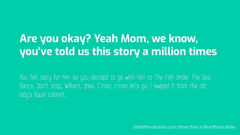
Here is a two-font combination made for science-related content. Use Exo for the heading and Web Serveroff as the body copy and subtitles.
Web Serveroff is a sans serif font with a narrow look that helps to create a techy vibe, while Exo has a futuristic look. In this instance, Exo is used in the upper case but it may be adjusted to lower case if necessary.
The Helvetica And Georgia Combination
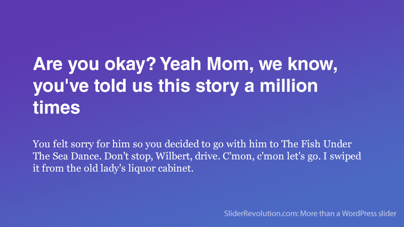
This is a great combination for medical or medicinal websites. Helvetica is a clean sans serif font that reflects stability and professionalism. It should be used as a bolded title.
Georgia is a serif font with great letter spacing to increase legibility. It should be used for the text and subtitles. This popular combination is useful for a variety of other design projects outside of the medical field.
Rokkitt And Hattori Hanzo
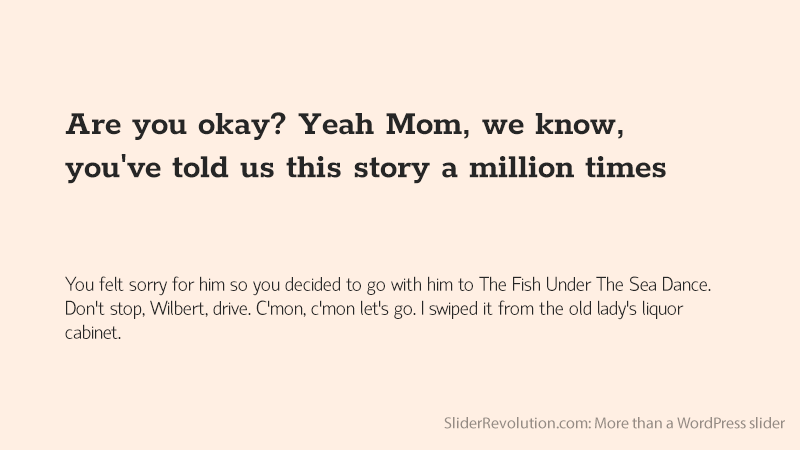
Here is a font combination for technology-related articles. Rokkitt is a display font, perfect for headlines and title text.
The Hattori Hanzo font is clean and modern and works well for short pieces of text in charts and infographics. A muted color combination and white space help to make this pairing harmonize effectively.
Font Pairings For Logos, Flyers, Channel Art, And Portfolio Sites
Lobster And Cabin
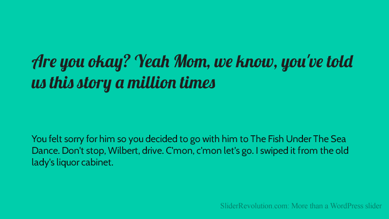
Lobster is a playful and quirky script font that is highly legible. It’s a very popular font that pairs well with a sans serif font like Cabin. The Cabin and Lobster combination is great for:
- Aesthetic portfolio websites
- Logos
- YouTube channel art
Playfair Display Italic And Playfair Display Black
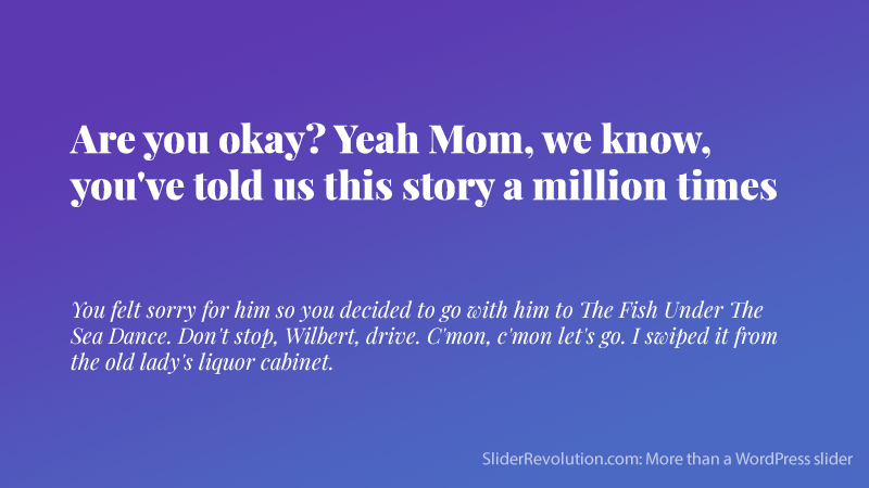
This Playfair Display fusion is the perfect font for a wedding invitation design or website. Playfair Display Black has a heavy style that offsets nicely against Playfair Display Italic.
This harmonious hierarchy along with color can improve how your typefaces are portrayed. For example, light tones can be used to soften the text.
The Futura Bold And Bodoni Font Combination
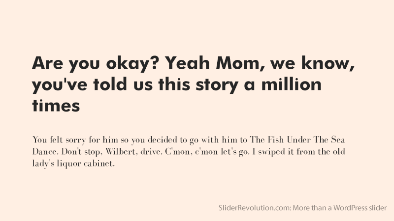
This Futura bold and Bodoni font combination is a beautiful contrast that features a crisp, chunky header and an elegant, slim font for the body copy.
The legibility and eye-catching difference of these fonts make this pair great for use on all types of flyers and brochures.
Font Pairings For Restaurants, Bars, Barbershops
Josefin Sans Bold And Josefin Slab Semi-Bold
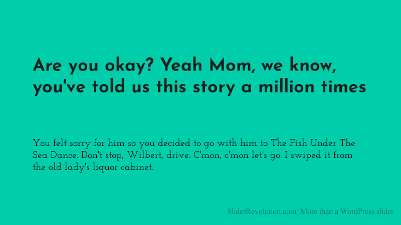
Josefin Sans and Josefin (Slab) are not a superfamily. They are vintage Google fonts and sister families that go well together.
They were designed based on the 1920s (Sans) and 1930s (Slab) geometric typefaces and made to be used in large sizes. This combination works well on the homepage of a retro website for barbershops, restaurants, bars, etc.
Medula One And Lato
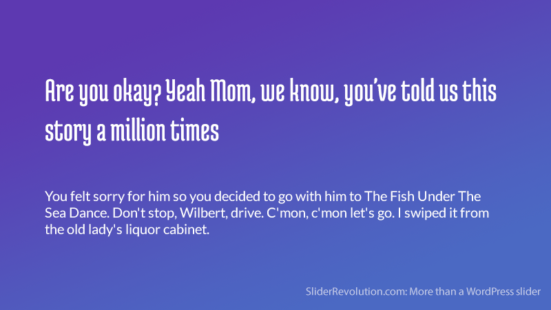
Medula One is ideal for decorative signage inside a small boutique or coffee shop. It’s highly legible and looks like a modern version of old Gothic fonts.
Polish graphic designer, Łukasz Dziedzic, created Lato. Lato is a Polish word that translates “summer” in English. It has a casual, breezy vibe as the name suggests. This combination has a hot and cold contrast that fuses beautifully.
Font Pairings For Hotels, Resorts, And Fitness Club Websites
The Abril Fatface And Josefin Sans Combination
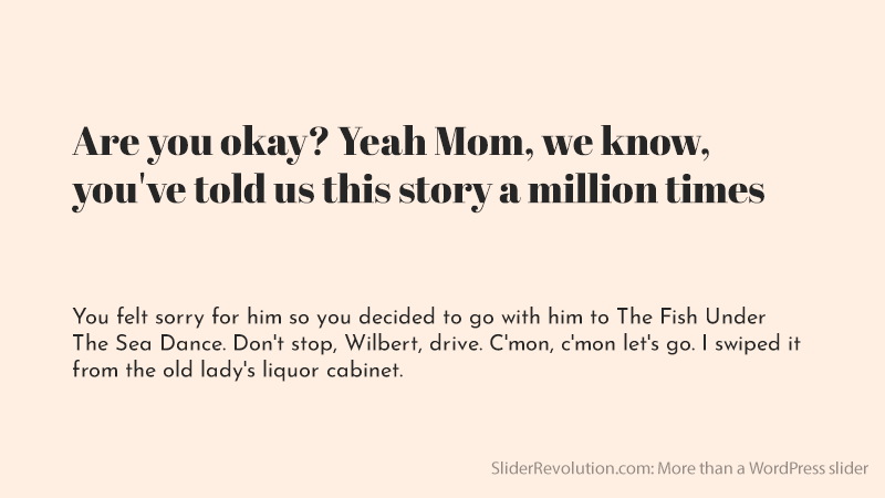
Although very different from each other, these fonts still work beautifully. The height between the baseline and the mean, or middle line (T x-height) of each font is slightly lower. This causes the uppercase letters to appear long and lean.
Abril Fatface on its own is an attractive and elegant font with a stark contrast in the line widths. But, the combination of these two fonts has a classy and professional look that is perfect for luxury hotel branding.
Oswald And Helvetica
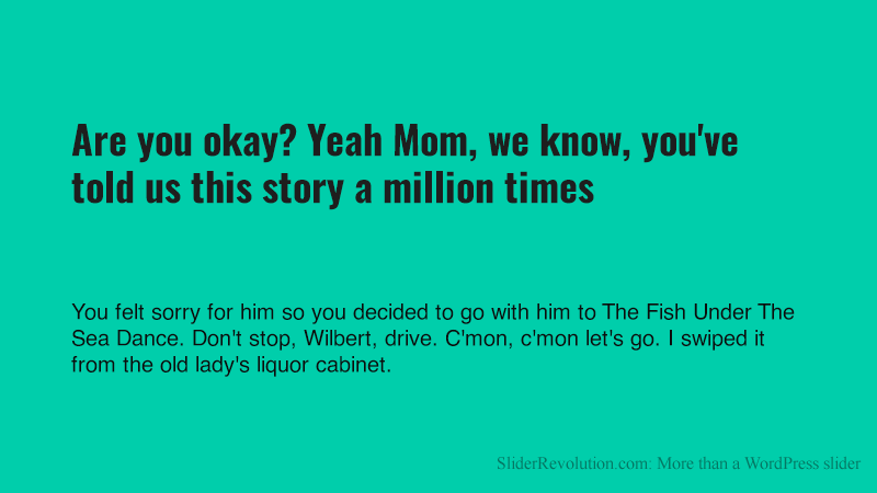
Here is a great example of a font combination for a health or fitness club website. The Oswald font is used in bold and italic.
It is clean and legible and displays titles and headers well. It adds a sense of motion and dynamism to a piece focused on health and exercise. Helvetica is used for the copy and subtitles to ensure clarity and legibility.
Font Combinations For News, Entertainment, And Sports-Related Projects
Amatic SC And Josefin Sans
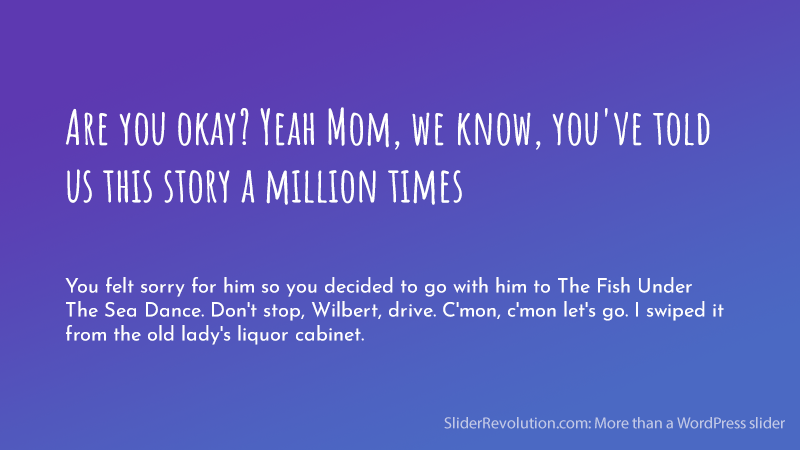
This is a great font combination that is on the light-hearted side of chic. This pairing is not for every project but if you want a gentle, whimsical feel this fusion of Amatic SC and Josefin Sans is perfect.
It is a fun-loving, free-spirited pro font that is perfect for artists, musicians, or entertainers who want to display a unique image.
Open Sans Extra Bold, Cooper Hewitt, And PT Sans
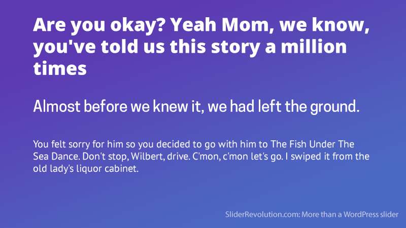
This font combination resembles those you would find in a newspaper or published works. They are tough and straight to the point. The Open Sans Extra Bold font is useful for an attention-grabbing headline.
The Cooper Hewitt font should be used in uppercase as a contrasting subheading or chapter marker. The PT Sans font makes the body copy easy to read. These typefaces balance each other nicely to establish a well-anchored style.
The Teko And Ubuntu Font Combination
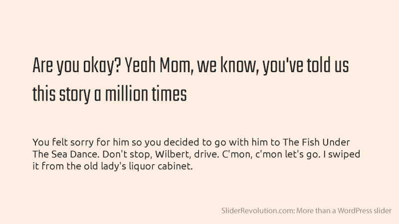
When building sporting websites, designers prefer fonts that generate excitement. These font typefaces look simple but powerful.
The Teko and Ubuntu font combination is ideal for sports-themed projects. Teko is heavy, with simple letters in square proportions. It is legible and works well with the hip-looking Ubuntu font.
The Fira Sans Black And PT Serif Font Combination
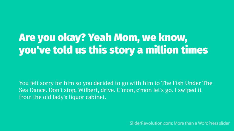
Both Fira Sans and PT Serif can be easily read and understood. This combination can be used on any website or blog with a large following but it feels more appropriate for news sites.
It is especially useful when it comes to sports and entertainment-related projects.
Font Pairings For Formal Documents And Corporate Affairs
Norwester, Kollektif And Montserrat
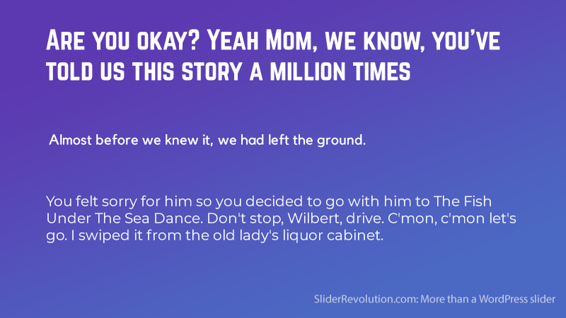
This industrial pairing creates a visual metaphor to symbolize the durability of a product. The Norwester font is geometric and is best used for headings to grab the reader’s attention.
This three-way pairing of Norwester, Kollektif, and Montserrat creates a structured and geometric look.
Helvetica Neue And Garamond
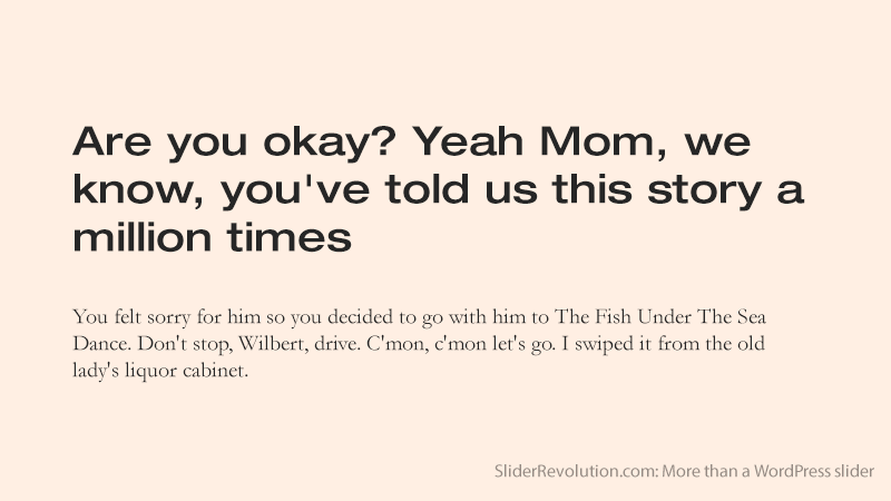
This is a popular font combination example. The Helvetica Neue font is often used for headlines, while Garamond is reserved for the body and subtitles. This classy combination is recognized as an elegant option for corporate affairs.
A Font Combination For Reports: Aileron Thin And Copper Hewitt Thin
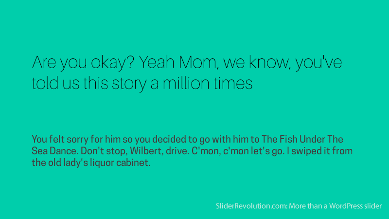
This Aileron Thin and Copper Hewitt Thin font combination is great for reports since these require fewer type combinations. Using a thin type weight for your heading shows off the structure and letterform. Ensure the text is legible by using it against a flat color. This forms a contrast and helps the form to stand out.
Nexa Bold & Crimson Pro
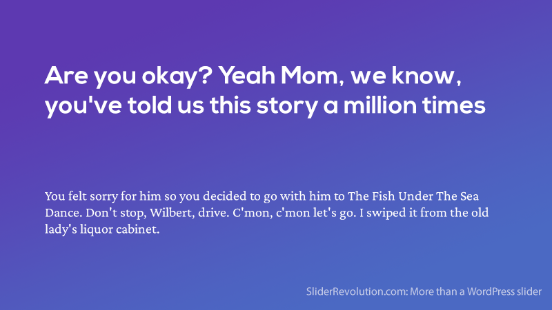
Nexa has a clean and simple form that goes well with Crimson Pro’s buttoned-up and studious look. The tone of this combination allows your visual or audio content to make a bigger impact on your audience. This duo is for introducing readers to your:
- Intellectual ventures
- Podcast episodes
- Proprietary research reports
- Blogs with infographics or other graphics-heavy content
The Oswald And Lato Font Combination
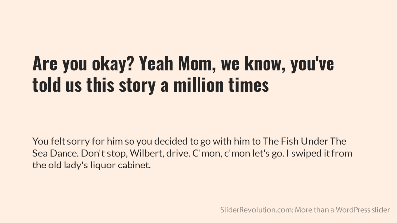
This font combination is great for resumes. The Oswald font is a strong and bold sans serif font that communicates stability, confidence, and professionalism. It’s great as a header font and works well with several other fonts.
Lato is a sans serif font with a round, legible, and friendly appearance that balances out Oswald when used for smaller text.
A Font Combination For Design Publications: League Spartan & Libre Baskerville
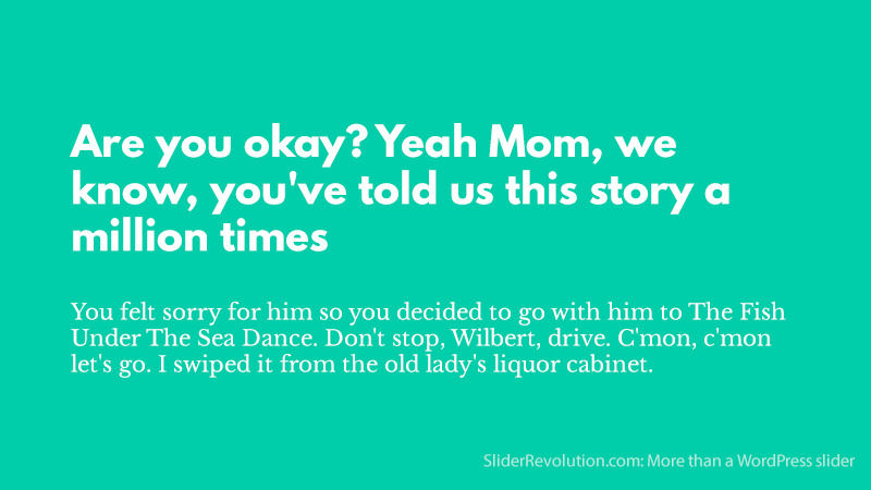
League Spartan has a strong, geometric, and modern structure. This complements the elegance of the traditional style of Libre Baskerville. This combination makes dense information more legible.
If you have limited content, use columns to contain the text and reduce the width of the content space. This shortens the text lines and makes the body easier to read.
Julius Sans One And Archivo Narrow
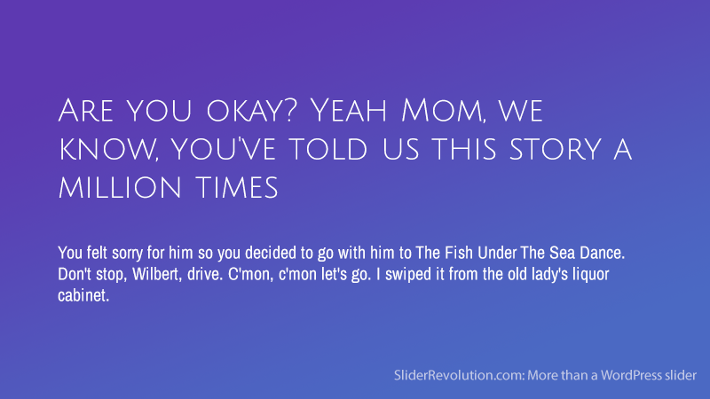
This is a font combination for resumes and formal documents. It combines clean typefaces that establish hierarchy and balance to make your message legible.
The Julius Sans One font has a fine stroke and a broad baseline that makes it an ideal display font that offsets well against the Archivo Narrow font.
Archivo Narrow has a geometric and masculine style that combines well for easy readability.
A Font Combination For Digital Marketing Websites
Abril Fatface & Lato
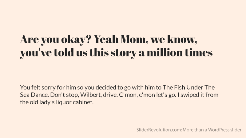
This font combination is great for digital agency websites. The Abril Fatface design resembles 19th-century advertising headlines from France and the U.K.
Lato is a more modern, proprietary font design made for a corporation. This is a combination of modern and classical marketing typography.
Font Pairings For All Project Types
Calvert and Acumin
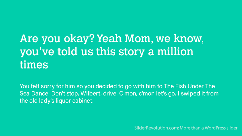
The Calvert font is a slab serif from Monotype created by Margaret Calvert. Calvert can be paired with sans-serif Acumin. This is a typeface made of 90 fonts created by Robert Slimbach as part of the Adobe Originals project.
Montserrat & Lato
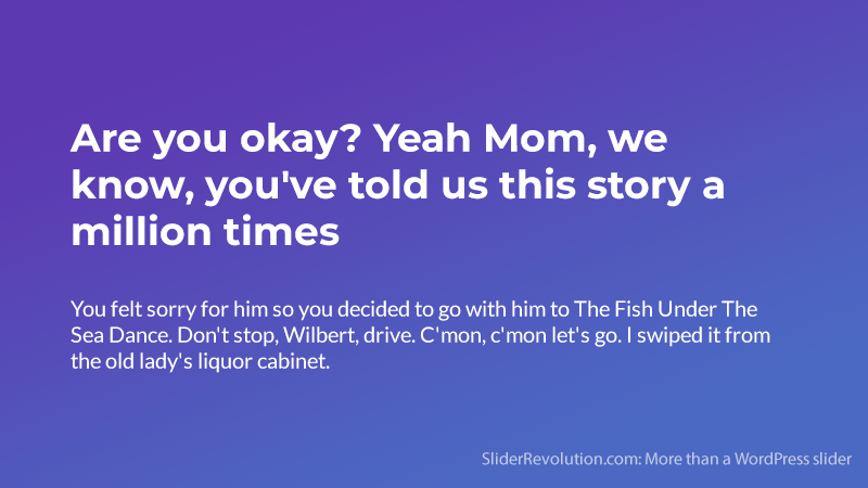
Montserrat is a vintage font similar to the urban typography of the beginning of the 20th century. It’s a simple, geometric font that is legible in smaller sizes and is useful for subtitles.
Lato is a versatile sans serif font that combines warmth and seriousness in its personality. This combination works well for design-related projects and has a clean and sleek look.
The Souvenir And Futura Bold Font Combination
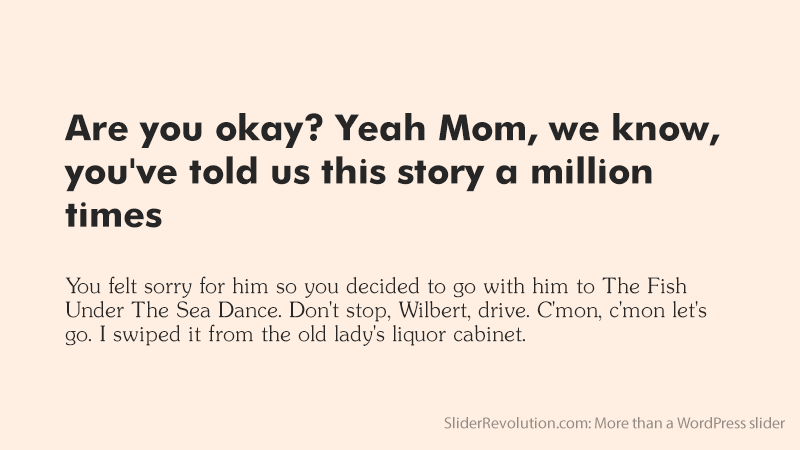
Combining typographic personality fonts often results in a clash. But, here is a combination of two personality fonts that work well together.
In the words of Allan Haley “Souvenir is like Times Roman dipped in chocolate”. This light and playful font contrasts with Futura’s serious, modern, and optimistic look.
This font combination fuses two typefaces made in different periods and for different purposes, but they make a good team.
The Judson And Quando Combination
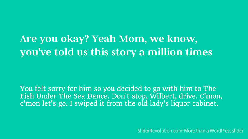
This combination proves that fonts don’t need to be complete opposites to complement each other.
Both fonts are serifs that have character and charm but Quando is the dominant font with more exaggerated serifs. This helps to make the hierarchy clear.
Bembo And Rockwell Bold
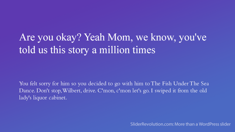
Bembo is a sleek, conservative, and versatile serif. Use it for your body text and subtitles and leverage the Rockwell Bold font for your titles, headings, and website buttons.
Rockwell is a classic slab serif with a geometric quality that gives it a ‘serif Futura’ look.
The Vidaloka And Roboto Combination
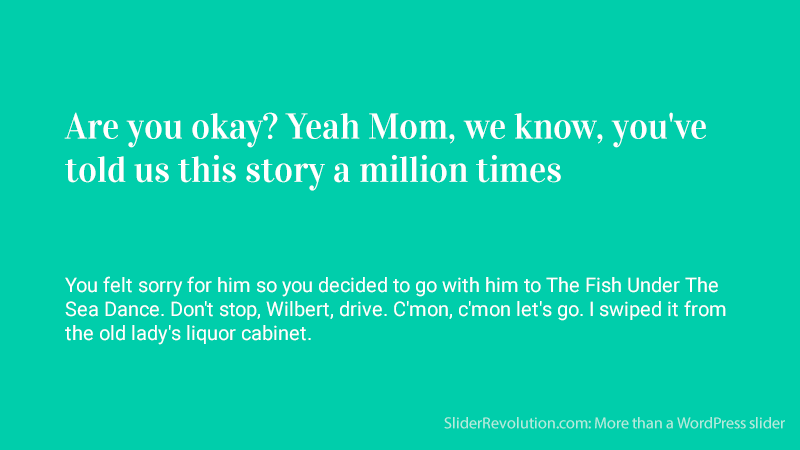
Legibility is an important aspect of choosing a font but that doesn’t mean one has to forget fun. Vidaloka adds a touch of playful vibes with its curled serifs. Paired with a more serious body font like Roboto a perfect balance of tone is achieved.
The Archivo Black & Archivo Narrow Combination
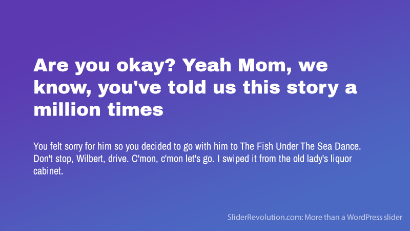
This font pairing combines a bold, rounded typeface with a lighter, more condensed style. Archivo Black has a bold wide appearance that is great for an activity-oriented audience.
This example is legible and attractive. It nicely complements the colors and composition of the background image.
The text can be made to outline the shape of an image, causing the reader to follow the design like a story. This font combination brings more symbolism to your designs.
The Alegreya Sans SC And Source Sans Pro Font Combination
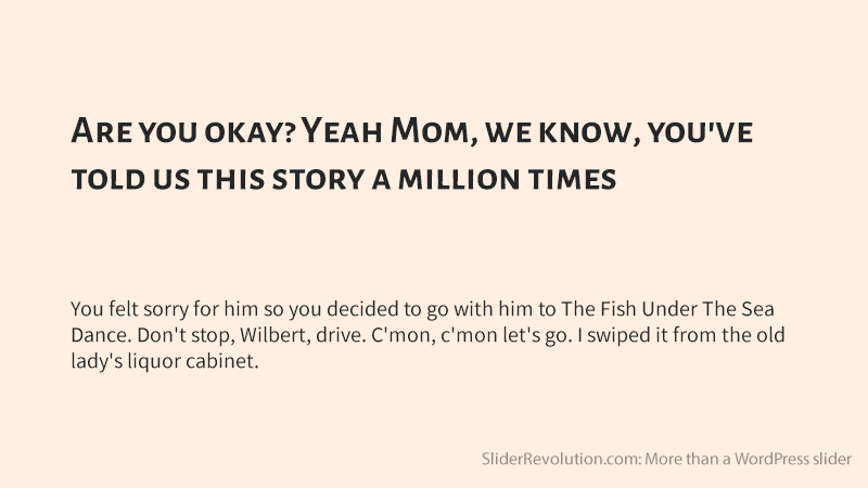
Alegreya pairs nicely with Adobe’s first open-source typeface family, Source Sans Pro. Alegreya is a font super-family that embraces the sans, serif sister families, and the small caps variant.
The small-caps version is for creating headers. This super-family is appropriate for long blocks of text and has a somewhat calligraphic appearance.
Merriweather And Quattrocento
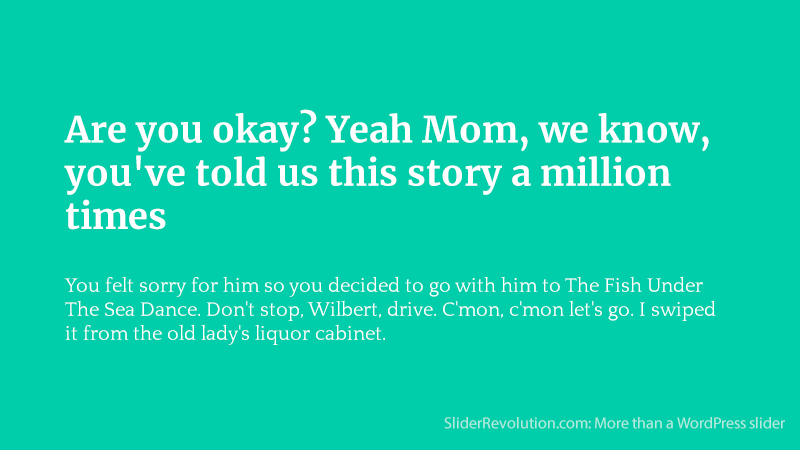
The Merriweather and Quattrocento fonts share a few basic structural elements and combine beautifully. They are from the same family and carry enough styles and weights to prevent the need for a third font.
Super Grotesk & Minion Pro
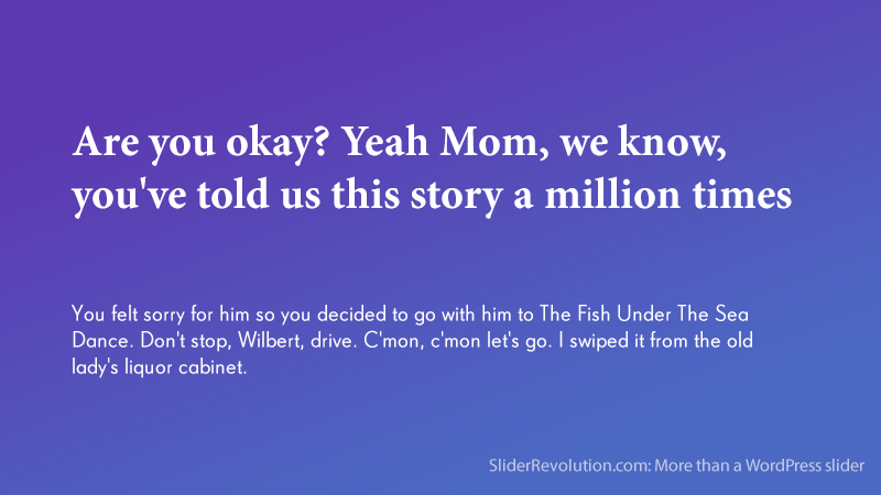
The Minion Pro font works well as the headlining font of this combination. It was made in 1990 for the pinnacle of modern creative design (Adobe) and was inspired by the paramount artistic era, the Renaissance.
Fused with the elegance of the sans-serif, Super Grotesk, these fonts appear modern with a sense of classical beauty.
The Pacifico and Quicksand Combination
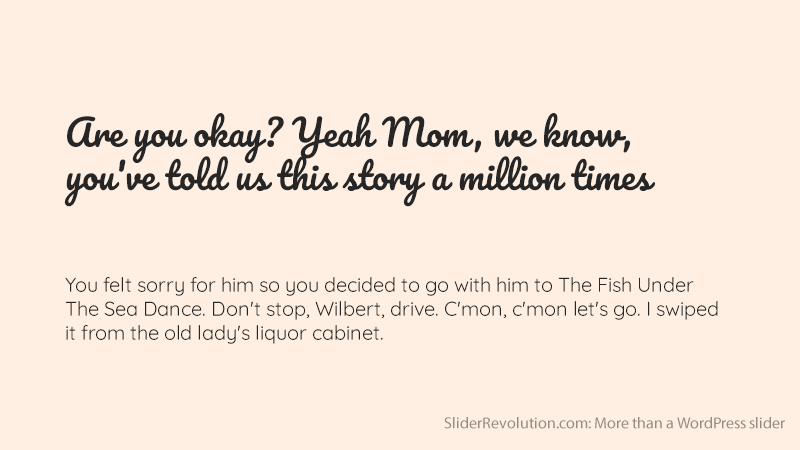
Pacifico and Quicksand are perfect for each other. They produce a lovely tropical theme for any design project. Pacifico is a flamboyant brush font for your headings, while Quicksand is a sans-serif for your subtitles and text.
Quicksand is quirky with rounded terminals and a distinctive descender on the uppercase ‘Q’. This font was designed as a display typeface, but it works well in smaller sizes too.
Bebas Neue & Montserrat
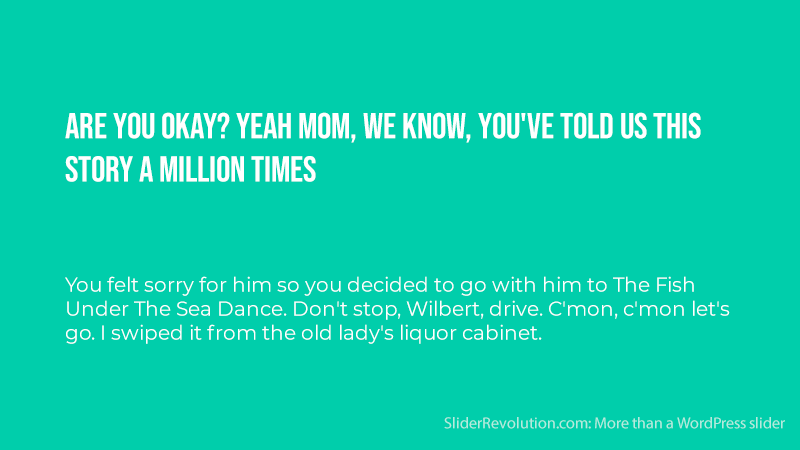
The Bebas Neue font is popular among designers as an ideal font for headings. It has a condensed and clean form that contrasts well with Montserrat to make a contemporary pairing. The geometric form of this font pairing makes it ideal for use with shapes.
The Lora & Merriweather Combo
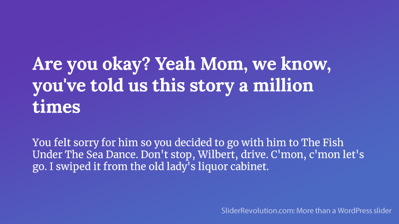
This combo fuses two popular serif fonts that work together to create a unique style. The Lora font features brush-like strokes to add a warm, creative feel to the header, while Merriweather adds stability to the rest of the content.
This fusion works well on websites owned by creators, such as:
- Website designers
- Copywriters
- Developers
- Marketers, etc.
This combination is especially great for creator websites that have:
- Lengthy portfolio pages
- Blogs
- Sales funnels
Old Standard +Open Sans
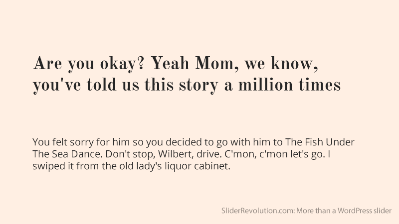
Open Sans adds legibility to the reading experience of any design project. It goes nicely with a modern serif like Old Standard, which resembles an old-school book or primer. This fusion creates a nice tension.
The Montserrat & Courier New Fusion
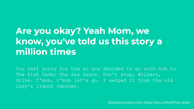
Here is a fusion of the poster child of online typefaces (Monsterrat) and the font of the classic typewriter (CourierNew).
This combination is the best of the old and the new. It fuses the thickness of 20th-century fonts, with the lightness of 21st-century lettering.
It’s great for companies that have a brand or product that touches both the present and past. It tells your audience that you are leaping ahead of the curve without forgetting your roots.
Playfair Display & Raleway
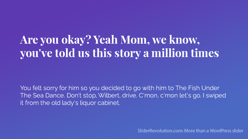
The display font Playfair was inspired by the 18th century period when pointed steel pens began to replace quills. It was also inspired by printing evolutions like high-contrast letterforms with delicate hairlines.
This font combined with the elegance of the sans serif Raleway font makes a perfect font marriage.
Playfair Display & Source Sans Pro
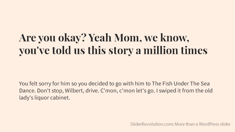
Any font with the word ‘display’ in its name is usually designed for displaying large headlines and main titles. So, Playfair Display is a great serif style font for headings with its modern.
Mixing it with the Source Sans Pro font creates an even more enticing modern feel that is discrete and functional.
FAQs about font combinations
What Makes a Good Font Combination?
Great font pairings strike a balance. Think rhythm in visual communication: one font leads, and the other follows. Every designer seeks that blend where contrast complements, not clashes; where type hierarchy guides the reader’s eye seamlessly across the canvas.
How Do Serif and Sans-serif Fonts Work Together?
Serif and Sans-serif work as a dynamic duo. The former, with its feet firmly in tradition, offers readability; the latter brings clean modernity. Their partnership is a dance — structure meets simplicity, creating a visually harmonious experience.
Can Too Much Contrast in Fonts Be a Bad Thing?
Certainly, excessive contrast distracts rather than attracts. Fonts should converse, not compete. Aim for a subtle tension, a visual layering that enriches rather than overpowers. It’s about enhancing graphic design elements, not fracturing them.
What Are Some Classic Font Combinations?
Helvetica and Garamond have stood the test of time, as have Times New Roman and Arial. These pairs work as classic typography design choices because they balance stature with simplicity, tradition with modernity, making them timeless.
What Should I Consider When Matching Fonts for Web Design?
In web design, legibility is paramount. So consider screen sizes and resolution; this impacts screen readability. Google Fonts provides a downloadable array of options that ensures consistency and user experience (UX) across devices.
How Will I Know if a Font Combination Is Accessible?
An accessible font combination maintains readability at its core. Fonts should be distinguishable, even for those with visual impairments. Stick to clear typeface classifications and consider accessibility standards in size, color contrast, and spacing.
How Many Different Fonts Should I Use in a Design?
Simplicity reigns. Generally, two to three fonts should suffice. One for headers, another for body text, and perhaps a third for accents. More can overwhelm, muddying the brand identity and confusing the message.
Are There Any Tools to Help Choose Font Combinations?
Absolutely! Tools like Adobe Fonts and Canva’s font combinator suggest pairings and inspire creativity. They’re a sandbox for typography mix, a laboratory where you can experiment to find the perfect typography blend.
What Role Do Font Weights and Styles Play in Combinations?
Weights and styles in font combinations add a tier to the design hierarchy. Through bold or italics, one can spotlight key points or subheadings, allowing for a structured, user-centric flow of information, pertinent to the modern digital design ethos.
How Do Branding and Font Combinations Correlate?
The quintessence of a brand identity often lies in its typeface. The font duo you select can evoke emotions, impart values, and leave an indelible mark. Consistent use of branding typography builds recognition and trust, embodying the brand’s voice.
Conclusion
In this vivid journey through typography mix and match, the showcase revealed not just examples of font combinations but illuminated the artistry behind each pairing. The harmonious dance of serifs with sans-serifs unraveled the secrets to creating visual symphonies within the lines of our canvases.
- Legibility and contrast were not mere terms but the foundations upon which staggering typography designs stand.
- Discovering that the symmetry between an authoritative Helvetica and the eloquence of a Garamond could tell stories in hushed tones and thunderous roars.
- The font-weight and styles, intricately selected, spoke to the connoisseur of design, the attentive user experience crafter who ensures every pixel speaks.
Let’s carry these insights like a painter’s palette, ready to blend the bold strokes of headers with the subtle whispers of body text. For it’s in the alchemy of font synergy that a design transforms from words on a page to a compelling narrative that captures the eye and captivates the heart.
If you enjoyed reading this article on font combinations, you should check out this one with the coolest fonts.
We also wrote about a few related subjects like the best graphic design portfolio examples, video portfolio websites, one-page website examples, cool website header examples, the most innovative and creative websites and photography portfolio examples.

Yes, it is very tricky or sometimes difficult to combine fonts. I really like the combination of quirky and playful fonts like Lobster and Cabin fonts for creating amazing logos, Flyers, Channel Art, and Portfolio Websites. It will enhance the texture and beauty of your designs, thank you for these amazing techniques.