
Imagine your WordPress site transforming from a static page to a dynamic visual experience. That’s the magic a slider can bring; it’s not just a tool, it’s a storytelling powerhouse that showcases your key content in a graspable, captivating carousel.
In the digital sphere where attention is currency, sliders are the mint. I’ve gleaned from countless projects that integrating this feature could mean the difference between a website that merely informs and one that enchants.
By the conclusion of our exploration, you’ll master the craft of adding a responsive slider to your frontispiece, enhancing not only aesthetics but also user engagement.
You’re set to navigate through the selection of robust WordPress slider plugins, the art of slider customization, and the often-overlooked integration of SEO-friendly sliders to ensure your site continues to rank high amidst search engines’ discerning algorithms. This is not just about ornamenting your homepage—it’s about refining the portal to your online realm.
This article will explain how to add a slider in WordPress using Slider Revolution.
For a visual demonstration watch this video below. Then come back for the step-by-step instructions provided in this article.
Overview of Slider Revolution
Slider Revolution has a Module Editor, also known as a visual editor, to create modules. Modules are containers for content.
They can be sliders, blog posts, carousels, social media feeds, hero units, and more.
Users can make their own modules or use one of the many premade modules called templates. The Module Editor does not require any code.
It is a visual editor that uses a drag and drop interface to create and modify modules.
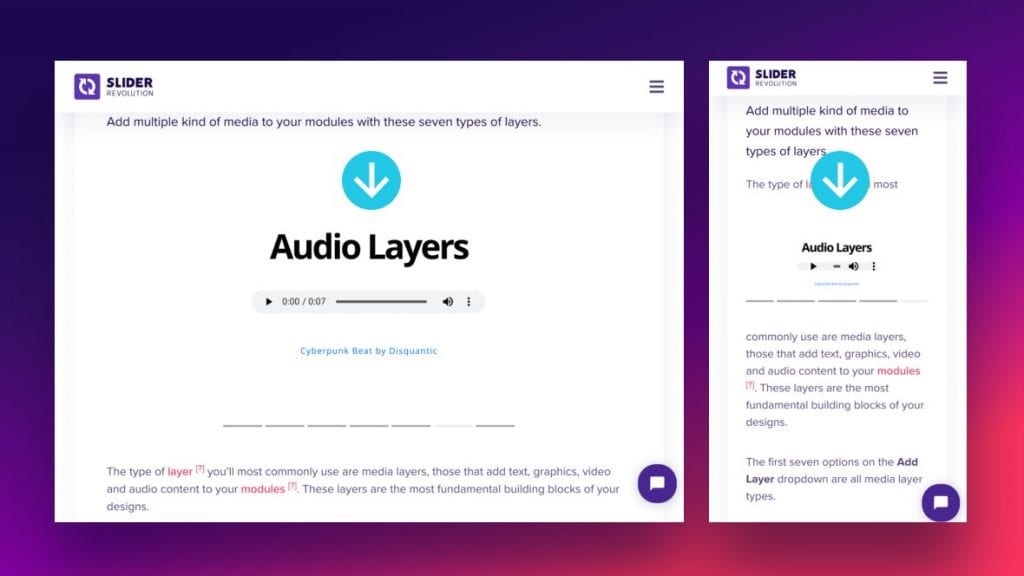
Users can insert modules into their existing website or create a new website made up of modules. Modules can contain any type of media such as videos, GIFs, buttons, SVG’s, audio, text, or images.
They can also include animations and special effects. The Timeline feature controls the animation and stacking of layers. This feature allows users to make motion graphic animations.
There is also a large selection of Add-ons. Add-ons extend the functionality of Slider Revolution and offer special effects.
Some special effects include transitions, whiteboard, particles, distortion, and shimmering.
Basic Process of How to Add a Slider in WordPress using Slider Revolution
The basic process of creating a website slider with Slider Revolution is as follows:
- Create a module
- Add slides
- Create layers
- Insert into WordPress
This article explains the process in detail, starting with how to create a module.
How to Create Modules
Users have two options for creating new modules. They can either create a blank module or edit a premade template module.
How to Create a Blank Module
A blank module provides users with an empty space and designing tools. The blank module option is best for those who want to design a module from scratch.
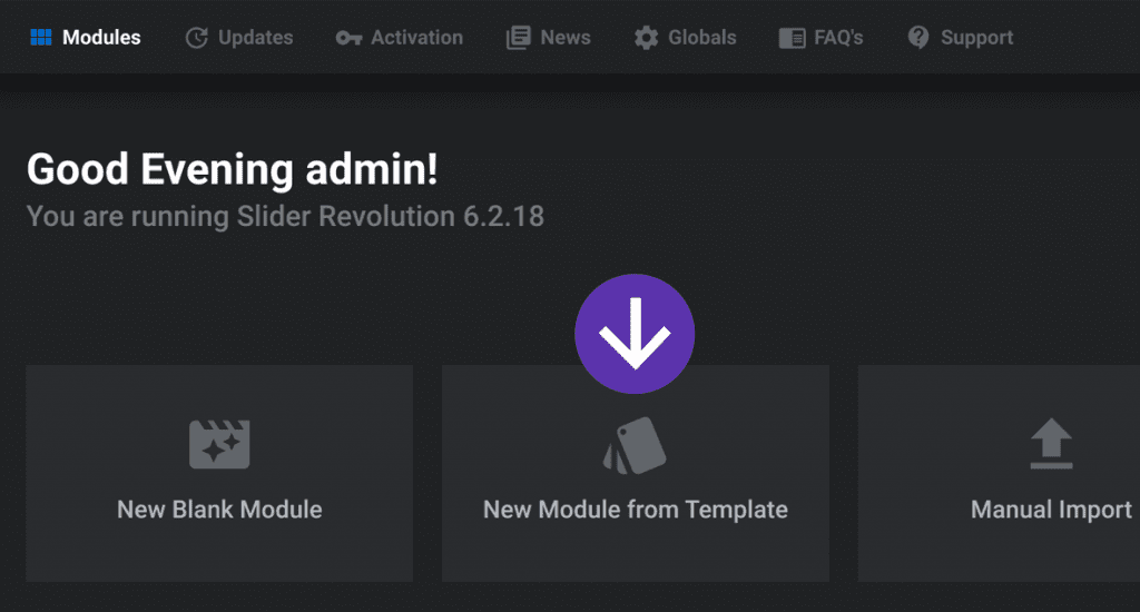
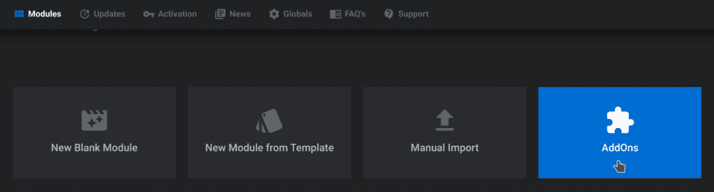
To start, click on the Slider Revolution plugin in WordPress. Click on the option titled New Blank Module.
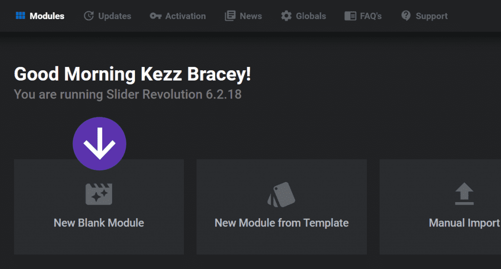
The plugin will then direct users to the module editor and a Module Creation Guide will launch. The Module Creation Guide assists in basic configuration settings.
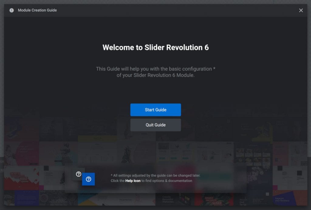
It offers two options: Start Guide or Quit Guide. If help is not needed for setting up the initial settings then select Quit Guide.
For those who would like help, click on Start Guide. The guide will proceed to the configuration settings.
Module Creation Guide
The module creation guide offers three pages of important initial settings.
Step 1 is to configure the module type. Step 2 is to choose the size and step 3 is to set up how the slider should resize on different devices.
Step 1: Module Type
First, the module creation guide will ask what module type users would like to design. It offers three different types: slider, scene, and carousel.
What does each of these module types do?
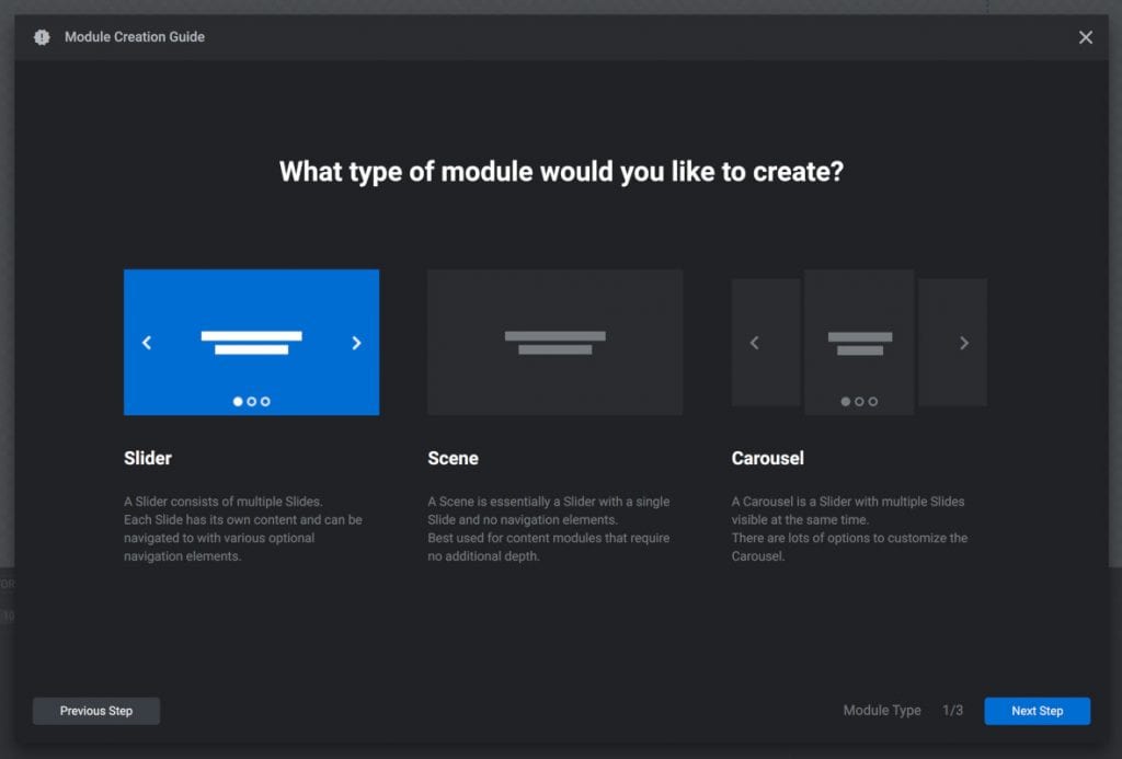
Slider Module Types:
A slider module has multiple slides. Visitors see one slide at a time.
The slides can change with navigation arrows, tabs, or be set to transition to the next slide on a timer. Here is an example of a slider that has navigation arrows and tabs:

Scene Module Type:
A scene has a single slide. Because a scene module has one slide they do not include any navigational elements.
Scene modules are an excellent choice for the static elements of a website such as headers and menus.
It is possible to build an entire site or landing page with Slider Revolution. In this case, users might want to stack many scene modules on top of each other.
Carousel Module Type:
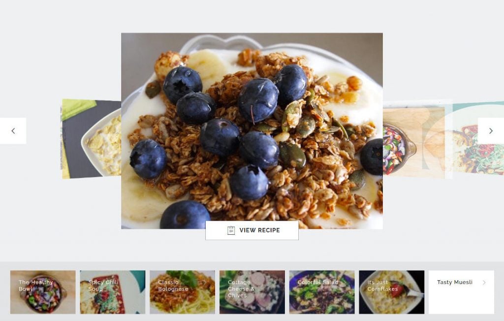
A carousel module has multiple slides and displays more than one slide at a time. The slides in a carousel module appear next to each other.
Visitors can pan through the slider with navigational arrows or tabs or they can click and drag from one slide to the other. The slides can also transition from one to the next on a timer.
Here is an example of a carousel slider that shows more than one image at a time. This one includes navigational tabs and arrows:
Which Module Type to Use?
The scene module type is best for sliders that do not need to rotate. This might include video players, headers, menus, navigation bars, and post displays.
The slider and carousel module types are good choices for slideshow content. For example, recipes, portfolio images, products, etc.
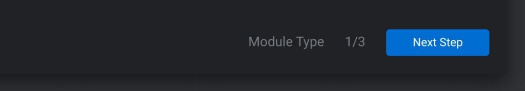
After choosing the module type, click on the Next Step button found in the bottom right corner of the window. The module creation guide will continue to the next step of module size.
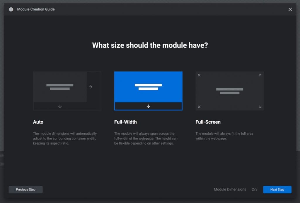
Step 2: Module Size
Again the module creation guide will display three options. These three options control the width and height of the module.
The three options are auto, full width, and full screen.
Auto Option:
The auto option will adjust the module’s width to fit inside its container. If posting a module inside an article, the auto option will adjust the size of the module to fit the size of the article.
For example, if the article is 800 pixels wide, then the module will have the same size. The height will adjust with the width to maintain the proper aspect ratio.
Full-Width Option:
With the full-width option, the module takes up the entire width of the browser. The module will break out of its containers, and spread across the browser viewport.
The height of the module is fixed and will not adjust. But users can change that in the layout settings to make the module maintain the aspect ratio.
Full-Screen Option:
The full-screen option makes the module adjust to the width and height of the browser. Unlike the full-screen size of YouTube videos, visitors can still scroll to see the content above and below the module.
But the initial size of the module will fill the entire browser screen.
What Size to Choose?
The auto option for modules is the best for a slideshow or video slider that will appear inline with a post.
The full-width size is great for banners, headers, or other content that spreads across the top of the website. It is also useful for showcasing products or an image slider halfway down the page.
The full-screen option creates an engaging visual presentation that captures visitor’s attention. Background videos or large image sliders would look good in a full-screen module.
After selecting the module size, click on the Next Step button in the bottom right-hand corner. The module creation guide will take users to the last page of configuration settings.
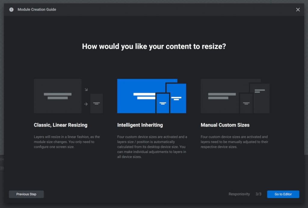
Step 3: Content Resizing
On the third and final step, the module creation guide offers slider resizing options. This determines how the slider will resize according to the dimensions of different devices.
The three options are: classic linear resizing, intelligent inheriting, and manual custom sizes.
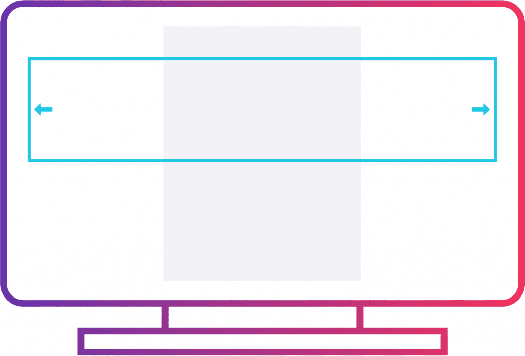
Classic Linear Resizing:
The classic linear resizing option shrinks the module to fit any size browser. The module will shrink but the aspect ratio will remain the same.
The layers within the module will also shrink in proportion to the module. While this is the simplest option it comes with a disadvantage.
Because everything shrinks, some of the layers might be hard to see on a small screen.
Here is an example of classic linear resizing. The layout remains the same on different sized screens:
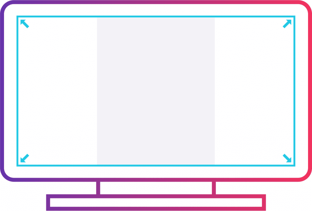
Intelligent Inheriting:
The second option is intelligent inheriting.
This option makes four different sized versions of the module. Each version will have a layout that suits a smaller and smaller screen.
Here is an example of Intelligent Inheriting. It adjusts the layout depending on the screen size of the device:

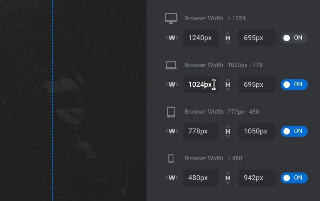
Manual Custom Sizes:
This option is similar to the intelligent inheriting option. It creates four versions of the module with different sizes.
But instead of the slider plugin determining the sizes, the user has to set the size for all four versions. Here are some settings available to users that want to adjust the layout size settings:
Which Resizing Option to Choose?
The classic linear option is best for modules containing simple content that will still function when it shrinks. This could include audio player modules, video players, or basic slideshows.
Choose intelligent inheriting to keep layers large and visible on small screens. With this option, Slider Revolution will generate the layout size settings.
However, users can still make manual adjustments to the layout sizes if they want.
The manual custom size option suits users who want to set the four layout versions to a specific size and position.
After choosing the resizing option, click on Go to Editor in the bottom right-hand corner. The guide will direct users to a blank slide.
Now it’s time to start the design process on the blank module.
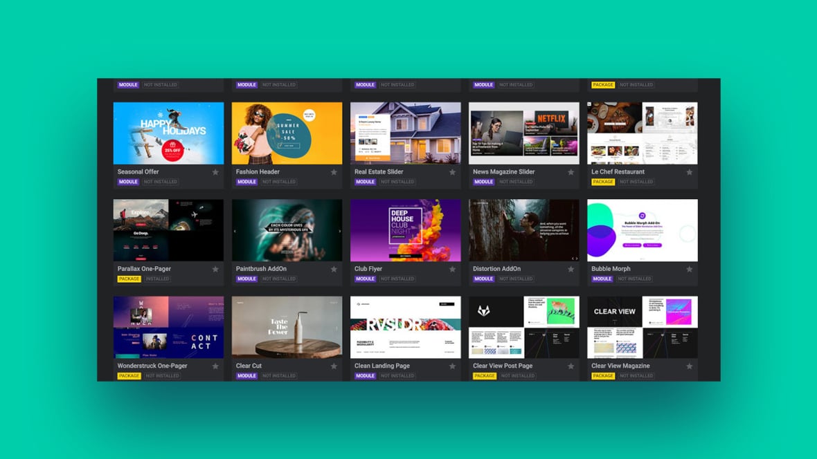
How to Create a Module from a Template
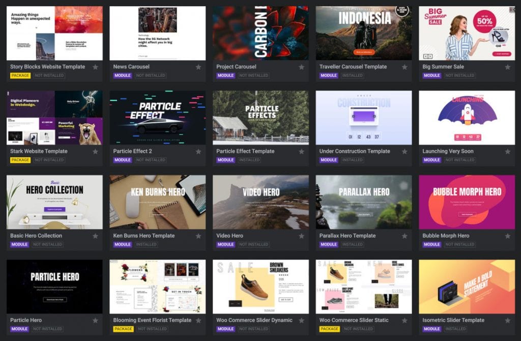
Slider Revolution plugin comes with more than two hundred premade templates. So for those who do not want to design a slider from scratch, they can modify a template to suit their needs.
The templates can also be used to create an entire website without a page builder. The following information will explain how to create a module from a template.
Why Use a Premade Template?
There are many benefits to using a template versus creating a module from scratch. Templates provide a premade design format and include special effects.
This allows users to leverage templates to produce quality sliders fast. Even those with only a basic understanding of website design can use Slider Revolution’s templates.
Templates also help users to find a design they love and can include it on their site straightaway. Slider Revolution has more than two hundred templates ready at the click of a button.
They are already attractive and engaging, so why not use them?
How to Get Started
How to View the Templates
Start by clicking on the Slider Revolution plugin in WordPress.
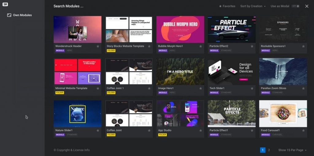
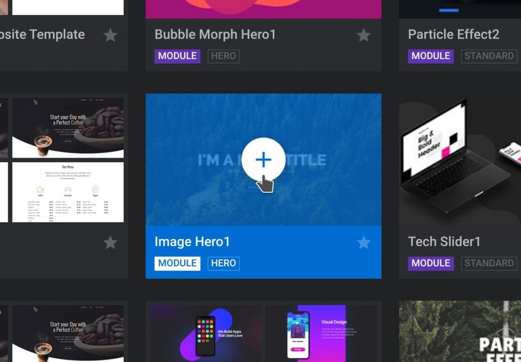
Select the option New Module from Template. A gallery of premade module templates will appear for users to browse.
Filters make it easier to scroll through the more than two hundred options.
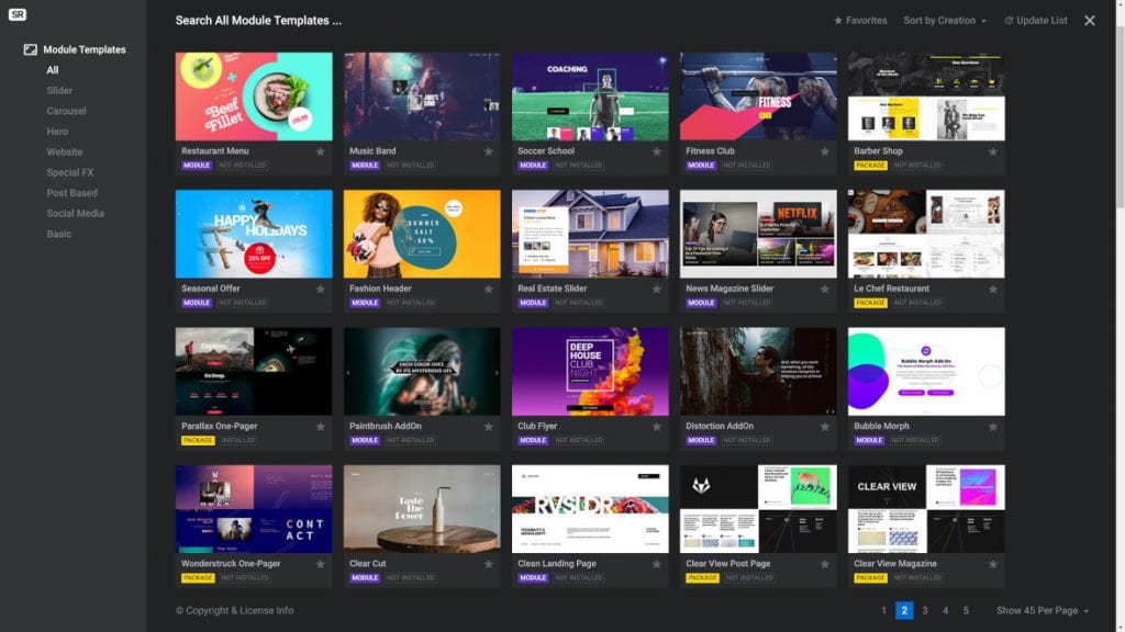
In the left-hand corner is a module template category list. Select one of the categories to filter the templates.
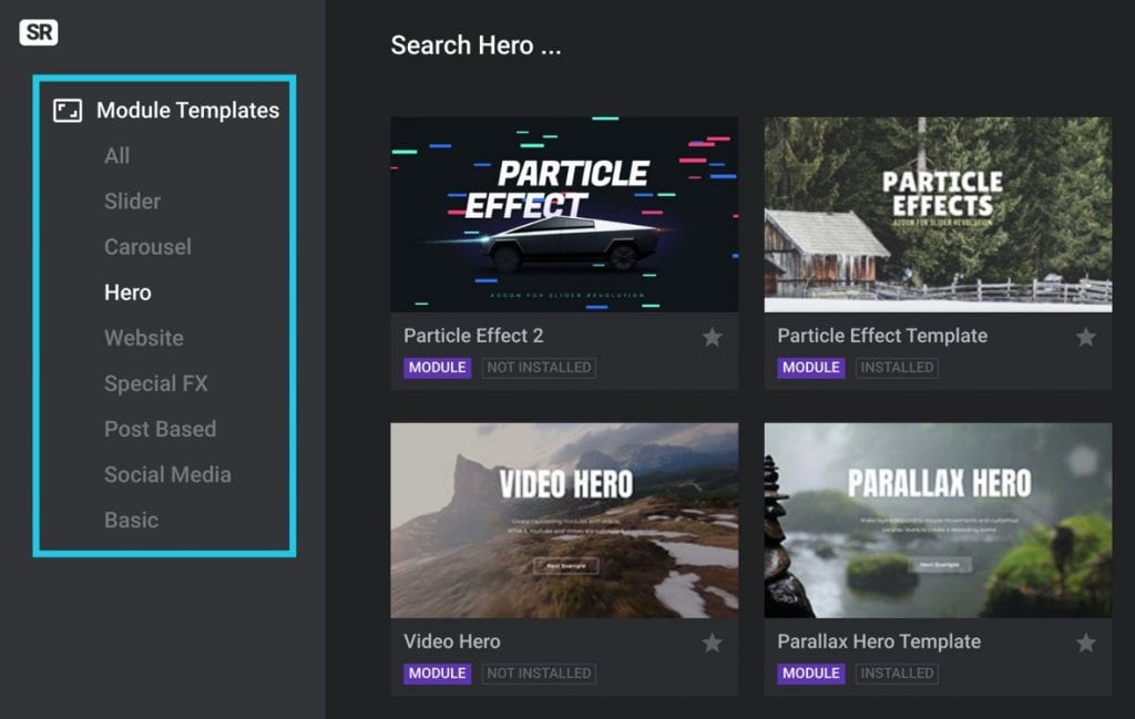
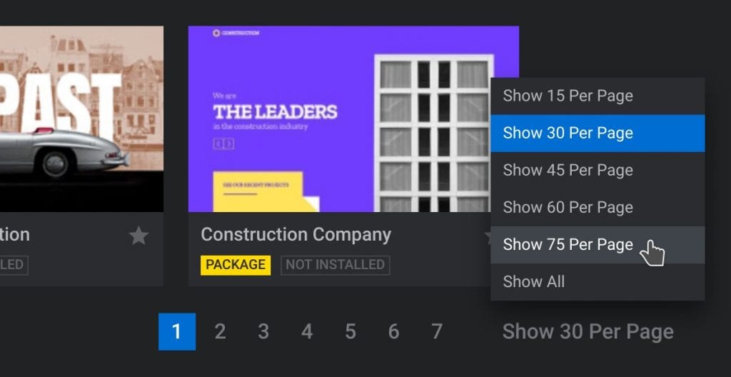
In the lower right corner of the window, users can alter the number of templates displayed. Click on the button and then select how many thumbnail templates to view.
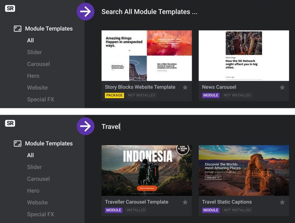
At the top of the page, there is an option to find templates by searching for keywords. Click on Search All Module Templates,type in a keyword, then press search.
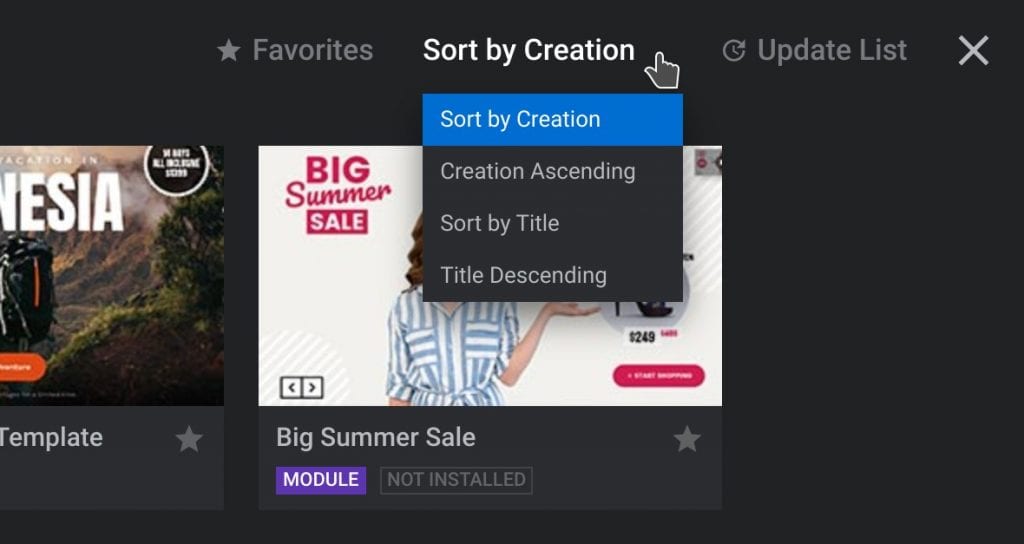
In the top right corner, users can change the order of the search results to further filter the templates.
How to Save the Templates
Users can save their preferred templates to their favorites. This means that they can continue looking through the gallery and come back to it later.
To add a template to favorites click on the star icon that appears in the bottom right corner of the thumbnail. The star will then appear white, indicating that it is now saved to favorites.
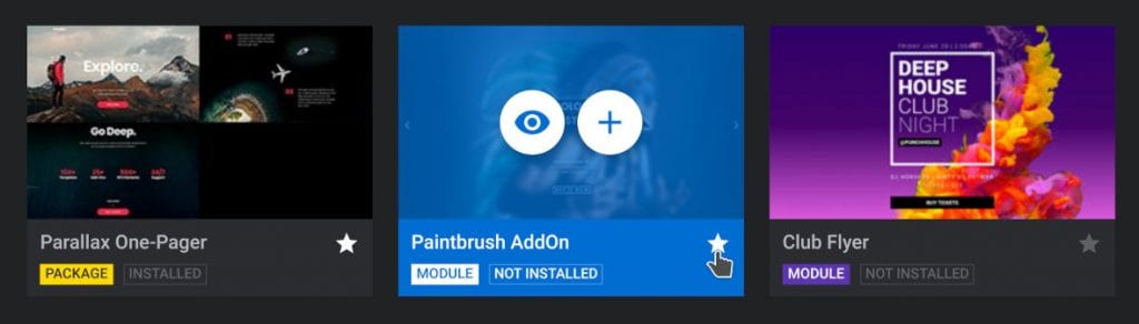
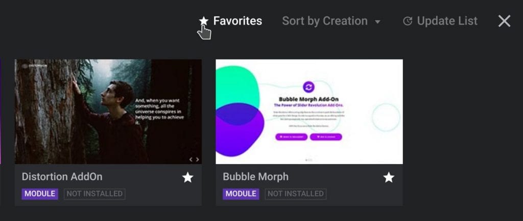
To view the saved templates, click on the favorite tab at the top of the window. The gallery will then only display the saved templates.
Click on the same tab again to go back to the normal gallery view.
How to Preview the Templates
To preview a template in its full size, hover over the thumbnail. Some icons will appear.
Click on the eye icon. The template will open in a new browser tab.
How to Use a Template Module
After selecting a template to use, it’s necessary to install the template.

To do so, hover over the thumbnail and click on the plus icon. A panel will appear that displays more information about the template.
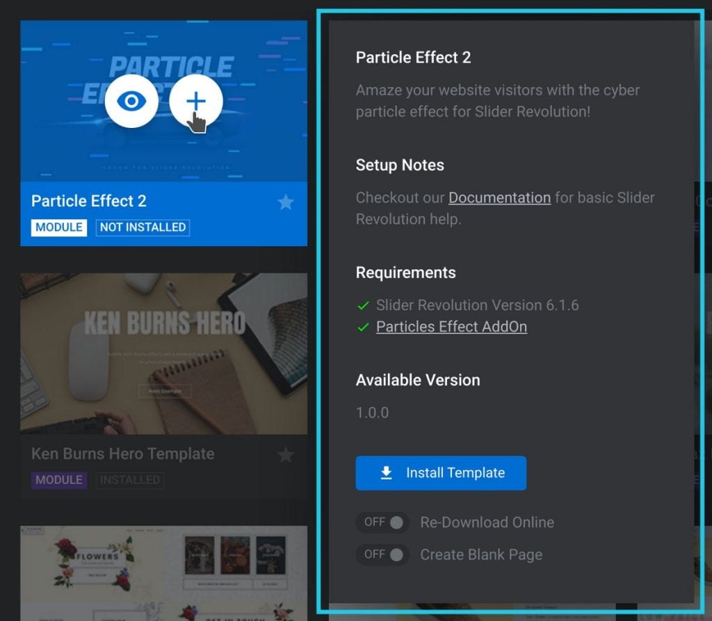
To proceed with the process and use this module template, click on Install Template. Slider Revolution will download the files and create a module with the template’s settings.
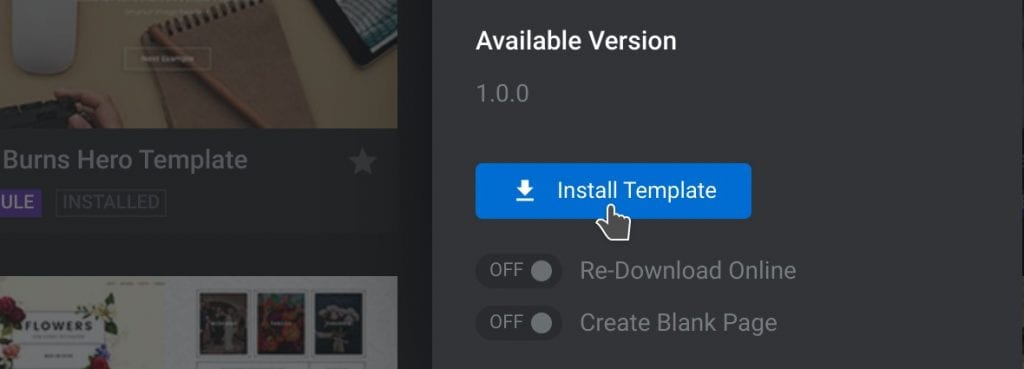
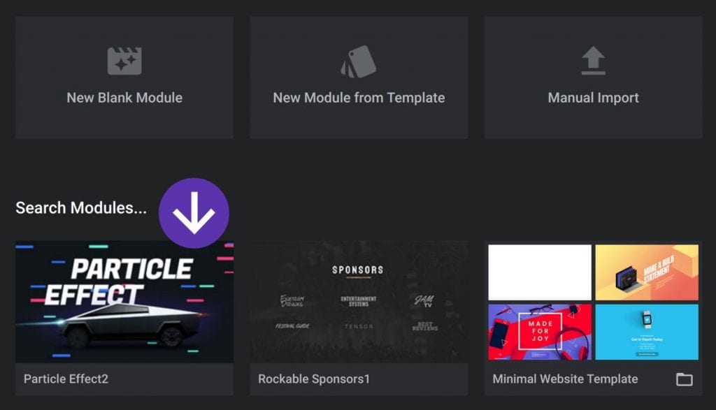
Once downloaded, the new module will appear under the Search Modules section.
Adding Add-Ons
Slider Revolution has a large selection of add-ons for special effects. Users need to install add-ons before they can be used.
Some module templates use add-ons to enhance their design, add effects, and functionality. To use a module template that includes add-ons, install and activate them beforehand.
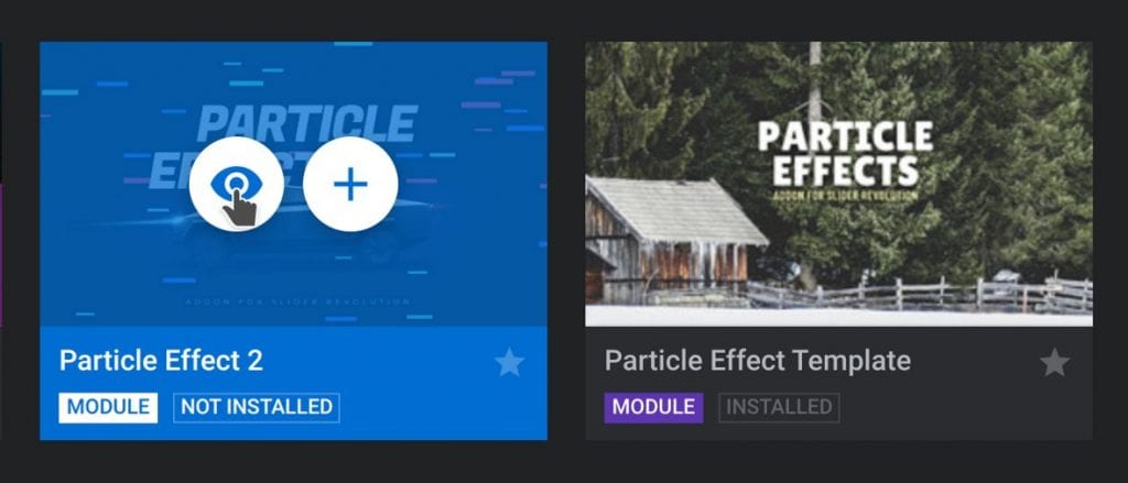
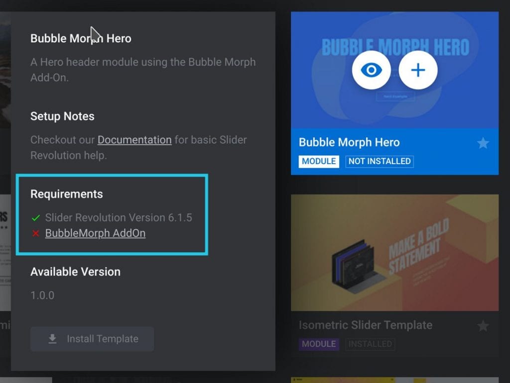
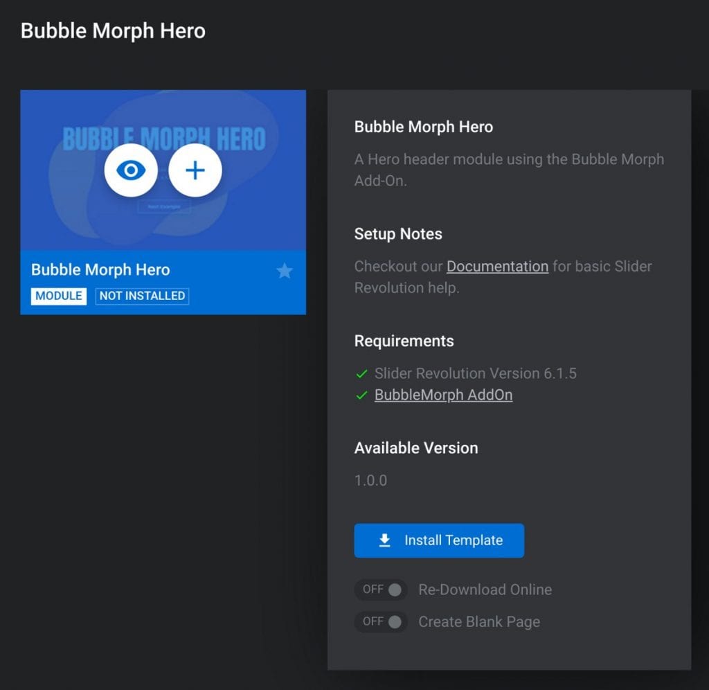
A module template cannot download if the add-on it requires is not installed. To find out what add-ons a template needs hover over the template thumbnail.
Next, click on the plus icon. An information panel will appear.
Look under the Requirements section to see what add-ons it uses. Installed add-ons will have a green checkmark.
The ones that still need installing will have a red X by them. Here is an example of a template that has one add-on installed but requires one more:
How to Install Add-Ons
To install an add-on it’s necessary to exit the template gallery. Make sure to save the desired template in favorites or make a note of it so you can find it again.
Also, make a note of which add-ons to install and activate. To exit the template gallery click on the X that appears in the top right corner.

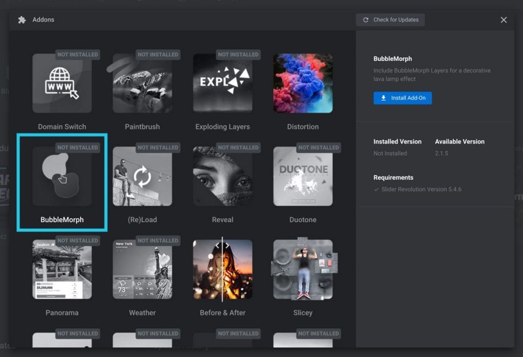
From the main Slider Revolution interface, click on the Add-Ons option. A window will appear that displays the add-ons.
Find the required add-on and click on it. The installation details for that add-on will appear in a sidebar to the right.
In the sidebar, click on the Install Add-On button.
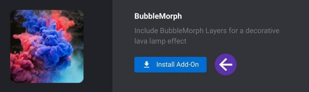
The add-on will download and install. Next, click on the Activate Add-On button in the sidebar.
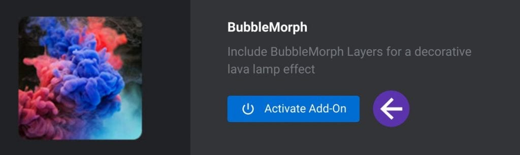
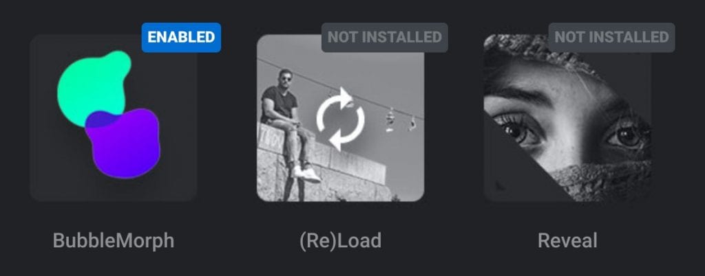
The thumbnails of the activated add-ons will go from black and white to color. Also, an ENABLED tag will appear in the right corner of the thumbnail.
This indicates that the add-on is now activated and ready to use. Repeat these steps to install all the add-ons required.
Here is an example of the BubbleMorph add-on thumbnail. It is displayed in color.
This shows that it is installed and activated. The other black and white thumbnails are not:
Having installed all the required add-ons, go back to the module template gallery. Locate the desired template and hover over the thumbnail.
Click on the plus icon. Now under the Requirements section, the add-ons should have a green checkmark.
Click on Install Template to download the module.
How to Insert a Module to a Post or Page
After installing the template and add-ons users can modify the modules to their needs. For basic editing techniques, click here.
After designing a module, the last step is to add the slider into WordPress as a post or on a page. To insert a slider into WordPress users can use shortcodes.
Or they can use the Slider Revolution block that comes with the plugin. Outlined below is how to add sliders on WordPress using the new Gutenberg block editor.
For those unfamiliar with Gutenberg blocks, this article explains how to use them.
How to Add a Slider in WordPress Using Slider Revolution Blocks
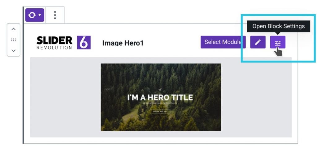
One way to insert a slider in WordPress is to use the Slider Revolution block. First, go to the WordPress editor of a page or a post and add a new Slider Revolution Block.
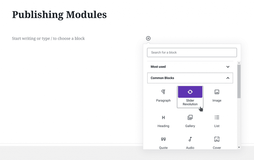
After adding the block, a gallery will open that displays the created modules.
To insert one of these modules to the post or page, hover over the thumbnail. Then, select the plus icon to insert the module.
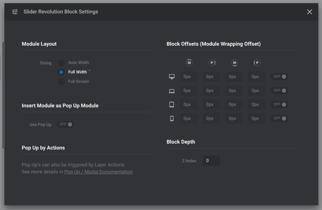
Having inserted the block, users can adjust the slider settings. Click on the block settings button that appears in the right corner.
This contains the configuration settings that control how the module interacts with the website. For example, users can change the size of the module.
This article discussed the three different module size options earlier. Users can change those settings here.
There’s also the option to add Block Offsets which adds an empty space around the module’s sides. Here are some slider settings that the user can change:
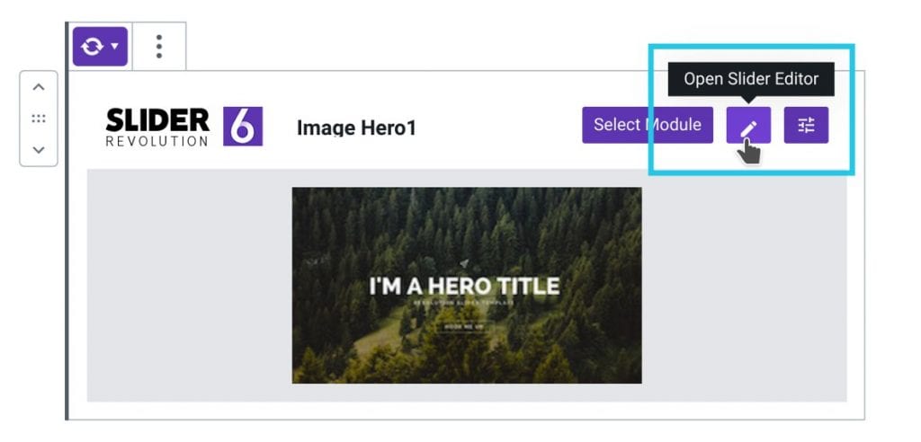
The Slider Revolution block also allows users to change the module that they want to insert. Click on the Select Module button.
Then select a different module to insert it.
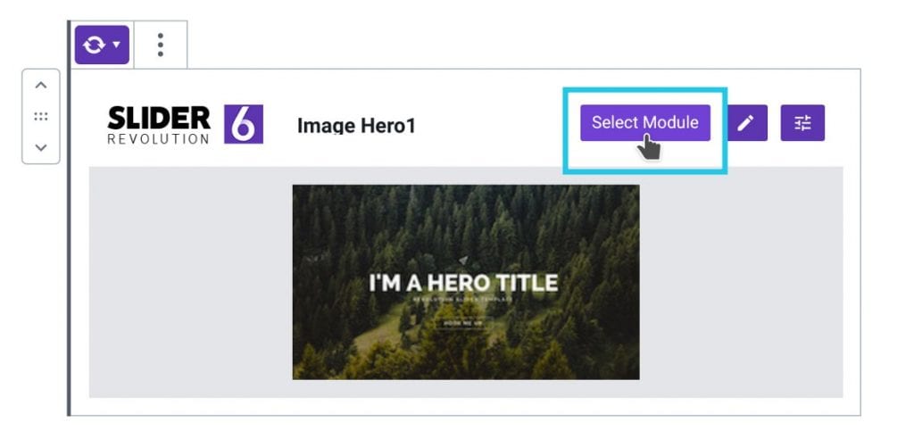
The pencil icon directs users to the module editor to make more edits or adjustments to the module.
How to Add a Slider in WordPress Using Shortcodes
It is also possible to insert a slider in WordPress using shortcodes. Locate the desired module in the Slider Revolution plugin.
Hover over the module and then click on the down arrow at the bottom to display some settings. Click on Embed.
The Standard Module Embedding window will open and display the shortcodes. Copy the shortcode by clicking on the blue copy icon to the right.
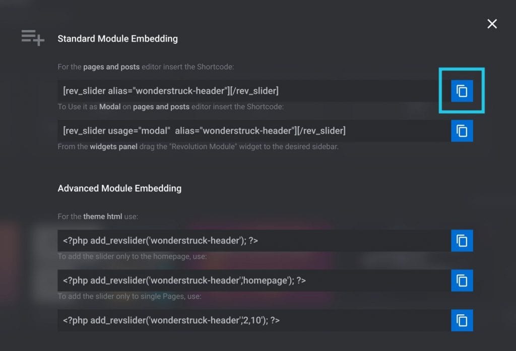
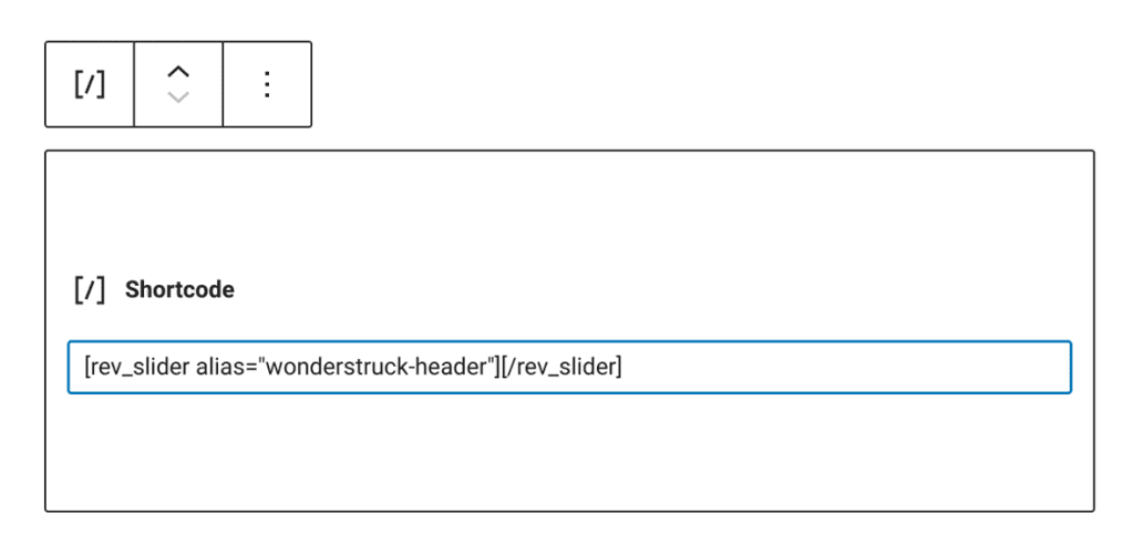
Next, go to a WordPress post or page editor and paste the shortcode in it. This will create a Gutenberg shortcode block.
Publish the Page or Post
After adding the slider module using either shortcodes or blocks, hit Publish. Preview the post to see what the module looks like on the frontend.
That is how to add a slider in WordPress in a few easy steps.
FAQ on adding a slider in WordPress
What’s the best slider plugin for WordPress?
Crafting sliders should be a blend of ease and sophistication, and Slider Revolution holds that balance well. Its visual editor makes delicacy out of complexity, while an array of features empowers your creativity—all with an eye on performance and SEO-friendly outcomes.
Can I add a slider to my WordPress theme without a plugin?
Yes, for those who prefer a hands-on approach, touch the core of WordPress with PHP, HTML, and CSS. Alter your theme’s files but tread lightly; one syntax misstep and your site’s harmony could be disrupted. Backup and child themes are your stalwart allies here.
How do I make my slider responsive in WordPress?
In the age of ubiquitous screens, responsivity is a cornerstone. Most slider plugins cater to this by default. Delve into the settings, where you can dictate the slider’s behavior across devices, ensuring your visuals are fluidly adaptive, not static and stubborn.
Is there a way to add video sliders in WordPress?
Yes, both motion and stillness have a place on your stage. Slider Revolution and LayerSlider extend an open hand to multimedia, where videos embed gracefully into the slider narrative. Set parameters for autoplay and looping with an air of subtlety to avoid overwhelming your audience.
What are the best practices for optimizing slider images for speed and SEO?
Precision is key; choose images of adequate size that don’t overburden load times. Tools like Google PageSpeed Insights guide you. Embrace image optimization plugins for compression without loss. And don’t forget alt text—search engines reward those who don’t overlook such details.
How do I create a full-width slider in WordPress?
Broaden your horizons with a full-width slider that spans edge to edge. Within your chosen plugin’s arsenal you’ll find the option to stretch your slider across the canvas. Keep an eye on your theme’s allegiance to such expansiveness—cooperation is essential.
Can I add sliders to my posts and pages with Gutenberg?
Certainly, the Gutenberg editor, with its block-based ethos, offers blocks tailor-made for sliders. Embed them within your posts and pages with a few clicks, no incantations needed. This is the genuine spirit of WordPress; power softly wrapped in intuitiveness.
How do I add captions and CTA buttons to my WordPress slider?
Words wield power and when paired with images, their allure only grows. Both Slider Revolution and LayerSlider let you overlay text captions and CTA buttons effortlessly. Customize to your heart’s content but remember, clarity trumps clutter—your call to action should stand out, not get lost.
Can slider plugins affect my website’s performance?
Indeed, while sliders dress your website for the occasion, they should not be a drag on its pace. Opt for plugins that balance elegance with efficiency, minimizing scripts and requests. Regularly test with tools like Google PageSpeed Insights to monitor and maintain sprightliness.
Are WordPress sliders accessible for all users?
As a virtual craftsman, ensuring every visitor can experience your content is not just considerate but necessary. Seek out slider solutions that follow accessibility standards. Caption your images, provide navigation controls, and test for keyboard and screen reader compatibility—accessibility is not a feature; it’s a fundamental right.
Conclusion
Capstones set in place, the journey through how to add a slider in WordPress reaches its zenith. These dynamic strips of imagery form an elegant confluence of your site’s spirit and the user’s first impression. Armed with this knowledge, from selecting the most fitting slider plugin to the meticulous customization of your carousel, expect a transformation.
Visual narratives now glide effortlessly across your digital canvas, responsive and adaptable, no corner of the screen untouched by the magic you’ve woven. A vast expanse of digital architecture bows gracefully to your command, beckoning SEO-friendly, optimized images to narrate your tale.
For your grand finale, remember sliders are more than mere embellishments. They are potent storytellers, conveying messages at a glimpse. Use them wisely and sparingly, allowing users to absorb your content, not be overwhelmed by it. May every transition be as smooth as the journey you’ve just embarked upon.
If you enjoyed reading this article on how to add a slider in WordPress, you should check out this article on the particle effect.
We also wrote about similar topics like using a hero slider, a video slider, a homepage slider (see the pattern here?). But also about the Ken Burns effect that we use in some of our slider templates, as well as WordPress themes with sliders included, WordPress video background, website sliders, and slider animation examples.


