
Want to get visitors to stop and take notice of the most important sections of your website? One way to do that is with a split screen slider.
This type of element has so many great uses. For instance, you can use it to:
- Make a strong impression with the hero image on your home page
- Show off the best work from your portfolio
- Display different product views without your visitor having to lose site of the accompanying copy
This isn’t the easiest effect to pull off when using WordPress. But Slider Revolution has changed that.
Table of Contents
- Tutorial: How to edit the Coffee Shop Split Screen Slider Template
- Step 1: Install the Coffee Shop Split Screen Slider Template
- Step 2: Remove the slides you don’t need
- Step 3: Edit the slider backgrounds
- Step 4: Remove the unwanted layers
- Step 5: Edit the copy
- Step 6: Add your animated elements
- Step 7: Duplicate the slide and customize your content
- Step 8: Edit the navigation
- Get ready to wow your website visitors with a cool split screen layout
Tutorial: How to edit the Coffee Shop Split Screen Slider template
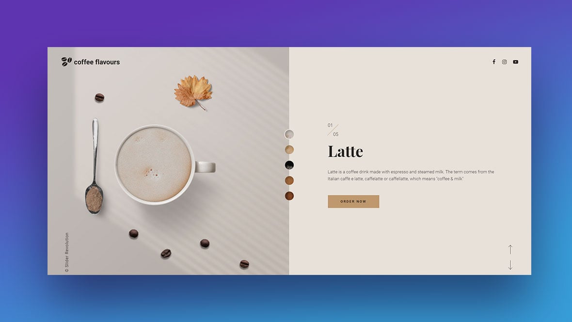
Slider Revolution has hundreds of wow-inducing templates ready for you to use. Including this one called Coffee Shop Split Screen Slider:
Want to design something that looks this cool? You don’t need to build it from scratch.
In the following tutorial, we’re going to break down how you can edit the above template and turn it into a split screen design that looks like this:

Step 1: Install the Coffee Shop Split Screen Slider template
Open the Slider Revolution plugin in WordPress. Scroll down and click on “New Module from Template”:
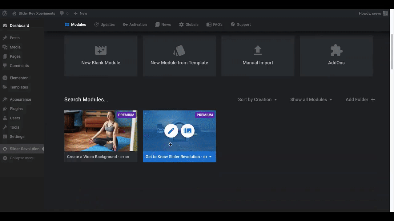
Search for “coffee shop” in the search bar. Hover over the template and click the plus-sign icon and “Install Template” to load it up.
You’ll now see it listed under “Search Modules” on your Slider Revolution page. Click the Edit (pencil) icon to open up the Slider Revolution editor.
Learn More:
Step 2: Remove the slides you don’t need
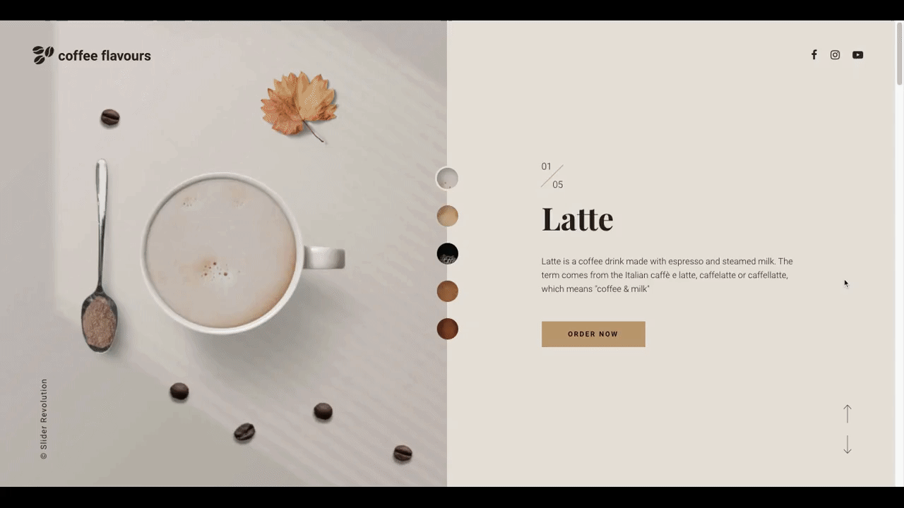
This particular split screen template has a number of things going on:
- The color of the background and corresponding navigation circle changes with each slide
- The copy on the right slide changes based on the coffee flavor shown
- The images on the left are individual layers that slide onto the screen together
It’s a really neat effect. It gives the coffee cup and ingredients a 3D feel, as if they’re being pushed across a table in front of you.
If you don’t want something this complex, you can still create a cool-looking vertical split screen where one side of the layout remains put while the other side moves various slides into place.
In order to do this, delete all of the slides but one.
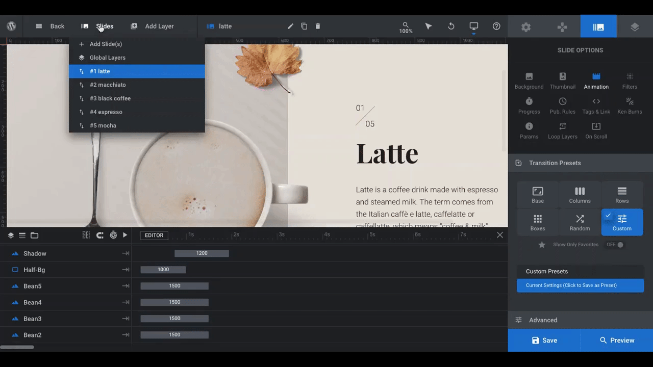
Go to the toolbar at the top and click on Slides. Next to the ones you don’t need, click the Delete (trash can) icon. It doesn’t matter which ones you delete so long as you leave one of them there to edit.
By doing it this way, you can set up your layout, design, and animations on the first slide. Once you’ve perfected it, you can duplicate the slide for as many as you need. You won’t have to worry about recreating your design choices and instead can focus on customizing each slide’s content.
Learn More
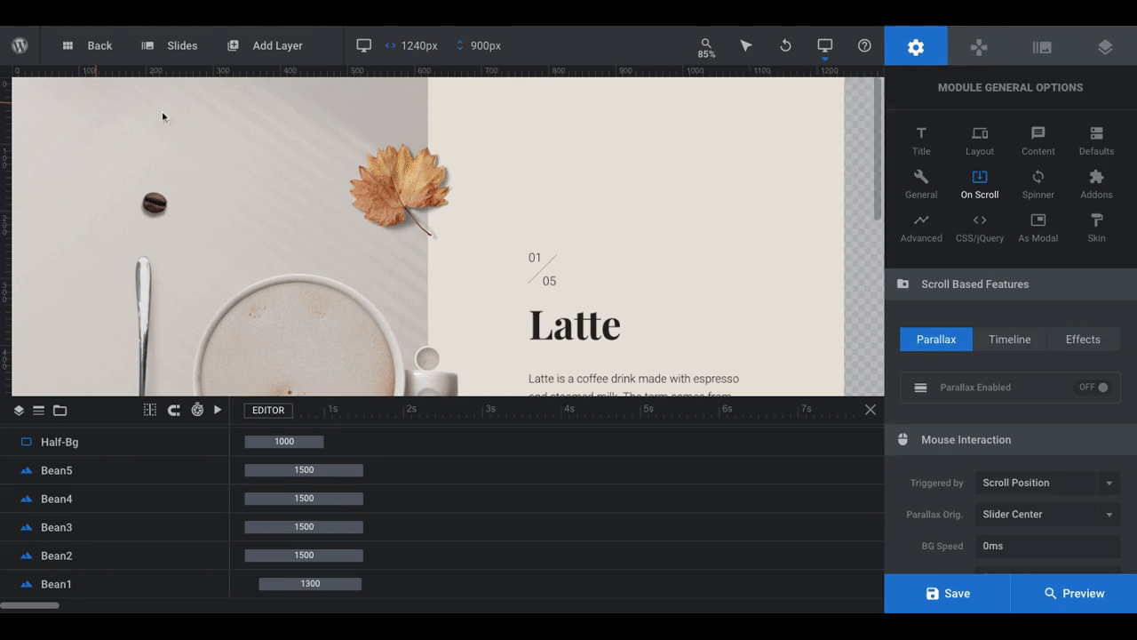
Step 3: Edit the slider backgrounds
In order to create the split screen effect, the template has two backgrounds:
On the left is a Module background. It’s what you see behind the coffee cup and elements on the left side of the slider. Technically, it covers the full width of the module.
There is a “Shape” Layer placed on top of it that creates the background for the right side of the slider.
You can see how the setup works here:
To edit the background on the left side of the slider, go to Slide Options > Background:
You can replace the existing textured background with an image, video, transparency, or color. I’ll be placing our text on the left side of the slider, so I want a white background for ours.
When you’re done updating the background with your changes, hit “Save”.
To edit the background on the right side of the screen, click on the rectangular layer. Make sure the layer name at the top says “half-bg”.
Then, go to Layer Options > Style:
Under Background, there are three options:
- Choose a background color to replace the beige color that’s there now
- Upload a background image or video
- Connect the section to a stream — like on YouTube or social media
For this edit, I’m going to insert the first image I want to appear in the split screen layout:
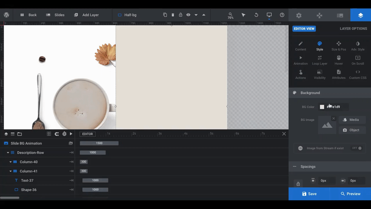
The first thing I did here was change the “BG Color” to transparent. To upload the image, I went to “BG Image”, clicked the “Media” button, and selected the file.
If your image doesn’t fit the space exactly, go to “Size & Pos” to make sure it does.
Learn More
- Selecting Layers via the Canvas or Timeline
- Changing Template Background Colors and Images
- Editing Images in Template Modules
Step 4: Remove the unwanted layers
As it stands now, there are a lot of layers (design elements) still left over from the template. To see them all, click on the “Preview” button in the bottom-right corner:
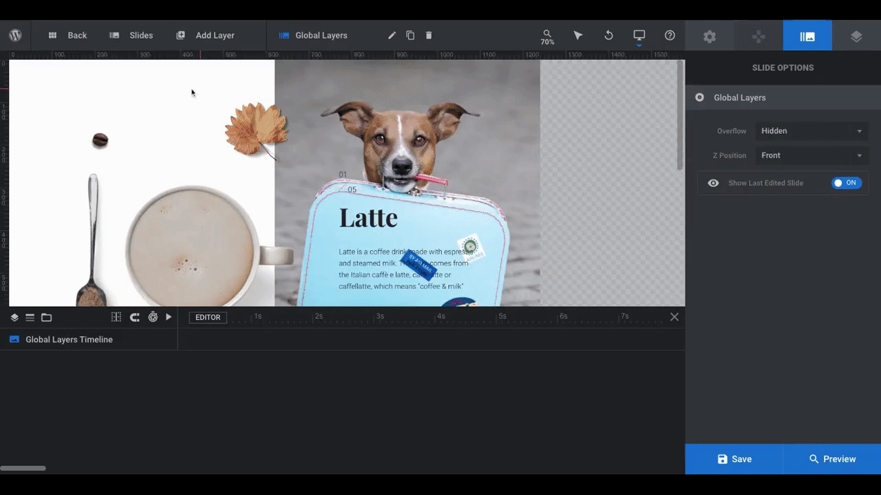
To remove the layers you don’t want, go to Global Layers as well as Slide 1.
I’m going to edit out the global layers I don’t need first:
These elements appear on every slide, which is why we often use them to add branding and navigational elements. If you’re planning to place this slide internally (i.e. not at the top of the home page) within your site, you might not need them. So feel free to delete them as you see fit.
You can quickly identify each layer using the timeline editor below. When you click on them, you’ll open their settings on the right while also highlighting them in the visual editor above.
To delete them, simply click on them and hit your keyboard’s “Delete” button.
Now let’s turn our attention to the unwanted elements within the first slide.
I won’t need the coffee-related layers since I’m building this split screen slider for a doggy daycare facility. So let’s delete them the same way I did the global layers:
Some of the elements may be tricky to click on in the visual editor. If you have any problems, just click on the name of the layer in the timeline controller below. Then hit your “Delete” button. It works the same way.
Save your changes when you’re done.
Learn More
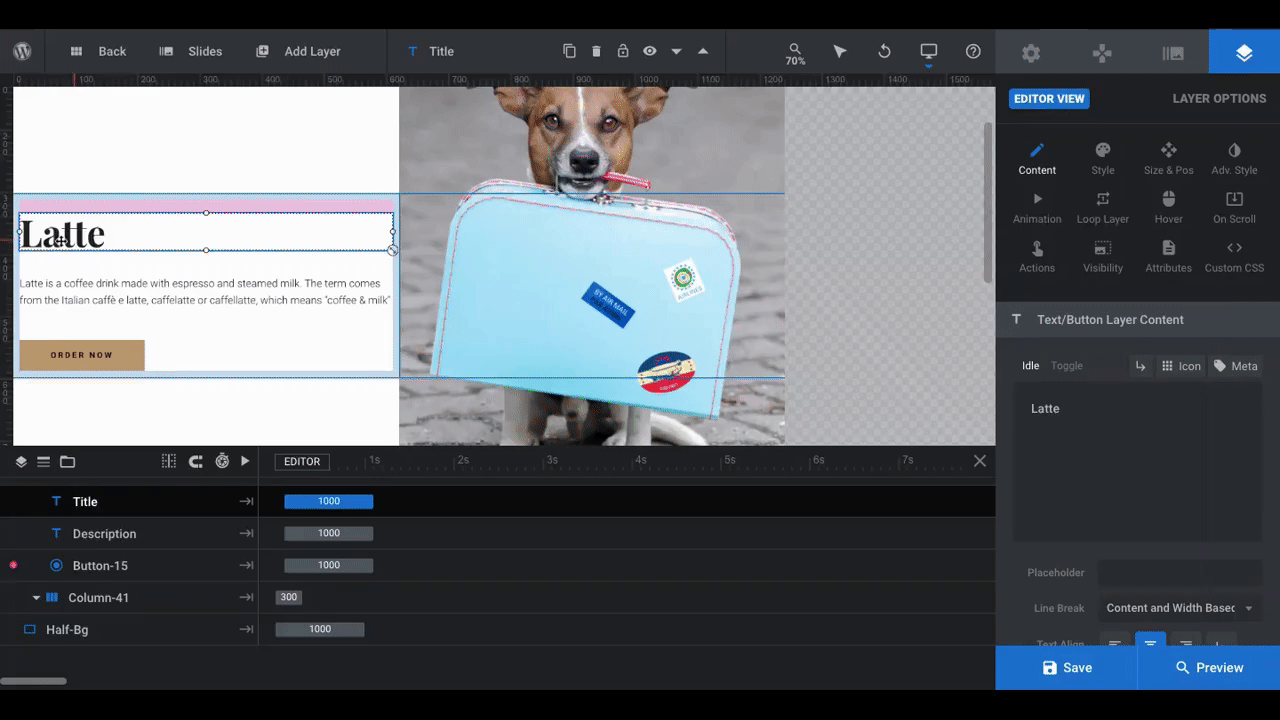
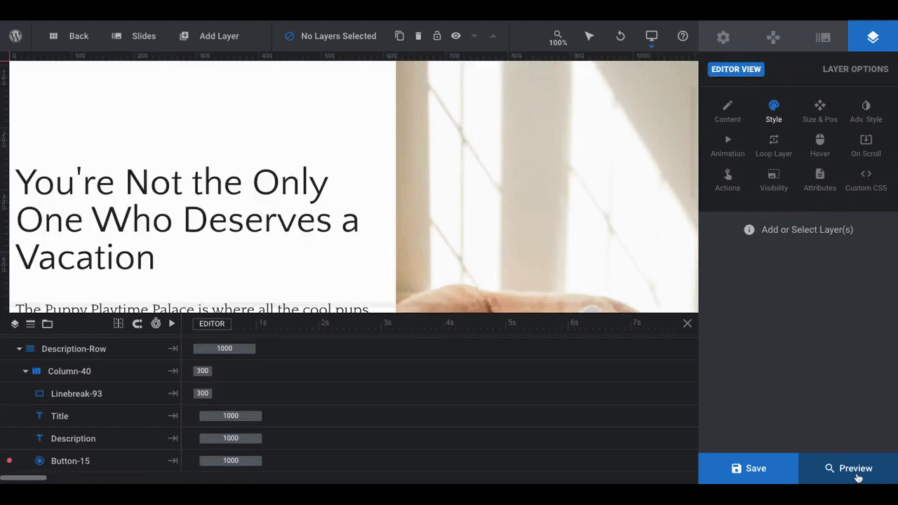
Step 5: Edit the copy
If you don’t need any text in your split screen layout, you can delete those layers — the headline, description, and call-to-action button — entirely.
For this example, I do need copy. However, I don’t want it to be layered on top of the image.
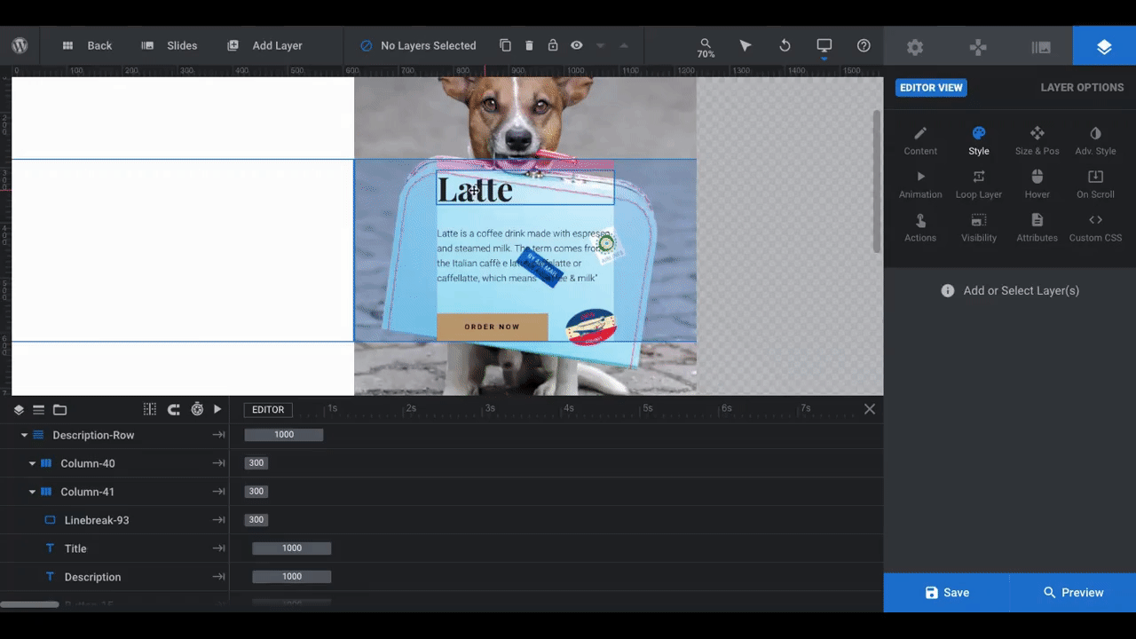
To preserve the layout and spacing, I’ll use the timeline editor at the bottom to move the layers from the right column (Column-41) to the left column (Column-40):
If you prefer a custom layout for your copy, you can also drag-and-drop the layers to wherever you want them in the visual editor. It’s completely customizable. You can also change the responsive view at the top of the screen by clicking the desktop icon if you want to edit your copy from a smaller viewport (like tablet or mobile).
To adjust the margins and padding for your columns and rows, select them in the timeline. Then, edit the values in the Layer Options on the right. You can customize each row or column of text for each device.
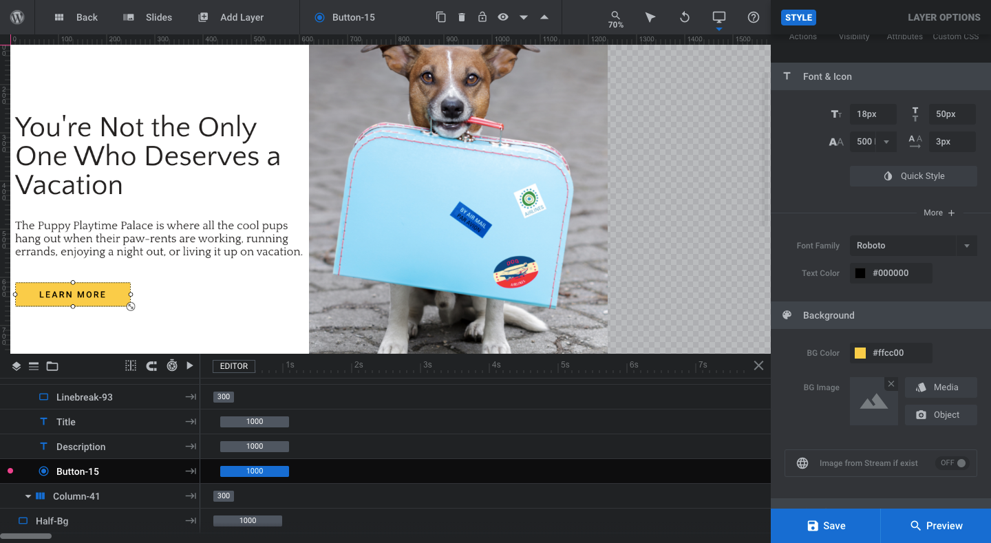
Now it’s time to edit the copy.
To do this, click on the layer you want to edit. Layer Options will open on the right side of the screen.
Click on Content to change what the layer says. Click on Style to change the font, size, color, spacing, and more.
Do the same for the button:
When you’re done editing your copy, save your changes.
Pro tip: When you add or edit copy on a slide, it is going to load into place with every scroll of the slider. Like this:
Notice how both the text and image slide into place. This would be fine if you plan on changing the copy alongside the text — like if you wanted each slide to tout the different doggy daycare services.
In order to get the smooth static effect like in our final design:
You’ll want to delete the text layers from your slide and recreate them as a Global Layer instead. This will keep the text in place — so long as you don’t animate it — no matter how many slides there are to scroll through.
Learn More
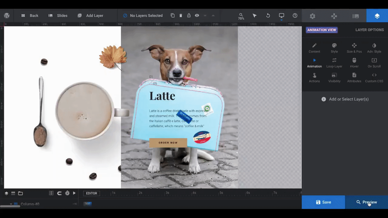
Step 6: Add your animated elements
The slide you’re working on now is technically already animated.
To see or edit the animation configured for your text, button, or image, click on the individual layer and go to “Animation” under Layer Options:
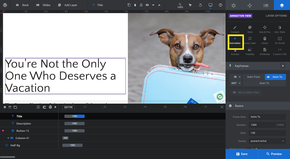
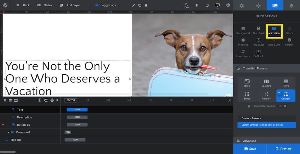
You can also see and edit the slide animation under Slide Options > Animation:
Now, if you want to add any other animations to your slider, you’ll be able to do that from these same panels. Let’s look at one way to do this:
To add a new image to the slide, go to “Add Layer” in the toolbar and select “Image” and “WordPress Library” to upload the file:
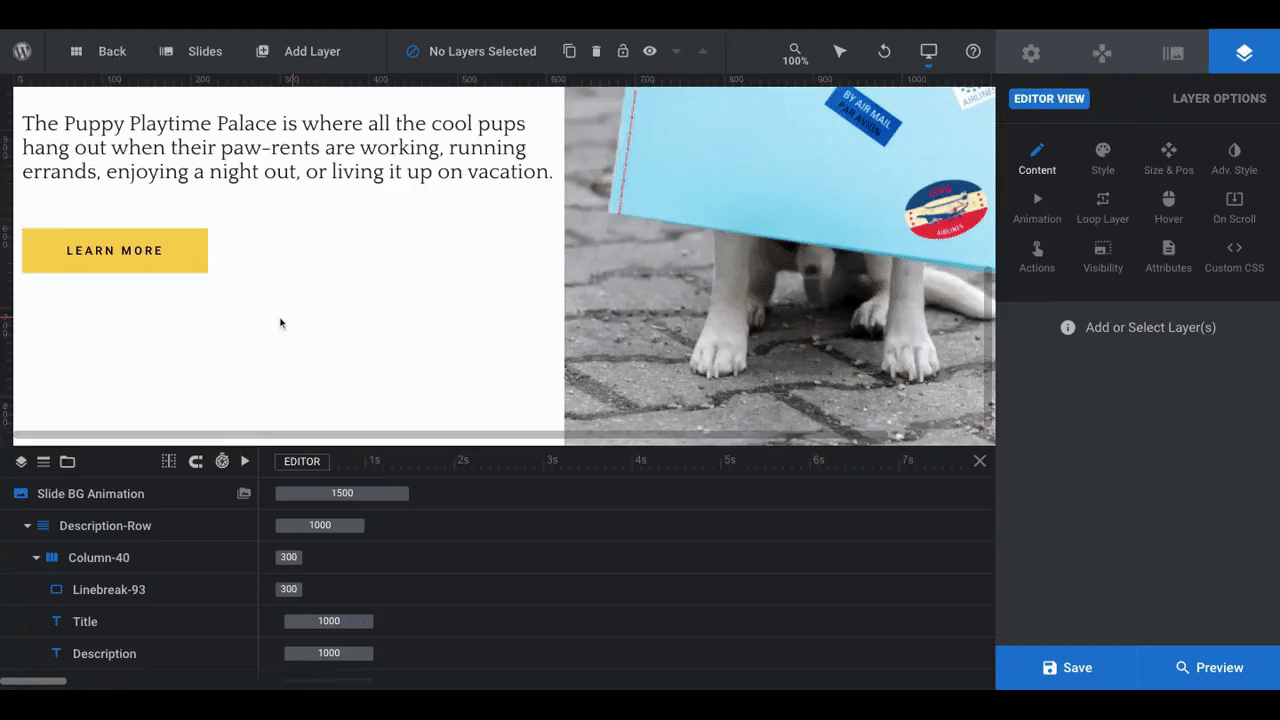
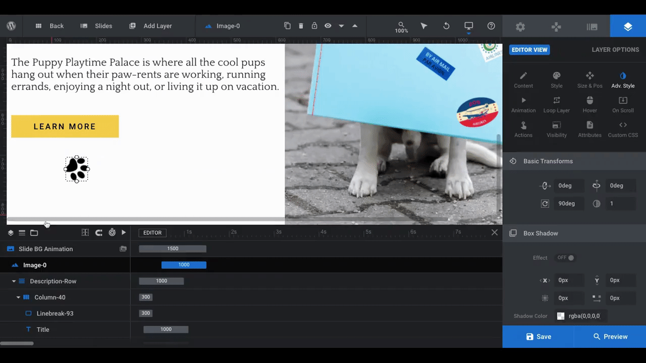
Drag and drop the image into place in the visual editor or use Layer Options to change the “Size & Pos”. To resize it, click on any of the dots around the border and drag it up or down to the size you want.
Use other Layer Options like “Style” to edit the color of the image and “Adv. Style” to play around with rotation, shadow, and corner designs.
By the way, when you add a layer to the stage (absolute positioning) and it goes next to text in a column (relative positioning), make sure to check all the device sizes to ensure correct layer positioning.
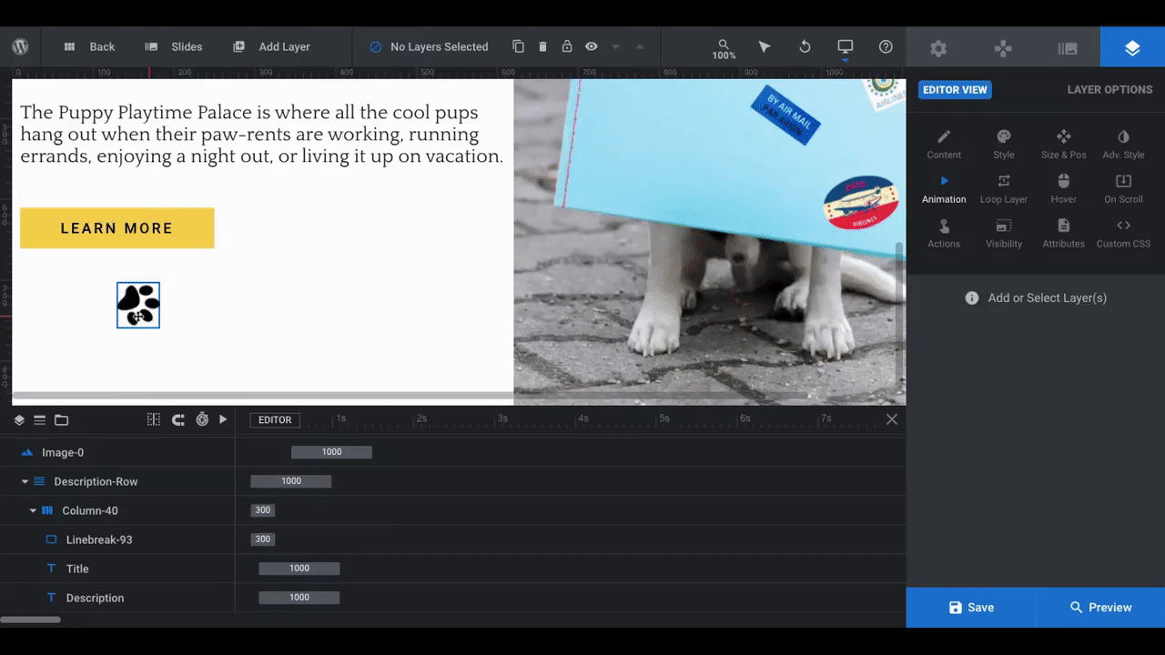
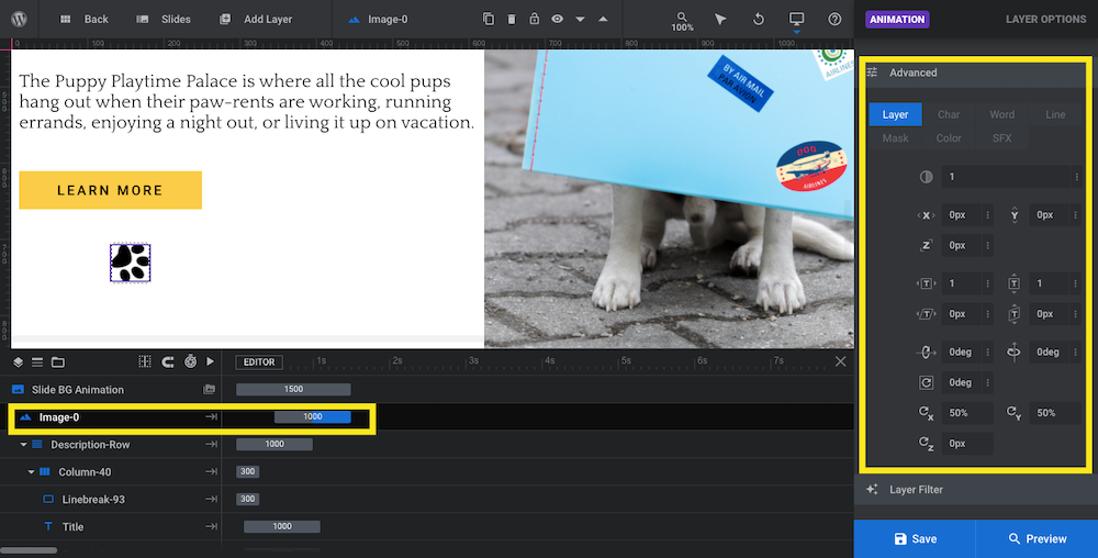
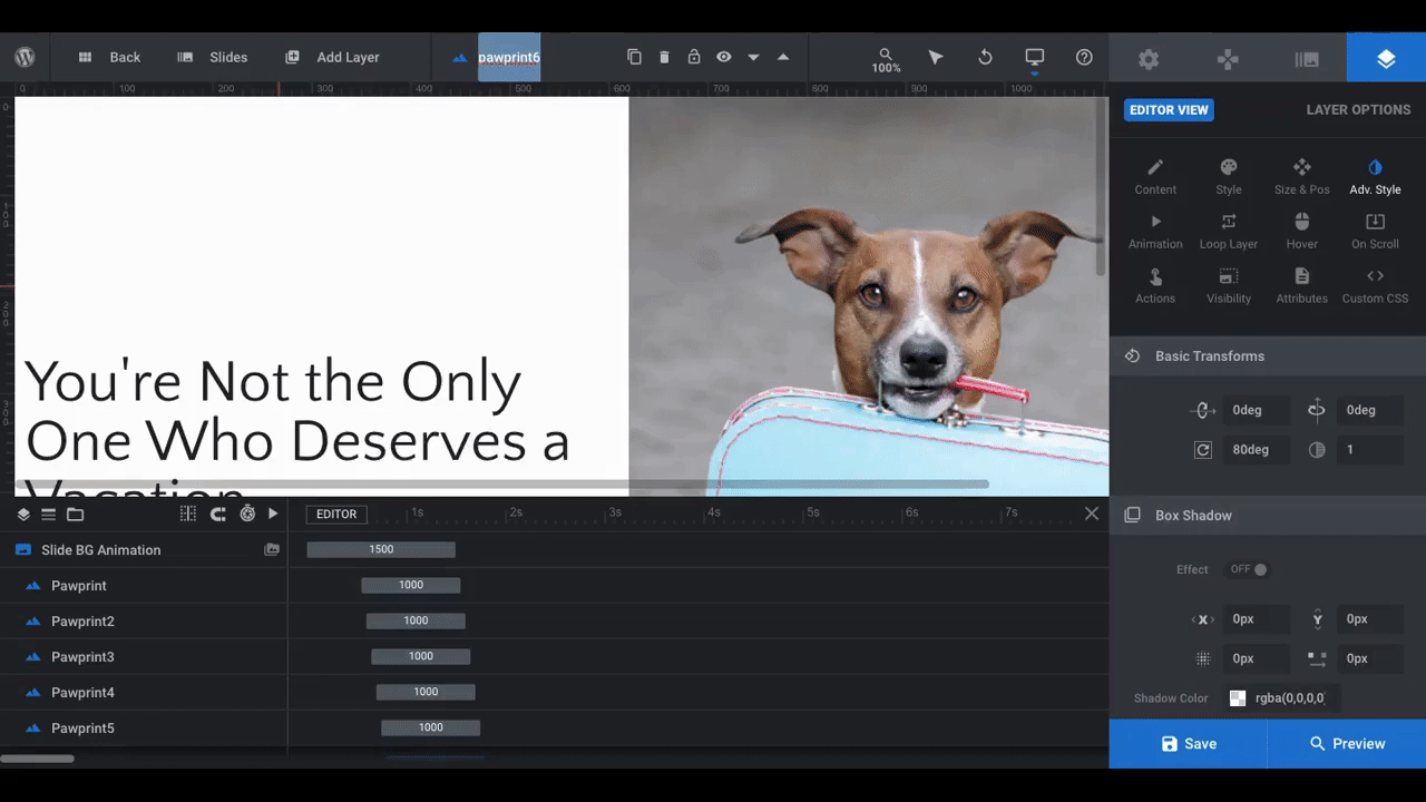
We’re going to apply a simple animation to the paw print graphic next.
Right-click on the layer and select “Animation”. It will take you to the Layer Options Animation tool:
Go to “Keyframes”. There are a number of animations to configure:
IN: This refers to how a layer transitions onto the slide. There are two parts to animate:
- Anim From is the starting position of the animation
- Anim To is the ending position of the animation
To select an animation for each, click on From or To, then click on the drop-down arrow next to “IN”. You can hover over and live-preview each of the animations.
OUT: This refers to how a layer transitions off of the slide. There’s only one option here. The animations are slightly different from “IN”, so review them carefully before selecting one.
Slider Revolution will take care of configuring the timing, duration, and effect of the animation if you do it this way. If you’d prefer to create custom animations, use the timeline editor on the left as well as the “Advanced” Settings in the Animation tab to do so:
By the way, you can add more keyframe steps to your animation from the Layer Options panel. Simply hover over the Anim From and Anim To buttons and you’ll see a plus-sign (+) icon pop up in between frames.
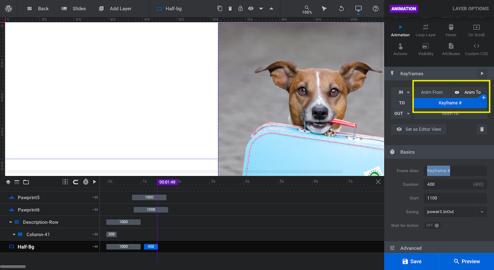
Click on this to add as many additional “TO” steps before the last “OUT” step. If you want to keep your animations straight, change the “Frame Alias” so it has a unique name.
Each new keyframe will retain the animation settings from the first one you set up. This will allow you to easily continue the animation. You can also customize them as you see fit.
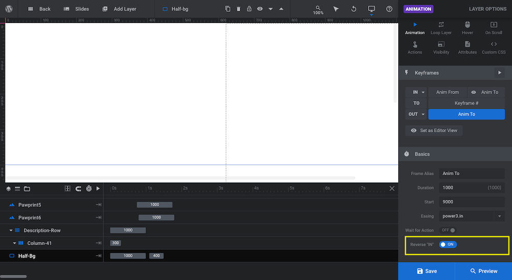
Pro tip: When setting up the “OUT” keyframe, there’s an option under “Basics” called “Reverse ‘IN’”. This setting automatically takes the “IN” animation of a layer and reverses it in the “OUT” frame.
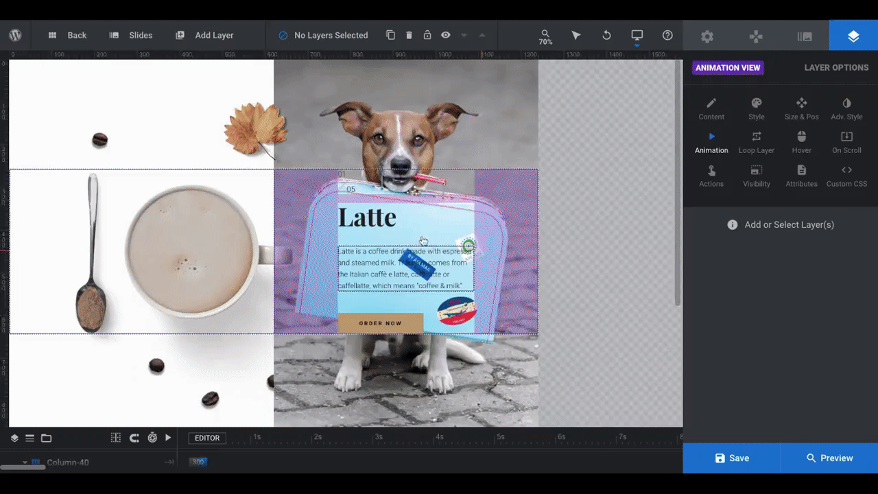
With the design and animation configured for my graphic, I’m going to duplicate the layer so I have additional paw prints that look and animate just like the first:
In addition, I’ve staggered them along the timeline so that they appear one after the other, to give the prints a walking-like effect.
When you’re done animating your slide, save your changes.
Learn More
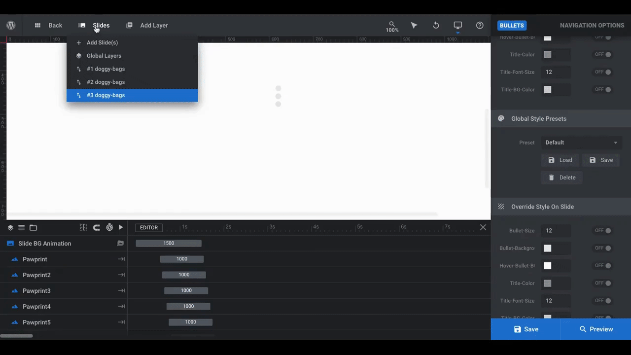
Step 7: Duplicate the slide and customize your content
Once you’re happy with your first slide, go ahead and create your other ones.
The split screen slider effect is already in place for you — it’s under Slide Options > Animation as a custom animation. All you have to do is duplicate the first slide in order to preserve the effect.
To duplicate the slide, go up to “Slides” in the toolbar, hover over your first slide, and click on the duplicate icon:
You’ll customize the content in Slide 2, Slide 3, and however many others you need just as you do when customizing the template. Spend some time going through each slide and make sure you’re happy with how everything looks and works.
When you’re done, click on “Preview” in the bottom-right corner of the settings bar and give your split screen slider a test run:
This one isn’t 100% done. I still need to edit the navigation element. However, previewing your slider at this point is a good way to ensure that your design and text are as close to perfect as possible before you put the finishing touches on the whole thing.
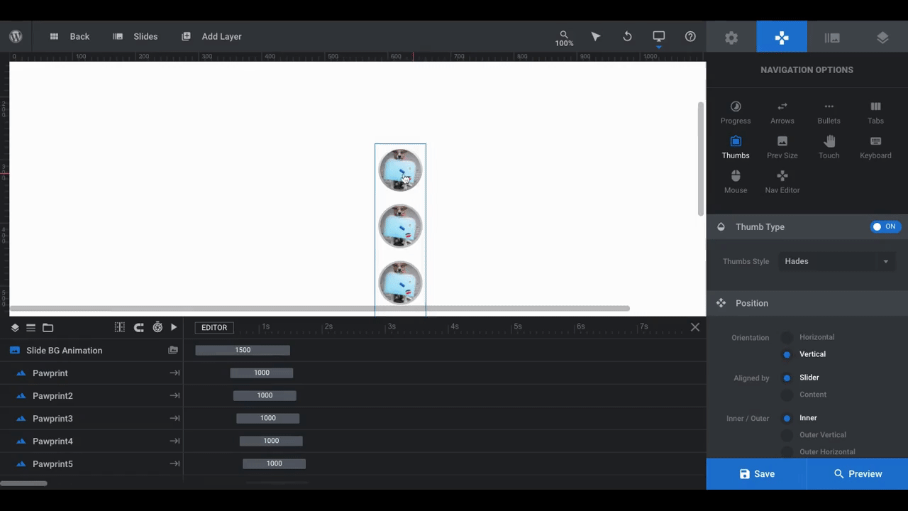
Step 8: Edit the navigation
Go to Navigation Options. You have five options for navigation styles:
- Progress bar
- Arrows
- Bullets
- Tabs
- Thumbs
Since this is a vertically sliding slider, the pre-selected Thumbs or Bullets are the best option since your visitors won’t be scrolling horizontally through the content:
You can also set the Progress Bar and Tabs to align vertically, but they won’t look as cool with the slider effect.
Just like all Slider Revolution elements, you can completely customize the navigation design. Just remember to update the actual thumbnails so they represent the content of each slide — even if you use a different navigation style.
To do this, start with Slide #1 in the toolbar. Go to Slide Options > Thumbs and update the media file so it shows the right preview:
Then, go through and fix all your other slides. This will not only be useful for website visitors if they’re using a Thumbs navigation, but also so you can preview which slide you’re editing before you open it up.
For this particular design, I’ve decided not to include a navigation simply because it’s a small slider (there are only 3 slides). It’s up to you to decide what’s best for your visitors.
Learn More
Get ready to wow your website visitors with a cool split screen layout
A split screen slider is one of those undeniably attractive design effects that gets visitors to stop and notice what you’re showing them. Not only that, it can completely alter the perception they have of the company behind the website. New or old, big or small — a split screen design will make a very strong and positive impression.
With the help of Slider Revolution and its fully customizable templates, you can easily design a split screen layout of your own.


Is it possible the half-BG to have a different BG on each half?
Hi Mauricio,
yes, absolutely. Please take a closer look here: https://www.sliderrevolution.com/design/split-screen-layout-with-slider-revolution/#h-step-3-edit-the-slider-backgrounds
Best regards, Dirk @ Slider Revolution