Eighty percent of what humans assimilate is visual. Colors have a big impact on people’s emotions and memory. So choosing the color for your logo and website is crucial.
When choosing a website color scheme, bear in mind the emotional effect it will have. Each color affects emotions differently. Hues and vibrancy also play into people’s emotions. With that in mind, it is important to first decide how you want visitors to feel when they enter your site.
Also, take into consideration the colors that will appeal to your target customers. Factors like gender and age affect the way people look at color. Disregard your personal taste and use colors that appeal to the target demographic.
This article created by our team at Slider Revolution will explain the important aspects of website color schemes. It will also provide examples for inspiration and discuss color palette generators.
Things To Consider About Website Color Schemes
A website color scheme is more than the color of the logo. It encompasses every color that appears on the website. This includes the colors within the images. All these colors together shape the mood of your website.
Here are some facts that show why color is important and the role it plays in making decisions:
- Colors determine whether a customer will buy a product up to 85% of the time
- 90% of the time it is the colors that help to attract new customers
- Colors influence subconscious judgment by 60-90%
- Color increases brand recognition by 80%
- Color can catch and hold a customer’s attention 3 times longer than black and white
Here are some suggestions to make website color schemes appealing:
- Choose colors that harmonize with each other. Learn about color theory before doing any design work.
- People can’t process too much information at once, so use color to organize your website
- Use contrasting colors to make the text readable (i.e. royal blue and yellow or any blue-yellow color combination)
- A simple formula is to use one light color on a dark background, and one vibrant color, or vice-versa plus the accent color
- Another guideline is to use one color for 60% of the website, another for 30%, and a third for 10%
Jump to the article sections
- Blue Website Color Schemes
- Red Website Color Schemes
- Yellow Website Color Schemes
- Green Website Color Schemes
- Black And White Website Color Schemes
- Pastel Website Color Schemes
- Color Combination Website Color Schemes
- Color Palette Generators
Blue Website Color Schemes
Tiny
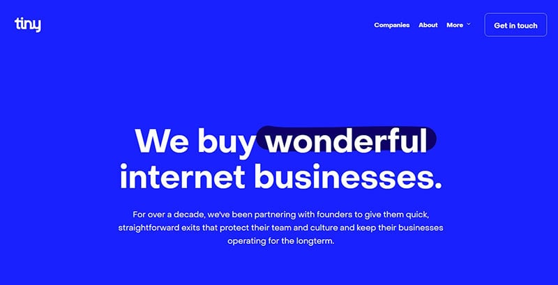
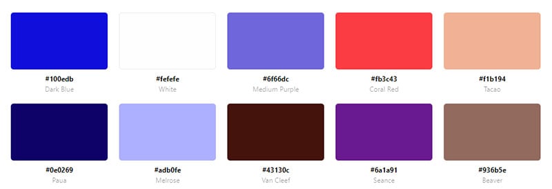
The company behind this sleek website buys internet businesses. It features a blue background with contrasting white text. The accent color is dark blue.
iFly 50
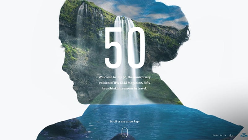
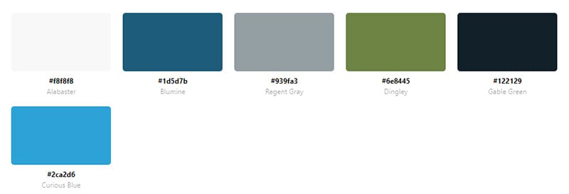
The landing page of iFly 50 greets visitors with a striking image of blue sky and blue water. This website is a good example of a nature photographer’s site.
Ankr
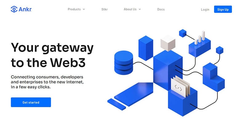
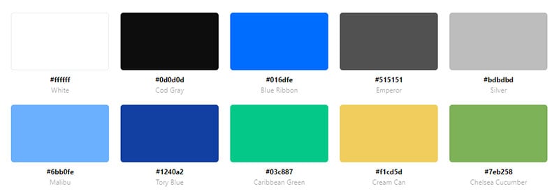
Ankr is a website that connects consumers to Web 3.0. It uses blue to make the animations and CTA’s stand out.
Ahrefs
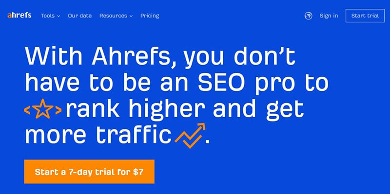
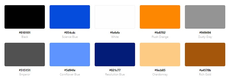
Ahrefs uses blue for 60% of the website. White is used 30% of the time and contrasts the blue. And the orange accent color accounts for 10%.
Enjoy Education

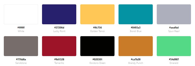
Enjoy Education is a London homeschooling company. Different shades of blue appear in the pictures and throughout their beautiful website. Orange elements create a nice contrast. That’s color psychology there.
Whitetail Gin
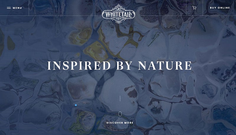

The tones of white and blue create a clean and classy look that complement the Whitetail Gin brand. The colors of the pictures and plenty of white space complement the color scheme.
NHS
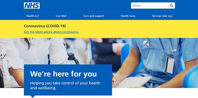
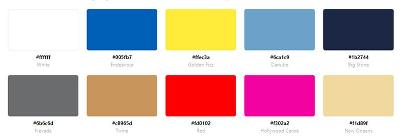
This blue website uses yellow as an accent color. The green CTA’s encourage visitors to click on them.
Dark Blue
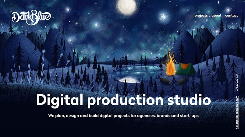
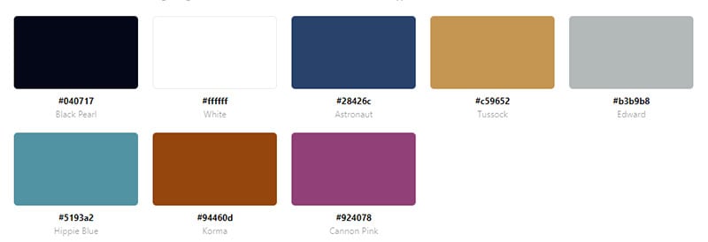
Dark Blue is a digital production studio based out of London. Complementing their name, the website uses a deep blue color as its background. The animations and photographs contain blue as well.
Loom
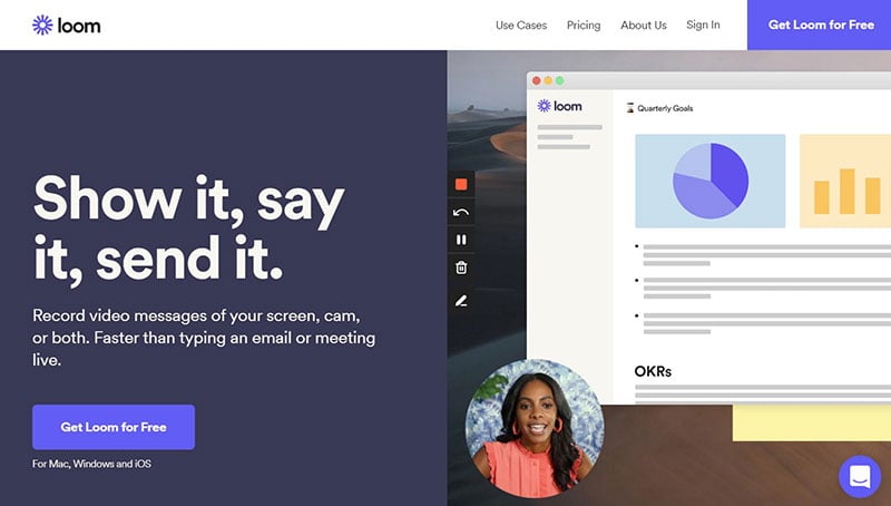

Loom uses dark blue as the background color. The secondary color is a lighter shade of blue which makes the CTA’s stand out. A soft orange color acts as an accent color to highlight important words.
Recess
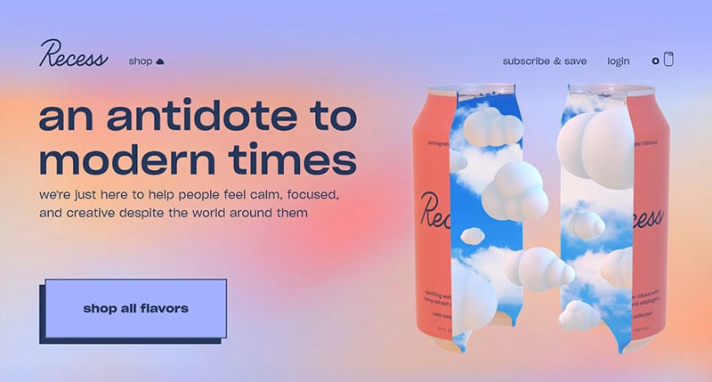
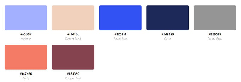
Recess sells sparkling water. The soft hues create a calm feeling. A light blue serves as the background color with darker blue lettering. The web designers who created this website surely know their color theory.
Love for Iceland
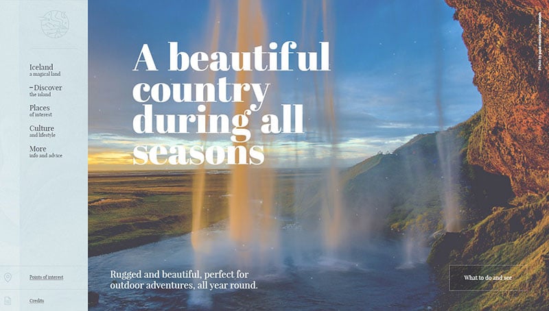

This website shows how a featured image can set the mood for the whole website. The bright blue ice, beautiful blue sky, and the blue at dusk set an adventurous and ominous mood for the visitor.
Grand Matter
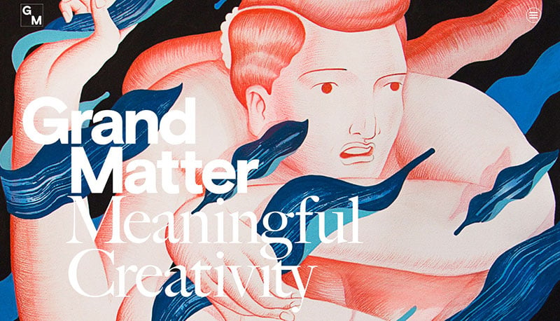
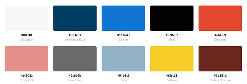
Grand Matter is a good example of a two-color website color scheme. The color palette includes dark blue and light pink.
Andris Gauracs
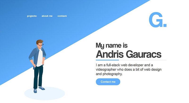
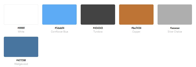
This website is the portfolio of a web designer. He uses blue to convey trust to his clients. Blue accents the white background. Blue also highlights the CTA’s and even the animation man is wearing blue.
BlueReceipt
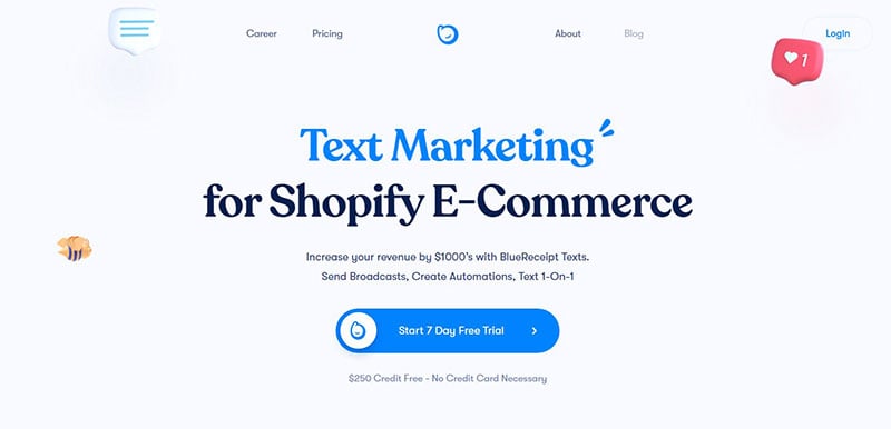
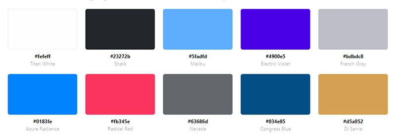
BlueReceipt uses a bright shade of blue and a dark shade for its text, CTA’s, and animations.
Dot Lung
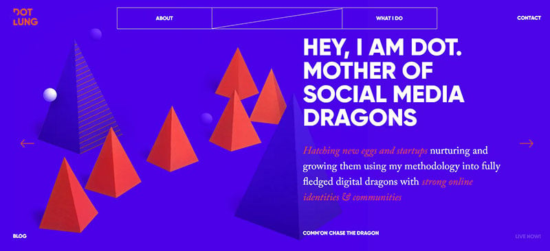

This website displays a simple color palette. It uses blue as a background color and red as a secondary color. The red emphasizes the simple graphics. White lettering makes the text stand out.
Ready
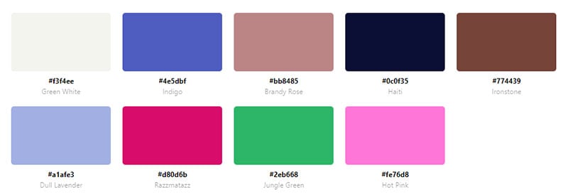
Ready is a new kind of calendar that helps you save time. The website uses various hues of blue to create an entertaining animation.
Tim Grover
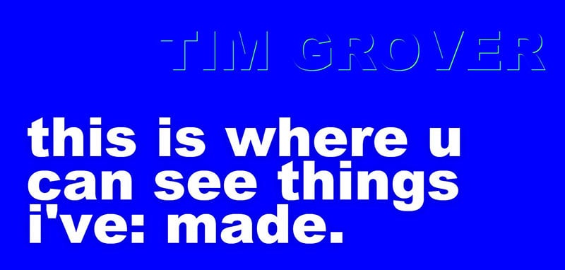
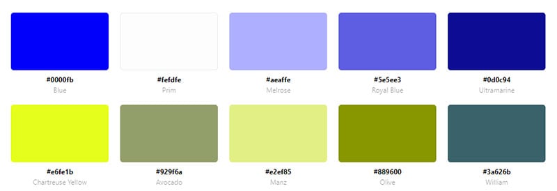
This website uses blue as its background color. The white words change color with a hover to yellow, light blue, or green.
Benediktas Gylys
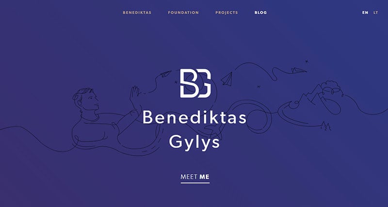

Benediktas Gylys chose an uncluttered color scheme. Navy blue is the primary color and reddish-brown serves as the secondary color.
Creative Mints

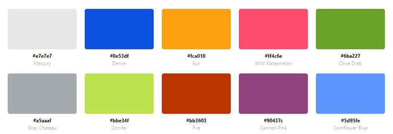
At a first glance, you might want to say that Creative Mints is using primary colors. However, this website design has a very vivid color combination: a blue background and four other colors: green, pink, light blue, and orange, plus a few that you don’t see that often on the page. These eye-catching colors create a very organized feel for the website even though there are waaay too many color choices.
Red Website Color Schemes
NUGGS
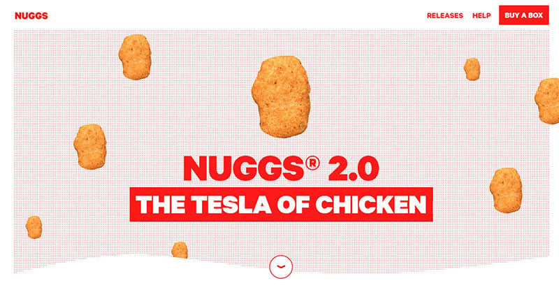
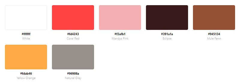
NUGGS is a bright and simple website with a basic color scheme. It contains a bright red background in some sections and red text in other sections.
Sourisseaux Partners

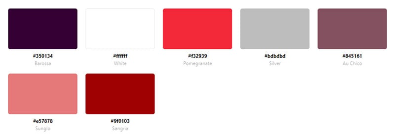
This website has a simple color scheme with red and purple as the main colors. Red emphasizes the headings of the text. Purple fills the background in some sections.
Kloaq
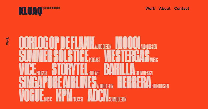
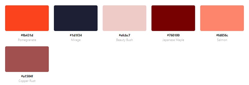
The KLOAQ website features a very simple color scheme. Orange fills the entire landing page. Navy blue accents highlight the important aspects.
Brand Aid

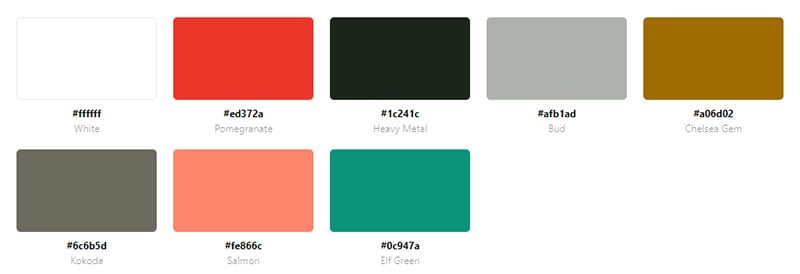
Brand Aid uses bright red for their website. Red is the background color when first entering the website. It is also used for the animation and call-to-action buttons.
Up
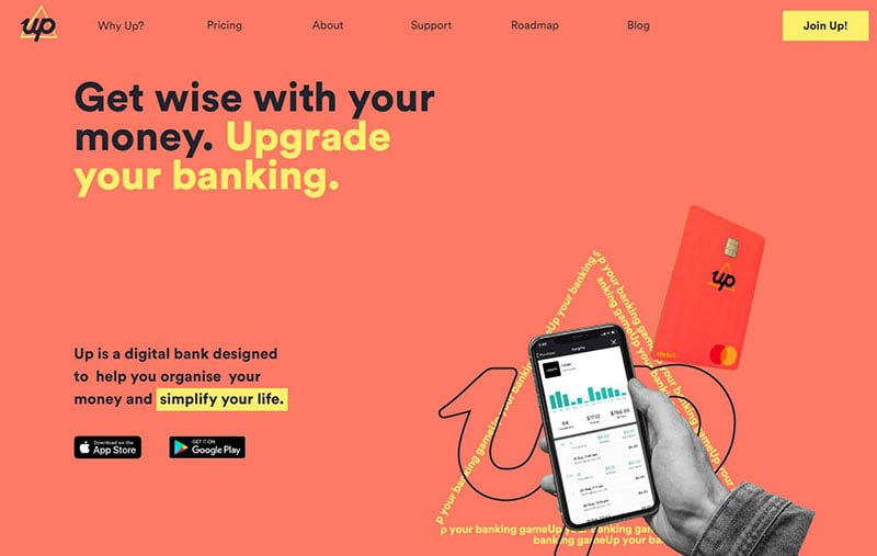
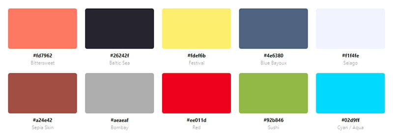
Up is a digital bank. It uses a coral background color and a bright yellow accent color for the text and CTA.
Web Design Field Manual
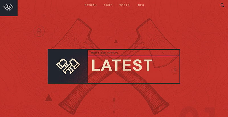

This website uses a dark red color scheme. The color helps layout the resources in an organized way. Navy blue is the accent color.
Emme
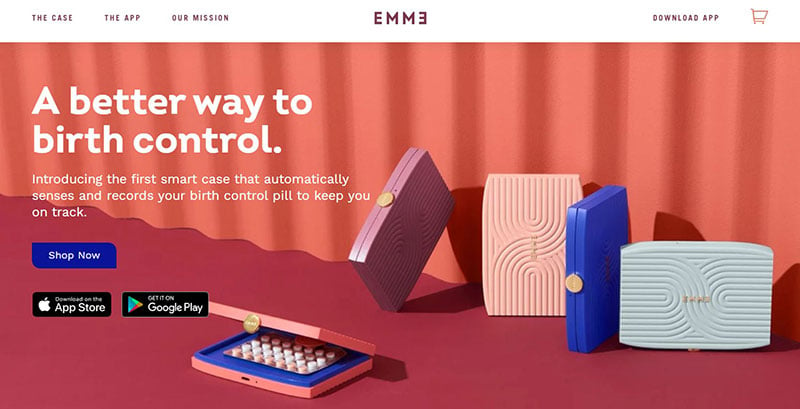
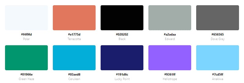
Emme is a website that offers a system to keep track of birth control pills. This beautiful website color palette contains various hues of coral and lavender. These colors appeal to their female demographic.
Hey Noodles

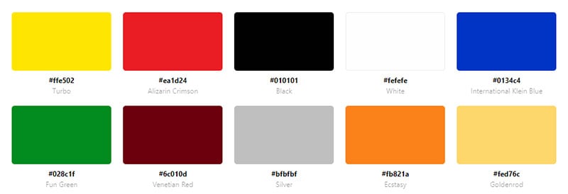
Hey Noodles uses bold colors. The red and yellow colors of the logo appear throughout the website.
Data Partners
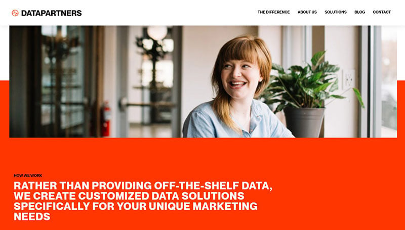
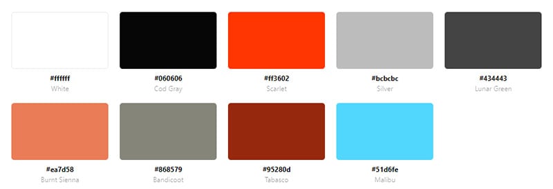
Data Partners provides marketing solutions to Fortune 1000 companies. Bright orange showcases important aspects and the CTA’s of the website.
Unspun

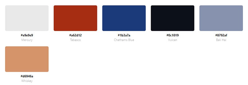
Unspun uses orange and the contrasting color of blue for a fun and creative website. These colors appeal to those with an active lifestyle.
Pizza Pizza
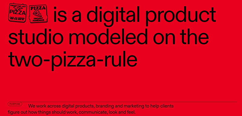

Pizza Pizza uses red for the entire website. Black letters make the text stand out.
MKJ Creative
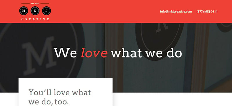
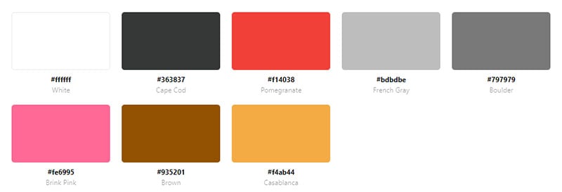
MKJ Creative is a website for a graphic studio. The simple layout uses red as an accent color to emphasize words. The minimal use of red and the typography make this a professional-looking website.
Spline

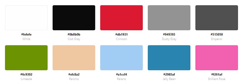
On the landing page of Spline, a bright red background displays black lettering. As you scroll down the red turns into a black background with white lettering.
Portal CVI Refrigerantes

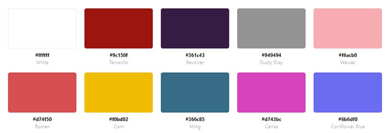
The red on this website is vibrant. It highlights the CTA’s and adds a pop of color.
Progress Parade
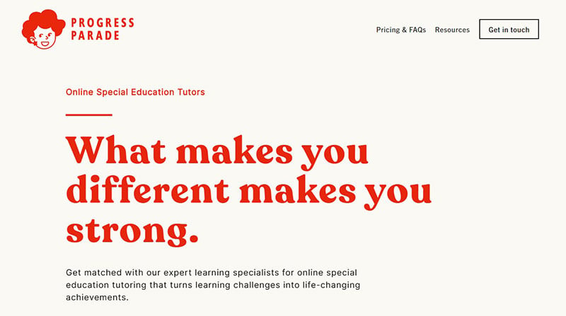
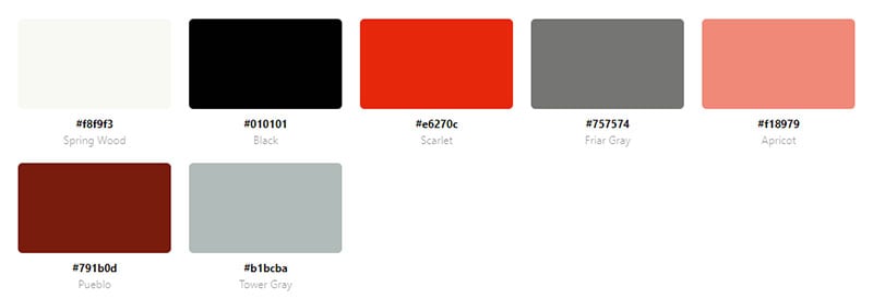
Progress Parade provides specialized tutors. Red brings the animations of this website to life. It is also used for the CTA’s and text headings. The use of color on this website creates an organized and appealing look.
Trionn Design

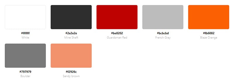
The logo contains waves of reds and oranges. An accent red color is also used and hovering over an image shades it in red.
KitKat
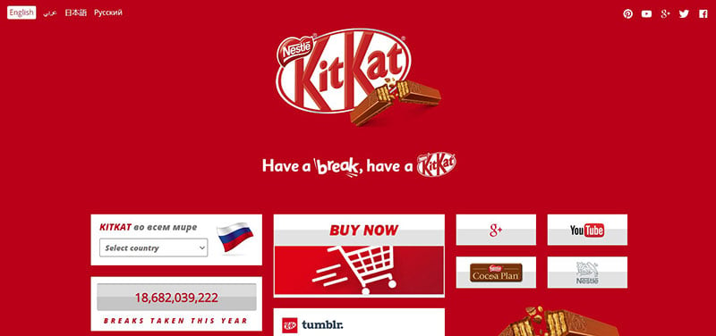
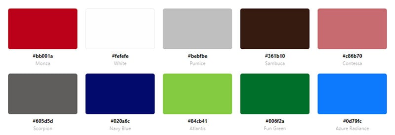
Everyone recognizes KitKat by its red packaging. Fittingly, this website is all red.
Veiled Fate
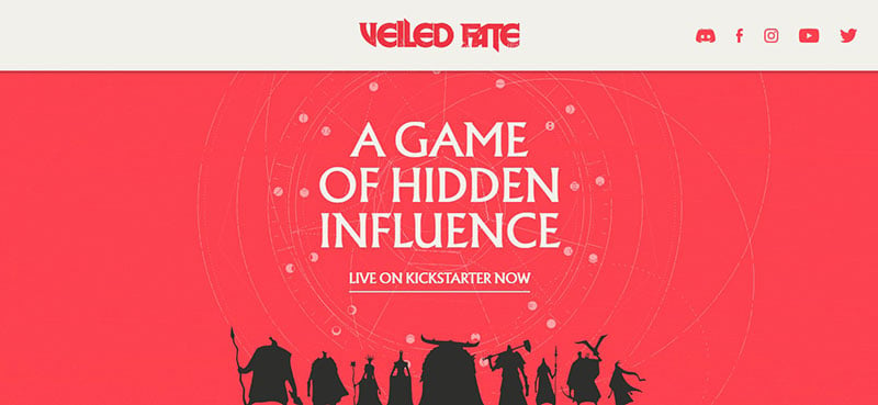
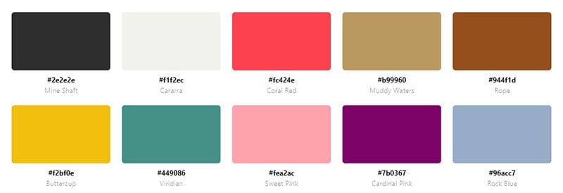
Veiled Fate features a game of strategy. The landing page features a pinkish-red color. Scrolling down, grey and light brown become the main colors.
Green Onion
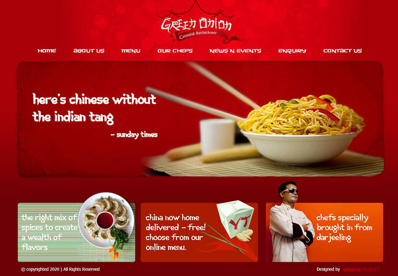
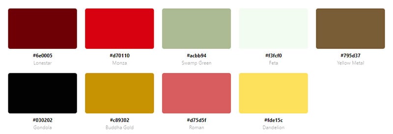
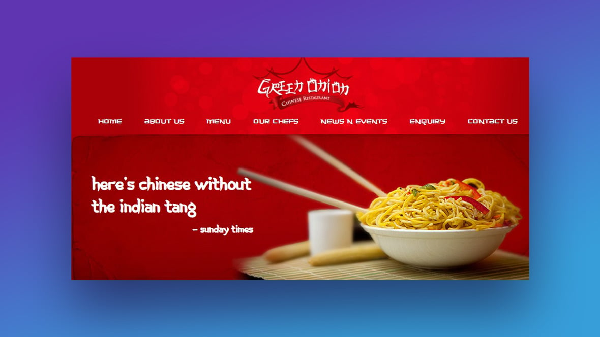
Green Onion has a clean and simple design. The background color is red and the call-to-action buttons are orange. Little bubbles of various shades of red appear at the top of the page as well.
Cafe Rouge
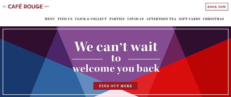
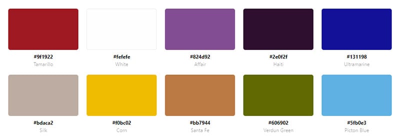
Cafe Rouge is a website for a french bistro. A dark red calls attention to the CTA’s. Dark red is also used in each section as an accent color.
Work & Co
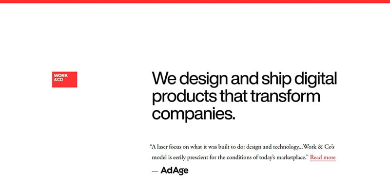
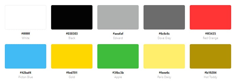
Work & Co designs digital products that transform companies. Red appears on a minimal scale in this website design. Hovering over the black lettering turns them to red. Red also appears in the CTA’s.
Yellow Website Color Schemes
Demuxed 2020

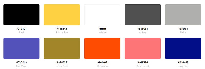
This website color palette is two-toned, using yellow and black. Yellow is the background color of the landing page. It contains black text and animations. Scrolling down, the background becomes black with yellow text. The website color scheme contributes to the simple and clean layout of this website.
ICO Syndicate
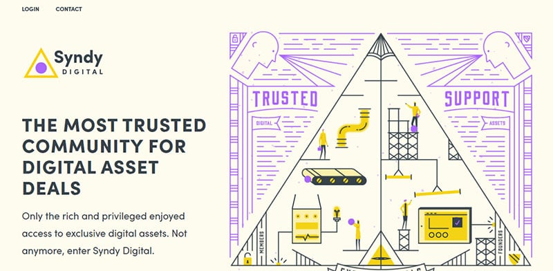
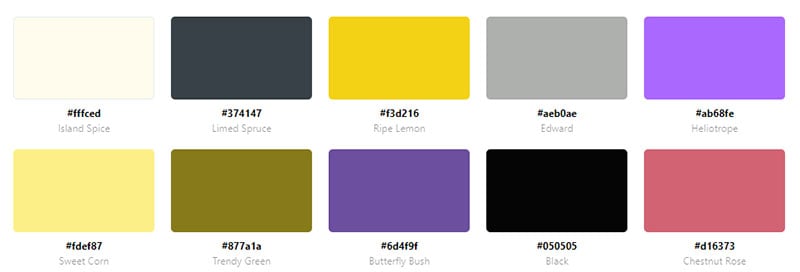
This website uses a combination of yellow and lavender to make a pleasing color scheme. The background is a soft and pale yellow. Bright yellow serves as an accent color.
Make Lemonade
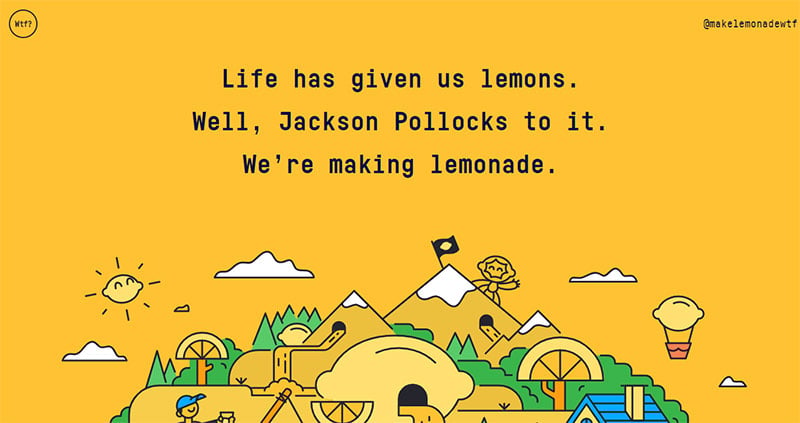
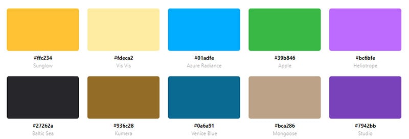
Complementing its name, this website employs a yellow color scheme. Different hues of yellow appear in the animation of this website. And the background is a solid yellow.
think bear
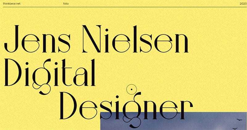
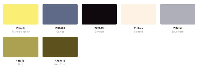
This website showcases the portfolio of digital designer Jens Nielsen. The background color is a soft yellow that brings out the colors in his featured image.
Alday
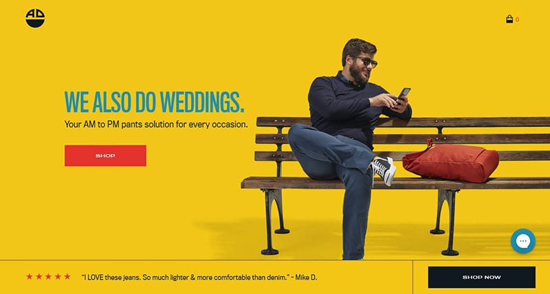
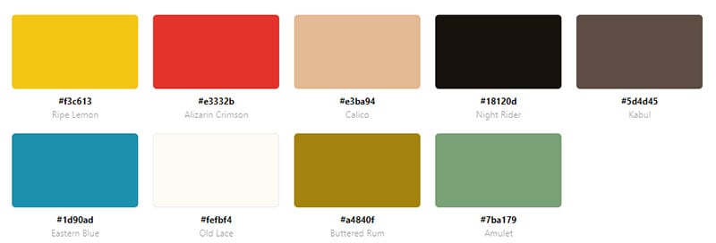
Alday is a brand of pants designed to put comfort first. The website’s colors are vibrant, with bright yellows and blues preferred. This, combined with parallax scrolling, creates a playful and appealing website.
Point
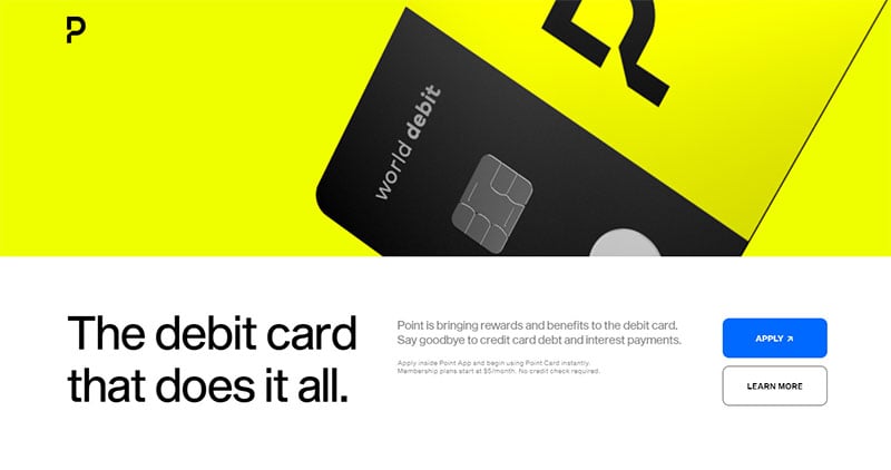
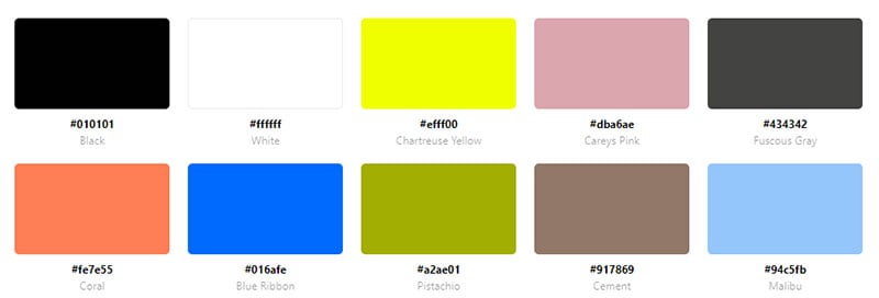
A video plays when visitors enter the site. The yellow, orange, and pink debit cards offered by Point flash on the screen. But it is a bright yellow that dominates the website color scheme.
youbringfire
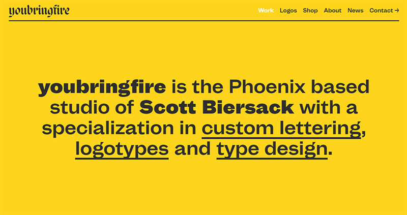
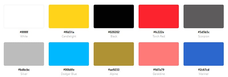
Youbringfire is the website of an independent designer named Scott Biersack. The landing page includes a bright yellow background and black letters.
Shelby Kay
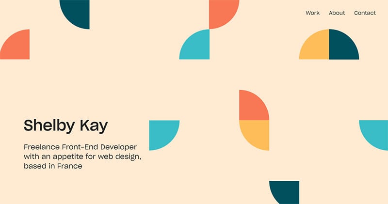
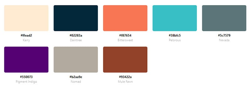
Shelby Kay is a freelance front-end developer. Several colors form the website’s color scheme. The combination is appealing and organized.
Lordz
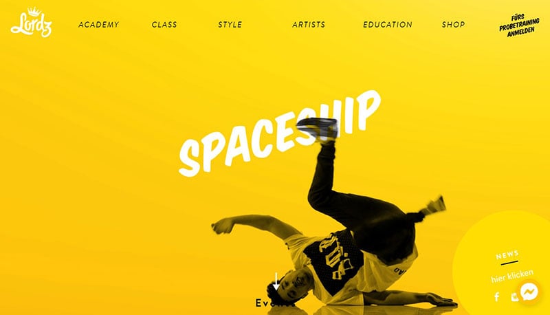
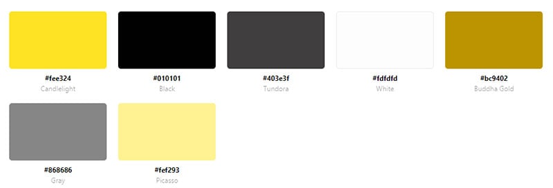
Lordz is the website for a dance academy. A unique feature is the animation of a dancer on a yellow background while the page loads. The whole website uses a yellow color scheme to create an energized and vibrant feel.
The Moon Exhibition
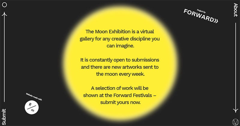
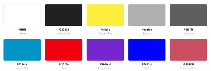
A moon greets visitors to the site, with background colors changing from bright yellow to softer hues. Scrolling down, bright yellow fills the whole website.
Adam Hartwig
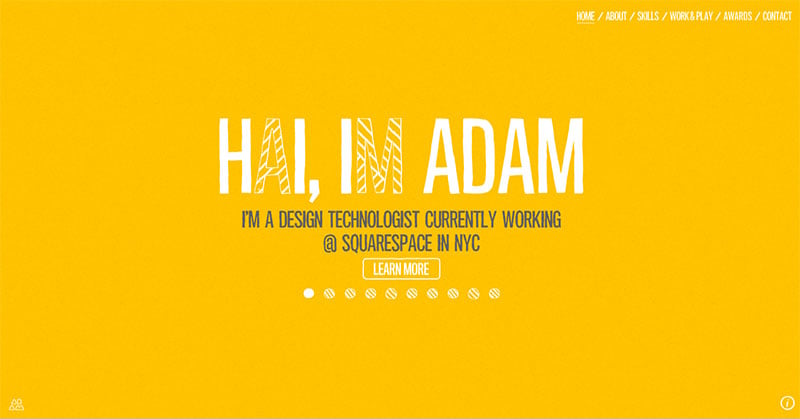

This website showcases the portfolio of the designer Adam Hartwig. It features a yellow background and white letters with parallax effects.
The Badass Project
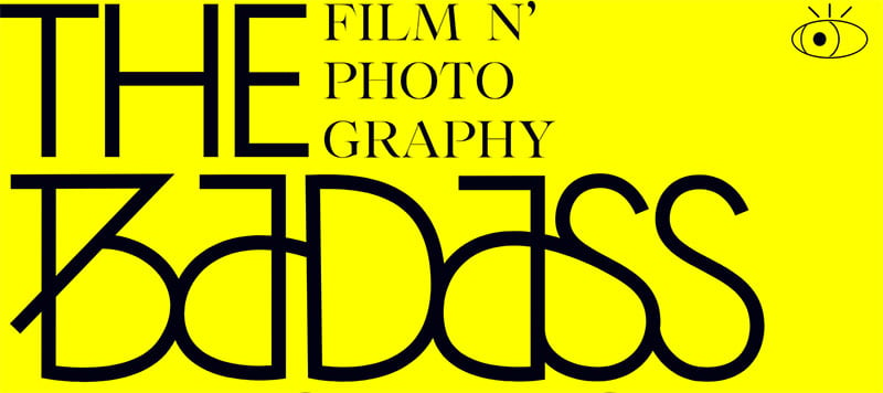
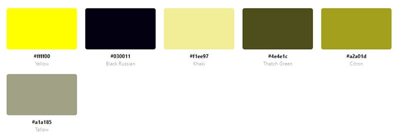
This website uses yellow and black throughout. Yellow is the background color and black makes the text pop. Yellow lettering overlaps the pictures.
Ritual

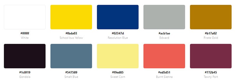
Ritual has a clean and simple layout, complementing the simple color scheme. Yellow creates a burst of color on an otherwise white background. The blue text combines well with the yellow.
Small Cos.
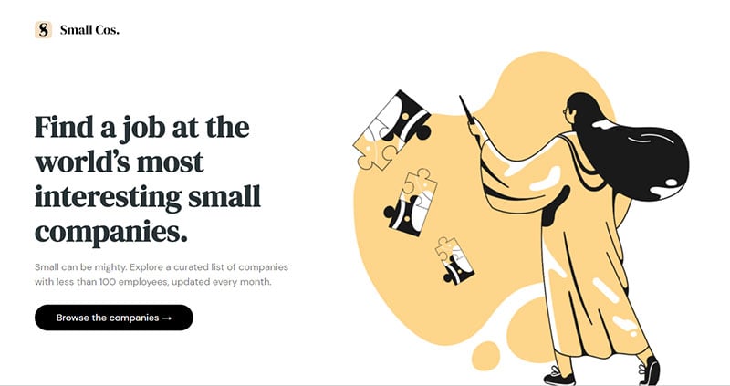
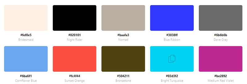
Small Cos. lists job openings at small companies. The website design is simple. A pale yellow draws attention to the animation. Scrolling down, a light pink surrounds the job listings. The bottom of the page again contains the pale yellow animation.
Croscon

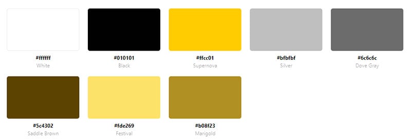
Visitors to this site are greeted with yellow graphic elements. Yellow also serves as an accent color that adds an extra pop to the color scheme.
MateCaps
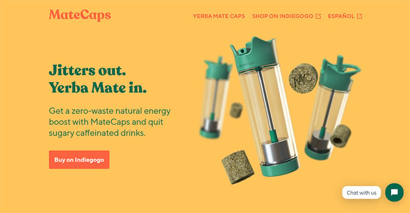
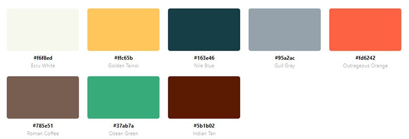
MateCaps sells yerba mate to replace coffee. The yellow, teal, and coral colors create an energized feeling. The background color of the landing page is yellow. Yellow continues to appear on the website. The teal and coral create a pleasant contrast against the yellow.
Creative Spark
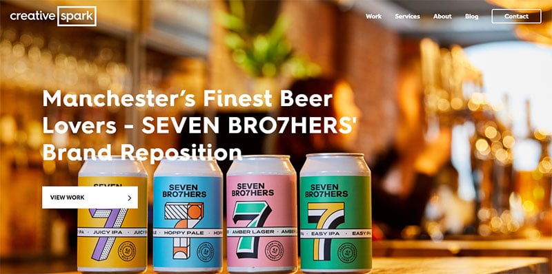
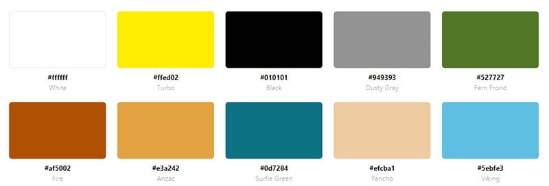
Creative Spark uses yellow as a dominant color on their website. Yellow is used as a background color, for the CTA’s, and appears in the images.
Pebble Naturals
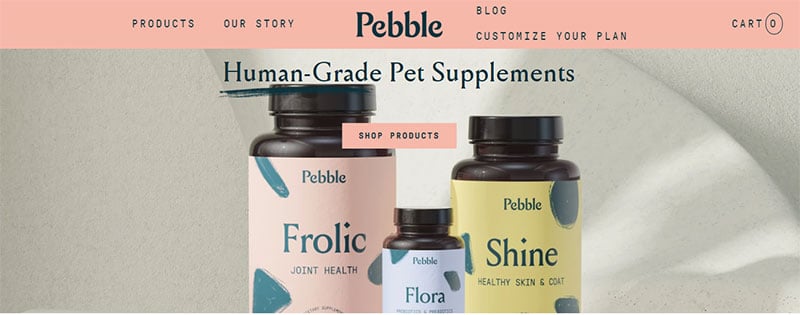
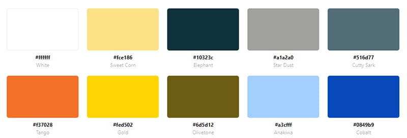
Pebble Naturals uses several colors. Yellow, light blue, and pink streak across the website’s pages.
Identix Design
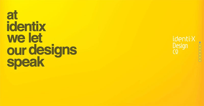
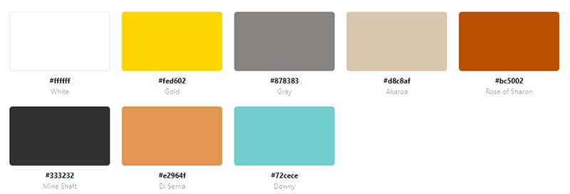
A bright yellow greets visitors as they enter this website. Yellow is further featured in the images, the animations, and the call-to-action buttons.
Lemonpie

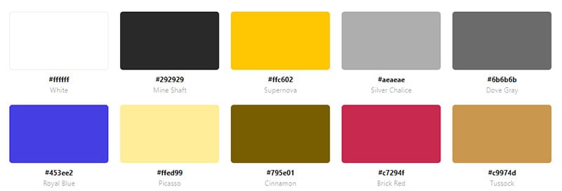
Lemonpie, known before as Be My Guest, is a podcast production agency. Befitting their name and logo, Lemonpie uses yellow throughout their website. Yellow highlights important phrases. A balance of yellow, black, and white provide a pleasing aesthetic.
eeerik
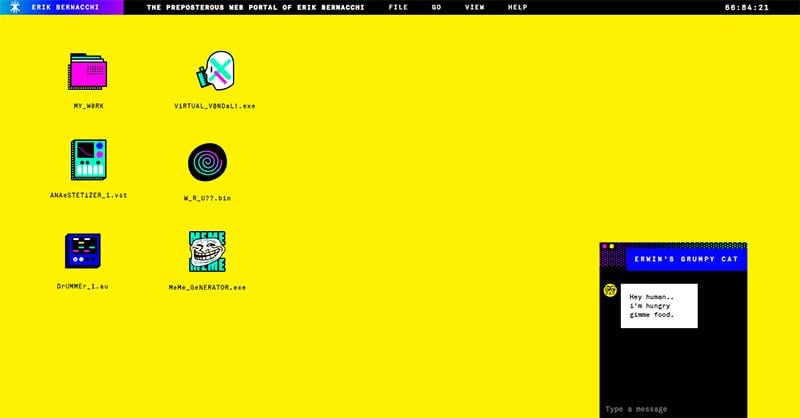
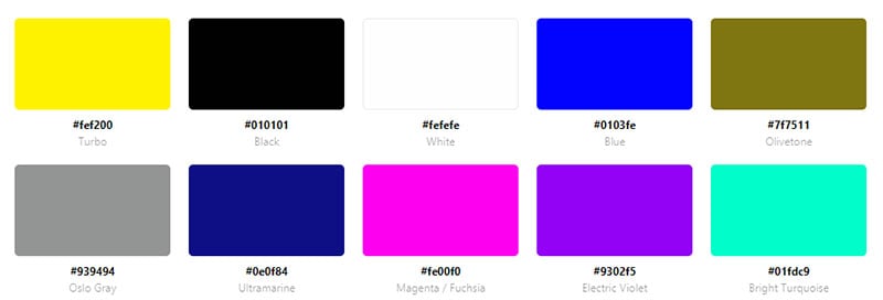
Eeerik displays a unique yellow web design. It contains rudimentary graphics that create a retro vibe. Bright yellow fills the webpage for a memorable website.
Mooze Design
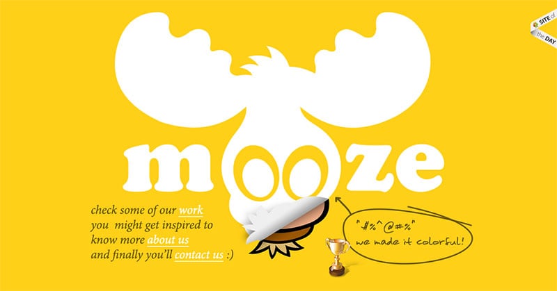
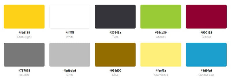
Mooze Design is an agency’s portfolio website. The huge logo centered on the landing page greets visitors. A bright yellow fills the background of the whole website.
WØRKS
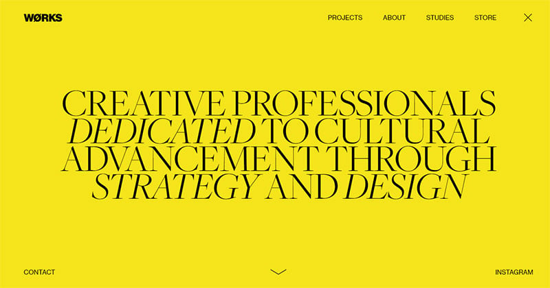
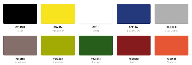
This website opens up to a bright yellow background with black letters. Scrolling down yellow appears intermittently for a pop of color.
Green Website Color Schemes
Waste Not
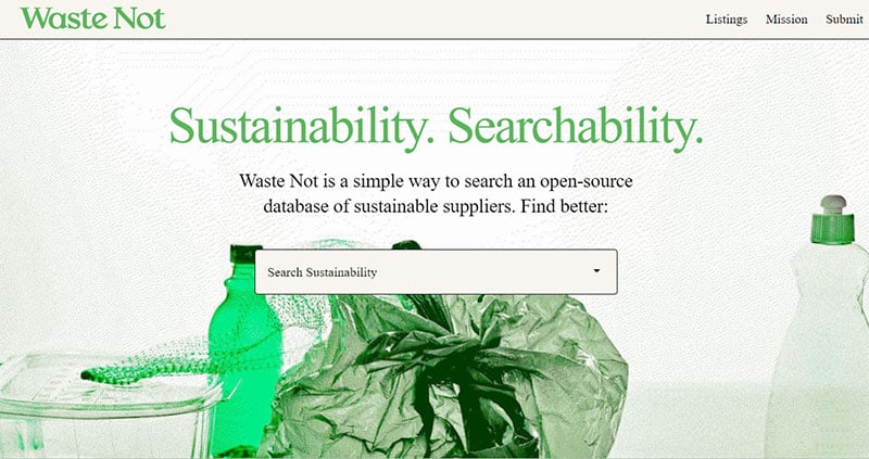
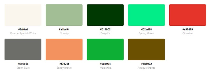
Waste Not allows users to search for sustainable suppliers for their businesses. In keeping with the theme, green is the dominant color of this website. It uses green lettering, green CTA’s, and green images.
Nature Makes Us Happy
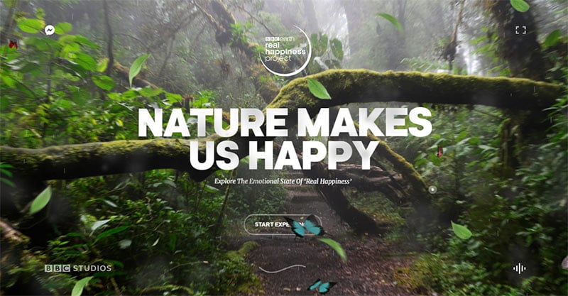
This website showcases a project from the BBC that says that watching nature makes people happy. The landing page shows a striking image of green nature. White readable letters stand in contrast.
Teachable

This website makes good use of different shades of green. Light and dark hues of teal and green are used throughout the website.
Geckoboard

Geckoboard provides a way for users to display KPIs and metrics in a clear way. Green call-to-action buttons and animations appear on the website. Contrasting the green is a dark blue background.
Geli
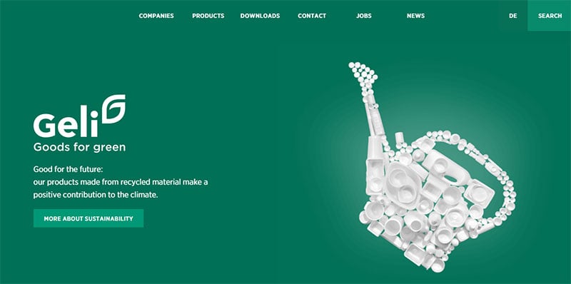

Geli is a gardening website so using green for a color scheme is fitting. A darker green color appears throughout the website. Images of leaves and green watering cans complement the different hues of green.
Hopewell Brewing
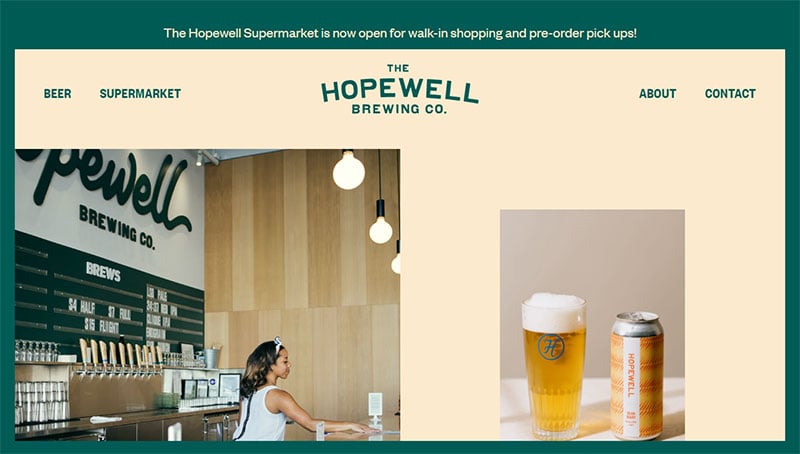
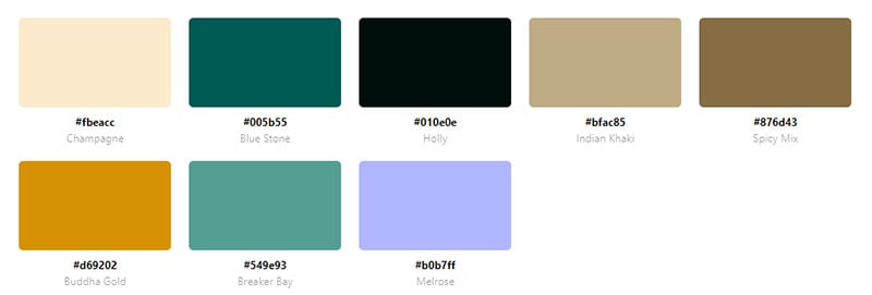
Hopewell Brewing is a craft brewery. The website uses dark green as a dominant color. A light pink accent color creates a pleasing combination of colors.
Humbly healthy

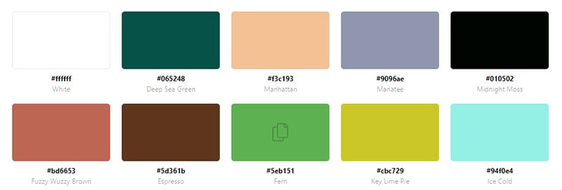
Humbly healthy is a website that talks about plant-based cuisine. It uses three main colors. Dark green is the dominant color. A dark blue and light peach complement the green and are used for the text and CTA’s.
Factor

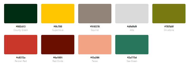
This website uses dark green and a bright yellow for its color scheme. The background color is green. The yellow text and boxes provide this website with an added dimension. A splash of white sets some words apart from the rest.
Ferrumpipe
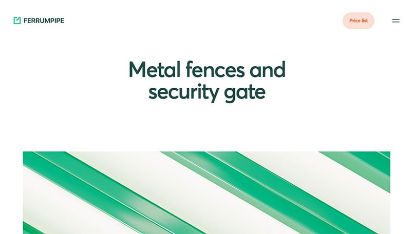

Although Ferrumpipe offers metal fencing in several colors, green is the dominant color of their website. White provides the backdrop for the green text. Green metal fencing features often in the images.
RunwayML

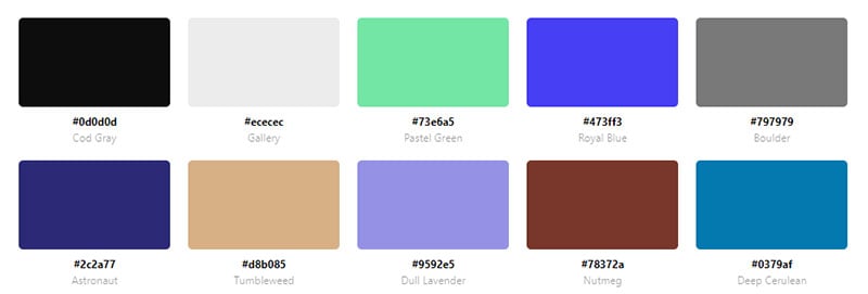
RunwayML has a mostly black background but splashes of green bring this website to life.
Web Development | Diego Díaz

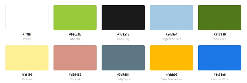
This website belongs to a web developer named Diego Díaz. He uses a light green color mixed with yellow to create a patterned background.
Practice
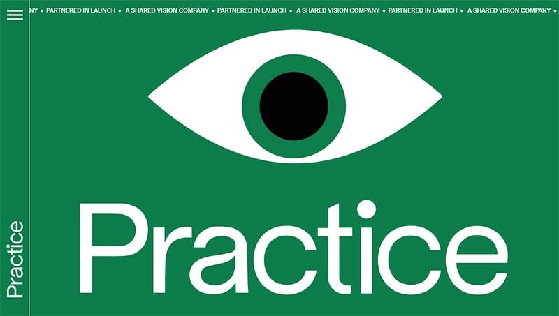
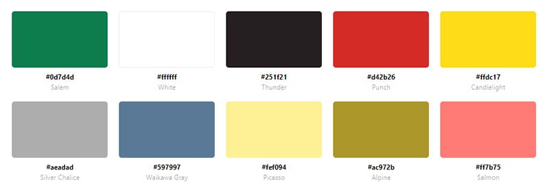
This website opens with a green eye that follows your pointer around. The background is green with white text. Green appears throughout the website.
Calico
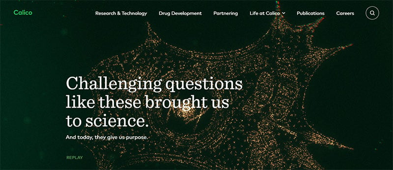
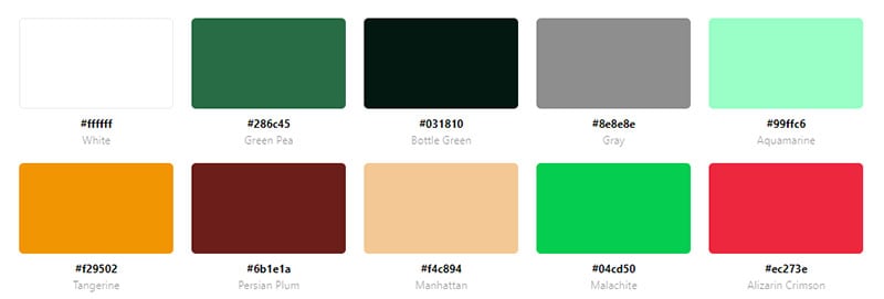
Calico researches aging. The website opens to a green backdrop with graphics of neurons. Green appears throughout the website as an accent color and an organizing aid.
RipePlanet
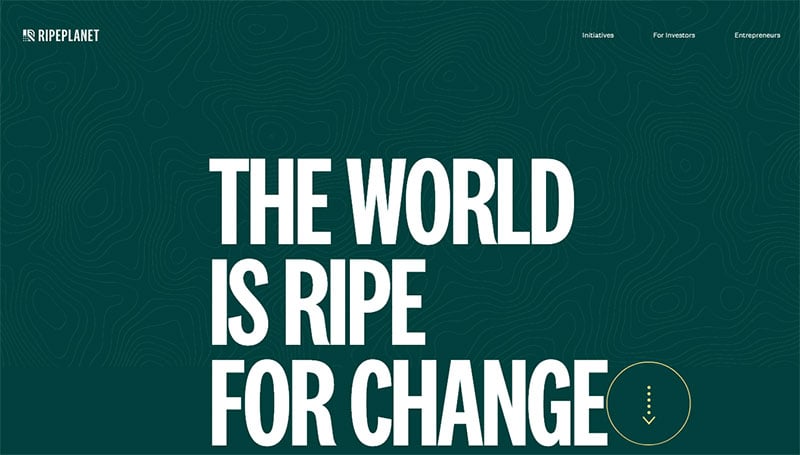
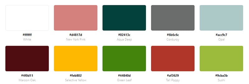
RipePlanet strives to set a sustainable standard for agriculture. The website uses a teal green on the landing page. Scrolling down, a light pink color complements the webpage. Green is also used in several images of fresh produce.
Kodibox

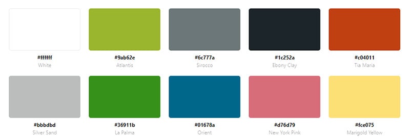
This website follows the pattern of other green website color schemes. The lettering, CTA’s, and images all include the color green.
WUNDER
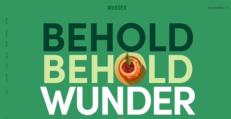
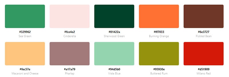
WUNDER sells cannabis-infused sparkling beverages. Dark green letters contrast the green background. The use of light pink as a secondary color complements the green well.
Markus

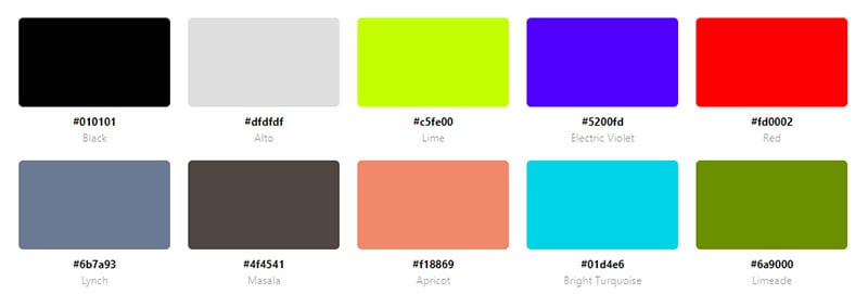
Markus is an advertising agency. The landing page opens to a yellowish-green background with black letters.
Reed Art Department
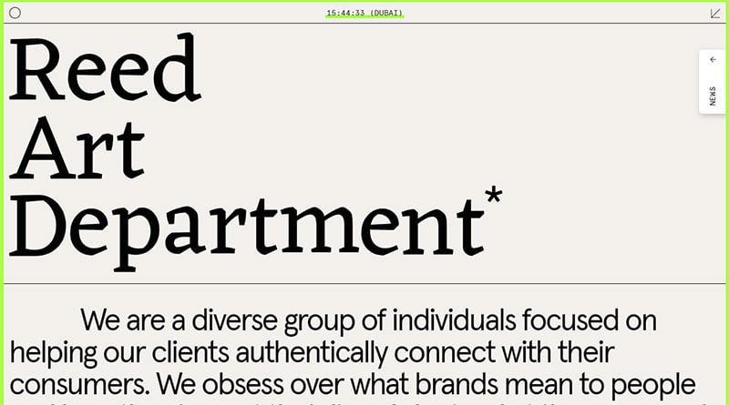

The Reed Art Department has a simple website. It has a greyish background with a green trim all around. On hover, the menu options are highlighted in green.
Black And White Website Color Schemes
Good Measure
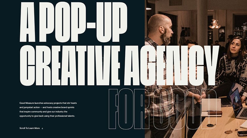
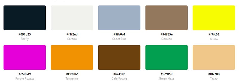
This website has a unique feature regarding the color scheme. At the bottom of the webpage, visitors can select different background colors. Choose between white, navy blue, light blue, and light pink.
Studio Bjork


Studio Bjork features black and white parallax scrolling. Instead of scrolling vertically this website scrolls horizontally. Samples of their work are displayed with alternating white and black backgrounds. This website color scheme works well since the focus is on the design and not on written content.
Quicksand
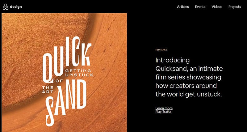
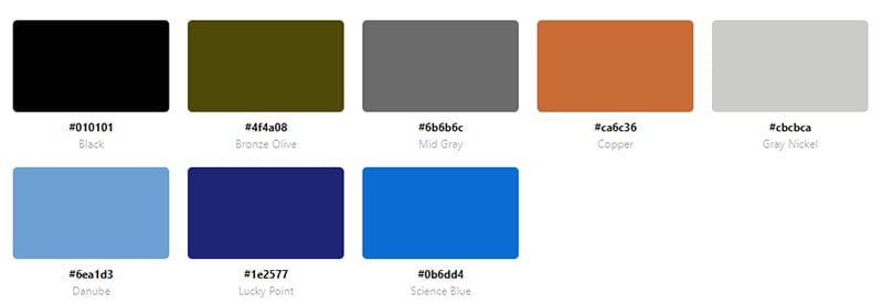
Quicksand is a film series from Airbnb, Inc showing how artists around the world have overcome adversity. The website has a simple color scheme with a black background and white text.
Duft & Co.
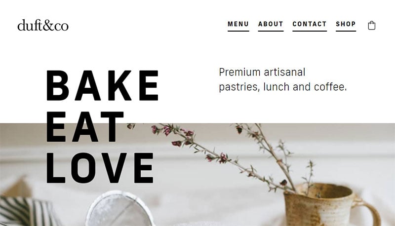
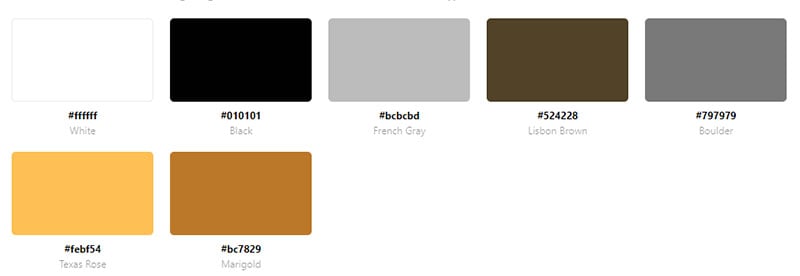
Duft & Co. sells artisanal pastries, lunch, and coffee. The white background with black text directs attention to the images of food. Following a common website color scheme practice, the end of the website reverses to a black background and white text.
Status
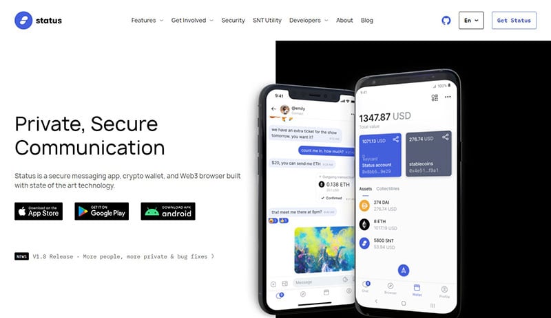
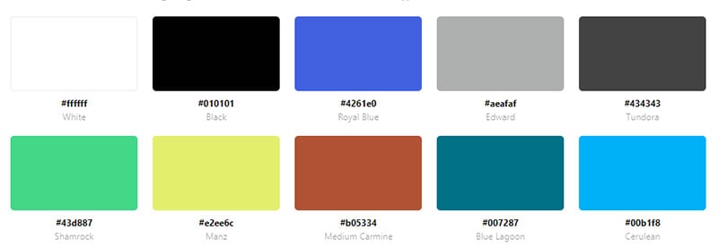
Status is a secure messenger, crypto-wallet, and Web3 browser. The website uses black, white, and blue to section the content into organized spaces.
The Ordinary
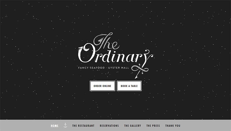

This website color scheme demonstrates the elegance of this restaurant. The landing page mimics a starry night to invoke feelings of romance. The rest of the website displays a simple and elegant style.
Natural
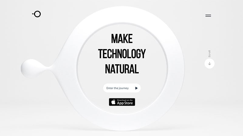

Natural is an artificial intelligence company based in California. The black and white website color scheme was no doubt chosen to create a futuristic feel. The website alternates between a black background with white text, and a white background with black text, which is exactly what the target audience might expect from this type of website.
G2K Creative Agency

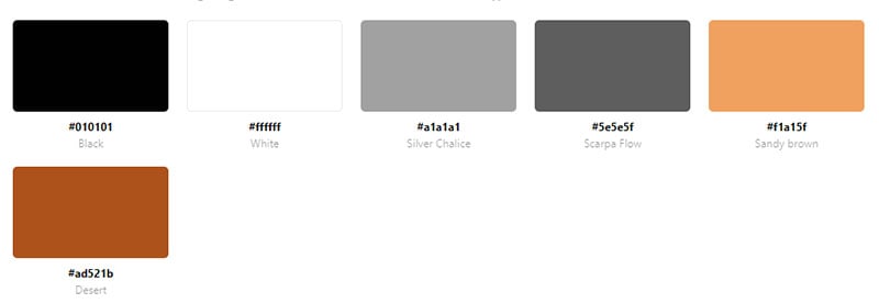
This website has an all-black background to draw the focus to the images. The white text below the images provides brief descriptions.
Hochburg. The Design Force
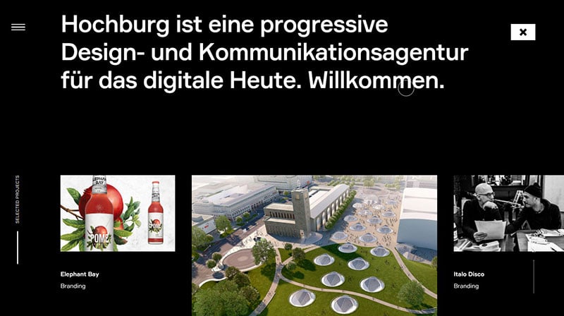
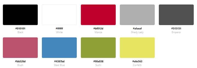
When entering the site the background color is black with contrasting white text. As you scroll down the colors reverse.
Glass
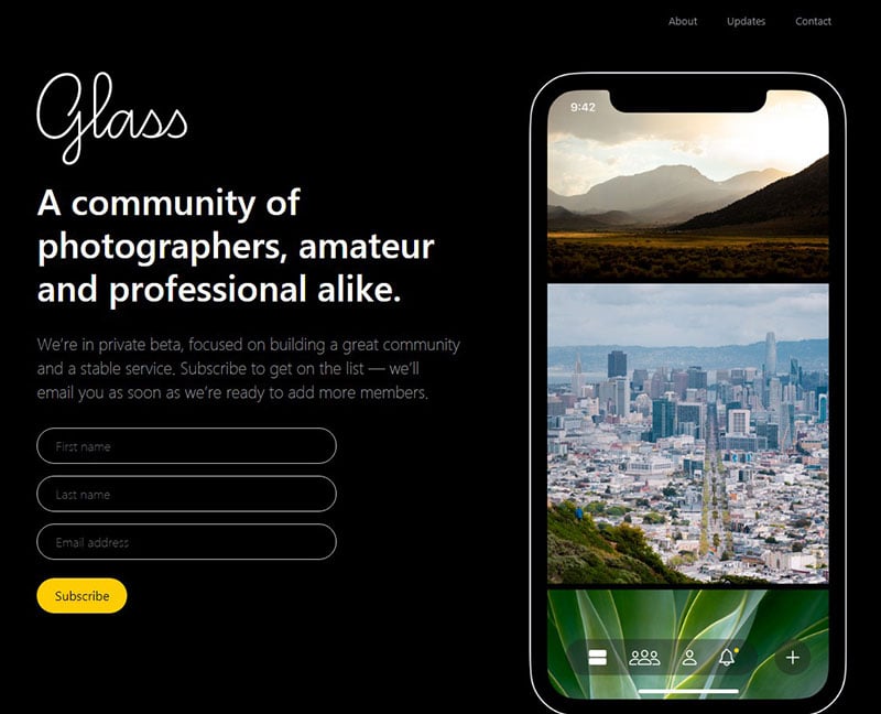
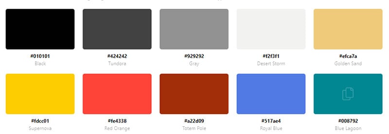
This website is a community of amateur and professional photographers. The black background and white text give this website a sleek style.
Maddad
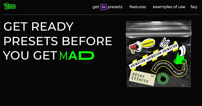
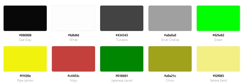
Maddad provides effects for text and animations. Their website uses a black background to showcase those effects. The majority of the text is white but alternates with other eye-catching colors like green and yellow.
CREATIVEPARK
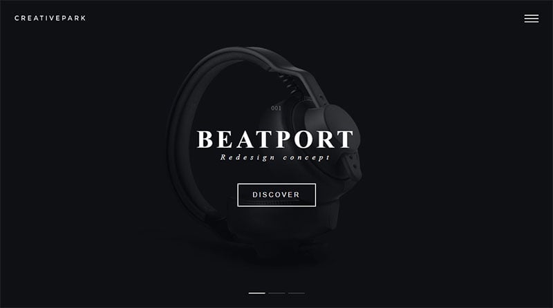

CREATIVEPARK uses a black and white website color scheme to create a sleek and mysterious feel.
Vorrel Prendergast Jr
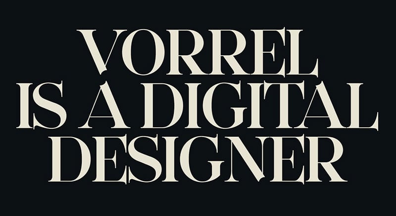
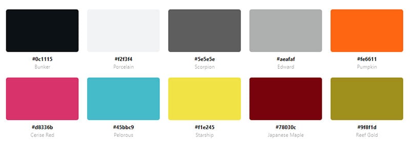
This website is the portfolio of a digital designer. Large white text on a black background greets visitors on entering the site. Scrolling down, the black provides a backdrop for the striking images.
Routalempi
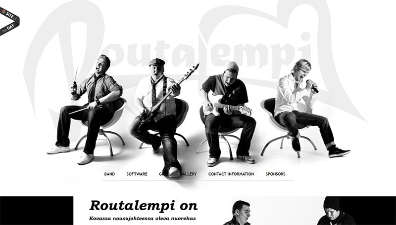
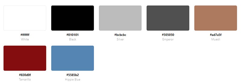
Routalempi opens to a black and white image of the band. The rest of the webpage uses a white background with a creative black font.
Boynton Yards
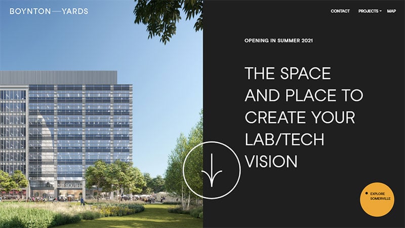
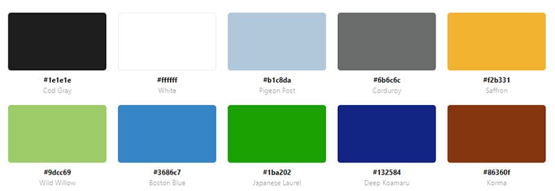
Entering the Boynton Yards website displays white text on a black background. Scrolling down the colors reverse. The black and white website color scheme maintains a simple and clean web design.
Pastel Website Color Schemes
Northstar
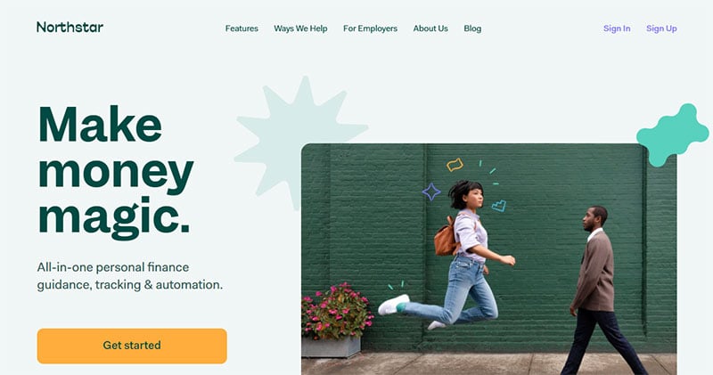
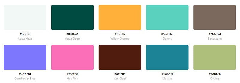
Northstar provides financial guidance, tracking, and automation. The website is very colorful with green, yellow, and a small amount of pink and blue.
HETIME
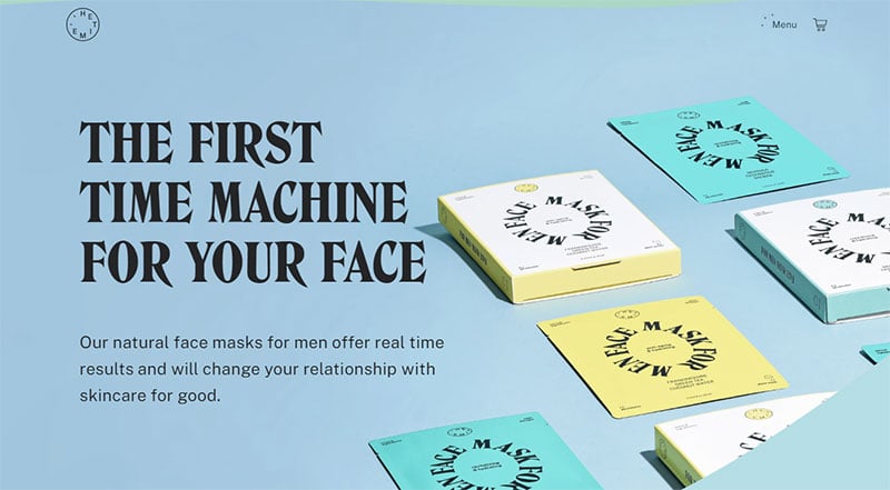
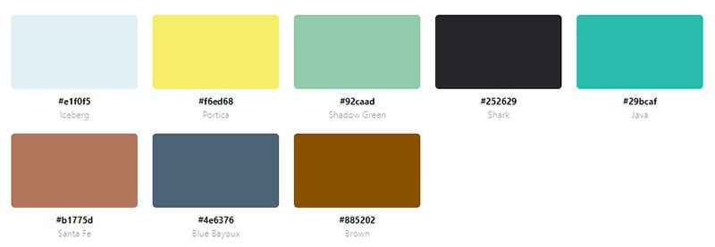
HETIME sells skincare face masks for men. Different shades of blue are used to appeal to their key demographic.
Mailchimp Presents
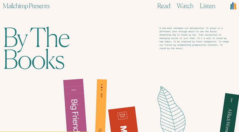
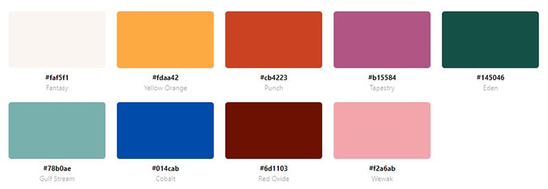
The background of this website is a soft lavender. Each book has a different color to give this website a pop of color.
Rideshur
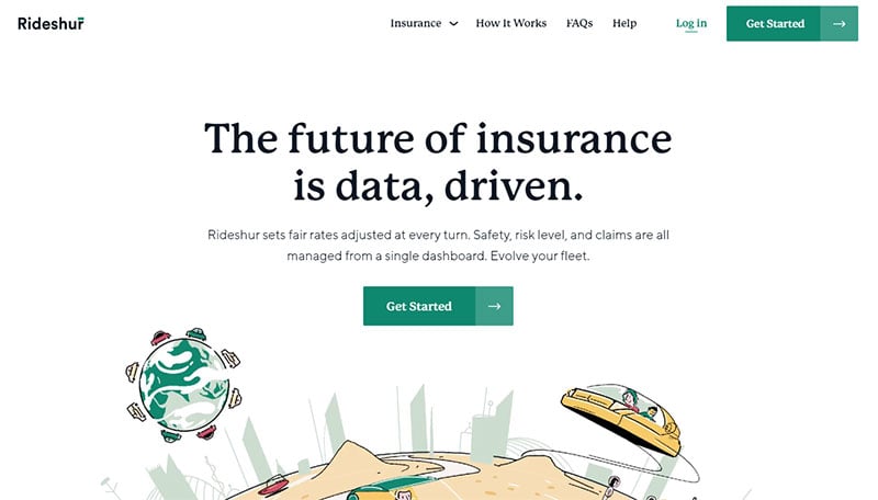
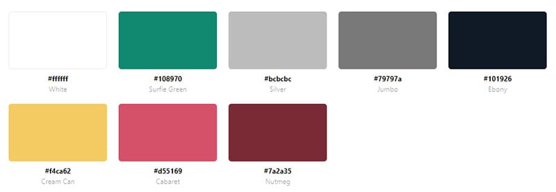
Rideshur is a website for fleet insurance. The web design is basic but the colorful animations set this website apart from others.
Hajinsky
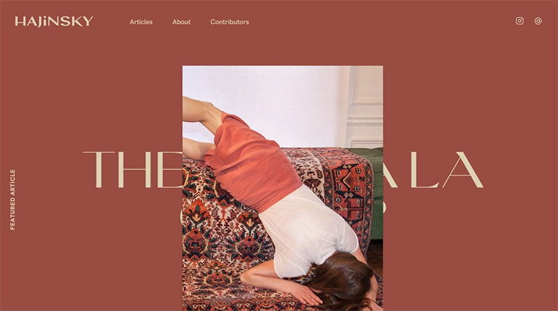
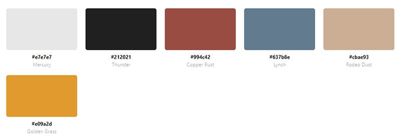
Hajinsky is a digital fashion psychology magazine. The webpage opens to a burnt orange color with an image featuring the same color. The rest of the website has a pastel blue background.
Ephraim Joseph
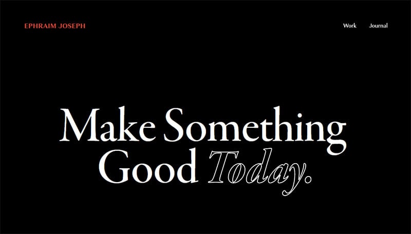
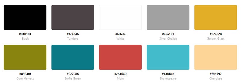
The landing page of this website displays a video with several pastel colors. Scrolling down, the website has a black background with white text.
Pinpoint

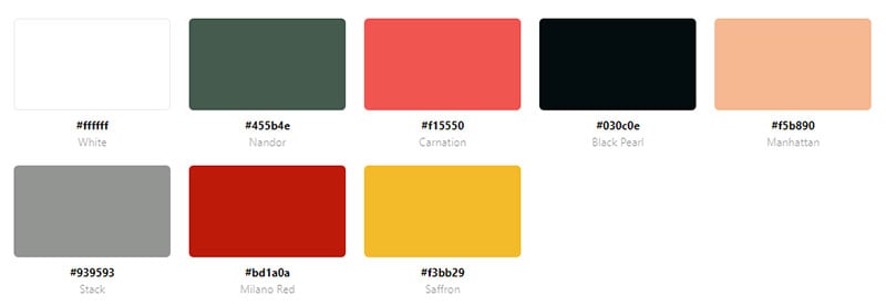
Pinpoint is a software designed to make the hiring process simpler. The website includes several splashes of color. The website color scheme includes green, peach, pink, and yellow.
Lunet Eyewear
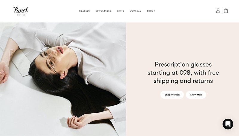

The background of Lunet Eyewear is white but the images of the eyewear have a pastel pink backdrop. Information is displayed in pastel blue boxes.
La Pierre Qui Tourne
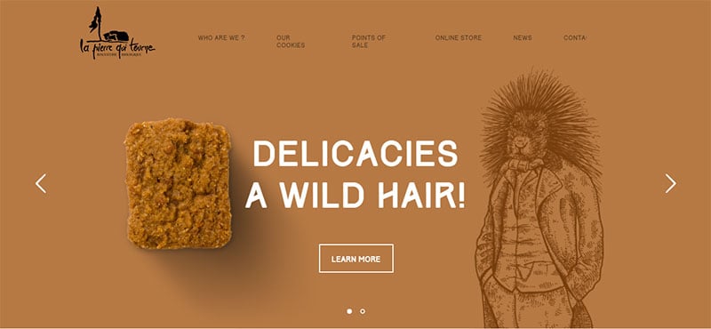
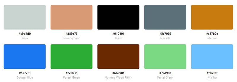
This website has a simple and pleasing design. The use of pastel green, pink, and yellow makes this a colorful website.
Overflow
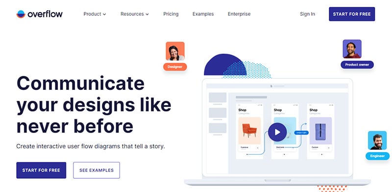
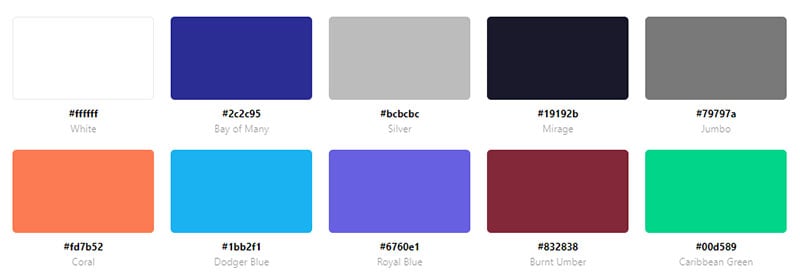
Overflow allows you to build interactive flowcharts. The website alternates sections with white and pastel blue backgrounds. The pastel blue creates a fun and happy feeling.
Two Create Studio
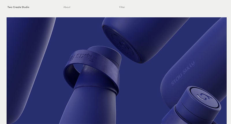
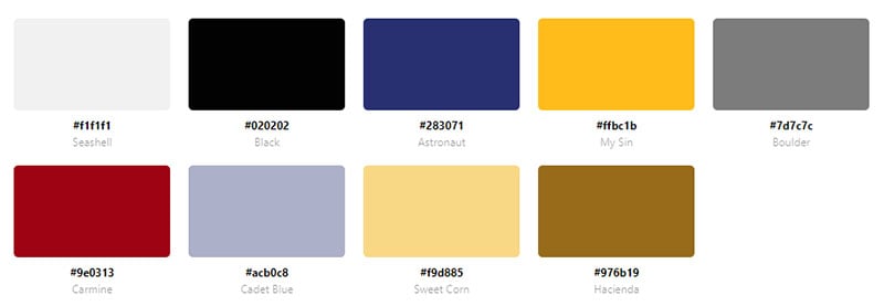
This website color scheme showcases the studio’s work in an organized and pleasing way. Several colors are used in this endeavor.
El Rayo Tequila
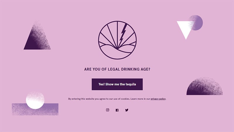
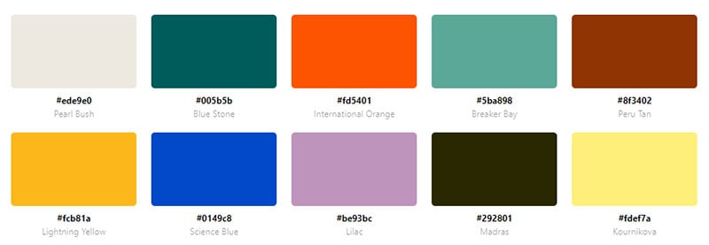
El Rayo Tequila uses many pastel colors to focus the attention on the tequila.
Origin
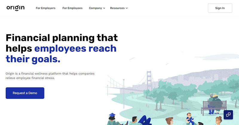
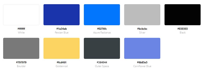
Origin uses a combination of pastel and bright blue in their animation. The animation creates a relaxing and peaceful feeling alluding to the success of this tool.
RuedaFilm

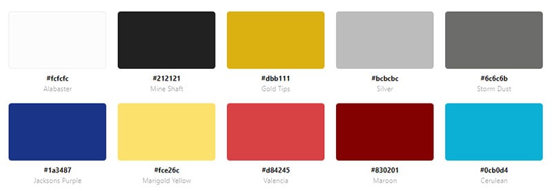
RuedaFilm puts more emphasis on written content. But the yellow color organizes the product reviews for easy navigation.
Sneaker Freaker
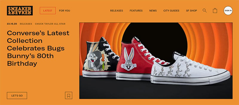
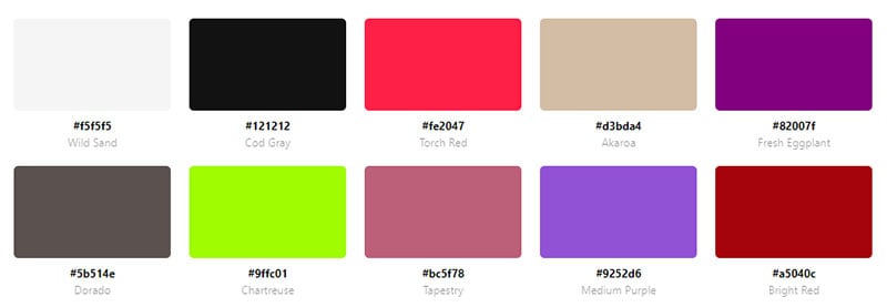
Sneaker Freaker contains a lot of information. The colors help the visitor distinguish one sneaker from the next one. The colors include pastel green, blue and pink as well as bright purple.
Sanne Wijbenga
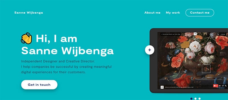
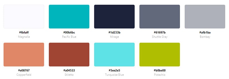
Sanne Wijbenga helps companies by creating digital experiences for their customers. The website has an appealing look with pastel blue and readable white text.
Color Combination Website Color Schemes
Helbak Ceramics
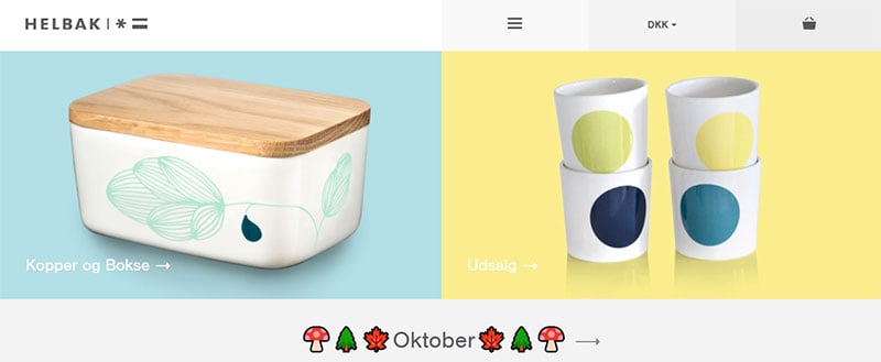
This website sells ceramics from Malene Helbak. The background colors highlight and complement the colors of the ceramics for sale.
Faculty
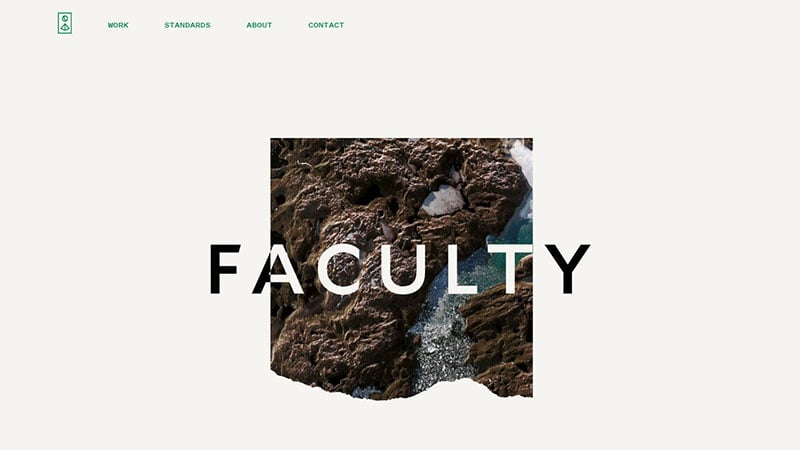
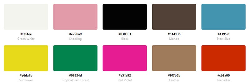
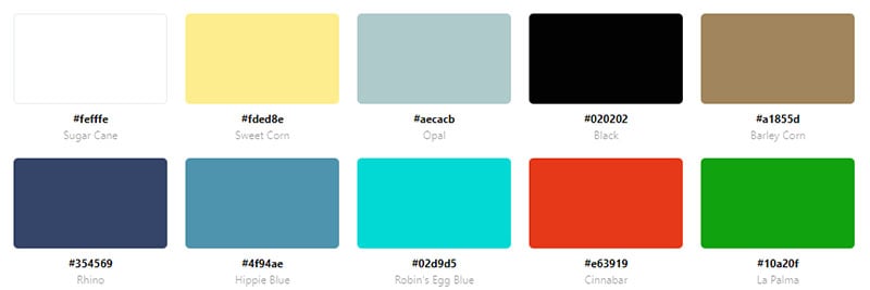
This website uses contrasting colors to make text stand out. It combines green, pink, and black to create a pleasing aesthetic.
Industry City
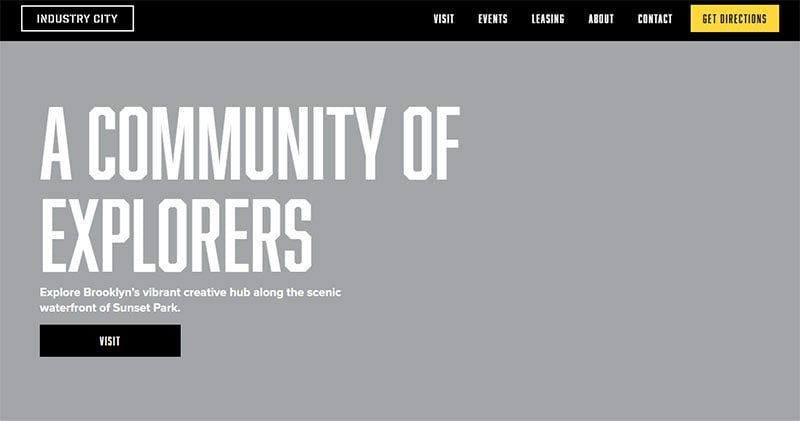
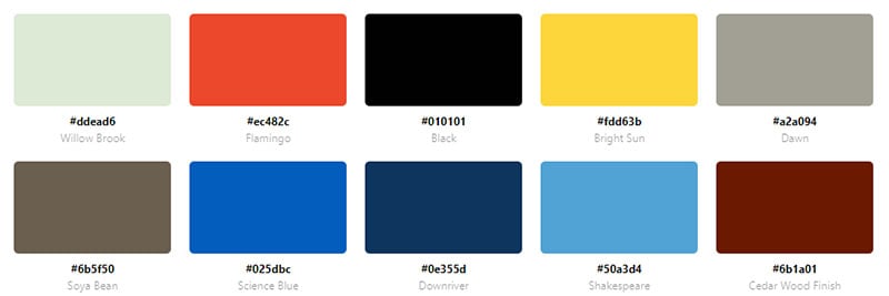
Industry City’s website uses a bright peach as its dominant color. A pastel blue and pink are also used.
Ayaka B. Ito
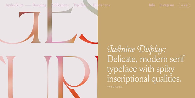
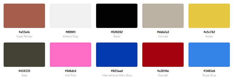
Ayaka’s website uses several colors. The colors separate the information into organized boxes to showcase Ayaka’s work.
Level
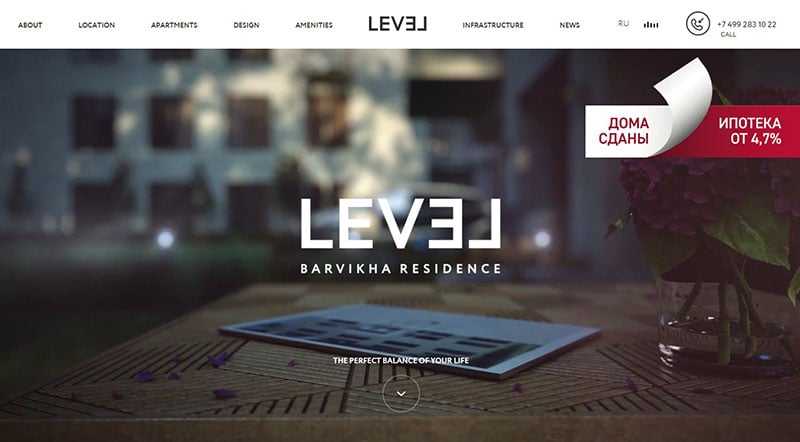
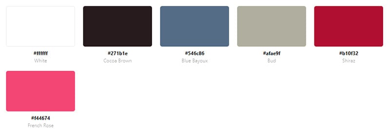
This apartment building offers a balanced living between a city apartment and nature. The website uses a split-screen to display striking images with vibrant colors.
Bizzon
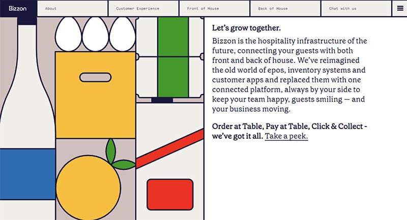
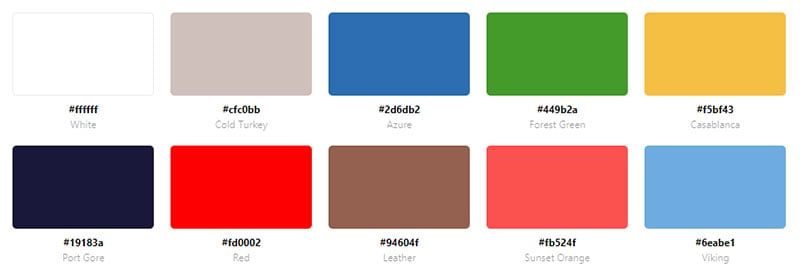
Bizzon uses green, yellow, red, and blue in the animations to create a colorful website. Using so many colors makes this website anything but boring.
Mollydooker Wines

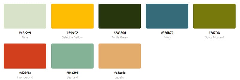
Mollydooker is a winery in Australia. Vivid images, graphics, animations, parallax effects, and many colors make this an exciting website like no other.
Quay Restaurant
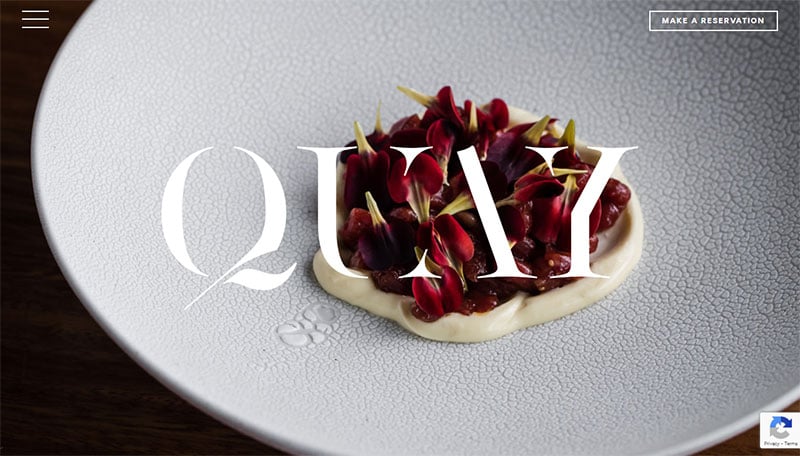
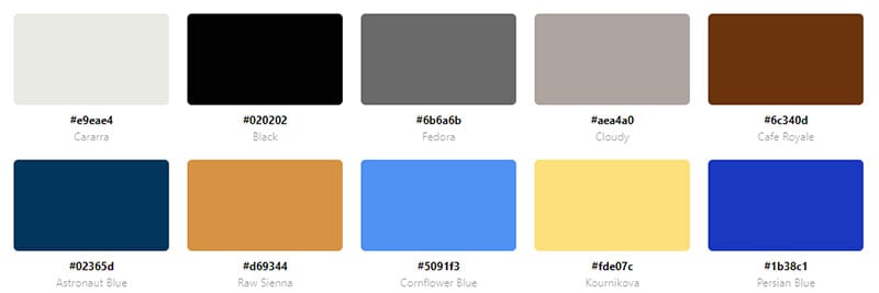
This website showcases one of Australia’s top restaurants situated in a stunning location. The webpage uses images so visitors can visualize the beautiful restaurant. Shades of blue complement the images.
Basium Fragrances
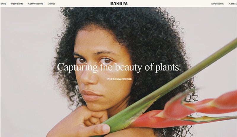
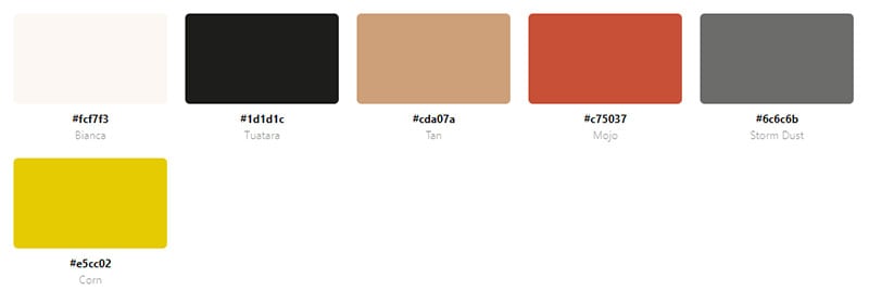
Basium Fragrances sell organic self-care products. To emphasize the gentleness of its products the website uses pastel blue and pink.
Wnder
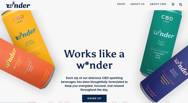

W*nder is a sparkling beverage infused with vitamins and CBD. The bottles are burnt orange, yellow, teal, and blue corresponding to the time of day you should drink it. Those same colors appear throughout the website creating an organized and appealing layout.
Tens Sunglasses
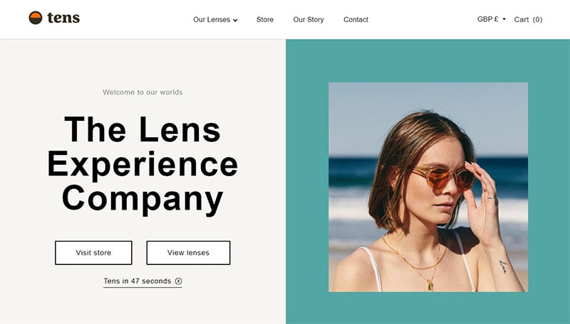
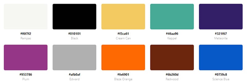
This website is a good example of combining colors to create an appealing aesthetic. Each section of the homepage has a different background and complementary color.
Animade
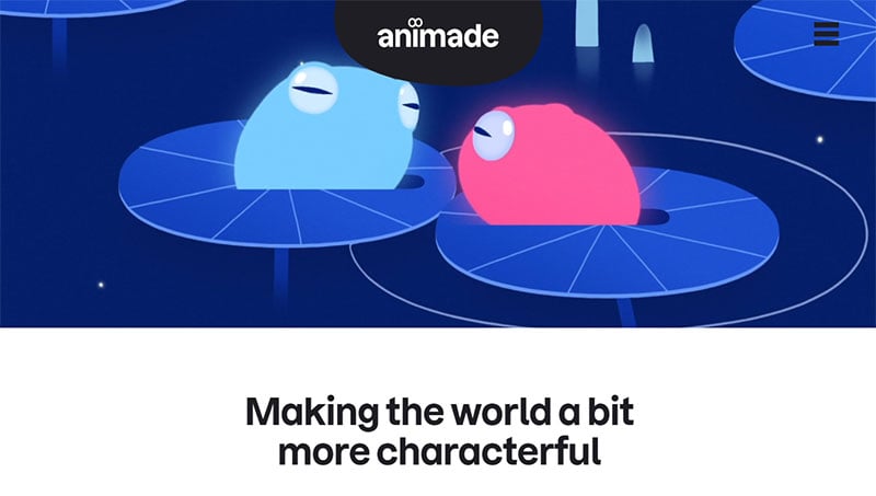
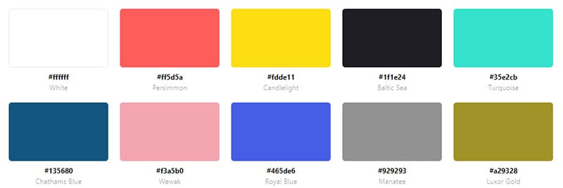
Animade is an animation studio. A video displaying their animations plays after entering the site. Each animation is full of color combinations and provides entertainment for the visitor.
Pablo The Flamingo

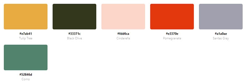
Pablo the Flamingo is a website that plays music and Pablo the Flamingo dances. The fact that this webpage is simple does not prevent it from combining colors to make an interesting style. Pablo, of course, is pink. He stands out in a yellow background and the logo is blue.
Finn

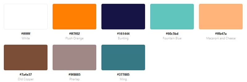
This website also uses a combination of several colors for its color scheme. Pink, light blue, dark blue, and orange all appear on this website.
Bonhomme
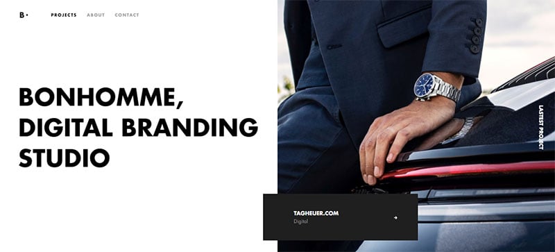
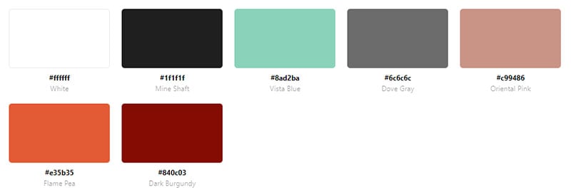
Bonhomme uses black and white for the most part. But a splash of turquoise gives this website the pop of color it needs.
Rainbo

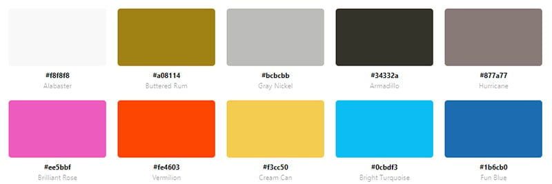
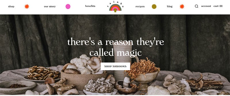
Rainbo is a medicinal mushroom company. The website uses a small amount of color. The color that it does use is a combination of several colors.
Shapefest
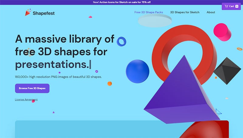
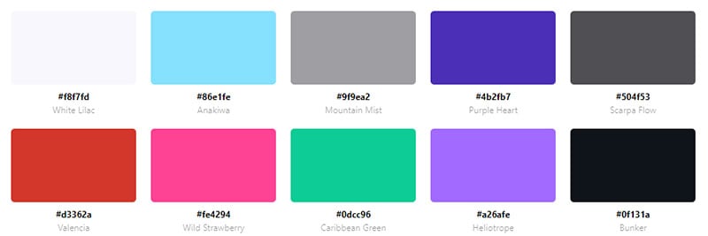
Shapefest provides a large library of 3D shapes for web design or anything else. The website displays some of the available 3D shapes in several bold colors.
Color Palette Generators
Selecting the right colors for your website is a big project that requires adjustments to get it just right. Creating a color palette takes time and effort. Using free online tools can streamline the process. These free color palette generating tools provide beautiful color schemes, help with text readability and shading:
Adobe Color CC
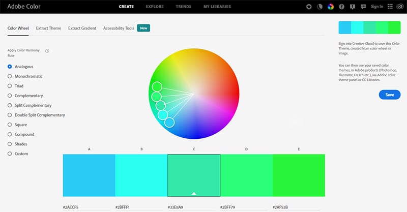
This site was formerly named Adobe Kuler. It is a free tool from Adobe that enables anyone to generate a color scheme. It can generate a stunning palette from a base color or from scratch. The website is detailed to help users find the best color scheme for their needs. If you have an account with Adobe you can save all your palettes to work on them later or share them with others.
Coolors
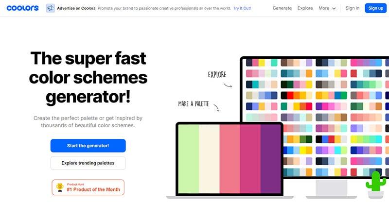
Coolors delivers cool color schemes for its users. Coolors presents ready-made customizable color palettes. Or hit the spacebar to have a new and random palette appear. Another option is to upload an image and Coolors will generate a color scheme based on that image. Users can copy the hex codes of their favorite colors to enter them into a logo maker.
Colormind
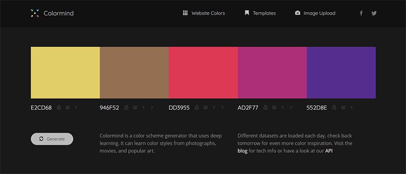
With this generator users are able to switch between a template or website design. Users can also choose between paper or material color designs. Colormind will provide beautiful color schemes based on an uploaded image. Another feature of this web app enables users to live preview their chosen color palette.
Paletton
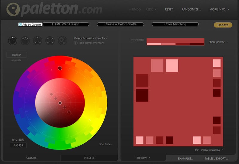
Paletton allows you to explore the color wheel. Choose monochromatic, adjacent, triad, tetrad, or a freestyle color scheme. Then choose a base color and the app does the rest by allocating the colors on the color wheel. This web app also allows you to explore the variations and hues of a selected color to create a monochromatic color palette.
Color Hunt
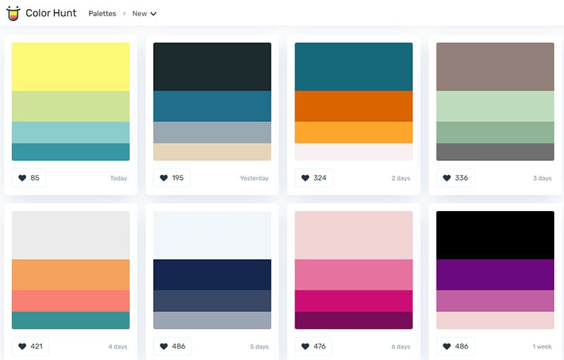
Color Hunt doesn’t show you a color wheel like our previous color palette tool but displays premade color palette options. There are so many to choose from that the options seem endless. Users can look through the preset palettes and save the ones that they like the most. Every day new color schemes are added to the site.
ColorDrop.io
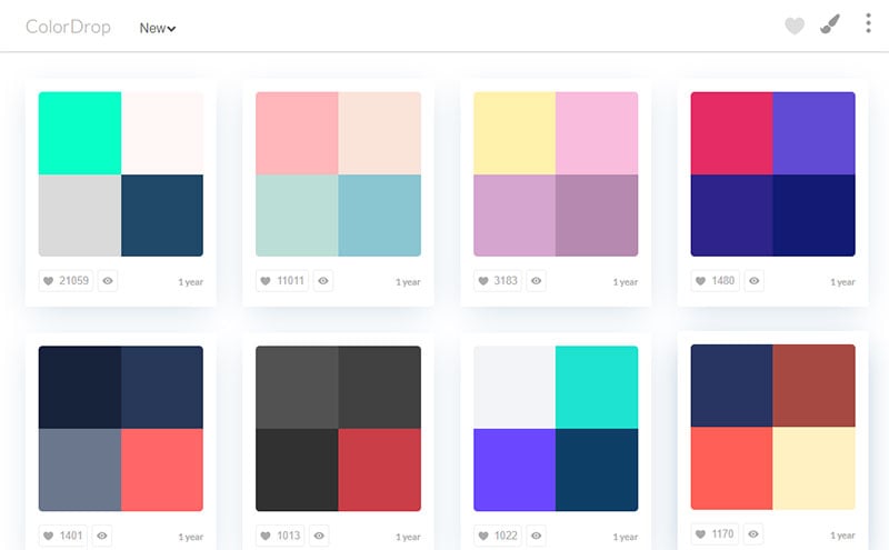
ColorDrop.io is a color palette generator best used for those who want a flat website design. Search through the color scheme options and save your favorites. Or find a specific color by typing it into the search box and the options containing that color will appear. This web app makes the hex codes available for you to use the colors immediately in your website design.
ColorSpace
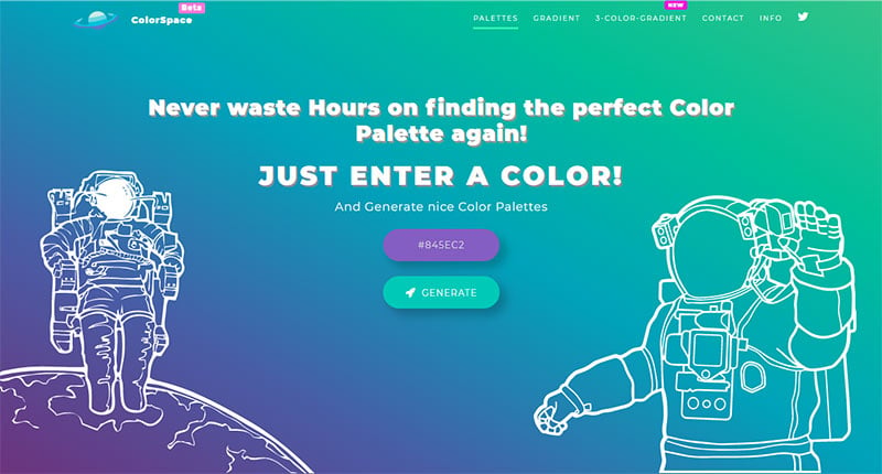
ColorSpace is another palette generator that provides several website color scheme options with one-click. Upon entering, the site visitors can choose a base color and then hit the “generate” button. The site will generate and display different color palettes with generic and matching gradients.
FAQs about website color schemes
Why are website color schemes important?
Color commands attention like nothing else. It’s a silent ambassador for your brand. Think mood board, think emotional impact. It sets the stage for visitor interaction, influencing how they perceive and engage with your content. Nail your color scheme, and you’re halfway to winning your audience over.
How do I choose the right colors for my website?
Start with your brand’s personality. Want to radiate trust? Go blue. Aiming for excitement? Red’s your best friend. Use a color wheel to find complementary colors and consider color trends for a modern vibe—just ensure accessibility standards aren’t overlooked. It’s a balance between aesthetics and function.
Can color schemes affect website conversions?
Absolutely, yes. A dash of color psychology goes a long way. Colors like orange can arouse action, compelling visitors to click that ‘Buy Now’ or ‘Subscribe’ button. Think conversion rates. Each hue comes with its unique persuasive power; harness it strategically within your UI design.
Does color contrast matter in website design?
More than you think. Color contrast isn’t just about beauty; it’s about usability. Pair colors for ease of reading; balance them to guide focus. It’s a key tenet of A11Y, ensuring inclusivity for all visitors, particularly those with visual impairments. It’s not just nice; it’s necessary.
How many colors should my website’s color scheme have?
Three to five is your sweet spot—a primary color that defines your brand, secondary colors for diversity, and neutrals for breathing room. Keep it simple with monochromatic design or stir in some variety with analogous colors. Too many and you’ll risk a visual cacophony.
What should I know about psychology in website color schemes?
Every color whispers its own tale—blue for tranquility, green for growth, black for sophistication. These aren’t just colors; they’re feelings and associations. Pick your palette with the story you want to tell in mind, and you’ll resonate with your visitors on a subconscious level.
Are there any tools to help create a website color scheme?
Heaps! Tools like Adobe Color CC help you conjure the perfect palette. Others, like ColorZilla, let you pluck colors right from your favorite sites. They go beyond HEX codes and RGB values, integrating color psychology, trends, and more into an interface that’s nothing short of wizardry.
Is it okay to use trendy colors in my website color scheme?
Trendy colors can refresh a brand, but tread lightly; today’s hot pink might be tomorrow’s passé peach. It’s all about timeless versus timely. Use trends as accents to inject vitality but anchor your scheme with evergreens. This way, your site stays chic sans frequent overhauls.
How can I use website color schemes to strengthen brand identity?
Your color scheme is a visual echo of your brand’s voice. Consistent use of colors across all touchpoints—logo, web, packaging—creates a cohesive identity. It’s your colors that often register first, paving the way for brand recognition and loyalty. Like a beacon, they signal your brand’s essence.
How do I test if my website color scheme works?
Real talk—test with real users. A/B testing different palettes gauges reactions to determine what sticks. Tools for web design color analysis suggest improvements, but the human element is pivotal. Monitor metrics, listen to feedback, and adapt. It’s a mix of science, art, and a smidge of intuition.
Conclusion
So we’ve journeyed through the vibrant landscape of website color schemes, uncovering the potential each shade carries and the profound effects they cast upon our digital visitors.
- We’ve embraced the power of color psychology, learning how subtle tweaks in hue can shape user perception and behavior.
- We’ve wielded tools like Adobe Color CC with the finesse of a painter, crafting palettes that resonate with brand identity.
- We’ve stressed the significance of accessibility—ensuring that our creations aren’t just visually pleasing but inclusively designed for all eyes.
As the curtain falls, remember that a website’s palette is more than a visual choice—it’s a strategic player in the grand scheme of user interaction. Approach it with care, blend it with intent, and watch as a spectrum of possibilities unfolds before your eyes—each color a key, unlocking potential and purpose on every page you design.
If you liked this article about website color schemes, you should check out this article about website footers.
There are also similar articles discussing minimalist websites, parallax scrolling, the cleanest website designs, and website animation.
And let’s not forget about articles on coming soon page design, modern website design, one page website, and creative websites.

Hey everyone! I really wanted to make my site by myself – taking into account my preferences. But I also wanted the design of my site to appeal to visitors. I have tried many patterns and combinations. Thanks for your advice guys! With this article, I found a solution that I really like!
This is the best resource I’ve found so far when it comes to color schemes applied to websites.
`
Thank you for sharing this.