

Web carousels have been an elegant way of connecting content together in a small, compact space. Not only do they look good, but they also save valuable website real estate at the same time.
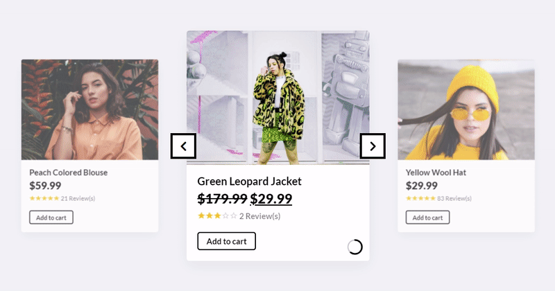
WordPress carousels can be especially helpful when you need to compare multiple offers or products. As an example, WooCommerce sites often incorporate carousels when recommending multiple products, showcasing an entire related selection of products without switching pages.
These carousels can be great tools for e-commerce websites that have little time to convince customers to buy. With these powerful tools, you can use many images within little space to impress your customers.
Trying to decide which clothes look good on you, your next nifty gadget, or which new kitchen appliance to buy is an exhilarating experience. A sleek carousel can make that experience even more fun and informative. Often it can be the final push for a website visitor to make a purchase.
But what are carousels? How should websites use them? This article will discuss website carousels in-depth, and it will show some great examples of websites with carousels. But first, what are carousels?
What Are Product Carousels?
Definition
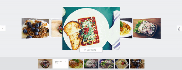
Often defined as slideshows, galleries, and sliders, website carousels let you showcase images, graphics, video, and text in one movable, “sliding” block. They act as a great option for connecting ideas and content, as they let you connect visual relationships between multiple pieces of content.
How Product Carousels Work
Web designers often use carousels as an easy-to-use, elegant, and space-saving way to demonstrate content with more interactivity. They also can be a great way to keep visitors engaged with your page’s content and encourage them to learn more about your products.
Carousels can be easily incorporated into demonstrations for detailed product shots. Doing so gives shoppers more options when viewing your products, as they gain access to extra perspective shots when deciding whether or not to purchase.
Best Practices for Creating Product Carousels
Different websites will design their carousels differently. Some businesses rely on spur-of-the-moment purchases, while others rely on more consistent purchases over time.
As an example, customers often buy luxury apparel and kitchen appliances on quick whims, so vendors, therefore, rely on a good visual first impression. This is why it’s vital to include an inspiring, realistic, and clear view of the options available. Carousels can help users decide between an array of choices, while also leaving the decision-making in the customer’s hands.
It’s also important to connect your customers with their interests, and an effective WooCommerce product slider can do just that. Using WooCommerce, you can design product sliders around your customer’s individual tastes.
Here are a couple of extra tips when building your product carousel:
- Conduct placement experiments. Try to find a location on your website where your carousel will be most effective. To accomplish this, you may need to use A/B tests to find the best possible placement.
- Add user-generated content. Customers are the best marketers you can hire, and they’re free! Ask your customers to post their experiences with your brand on social media using a specific hashtag or thread.
- Adjust to mobile screens. Many of your shoppers will be using their phones or tablets when browsing your products. Your goal should be to design a product slider that can help all of your clientele, not just those on a laptop.
- Highlight special deals. Instead of letting your customers search for deals on their own, you should help them in their search. You can do this by showcasing your limited-time offers on your product carousels.
- Add a shopping cart button. If you include an add-to-cart button in your product carousel, your customers won’t need to worry about switching tabs to purchase. When facilitating an easy buy, try to take away any unnecessary steps for your clients.
Types of Product Carousels
Regardless of your audience or industry, website carousels can be the difference factor for your business. This isn’t to say, though, that each carousel will work for everyone. There are some styles of carousels that are more effective for certain businesses.
Although it could be said that there are thousands of types of carousels on the web, they all break down into the same building blocks. When broken down, a web carousel will be formed by these components:
- Container: Although it’s pretty self-explanatory, it’s still an important part of any carousel. A container simply refers to the space on a page that a website carousel occupies.
- Slide: All carousels are made up of multiple slides. These slides could include content such as photos, visuals, videos, text, calls to action (CTAs), or links.
- Navigation: Navigation refers to the UI elements that allow users to move from one slide to the next. These navigation cues can look like dots, arrows, text, or any other symbol you can think of.
- Animated transitions: Often carousels will include animations or effects to signal the movement of slides. Although it’s not necessary for all carousels, a good animation can have an important effect on customers’
Advantages of Product Carousels Over Traditional Product Displays
There are many contexts in which carousels are useful, but that doesn’t mean they should be placed willy-nilly. They need to be implemented with performance, usability, accessibility, and most importantly, a goal in mind. Try to think carefully about what you want from your website before using a carousel as a crutch. Here are some examples of contexts where carousels are effective.
- When helping customers compare products. A carousel banner can give clients a wide range of sight on multiple products at once, which can help them compare and decide on a purchase more quickly. If you have the goal to showcase specifications, technicalities, or other product info to your clients at a glance, then a carousel can help.
- When the layout is mostly visual. Including rotating images can be a great advantage when your website includes little text, with more emphasis on visual elements.
- When it helps in cross-selling. If you want to suggest multiple complementary products to increase their order value, then a product carousel is what you need. In reality, this is what Amazon uses to convince customers to buy other relevant products when ordering singular items.
Benefits of Using Product Carousels

Product carousel sliders are both visually attractive and proven to increase profits. If you implement them wisely, they can act as powerful engagement tools, and they can increase customer retention rates regardless of your industry or clientele.
Today’s largest worldwide corporations—like Netflix, Amazon, Toyota, and Spotify—use carousels often, and millions of smaller or mid-sized businesses also choose to utilize them. In general, they are a great and easy way to catch users’ attention, promote products or services, and enhance users’ experiences.
Here are some of the main benefits of using carousels.
Better Organization
A carousel slider can easily organize an album of grouped images, products, or even multi-stepped processes.
Carousels do this by organizing your products within individual categories. Instead of overloading your customers with a large grid with thousands of items, carousels group products into simple rows such as “best rated,” “most popular,” and “on-sale.”
Increased Engagement
Carousels can hit that sweet spot between single images and long lists of items. You can use them as quick, actionable hooks that leave your clients wanting more.
Websites are constantly fighting to keep your attention, and good carousel website design can engage your visitors for much longer than a simple image. Needless to say, carousels will likely become a necessary element for effective web design.
Improved User Experience
Using a carousel, you can improve your customer’s experience by facilitating easy movement and providing more information.
Carousels also help keep customers interested by organizing the page and making it more visually attractive. As a result, carousels can be a great way to keep website visitors coming back.
You can even further optimize your carousel design by tracking users’ interactions, and then use that data to improve your site in the future.
Increased Visibility
By combining attractive photos with necessary details like prices, carousels can offer immense value.
Although words are helpful, pictures can prove to hold much more value when people scroll through products, places, people, or food.
Implementing Product Carousels on Your Website
Are you ready to let clients engage actively with your store the second they enter?
You can start by designing an engaging product carousel using the Slider Revolution plugin.
This section will now discuss how to implement a product carousel on your website. If you want to follow along, you will have to download the Slider Revolution plugin. But don’t worry, you will get good use out of it.
As an idea, this concept would be a good way to design a hero image. Not only would it let you show off your most popular products, but it would also highlight their versatility and value.
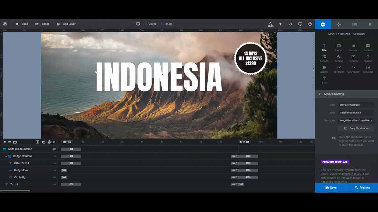
Step 1: Update the Background Image for Each Slide
To start, you want to focus on the background image of each slide. While replacing one image for the next is simple for Slider Revolution, creating a background takes a little bit more work.
To do this, select “Slides” on the toolbar and click on the first slide to begin. After that, select “Slide Options” and “Background.” From there, you can select the media library and enter your background image.
Step 2: Replace the Traveler Graphic
The “Traveler” layer is an always visible effect on the product carousel. To make this effect possible, you need to place the graphic as part of the “Global Layers” of the carousel template.
To do this, select the “Slides” option on the toolbar and click on “Global Layers.” From there, you will find a list of layers separate from the list you see in your slides. Next, input the “Traveler” layer, and you’re done!
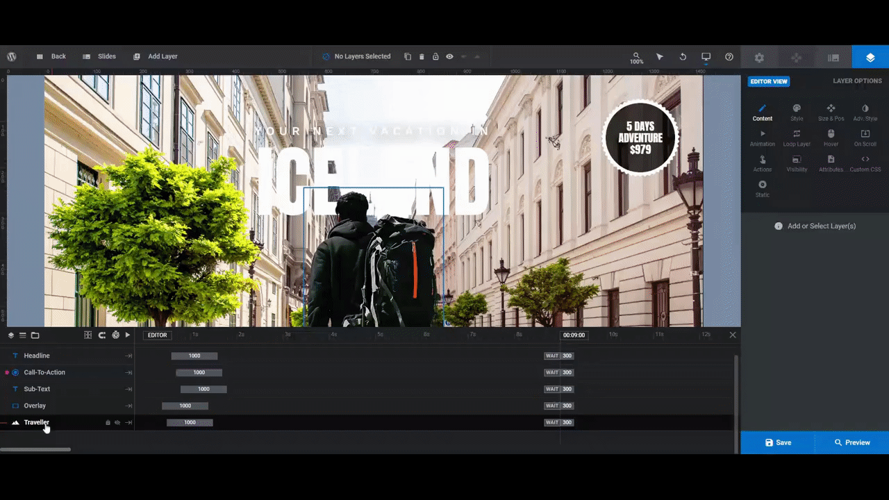
Step 3: Edit the Text and CTA in the Global Layers
While you’re still in the “Global Layers” tab, try to edit the rest of the layers to fit your carousel design before moving back to the other slides. Best to save time when you can.
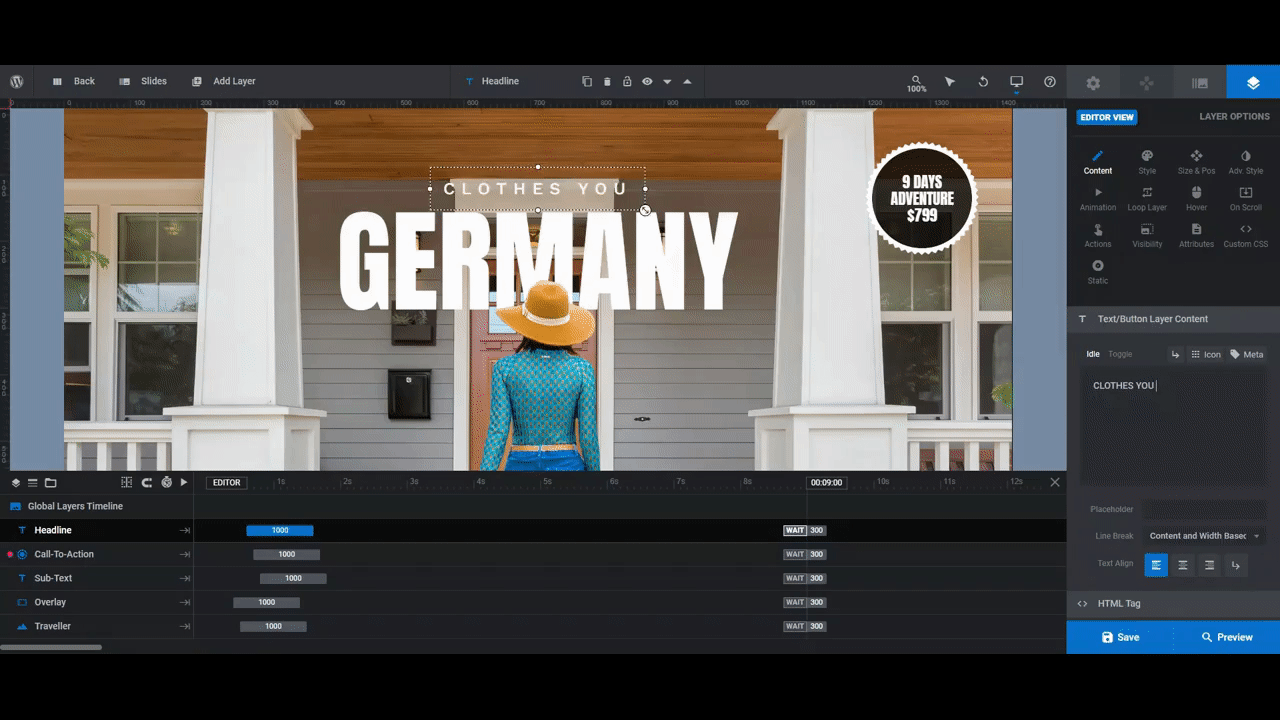
There are four layers here that you will need to edit:
- The Overlay
- The Sub-Text
- The Call-to-Action
- The Headline
Step 4: Edit the Location Text in the Slides
Once you have finished editing the “Global Layers” tab, you can go back to the slides and finish up your carousel.
There, you can add all the information you want clients to see when browsing your carousel content.
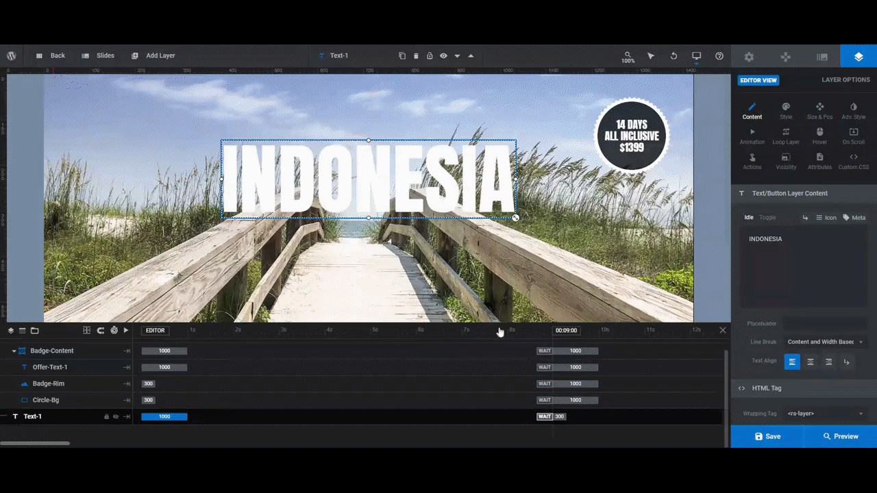
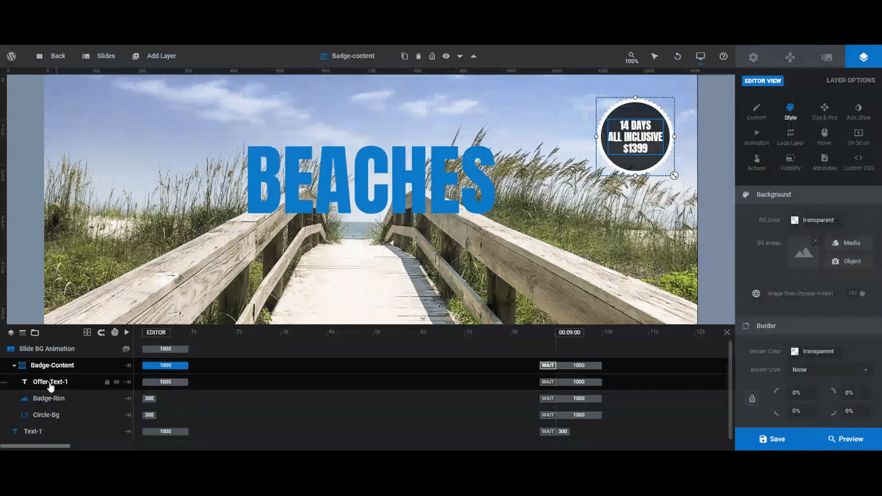
Step 5: Update the Spinning Badge
The last step in editing this template involves the spinning badge in the top-right corner of the carousel. It includes a small group of layers titled “Badge-Content” and multiple images or slides of their own. Each slide is comprised of three components to edit:
- Circle-Bg
- Badge-Rim
- Offer-Text-1
This is just a quick summary, though. You can check the whole tutorial on how to create an engaging carousel for a more detailed walkthrough.
Examples of Websites With Carousels
Amazon
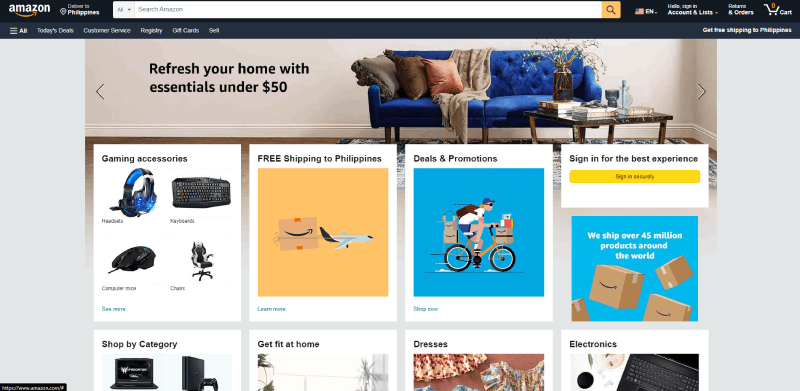
Much like other product-based businesses, Amazon utilizes many horizontal carousels to display its products without taking too much space.
And they use more than just simple homepage carousels; they also use many sub-page carousels to build consistency throughout their website.
Bahama Bucks
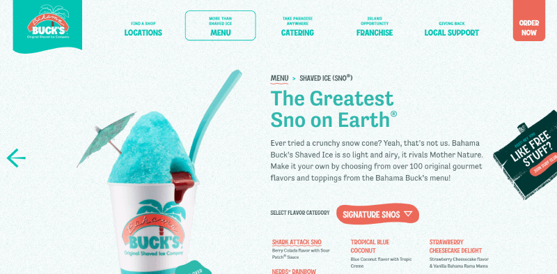
Out of all the examples on this list, Bahama Bucks has the most vibrant and lively website to date. They use a refreshing color scheme throughout their website, and this includes their carousels as well. When designing an image carousel for your own website, try to follow a color scheme to build your brand.
Netflix
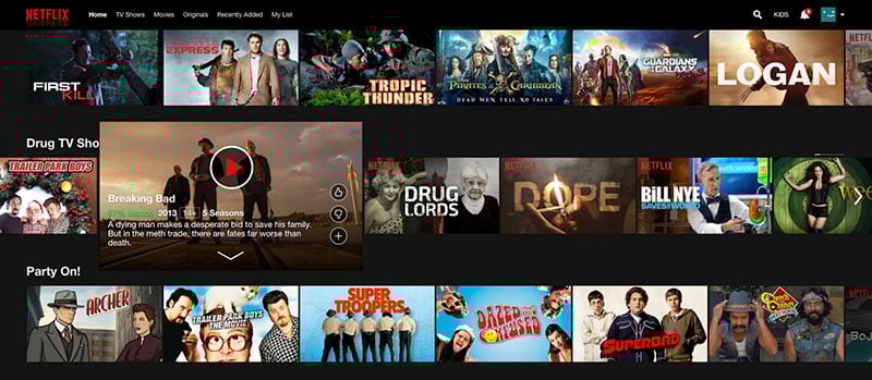
Netflix uses multiple horizontal carousels to provide viewers with a vast way to slide through movies within different genres and categories. It’s a good example of using a simple carousel UI to help users easily navigate the content of a website.
IKEA
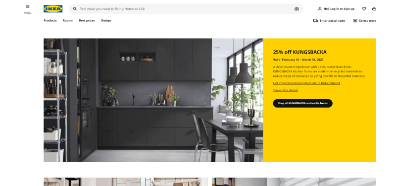
Ikea is well known for its large quantity of high-quality furniture, which can easily cause problems for a simple website. Ikea solves this problem by utilizing organized carousels to help clients find what they’re looking for in just seconds.
Dreamworks

Dreamworks uses an eye-catching homepage carousel to market their newest movie. The entire page acts as a full-screen carousel that moves from slide to slide. This creates a unique experience for users and drives visitors’ attention toward their newest movie. Images snap perfectly and quickly into view to create an immersive experience.
Orizaba Original
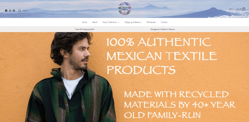
One of Orizaba Original’s greatest strengths is its large selection of products. The designer of this site believed, quite wisely, in fact, that visitors should be shown this strength early in their shopping journey.
They do this by switching the image of each product to a different view whenever the user hovers their mouse over it.
This not only keeps clients engaged, but also maximizes the small area of space allotted for each product. It’s easily one of the most unique carousel examples on this list.
LookBook Carousel Design
LookBook Carousel is an interesting carousel concept created with fashion websites in mind. Instead of the common, horizontally formed carousel, LookBook instead auto-plays vertically. Although they are uncommon, vertically rotating designs can facilitate visitors to view your products effectively.
Men’s Wearhouse
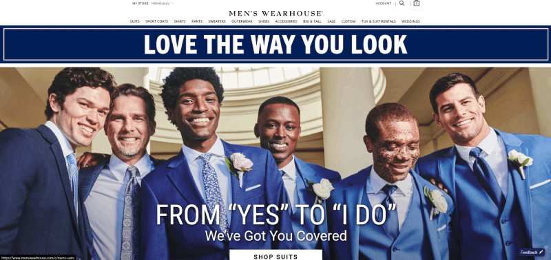
Men’s Wearhouse uses sliders to create a vertical website carousel that displays their best-selling products. It’s also a great example of user-based e-commerce (mentioned earlier) in action. Using this, you can display a wide array of products within a category that interests your viewers, and showcase different product types in categories like new products, best selling products, or random products.
Newegg
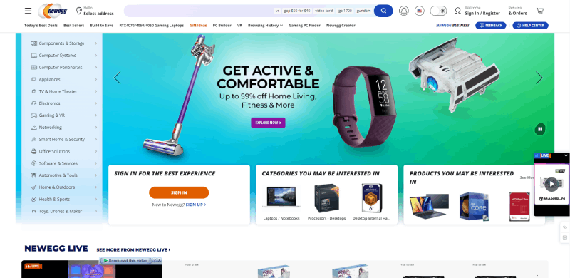
With loads of different computer parts to sell, Newegg uses many compact sliders to let visitors see them all. They even leave space afterward for a featured products carousel. Out of all the websites with carousels on the market, this one is the most condensed and efficient one you will find.
Au Lit Fine Linens
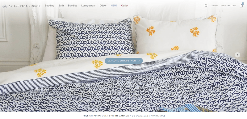
This website uses an elegant link carousel that gives visitors more ways to move around its other pages. Instead of using a carousel to showcase individual products or categories, this website uses carousels as a “link sandbox.”
Apple Store
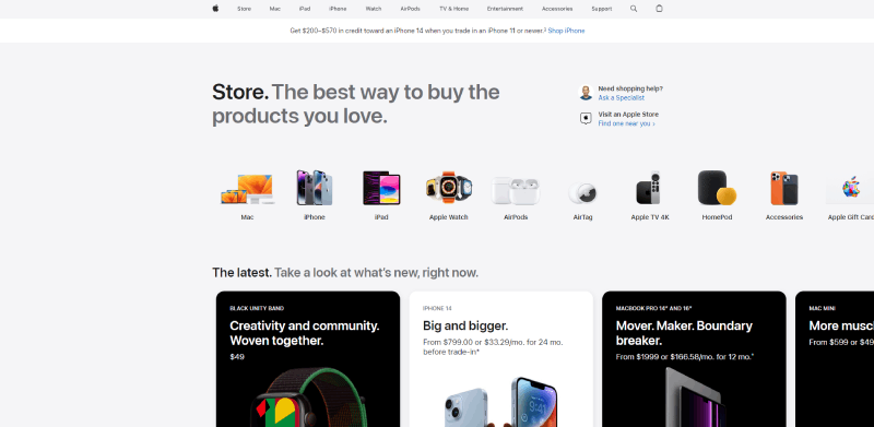
Carousels can be found everywhere, and Apple is no exception. To start, the Apple Store greets you with a visually appealing product carousel that draws customers in. From there, the store also uses a color carousel that lets you compare the separate color options of the product you’re interested in.
Toyota
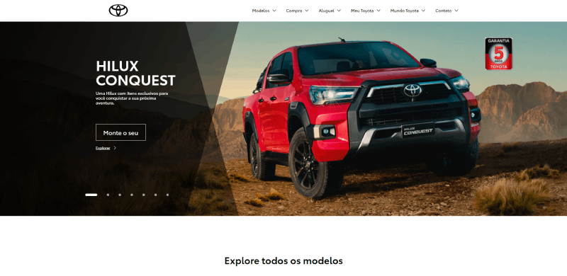
The official site for Toyota Motors Brazil uses a very simple yet effective card carousel that includes a product showcase, CTA buttons, text introductions, and arrows. After visitors enter the site, this carousel will begin its rounds, showcasing different brand concepts and products.
What’s Better About Websites With Carousels?
Now that you know how a web carousel works and what makes a good carousel, and you’ve looked at some real-world examples, you’re ready to begin designing your own websites with carousels. If you’re still on the fence about carousels as a whole, here are some final points about why carousels can help your website.
First of all, carousels are great at displaying a lot of information without taking up much space on the screen. They also keep your visitors engaged and build interactivity within your website. Just try to not go overboard and overuse them. While many audiences enjoy carousels in moderation, too many of them will annoy visitors and take away the appeal. To fight this, try to consider which features your audience needs and how to keep your carousel UI useful.
To maximize your carousel efficiency, make sure that each slide is short and sweet. Also, try to fill it with your highest quality content to catch and maintain your visitor’s interest for longer. Once you’ve implemented a healthy number of carousels into your website, no doubt your lead retention and sales will increase.
If you liked this article about websites with carousels, you should check out this article about mobile carousels.
There are also similar articles discussing carousel UX, Owl Carousel, product carousels, and testimonial carousels.
And let’s not forget about articles on carousel sliders, Bootstrap carousels, ecommerce sliders, and parallax sliders.


