Table of Content
Support
Weatherbit in no way endorses or provides support for Slider Revolution or the Slider Revolution Weather add-on. Please click on the button below for help from our experts at https://support.sliderrevolution.com.
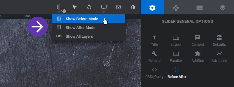
View Switcher
Switch between modes when settings up your Before and After views
Module Settings
Icons
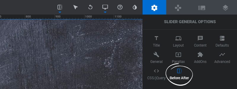
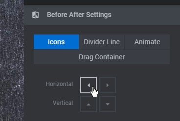
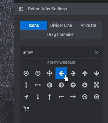
Arrow icons are available for the horizontal and vertical drag bars. Click one of the icons to change it to another.
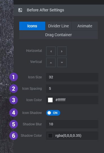
1. Icon Size
The font-size of the drag arrow icons.
2. Icon Spacing
The space between the drag arrow icons in pixels.
3. Icon Color
The drag arrow icons color.
4. Icon Shadow
Choose to add a CSS text-shadow to the drag arrow icons.
5. Shadow Blur
The blur value for the Icon Shadow.
6. Shadow Color
The color of the Icon Shadow.
Divider Line
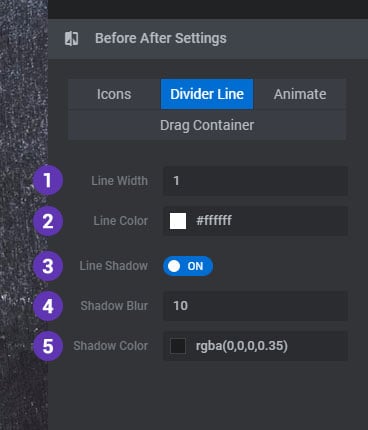
1. Line Width
The width of the divider line in pixels.
2. Line Color
The color of the divider line.
3. Line Shadow
Add a CSS box-shadow to the divider line.
4. Shadow Blur
The blur value for the divider line shadow.
5. Shadow Color
The color of the divider line Shadow.
Animate
1. Animate on Stage Click
Automatically move the divider line view to the point wherever the Module is clicked.
2. Duration
The total time the click animation will take place in milliseconds.
3. Easing
The easing equation for the click animation.
4. Mouse Cursor
The CSS cursor to use when hovering the mouse over the Module.

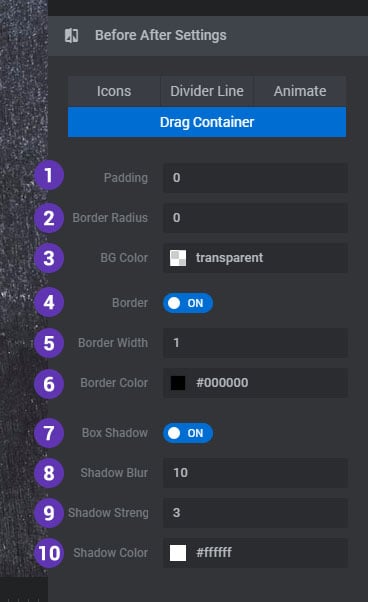
Drag Container
1. Padding
Space for the drag arrows container.
2. Border Radius
A CSS border-radius for the drag arrows container.
3. BG Color
The background color for the drag arrows container.
4. Border
Add an optional border for the drag arrows container.
5. Border Width
The border size for the drag arrows container.
6. Border Color
The color of the drag arrows container border.
7. Box Shadow
Add an optional CSS box-shadow to the drag arrows container.
8. Shadow Blur
The blur value for the drag arrows container box shadow.
9. Shadow Strength
The strength of the shadow for the drag arrows container box shadow.
10. Shadow Color
The color for the drag arrows container box shadow.
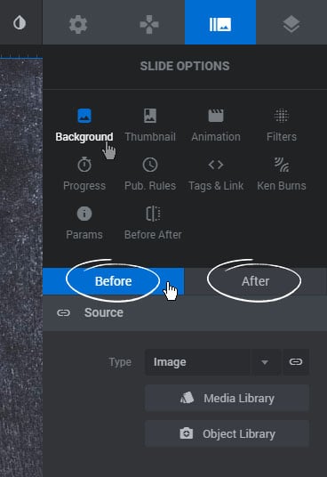
Slide Background
Set a Main Background for both the Before and After Views
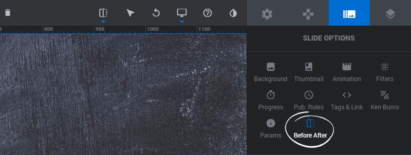
Slide Settings
General Settings
1. Active
Enable the Before/After AddOn for the current Slide.
2. Direction
Choose if the views should be split side by side or on top of one another.
3. Init Split
The starting point of the Before/After view whenever the Slide is shown.

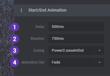
Start/End Animation
1. Delay
A delay in milliseconds before the Before/After views take their initial starting place.
2. Duration
The total time the initial animation will take place.
3. Easing
The easing equation for the initial animation.
4. Animation Out
Choose if the Before/After views should fade out or “collapse” (reverse the start animation) when the current Slide changes to the next.
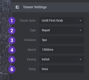
Animate the arrows to give the user a hint that they can be dragged.
Teaser Settings
- Infinite Loop
Animate the arrows continuously. - On Initial Reveal
Animate the arrows briefly when the Slide is first shown. - Until First Grab
Animate the arrows until the user first interacts with the Before/After views.
Choose “Repel” or “Attract” to determine the bounce direction for the animation.
3. Distance
The amount of pixels to animate the Arrows away from each other.
4. Speed
The total time the animation will take place in milliseconds.
5. Easing
The easing equation for the animation.
6. Delay
A delay in milliseconds before the animation begins.
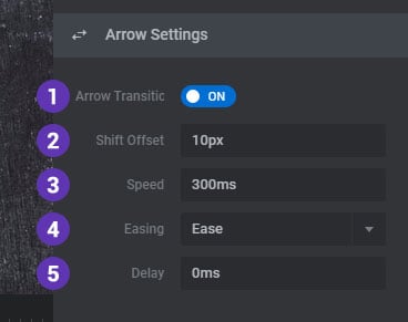
Arrow Settings
1. Arrow Transition
Enable a hover transition for the drag arrows on mouse-over.
2. Shift Offset
The amount of pixels to animate the Arrows away from each other.
3. Speed
The total time the animation will take place in milliseconds.
4. Easing
The easing equation for the animation.
5. Delay
A delay in milliseconds before the animation begins.
Layer Settings
Select a Layer on the editing Stage and choose if it should be place in the Before or After view.
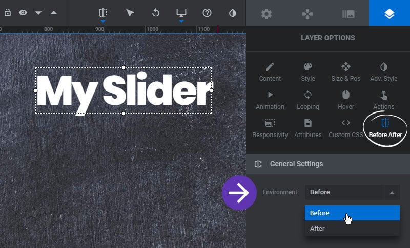
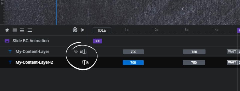
Layers will then have a “B” (Before) or “A” (After) designation in the Timeline Editor, and the crossed-out eye icon will signal if the Layer is visible on the editing stage or not depending on the editing view.
