
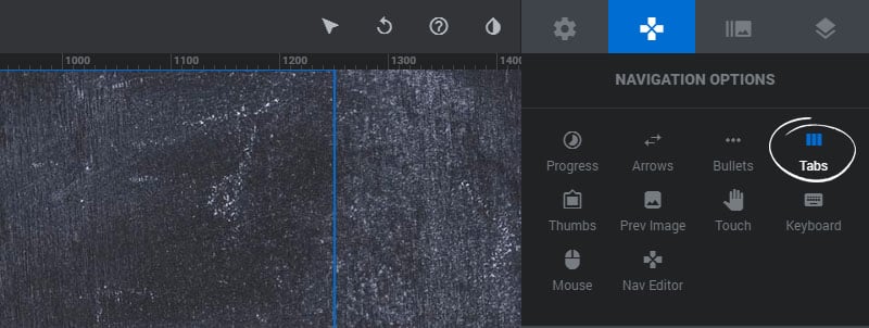
Table of Content
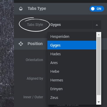
Tabs Type/Style
Choose a predefined style for the Tabs.
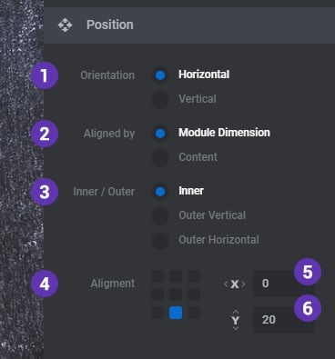
Position/Alignment
1. Orientation
Choose “horizontal” to place the Tabs beside each other, and “vertical” to stack the Tabs on top of one another.
2. Aligned By
Choose “Module Dimension” to align the Tabs to the entire module, or “Content” to align the Tabs by the Content Layers Grid.
3. Inner/Outer
Choose if the tabs should be placed inside or outside of the main Module. Then if outside, choose if they should be be started on top of one other (vertical) or sit side-by-side (horizontal)
4. Alignment
Set the position of where the Tabs should be placed.
5. Offset X
A horizontal margin from the Tabs alignment position.
6. Offset Y
A vertical margin from the Tabs alignment position.
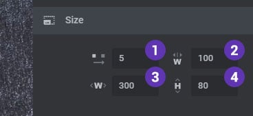
Tabs Size
1. Spacing
The spacing in pixels between each Tab.
2. Min. Width
As the Module is resized the tabs will also resize, but the width will never fall below this number.
3. Max. Width
The default width for the Tabs when the Module is scaled to 100%.
3. Height
The default height for the Tabs when the Module is scaled to 100%.
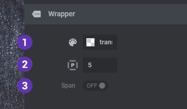
Tabs Wrapper
The Tabs wrapper is the outer div container that the Tabs are placed inside.
1. Background Color
The main background color for the wrapper.
2. Padding
The space between the tabs and its outer container in pixels.
3. Span
Choose “On” to stretch the wrapper to the full width of the Module, and “Off” to display the tabs as an inline-block.
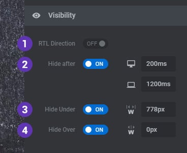
Visibility
1. RTL Direction
Enable this option is your website’s uses a right-to-left language.
2. Hide After
Choose to hide the navigation after a set amount of time on desktop and mobile devices when the user’s mouse is idle.
3. Hide Under
Choose to hide the navigation under a certain screen width. Useful for deploying multiple navigation elements (arrows, tabs, etc.) for different screen sizes.
3. Hide Over
Choose to hide the navigation over a certain screen width. Useful for deploying multiple navigation elements (arrows, tabs, etc.) for different screen sizes.
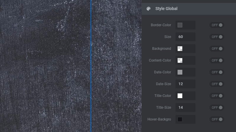
Default Styles
Styles adjusted here will apply globally to the Tabs for all Slides. Styling options will vary based on the Tabs Type preset.
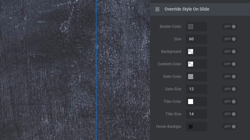
Override Styles on Slide
Styles adjusted here will be applied to the current Slide only, overriding the global styles set above. Styling options will vary based on the Tabs Type preset.


