Table of Content
- Step 1 : Keep your images “web friendly”
- Step 2 : Don’t use images larger than they need to be
- Step 3 : Images will always scale based on the “Layers Grid Size” ratio
- Step 4 : Use the file size optimizer
Step 1
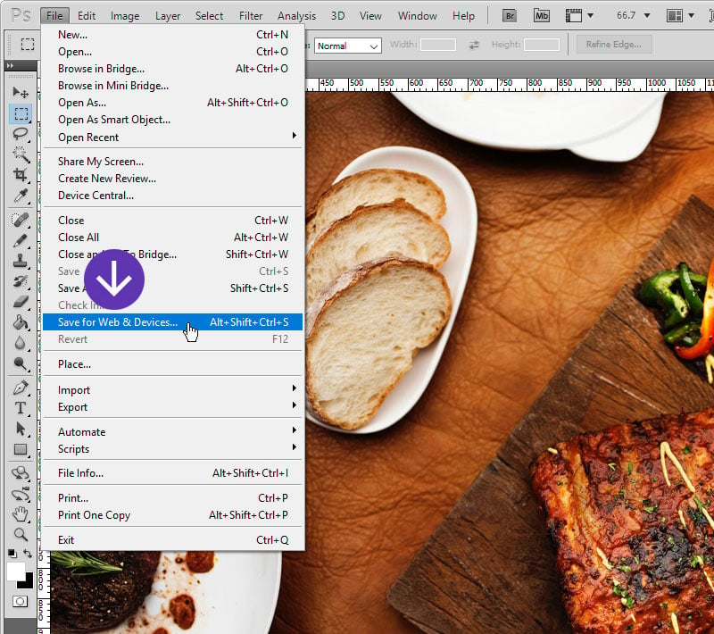
Very large image = large file size = long loading times. Keep your images “web friendly”.
This means images that are below 1920×1200 in size, and use Photoshop’s “Save for Web” option to reduce file size as much as possible without sacrificing image quality.

Step 2
Don’t use images larger than they need to be.
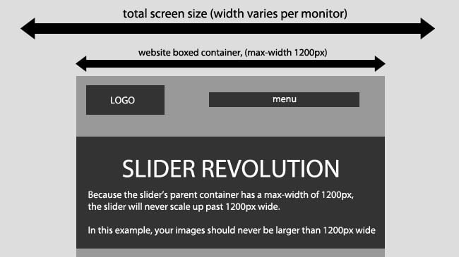
If the Slider is placed inside a boxed container within your site, and the Slider’s width never increases larger than 1200px, your image’s original width should be no larger than 1200px.

Step 3
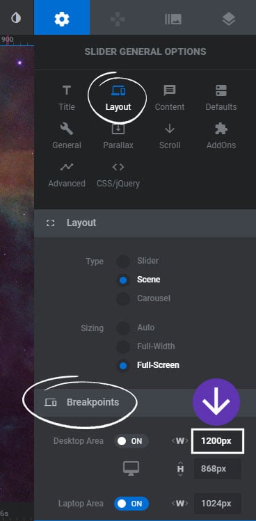
Images will always scale based on the slider’s “Layers Grid Size” ratio.
If our slider will never scale past 1200px, as shown in #2 above, here’s the mathematical equation for how images will be resized:
Image Width = Slider Width
Image Height = Grid Height * (Slider Width / Grid Width)
Based on the above equation, if your slider’s actual width is 1200px (the width of the slider when displayed on your web page), with an image size of 1000×500, and a “Layer Grid Size” of 1000×500, the image would be resized to 1200×600.
A common question once images are resized is: “Why are my images being cropped and some portions of the image can’t be seen?” The answer is based on the math equation above. Unless the image’s original size is equal the the slider’s “Layers Grid Size”, the image will need to be stretched and cropped. To avoid this, set your slider’s “Layers Grid Size” to equal the exact size of your image’s original size.

Step 4
Use our file size optimizer to help you with the steps before and optimize embedded media files and to get a general overview about loaded filesizes.


