
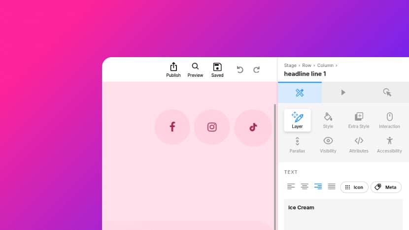
Layer Panel: Content
UI Navigation Map: Layer panel: Content

Select a layer via the Canvas or Layers sidebar, in the Right Sidebar click the Design icon to enter Design Mode, then:
- Layer Panel
- Slide Background Section
- Content Type
- Slide Background Color
- Gradient
- Chaos
- Grain
- Chromatic Grain
- Motion
- Cycle
- Text Section
- Text Align
- Icon
- Meta
- Content
- Mark
- AI Text Generation
- AI Text Generation Tool
- Line Wrap
- Counter Section
- Counter
- Preview in Backend
- Start
- From
- Duration
- Delay
- Easing
- Count Again on Return
- Number Format Section
- Decimals
- Thousands
- Prefix
- Suffix
- Compact
- Rolling Digits
- Image Content Section
- Thumbnail
- Image Alignment
- Custom Align
- Image Size
- Image X Position
- Image Y Position
- Image URL
- Image Variant
- Prefer Feed Image
- Audio Content Section
- File Name
- Preload
- Controls
- Autoplay
- From
- Till
- Playzone
- Default Volume
- Skip Preload
- Playback Settings
- Stop Other Media
- Pause Module Timer
- Rewind On Slide Start
- Restart on End (Loop)
- Next Slide When Ends
- SVG Content Section
- Thumbnail
- Video Content Section
- Video Type
- File Name
- YouTube ID
- Vimeo ID
- Prefer Feed Video
- Preload
- Autoplay
- Fit
- Aspect Ratio
- From
- Till
- Default Volume
- Speed
- Video Poster
- Thumbnail
- If Video Paused
- Hide on Mobile
- Keep on Mobile
- Prefer Feed Cover
- Playback Settings
- Allow Full Screen
- Use Inline Mode
- Start Media Muted
- Stop Other Media
- Pause Module Timer
- Rewind On Slide Start
- Restart on End (Loop)
- Next Slide When Ends
- Interaction & Controls
- No Interaction (Frontend)
- Controls
- Video Arguments
- Video Args
- YouTube Args
- Vimeo Args
- Slide Background Section
In Slider Revolution, a module is a slider, carousel or animated section placed on a WordPress page. Each slide in a module is built from layers, such as text, images, videos and buttons, placed over the slide's background. Layers are added and edited in the Module Editor.
Design Mode is the part of the Module Editor where the selected layer's content, style and behavior are set, one panel at a time. Its Layer panel holds what the layer shows and where it sits, how large it is and how it flows.
This article covers the content sections of the Layer panel: the text, counter, image, audio, SVG or video a layer shows, and the fill of the Slide Background. Most sections appear only when a layer of their type is selected.
The position, size and layout sections lower in the same panel are described in Layer Panel: Position, Size & Layout.
To open the Layer panel, select a layer on the Canvas, the editable preview of the slide, or in the Layers sidebar. Then, in the Right Sidebar, click the Design icon 1 to enter Design Mode.
Click the Layer tab icon 2 to open the Layer panel.

Slide Background Section
Section Visibility
- Visible when the Slide Background layer is selected.
- Hidden when the Slide Background layer is not selected.
Select the Slide Background layer then use the Slide Background section to configure its content: a color or gradient, with optional motion, or an image or video.

Content Type (Dropdown)
Setting Visibility
- Visible when the Slide Background section is visible.
- Hidden when the Slide Background section is hidden.
Set whether the Slide Background should be filled with a color or gradient, an image, or a video.

Options:
- Color: Enables the Slide Background Color, Gradient, Chaos, Grain, Motion and Cycle settings below.
- Image: Enables an Image Content section below, where you can set the Slide Background image. A different image can be set for each device size, as described under Image Content.
- Video: Enables a Video Content section below, where you can set the Slide Background video.
Slide Background Color (Color Swatch)
Setting Visibility
- Visible when the Slide Background section is visible, and Content Type is set to Color.
- Hidden when the Slide Background section is hidden, or Content Type is set to Image or Video.
Displays the currently applied Slide Background color. Click the color swatch to open a Color Picker window and set a new Slide Background color.

Gradient (Image Select)
Setting Visibility
- Visible when the Slide Background section is visible, and Content Type is set to Color.
- Hidden when the Slide Background section is hidden, or Content Type is set to Image or Video.
Sets a ready made gradient as the Slide Background, chosen from tiles. The tiles are in pages of five, with a None tile on each page, and the dots beneath the grid switch pages. The default is None.

Options:
- None: No gradient. The Slide Background is the Slide Background Color.
- Reef, Coral, Lagoon, Bloom, Dawn, Frost, Moss, Dusk, Ember, Slate, Ocean, Deep, Sky, Mint, Aurora, Sand, Peach, Rose, Berry, Neon, Halo, Spot: Each tile shows the gradient it applies.
Chaos (Number, percentage, range)
Setting Visibility
- Visible when the Slide Background section is visible, and Content Type is set to Color.
- Hidden when the Slide Background section is hidden, or Content Type is set to Image or Video.
Sets how irregular the gradient's blend of colors is. The default is 0%.
Options:
- 0%: Minimum. The gradient blends evenly.
- 100%: Maximum. The colors blend in the most irregular way available.
Grain (Number, percentage, range)
Setting Visibility
- Visible when the Slide Background section is visible, and Content Type is set to Color.
- Hidden when the Slide Background section is hidden, or Content Type is set to Image or Video.
Sets how much grain is laid over the gradient. The default is 0%.

Options:
- 0%: Minimum. No grain.
- 100%: Maximum. The heaviest grain available.
Chromatic Grain (Toggle)
Setting Visibility
- Visible when the Slide Background section is visible, and Content Type is set to Color.
- Hidden when the Slide Background section is hidden, or Content Type is set to Image or Video.
Sets whether the Grain over the Slide Background color is drawn in color instead of black. The default is Off.

With Chromatic Grain on, the grain is drawn as red, green and blue specks, at about the same strength as black grain. Grain still sets how much grain there is, so at 0% no grain shows.
Options:
- On: The grain is drawn in red, green and blue specks.
- Off: The grain is drawn in black.
Motion (Dropdown)
Setting Visibility
- Visible when the Slide Background section is visible, and Content Type is set to Color.
- Hidden when the Slide Background section is hidden, or Content Type is set to Image or Video.
Sets whether the Slide Background gradient moves, and how. The default is None.
The motion is drawn by the browser without any script, and is not played for a visitor whose device asks for reduced motion.
Options:
- None: The background is still.
- Drift: The gradient moves steadily across the slide.
- Sway: The gradient moves back and forth.
- Pulse: The gradient grows and shrinks.
- Hue Shift: The gradient's colors cycle through the hues.
Cycle (Number, seconds, range)
Setting Visibility
- Visible when the Slide Background section is visible, and Content Type is set to Color.
- Hidden when the Slide Background section is hidden, or Content Type is set to Image or Video.
Sets how long one round of the Motion takes. The default is 20s.

Options:
- 1s: Minimum. The fastest motion available.
- 120s: Maximum. The slowest motion available.
Text Section
Section Visibility
- Visible when a Text layer is selected.
- Hidden when a Text layer is not selected.
Use the settings in the Text section to configure Text layers.
Note that font icon layers are also configured via this section, as they are standard Text layers used to display font icons.

Text Align (Align Switch)
Setting Visibility
- Visible when Text section is visible.
- Hidden when Text section is hidden.
Set the horizontal alignment of the text layer.

Options:
- Left
- Center
- Right
- Justify
Icon (Button)
Setting Visibility
- Visible when Text section is visible.
- Hidden when Text section is hidden.
Click to open a font icon browsing panel.

Select an icon to insert it into the Content text area as an HTML snippet.

Meta (Button)
Setting Visibility
- Visible when Text section is visible.
- Hidden when Text section is hidden.
Click to open a meta tag browsing panel.

Meta tags fetch data such as WordPress site and post info, social media feed details, WooCommerce product information, and event specifics.
Select meta tag to insert it into the Content text area as an HTML snippet.

Content (Text Area)
Setting Visibility
- Visible when Text section is visible.
- Hidden when Text section is hidden.
Enter the content that should appear in the Text layer.

Mark (Button)
Setting Visibility
- Visible when Text section is visible, and words are selected in the Content field.
- Hidden when Text section is hidden, or no words are selected in the Content field.
Located in the bottom right corner of the Content field, beside the AI button. Click to mark the selected words for the Highlights section of the Style panel.

Mark wraps the selected words in <mark> tags in the Content field. Clicking Mark on a selection that already contains marked words removes those tags.
Only marked words get a highlight, and only while Highlights is turned on in the Style panel.
AI Text Generation (Button)
Setting Visibility
- Visible when Text section is visible.
- Hidden when Text section is hidden.
Located in the bottom right corner of the Content field. Click to open the AI Text Generation tool.

AI Text Generation Tool (Form)
Setting Visibility
- Visible when Text section is visible.
- Hidden when Text section is hidden.
Opens the text 1 from the Content text area, such that it can be edited with the assistance of integrated AI.
Select a type of AI processing to apply 2, then click Generate 3 to initiate processing.

Once processing is complete, choose an option (if multiple options were generated) or continue editing.

Line Wrap (Dropdown)
Setting Visibility
- Visible when Text section is visible.
- Hidden when Text section is hidden.
Configure how text lines wrap and break within the layer.

Options:
- Auto: Lines wrap to stay within the layer's width. Lines break if there are line-breaks, new lines or
<br>tags in the Content text area. - Content Width: Lines wrap to stay within the layer's width.
<br>tags create line-breaks, but line-breaks or new lines in the Content text area are ignored. - Any Content Breaks: Lines break only if there are line-breaks, new lines or
<br>tags in the Content text area. - Only
<br>tags: Lines break only where<br>tags are placed in the Content text area.
Counter Section
Section Visibility
- Visible when a Counter layer is selected.
- Hidden when a Counter layer is not selected.
A Counter layer is a Text layer that counts up to the number in its text. It is added from the Add Sidebar, via Text -> Content -> Counter, and configured in the Counter section.
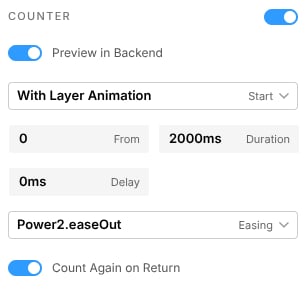
The number in the layer's Content text area is the number it counts up to. Any words around the number stay in place, and the count is shown in the layer's own font and color. The count starts with the layer animation, when the layer is hovered or clicked, or when a Start Counter action fires. Start Counter and Reset Counter are layer actions, added in Action Mode to any layer on the slide, so that for example a button can start a counter placed elsewhere on the slide.
Counter (Toggle)
Set whether the layer counts. The default is On.

Options:
- On: The layer counts up to its number, and the settings below are shown.
- Off: The layer shows its number as plain text.
Preview in Backend (Toggle)
Setting Visibility
- Visible when Counter toggled on.
- Hidden when Counter toggled off.
Set whether the count also plays in the Module Editor. The default is On.

Options:
- On: The count plays in the editor as well as on the page.
- Off: The count plays on the page only, and the editor shows the final number.
Start (Dropdown)
Setting Visibility
- Visible when Counter toggled on.
- Hidden when Counter toggled off.
Set what starts the count. The default is With Layer Animation.

Options:
- With Layer Animation: The count starts as the layer animates in.
- On Layer Hover: The count starts when the visitor hovers over the layer.
- On Layer Click: The count starts when the visitor clicks the layer.
- By Action Only: The count starts only from a Start Counter layer action, for example on a button elsewhere on the slide.
From (Number)
Setting Visibility
- Visible when Counter toggled on.
- Hidden when Counter toggled off.
Set the number the count starts from. The default is 0.

Duration (Number, milliseconds, range)
Setting Visibility
- Visible when Counter toggled on.
- Hidden when Counter toggled off.
Set how long the count takes, from its From number to the number in the text. The default is 2000ms.

Options:
- 100ms: Minimum. The shortest count available.
- 10000ms: Maximum. The longest count available.
Delay (Number, milliseconds, range)
Setting Visibility
- Visible when Counter toggled on.
- Hidden when Counter toggled off.
Set how long the count waits after its start trigger before it begins. The default is 0ms.
Options:
- 0ms: Minimum. The count begins at once.
- 10000ms: Maximum. The longest wait available.
Easing (Dropdown)
Setting Visibility
- Visible when Counter toggled on.
- Hidden when Counter toggled off.
Set the easing curve of the count, which decides whether it runs evenly or speeds up and slows down along the way. The default is Power2.easeOut, which starts quickly and slows down as it reaches the final number.

The options are the same easing curves offered for layer animations under Easing in the Advanced sub-mode of Animation Mode.
Count Again on Return (Toggle)
Setting Visibility
- Visible when Counter toggled on.
- Hidden when Counter toggled off.
Set whether the count runs again each time its slide is returned to. The default is On.

Options:
- On: The count plays every time the slide is shown.
- Off: The count plays once, and the layer then shows its final number.
Number Format Section
Section Visibility
- Visible when a Counter layer is selected, and Counter toggled on.
- Hidden when a Counter layer is not selected, or Counter toggled off.
In the Number Format section set how the counted number is written: its decimals, thousands separator, and any text before and after it. Left empty, each takes its form from the number as it is written in the Content text area.

Decimals (Number, range)
Set how many decimal places the number is shown with. Empty by default, which keeps the decimals of the number as written.

Options:
- 0: Minimum. No decimal places.
- 4: Maximum. Four decimal places.
Thousands (Dropdown)
Set the character that groups the thousands. The default is As Written.

Options:
- As Written: The separator used in the number as written, if any.
- Comma: Groups of three digits are separated with a comma,
12,500. - Dot: Groups of three digits are separated with a dot,
12.500. - Space: Groups of three digits are separated with a space,
12 500. - None: The digits run together,
12500.
Prefix (Text)
Set text shown before the number, such as a currency sign. Empty by default.
Suffix (Text)
Set text shown after the number, such as a percent sign or a unit. Empty by default.

Compact (Toggle)
Set whether a large number is shortened to a compact form, with one decimal and a unit letter: 1.2k, 3.4M, 5.6B. The default is On.

Options:
- On: Thousands, millions and billions are shortened,
12,500becomes12.5k, and the thousands separator is not used. - Off: The number is shown in full.
Rolling Digits (Toggle)
Set whether the digits roll like an odometer as the number changes. The default is On.

Options:
- On: Each digit scrolls vertically to its next value. The last digit scrolls fastest and is blurred while it moves, and each digit to its left changes only when the digit to its right passes from 9 to 0.
- Off: The number changes in place, without rolling digits.
Image Content Section
Section Visibility
- Visible when an Image layer is selected, or the Slide Background is selected with Content Type set to Image.
- Hidden when any other layer is selected, or the Slide Background has Content Type set to Color or Video.
Use the settings in the Image Content section to configure Image layers and the Slide Background image.

A different image can be set for each device size. Select a device with the Device Switcher in the Top Bar, then set the image for that device.
A device with no image of its own shows the image set for the next larger device, so an image set for Desktop is also shown on Notebook, Tablet and Mobile until one of those is given its own. Each image is optimized at the size it is shown at. The same applies to the Slide Background when its Content Type is set to Image.
Thumbnail (Image Preview & Buttons)
Setting Visibility
- Visible when Image Content section is visible.
- Hidden when Image Content section is hidden.
Displays a preview of the currently selected image.

Hover over the preview image to access buttons to replace the current image via the WordPress library 1, the Elements Library 2, or with a new AI-generated image 3.

Image Alignment (3×3 Checkbox Grid)
Setting Visibility
- Visible when Image Content section is visible.
- Hidden when Image Content section is hidden.
Set the alignment of the image within its own layer. This is useful when the image has a different aspect ratio to the layer, allowing you to control which portion of the image is visible.
The 3×3 grid represents the corners and edges of the layer, e.g. to align top left choose the top left checkbox.

Custom Align (Checkbox)
Setting Visibility
- Visible when Image Content section is visible.
- Hidden when Image Content section is hidden.
When active, allows you to use the Image X Position and Image Y Position settings to configure an alignment not provided for by the Image Alignment setting.

Options:
- Enabled: The Image X Position and Image Y Position settings become editable, allowing you to configure custom image alignment.
- Disabled: The Image X Position and Image Y Position settings are read only, showing the alignment set via the Image Alignment setting.
Image Size (Dropdown)
Setting Visibility
- Visible when Image Content section is visible.
- Hidden when Image Content section is hidden.
Set how the image is sized, and if it repeats, within the layer.
With Cover, a layer or module of a different shape on each device shows a different part of the image. Image Alignment sets which part stays in view, and a separate image can be set for each device, as described under Image Content. Contain shows the whole image on every device.

Options:
- Cover: Ensure the image covers the whole layer, even if some areas are not visible.
- Contain: Ensure the full image is contained inside the layer and visible, even if some areas of the layer are empty.
- Auto: Image displays at its actual dimensions, regardless of layer dimensions.
- %: Set the image width, relative to the layer's width.
- px: Set the image width in pixels, independently of the layer's width.
- Repeat X: Tile the image horizontally within the layer.
- Repeat Y: Tile the image vertically within the layer.
Image X Position (Number, percentage)
Setting Visibility
- Visible when Image Content section is visible.
- Hidden when Image Content section is hidden.
Shows the horizontal position of the image within the layer, as a percentage.

When the Custom Align setting is disabled Image X Position is read only, showing the alignment settings drawn from the Image Alignment setting.
When Custom Align is enabled Image X Position can be edited with a custom percentage value.
Image Y Position (Number, percentage)
Setting Visibility
- Visible when Image Content section is visible.
- Hidden when Image Content section is hidden.
Shows the vertical position of the image within the layer, as a percentage.

When the Custom Align setting is disabled Image Y Position is read only, showing the alignment settings drawn from the Image Alignment setting.
When Custom Align is enabled Image Y Position can be edited with a custom percentage value.
Image URL (Text)
Setting Visibility
- Visible when Image Content section is visible.
- Hidden when Image Content section is hidden.
Shows the URL of the currently selected image, and allows editing of the URL if needed.

Image Variant (Dropdown)
Setting Visibility
- Visible when Image Content section is visible.
- Hidden when Image Content section is hidden.
In the event there are multiple sized variants of the image, select which version to use.

Options:
- List of each available version, e.g. "Original Source", "Thumbnail Source".
Prefer Feed Image (Toggle)
Setting Visibility
- Visible when Image Content section is visible, and Top Bar -> Settings sidebar -> Content Source panel -> Content Source is set to anything other than Custom Gallery.
- Hidden when Image Content section is hidden, or Top Bar -> Settings sidebar -> Content Source panel -> Content Source is set to Custom Gallery.
If using WordPress/WooCommerce posts or a social media feed as the module's content source, set whether or not to prefer images drawn from this feed.

Options:
- On: The layer will use an image from the module's content feed, if one is available.
- Off: The layer will always use the image selected for the layer, even if a feed image is available.
Audio Content Section
Section Visibility
- Visible when an Audio layer is selected.
- Hidden when an Audio layer is not selected.
Use the settings in the Audio Content section to configure Audio layers.

File Name (Text)
Setting Visibility
- Visible when Audio Content section is visible.
- Hidden when Audio Content section is hidden.
Set the name of the audio file to load. Click the button to the right to choose a new audio file from the WordPress library.

Preload (Dropdown)
Setting Visibility
- Visible when Audio Content section is visible.
- Hidden when Audio Content section is hidden.
Set which aspects of the audio file should be preloaded.

Options:
- None: Prevents any preloading. The audio file will load only when it's played.
- Auto: Loads the whole audio file in advance, even if it is never listened to.
- Meta Data: Preloads meta data about the audio file, i.e. information such as its length. The audio file itself will still only load when played.
Controls (Dropdown)
Setting Visibility
- Visible when Audio Content section is visible.
- Hidden when Audio Content section is hidden.
Set whether to show controls or have the layer be invisible to visitors.

Options:
- None: Hide controls, and therefore hide the layer from visitors.
- HTML5: Show HTML5 based controls.
Autoplay (Dropdown)
Setting Visibility
- Visible when Audio Content section is visible.
- Hidden when Audio Content section is hidden.
Set a trigger that will initiate playback of audio.
Note that browsers do not allow autoplay of audio without an interaction-based trigger, unless it starts muted.

Options:
- On Interaction: Audio will only play when triggered by a user interaction, e.g. pressing play on HTML5 controls, or clicking a custom button created using Actions.
- Every time: Audio will automatically play, muted, every time the parent slide loads.
- 1st Time: Audio will automatically play, muted, the first time the parent slide loads only.
- Skip 1st Time: Audio will automatically play, muted, the second time the parent slide loads and each time thereafter.
From (Timestamp)
Setting Visibility
- Visible when Audio Content section is visible.
- Hidden when Audio Content section is hidden.
Set the time from which the audio track should start playing.
Note that this refers to the time in the audio track itself, not the time in the slide's timeline playback.
For example, start playback 30 seconds into the audio clip by setting the value to 00:30.

Till (Timestamp)
Setting Visibility
- Visible when Audio Content section is visible.
- Hidden when Audio Content section is hidden.
Set the time until which the audio track should play.
Note that this refers to the time in the audio track itself, not the time in the slide's timeline playback.
For example, end playback 2 minutes into the audio clip by setting the value to 02:00.

Playzone (Waveform)
Setting Visibility
- Visible when Audio Content section is visible, and a valid audio file set in the File Name setting.
- Hidden when Audio Content section is hidden, or no audio file set in the File Name setting, or an invalid audio file set.
Shows a waveform representing the audio file's sound, and provides drag handles on the left and right ends with which you can shorten the playback zone of the clip.
Note that a valid audio file is required, of format mp3, wav, ogg, or m4a/aac.

Moving the left and right handles automatically updates the From and Till settings for the audio layer, and correspondingly, modifying the From and Till settings updates the Playzone display.

Default Volume (Number, range)
Setting Visibility
- Visible when Audio Content section is visible.
- Hidden when Audio Content section is hidden.
Set the volume for audio playback.

Options:
- 0: Minimum. No audible sound.
- 100: Maximum. Loudest volume.
Skip Preload (Number, seconds, range)
Setting Visibility
- Visible when Audio Content section is visible.
- Hidden when Audio Content section is hidden.
Delay preloading of the audio file for a specified time.

Options:
- 0sec: Minimum. No delay of preloading.
- 100sec: Maximum. Longest delay of preloading.
Playback Settings (Expander)
Setting Visibility
- Visible when Audio Content section is visible.
- Hidden when Audio Content section is hidden.
Click to expand the Playback Settings area and access more playback configuration settings.

Stop Other Media (Toggle)
Setting Visibility
- Visible when Audio Content section is visible, and Playback Settings expanded.
- Hidden when Audio Content section is hidden, or Playback Settings collapsed.
Set whether to stop other layers' playback when this audio layer starts playing.

Options:
- On: Stop other playing media when this audio layer starts playing.
- Off: Allow other playing media to run while this audio layer plays.
Pause Module Timer (Toggle)
Setting Visibility
- Visible when Audio Content section is visible, and Playback Settings expanded.
- Hidden when Audio Content section is hidden, or Playback Settings collapsed.
Set whether to prevent the module from progressing while this audio layer plays.

Options:
- On: The slide will be paused while the audio layer plays.
- Off: The slide will continue progressing while the audio layer plays.
Rewind On Slide Start (Toggle)
Setting Visibility
- Visible when Audio Content section is visible, and Playback Settings expanded.
- Hidden when Audio Content section is hidden, or Playback Settings collapsed.
Set whether or not to rewind the audio layer when the parent slide loads each time.

Options:
- On: The audio layer will start playing at the beginning each time the parent slide loads.
- Off: The audio layer will remember its position and resume playback when the parent slide loads.
Restart on End (Loop) (Toggle)
Setting Visibility
- Visible when Audio Content section is visible, and Playback Settings expanded.
- Hidden when Audio Content section is hidden, or Playback Settings collapsed.
Set whether to start audio playback again once the clip is complete, i.e. looping.

Options:
- On: Audio layer will start playing again once finished.
- Off: Audio layer will play once and then stop.
Next Slide When Ends (Toggle)
Setting Visibility
- Visible when Audio Content section is visible, and Playback Settings expanded.
- Hidden when Audio Content section is hidden, or Playback Settings collapsed.
Set whether to proceed to the next slide after the audio finishes playing.

Options:
- On: When the audio completes the module will progress to the next slide.
- Off: Completion of the audio will have no impact on slide progression.
SVG Content Section
Thumbnail (Image Preview & Buttons)
Section/Setting Visibility
- Visible when an SVG icon layer is selected.
- Hidden when an SVG icon layer is not selected.
Displays a preview of the currently selected SVG image.

Hover over the preview image to access buttons to replace the current image via the WordPress library 1, or the Elements Library 2.

Video Content Section
Section Visibility
- Visible when a Video layer is selected.
- Hidden when a Video layer is not selected.
Use the settings in the Video Content section to configure Video layers.

Video Type (Tab Switch)
Setting Visibility
- Visible when Video Content section is visible.
- Hidden when Video Content section is hidden.
Set the type of video to use for the layer.

Options:
- HTML5: Use a locally hosted video.
- YouTube: Use a video from YouTube.
- Vimeo: Use a video from Vimeo.
File Name (Text)
Setting Visibility
- Visible when Video Content section is visible, and Video Type is set to HTML5.
- Hidden when Video Content section is hidden, or Video Type is set to YouTube/Vimeo.
Set the name of the video file to load. Click a button to the right to choose a new video file from the WordPress library 1, or the Elements Library 2.

YouTube ID (Text)
- Visible when Video Content section is visible, and Video Type is set to YouTube.
- Hidden when Video Content section is hidden, or Video Type is set to HTML5/Vimeo. If loading a YouTube video, enter the ID of the video.

To find a YouTube video's ID, look in its URL for the string of letters and numbers after: watch?v=
A YouTube ID should look something like: mn5hC07aGvE
Vimeo ID (Text)
Setting Visibility
- Visible when Video Content section is visible, and Video Type is set to Vimeo.
- Hidden when Video Content section is hidden, or Video Type is set to YouTube/HTML5.
If loading a Vimeo video, enter the ID of the video.

To find a Vimeo video's ID, look at the end of its URL for the numbers after the trailing /.
A Vimeo ID should look something like: 4446067
Prefer Feed Video (Toggle)
Setting Visibility
- Visible when Video Content section is visible, and Video Type is set to YouTube/Vimeo.
- Hidden when Video Content section is hidden, or Video Type is set to HTML5.
If using a social media feed as the module's content source, set whether or not to prefer videos drawn from this feed.

Options:
- On: The layer will use a video from the module's content feed, if one is available.
- Off: The layer will always use the video selected for the layer, even if a feed video is available.
Preload (Dropdown)
Setting Visibility
- Visible when Video Content section is visible, and Video Type is set to HTML5.
- Hidden when Video Content section is hidden, or Video Type is set to YouTube/Vimeo.
Set which aspects of the video file should be preloaded.

Options:
- None: Prevents any preloading. The video file will load only when it's played.
- Auto: Loads the whole video file in advance, even if it is never watched.
- Meta Data: Preloads meta data about the video file, i.e. information such as its length. The video file itself will still only load when played.
Autoplay (Dropdown)
Setting Visibility
- Visible when Video Content section is visible.
- Hidden when Video Content section is hidden.
Set a trigger that will initiate playback of video.
Note browsers do not allow autoplay of audio without an interaction based trigger, unless it starts muted. To play a video with sound, set Autoplay to On Interaction. The other options start the video muted, whatever Start Media Muted is set to.

Options:
- On Interaction: Video will only play when triggered by a user interaction, e.g. pressing play on HTML5 controls, or clicking a custom button created using Actions.
- Every time: Video will automatically play, with audio muted, every time the parent slide loads.
- 1st Time: Video will automatically play, with audio muted, the first time the parent slide loads only.
- Skip 1st Time: Video will automatically play, with audio muted, the second time the parent slide loads and each time thereafter.
Fit (Dropdown)
Setting Visibility
- Visible when Video Content section is visible, and Video Type is set to HTML5.
- Hidden when Video Content section is hidden, or Video Type is set to YouTube/Vimeo.
Set how the video is sized within the layer.

Options:
- Contain: Ensure the full video is contained inside the layer and visible, even if some areas of the layer are empty.
- Cover: Ensure the video covers the whole layer, even if some areas are not visible.
Aspect Ratio (Dropdown)
Setting Visibility
- Visible when Video Content section is visible.
- Hidden when Video Content section is hidden.
Set the aspect ratio of the video. Should be set to match the aspect ratio of the original video. In most cases it will be set to the correct value automatically.

Options:
- 16:9
- 4:3
- 1.85:1
- 2.39:1
From (Timestamp)
Setting Visibility
- Visible when Video Content section is visible.
- Hidden when Video Content section is hidden.
Set the time from which the video should start playing.
Note that this refers to the time in the video itself, not the time in the slide's timeline playback.
For example, start playback 30 seconds into the video by setting the value to 00:30.

Till (Timestamp)
Setting Visibility
- Visible when Video Content section is visible.
- Hidden when Video Content section is hidden.
Set the time until which the video should play.
Note that this refers to the time in the video itself, not the time in the slide's timeline playback.
For example, end playback 2 minutes into the video by setting the value to 02:00.

Default Volume (Number, range)
Setting Visibility
- Visible when Video Content section is visible.
- Hidden when Video Content section is hidden.
Set the volume for the video's audio track.

Options:
- 0: Minimum. No audible sound.
- 100: Maximum. Loudest volume.
Speed (Dropdown)
Setting Visibility
- Visible when Video Content section is visible, and Video Type is set to YouTube.
- Hidden when Video Content section is hidden, or Video Type is set to HTML5/Vimeo.
Change a YouTube video's playback speed to be faster or slower than normal.

Options:
- 1/4
- 1/2
- Normal
- 1.5x
- 2x
Video Poster (Expander)
Setting Visibility
- Visible when Video Content section is visible.
- Hidden when Video Content section is hidden.
Click to expand the Video Poster area and configure the image that acts as a placeholder until video playback starts.

Thumbnail (Image Preview & Buttons)
- Visible when Video Content section is visible, and Video Poster expanded.
- Hidden when Video Content section is hidden, or Video Poster collapsed. Displays a preview of the currently selected Video Poster image.

Hover over the preview image to access buttons to replace the current image via the WordPress library 1, the Elements Library 2, or to capture a frame from the video 3.

If Video Paused (Toggle)
Setting Visibility
- Visible when Video Content section is visible, and Video Poster expanded.
- Hidden when Video Content section is hidden, or Video Poster collapsed.
Set whether the Video Poster should appear when the video is paused.

Options:
- On: The Video Poster will appear when the visitor presses a pause button, or when the video is paused due to changing slides.
- Off: The Video Poster will only appear before playback commences.
Hide on Mobile (Toggle)
Setting Visibility
- Visible when Video Content section is visible, and Video Poster expanded.
- Hidden when Video Content section is hidden, or Video Poster collapsed.
Set whether to hide the Video Poster on mobile devices, in order to minimise loading time.

Options:
- On: Hide the Video Poster on mobile devices.
- Off: Show the Video Poster on mobile devices.
Keep on Mobile (Toggle)
Setting Visibility
- Visible when Video Content section is visible, and Video Poster expanded.
- Hidden when Video Content section is hidden, or Video Poster collapsed.
Set whether you want to show only the Video Poster on mobile devices, without any video playback being possible.

Options:
- On: On mobile devices the Video Poster will still appear, but there won't be any video playback.
- Off: On mobile devices video playback will be possible, unless Hide on Mobile is toggled on.
Prefer Feed Cover (Toggle)
Setting Visibility
- Visible when Video Content section is visible, and Video Poster expanded.
- Hidden when Video Content section is hidden, or Video Poster collapsed.
If using a social media feed as the module's content source, set whether or not to prefer a video poster image drawn from this feed.

Options:
- On: The layer will use a video poster image from the module's content feed, if one is available.
- Off: The layer will always use the video video poster image selected for the layer, even if a feed image is available.
Playback Settings (Expander)
Setting Visibility
- Visible when Video Content section is visible.
- Hidden when Video Content section is hidden.
Click to expand the Playback Settings area and access more playback configuration settings.

Allow Full Screen (Toggle)
Setting Visibility
- Visible when Video Content section is visible, and Playback Settings expanded.
- Hidden when Video Content section is hidden, or Playback Settings collapsed.
Set whether to allow visitors to set video to full screen.

Options:
- On: Visitors can set videos to full screen either through HTML5 controls, or custom controls created using Actions.
- Off: Visitors cannot set videos to full screen, and HTML5 controls for full screen will be hidden.
Use Inline Mode (Toggle)
Setting Visibility
- Visible when Video Content section is visible, and Playback Settings expanded.
- Hidden when Video Content section is hidden, or Playback Settings collapsed.
Set whether to prevent mobile devices automatically setting the video to full screen mode.

Options:
- On: Prevent mobile devices automatically full screening videos.
- Off: Allow mobile devices to automatically full screen videos.
Start Media Muted (Toggle)
Setting Visibility
- Visible when Video Content section is visible, and Playback Settings expanded.
- Hidden when Video Content section is hidden, or Playback Settings collapsed.
Set whether to mute the video's audio each time its parent slide loads.

Options:
- On: Mutes the video's audio, even if it was unmuted the previous time it loaded.
- Off: If the video was previously unmuted, it stays unmuted when its parent slide reappears, even if the visitor has since scrolled to another part of the page.
Stop Other Media (Toggle)
Setting Visibility
- Visible when Video Content section is visible, and Playback Settings expanded.
- Hidden when Video Content section is hidden, or Playback Settings collapsed.
Set whether to stop layers' playback when this video layer starts playing.

Options:
- On: Stop other playing media when this video layer starts playing.
- Off: Allow other playing media to run while this video layer plays.
Pause Module Timer (Toggle)
Setting Visibility
- Visible when Video Content section is visible, and Playback Settings expanded.
- Hidden when Video Content section is hidden, or Playback Settings collapsed.
Set whether to prevent the module from progressing while this video layer plays.

Options:
- On: The slide will be paused while the video layer plays.
- Off: The slide will continue progressing while the video layer plays.
Rewind On Slide Start (Toggle)
Setting Visibility
- Visible when Video Content section is visible, and Playback Settings expanded.
- Hidden when Video Content section is hidden, or Playback Settings collapsed.
Set whether or not to rewind the video layer when the parent slide loads each time.

Options:
- On: The video layer will start playing at the beginning each time the parent slide loads.
- Off: The video layer will remember its position and resume playback when the parent slide loads.
Restart on End (Loop) (Toggle)
Setting Visibility
- Visible when Video Content section is visible, and Playback Settings expanded.
- Hidden when Video Content section is hidden, or Playback Settings collapsed.
Set whether to start video playback again once the clip is complete, i.e. looping.

Options:
- On: Video layer will start playing again once finished.
- Off: Video layer will play once and then stop.
Next Slide When Ends (Toggle)
Setting Visibility
- Visible when Video Content section is visible, and Playback Settings expanded.
- Hidden when Video Content section is hidden, or Playback Settings collapsed.
Set whether to proceed to the next slide after the video finishes playing.

Options:
- On: When the video completes the module will progress to the next slide.
- Off: Completion of the video will have no impact on slide progression.
Interaction & Controls (Expander)
Setting Visibility
- Visible when Video Content section is visible.
- Hidden when Video Content section is hidden.
Click to expand the Interaction & Controls area and access configuration settings for user accessible video interaction such as playing, pausing, full screen etc.

No Interaction (Frontend) (Toggle)
Setting Visibility
- Visible when Video Content section is visible, and Interaction & Controls expanded.
- Hidden when Video Content section is hidden, or Interaction & Controls collapsed.
Set whether it should be possible for visitors to interact with the video through either HTML5 or custom made controls.

Options:
- On: No visitor interaction with the video is possible.
- Off: Interaction with the video is possible, and the Controls setting becomes available.
Controls (Dropdown)
Setting Visibility
- Visible when Video Content section is visible, and Interaction & Controls is expanded, and No Interaction (Frontend) is toggled off.
- Hidden when Video Content section is hidden, or Interaction & Controls is collapsed, or No Interaction (Frontend) is toggled on.
Set what kind of interaction controls are shown for the video.

Options:
- None: No HTML5 controls are shown. Custom controls made with Actions are still possible.
- Small: A small sized set of controls is shown along the bottom of the video 1.
- Large: A large play/pause button is shown in the center of the video 2.
- Both: Small and large controls are both shown.
Video Arguments (Expander)
Setting Visibility
- Visible when Video Content section is visible, and Video Type is set to YouTube.
- Hidden when Video Content section is hidden, or Video Type is set to HTML5/Vimeo.
Click to expand the Video Arguments area in order to add custom YouTube or Vimeo argument strings.

Video Args (Text Field)
Setting Visibility
- Visible when Video Content section is visible, and Video Arguments expanded.
- Hidden when Video Content section is hidden, or Video Arguments collapsed.
Add either YouTube or Vimeo specific argument strings.
For example, add arguments to show or hide the YouTube logo, show or hide the Vimeo author image, etc.

YouTube Args (Button)
Setting Visibility
- Visible when Video Content section is visible, and Video Type set to YouTube, and Video Arguments expanded.
- Hidden when Video Content section is hidden, or Video Type set to HTML5/Vimeo, or Video Arguments collapsed.
Click to show a selection of YouTube Arguments and read what each one does. Click an argument to insert it into the Video Args field.

Vimeo Args (Button)
Setting Visibility
- Visible when Video Content section is visible, and Video Type set to Vimeo, and Video Arguments expanded.
- Hidden when Video Content section is hidden, or Video Type set to HTML5/YouTube, or Video Arguments collapsed.
Click to show a selection of Vimeo Arguments and read what each one does. Click an argument to insert it into the Video Args field.

