
Activate and Configure Arrow Navigation
Learn how to add navigation arrows to your Slider Revolution modules.
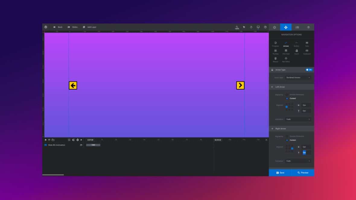
Table of Contents
What Do Arrows Do?
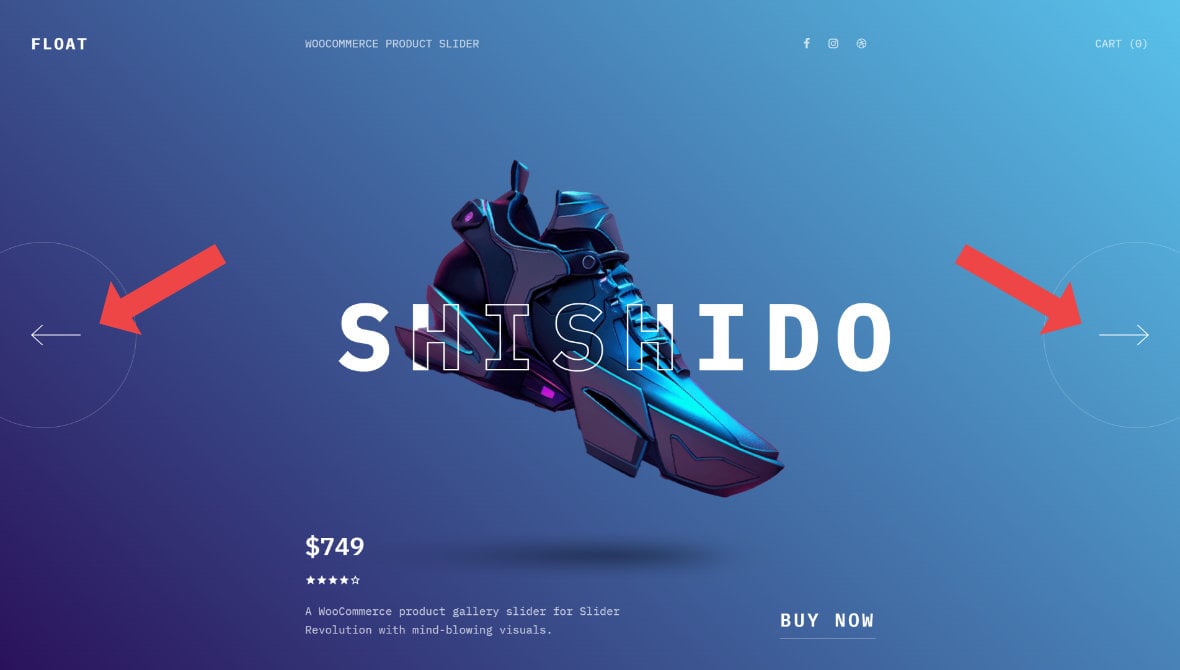
Navigation arrows are a pair of buttons that appear on a module [?]
A module in Slider Revolution acts as a container for slides, which in turn act as containers for layers. Modules are created and edited with the module editor.
A "module" is a single, self contained piece of content. You can think of this as being similar to the way a post or page in regular WordPress is a self contained piece of content.
A module can represent any kind of content Slider Revolution is capable of creating, such as a slider, carousel, hero unit, navigation menu, posts display and so on.
Multiple modules can be combined to form rich content such as complete sites and landing pages., typically at its left and right edges, and give the visitor a way to manually move to the next or previous slide [?]
A "slide" in Slider Revolution is a container into which multiple layers can be added, with layers in turn acting as containers for various forms of media such as images, text, video, audio, buttons, and special effects.
Slides are added to modules and edited via the module editor.
Within the module editor, each slide has its own animation timeline, background and collection of layers.
A single module can have one or many slides. A module with one slide is called a scene, and a module with multiple slides is called a slider or carousel.:
Activating Arrow Navigation
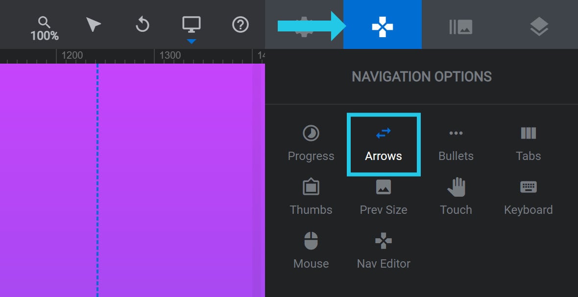
To add arrow navigation to your module, go to the Navigation Options tab, Arrows sub-section:
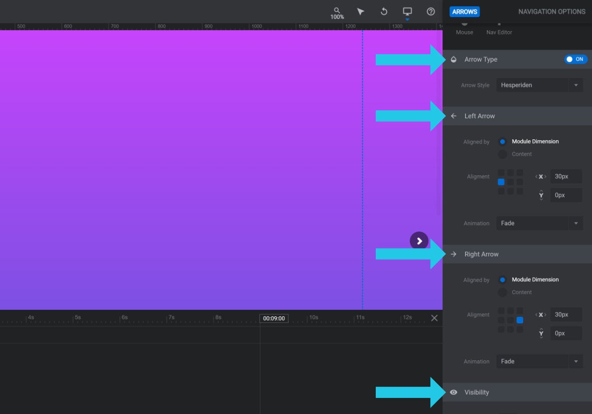
Set the toggle in the Arrow Type panel to ON:
A number of new panels and options that can be used for further configuration will then appear below:
Configuring Arrows
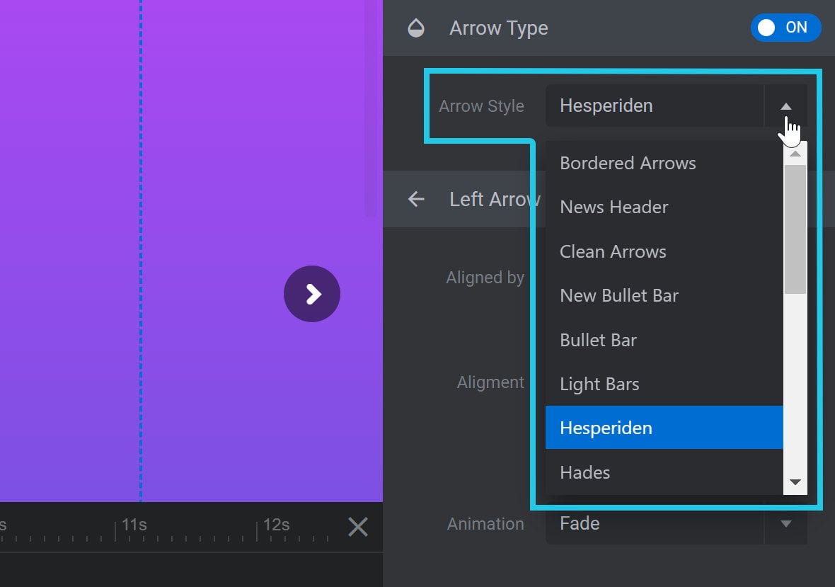
Arrow Style
In the Arrow Type panel, you can use the Arrow Style option dropdown to select from several different styles for your arrows:
Different arrow styles have varying shapes, colors, borders and backgrounds.
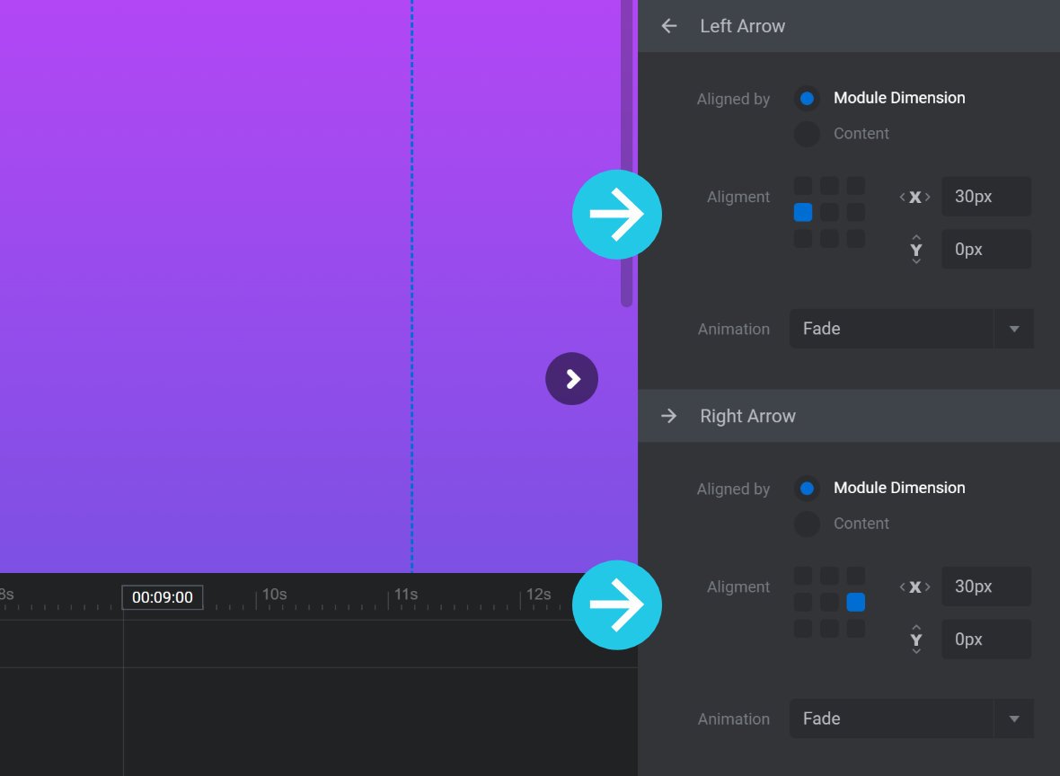
Left/Right Arrow Panels
Below the Arrow Type panel you will see the panels Left Arrow and Right Arrow:
Both panels contain the same options, with each applying to a single arrow only.
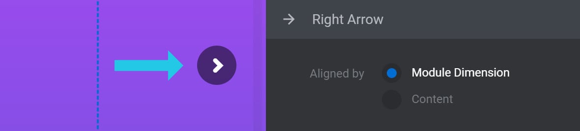
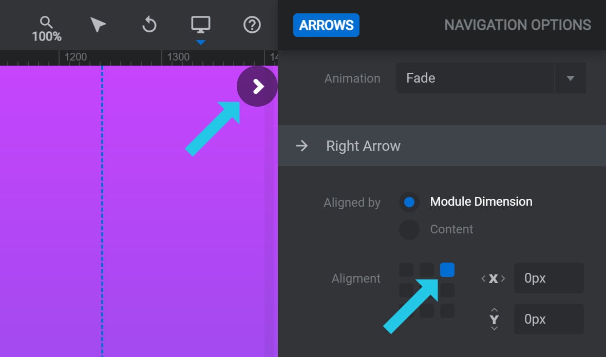
Aligned by
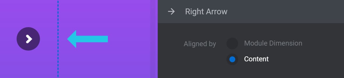
The Aligned by option allows you to decide what the arrows’ alignment should be relative to. It can be set to either Module Dimensions or Content:

If you select Module Dimensions, the arrows will be pushed out to the further edges of the module:
If you select Content, the arrows will stay inside the area marked on your canvas [?]
The canvas is the point and click design space in the module editor. It forms the largest area of the module editor.
In this area layers can be selected, moved and resized. Animations can also be previewed. with the blue dotted lines:
Alignment
The Alignment option allows you to set the horizontal and vertical alignment of your arrow. You will see a grid of points representing the available alignment settings: the corners, edges and center:
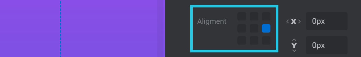
For example, if you click the top right grid point, your arrow will be aligned to the top right corner:
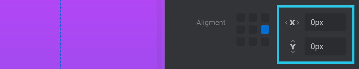
Offset X/Y
The Offset X and Offset Y options allow you to offset an arrow’s position by a pixel(px) amount:
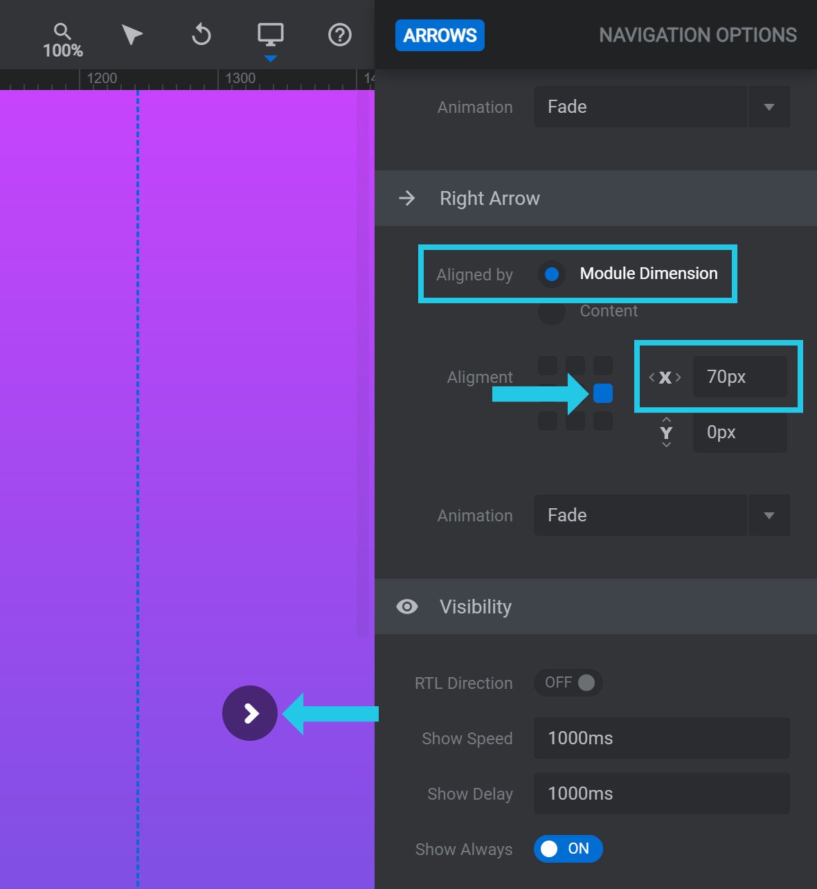
The Offset X option creates a horizontal offset. If the arrow is left aligned, the offset will move the bar to the right. If the progress bar is right aligned, the offset will move the bar to the left.
For example, here is a right arrow with Aligned by set to Module Dimension, Alignment set to the center right, and Offset X set to 70px:
The Offset Y option creates a vertical offset. If the arrow is top aligned, the offset will move the bar down. If the arrow is bottom aligned, the offset will move the bar up.
For example, here is a right arrow with Aligned by set to Content, Alignment set to the top right, and Offset Y set to 120px:
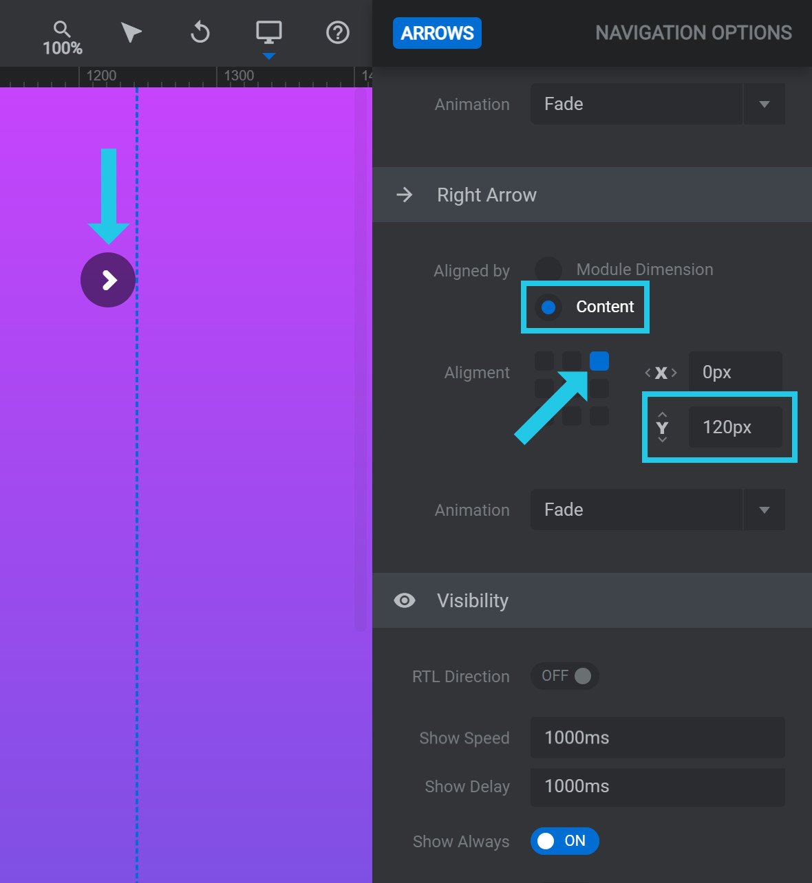
Animation
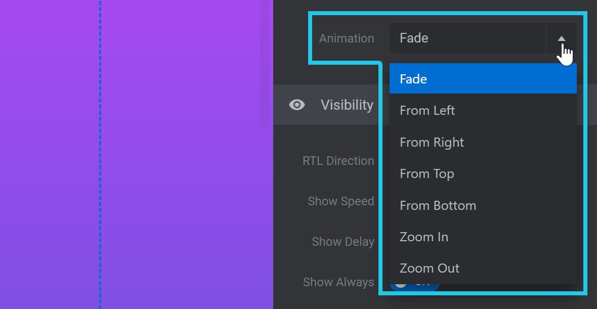
By default, when your arrows appear they will fade in. However, you can alternatively use the Animation option to have them appear via a different animation instead.
You can make the arrows slide in from one of four directions, zoom in, or zoom out:
Visibility Panel
RTL Direction
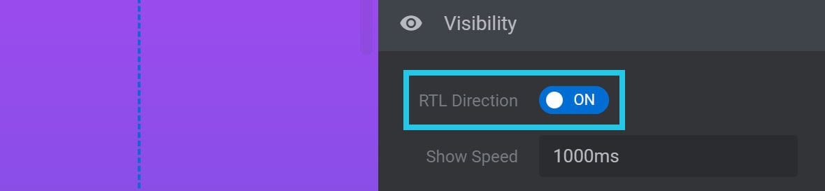
By default, clicking the right arrow progresses to the next slide.
If instead you want the left arrow to progress to the next slide, toggle the RTL Direction option to ON:
Show Speed
The Show Speed option allows you to set the time, in milliseconds(ms), it should take for your arrows to animate into view:

Show Delay
The Show Delay option allows you to set the time, in milliseconds(ms), that should pass before your arrows begin animating into view:

Show Always
If you’d like the arrows to disappear when there is no mouse hovering over the module, toggle the Show Always option to OFF:

The arrows will then disappear after a certain period of time, and reappear if the visitor hovers or taps the module.
When Show Always is set to OFF, the options Hide After: Desktop and Hide After: Mobile will appear:
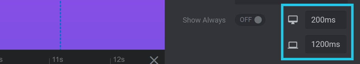
Hide After: Desktop
Use the Hide After: Desktop option to set the amount of time, in milliseconds(ms), before the arrows should be hidden on desktop devices.
Hide After: Mobile
Use the Hide After: Mobile option to set the amount of time, in milliseconds(ms), before the arrows should be hidden on mobile devices.
Hide Under
If you’d like the arrows to be hidden when browser window is narrower than a certain width, toggle the Hide Under option to ON:

Hide Under Limit
When Hide Under is set to ON, the option Hide Under Limit will appear:
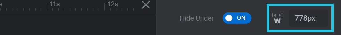
Use the Hide Under Limit option to set the browser width, in pixels(px), under which the arrows should be hidden.
Hide Over
If you’d like the arrows to be hidden when browser window is wider than a certain width, toggle the Hide Over option to ON:

Hide Over Limit
When Hide Over is set to ON, the option Hide Over Limit will appear:
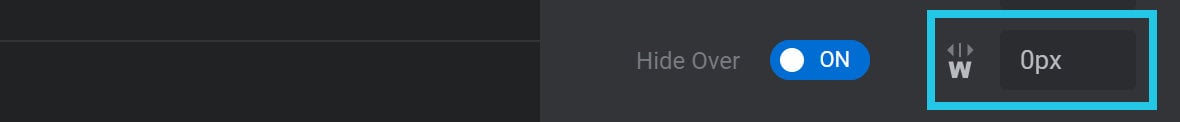
Use the Hide Over Limit option to set the browser width, in pixels(px), over which the arrows should be hidden.
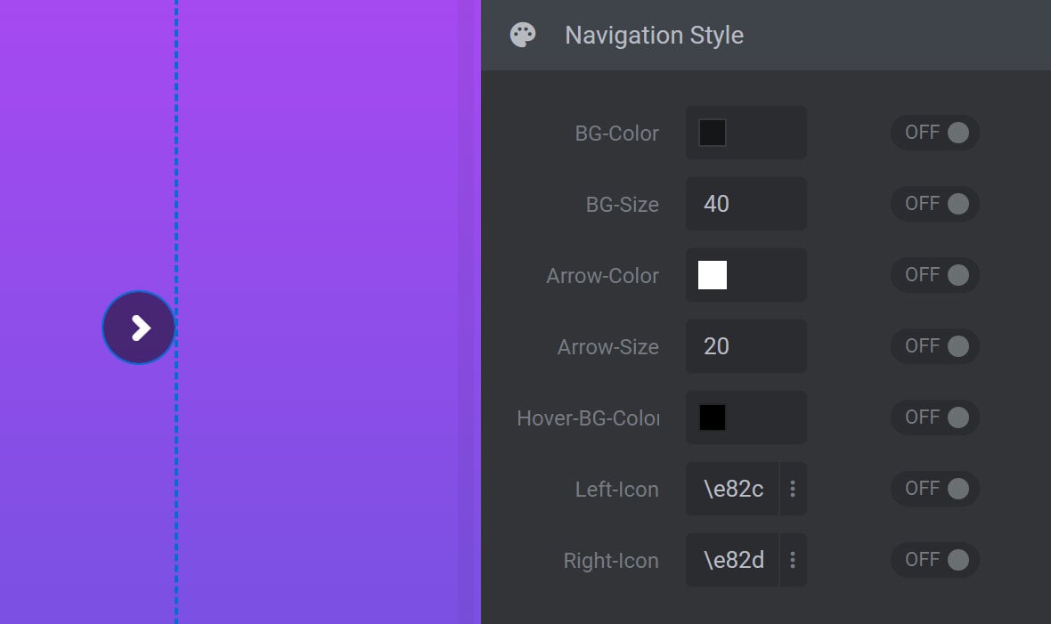
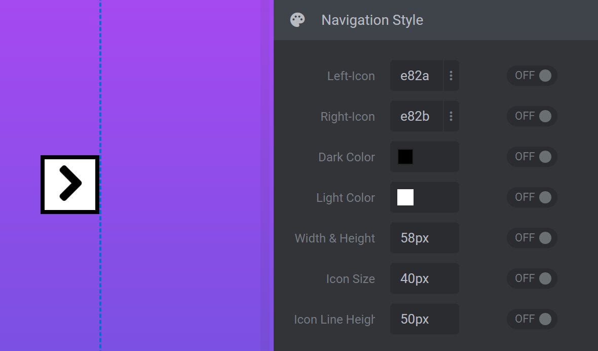
Navigation Style Panel
The Navigation Style panel allows you to customize the appearance of your module’s navigation arrows:
Note: This panel may or may not appear, depending on the setting of the Arrow Style option, because some styles cannot be customized.
The options in this panel can also vary depending on your chosen Arrow Style. For example, if Arrow Style is set to Bordered Arrows, the options available in the Navigation Style panel would look like this instead:
For any aspect of the navigation style you want to override, toggle the switch on its right to ON:

Each Arrow Style has its own collection of style options, so sometimes you might see options with different names that do very similar things. The range of these options that can appear are as follows:
Arrow Icon Options
Arrow Color or Arrow
The Arrow Color option is used to set the color of the arrow icon:
In the Hades style only, use the Arrow option to set the color of the arrow icon:
Hover Arrow
The Hover-Arrow option is used to set the color of the arrow icon when hovered over:
Arrow Size, Font Size or Icon Size
The Arrow-Size option is used to set the size of the arrow icon:
In the Uranus style only, use the Font-Size option to set the size of the arrow icon:

In the Bordered Arrows style only, use the Icon Size option to set the size of the arrow icon:
Icon Line Height
In the Bordered Arrows style only, the Icon Line Height option sets the line height of font icons:
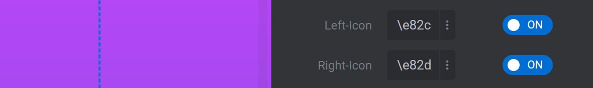
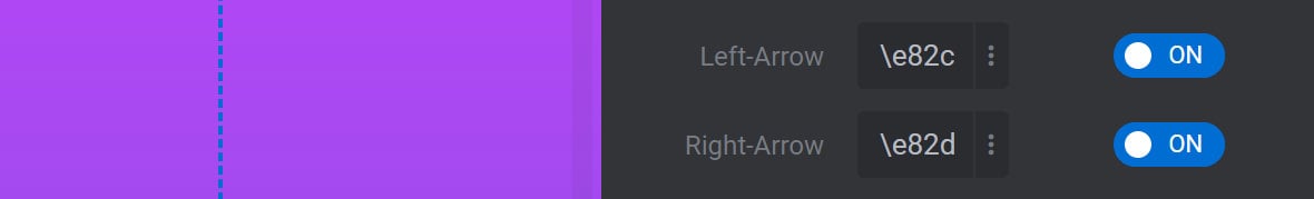
Left/Right Icon or Left/Right Arrow
The Left-Icon or Right-Icon options are used to select an arrow icon style with a CSS Unicode string:
In the Hephaistos style only, use the Left-Arrow and Right-Arrow options to select an arrow icon style:
Background Options
BG Color, Background, or BG-RGBA
The BG-Color or Background options are used to set the color of the area behind the arrow icon:


In the Erinyen style only, use the BG-RGBA option to set the background color behind the arrow icon:

BG Size or Size
The BG-Size and Size options can both be used to set the size of the area behind the arrow icon, without changing the size of the icon itself:


Hover Background, Hover BG Color, or BG Color Hover
The Hover-Background option is used to set the color of the area behind the arrow icon on hover:

In the Hesperiden style only, use the Hover-BG-Color option to set the color of the area behind the arrow icon on hover:

In the Dione style only, use the BG-Color-Hover option to set the color of the area behind the arrow icon on hover:

Title & Image Options
Title Wrap BG Color, Title Background, or Overlay
In an arrow style that incorporates a post title, depending on the Arrow Style, the Title-Wrap-BG-Color, Title-Background, or Overlay options are used to set the background color behind that title.
In the Hebe style only, use the Title-Wrap-BG-Color option to set the background color behind the post title on hover:

In the Hermes style only, use the Title-Background option to set the background color behind the post title:

In the Erinyen style only, use the Overlay option to apply a color to both the background of the post title and the navigation button, visible on hover:

Title Color, Title Font Color, or Hover Title
In an arrow style that incorporates a post title, depending on the Arrow Style, the Title-Color, Title-Font-Color, or Hover-Title options are used to set the color of that title.
In the Hebe style only, use the Title-Color option to set the color of the post title, visible on hover:

In the Hermes style only, use the Title-Font-Color option to set the color of the post title, visible on hover:

In the Ares style only, use the Hover-Title option to set the color of the post title, visible on hover:

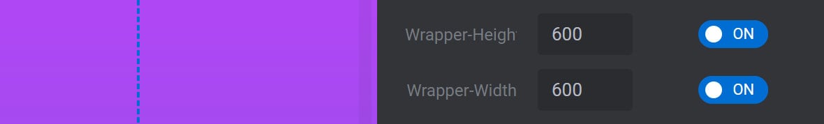
Wrapper Height/Wrapper Width
In the Hermes style only, the Wrapper-Height and Wrapper-Width options are used to set the height and width of the post title:
Title Size or Title Font Size
In an arrow style that incorporates a post title, the Title-Size option sets the font size of the post title:

In the Erinyen style specifically, use the Title-Font-Size option to set the font size of the post title:

Image Size
In the Hebe style only, the Image-Size option sets the size of the post image, visible on hover:

Other Options
Height, Width, or Width & Height
The Height option sets the overall height of the area containing the navigation arrow:

The Width option sets the overall width of the area containing the navigation arrow:

In the Bordered Arrows style only, use the Width & Height option to set both the width and height of the area containing the navigation arrow:

Padding
In the Metis style only, use the Padding option to create space around the arrow icon:

Dark Color and Light Color
In the Bordered Arrow style only, use the Dark Color option to set the border, arrow and background hover color:

In the Bordered Arrow style only, use the Light Color option to set the background and arrow hover color:

Border
In the Persephone style only, the Border option sets the border color of the navigation arrow container:

Title Wrap Border Radius
In the Erineyn style only, the Title-Wrap-Border-Radius option sets the border radius of the post title background on hover, allowing you to easily adjust between square and rounded corners:

Letter Spacing
In the Erineyn style only, the Letter-Spacing option controls the spacing between letters in the post title, visible on hover:

Global Style Presets Panel
After customizing a navigation arrow style, it can be saved for later use via the Global Style Presets panel:
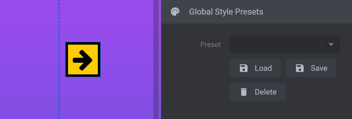
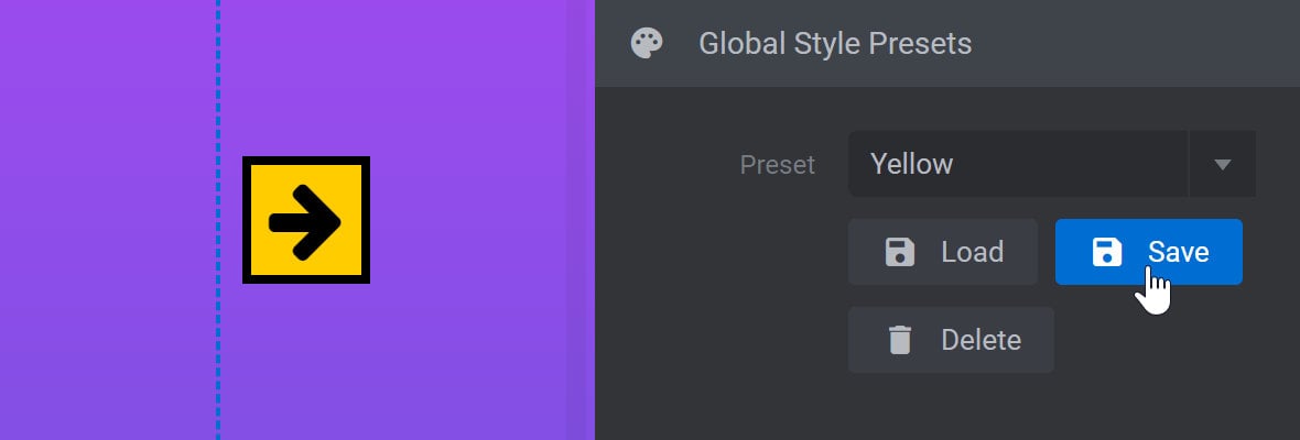
Save a Preset
To save a new custom preset, expand the Preset dropdown, type in a name for your preset:
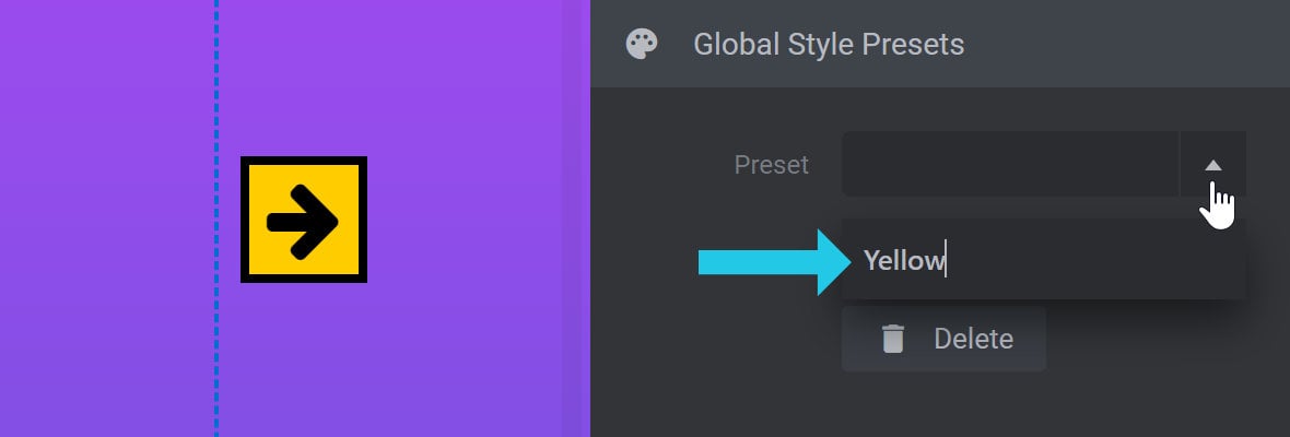
Press ENTER on your keyboard to commit the name, then click the Save button to save your current style under that name:
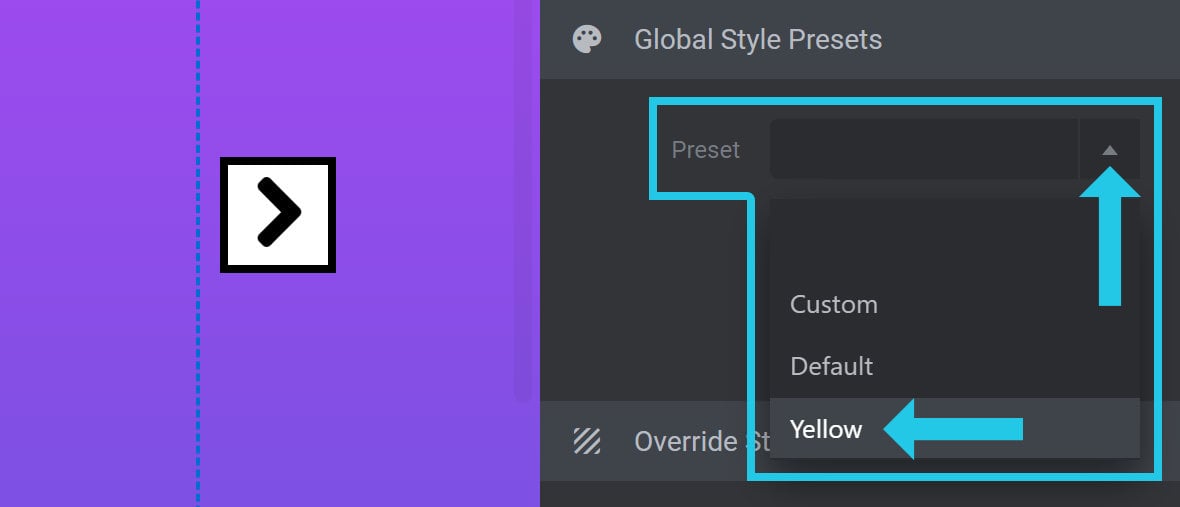
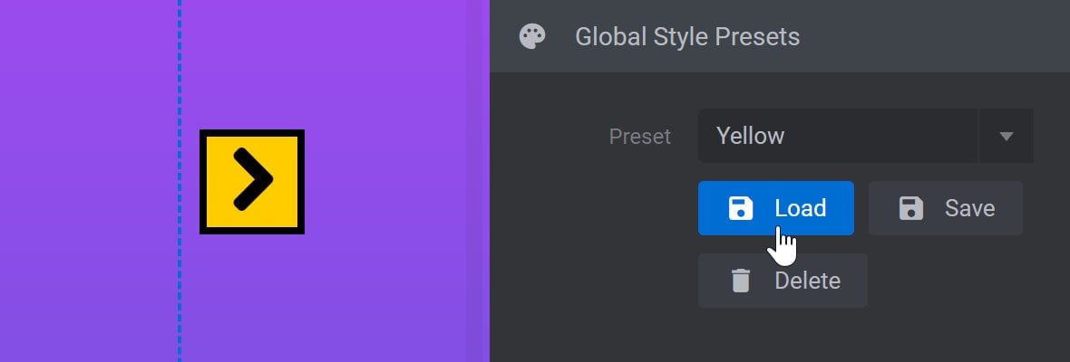
Load a Preset
To load a preset, expand the Preset dropdown and select the preset you want to use:
Then click the Load button to apply the selected preset:
Delete a Preset
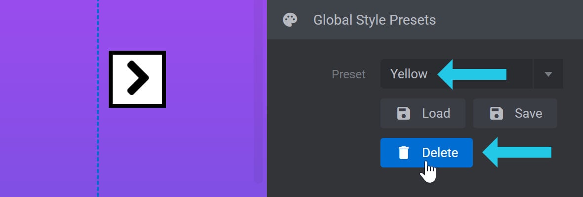
To delete a preset, expand the Preset dropdown and select the preset you want to remove:
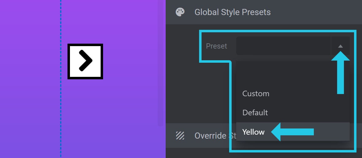
Then click the Delete button to remove the selected preset:
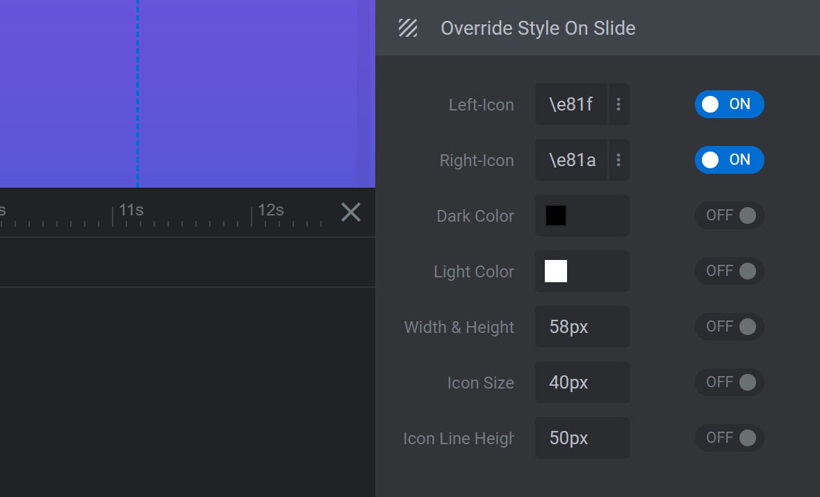
Override Style On Slide Panel
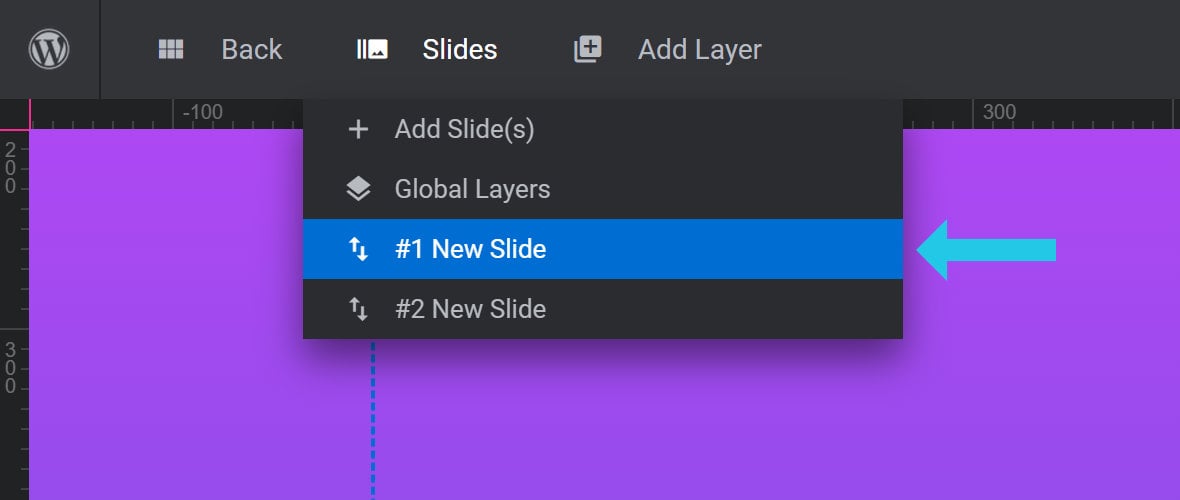
The Override Style On Slide panel has all the same options as the Navigation Style panel:
However instead of affecting the arrows for the entire module, it allows you to override any of those options on the currently selected slide, identifiable by the slide that is highlighted blue in the Slides dropdown menu: