
More than just a
WordPress Slider
This versatile WordPress plugin helps beginner-and mid-level designers WOW their clients with pro-level visuals.
SLIDER REVOLUTION 6

Sliders
Hero
Websites
Content
Media
Trusted by over 9 million users worldwide
What customers love about Slider Revolution:
Your secret weapon to creating responsive WordPress sliders, web pages & stunning visuals even with zero experience.
You can now dazzle your clients with jaw-dropping responsive designs that look amazing on any device. No coding required.
Exceed even the most unrealistic expectations with special effects, animations and impressive designs. All at your fingertips in our drag-and-drop intuitive editor.
Bridge the gap between what clients want
and what you can do
You know when a client shows you a million-dollar website and says “I want one just like that, but better“?


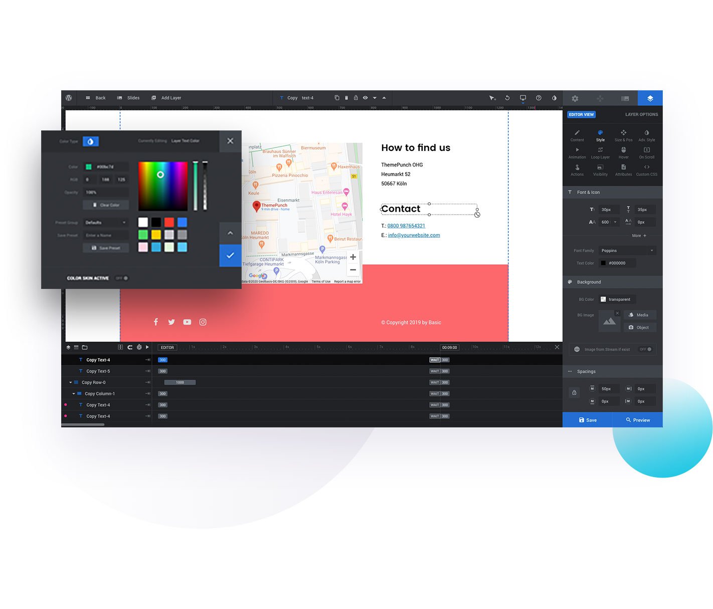
The drag-and-drop editor you didn’t dare dream of
The Slider Revolution editor was built to save hours or even days of work on every project.
The new interface comes with intuitive options categories. You’ll know exactly where you can find what you need at all times, so you can implement your creative vision with just a few clicks.
The speed of production will make your clients marvel at the how fast you can deliver fully-polished, stunning visual work.
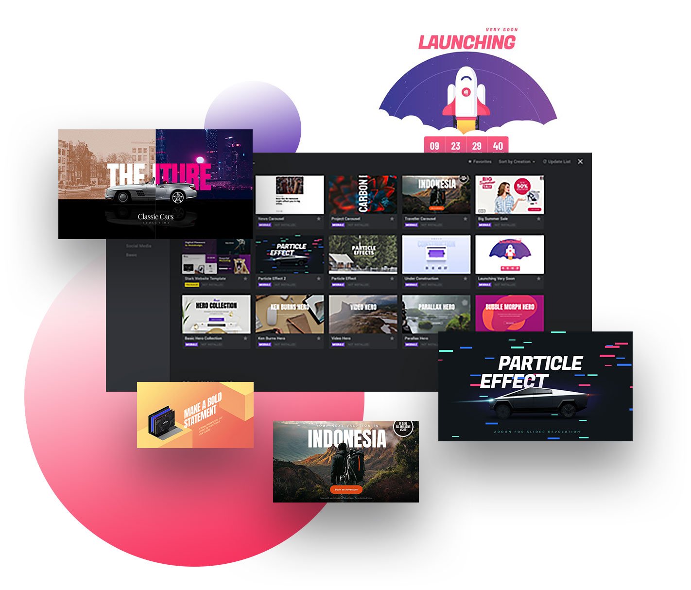
250+ templates to get you started on your responsive content
These customizable templates are NOT just for WordPress responsive sliders, but also for hero sections, web pages and other content elements.
You’ll able to create everything a pro can do without writing a line of code.
Once you open your eyes to the immense possibilities our template library offers you, you’ll never have to deal with the limitations of an average WordPress slider plugin ever again.
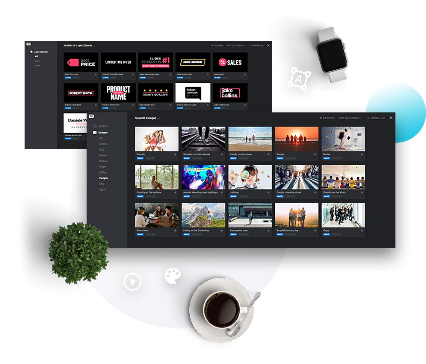
2000+ element library to turn your raw ideas into stunning visuals
You’ve got a royalty-free media library at your fingertips all included in this cutting-edge WordPress slider plugin—
Background images, videos, object PNGs, font icons & SVGs, premade layer groups and many more!
Just point & click to turn any cookie-cutter element on your page into a visual force with great aesthetics AND excellent functionality.
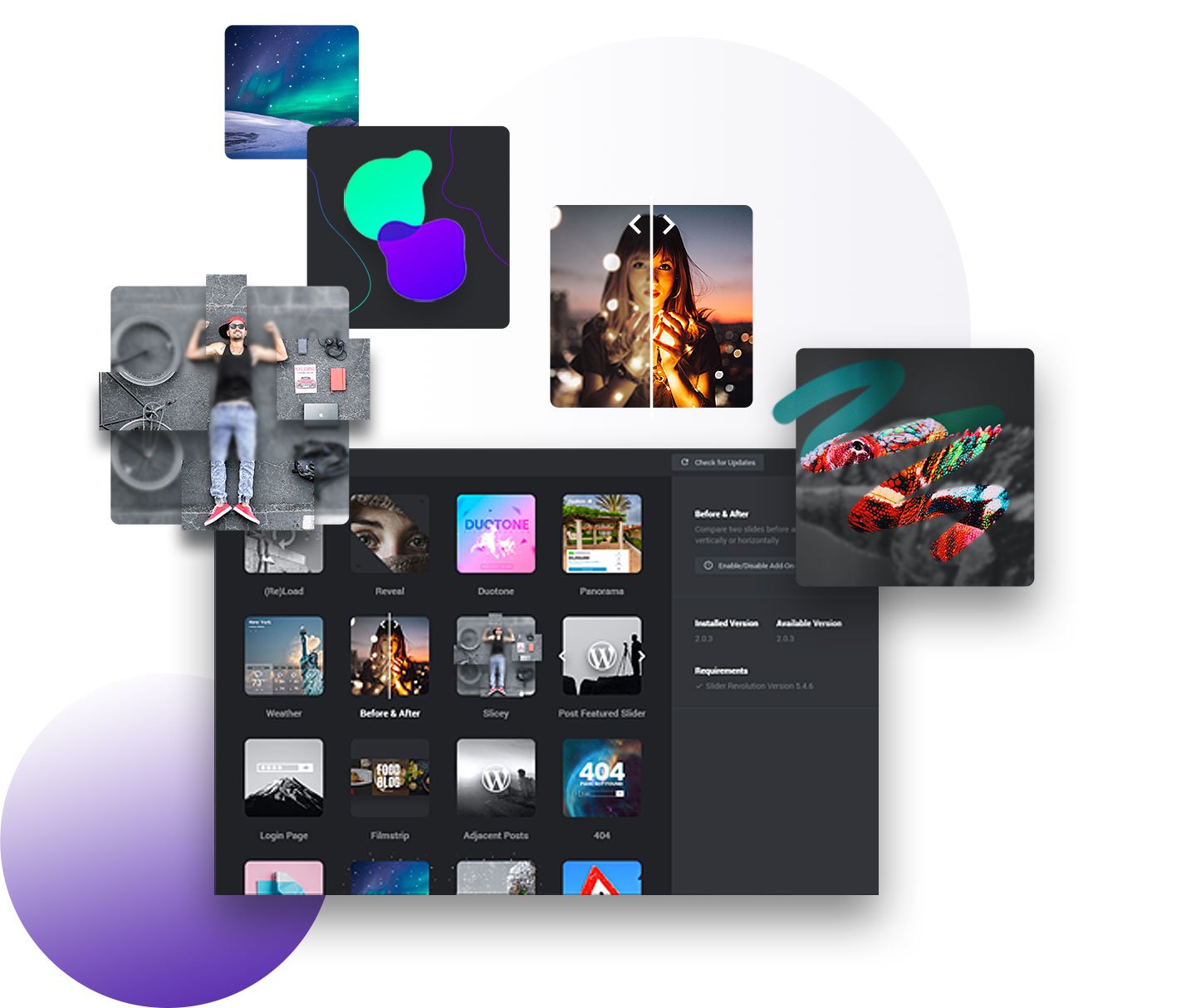
25+ add-ons to make your creative vision come to life
Slider Revolution’s add-on library is your secret trick to big visual impact. You get more fine control while adding dynamic content to sites quickly and efficiently.
The variety of options gives you complete freedom to show powerful ideas in an engaging way, with zero technical knowledge needed.
This alone will raise the status of your work in the eyes of your clients.
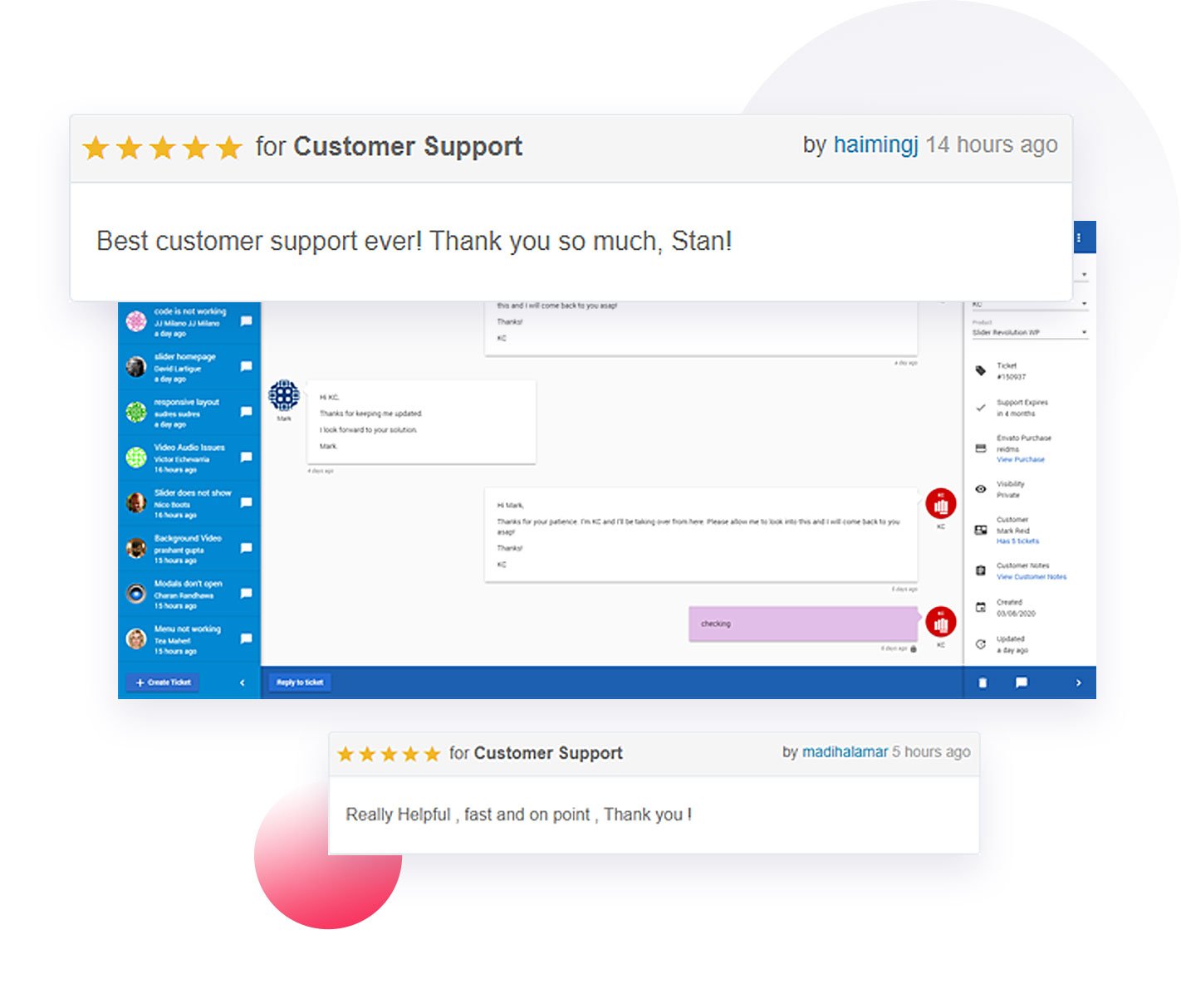
1 on 1 Customer Support to handhold you every step of the way
You get 24/7 access to our highly-qualified customer support team, no matter what timezone you live in.
They are always there to answer your questions and send you the right documentation whenever you need guidance.
Enjoy our quick and efficient team of support wizards, highly appreciated by 7+ million users who gave us a 4.7/5 rating on CodeCanyon.
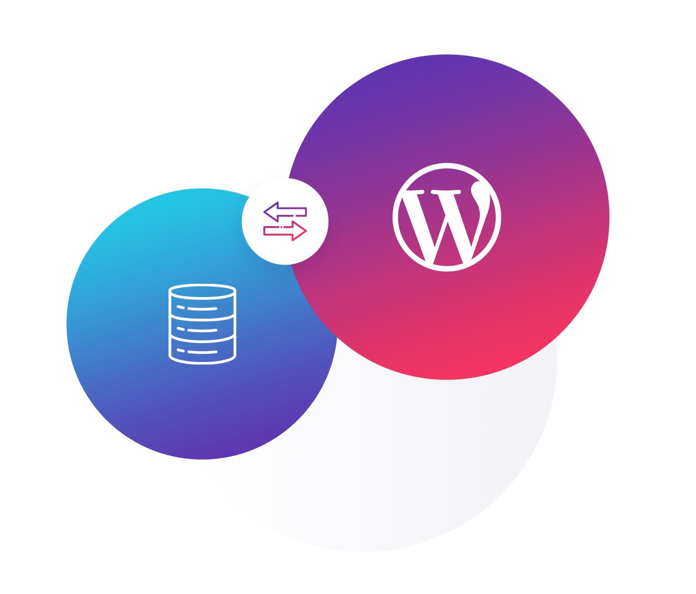
Express 1-Click Updates directly from our update servers
Be the first to receive updates and get instant access to the latest special effects in Slider Revolution.
With just 1 click, you get to explore new ways to turn every element into a magical visual experience.
Flawlessly responsive carousels and slides are already old news to us. We make sure to bring the hottest trends at your fingertips, so you’ll always stay ahead of everyone else in the industry.
Explore The 250+ Eye-Candy Templates
Your Competitors Wish They Had


Watch the quick demo to see why Slider Revolution is more than just a WordPress slider plugin


Here are some wonderful and surprising ways
you can use Slider Revolution to turn any
web page from Meh to Wow …
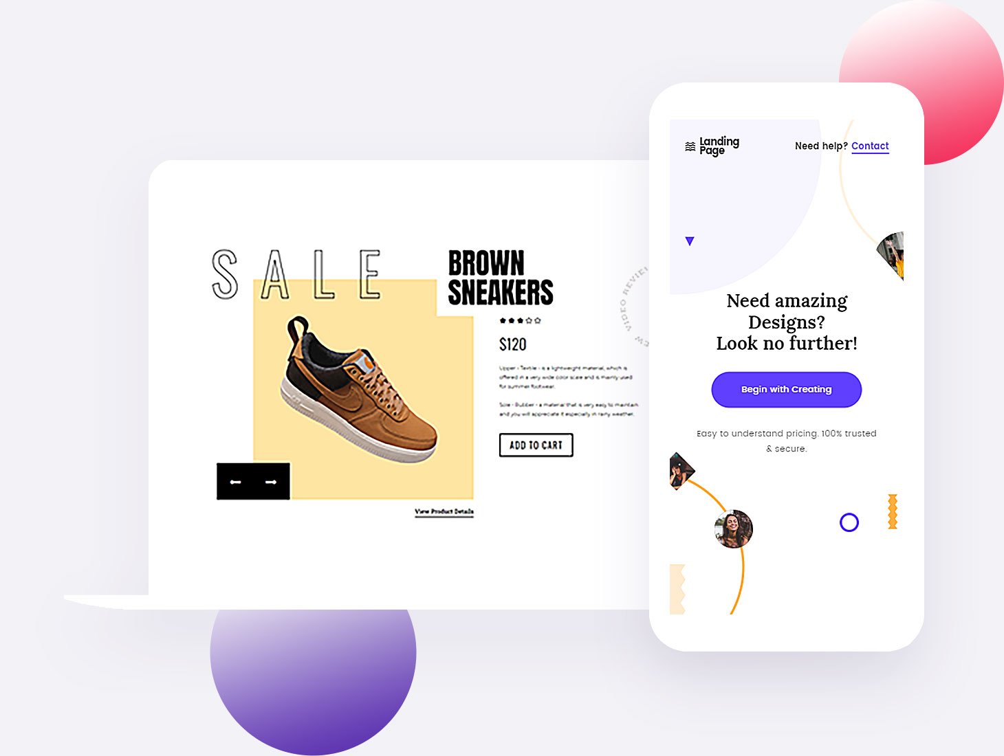
Hero Sections
Create hero sections that instantly grab attention.Pro-Level Websites
Put together pro-level web pages in minutes.Hypnotizing Sliders
Create responsive sliders & carousels that hypnotize.Social Media
Show videos & images from SM platforms.Special FX
Add layers of special effects to any type of media.High-End Design
Build award-worthy responsive websites for your clients.Rich Content
Build rich & dynamic content that never gets ignored.Visual Freedom
Get total freedom over every element on your page.Pump It Up
Pump up boring visual elements such as forms & CTA buttons.Slider Revolution is the combo you
never thought possible
You won’t need multiple apps to bring your creative vision to life anymore. You have everything you need rolled into ONE WordPress slider plugin.
Photoshop gives you,
with a much shorter and
easier learning curve.
After Effects delivers,
all included into the most
powerful WordPress editor.
Adobe Flash provided,
but you can use any type of
media any way you want.


Make everyone wonder
„How Did You Do THAT?“
Hear it directly from our users:
“We couldn’t find a tool that could do everything we wanted.
So we created Slider Revolution.”
Moritz Praetorius, founder @ Themepunch


How did Slider Revolution come to life?
We initially built it for our own needs. We just couldn’t find a slider plugin that could do everything we wanted, so we were forced to waste time on research and learning how to use multiple tools.
So the team here at Themepunch created Slider Revolution and kept adding features to follow our growing needs—and our bold ideas!
Now we use it on all our websites and can’t imagine living without it. That’s why we constantly update it to match the latest trends and quality standards.
If you’re like us and you’re tired of using 12+ apps for a result that doesn’t even get an enthusiastic “WOW!” from your clients… Or that doesn’t look gorgeous on mobile…
Slider Revolution will hand you everything you need for stunning responsive slides, carousels, web pages or full websites.
All rolled into ONE single powerful WordPress slider plugin.
Without writing code.
visual experiences even with
no coding knowledge?
websites, landing pages, hero sections, sliders & carousels and many more!
No coding required. Amazing mobile experience. Multiple pricing options.


