
Desktop, Laptop, Tablet and Phone Size Variants
In this guide, learn about the four layout size variants available in Slider Revolution, and how to preview & edit them.
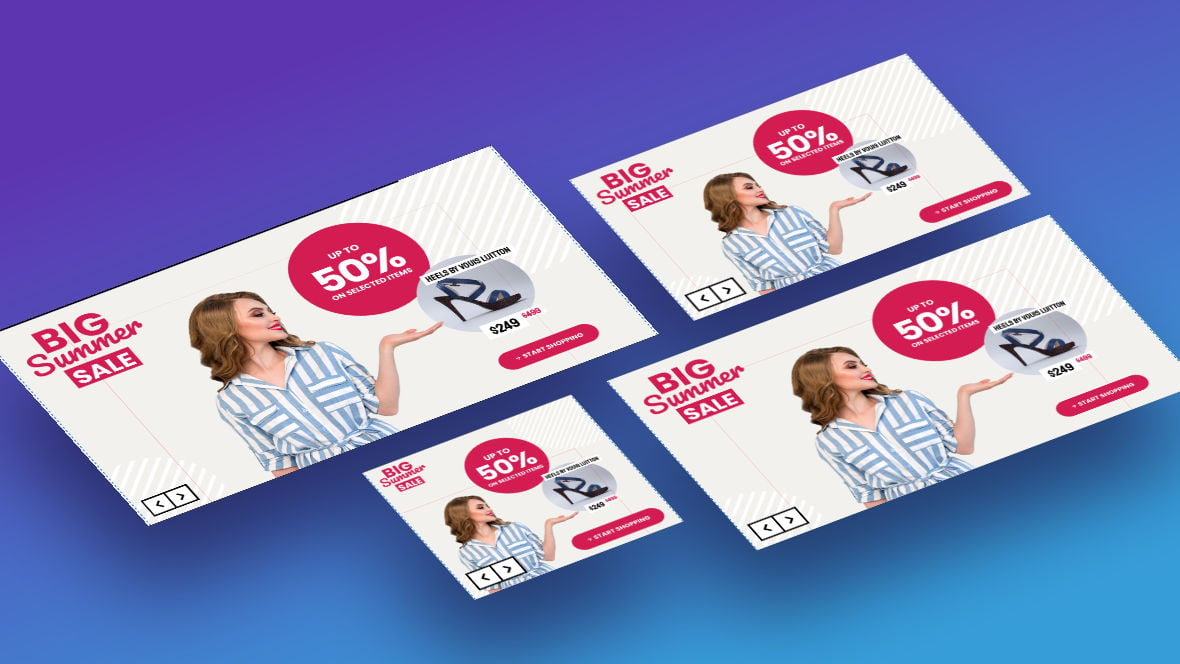
Table of Contents
- Introduction
- Checking Responsiveness in Edited Templates (Video Tutorial)
- The Four Layout Size Variants
- Working with the Four Layout Size Variants
- Preview and Editing Methods
- Coming Up: Adjusting for Responsiveness
Introduction
Slider Revolution [?]
Slider Revolution is a website content creation tool with a focus on captivating animation and stunning visual effects.
It began its life as a plugin for creating slideshows, but has evolved into a fully fledged piece of design software. allows you to make up to four differently sized variants of a modules [?]
A module in Slider Revolution acts as a container for slides, which in turn act as containers for layers. Modules are created and edited with the module editor.
A "module" is a single, self contained piece of content. You can think of this as being similar to the way a post or page in regular WordPress is a self contained piece of content.
A module can represent any kind of content Slider Revolution is capable of creating, such as a slider, carousel, hero unit, navigation menu, posts display and so on.
Multiple modules can be combined to form rich content such as complete sites and landing pages., in turn allowing you to adjust its layout to suit progressively smaller screens.
Once your module is published, Slider Revolution will then dynamically select one of those size variants to show a visitor, depending on which best fits the screen dimensions of their device.
On this page of the manual we’ll learn what these four size variants are, how they are typically worked with in Slider Revolution, and the methods you have available to preview how they look.
Checking Responsiveness in Edited Templates (Video Tutorial)
Everything covered in this section of the manual can also be learned by watching the ‘Checking Responsiveness in Edited Templates’ tutorial video below:
If you watched the above video in full you can skip the remainder of this section of the manual and proceed to the next section of the manual to learn about making modules from scratch.
Or, continue reading to learn more about the four layout size variants in Slider Revolution.
The Four Layout Size Variants
The four layout size variants in Slider Revolution broadly correspond with four categories of device, progressively decreasing in screen size: desktops, laptops, tablets and phones.
In practice, the separation between these device categories can be somewhat blurred. For example, an iPad Pro tablet is bigger, at 12.9 inches, than an Asus VivBook laptop, at 11.6 inches.
So don’t worry too much about each layout strictly being only for one type of device. Instead, think of using your four layouts to cover a broad range of sizes, and leave it down to Slider Revolution to show the right layout at the right time.
You might find your “desktop” or “laptop” layout gets shown on large tablets, and your “tablet” layout on small laptops or even large phones. And that’s totally fine, we just need to make sure that no matter the device size, one of our four layouts is going to fit it nicely.
Working with the Four Layout Size Variants
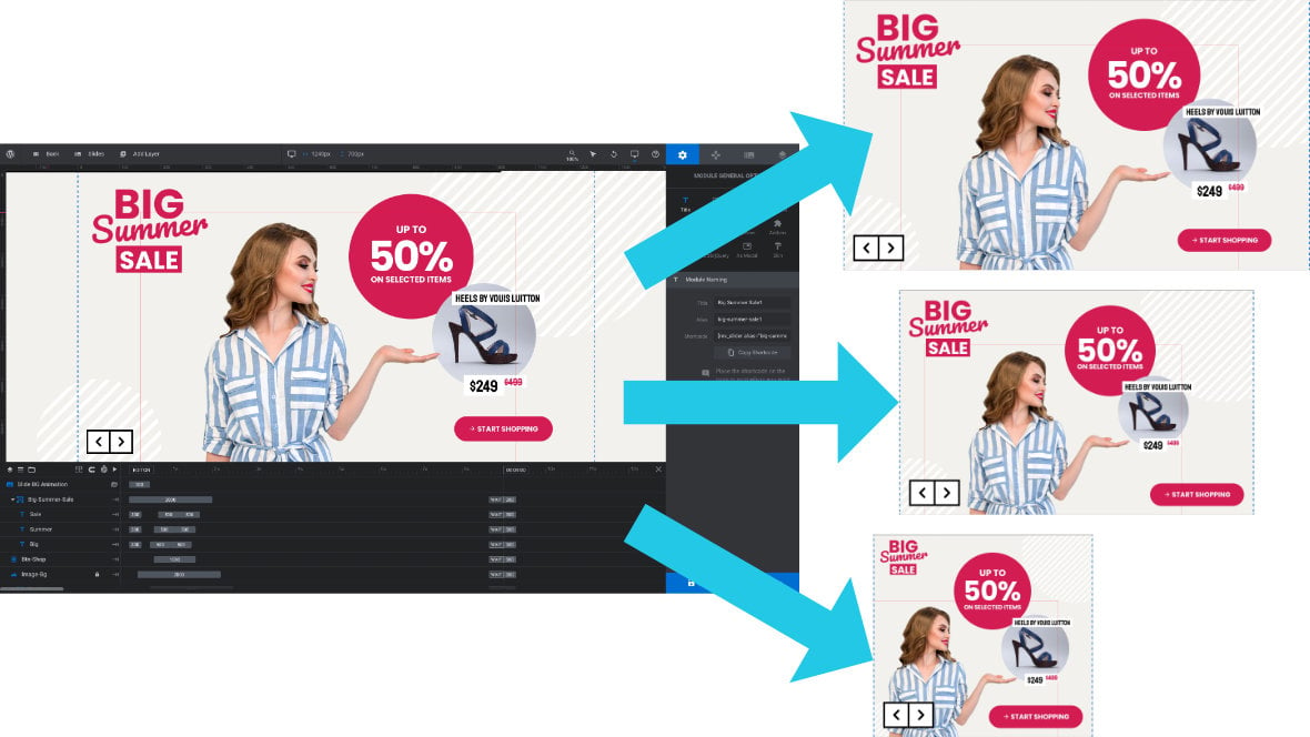
Typically a module is first designed at desktop size, which is the largest and in effect the “default” layout in Slider Revolution. Modified versions are then made at each of the remaining three progressively smaller sizes.
Even when you are working with template [?]
A "Template" is a premade module. It has pre-configured layers already in place.
It is designed to be ready for use, either as is or after being modified in the module editor.
Slider Revolution comes with several templates you can use, or alternatively you can create your own templates, thereby allowing you to easily reuse modules you have produced. based modules, rather than designing from scratch, you will use essentially the same process.
First, you will make your customizations to the module’s desktop size layout, which may in turn effect how it looks at the three smaller sizes. So you will then check on those other sizes, making further modifications wherever necessary to ensure they are still laid out optimally.
Preview and Editing Methods
In order to work with the four layout size variants and ensure they are optimally responsive you will need to know how to preview and edit them.
Slider Revolution gives you two ways to preview layout variants:
1) On the canvas [?]
The canvas is the point and click design space in the module editor. It forms the largest area of the module editor.
In this area layers can be selected, moved and resized. Animations can also be previewed., which is also where you will take care of editing.
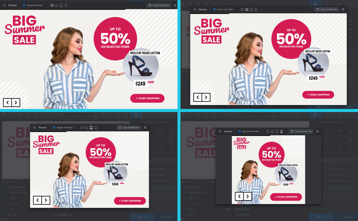
2) In the main popup preview.
On Canvas Preview
By default, when you open up a module in the module editor [?]
The "Module Editor" is the tool used to create & modify modules.
Through this visual, drag & drop, no-code interface you can add various types of layers, animation and special FX to your modules, as well as managing slides and configuring options. you will see its desktop layout on the canvas.
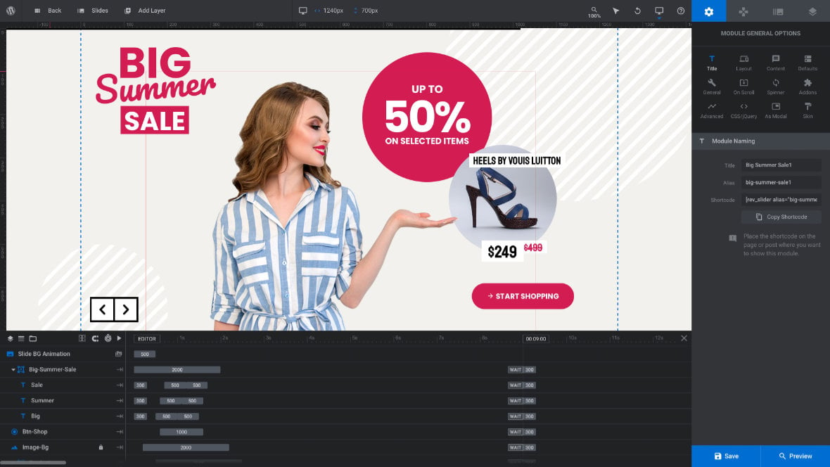
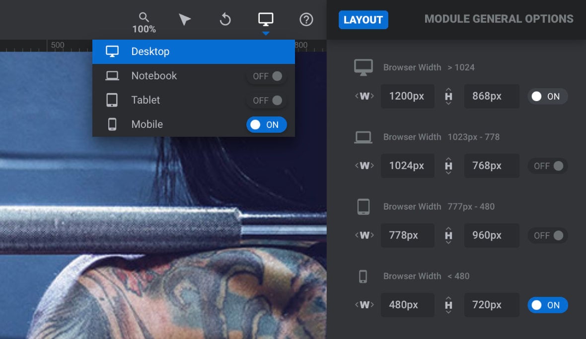
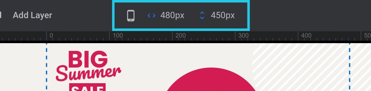
If you look in the center of the the top toolbar, you will see a little display showing a desktop monitor icon to reflect this. (On smaller screen devices the display may appear towards the left end of the toolbar). To the right of the icon you will also see a readout of the width and height of this layout, respectively.
Note: You will need to have the Module General Options tab open, signified by a gear icon, in order to see the layout version display in the top toolbar. This is because other options tab will replace that area with readouts related to them.
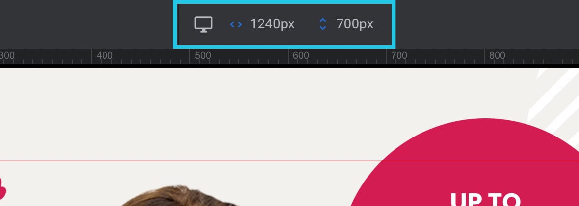
To switch into another layout and show it on the canvas, use the device switcher on the right end of the top toolbar.
Click the device switcher and a dropdown will appear, showing toggle switches and icons representing the other three layout sizes: laptop, tablet and phone.
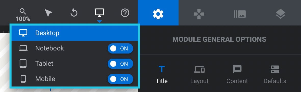
If the template on which the module was based has ready-made responsive layouts, which most do, you will see one or more toggles here set to ON.
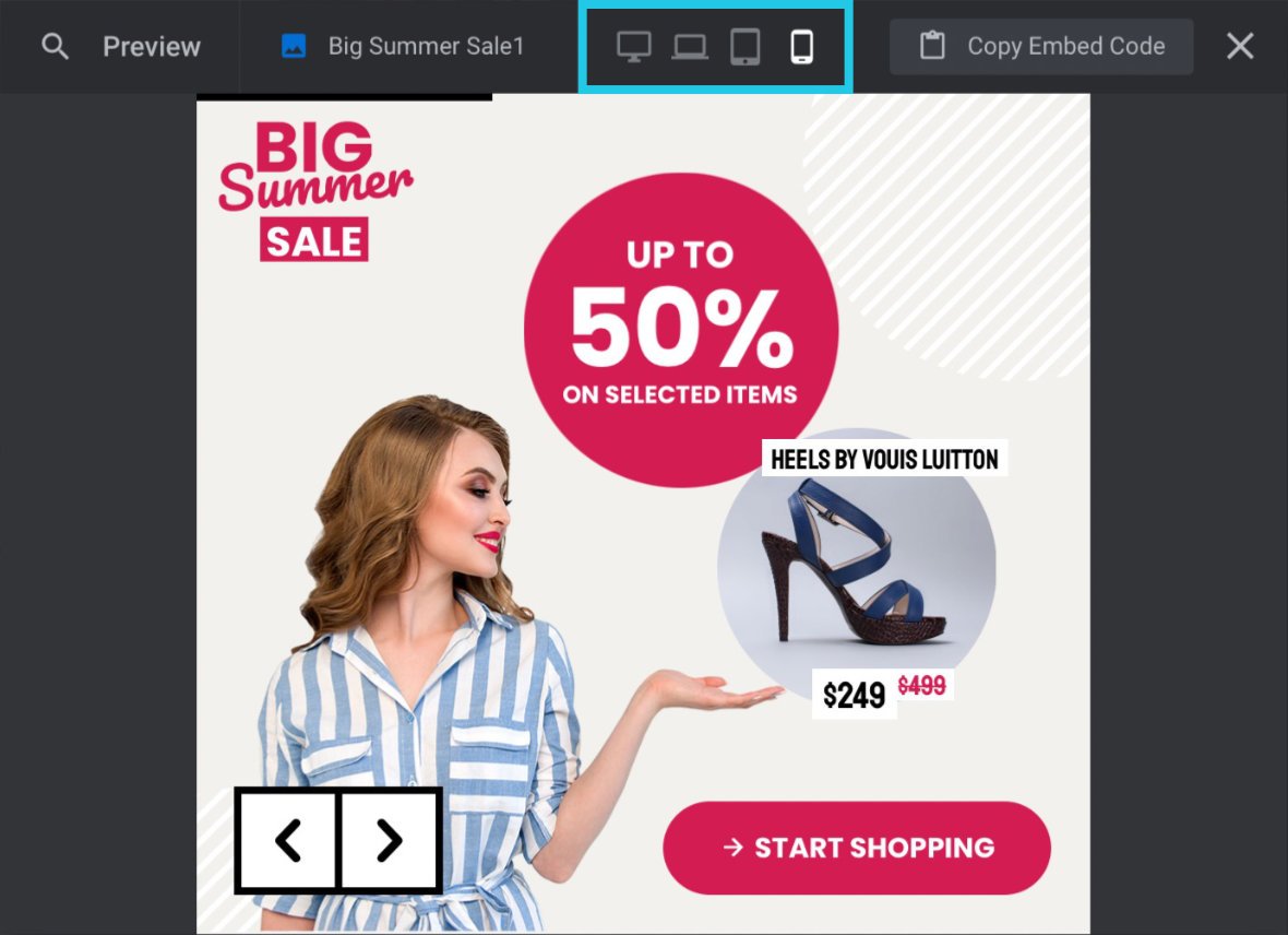
For every toggle switched to ON, you will find a corresponding layout has been made and optimised for that size. Click on the name next to that toggle and the on-canvas preview will switch to show you that layout. In the image below you can see we have switched into the phone (aka mobile) layout:
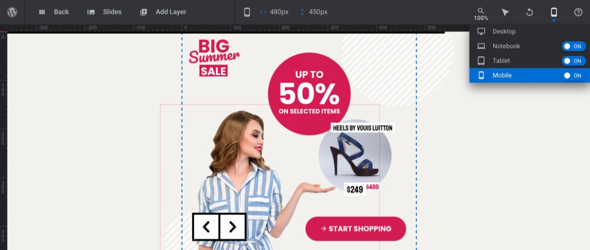
When you switch layouts, the icon and dimensions in the center of the top toolbar will update as well.
You will then also see the blue dashed borders on the canvas has changed size, indicating the boundaries of the currently shown layout.
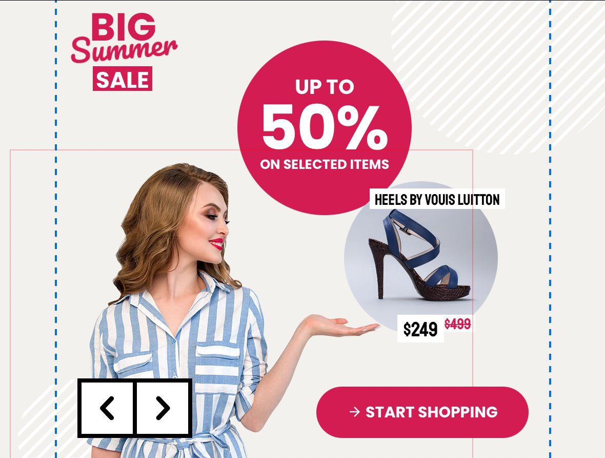
You can now preview your animations playing through at this smaller size.
On Canvas Edit
While you have a particular size showing on the canvas, any layout edits you make will be applied to that size, and not to any size larger than it.
So if you are making changes to the phone size layout, the tablet layout will be unaffected. If you modify the laptop layout, the desktop layout won’t change.
In some cases changing larger size layouts will effect smaller size layouts through a process called “inheritance”, but we’ll discuss that more on the next page of the manual when we learn how to make adjustments for responsiveness.
Main Popup Preview
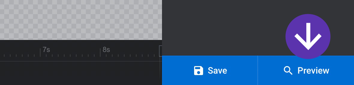
The regular popup preview can also show you all four size layout variants. Click the Preview button at the bottom right corner of the module editor to see the popup preview:
This will show you the desktop layout by default, as indicated by the white color applied to the desktop icon at the top of the toolbar, next to the three grey colored icons representing the other layout variants:
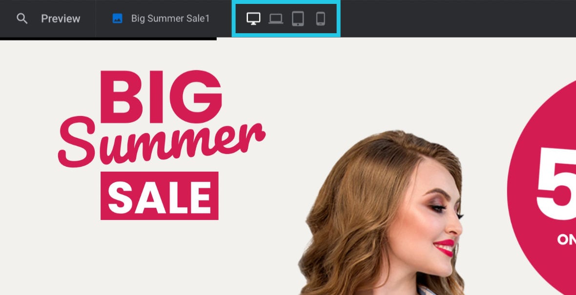
Click any of these icons to switch the layout size being previewed. The currently previewed layout’s icon will always be white in color:
Coming Up: Adjusting for Responsiveness
In the next guide we’ll check out some of the major things to watch out for when checking on responsiveness in customized template-based modules, and learn how to modify your layouts to correct any issues you find.