
The Tools of the Color Selection Dialogue
Let’s learn how to take full advantage of Slider Revolution’s powerful colour selection dialogue box.
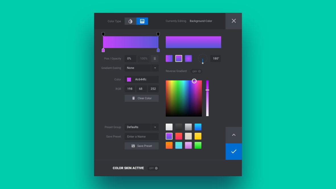
Table of Contents
- Selecting Colors (Video Tutorial)
- Opening the Color Selection Dialogue Box
- Color Selection Dialogue Box Sections
- Top Bar
- Color Inputs
- Presets
- Side Buttons
- Gradient Editing
Selecting Colors (Video Tutorial)
Learn all about Slider Revolution’s Color Selection Dialogue Box by watching the below Selecting Colors tutorial video:
If you watched the above video in full you can skip to the next section of the manual: Changing Spinners.
Or continue reading to learn how to take full advantage of the Color Selection Dialogue Box.
Opening the Color Selection Dialogue Box
The color selection dialogue box appears when you need to choose a color for any layer [?]
Layers are containers for visual, audio or layout items and are added to slides. For example, text, button, image, audio, video, group and row are all types of layers.
Layers are added to slides via the module editor. setting. It will be launched whenever you click a small color swatch & color code field that looks like this:

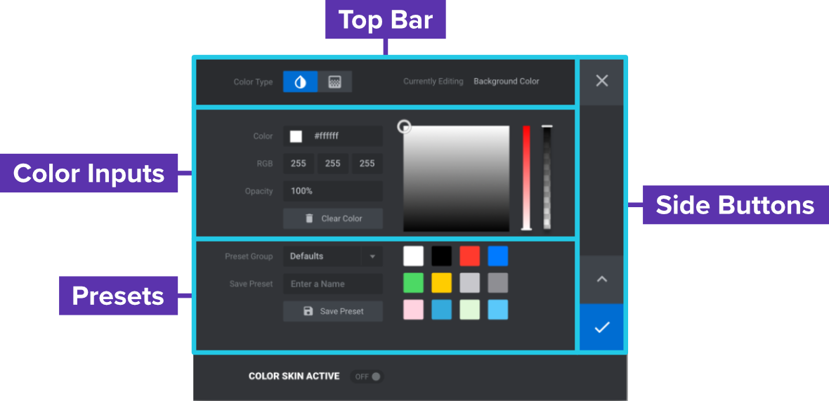
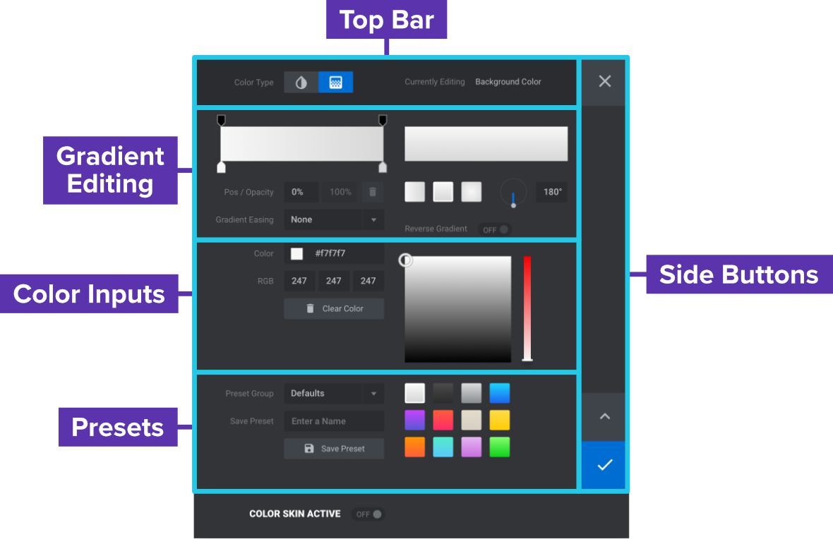
Color Selection Dialogue Box Sections
We’ll be breaking the color selection dialogue box into five sections so we can focus on one at a time. These sections are as follows:
- Top bar
- Color inputs
- Presets
- Side buttons
- Gradient editing
When working on a flat color, the sections will appear like this:
When working on a gradient, the sections will appear like this:
Note that in both cases there is an additional section at the bottom that relates to color skins, but we won’t be covering skins right now. In this guide we’ll specifically be focusing on working with flat and gradient color selection. We’ll cover color skins later in the manual.
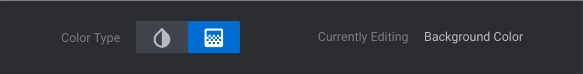
Top Bar
The top bar comprises the top left portion of the colour selection box and looks like this:
Note that if you need to move the box around so you can see behind it, you can do so by clicking and dragging on this bar.
Color Type
On the left side of the top bar you will see the Color Type toggle. This will allow you to switch between selecting a flat color by clicking the left most icon, or a gradient by clicking the right most icon.
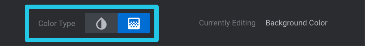
Most layer types will allow you to use either flat or gradient colors, however text layers use flat colors only.
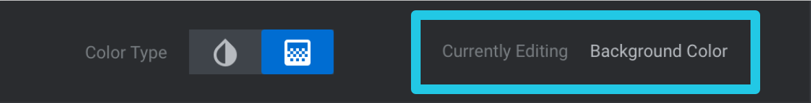
Currently Editing
On the right end of the top bar is the Currently Editing status. This displays the name of the setting currently having its color edited, which helps you keep track of what you are working on.
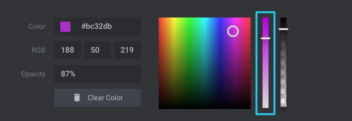
Color Inputs
Immediately below the top bar is the Color Inputs section. Here you will find various tools that allow you to input color settings:
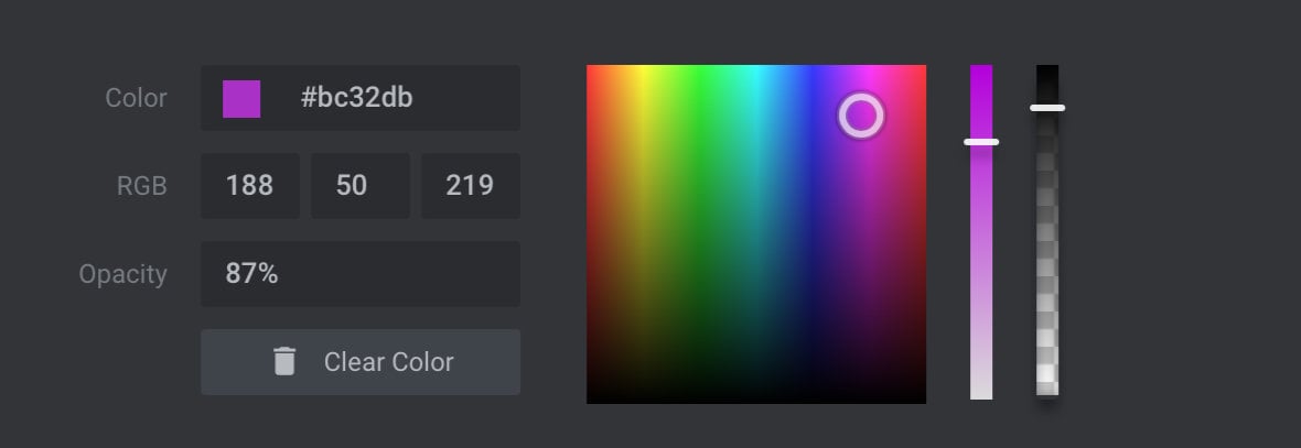
Let’s break down which aspect of color selection each one of these tools facilitates.
Hue and Lightness Box
The large box in the middle of the color inputs area allows you to control hue and lightness.
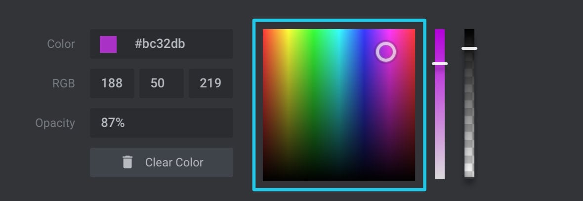
Hue is another name for what we would usually, in every day language, call color i.e. orange, green, blue, red etc. You can choose a hue in this box by dragging the small circular indicator left or right.
Lightness refers to how much black is mixed into your color and can be set by dragging the circular indicator up or down in the box. For lighter colors drag up to mix in less black. For darker colors drag down to mix in more black.
Saturation Slider
The Saturation Slider, to the right of the hue and lightness box, allows you to control how much white is mixed in to your color.
If you want bright, vivid colors move the slider towards the top, or for soft, pastel colors move the slider towards the bottom.
Opacity Slider and Field
There are two controls that allow you to set the opacity of your color, i.e. how transparent it is. There is a slider to the right of the saturation slider, and an Opacity input field at the bottom left.
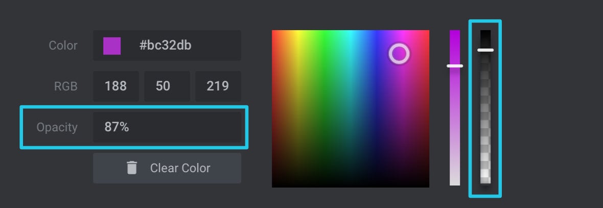
Drag the slider down to make the color more see-through. Drag the slider up to make the color more opaque.
Alternatively, you can directly enter your preferred level of opacity as a percentage in the Opacity field. 100% represents a completely solid color, while 0% represents a completely transparent color.
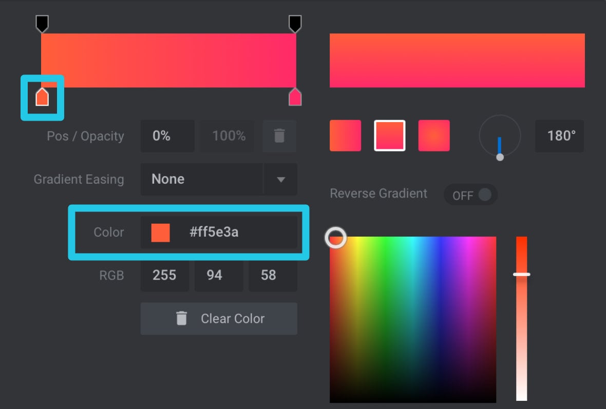
Color Field (Hexcode)
The Color field shows your color represented as a hexcode, which is a six character code used in web design and many graphic design programs.
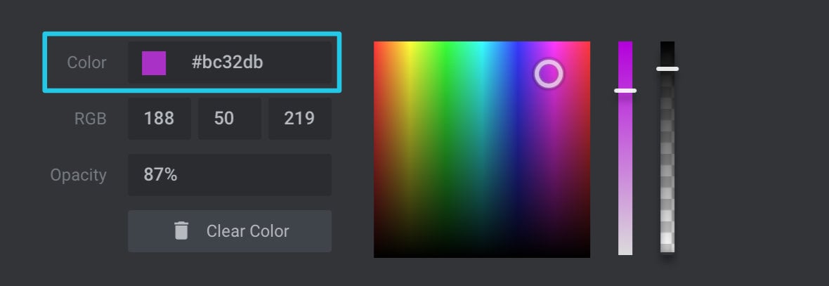
The code in the Color field will automatically update as you make changes in other fields. You can also directly input a code here if you already know the color you need to use.
RGB Fields
The RGB fields show your color represented as three numbers, each representing the amount of red, green and blue in the color respectively. RGB codes are also used in web design and many graphic design programs.
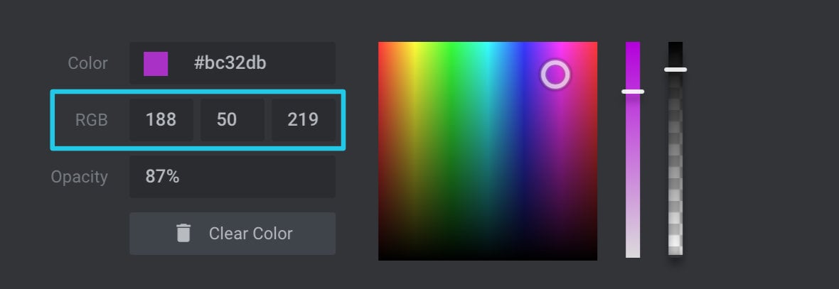
The RGB fields will also update automatically as you make changes to other fields, and can be modified via direct input.
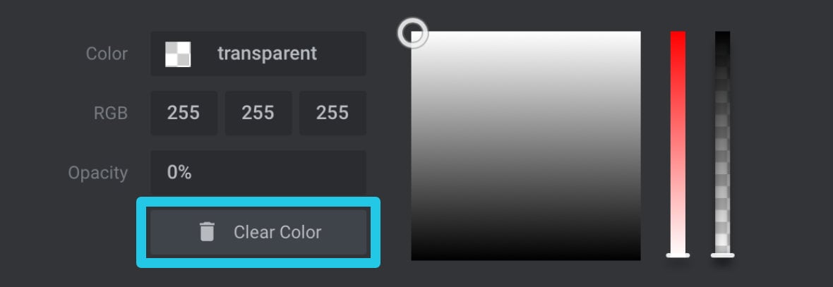
Clear Color Button
If you don’t want to have any color at all for a given setting, click the Clear Color button and it will fill in a “transparent” value.
Presets
Presets are colors you can save in order to easily reuse them later. The section that controls presets is below the colour inputs section and looks like this:
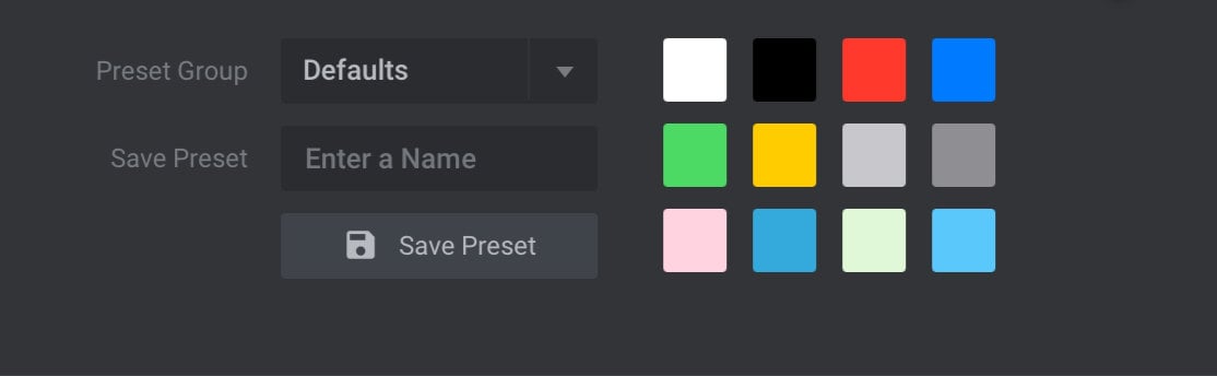
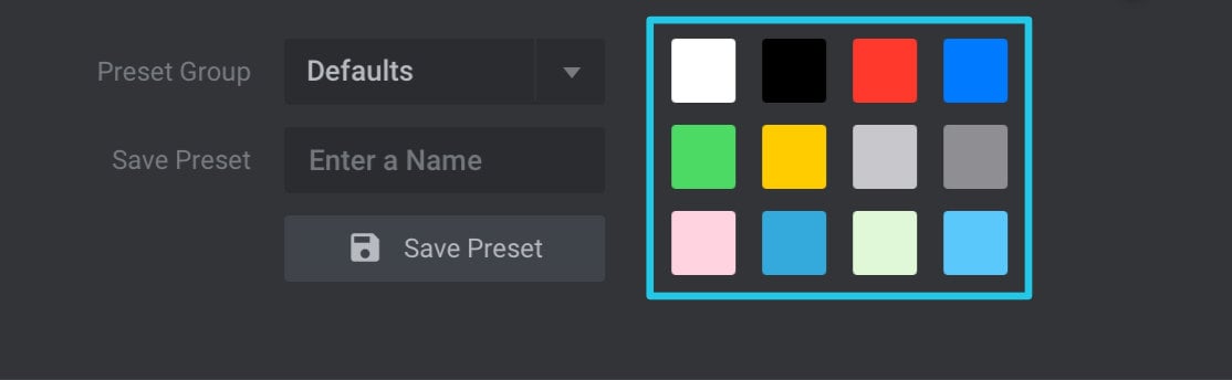
Preset Swatches
On the right of the presets section is the collection of default color swatches. You can click on any of the swatches to choose it for the setting you are currently editing.
Preset Group
There are two groups of presets available to work with: The Defaults group which is pre-filled with a collection of colors ready for you to use, and the Custom group to which you can add your own presets.
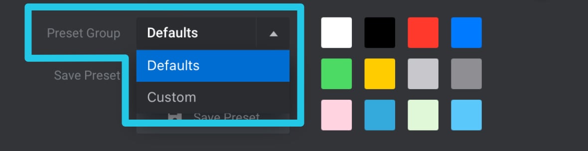
You can switch between these groups by using the Preset Group dropdown list.
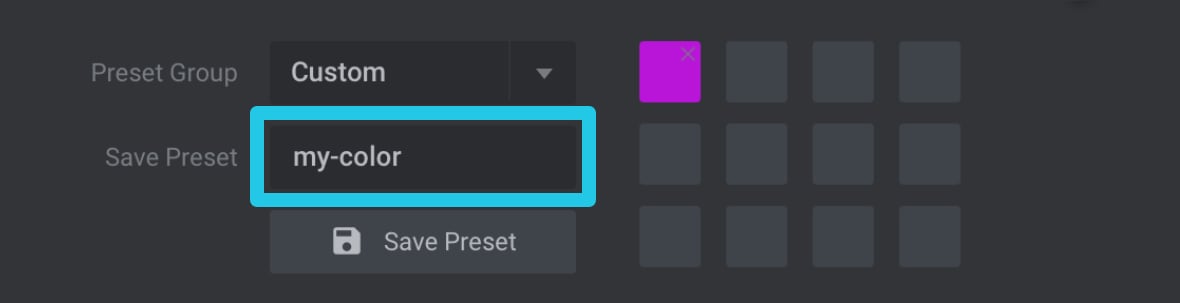
Preset Name
Before you can save a color as a preset it needs to be given a unique name. Enter a name for your color in the Save Preset field.
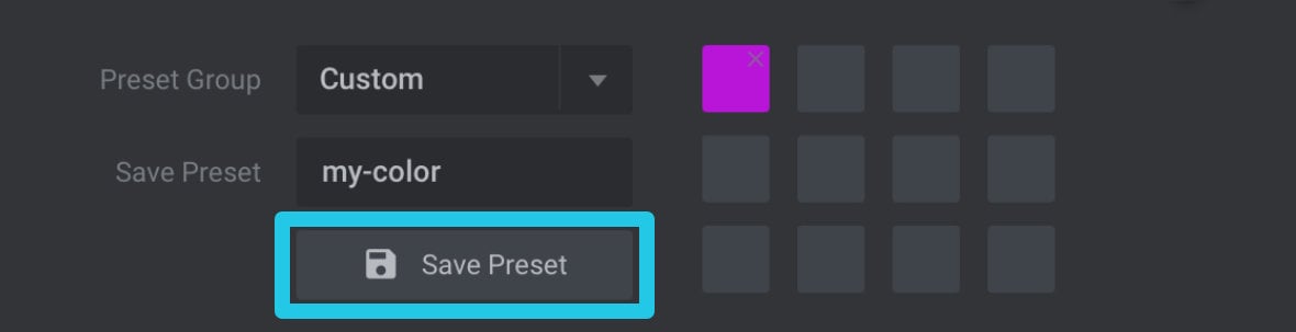
Save Preset Button
Once you’ve entered a name for your color, click the Save Preset button to add it to the custom preset group.
Side Buttons
Down the right hand side are three large buttons. Let’s cover what each one does.
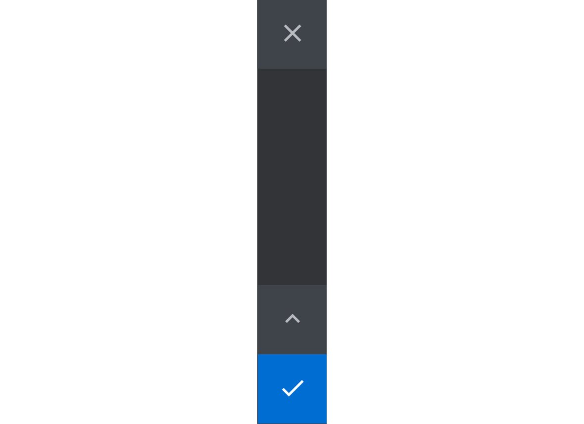
Exit Button
Click the button with the “X” Icon if you would like to close the color selection dialogue box without applying any of your charges.

Make sure you don’t accidentally press this button if you do want to apply the color you have selected.
Show / Hide Presets Toggle Button
Clicking this button will toggle the presets section to be either shown or hidden.


Commit Color Button
Click the large blue tick button to commit your selected color and close the color selection dialogue box.

Gradient Editing
The Gradient Editing section will appear in the color selection dialogue box when it’s in gradient color type mode. Let’s look at what each part of the section does to help you create gradients.
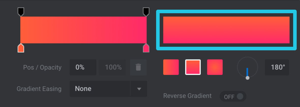
Gradient Preview
In the top right corner of the gradient editing section is the Gradient Preview. Make sure you look here to check how your gradient is coming together as it is the only part of the gradient editing section that will give you an accurate representation.
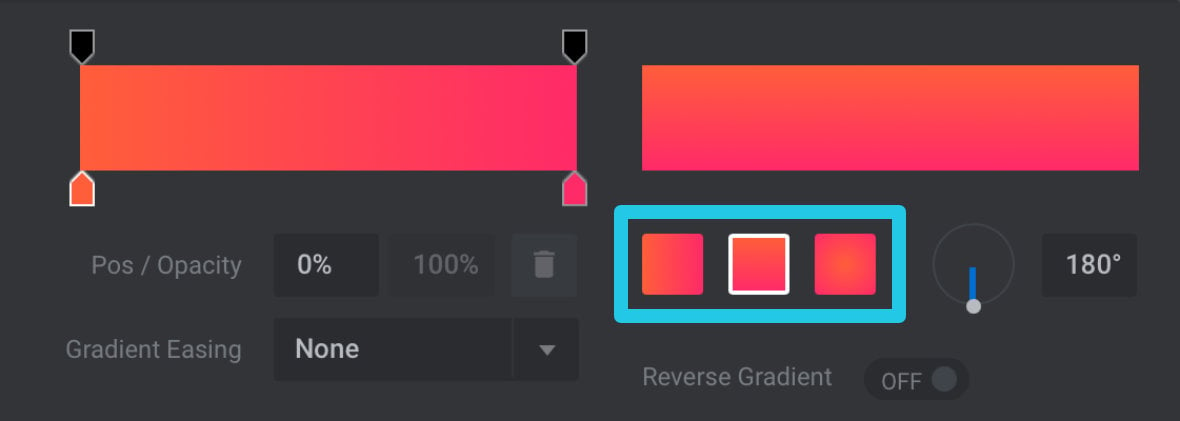
Gradient Type
There are three Gradient Type boxes located below the gradient preview. Clicking one of these boxes allows you to switch between a horizontal linear gradient, a vertical linear gradient, or an elliptical gradient:
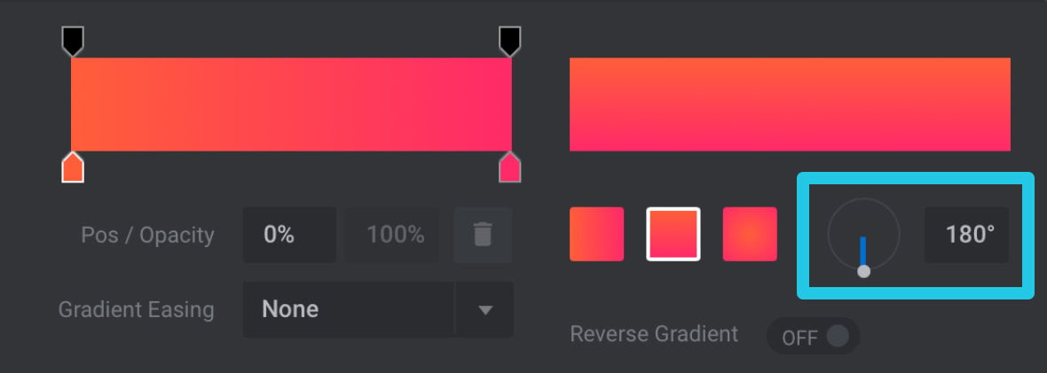
Gradient Angle
To the right of the gradients type boxes are the Gradient Angle controls. On the left most of these controls, click and drag the end of the blue line to determine the angle of your gradient. Alternatively you can directly enter the angle you wish to use, as a degree value, in the field to the right.
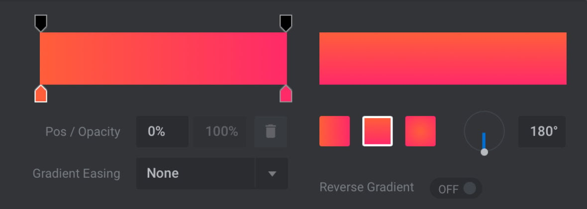
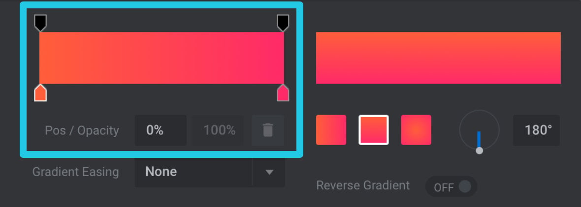
Gradient Stop Editor
At the top left corner is the Gradient Stop Editor. All gradients are made up of “stops”, which are individual points of color or opacity that the gradient transitions between. The gradient stop editor allows you to specify the values of these color and opacity stops.
Color Stops
The color filled, house shaped pointers pictured below each represent the color stops of your gradient.
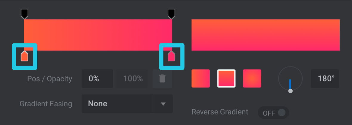
To modify the colors your gradient uses click on a color stop to select it and you will see the corresponding hexcode appear in the Color field below. You can then use all the color input fields we talked about earlier to set the color you want for the selected stop.
Opacity Stops
The stops along the top work much the same as the color stops, with the difference being they represent opacity.
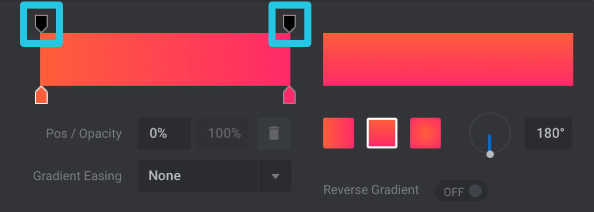
To alter the value of an opacity stop, select it then modify the percentage number in the Opacity field below:
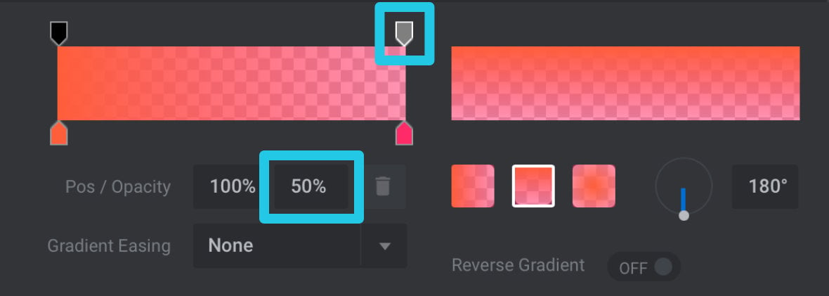
Moving Stops
By default a gradient will have color and opacity stops at each end, however stops can actually be positioned at any point along a gradient. To move a stop, click and drag it into your preferred position, or select it then directly enter a value into the Pos field below.
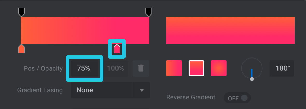
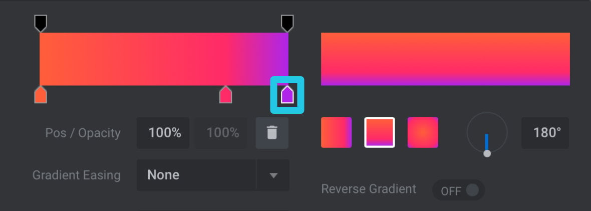
Adding Stops
You are not limited to having only two color stops and two opacity stops. You can actually have as many stops, of either type, as you would like. To add a stop just click in the position where you would like the new stop to appear:
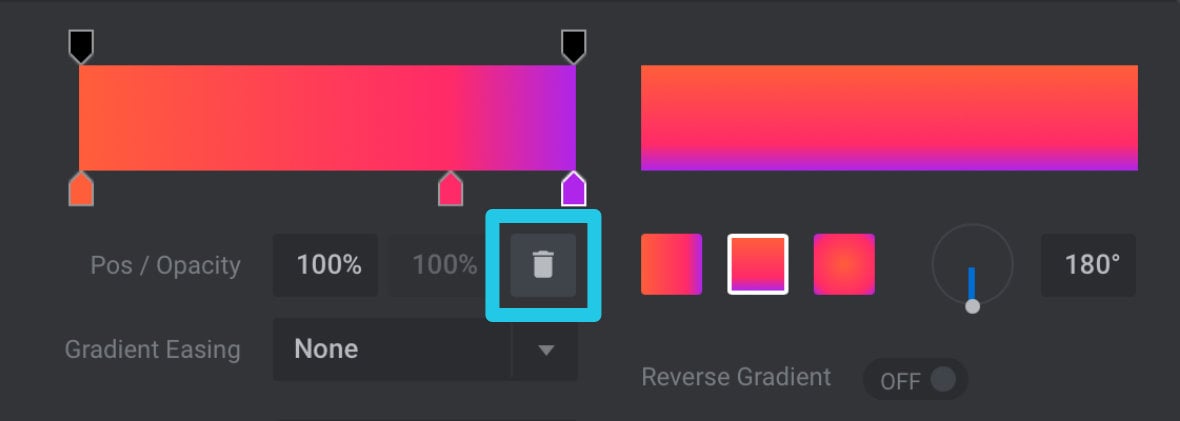
Deleting Stops
To delete a stop, select it then click the bin / trash icon below:
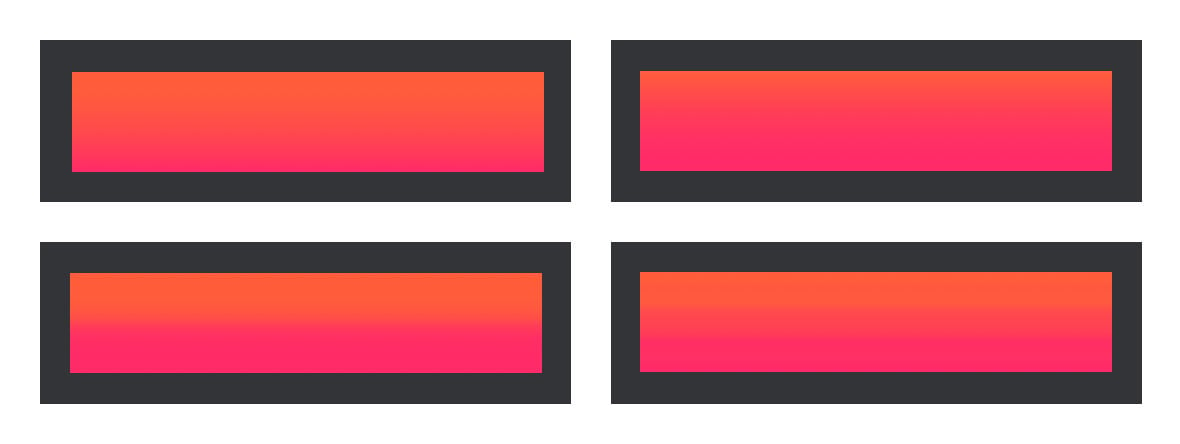
Easing / Strength
The Easing / Strength options allow you to change how colors transition between stops. To try out different easing functions choose from the Easing dropdown list pictured below:
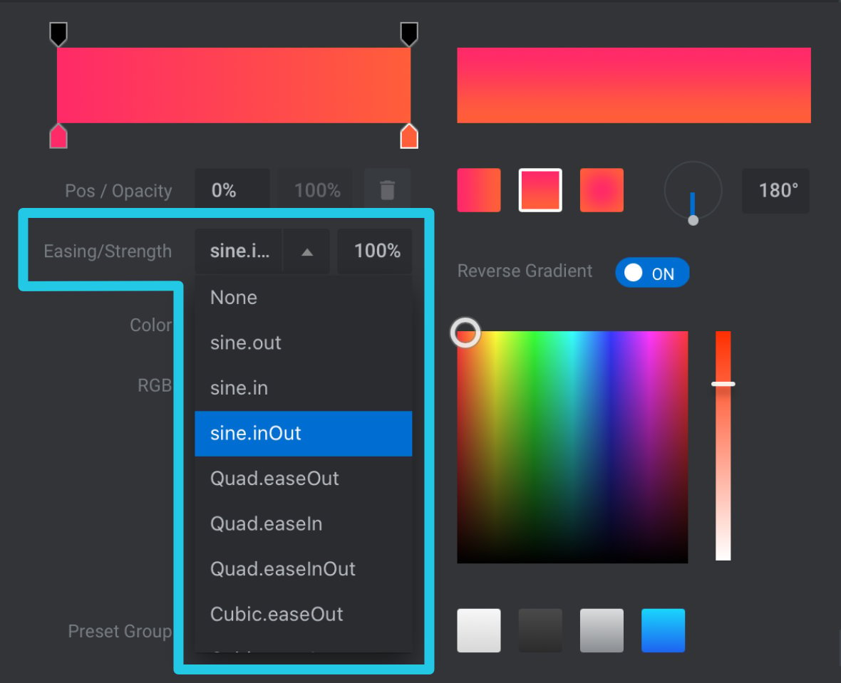
You can also modify the percentage value shown in the Strength field to determine how much of an influence your selected easing function has.
The image below shows how four different easing functions can modify the way a single gradient looks:
Reverse Gradient
To quickly change the direction of your gradient, such as changing it from black through white to white through black, toggle the Reverse Gradient switch:

Coming Up: Swapping Spinners
As you can see the color selection dialog box is a robust tool with a great many helpful features you can use in your color scheme creation process.
Up next is the last of our intermediate template editing techniques, where we look at how you can swap out your module’s spinner a.k.a. its preloading animation.