
Imagine a stage without a curtain call, a novel minus the final chapter. That’s your website without a properly tailored footer—sure, the show goes on, but the crowd leaves feeling something’s amiss. Here’s where Bootstrap, that sleek and savvy front-end framework, rocks the spotlight, ensuring your website’s final bow is as impactful as its entrance.
Today, we’re diving feet-first into the world of Bootstrap footer examples, the unsung heroes that cap off your content.
Often overlooked, these powerful lines of code are a goldmine for user navigation and engagement, done right—they transform from mere afterthoughts to pivotal points of connection.
By the end of our journey, you’ll wield the magic to craft footers that don’t just live at the bottom but elevate the overall experience.
From responsive templates to footer bar widgets that whisper finality with finesse, you’ll unlock a world where website footer best practices and footer design trends converge. Prepare to customize that underutilized real estate like never before.
Bootstrap Footer Templates To Check Out
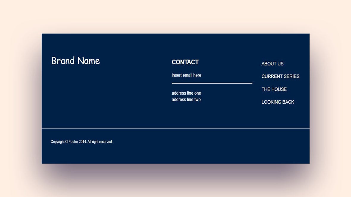
Footer made in Bootstrap
Aviforever is the coder behind our first Bootstrap footer., which can be readily used by anyone. Just adjust the footer content to match the information.
Bootstrap Footers – Material Design & Bootstrap 4
This basic footer design is coded in Bootstrap 4 by MDBootstrap. It has site navigation features, such as buttons and links, and incorporates company info, copyrights, and forms, among others.
Bootstrap Footer Design
This one is designed and coded by anu.uxe
simple fixed footer
This page-wide footer design by Mātthīas has ample space to add links, widgets, and company information. The template is modifiable to the needs of the user. The footers can be decorated with elements from the CSS link style design collection.
Bootstrap 4 Footer with Social icons
This Bootstrap 4 footer by Namiq Namaz has space for anything that the visitor should look at. It has space for links to external links, privacy policy, relevant secondary pages, sponsors, and terms and conditions.
CSS Goey footer
An interactive CSS footer made by Zed Dash. A fresh new design concept that will catch the eye of the visitor. Some have described the red bubbles as a burning fire effect, others see a lava lamp. To change the look of the footer, the user can change the color.
Footer UI: Dark Theme
This is a simple footer template with a dark background, coded by Prince Sargbah.
Footer bootstrap design
This dark-themed Bootstrap footer is by dia. It is a clean and simple design. There is a bright orange button that draws attention and incites action, which is very useful for highlighting core information for the visitor.
bootstrap footer
This one is made by Sebastian Sabadus.
stylish footer
Stylish footer has a moving vector background. Its creator, Swarup Kumar Kuila, has made sure that the text does not interfere with the background. This concept is free to use and adapt to the needs of the programmer.
CSS Goey footer
This footer, coded by fanggeyanhua, is dynamic and has the appearance of blue fire.
Bootstrap footer
Made by Ali, this is a simple footer with a dark theme.
Footer Light
Seemingly one of the simplest footers on this list, coder Ahmed El Sheikh has minimized this footer to six circles with links to social media pages. Apart from that,it has no text and no links.
Beautiful Aurora Footer Lights
The Aurora light effect is a very subtle and simple trick that briefly draws attention to the bottom of the page. Amit Ashok Kamble used this to highlight the area of the page where the footer with important information is located. The natural-looking colors and color changes are thanks to the latest CSS coding.
bootstrap footer example
Thisbootstrap footer, made by Muktihaniro,is excellent for showing brand, identity, and company news.
Footer UI: Dark Theme
The coder, umid, made a dark-themed footer with five columns. It can display contact information, links, logos, a menu, and social media links. The column on the right has space for a newsletter. It invites the visitor to subscribe to receive news regularly.
Multi Column Bootstrap Footer
This is a footer with various columns, coded by Kate.
HTML CSS Mobile Responsive Footer
This piece of code by Jake is especially useful for any web designer who is looking for a responsive Bootstrap footer. It comes with all the elements a website visitor may need to easily navigate and visit social media links.
footer with conent scale
This footer, made by moises, is a real timesaver when developing a web page. It contains a content scale that covers the entire page.
responsive footer bootstrap 4
This Bootstrap footer is the result of code made by Axelaredz. It has space for all the important information that a client should have quick access to. It can display contact information, page links, and an info section. The basic design even has space for a company logo.
HTML CSS Mobile Responsive Footer
This stylish theme with a beautiful dark background was made by hari. It is based on HTML and CSS and was designed to be responsive, which makes it very suitable for adding it to any kind of website, even to existing pages. Its flexibility and customizability are great advantages of this Bootstrap footer.
Footer with CSS Grid
Jules Forrest is the creator of this animated Bootstrap footer. When moving the mouse over one of the links, a waving hand emoji starts waving welcomingly. The effect attracts the attention of the user and invites them to click any of the social media links.
A simple responsive Footer
This Bootstrap footer is one of the more elaborate choices. Ravi Chauhan included company info, address, social media links, and a map in his design. Its main advantage is that it allows the visitor to navigate most parts of the website. The green background color is both bright and calming and it sure catches the eye. Unique fonts complete this special design.
Another Simple Footer
This Bootstrap footer is very simple. The coder, toama, made this small design and has space for a small amount of information. Footer content is limited to the copyright, contact, and social media links. It is like a small banner at the bottom of a page.
Fancy Footer
Anurag Chitnis made this footer based on Bootstrap 4. The special feature is that it unfolds and collapses by clicking an arrow on the right bottom corner. A shade around the arrow guides the visitor in the right direction.
Basscss: Responsive Footer
Coded by Taher Ben Sassi, the footer content can be used to display company information, links, and other important information. It has an additional button that brings the user straight back to the top of the page.
stylish footer
This free Bootstrap footer is made by George Thomas. It has an animated background showing a cityscape. That background is bound to leave a lasting impression on the visitors. It has sections for contact information, downloads, help, and social media. There is also a highly visible CTA for newsletter subscriptions.
FAQs about Bootstrap footers
How do I create a basic Bootstrap footer?
You spark up your editor and drop in a div with a class of footer. Next, weave some Bootstrap classes like container or container-fluid for responsive muscle. Keep it simple: Include your copyright, a dash of contact info, and violá, you’ve got a basic but solid foundation.
Can I add social media links to my Bootstrap footer?
Absolutely! Bootstrap’s grid system plays nice here. In a column, toss in some icons—FontAwesome is a buddy—and hyperlink them to your social landscapes. Now, users can easily leap from your digital doorstep to your social spheres.
Are Bootstrap footers responsive by default?
Bootstrap’s built on a mobile-first philosophy. That means your footer will shimmy to fit screens from phones to phablets to desktops—no sweat. Just ensure you’re using the right container classes and follow responsive design rules.
How can I make my Bootstrap footer stick to the bottom?
Well, there’s a trick called the fixed-bottom class in Bootstrap’s bag. Append it to your footer’s classes and presto, it’s cozily hugging the screen’s bottom, no matter how short your content is. Just be wary of overlaps on shorter pages.
Is there a way to customize Bootstrap footers beyond the default styles?
The sky’s your limit! Override Bootstrap’s CSS in your stylesheet. Want to change colors, padding, or fonts? Go on—it’s all yours to tweak. Make that footer stand out or blend in; it’s your canvas.
What should I include in a multi-column Bootstrap footer?
A multi-column footer is like a mini sitemap. Think: About Us, Contact, Products, Services, Legal, even a newsletter signup form. Arrange these with Bootstrap’s column classes and your footer won’t just be informative, it’ll be a navigation powerhouse.
How can I add a copyright notice to my Bootstrap footer?
Dig down to the basics. Text in a paragraph tag, sprinkle the current year, and your name or your company’s trademark. This isn’t just legalese—it echoes credibility and roots your digital territory in the vast web wilds.
Do I need to consider accessibility when designing a Bootstrap footer?
As surely as the sun rises. Screen readers are real users too! Use semantic HTML5 elements. Make sure links have clear text. Add alt text for icons. And remember, contrast is key—not just for style, but for readers of all sight levels.
How do I add a newsletter signup form to my Bootstrap footer?
Craft a form element with an input type of email and a submit button. Hook it with Bootstrap styling for a seamless look. Users will be tossing their emails your way with ease, eager for your updates, right from your footer’s embrace.
Can I use Bootstrap footers for site navigation?
Absolutely. Think of it as the lower deck of your site’s cruising ship. List your main pages, tuck them in columns or a list group. This way, users have a second chance at navigation, right at the bottom, making for smooth sailing.
Ending thoughts
And there you have it, a whirlwind tour of Bootstrap footer examples. We’ve armed soles with the know-how to craft footers—these bases shouldn’t be just afterthoughts but strategic players in your web game.
From flexible templates to sticky-bottom charms, we’ve ensured your footers won’t just idle at the bottom but will rise to the occasion, becoming beacons of navigation. Your takeaway? Don’t let the footer be the forgotten child of your website family.
Dress it up with responsive design, accessible content, and a dash of creativity. Remember, every great website deserves a grand ending, and now you can script yours with finesse. So go ahead, customize and create footers that align with the rhythm of your brand, adding that final note that sings, “Come back soon.”
If you liked this article about Bootstrap footers, you should check out this article about Bootstrap sidebars.
There are also similar articles discussing Bootstrap profiles, Bootstrap carousels, Bootstrap timelines, and Bootstrap search box.
And let’s not forget about articles on Bootstrap menus, Bootstrap testimonial sliders, Bootstrap galleries, and Bootstrap login forms.


