
A Bootstrap menu bar is great for helping users navigate an app or website. A website’s UX is indirectly determined by the quality of its navigation bar.
So, designers need to use navbars that are built with the following key elements in mind:
1. Usability
Useful tools like a call to action button or a search bar
2. Animation Speed
If animation effects are used in the navbar, they should be quick so that site visitors do not need to wait for the nav link options to appear.
3. Legible and Understandable
The navbar text and labels must be easy to read and understand.
4. Branding
All of the above-highlighted qualities are built into Bootstrap menu bars. So for a better user experience, a bootstrap menu is the best choice.
Bootstrap Navigation Bar Types
There are different types of navigation menus for apps and websites. Here are a few examples:
- Hamburger styles
- Sidebar styles
- Off-canvas styles
Bootstrap Menus With Div And Li Class Nav Item Code Snippets
This article is a collection of the best free Bootstrap menu examples to use when designing an app or website. To help you get a clear understanding of each template, excerpts of their customizable codes are included.
Bootstrap Menu Examples For Apps
Mobile Menu Concept
Author: Kyle Lavery
This is a beautiful quick menu concept for mobile applications. The hamburger-styled navigation bar is located at the bottom of the screen which makes it a thumb-friendly design.
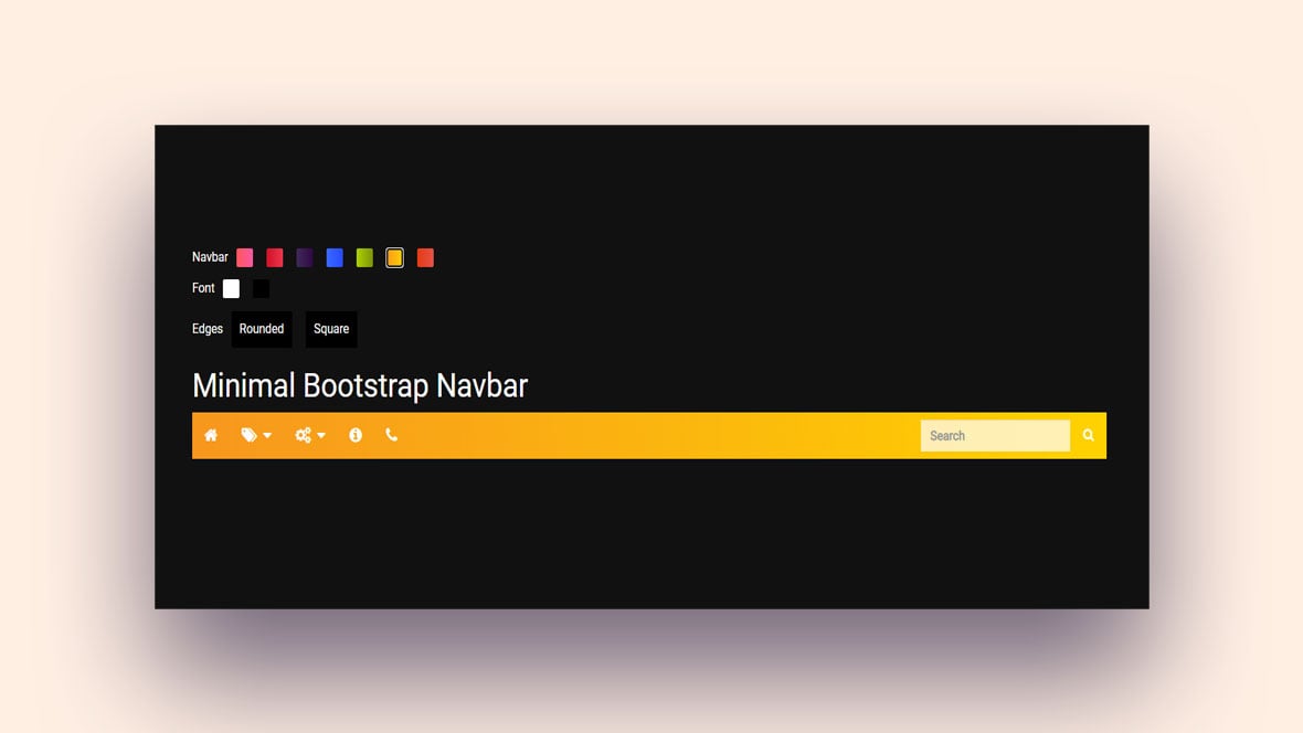
Bootstrap navbar center
Author: Lala
This navbar has a minimal design with centered nav item headers.
Multi-level Bootstrap Menu on hover (no jquery) Bootstrap3
Author: Vaibhav
This option has a minimalistic design with a drop-down menu that activates when hovered over. Here is an excerpt of the dropdown menu code:
<li><a href="#">Level 1</a></li>
<li class="dropdown-submenu">
<a href="#" class="dropdown-toggle" data-toggle="dropdown">Level 1</a>
<!-- Level 2 -->
<ul class="dropdown-menu">
<li><a href="#">Level 2</a></li>
Accordian Menu
Author: Siddharth Panchal
A minimal Bootstrap menu that is suitable for mobile apps.
Pull Menu – Menu Interaction Concept
Author: Fabrizio Bianchi
This design is perfect for mobile apps. It functions with a ‘pull’ menu that transitions to the next category with each pull. You can edit the code to add as many categories as your clients want. A ‘pull’ menu is a unique approach and substitute for a sliding list.
Bootstrap Menu Examples For Apps And Websites
Bootstrap Flex Nav Menu Responsive Brand Logo Image
Author: Bryan Willis
This navbar consists of nine responsive Bootstrap menu examples. Each example contains a logo with navbar contents that can be repositioned with a few simple adjustments to the code.
Mega menu with on mouse hover sub-menu
Author: anil0495
This option is great for a website design project. It includes a dropdown item bar and a hover animation effect on the navbar text. Here is a brief excerpt of the code:
<div class="container">
<nav class="navbar navbar-inverse">
<div class="container-fluid">
For mobile display:
<div class="navbar-header">
<button type="button" class="navbar-toggle collapsed" data-toggle="collapse" data-target="#bs-example-navbar-collapse-1" aria-expanded="false">
<span class="sr-only">Toggle navigation</span>
<span class="icon-bar">
Bootstrap 4 mega menu navigation bar with icons
Author: Omkar Bailkeri
This menu features clickable dropdown item menus.
1 Bootstrap Navbar
Author: Zachary Kahl
This Bootstrap nav item bar can be adjusted using the onscreen customization options. It has a clean navbar design with ample space between the nav icons.
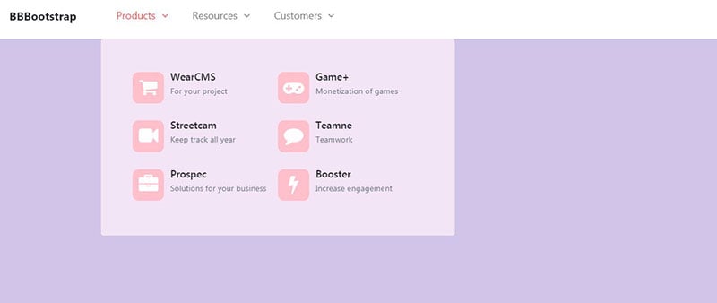
Bootstrap 4 Dropdown Megamenu
Author: BBBootstrap Team
This design is a hamburger-styled menu that is suitable for an app or website. Here is a snippet of the HTML code used in the design:
<div id="navbarContent" class="collapse navbar-collapse">
<ul class="navbar-nav mx-auto">
<li class="nav-item dropdown megamenu"><a id="megamneu" href="" data-toggle="dropdown"
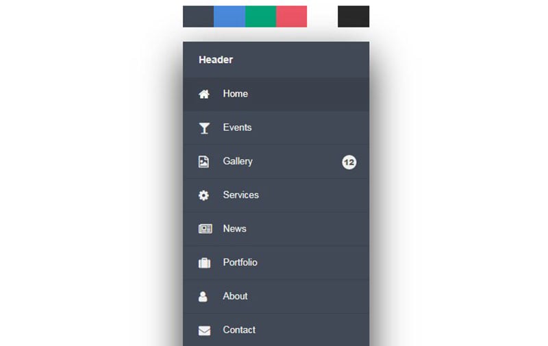
Side Menu (Responsive)
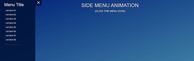
Author: Siddharth Panchal
Here is a responsive hamburger-styled side menu suitable for designing the UI of an app or website.
Gooey Menu
Author: Lucas Bebber
This Bootstrap hamburger nav item bar was built with the CSS and SVG filter. There are 4 versions of this design. Choose a version for a website or app based on your client’s taste.
iOS style sliding menu
Author: Jason Howmans
This Bootstrap design is specifically for iOs users, but it is accessible on other operating systems. This menu is especially great for apps but it can be used for a website.
Bootstrap Menu Examples For Websites
Bootstrap 4 NavBar Variations
Author: Nikola Seke
In this Bootstrap 4 navbar template, the author has assembled two vertical hamburger demos and five horizontal menus. With so many options to choose from, your clients will appreciate the freedom of choice.
CSS3/Javascript Pure Dropdown Menu
Author: Pedro Nauck
This Bootstrap navigation menu is minimal and natural. The menu bar is located in the center of the UI and activates or hides navbar contents when clicked.
Responsive Animated Nav!!!!!!!!!!!!!
Author: Scott Marshall
This is a responsive navigation menu that activates when hovered over. Copy and paste the code and you’re on your way. Here is an excerpt of the code used to build this template:
<nav class="navbar navbar-inverse navbar-fixed-top" role="navigation">
<div class="container"> <div class="navbar-header"> <button type="button" class="navbar-toggle" data-
toggle="collapse" data-target="#bs-example-navbar-collapse-1"> <span class="sr-only">Toggle
navigation</span>
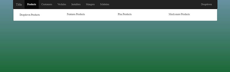
Responsive and Mega menu
Author: Arjun Amgain
This menu is transparent and easy to navigate. It includes a dropdown item menu that activates when hovered over.
HTML5/CSS3 Horizontal Menu
Author: Dhanush Badge
This Bootstrap menu does not have a hamburger design but it includes a dropdown toggle design that is similar. Edit the code to delete the default text and add the client’s nav item text to the menu sections.
menu with awesome hover
Author: Swarup Kumar Kuila
This menu features a hexagonal design with a nav item animation that activates when hovered over.
Bootstrap Resume Landing Page/Website
Author: Marina Marques
This navigation bar featured a simple hamburger-styled dropdown menu with animated navbar text. This option is built with javaScript and includes jQuery for the page scrolling feature. Here is an excerpt of the code used to build this template:
<div class="collapse navbar-collapse navbar-right" id="ResponsiveNav">
<ul class="nav navbar-nav">
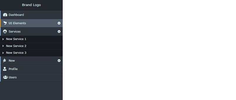
Fixed Navigation Sidebar
Author: Boomer
This menu features a sidebar design.
Sticky Slide Out Navigation Menu
Author: Julie Park
This is a hamburger-styled menu. A nav item is highlighted when the cursor points on it. The navbar is made sticky, so it does not move when users scroll down the page.
Love Style Header Menu Effect

Author: Nemra1
This hamburger menu features an animated transition to the navbar text when the hamburger icon is clicked. Here is an excerpt of the code used:
<div class="nav-modal"> <div class="blob"></div> <nav> <ul> <li><a ref="#">HOME</a> <ul> <li><a href="#">STUFF</a></li> <li><a href="#">STUFF</a></li>
<li><a href="#">STUFF</a></li>
Responsive Side Navigation Menu Bar
Author: aniketDev
This design is located at the left of the UI with dropdown items that activate when clicked.
Draggable Bootstrap Menu (navbar)
Author: Wade
This is a draggable Bootstrap menu. The dropdown menu overflows the main menu with the same background color.
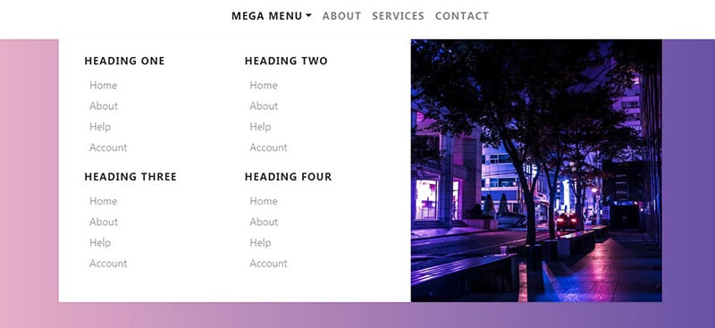
Mega menu slide down on hover with carousel
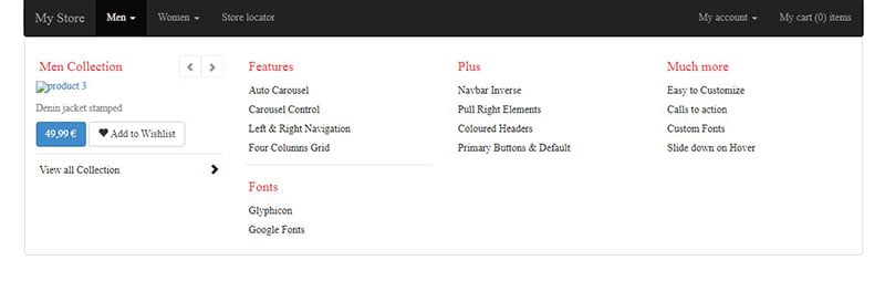
Author: Maridlcrmn
This menu has a nice nav item dropdown design. This option is well suited for an eCommerce website. Here is an excerpt of the li class code used to make this template:
<div class="collapse navbar-collapse js-navbar-collapse"> <ul class="nav navbar-nav">
<li class="dropdown mega-dropdown">
<a href="#" class="dropdown-toggle" data-toggle="dropdown">Men <span class="caret"></span></a>
Bootstrap NavBar with Logo and Text
Author: Linh
This navbar template contains a logo with responsive navigation menus.
A Pen by Oskar Borowski
Author: Oskar Borowski
This navigation bar uses a hover feature to activate the navbar text animation and dropdown menu.
bootstrap 4 navbar
Author: Piyush
This navbar design features a dropdown menu with a sticky effect.
Bootstrap Mega Menu
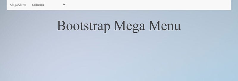
Author: AtiqUrRehman
This Bootstrap menu template is a great design for an eCommerce website.
Bootstrap menu + submenu
Author: Raian de Andrades
This design features three menu headers and two dropdown menu options.
Responsive Bootstrap 4 menu – light/dark
Author: Ivan Grozdic
This navbar is designed with two dropdown menu headers and features a dark and light mode toggle button. Here is an excerpt of the button class, navbar-toggler- type button data:
<button class="navbar-toggler" type="button" data-toggle="collapse" data-target="#navbarSupportedContent" aria-controls="navbarSupportedContent" aria-expanded="false" aria-label="Toggle navigation">
Bootstrap responsive hover navbar
Author: Tristan Cottam Meulemans
A simple Bootstrap menu design that is suitable for an eCommerce website.
BetterNav
Author: Georgi Demirev
This Bootstrap menu is a fixed navbar with an animated dropdown menu.
Bootstrap menu with Smooth border transition
Author: Rajesh Kr. Das
Here is a Bootstrap menu with a beautiful background color and a simple design.
Bootstrap Menu Underline Effect
Author: Trish Recuero
This option is a simple nav item bar developed by Trish Recuero. It includes CSS, HTML and JavaScript Here is an excerpt from the HTML code:
<div class="collapse navbar-collapse" id="navbarSupportedContent">
<ul class="navbar-nav mr-auto"> <li class="nav-item"> <a
class="nav-link" href="#">Home <span class="sr-only">(current)</span></a> </li>
<li class="nav-item"> <a class="nav-link" href="#">Link</a> </li> <li class="nav-item">
CodePen Challenge – August 2019 [week 2]
Author: ItsMeNatalie
In this option, the dropdown sub-components activate to overlay the main navbar menu. The author included symbols to show users which option they are seeing and how to return to the main menu.
Bootstrap 4 Navbar with Icon Top
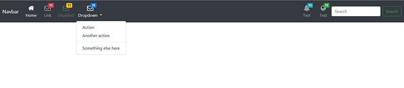
Author: tam710562
The Bootstrap 4 Navbar template is great for building an email system. It features three kinds of visual elements. These include:
- Icons atop navbar text
- A search bar
- A dropdown menu
Hamburger Menu – HTML, CSS & jQuery
Author: Glenn Smith
This burger-styled Bootstrap menu is located in the upper right corner of the UI. It includes a white background and up to five menu categories.
Quick Tip: How to Make Bootstrap’s Dropdown Work on Hover
Author: Envato Tuts+
This navbar is a fully responsive design for a website. It includes dropdown menus that turn white when hovered over. Here is an excerpt of the HTML code:
<div class="dropdown-menu" aria-labelledby="navbarDropdown2">
<a class="dropdown-item" href="#">Action</a>
<a class="dropdown-item" href="#">Another action</a>
<div class="dropdown-divider"></div>
MainMenu #CodePenChallenge
Author: Mohamed Ayman
This Bootstrap nav item bar activates with the hover effect. It is a colorful navbar design with cool animation effects for each dropdown item. This design incorporates both icons and text labels so that the user can easily navigate the website.
Pure CSS Fullscreen Navigation Menu
Author: Brendan Palmer
As the name suggests, this Bootstrap navigation menu consumes the entire page when it expands. Be sure to groups all critical functions of the website in the appropriate nav item menus.
Expanding Menu
Author: Gerry
This Bootstrap nav item bar uses a hamburger-styled expanding animation. The menu unfolds and refolds quickly and smoothly.
Bootstrap NavBar Menu Dropdowns

Author: Fontenele
This navigation bar was built with Bootstrap 4.1.1. It shows navbars contents using a dropdown menu with nested layers (gradient descent method).
bs-navbar-login-signup
Author: John Smith
This Bootstrap template incorporates the login and registration buttons into the navigation bar. It also includes nav link items and a dropdown function that activates when clicked. Here is an excerpt of the code used in this design:
<div class="collapse navbar-collapse" id="bs-example-navbar-collapse-1">
<ul class="nav navbar-nav">
<li class="active"><a href="#">Link</a></li>
<li><a href="#">Link</a
Another menu concept
Author: Rune Sejer Hoffmann
This Bootstrap nav item design uses hover and line effects to highlight the selected menu items. It is a hamburger-styled demo concept that requires a bit of code adjustment to be fully functional.
Bootstrap 4 navbar dropdowns not overlapping the viewport
Author: Gilles MIgliori
This Bootstrap navigation bar is a great option for a website. This design features a long drop-down list with clickable buttons. The drop-down lists can be aligned to the left, right, or center of the UI.
Bootstrap Menu for OnePage web
Author: Harun Kocaman
This is a Bootstrap + jQuery smooth-scroll effect menu. With this navbar design, the menu items are fixed to the UI. When menu items are clicked the screen transitions to reveal related content.
Bootstrap 4 Navbar – Display Submenu on Hover
Author: ReeZh Design
The Bootstrap 4 Navbar template is a great option that activates when hovered over.
Menu cpc-menus #CodePenChallenge
Author: Vincent Durand
This example uses swift hover and clicking animation effects. All of these fluid animations are made using the CSS3 script.
FAQs about Bootstrap menus
1. What is a Bootstrap menu, and how does it work?
A Bootstrap menu is a navigation bar that builds a responsive and adaptable user experience using the Bootstrap framework. It provides a variety of pre-built designs and elements that can be quickly incorporated into any online application, including dropdown menus, buttons, and icons. Bootstrap menus may be modified using the documentation and are created using HTML, CSS, and JavaScript.
2. How can I customize the appearance of my Bootstrap menu?
CSS customization of Bootstrap menus enables you to alter the menu’s color, font, size, and layout. To replace the built-in Bootstrap styles, you can also add your own unique styles. JavaScript can also be used to add interactivity to the menu by animating menu items or altering the menu’s behavior in response to user interaction.
3. What are the different types of Bootstrap menus, and which one should I use?
The Navbar, a horizontal menu that runs the entire width of the page, the Sidebar, a vertical menu that is typically used for navigation on smaller screens, and the Mega Menu, a full-screen menu that displays multiple levels of navigation, are just a few examples of the different types of Bootstrap menus. The style of your application and the requirements of your users will influence the type of menu you select.
4. How can I make my Bootstrap menu responsive?
The built-in Bootstrap classes that adapt the menu’s layout and look based on the size of the screen can help you make your Bootstrap menu responsive. Among these classes are “collapse,” which conceals the menu on smaller screens and shows a toggle button, “navbar-expand-breakpoint,” which establishes the point at which the menu expands to a full-screen view, and “dropdown-menu-right,” which aligns dropdown menus to the right of the menu item.
5. What is the role of the Bootstrap grid system in creating a menu?
The menu’s layout and responsiveness are both achieved through the use of the Bootstrap grid framework. The grid system uses a 12-column layout and lets you specify the width of each column as either a fixed amount or a percentage. The grid system lets you build multi-level menus, give menu items icons or photos, and adjust where the menu appears on the screen.
6. Can I add images or icons to my Bootstrap menu items?
Yes, you can use HTML and CSS to add images or icons to your Bootstrap menu items. The “img” tag and the “fa” class from Font Awesome can both be used to add pictures and icons, respectively. Additionally, you can use CSS to alter the size or placement of the images or icons to alter how they appear.
7. How can I add dropdown menus to my Bootstrap menu?
Use the “dropdown” class and the “data-toggle” attribute to include dropdown menus in your Bootstrap menu. The “data-toggle” attribute describes the kind of interaction that causes the dropdown menu to appear, and the “dropdown” class constructs the dropdown menu. The dropdown menu can also have additional functionality added to it using JavaScript, such as the ability to move it around or animate its appearance.
8. How can I change the behavior of my Bootstrap menu when the user hovers or clicks on a menu item?
Using CSS and JavaScript, you can modify how your Bootstrap menu responds when a user hovers over or selects a menu item. For instance, you could display a dropdown menu when a user clicks on a menu item or change the background color of the menu item when they linger over it. JavaScript can also be used to build more complex interactions like having a tooltip or modal window appear when a user interacts with a menu.
9. How can I create a sticky or fixed Bootstrap menu?
Use the “fixed-top” class to fix the menu to the top of the screen or the “sticky-top” class to keep the menu there until the user scrolls past it to build a fixed or sticky Bootstrap menu. JavaScript can also be used to provide the sticky menu with other features like animating its appearance or shifting its position in response to user interaction.
10. How can I add animations or transitions to my Bootstrap menu?
You may use CSS and JavaScript to provide your Bootstrap menu animations or transitions. For instance, you can use CSS transitions to animate how the dropdown menu or menu items seem as they are shown.
JavaScript can also be used to provide more intricate animations, such animate the menu when the user scrolls or giving the dropdown menu a sliding effect.
Additionally, you can enhance the animation effects in your Bootstrap menu by using third-party libraries like jQuery or GreenSock. However, it’s crucial to use animations sparingly and to make sure they don’t impair your application’s usability or performance.
Ending thoughts on the best Bootstrap menu templates you can wish for
A navigation bar is a necessary map for a website or app. A properly designed navigation bar boosts the ratings of a website and its designer. Bootstrap menu bars incorporate all the design principles used to create powerful navbar menus.
The free Bootstrap menu examples in this list are easy to customize and can shorten a web designer’s delivery time. So for a better user experience and SEO content score choose a Bootstrap menu from this list.
If you liked this article about Bootstrap menus, you should check out this article about Bootstrap sidebars.
There are also similar articles discussing Bootstrap profiles, Bootstrap carousels, Bootstrap timelines, and Bootstrap search box.
And let’s not forget about articles on Bootstrap footers, Bootstrap testimonial sliders, Bootstrap galleries, and Bootstrap login forms.


