
Adding a sidebar menu to a website or app’s user interface makes its features and options accessible. Using a Bootstrap sidebar menu brings many benefits.
These include:
- Increased sales
- Positive user experiences (users can find what they are looking for fast and with ease)
- Displaying important info about one’s products and business
- Increased site engagement via appropriate navigation links
What Is A Sidebar Navigation Menu
A sidebar menu is a multi-functional element built into an app or website’s user interface (UI).
This article lists two main sidebar-menu template categories. A collapsible Bootstrap sidebar and a responsive fixed sidebar design.
Bootstrap Sidebar Menu Examples
Those with web development skills may be able to build their own sidebar menu. But to save time, choose a free sidebar from this list of awesome templates and adjust the code as desired.
Fixed Sidebar Templates For Desktop-Screens
Bootstrap sidebar vertical tabs hover effect
This Bootstrap sidebar sits at the left of the web page. It comes with vertical tabs and uses the hover effect.
By hovering over the tabs the text sections become visible on the web page.
Quick Bootstrap Sidebar
Author: Olumide Falomo
This Bootstrap sidebar design has various navigation menus and a fixed sidebar header. It is customizable and can meet any user requirement.
bootstrap-navbar-sidebar
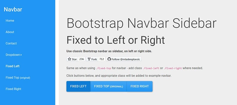
Author: Mladen Plavsic
This Bootstrap 4 sidebar example comes with a fixed navbar.
The navigation bar can sit on the left, right, or top of the user interface. It’s a great design for a desktop user interface.
A Pen by Davi Souza
Author: Davi Souza
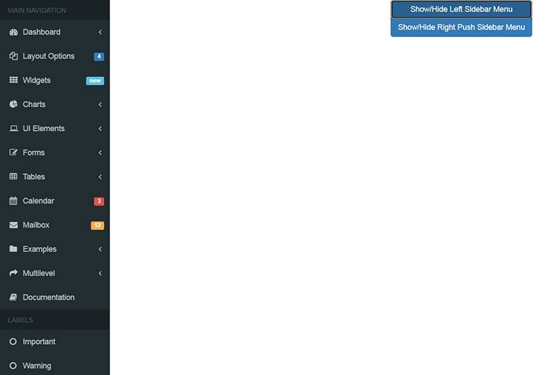
With this Bootstrap sidebar example, the navbar is immediately visible. It is a fixed sidebar located to the left of the website.
Users can easily toggle sidebar items with the click of a button.
Bootstrap Sidebar
Author: Mauricio
This Bootstrap side nav option comes with a vertical scroll bar.
The user can scroll through and see all menu items even if they don’t all fit on the screen. This is great for online shopping sites.
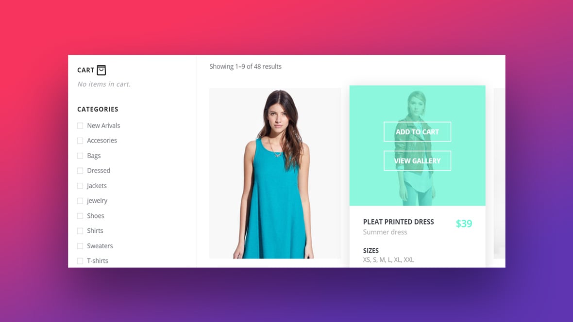
Add to cart interaction
Author: Virgil Pana
The standout feature of this fixed sidebar design is its add-to-cart option. When users add products to their carts, these items fall into the cart.
Users can then see the products in their carts on the same page.
Bootstrap 3 – Sidebar Layout
Author: Brenna Veen
This fixed sidebar design has a vertical scroll bar on the left side. On a small browser window, users can see the remaining menus in the sidebar.
Collapsible Sidebar Template Examples For Desktop User Interfaces
SVG Gooey Hover Menu Concept
Author: Michael Leonard
This Bootstrap sidebar design is playful. It is bound to keep visitors interested in your website.
This is due to the animated water drop movement of the sidebar.
A Pen by Attila Albert
Author: Attila Albert
Attila Albert’s Bootstrap sidebar design is beautiful and unique. This design works well for mapping and location-based websites.
The page content includes a world map built into the design and a list of places in the menu. The map displays places that users click.
pro-sidebar-template
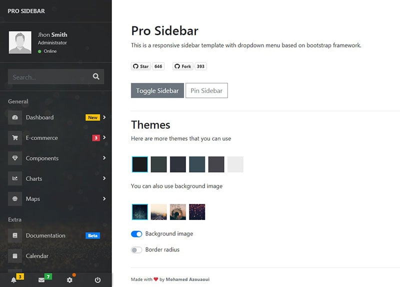
Author: Mohamed Azouaoui
This is a responsive sidebar template that drops down. The designer based it on the Bootstrap framework.
Collapsing Sidebar
Author: Andrea
This Bootstrap 4 sidebar design is a unique collapsing sidebar. When users click on the sidebar header, the group of menus automatically dropdown.
It works well as a vertical side navbar for desktop user interfaces.
Bootstrap sidebar
Author: Rijdzuan Sampoerna
This Bootstrap navbar option has five menu items:
- Applications
- Components
- Dashboard
- Links
- Extras
Users can add more navbar items as the need arises.
BootStrap Sidebar Toggle
Author: Jamie Bowers
Vertical scrolling and a toggle button are the standout features of this sidenav example.
Adminator-admin-dashboard
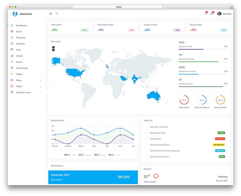
Author: Aigars Silkalns
This Bootstrap 4 sidebar displays the navigation menus via colorful icons and texts. It is collapsible and minimal in design.
This helps to prevent overcrowding of the sidebar while still displaying multiple contents.
Improved user experience comes from the fluid and swift animation effects. These prevent the user from having to wait for options to load.
Offcanvas sidebar menu with a twist
Author: Devilish Alchemist
The animations within this theme are well-executed. But, some of the text becomes hidden when the sidebar collapses.
So this is best suited to sites with less page content.
CSS sidebar toggle
Author: Silvestar Bistrovic
This Bootstrap navigation sidebar has a colorful and simplistic design. With a few changes to the code, designers can use this collapsible sidebar for their website.
sidebar-menu
Author: huang.xinghui
This Bootstrap sidenav menu comes with two options for a collapsing effect.
Bootstrap Sidebar
Author: Truong Tran
This sidebar navigation design by Troung Tran contains a sidebar header with text. With this design, clicking the data toggle button will show or hide the sidenav.
Bootstrap Sidebar
Author: Hussein
Hussein’s Bootstrap sidebar design comes with a variety of navigation menus. To know more the user must click on the menu items.
Collapsible Sidebar Template Examples For Mobile User Interfaces
Secret Project
Author: Mohan Khadka
This Bootstrap sidenav design works well for a mobile app’s landing page. The screen transitions are smooth and beautifully designed to display page content.
Triangular Sidebar Menu (webkit only)
Author: Nikolay Talanov
This sidebar is a great starting point to create an interactive landing page for mobile devices and other small screens. Visitors will love this cool design concept.
With this collapsible Bootstrap sidebar, your app is sure to get people talking.
SideNav
Author: m
Here is a collapsible Bootstrap sidebar that is well suited for mobile applications.
Collapsible Sidebar
Author: Remi Cauchon
In this sidebar, there are navigation menus. As the name suggests, it collapses when one clicks the menu icon.
Users can make the menu appear again by clicking it a second time.
Elastic SVG Sidebar Material Design
Author: Nikolay Talanov
The ‘Elastic SVG Sidebar Material Design’ is for mobile applications. Users will enjoy interacting with this collapsible Bootstrap 4 sidebar design.
sidebar with Bootstrap 3
Author: pongsawat pasom
This Bootstrap sidebar includes a menu icon and a toggle bar located to the left of the page.
One can collapse the sidebar by clicking on the hamburger-style menu icon. To get the sidebar to reappear click the icon again.
Sidebar slide-in-out effect
Author: Mari Johannessen
This Bootstrap sidenav is collapsible. To make it easy to alter the design, the creator hasn’t included any content or navbar elements.
Collapsible Sidebar Template Examples For All User Interfaces
ElaAdmin
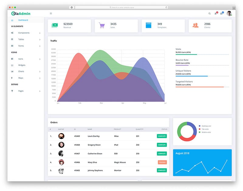
ElaAdmin is a collapsible dashboard template. It uses a colorful hamburger-styled sidebar.
This sidebar is minimal making it great for all screen types. Each icon becomes bigger when the sidebar is folded.
Bootstrap SideBar Menu
Author: Hugh Balboa
This is a simple collapsible sidebar admin menu that is suitable for all screen types.
react-motion with glamorous & glamor
Author: Kye Hohenberger
This sidebar example comes with both folding and unfolding animation in it. Since it is a Unicode design, using it on a website or application is easy.
Material Design – Sidebar (Profile menu)
Author: Sergey Kupletsky
It’s possible to use this sidebar in Bootstrap 3 projects. Its design is recognizable from the Google account page or Google Play Store page.
This is a collapsible sidebar for menu page content.
Bootstrap 4.1.3 sidebar nav
Author: Tio Jevero
This is a trendy sidebar example by Tio Jevero. It has a vertical sidenav and an attractive hover effect.
FAQs about Bootstrap sidebar templates
1. What is a bootstrap sidebar template, and how does it work?
A pre-made, editable user interface component known as a bootstrap sidebar template is used to navigate and show content on websites. It is made using the aid of Bootstrap, a well-liked front-end development framework that offers a selection of tools and parts for building adaptable and mobile-first websites. Links, symbols, and other components that let users reach various pages or areas of a website are frequently included in sidebar templates.
2. Can I customize the sidebar template’s color, size, and position to fit my website’s design?
Yes, the sidebar templates for bootstrap are very customizable. To fit the layout of your website, you can alter the sidebar’s color, size, position, and other attributes. For a special look and feel, you may also apply your own CSS classes and styles to the template.
3. Are there any pre-built bootstrap sidebar templates available for free, or do I need to create my own?
You can download and utilize a variety of free Bootstrap sidebar templates for your website from the internet. These templates were made by developers and designers and can be altered to meet your requirements. The built-in components and styles of Bootstrap can also be used to build your own custom Bootstrap sidebar template.
4. How do I add icons and links to the sidebar template?
Use Bootstrap’s built-in classes and components, such as the “nav” and “nav-link” classes, to add icons and links to a sidebar design. To add icons to the sidebar, you may also use third-party icon libraries like Font Awesome or Material Icons.
5. Can I use the sidebar template with any content management system (CMS), such as WordPress or Drupal?
Yes, any CMS, including WordPress, Drupal, Joomla, and others, can use Bootstrap sidebar templates. By including the template in the HTML, CSS, and JavaScript files of your website, you may integrate it into your CMS.
6. How can I make the sidebar template responsive, so it works on mobile devices and tablets?
The responsive grid system and classes “col-sm”, “col-md”, and “col-lg” in Bootstrap can be used to make sidebar templates responsive. You may design a flexible layout using these classes that adapt to various screen sizes and devices.
7. What is the best way to test the sidebar template on different browsers and devices?
Using web development tools like Chrome DevTools, Firefox Developer Edition, or Safari Web Inspector will allow you to test a bootstrap sidebar template across a variety of browsers and mobile platforms. You can use these tools to test the compatibility and responsiveness of your template as well as to inspect and troubleshoot the HTML, CSS, and JavaScript code of your website.
8. Can I use the Bootstrap sidebar template with different frameworks, such as Angular or React?
Yes, you can use Bootstrap sidebar templates with a variety of frameworks, including Angular, React, Vue, and others. By importing the template’s CSS and JavaScript files and utilizing its components and classes in your code, you may include the template in your framework.
9. How do I ensure that the sidebar template is accessible to users with disabilities?
You can utilize best practices for accessibility and the Web Content Accessibility Guidelines (WCAG) to make sure a bootstrap sidebar template is usable by people with impairments. These include using semantic HTML tags, providing alternative text for images and icons, and making sure the template can be navigated using the keyboard.
10. What are some best practices for using Bootstrap sidebar templates, and how can I avoid common mistakes?
Best practices for using bootstrap sidebar templates include keeping the design straightforward and user-friendly, using succinct and clear labels for links and icons, optimizing the template for speed and efficiency, and testing it across a variety of platforms and browsers. Avoid making common blunders including overcrowding the sidebar with links or icons, using odd or ambiguous labels, and failing to test the design on various devices and screen sizes.
Ending thoughts on these Bootstrap sidebar templates
This article lists Bootstrap sidebar navigation templates for use on any application or website.
A sidebar is a great way to deliver a positive user experience. These sidebar examples give users easy access to your products and business information.
Those with the necessary skills may be able to build their own sidebar menu. But why not choose a free Bootstrap sidebar from this list of awesome templates instead?
If you liked this article about Bootstrap sidebars, you should check out this article about Bootstrap profiles.
There are also similar articles discussing Bootstrap carousels, Bootstrap timelines, Bootstrap search boxes, and Bootstrap menus.
And let’s not forget about articles on Bootstrap footers, Bootstrap testimonial slider, Bootstrap gallery, and Bootstrap login form.


