
Ever found yourself mesmerized by a sleek, subtle backdrop on a website that gently merges into the canvas of content? CSS blur effect—a powerhouse aesthetic in the world of web design effects—does just that. It’s the virtual equivalent of a soft morning mist, transforming stark, rigid lines into a dreamy, inviting interface.
Harness the transformative magic of CSS and elevate user experience to an art form. Dive into the myriad ways CSS3 effects blend function with finesse, creating a cohesive visual journey. Through this exploration, you’ll grasp how CSS filter properties wield the power to enchant—the Gaussian blurs to frosted glass illusions.
By the conclusion, the veil of complexity around implementing dynamic blurring will have lifted. Whether a seasoned front-end developer or a curious newbie, you’ll be armed with a swathe of practical CSS blur effect examples. Craft interfaces that not just capture attention but leave eyes lingering, craving more.
Awesome CSS Blur Effects
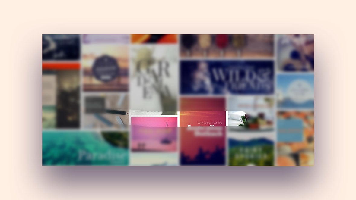
Claymorphism Carousel

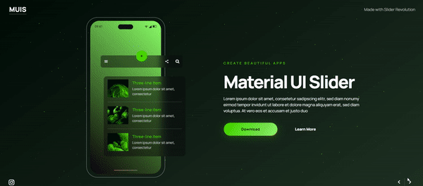
Material UI Slider
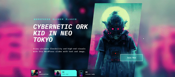
Neon WordPress Slider With Text
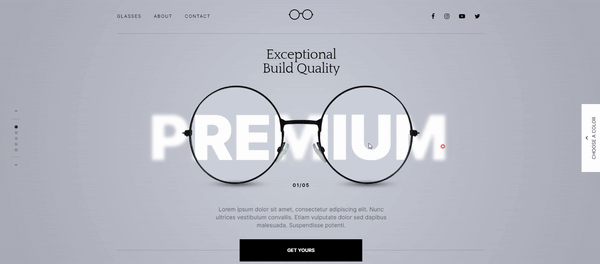
Optic Shop Showcase Slider
CSS Cool Directional Motion Blur
XYZt has done a great job in creating this HTML and CSS filter property.
Image Blur With a Soft Transition
This is a cross-browser blur that would work great on a website’s background image. It uses the SVG filter property for Firefox and CSS for Webkit. We owe this piece to Dudley Storey.
Blobby Background
Ted Kusio was able to create this blurred texture based on green and blue circles. The design is responsive and includes a texture on the top.
Subway-type Red Line
Carl Calderon brings this filter property based on a subway line from Stockholm.
Shifting Depth of Field
This option will look great on a solid background color. Thomas Trinca was able to imitate the color shifting of a camera lens. He uses keyframes and a cool CSS blur effect.
CSS3 filters on your background images
Check out bookcasey’s fine work. A blurry background image can highlight the headings or the site’s main content.
CSS Blur
A blurry background image right behind an attractive layout where to place the heading. The user aadamski91 created a stunning blur effect with the possibility to resize the window.
Simple Blur Effect on a white background
Scott Dunham describes his work as “messing around” with a filter property and throwing in some parallax effect.
iOS 7 Header
A CSS filter blur for every browser like in iOS7. A fine work by Rik Schennink.
CSS3 filter animation
This type of blurred effect is very hard to achieve. Hence, developers can feel frustrated and irritated when trying to implement such a feature. However, this changed in 2018 as Dorian Nowak found this awesome solution. Implement this on a website and make your heading look amazing.
Backdrop filter
Ycw brings an easy solution for an fx without a backdrop-filter.
Pure CSS Blur with a Hover Effect
Mathew Craig wanted to see if he could apply a blur filter without affecting the overlay. He managed to do it by playing around with CSS filter blur options.
Blur effect with filter fallback and backdrop-filter
If you need to add a scroll feature, bind the event to backdrop. Follow Rplus’s advice to create this stunning blur effect.
Simple Blur
It’s amazing what you can achieve with a CSS filter. Here is one example by Michael Tempest. The overlay that you see on top is based on the same image. It has an SVG base64 mask of the original photo. With this, the developer creates a focused view. Such an approach is very useful if you want the viewer to focus on a particular element.
Blurring Out
A backdrop filter is a great tool for inserting a blurry background image. It’s great for blurring the background of a pop-up off-canvas menu. SitePoint has done a great job.
CSS Blur image cross browser
A filter for Firefox with a cross-browser effect. The author is Yudo.
I ♥ BLUR
Visitors usually like little surprises. Sometimes, designers can spread cool blur effect options across the page to surprise the user and create a superb experience for them. Click this button and you’ll see an original approach that provides visual feedback.
Bulanıklık efekti
Ayhan ALTINOK created this cool effect that will surely inspire you.
SVG vs CSS
Jonas Sandstedt shows you the difference between a CSS option and an SVG example.
Intrinsic Ratio Blur
Apply a CSS filter blur to achieve this interesting effect on your background image. Congratulations to Charlotte Dann for a fantastic job.
Blurred Hover Effect – No jittering
Check out this CSS blurry background image by Alexander Flenniken.
CSS Effect
Jay Holtslander brings this cool CSS blurred image.
Blurry impressive Background
There’s nothing like an iOS background image to showcase these blurred elements.
CSS blur effect
This effect’s author is hchiam
Pure motion
Here is how to use an element in motion. Karlo Videk created this animation based on one single element.
Frosted Glass Effect for a Form
This example by Usama Tahir will make your forms look impressive.
CSS Blur Effect
Shahid Khan brings us this colorful screen blend.
Canva’s blur effect
Sam Woolerton is the author of this cool effect from the source code.
CSS – Background with Blur
A simple image with a stylish blurred background. The author is Tiago Dias.
Hover effect
By learning CSS you can put together functional and stunning effects. Designs that are based on CSS are lighter than the ones made on graphics.
CSS blur effect with button overlay
A blurred background image with a button.
Text Over Any Background
Chris Smith provides both contrast and brightness in this example. He lowered the contrast by 70% so that the viewer could read the title easily.
CSS Blur Effect
In this case, the author is vaibhav-lone.
Blurred text with only CSS only
Adam Ruf decided to explore new ways of applying a CSS blur effect. In this case, the text shadow covers only some parts of the paragraph. You can achieve a backdrop filter on the image if you use 100% width and height.
CSS Blur Effect
Three blur effects in a row on images.
Blur with CSS & SVG
Vincent De Oliveira created this progressive blur.
CSS Blur Effect Test
Marius brings us this blurry background with an impressive color selection.
In/out of focus
Are you looking for some text effects? Jonny Scholes brings an example that’s easy to implement, even for beginners. These examples are excellent for acquiring experience fast.
Focus Circle
Andy created this unique effect.
Lightbox with zoom & blur effect
A workaround for vertical videos filling the remaining space with their blurred versions.
Blur Buttons
Natalie Frecka combined more blur than you can imagine with a hovering effect.
CSS blur effect hover card
In this case, the author is Ankit Srivastava
Draggable blur mask over image
A job well done by marcruecker.
CSS blur effect
A nice effect over a long text.
Bokeh Pattern
Owlypixel is the author of this blur which reminds us of the Bokeh-style.
Css blur effect
Gabriel Pizarro Correa did a neat job with this effect.
A blurred overlay
Any Gaussian function or CSS blur effect looks better if the designer inserts his/her personal touch. Glenn Reyes manages to give an artistic touch that looks great on Internet Explorer or any other browser.
CSS Blur Effect
Maria placed the word “love” on a red background.
CSS Filters
Sam Jarvis uses the blur smartly on two circles with overlapped sections.
CSS blur effect
Check out the work of ManuTheCode.
Loading Animation CSS
You can achieve an effect like this using only CSS.
Text blurring animation
Andrew Burton uses tex shadow and CSS3 animations to achieve this cool effect.
Pure CSS Text Blur
If you’re looking for a solution that’s easy and that has a short learning curve, check out this example.
Rollover CSSS Blur Filter Image Gallery
Make your background beautiful with an effect like this. It’s triggered by the mouse movements which provides an awesome user experience.
FAQ on CSS blur effects
How do I implement a CSS blur effect on an image?
To conjure that ethereal look on an image, employ the filter property with blur. Picture this: filter: blur(5px);. Five pixels is often your sweet spot for a gentle haze. It melds your image into the background just enough without losing its soul.
Can I apply a CSS blur effect to text?
Absolutely, text isn’t immune to the blur’s charm! Adopt the same filter: blur(2px);—tone down the radius; you want the words dreamy, not illegible. A dash of blurring breathes life into static text, giving it a soft, mysterious whisper.
What’s the deal with CSS blur effect not working in some browsers?
Ah, the cross-browser conundrum! Not all browsers are on speaking terms with backdrop-filter or filter. A surefire workaround? Prefixes. Yes, -webkit-filter: blur(5px); should play nice with the rebels—looking at you, Safari and Chrome.
Is there a way to animate a CSS blur effect?
Animation and blur, a match made in heaven! Transition your element from crystal clarity to a gentle fog with transition: filter 0.5s ease-in-out;. Follow this with a hover effect that brings filter: blur(4px); onto the stage. Watch it sweep over your content like a delicate dance.
How does CSS backdrop-filter differ from filter with blur effects?
Think of backdrop-filter as the cool cousin to filter. It won’t just blur what it’s directly applied to; it blurs all the fiesta happening behind the element—a real frosted glass affair. filter? It deals only with the element it’s attached to; a more selfish operator.
Can CSS blur effect impact website performance?
True story, the mystical blur is a bit of a diva when it comes to resources. Heavy use, especially with animations, can make your website performance take a hit—think heavier page loads and a tad bit of lag. Moderation is key, don’t let the blur blur your performance!
Are there CSS blur effect limitations on mobile devices?
Your handheld marvels prefer to keep things light and breezy. Beware, backdrop-filter may throw a fit on some mobile platforms. It’s like squeezing into a tight suit; it’s not for every device. Test, tweak, and maybe keep it desktop-centric if the blur throws a tantrum.
Can we create color blur effects using CSS?
Why stop at a smoky silhouette when you can dip your blur into a kaleidoscope? Glide filter: blur(10px) hand in hand with background-color: rgba(255, 0, 0, 0.5);—now watch as the hues blur into a sunset, painting the sky with shades you never knew were possible.
Is it possible to blur only part of an element with CSS?
Definitely! It’s like placing a translucent curtain over a section of your content. Wrap the portion you desire in a pseudo-element. Now, let backdrop-filter: blur(8px); rain down. It’s selective blurring at its finest, proving that sometimes, focusing on just a fragment can create a masterpiece.
How do I remove CSS blur effect on hover?
A game of now you see me, now you don’t. Start with elusiveness: filter: blur(4px);. Now, conjure the clarity on hover: :hover { filter: none; }. Like a morning fog lifted by the sun’s first rays, you reveal the crisp truth beneath the blur’s vanishing act.
Conclusion
We’ve danced through the foggy realms of web design, where the CSS blur effect examples laid out here are more than mere visual treats; they’re storytellers, setting the mood, guiding emotions, offering an almost tangible texture to your digital canvas. With CSS3 effects and filter properties, layers of sophistication are at your beck and call, transforming blunt visuals into softened whispers that invite users to a more immersive experience.
- Dynamic blurring slides into your toolkit with grace.
- Frosted glass effects lend that chic finish.
- Responsive design blur ensures elegance on every screen.
And while you juggle front-end development techniques, never lose sight of what’s beyond the blur—a clear, accessible, user-focused interface. Craft with intention, blur with a purpose, and leap boldly into this mistscape of design, where beauty and performance waltz in harmony. Here’s a toast to the whispers of design that speak volumes, to the blur that sharpens focus on what truly matters—user connection.
If you liked this article about CSS blur effects, you should check out this article about CSS animation libraries.
There are also similar articles discussing cool CSS buttons, CSS shadow effects, CSS blockquotes, and CSS charts.
And let’s not forget about articles on CSS headers, CSS parallax effects, CSS animations on scroll, and CSS page transitions.


This is awesome! a full list of blur effects and they are pretty easy to apply!!!
Thank you Dirk!