
Imagine a static webpage, now inject life into it with a dash of animation—suddenly, it’s not just a page; it’s an experience. That’s the magic CSS border animations can cast.
Here’s the scoop: websites aren’t just about content, it’s how you present it. And trust me, a border doing a little dance on hover? It’s like your site is saying “Hey, noticed you there!”
In this pixel playground, even a simple border can be a showstopper. As we embark on this journey, we’re going to dive into the vibrant world of CSS border animation examples.
You’ll catch a glimpse of moving art and learn how, with a handful of code, you can elevate your design game.
By the end of this article, your toolkit will be brimming with tricks – from animated border effects to CSS hover effects that work across all those browsers. We’ll untangle the web of CSS3 border properties and show you how to choreograph those borders using keyframe animations.
Ready to code borders that can boogie? Let’s animate our way to cool, creative, and interactive web designs that engage and mesmerize.
CSS Border Animation Code Examples
This article is a list of CSS border animation examples all created using the latest HTML and CSS script. These border animation code examples are customizable to suit your web design needs.
CSS Border Animation Examples For Websites
Border animation
Author: Panos Christophides
Made with: HTML, CSS
This CSS border animation element uses a hover feature to summon the animations. These animations include color transitions and border outlining.
CSS Border Animation
Author: LycanOne
Made with: HTML, CSS
This border animation effect is unique and smooth. Its CSS3 design makes it ideal for use on any modern website.
Draw borders from center!
Author: Ben Sheppard
Made with: HTML, CSS
This option draws borders in the center of a box using pseudo-elements. The hover feature activates the borderlines.
navbar animated border bottom
Author: Peter Bou Saada
Made with: HTML, CSS
The animation effects occur when the user hovers or clicks on the menu options in the sidebar. The result is a mild border animation at the bottom of each button.
Only CSS animated border button
Author: PineappleSyrup
Made with: HTML, CSS
This CSS animation design has a hover-border button effect.
Animated border effect
Author: Travis
Made with: HTML, CSS
Made using one div, this animation effect is for a box or container. The hover effect is a surprise element in this border animation.
Button hover border animations – CSS
Author: Gabriele Mantovani
Made with: HTML, CSS
This CSS border animation activates when hovered over. It’s great for animating web button borders.
Border animation using clippath
Author: Kang
Made with: HTML, CSS
This border animation design was built with the clip-path property. This option comes with two border effects.
These include:
- The borders of boxes move slowly when left undisturbed
- The borders move rapidly when hovered over
[PURE CSS] border animation without svg
Author: Rplus
Made with: HTML, CSS
This CSS border animation (without SVG) makes use of the color transition and hover effect.
CSS Border transitions
Author: Giana
Made with: HTML, CSS
Here is a CSS border animation design that has a variety of properties. These include:
- A border-radius effect
- Hover effect
- Color transitions
- Spinning border animation effect
Animated Border Menus pure CSS
Author: Kseso
Made with: HTML, CSS
This design is like Codrops´ way only with CSS. A great border animation design for a website.
SVG Border Animation 1
Author: Zach Saucier
Made with: HTML, CSS
The SVG Border Animation 1 design is a simple but attractive border button option.
Gold Border Shimmer
Author: Kevin Cullen
Made with: HTML, CSS
This border option adds a shimmering golden edge to the image boxes and articles.
Cool CSS Button Border Animation On Hover – CSS3 Hover Effects – Pure CSS
Author: Ramkirat Gupta
Made with: HTML, CSS
This example is great for a button border animation effect. Made with CSS script, designers can add custom effects to design cool action buttons.
CSS border hover transitions
Author: Jamie Calder
Made with: HTML, CSS
CSS border hover transitions are nicely used in this example. It is useful for highlighting a box or button on a website.
Sass button border hover effect mixing
Author: Giana
Made with: HTML, CSS
This border animation design has a hover feature and a smooth color mixing effect. The animation effects are for the borders of a button, so extra screen space is not needed.
Double border animation
Author: Antares
Made with: HTML, CSS
This border animation design is in SVG format. It features a hover-border button effect.
CSS-only border animation
Author: Danny Joris
Made with: HTML, CSS
This CSS border animation option facilitates a solid outline of a button’s borders. The border-line appears when one hovers over the button.
Button Border Slide Mixing
Author: Thomas Vaeth
Made with: HTML, CSS
With this option, the border animation effects show when one hovers over a button. Color(s) outline the button based on the website designer’s adjustment of the code.
Border-radius animation
Author: Yuku
Made with: HTML, CSS
The border-radius design is simple and playful. Its animation properties give a rounded look to web elements such as buttons and borders.
Border Animation Effect with SVG
Author: GIO
Made with: HTML, CSS
A border animation effect with SVG
Border animation (circle)
Author: Katmai7
Made with: HTML, CSS
Border-radius and hover effects are present in this animation option.
Animated border tracing
Author: Jameal G
Made with: HTML, CSS
Use this border animation design to call attention to a box on your website.
SVG Ellipse Border Animation
Author: Corey Bullman
Made with: HTML, CSS
The SVG Ellipse Border Animation is a stylish border effect for menu icons and buttons.
Border composition and animation
Author: Paolo Cavanna
Made with: HTML, CSS
This option uses a simplistic design to achieve a hover effect and border animation effect.
CSS Border Animation
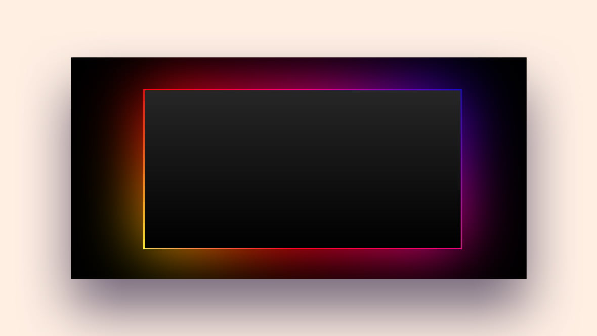
Author: Nick
Made with: HTML, CSS
This illuminated border with an RGB effect is for Razer fans.
With this animation border design, colors outline the borders that run along the width of a box. This is perfect for creating a gaming website.
Animated border-image with SVG in data url
Author: Bram de Haan
Made with: HTML, CSS
This is a fork made from a fork created by Joey Hoer (see link >) http://codepen.io/joeyhoer/pen/HCEJb.
Button bubble effect
Author: Adrien Grsmto
Made with: HTML, CSS
Built with CSS3 script and Javascript to give this CSS border animation a fluid effect.
This playful movement displays when one hovers over a button. The button also changes into different colors when clicked.
Fancy border radius
Author: Jessica Aiskel
Made with: HTML, CSS
Here is a fancy border animation element for a website.
Houdini gradient border animation
Author: Michelle Barker
Made with: HTML, CSS
This border option is for Chrome-based browsers only.
Mix-blend-mode: luminosity & Animating border-radius on CSS
Author: Andrej Sharapov
Made with: HTML, CSS
Adjust the code of this CSS border animation to customize its luminosity & border-radius properties. Doing so will change the color, shape, and text elements in the block.
Border animation on hover
Author: Artem Tumin
Made with: HTML, CSS
This animation border is useful for styling navbar menu items. It runs the full length and width of the menu buttons when hovered over.
Animated Border Button
Author: Clint Losee
Made with: HTML, CSS
This CSS border animation design is great for highlighting button borders.
Framed
Author: Chance Squires
Made with: HTML, CSS
This border effect frames content blocks and buttons when hovered over.
CSS Border Animation Examples For Websites And Mobile Apps
Animated gradient border around resizable content
Author: Johnny Fekete
Made with: HTML, CSS, JS
A great animated border for your web design or mobile app.
CSS-only shimmering neon text
Author: Giana
Made with: HTML, CSS
The border effects of this design appear to shimmer with a neon-like animation effect.
Border-gradient mixing
Author: John Grishin
Made with: HTML, CSS
Use this design for elements with a border-radius. It is useful for both website and mobile applications.
Border animation – menu inspiration
Author: TOMAZKI
Made with: HTML, CSS
This border animation design stimulates the user’s mind and lets them know that they will see a result in a box. It is useful for any part of a mobile app or website.
border-animation-css
Author: Swarup Kumar Kuila
Made with: HTML, CSS
This CSS border animation has a beautiful background color. It also has a dazzling border effect.
Animated Border Gradient Effect
Author: Jonathan Dauz
Made with: HTML, CSS
The ‘Animated Border Gradient Effect’ design uses CSS3 gradients and animations.
Animated Border Menus
Author: roger Nery
Made with: HTML, CSS, JS
This is a tutorial from tympanus.net on how to create a menu icon with an animated border effect. This menu effect is inspired by CreativeDash’s bounce menu for mobile apps.
Border animation
Author: Inderpreet Singh
Made with: HTML, CSS
An attractive CSS border animation. It is useful for drawing attention to elements on a website or mobile app.
Animated Border Gradient Effect
Author: KodsuzAdam
Made with: HTML, CSS
The designer achieved this animation effect by using CSS3 gradients. The border animation takes place at the bottom border of a website or mobile app.
animated border (circle)
Author: Abdel Rahman Wahdan
Made with: HTML, CSS
This option comes with an animated border-radius feature built using CSS3 animation.
Diagonal stripe border effects
Author: Comehope
Made with: HTML, CSS
The CSS border animation effects in this option are colorful with diagonal stripes. These border effects are for calling attention to boxes and buttons.
Rotating border
Author: Jesse B
Made with: HTML, CSS
This is a rotating rainbow-colored border that is great for mobile apps and websites.
CSS border (using an SVG)
Author: Louis Hoebregts
Made with: HTML, CSS
A great CSS border animation built with an SVG. The border remains intact at any size.
It’s great for website boxes and mobile app borders.
dashed border icon animations
Author: FlorinCornea
Made with: HTML, CSS
This option carries three icon border animations. These are icons for:
- Success
- Warning
- Danger
Gradient Border
Author: Alphardex
Made with: HTML, CSS
This CSS animation border is great. It colorfully outlines image and text boxes.
Border animation
Author: Joel Rodelo
Made with: HTML, CSS
A simple border animation to outline the edge of an image or text box.
FAQs about CSS border animations
How do I add animation to a CSS border?
You’re thinking, “Static borders? Not in my realm.” To animate a border, tap into CSS keyframe animations. Define your frames, set those properties—think border-width, border-color—then link it up with an animation name. Hook that name to your border element, and watch it come to life.
What CSS properties can be animated in border animations?
Here’s the lowdown: Not all border properties are down for the animation dance, but a good bunch are. You’ve got border-width, border-color, even border-radius. Flex them together or solo for some eye-catching action. Just set your keyframes for each and animate away.
Can CSS border animations work on all browsers?
Ah, the cross-browser conundrum. Most modern browsers will play nice with your CSS border animations. But remember, the older ones might throw a tantrum. Always a good move to double-check compatibility or use fallbacks, like CSS hover effects, to keep it looking sharp everywhere.
How can I make a responsive CSS border animation?
Responsiveness is key, right? Use percentages, vw (viewport width), or vh (viewport height) units when defining your animations. This way, your borders will groove perfectly to any screen size. Trust me, your responsive border graphics will scale beautifully no matter the device.
Are there performance concerns with CSS border animations?
Let’s keep it real—animations can be resource-hungry. But borders, they’re usually chill. To keep your animations snappy, minimize complex calculations and consider the painting area. Avoid overloading with excessive animations and you’ll keep the performance smooth.
How do I create a looping CSS border animation?
Gotcha, endless motion’s the goal. In your @keyframes, plot the journey from start to end. Then, in your element, set the animation iteration to ‘infinite’. That’s it; your border will be doing laps for eternity, or, you know, until the tab’s closed.
Can I use CSS border animations on mobile devices?
Absolutely! Mobile’s got this. Just keep an eye on performance and touch interactivity. Sometimes less is more on smaller screens. You want your web design animation techniques to be snappy and not drain those precious batteries. Streamline your code, and your mobile users will thank you.
What’s the best way to learn CSS border animation?
You’re in for some fun. The best way? Experiment, then experiment some more. Look up some CSS border animation examples online, mess around with code snippets, and check out those front-end development trends. Each trial will teach you something new—embrace the process.
How can I ensure accessibility with CSS border animations?
Accessibility, non-negotiable. For starters, don’t rely solely on color. Ensure animations don’t trigger seizures—no rapid flashing here. Allow an option to pause or stop the motion, and keep your animations subtle. Animations are cool, but user safety and comfort? Cooler.
Can CSS border animations improve user engagement?
For sure, they’re engagement gold when done right. Subtle animations guide users, highlight actions, and enhance feedback. It’s the difference between meh and mesmerizing. Just remember: it’s a spice, not the main dish. Use animations to complement your content, not overpower it.
Ending thoughts
So, we’ve danced our way through the pixel party, haven’t we? CSS border animation examples are more than just eye candy—they’re the heartbeat of a lively web page. Now, you’ve peeked behind the curtain and seen how simple lines can jazz up a user’s journey, right?
Remember, we’ve waltzed through smooth transitions, tiptoed around animated border effects, and boogied down with interactive border designs. These aren’t just tricks up the sleeve; they’re tools to craft digital experiences that stick, that resonate, that whisper, “Hey, wasn’t that cool?” And they echo back, “Heck, yes”.
Take these gems and sprinkle them across your own canvases. Front-end development is part art, part science, and a whole lot of heart. Just never forget – while animations charm, they must always serve a purpose. They’re here to amplify your message, not shout over it.
Now, go ahead. Code, create, and let those borders be the pulse of your web symphony.
If you liked this article about CSS border animations, you should check out this article about CSS progress bars.
There are also similar articles discussing CSS select styles, CSS loaders, CSS login forms, and CSS background patterns.
And let’s not forget about articles on CSS image effects, CSS dropdown menus, CSS arrows, and CSS cards.


This is amaizning, I love it!! good job, evebrybody!!! ;-D