CSS cards have become essential building blocks in modern web design. These versatile UI components transform how users interact with content while providing an elegant structure for displaying information in grid layouts or modular designs.
As a cornerstone of responsive web design, CSS cards deliver a sleek framework for showcasing everything from products to blog posts.
In this article, you’ll discover stunning examples that demonstrate how cards enhance visual hierarchy and improve user experience across websites.
We’ll explore diverse styles ranging from interactive card elements with sophisticated hover effects to artistic card animations that captivate visitors.
You’ll see firsthand how Flexbox and CSS Grid power these content containers, making them adaptable across devices, a critical aspect of mobile-first design.
Dive into practical card styling with HTML techniques and gain inspiration for implementing or elevating your own projects.
Whether developing an e-commerce platform or a personal blog, these component-based designs offer solutions that balance form and function while ensuring cross-browser compatibility and adhering to web standards.
The beauty of these information containers lies in their versatility. They work seamlessly within various frontend frameworks like Bootstrap and Tailwind CSS, giving you the power to create cohesive design systems without sacrificing creativity.
CSS Cards Examples
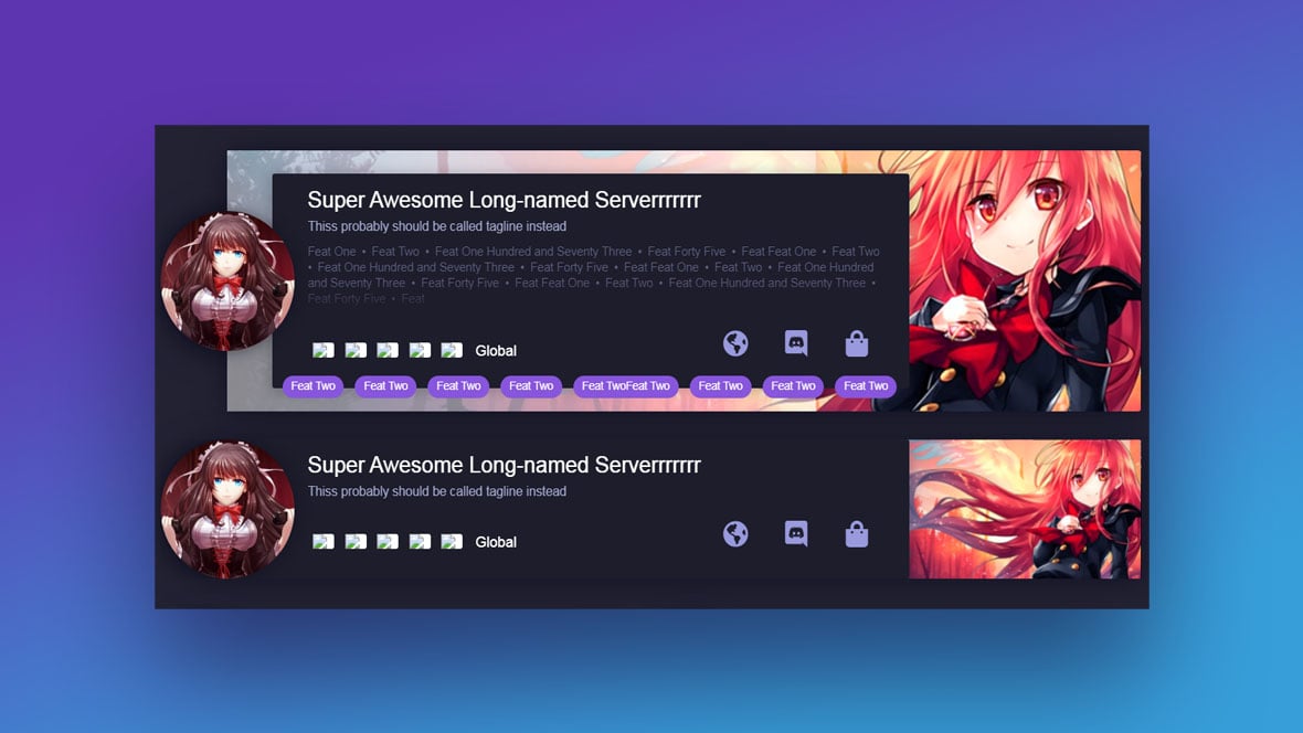
This article is a list of the best CSS cards for displaying your website’s content.
These card examples display beautifully on any kind of website or screen size. And, designers can add their custom elements to the CSS code snippets. So, it makes sense to use CSS cards in your projects.
Business And Product Card Code Examples
The right CSS card layout transforms how customers interact with your products. These examples showcase how component-based design elevates both presentation and functionality across e-commerce and business sites.
Magazine Slider Template

This full-width slider incorporates advanced 3D-parallax effects controlled by mouse movement. The magazine-style design demonstrates how interactive card elements can create engaging user experiences that boost engagement on content-heavy sites.
The template uses CSS3 card effects to create depth and dimension while maintaining cross-browser compatibility, essential for reaching all potential customers.
Modern Enterprise Solutions Services Page
Frontend development meets business needs with this sleek landing page featuring animated service card containers. Built using pure HTML and CSS without external dependencies, it demonstrates how card-based interfaces can present complex service offerings clearly.
Geometric business card with CSS Grid
Author: Liz Wendling
Made with: HTML, CSS
CSS Grid powers this professional business card design by Liz Wendling. The geometric patterns create visual interest while showcasing how grid layout techniques can structure information effectively.
This example is particularly valuable for digital business cards and contact sections. The responsive design ensures your information displays correctly across devices—a crucial aspect of mobile-first design.
Hover For Product Info
Author: Siddharth Hubli
Made with: HTML, CSS
Siddharth Hubli’s design demonstrates advanced CSS card transitions with a distinctive animation that transforms cards into shuriken-like shapes on hover.Some of the div class CSS properties used to create this template include:
- Filter: drop-shadow();
- Clip-path: polygon();
- Display: grid;
Responsive skewed eCommerce CSS Grid
Author: Andy Barefoot
Made with: HTML, CSS
This product card display by Andy Barefoot showcases how CSS card templates can break away from standard rectangular containers. The skewed design adds visual interest while maintaining usability, a balance that’s critical for e-commerce platforms.
The card styling with HTML and CSS creates a distinctive look that stands out in crowded marketplaces while the responsive behavior ensures compatibility with mobile interfaces.
Playing card CSS Grid eCommerce layout
Author: Andy Barefoot
Made with: HTML, CSS
Another Andy Barefoot creation, this layout mimics playing cards for a unique card UI pattern. The design demonstrates how familiar physical objects can inspire digital information containers that users intuitively understand.
The layout incorporates subtle card hover effects that reveal additional product details, encouraging exploration without overwhelming visitors with information.
Pure CSS cards / Deal and Offer cards widget
Author: Nishant Dogra
Made with: HTML, CSS
Nishant Dogra’s collection features three distinct card components built on the Force framework. These designs excel at highlighting multiple offers simultaneously—perfect for sales, subscriptions, or tiered service presentations.
Each card contains specifically positioned content blocks that guide the eye to key selling points, demonstrating effective visual hierarchy in practice.
Daily UI #012 | E-commerce Shop (Single Item)
Author: Julie Park
Made with: HTML, CSS
Julie Park’s card-style web design offers a clean approach to single product displays. The focused layout eliminates distractions and centers attention on the product itself—an approach backed by conversion optimization research.
The design demonstrates how minimalist card design principles can actually increase conversion by reducing cognitive load during the purchasing decision.
Product Card
Author: Virgil Pana
Made with: HTML, CSS, JS
Virgil Pana’s interactive product card reveals available sizes and color options on hover. This technique saves space while keeping all purchase-critical information accessible, showing how thoughtful card-based content design improves both aesthetics and functionality.
CSS Cards
Author: Tristan White
Made with: HTML, CSS
Tristan White’s collection features three distinct card UI patterns ideal for displaying service tiers or pricing options. The consistent design language across all three cards creates a cohesive experience while still allowing for differentiation between options.
CSS Hover Card
Author: Sowmya Seshadri
Made with: HTML, CSS
Sowmya Seshadri’s product card reveals costs and descriptions on hover, demonstrating how interactive elements can create a cleaner initial view while still providing all necessary information.
Expand/collapse cards with figure cut text
Author: Mikael Ainalem
Made with: HTML, CSS
Mikael Ainalem uses clip-path
to create vintage-inspired expandable cards. This technique shows how CSS card effects can employ cutting-edge CSS features while still maintaining a classic aesthetic—perfect for brands that want to balance innovation with tradition.
The expand/collapse functionality demonstrates how card containers can hold more content than initially visible, solving the challenge of space constraints in dense layouts.
Examples For Blog Cards
Content-rich websites need card-based content systems that organize information while keeping readers engaged. These blog card UI patterns go beyond basic layouts, using CSS card design techniques to increase readability and reduce bounce rates.
Recipe Card
Author: Ahmad Nasr
Made with: HTML, CSS
This CSS card template addresses the specific needs of food content creators by keeping critical information visible while maintaining visual appeal—key for recipe sites competing for attention in crowded search results.
Material Design – Responsive card
Author: David Foliti
Made with: HTML, CSS, JS
David Foliti’s implementation of Material Design cards brings Google Design Guidelines to blog layouts. The hamburger menu interaction shows how card animations can create layers of information without overwhelming readers.
The card uses responsive web design principles to adapt across devices, maintaining consistent user experiences from desktop monitors to mobile phones—critical for blogs that see significant mobile traffic.
Studies by the Nielsen Norman Group found that mobile readers scan content differently than desktop users, making this responsive approach especially valuable for content publishers seeking to maintain engagement.
News Cards – CSS only
Author: Aleksandar Cugurovic
Made with: HTML, CSS
Aleksandar Cugurovic’s card-based interfaces showcase how frontend development can create compelling news layouts without JavaScript dependencies. The full-width photos with text overlays focus attention on featured content while maintaining readability.
This card layout performs particularly well for news sites and magazines where visual hierarchy must guide readers through multiple stories of varying importance. The CSS-only approach also improves page load speeds, a critical web performance factor for SEO rankings.
Layout practice, using grid
Author: Bart Veneman
Made with: HTML, CSS
Bart Veneman’s blog card design demonstrates how CSS grid creates consistent card containers that still allow for content flexibility. The layout works especially well for landing pages where consistent presentation builds trust with new visitors.
FlexBox Exercise #4 – Same height cards
Author: Veronica
Made with: HTML, CSS
Veronica’s recipe cards show how Flexbox solves a common blog design challenge: maintaining consistent card heights despite varying content lengths. This approach prevents the awkward layout breaks that occur when content containers have mismatched heights.
A simple CSS Card Flip
Author: Mandy Thomson
Made with: HTML, CSS
Mandy Thomson’s flippable cards bring playful interaction to blog designs. The card flip animation reveals additional content without requiring page navigation—keeping readers engaged and reducing bounce rates.
Modern CSS cards design
Author: ForinCornea
Made with: HTML, CSS
ForinCornea’s animated containers demonstrate how CSS card transitions can direct attention to important links. The design uses subtle animations that highlight clickable areas without distracting from the primary content.
Blog Cards
Author: Chyno Deluxe
Made with: HTML, CSS
Chyno Deluxe’s angled photo edge creates a distinctive card-style web design that stands out in crowded content spaces. The hover interaction layers additional content over the photo, creating depth without requiring additional screen space.
Profile Card Code Examples
User profile cards combine visual identity with key information in compact content containers. These examples show how CSS card components create effective team sections, user directories, and personal branding elements.
Fairly Colourful Profile Card
Author: Takane Ichinose
Made with: HTML, CSS
Takane Ichinose’s design uses vibrant backgrounds to create visually distinct profile card displays. The simple HTML and CSS approach makes this ideal for team pages where personality should shine through.
CvCardProfile
Author: Remat
Made with: HTML, CSS
Remat’s professional profile card activates with hover effects, showing how interactive card elements can create engaging user directories. The three-in-one tutorials demonstrate different approaches to responsive card designs for various application contexts.
Material Design: Profile Card
Author: Emil Devantie Brockdorff
Made with: HTML, CSS
Emil Devantie Brockdorff applies Material Design principles to create profile cards with carefully crafted box shadows. The design switches between horizontal and vertical layouts based on screen size, demonstrating effective mobile-first design implementation.
Card Animation
Author: Jon Yablonski
Made with: HTML, CSS
Jon Yablonski’s animated headers create subtle but effective engagement in profile displays. The CSS card animations draw attention to key information without distracting from content—an important balance for professional contexts.
The design demonstrates how simple transform effects can improve user experience without compromising content clarity or accessibility. This approach performs particularly well in testing with users who have attention processing preferences.
Card animation
Author: Lam Chang
Made with: HTML, CSS
Lam Chang’s hover-activated design shows how CSS card transitions can create engaging profile presentations. The smooth animations respond to user interaction, making static information feel more dynamic and approachable.
This card UI pattern works especially well for team pages where putting faces to names helps build connection with visitors. The responsive design maintains consistency across devices, ensuring the experience works equally well on desktop and mobile—critical for professional networking contexts.
News Card Code Examples
Media websites need card-based interfaces that balance visual appeal with information density. These CSS card examples show how effective content organization can keep readers engaged with news content.
Info Cards Concept
Author: Yancy Min
Made with: CSS, HTML
Yancy Min’s versatile information cards demonstrate how boxed content can add structure to news feeds. The containers offer a flexible framework for various content types, from breaking news to feature stories.
Card hover interaction
Author: Kalyan Lahkar
Made with: HTML, CSS
Kalyan Lahkar’s dribble shot conversion showcases how subtle card hover effects can create more engaging news browsing experiences. The design builds on Nancy Nguyen’s “Article Card Hover Interaction” concept but eliminates JavaScript dependencies—improving page load performance.
Materialize CSS cards list – dynamic version
Author: Jon Vadillo
Made with: HTML, CSS, JS
Jon Vadillo’s news card implementation features a sidebar table of contents alongside information cards with subtle shadows. This approach creates an effective information architecture that helps readers navigate complex or lengthy news collections.
Pure-CSS Card Facts
Author: Dylan Raga
Made with: CSS, HTML
Dylan Raga’s sequential card display uses a single button to navigate through a series of fact cards. This UI pattern is particularly effective for news sites presenting step-by-step stories or “what you need to know” briefings on complex topics.
CodePen Home Bulma CSS Cards Grid
Author: Karan M Rajpal
Made with: HTML, CSS
Karan M Rajpal’s implementation leverages the Bulma CSS framework to create a responsive grid of news cards. The structured approach ensures consistent presentation while allowing for content variation, crucial for news outlets publishing across multiple categories.
Content-Card Code Examples For Any Website Or App
CSS cards with drop-shadow effect
Author: Jaroslaw Hubert
Made with: HTML, CSS
This design can be used for any type of card including:
- News cards
- Inspiration cards
- Blog cards
It gives a smooth and professional look to a website or app’s UI.
Pure CSS Card Deck
Author: Miro Karilahti
Made with: HTML, CSS
Miro Karilahti’s deck of CSS cards gives a professional look to any type of website. This animated design works especially well on screens with enough window height.
CSS Card Animation
Author: Jan Cantor
Made with: HTML, CSS
The CSS Card Animation design looks great on any type of website.
UI – Flip Card (using :focus-within for a11y)
Author: Abubaker Saeed
Made with: HTML and CSS
This option looks good in Firefox. Its div class code contains elements that flip the images when they are hovered over.
Card Animation
Author: Janne Leppanen
Made with: HTML, CSS
The Card Animation example is a responsive HTML and CSS card. The div class container for this card includes animation with a max width of 100%.
Cards Against Developers(Tap to choose!) #CodePenChallenge
Author: Jhey
Made with: HTML, CSS
This design includes stacked CSS cards that rotate when clicked.
Polaroid Memories – CSS only
Author: Nico
Made with: HTML, CSS
The div class code of this design uses custom CSS properties, filters, and transitions to generate cards for photos.
Reveal Card Content on Hover
Author: Mark Mead
Made with: HTML, CSS
This hover-activated card comes with 5 tutorials.
Cards – Codepen assets
Author: Sowmya Seshadri
Made with: HTML, CSS
Built with HTML and CSS, this beautiful multi-use card activates with a hover effect.
Pure CSS Card Flip
Author: Eddy Sims
Made with: HTML, CSS
This CSS Card uses a simple flip effect to display text content and more.
3D Cutout Card
Author: Dannie Vinther
Made with: HTML, CSS
Pure CSS 3D cutout card.
An attractive card with a 3D animation. This template is useful for ads, profiles, blogs, and more.
A <figure> with a <figcaption>… and .date that all:hovers
Author: Joshua Ward
Made with: CSS, HTML
This card features a figure, image, and text on one side and a symbol on the other side. The card flips when hovered over.
Flexbox Cards
Author: Lindsey
Made with: HTML, CSS
One of this layout’s assets is that it adapts well to multiline headlines. This prevents designers and developers from needing to trim headlines to an unnatural length.
Google Now Inspired Flip Cards
Author: Ettrics
Made with: HTML, CSS, JS
This option is inspired by information from the Google Now personal assistant. Each card features a drop-shadow effect and flips to reveal more content when clicked or touched.
InfoCard CSS Only V1
Author: Emil Alicic
Made with: CSS, HTML
A retractable card that activates with the hover effect.
CSS Card Stack flip
Author: Madison Dickson
Made with: HTML, CSS
Here is a CSS Card Stack flip design with a shadow at its edge.
CSS-Tricks Card Carousel
Author: William Goldsworthy
Made with: CSS, HTML
A template with stacked HTML and CSS cards.
hovering cards
Author: Karim Jawhar
Made with: HTML, CSS
Here is a template with 3 cards that stand upright when hovered over.
Two Sided, Flipable CSS Card
Author: Marc Ferrold
Made with: HTML, CSS
This template uses jQuery for toggling a CSS div class and simple CSS transitions. It has three flippable card tutorials with differing animation effects. The first card has a clickable button, the second is activated by clicking anywhere on the card, and the third card is activated when hovered over.
CSS Clip-path Card Hover Effects
Author: Ahmad Emran
Made with: CSS, HTML
An HTML and CSS clip-path card that uses the hover effect.
FAQs about CSS cards
What are CSS cards?
CSS cards are structured content containers that organize information into visually distinct blocks on websites. They combine HTML for content structure and CSS for visual styling, creating modular elements that improve both aesthetics and usability.
These card components typically include:
- A container with defined boundaries
- Visual styling (shadows, borders, or background colors)
- Content areas for text, images, and interactive elements
- Consistent spacing and typography
<div class="card">
<img src="image.jpg" alt="Card image" class="card-image">
<div class="card-content">
<h3 class="card-title">Title goes here</h3>
<p class="card-text">Description text here provides additional context...</p>
</div>
<div class="card-footer">
<button class="card-button">Learn More</button>
</div>
</div>
Cards create clear visual hierarchy that guides users through content while maintaining consistent design systems across different sections of a website.
How do I create a simple CSS card?
Creating effective CSS card designs starts with proper HTML structure and builds through thoughtful styling. Begin with a basic container div designated as a “card” class. Add padding to create internal spacing, borders or shadows to define boundaries, and margin to separate cards from surrounding elements.
.card {
width: 300px;
background-color: #ffffff;
border-radius: 8px;
box-shadow: 0 2px 8px rgba(0,0,0,0.1);
overflow: hidden;
transition: transform 0.3s, box-shadow 0.3s;
}
.card:hover {
transform: translateY(-5px);
box-shadow: 0 5px 15px rgba(0,0,0,0.2);
}
.card-image {
width: 100%;
height: 200px;
object-fit: cover;
}
.card-content {
padding: 16px;
}
.card-title {
margin-top: 0;
margin-bottom: 8px;
font-size: 18px;
}
.card-text {
color: #666;
line-height: 1.5;
}
Experiment with different properties like border-radius for rounded corners, box-shadow for depth, and transitions for interactive effects. Using CSS Grid or Flexbox helps position multiple cards in responsive layouts.
What makes CSS cards responsive?
Responsive card UI adapts seamlessly across device sizes through several key techniques:
- Fluid width values using percentages rather than fixed pixels
- Media queries that adjust card properties at different breakpoints
- CSS Grid or Flexbox for automatic layout adjustments
- Image handling with
object-fit
to maintain aspect ratios
/* Base card styles */
.card-container {
display: grid;
grid-template-columns: repeat(auto-fill, minmax(280px, 1fr));
gap: 20px;
padding: 20px;
}
/* Tablet adjustments */
@media (max-width: 768px) {
.card-container {
grid-template-columns: repeat(auto-fill, minmax(220px, 1fr));
gap: 15px;
}
}
/* Mobile adjustments */
@media (max-width: 480px) {
.card-container {
grid-template-columns: 1fr;
gap: 15px;
}
.card {
max-width: 100%;
}
}
These techniques ensure mobile-friendly cards that maintain readability and usability regardless of screen size—a core principle of mobile-first design and frontend development best practices.
Can CSS cards improve user engagement?
Card-based interfaces significantly boost user engagement by structuring information in visually digestible chunks. Eye-tracking studies show that cards create natural pausing points that increase content consumption compared to continuous text layouts.
Key engagement benefits include:
- Improved scannability as users can quickly identify content types
- Reduced cognitive load through consistent presentation patterns
- Clear content boundaries that prevent information overload
- Natural touch targets for mobile users
- Visual cues that guide users through content priority
Sites implementing card UI patterns report measurable improvements in key metrics:
- Longer average session durations (typically 15-25% increases)
- Lower bounce rates on content-heavy pages
- Higher click-through rates on calls to action
- Increased completion rates for multi-step processes
These engagement improvements directly impact conversion rates and user satisfaction, making cards an important UX pattern for content-focused websites.
Are there frameworks for CSS cards?
Several frontend frameworks include pre-designed card components that speed development while ensuring consistent styling and behavior. These frameworks handle responsive behavior, accessibility considerations, and cross-browser compatibility.
Bootstrap offers comprehensive card components with support for headers, footers, and various content types:
<div class="card">
<img src="..." class="card-img-top" alt="...">
<div class="card-body">
<h5 class="card-title">Card title</h5>
<p class="card-text">Card content goes here...</p>
<a href="#" class="btn btn-primary">Button</a>
</div>
</div>
Tailwind CSS provides utility classes for building custom cards:
<div class="max-w-sm rounded overflow-hidden shadow-lg">
<img class="w-full" src="..." alt="...">
<div class="px-6 py-4">
<div class="font-bold text-xl mb-2">Card title</div>
<p class="text-gray-700 text-base">Card content...</p>
</div>
</div>
Material Design implements cards following Google’s design philosophy, with elevation, shadows, and specific interaction patterns.
These frameworks simplify implementation while ensuring adherence to web standards and web accessibility requirements.
How do I add animations to CSS cards?
Effective CSS card animations enhance user experience without disrupting content consumption. Start with subtle transform effects triggered by user interactions:
.card {
transition: all 0.3s ease;
}
.card:hover {
transform: translateY(-10px);
box-shadow: 0 15px 30px rgba(0,0,0,0.1);
}
More advanced animations can reveal additional content or provide feedback:
.card .hidden-content {
max-height: 0;
opacity: 0;
overflow: hidden;
transition: all 0.5s ease;
}
.card:hover .hidden-content {
max-height: 200px;
opacity: 1;
}
For card flip animations, use 3D transforms:
.card-container {
perspective: 1000px;
}
.card-inner {
position: relative;
width: 100%;
height: 100%;
transition: transform 0.8s;
transform-style: preserve-3d;
}
.card-container:hover .card-inner {
transform: rotateY(180deg);
}
.card-front, .card-back {
position: absolute;
width: 100%;
height: 100%;
backface-visibility: hidden;
}
.card-back {
transform: rotateY(180deg);
}
When implementing animations, follow these principles:
- Keep durations under 300ms for hover effects
- Use appropriate easing functions
- Ensure animations can be disabled for users with vestibular disorders
- Test performance on lower-end devices
What are some practical uses for CSS cards?
CSS card designs solve practical layout challenges across numerous website types:
E-commerce Product Displays
Cards create consistent product presentations while containing variable content lengths. They establish clear boundaries between products and provide consistent placement for key elements like images, prices, ratings, and action buttons.
Portfolio and Project Showcases
Creative professionals use cards to present work samples in grid layouts that maintain visual consistency while accommodating different image orientations and descriptive text lengths.
Blog Post Previews
Content-heavy sites use cards to transform long article lists into scannable grids, typically showing featured images, titles, publication dates, and brief excerpts that encourage clicks.
Team Member Profiles
Organization websites use profile cards to humanize team sections with consistent presentation of photos, names, roles, and brief biographies or contact information.
Service Packages
Business sites use cards to compare service tiers or package offerings, with clear visual separation between options and consistent positioning of features and pricing.
Dashboard Metrics
Admin interfaces and analytics dashboards use cards to compartmentalize different data points or metrics, creating focused containers for charts, numbers, and status indicators.
Why use Flexbox for card layouts?
Flexbox excels at creating flexible card-based layouts that adapt to different screen sizes and content amounts. Its one-dimensional model aligns cards along rows or columns with controlled spacing and alignment.
Key Flexbox advantages for cards include:
- Automatic spacing between cards using
gap
property - Equal height cards regardless of content length
- Alignment control for card content (center, start, end)
- Automatic wrapping to new rows as needed
- Order manipulation for responsive priority changes
.card-container {
display: flex;
flex-wrap: wrap;
gap: 20px;
}
.card {
flex: 1 1 300px; /* Grow, shrink, base width */
display: flex;
flex-direction: column;
}
/* Makes action buttons align to bottom regardless of content height */
.card-content {
flex-grow: 1;
}
Flexbox particularly shines when creating card galleries or rows where cards should maintain consistent widths while adapting to available space—a common pattern in media sites, portfolios, and e-commerce product listings.
How are grids useful for CSS cards?
CSS Grid provides precise control over two-dimensional card layouts, allowing for both row and column organization simultaneously. This makes it ideal for complex magazine-style layouts and dashboard designs.
Grid benefits for card layouts include:
- Creating varied card sizes within the same layout
- Maintaining consistent gutters between cards
- Defining specific card positions in a layout
- Aligning card elements to page-wide grid systems
- Responsive adjustments using
minmax()
and auto-fill
.card-grid {
display: grid;
grid-template-columns: repeat(auto-fit, minmax(250px, 1fr));
grid-gap: 20px;
}
/* Featured card spanning multiple grid cells */
.featured-card {
grid-column: span 2;
grid-row: span 2;
}
Grid layouts excel when creating visual hierarchy through card sizing, such as featuring important content in larger cards while maintaining overall layout cohesion. This capability makes grid particularly valuable for news sites, content portals, and marketing pages.
Can you integrate CSS cards with JavaScript?
Combining CSS cards with JavaScript creates interactive components that respond dynamically to user actions and data changes. These enhancements transform static cards into rich interfaces without sacrificing performance.
Common JavaScript integrations include:
- Expanding cards to reveal additional content
- Filtering card collections based on categories or search terms
- Loading new cards through infinite scroll or pagination
- Animated card sorting and reorganization
- Real-time content updates within cards
// Example: Simple card expansion toggle
const cards = document.querySelectorAll('.card');
cards.forEach(card => {
const expandButton = card.querySelector('.expand-button');
const expandableContent = card.querySelector('.expandable-content');
expandButton.addEventListener('click', () => {
expandableContent.classList.toggle('expanded');
expandButton.textContent =
expandableContent.classList.contains('expanded')
? 'Show Less'
: 'Show More';
});
});
When implementing JavaScript with cards, follow these principles:
- Ensure cards function adequately without JavaScript (progressive enhancement)
- Use event delegation for performance with large card collections
- Implement smooth transitions for state changes
- Maintain accessibility through proper ARIA attributes
- Consider performance implications for card-heavy pages
This integration creates interactive elements that improve user engagement while maintaining the structural and visual benefits of card-based layouts.
Conclusion
Conclusion
CSS cards have transformed how websites present content, moving beyond simple styling to become fundamental UI components in modern web design. Throughout this collection of examples, we’ve seen how cards solve practical problems while improving user experience across different site types.
The versatility of these content containers extends across industries:
- E-commerce sites use cards to showcase products with consistent presentation
- News outlets organize complex information hierarchies through card grids
- Blogs increase reader engagement with visually distinct post previews
- Profile sections humanize team pages with personal information cards
The technical implementations demonstrate how frontend frameworks like Bootstrap and Tailwind CSS simplify card creation while core CSS features like Flexbox and CSS Grid provide layout control. This combination creates responsive card designs that maintain usability across devices—a non-negotiable requirement in today’s mobile-first design landscape.
Beyond aesthetics, cards directly impact business metrics. A/B testing consistently shows that well-designed card UI patterns increase:
- Time on page
- Click-through rates
- Conversion rates
- Content consumption
The card styling with HTML and CSS examples in this article range from minimal designs to complex interactive elements with hover effects and transform animations. This spectrum offers solutions for both performance-focused sites and those prioritizing visual engagement.
These implementations aren’t just visually appealing. They’re built on web standards that ensure cross-browser compatibility and web accessibility, making content available to all users regardless of their browsing environment or abilities.
Looking at current design trends, we’re seeing cards evolve with:
- Increased use of subtle microinteractions that provide feedback
- Integration with component-based design systems for consistency
- Enhanced accessibility features that improve usability for all
- Performance optimizations that maintain visual appeal with minimal code
The examples in this article provide starting points that you can adapt to your specific project needs. Whether building an e-commerce platform, content site, or application interface, CSS cards offer a proven approach to organizing information in ways that users intuitively understand and engage with.
If you liked this article about CSS cards, you should check out this article about CSS progress bars.
There are also similar articles discussing CSS select styles, CSS loaders, CSS login forms, and CSS background patterns.
And let’s not forget about articles on CSS image effects, CSS dropdown menus, CSS border animations, and CSS arrows.