Imagine this: You’ve got raw data, numbers that could make or break your next project. But here’s the catch, data alone is like a riddle wrapped in a mystery. Enter CSS charts—the heroes in the shadows that make those numbers sing on the web. They transform complexity into clarity, one pixel at a time.
In the realm of web development, the need for crystal clear data visualization is non-negotiable. Bland tables can’t wield the power of well-designed, interactive graphs. That’s why I’m diving deep into this topic, drawing on my frontline experience to show you how to bring data to life.
By the final punctuation mark, you’ll be equipped with an arsenal of CSS chart examples. From responsive pie charts that adapt like chameleons, to bar graphs that tell a story, your data points will evolve into narratives. I’ll walk you through the essentials—canvas-based graphs, the elegance of SVG chart integration, and the wizardry of JavaScript chart libraries.
Ready to empower each dataset with personality and purpose? Let’s chart this odyssey.
CSS Charts That You’ll Like
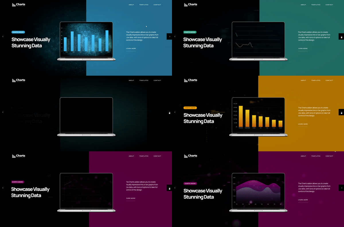
WordPress Charts And Graphs

This Pen is 19% HTML & 81% CSS
By Bence Szabo
CSS chart animated
By Josh
Inspired by weekly css chart
Interactive SVG & CSS graph with segments, legend and hover effect
By Explosion AI
This Jade template generates an interactive bar graph using SVG and CSS. It was developed to data visualization on a blog and allowed the blog owner to generate a static illustration without affecting the original data.
Diagram
By Nick Walsh
This is an attempted recreation of the color charts in Charles Hayter’s “A New Practical Treatise on the Three Primitive Colours Assumed as a Perfect System of Rudimentary Information.”
pure css chart
By Arvin Xiang
CSS only pie chart
By Temani Afif
Animated UI circle, demo for client
By Frida Nyvall
It uses animate.css and wow.js to animate a slide in effect on the text. It also builds on previous pens to animate the circle and the counting numbers
D3 Line Chart Plotting Shot Attempts
By Brittany Storoz
D3 line chart plotting shot attempts for an NHL hockey game. Different point styles are used for goals vs. shots, tooltip appears on hover & additional details appears on click. Chart toggle underlays 5v4, 4v5 and 5v5 events during the game.
#DailyCSSImages 30 – Bar graph
By Champlow
HTML5 and CSS3 are only simple and responsive organizational charts.
Animated Data Bar Chart & Graph
By Ettrics
Interactive bar graph packed with information and animations. Built with CSS and jQuery.
Bars Chart
By Tadaima
A lightweight, customizable and ready-to-use 3D chart.
Graph – Loop 26
By Jorge Mendes
CSS Chart
By Marcello Africano
Css Chart
By Rayan Studio
Customisable Animated Donut Chart
By Hermann Frank
Here is a beautiful example of a minimalistic, clean animated chart that you could create with CSS but also with various chart tools. It’s also completely customizable. This animated doughnut chart can be effective for representing data when you carefully follow the codes provided by the web developer.
Circle Chart With Three Bars
By Chris Coyier
SIMPLE CSS CHART FOR DYNAMIC CONTENT – Method I
By Pe
charts
By Eric LEGUEN
Statistics card
By Sabine Robart
Financial chart UI design, animated svg line. Tooltips on hover. No Jquery nor javascript involved
Skills chart animation with a bit of Houdini magic (fully functional in Chromium only)
By Ana Tudor
Circle Bar Chart
By Frank Ali
This is a good circle bar chart with an attention grabbing gradient effect. In this link, you can see the web developer’s codes and learn how to make your own.
css – chart
By gahyun
CSS Chart
By Hugo Gomez
Simple and Responsive Organizational Chart (HTML5 and CSS3 only)
By Erin E. Sullivan
A simple and responsive organizational chart. HTML5 and CSS3 only. No jQuery. IE11 friendly.
CSS Only 3D Bar Graph
By Tim Ruby
3D CSS Bar Graph using basic practices. More coming later on.
highcharts demo
By Valentina
CSS Chart Circle
By Jeff Silva
SVG Doughnut chart with animation and tooltip
By Hiro
A simple SVG Doughnut chart with animation and tooltip. It can be integrated into a variety of different web projects. Codes are also provided in the link.
Interactive, responsive pie chart with conic-gradient(), CSS variables & Houdini magic 🎩🐇✨ – bar chart fallback for non-Blink
By Ana Tudor
Pie chart only for Blink browsers. Transition needs Experimental Web Platform features flag enabled. Bar chart fallback for other browsers.
SVG Pie chart with tooltip and mouse effects
By Ivan Rafael Lovera
The codes provided in the link allow you to make this SVG Pie chart with tooltip and mouse effects yourself. The pie chart has a minimal and effective design.
Cloud storage ui
By miyavibest
This cloud storage user interface includes a menu with Files, Photos, Music and Links tabs. It also includes other beautiful CSS jQuery charts and graphs you can learn to code.
CSS/SVG Animated Circles
By Kyle Edwards
Animated Chart
By Christian Naths
Dash Board
By miyavibest
Here are the HTML, CSS and JS codes for this dashboard chart. It has a beautiful design and is a great option for your next project.
CSS chart shapes
By Preethi Sam
Animated Graph – CSS
By Vanessa
Interactive SVG & CSS graph. Elements include segments, legend, and hover effect.
Animated bar chart
By Creative Punch
Simple animated bar chart. This could be made completely in CSS once there is support for using attr() with the “height” property. Hopefully, this will be a possibility in the future.
Responsive CSS Bar Graph
By Brad Oyler
This responsive CSS bar graph is easy to make. It can be designed with multiple colors that will be eye-catching on any device. Follow the link to learn how to make it and customize it to fit your needs.
Pure CSS Bars
By Rafael González
Enjoy these ‘ready-to-use’ Pure CSS Bars. For information on how to code Pure CSS Navigation triggers, just follow the CSS comments to get the bar’s code.
CSS 3D Animated Chart
By Evan Q Jones
3D prisms created solely with HTML and CSS3(D) transforms. Shaded with CSS gradients and animated with CSS transitions. AngularJS is used to wire up an updating dataset.
pure css chart with value (lea verou)
By Giorgia
CSS Animation: A Line Graph
By Olivia Ng
Getting the dots and line angles correct can be time-consuming.
Purple pie chart
By Anjanas_dh
html chart
By sean_codes
Pure CSS Donut Charts
By Jerry Low
Pure CSS donut charts where the actual numbers are configurable in the DOM rather than in CSS and in JS.
FAQ on CSS charts
How do you create a simple CSS bar chart?
Truth be told, it’s quite straightforward. You start with a basic list of data points. Each list item transforms into a bar with heights corresponding to the data values. Style them with CSS to pop with color and voila – a simplified bar chart emerges sans JS complexity.
Are CSS charts responsive and mobile-friendly?
Absolutely, yes. With the magic of media queries and flexible units like percentages and VW/VH, these CSS charts shape-shift seamlessly. In the mobile-first era, it’s essential. Your pie chart? It’ll adapt to screens from smartwatches to desktops, ensuring your visuals are as versatile as your audience is diverse.
Can CSS charts be animated?
Animate? Of course, they can! Use keyframe animations to breathe life into them. Watch bars slide, pie slices bloom, and lines draw themselves across the screen with just a dash of CSS wizardry. All this, creating an engaging narrative for your datasets.
What about interactivity with CSS charts?
You might think CSS is static, but pair it with pseudo-classes like :hover and :active, and interactivity enters the chat. Tooltips on hover? Done. Highlighting key metrics? Easy.
How do CSS charts compare to JavaScript chart libraries?
JavaScript libraries are feature-rich powerhouses; no denying that. However, CSS charts bring simplicity and lightness – no script overload. Think of them as the minimalist’s approach to data storytelling when complexities can take a backseat.
Are there limitations to using CSS for charting?
CSS excels at simplicity but hit it with elaborate, multi-layered data, and it could sweat. There’s a threshold where you might need to tag JavaScript in. For the most part, though? You’d be surprised at how far you can push pure CSS plotting.
Is it possible to create complex chart types with CSS, such as scatter plots?
While you can, it’s a lot like threading a needle with gloves on. It’s possible, but not without its set of acrobatics and clever positioning. If complexity levels spike, that’s where JavaScript lovingly interjects.
How do you ensure accessibility in CSS charts?
Accessibility is king. Use ARIA roles and ensure your charts are keyboard-navigable. Remember, a chart unseen or un-interpreted does no one any good. Your aim? Inclusivity in every pie slice and bar.
Can I use real-time data with CSS charts?
CSS handles the display, but for real-time data, you’ll need a sidekick – hello JavaScript and AJAX. They fetch the fresh data, while CSS ensures it looks sharp on the fly.
How do you tackle cross-browser compatibility in CSS charts?
Normalize CSS. Prefix where necessary, test across the board. Flexibility and fallbacks are your friends in the high seas of diverse browsers. With careful planning, your CSS chart can and will play nice with the wide web of browsers.
Conclusion
Wrapping up, we’ve waltzed through the wonders that are CSS charts examples, breaking them down from wireframes to colorful, dynamic narratives. They’re the unsung heroes, giving abstract numbers a voice and—dare I say—personality.
- Saw how responsive design turns a static snapshot into a fluid visual feast.
- Witnessed animations spark stagnant pixels into storytelling dancers.
- Discovered that interactivity isn’t exclusive to the kingdom of JavaScript.
- Realized the vast expanse between straightforward bar charts and the Sisyphean task of crafting a CSS scatter plot.
The takeaway? With CSS, you can steer data visualization into a realm where not only insights are gleaned but also delivered with a garnish of engagement and aesthetics. And while CSS has its boundaries, its capabilities are expanding, much like the universe – quietly, powerfully, inevitably. Now, armed with examples and know-how, you’re ready to transform your data into a visual dialog that speaks volumes—without saying a word.
If you liked this article about CSS charts, you should check out this article about CSS animation libraries.
There are also similar articles discussing cool CSS buttons, CSS shadow effects, CSS blockquotes, and CSS blur effects.
And let’s not forget about articles on CSS headers, CSS parallax effects, CSS animations on scroll, and CSS page transitions.

