
Picture this: a webpage that’s more than text and images—it’s an experience. That’s what CSS image effects examples are all about. They’re the secret sauce that makes you stop and say, “Cool, how’d they do that?”
Imagine diving into a world where images fade in like whispers, or pop out with a flair. This isn’t about slapping on some filters and calling it a day, it’s about crafting visuals that stick with you, long after you’ve scrolled past.
In this playground, you’ll get the blueprint to create hover animations that make images come alive under your cursor, and responsive images that look great on any device. It’s about turning static into dynamic, bland into “whoa!”
By the time the curtain closes on this show, you’ll be equipped to transform any humble image with a symphony of CSS transitions, filters, and 3D transforms. Ready to boost that web page from pretty cool to pretty incredible? Let’s roll up those sleeves and dive in.
CSS Image Effects Templates
There are hundreds of CSS image effect (filter property) examples online but it will take you quite a while to filter them all and pick the ones that are actually useful.
This article is a list of the top 53 CSS image effects. Click the header links to view the code and media queries for each template.
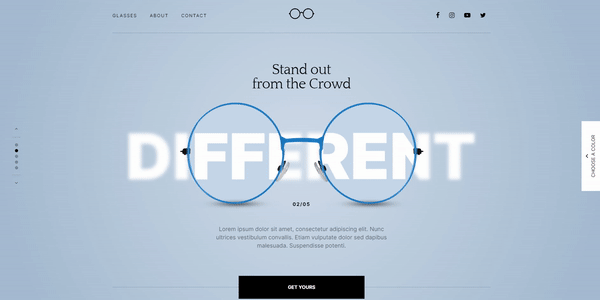
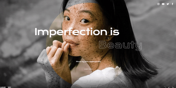
Optic Shop Showcase Slider
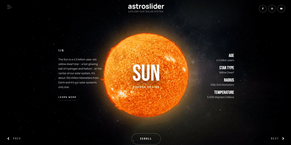
Solar System Showcase Slider
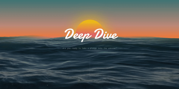
Deep Dive Ocean Water Effect
Photographer & Videographer Slider
Paintbrush Effect Collection
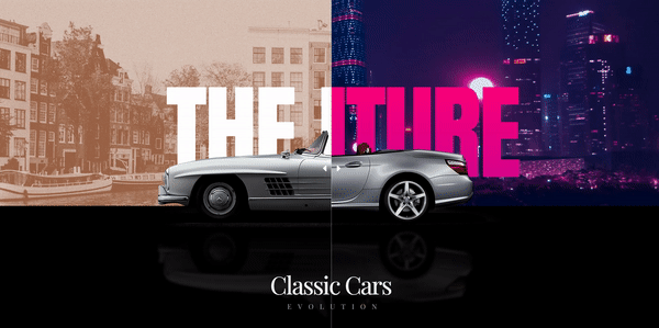
Classic Cars Before After Hero
CSS Mix Blend Mode Templates
Particle Effect One Slider
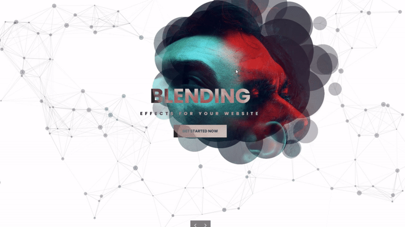
A Pen by Porecelanosa
Author: Porcelanosa
Made with: HTML, CSS
This option supports Mix-blend mode with a centered background image.
[CSS] anime effect
Author: Rplus
Made with: CSS, HTML
Here is a CSS anime with image hover effects and Mix-blend-mode.
Image Mosaic Effect With CSS Grids and Blend Modes
Author: Dudley Storey
Made with: HTML,SCSS
This filter effect is separated into various image boxes against a white background. This combination of image boxes creates the perfect max-width layout for the site’s UI.
Pen by Addison Staples
Author: Addison Staples
Made with: HTML, CSS
This example supports Mix-Blend mode with the background position of the image centered.
Templates With A Centered Background Position
A Pen by Arien
Author: Arien
Made with: HTML, CSS
Arien’s template is a CSS infrared image effect with a centered background image.
One background for multiple divs
Author: Ivan Bogachev
Made with: HTML (Pug), CSS (Less)
This fancy image effect for your browser or website, features a demo image with three layers.
A Pen by Saudad Marketing
Author: Saudad Marketing
Made with: CSS, HTML
This example uses pseudo-elements and a mirror effect.
Flexible multi-panel background
Author: Ana Tudor
Made with: HTML (Pug), CSS (SCSS)
Here is a beautiful image animation with a centered background-position.
A Pen by Saudad Marketing
Made with: HTML, CSS
This option features a fun photo-border effect. The border images are generated from the parent element in the middle. The code consists of a background size of 60% and 20% respectively with a centered background-position.
A Pen by Davy Peter Braun
Author: Davy Peter Braun
Made with: HTML, CSS
This is Davy Braun’s image with a hallucination effect. Its offset and height values are 5 px and 100 vh respectively.
colored pencil effect on image pure css
Author: erman enginler
Made with: CSS, HTML
Here is a design with a colored pencil effect and a centered background position.
A Pen by Julio Bonjoch
Author: Julio Bonjoch
Made with: HTML
This colorful example works great on modern browsers like Google, Firefox, and Internet Explorer.
2.5D
Author: Matt Drew
Made with: CSS, HTML
The 2.5D option contains far-field effects that make pictures slide slowly. It has a box shadow but does not activate with image hover effects. 2.5 is great for old memories and old-age pictures.
hallucination-effect
Author: vr201
Made with: HTML, CSS
A beautiful hallucination effect with a centered background image.
Night-Vision Image Effect Templates
A Pen by tr13ze
Author: tr13ze
Made with: HTML, CSS
With the night vision and blur effect, your image will have a unique look. There are links within the code to access the stock image galleries
A Pen by Hoo Ja Oh
Creator: Hoo Ja Oh
Made with: CSS, HTML
This is a template with a night vision background color effect. The background-position of the image is centered with the background image code reflecting ‘$url’.
A Pen by Rick Metzger
Author: Rick Metzger
Made with: HTML, CSS
Here is a $url night vision effect with a centered background-position.
Pencil And Watercolor Effect Templates
A Pen by ha quang thien
Author: Ha Quang Thien
Made with: CSS, HTML
This CSS image features a pencil effect filter.
A Pen by Woody
Author: Woody
Made with: HTML, CSS
This example features the watercolor effect. The image code can be altered in many ways, including the:
- Background size
- Blur value
- Background position
- Brightness etc.
A Pen by Shaman Tito
Author: Shaman Tito
Made with: HTML, CSS
This example supports the Polaroid image effect.
Templates With Image Hover Effects
3D perspective mouse hover image
Author: Eriksen
Made with: HTML, CSS
The 3D Perspective Mouse Hover Image effect activates when the user hovers over the photo.
CSS Glitch Image Effect
Author: Nathan Dickison
Made with: HTML, CSS
In this example, the demo picture has clear details but activates with a glitch effect when hovered.
CSS Clip-Path Hover Effect
Author: Ryan Mulligan
Made with: HTML, CSS
Here is an animated CSS clip-path template that activates with the hover effect.
Glitch Effect on Hover
Author: Ryan Yu
Made with: HTML, SCSS
This design features a CSS clip-path glitch effect without JavaScript.
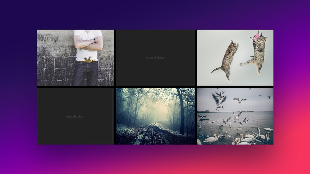
Kitties! (hover images)
Creator: Ana Tudor
Made with: CSS, HTML
This option activates with a hover effect but there is no edge support for the pentagons. It looks great because of the clip-path and the box-shadow feature around the pentagons.
Css Image Hover Effects
Author: Yaroslavw
Made with: CSS, HTML
For this option, photos are displayed within a content box. When the user hovers over the images, they slide from right to left to reveal text.
Grid Image Effect
Author: Jesús Gracia
Made with: HTML, CSS
An amazing grid effect that activates with the CSS image-hover effect.
Zoom iMage with scale
Author: Omar Dsoky
Made with: CSS, HTML
When the user hovers over the picture, the text disappears to display the full image.
When Life Gives You Lemons
Author: Collin Smith
Made with: CSS, HTML
In this template image hover, effects can be used for links to categories or posts. The container is skewed and the background image is kept straight.
CPC · Image hover · 01
Author: Noah Delagardelle
Made with: HTML, CSS
This design activates with the CSS image hover effect.
Colored Overlay Using “box-shadow”.
Creator: Preethi
Made with: HTML, CSS
This example has a colored overlay effect with a box-shadow for images.
Perspective Tilty Images
Author: Henry Desroches
Made with: HTML, CSS
This template t uses transform: matrix3d() in the CSS code. The image animation activates when hovered over.
Pure CSS Thumbnail Hover Effect
Author: Aysha anggraini
Made with: HTML, CSS
Here’s a jQuery option that features 6 fallback images that activate with the hover effect. You can adjust the code or use this option to display multiple photos at once. Click the header link to view tutorials for these thumbnail themes.
Image Hover – CSS (filters & transitions) – CodePen Challenge
Author: Vlad Racoare
Made with: HTML, CSS
This image effect activates when hovered. It uses elements like:
- Transforms
- Filters
- Positioning
- And Pseudo-elements
Water Your Cat
Author: Ana Tudor
Made with: HTML, SCSS
This is a beautiful design for websites. Above the center picture, there is a checkbox to the left of the demo text (water your cat so it grows). When the user clicks into it, the center image transforms. This option also has an image hover function that activates on the checkbox.
Simple Pulsing Image Hover Effect
Author: Alex Raven
Made with: CSS, HTML
When site visitors hover the cursor over an image, the effect is activated with a blurry gray square at the center of the image box.
Image revealing from text on hover
Author: Web-tiki
Made with: HTML, CSS
Here is a responsive thumbnail image for any browser or web design project. You can include text that inspires the user to hover over the image box. Once the viewer points the cursor at the image, the text disappears and transitions into the image.
3D image hover CSS
Author: Shounak Ghosh
Made with: HTML, CSS
A beautiful image animation effect that activates when hovered.
CSS Image Templates With Multiple Effects
Image with reflection and proximity effect on hover
Author: Tiago Alexandre Lopes
Made with: HTML, CSS
This template features the image with reflection and image hover effects.
Image Effects
Author: Dominik Suter
Made with: HTML, CSS
As the user scrolls, images display from blurry to clear with crisp colors. In addition, there is an effect that can make your images fade away because of no colors.
CSS Gradient Hover Effect
Author: Jon Daiello
Made with: HTML, SCSS
A CSS template that utilizes mix-blend-mode and image hover effects.
Images Hover Animations
Author: Stas Melnikov
Made with: HTML, CSS
This option features a variety of fallback animations and CSS image hover effects. Each image effect activates with a blurry purple screen covering it.
Simple CSS Image Effects
Author: Ion Emil Negoita
Made with: CSS, HTML
Here is a code for creating stunning CSS filters that can be applied to any image on your website. Each demo has a different background color with a filter brightness of 70%.
CSS Blend Modes
Author: Eddie Solar
Made with: HTML, CSS
This option experiments with different CSS blend modes. It offers various fallback web templates in the event the client dislikes the first demo.
hallucination effect
Author: Soruly
Made with: CSS, HTML
The Hallucination Effect template displays a lovely full-page anime image. The code supports mix blend mode and includes elements like:
- Background-image set to $url
- Background-size set to cover
- Background-position set to center
A Pen by Luchadora
Author: Luchadora
Made with: CSS, HTML
This option uses the overlay effect to add interactivity to site images and activates with the hover effect. It includes code parameters, such as:
- Background image URL
- Background size
- Background-position
- Background-repeat
image selector with reflection
Author: Paul
Made with: CSS, HTML
A design that uses radio buttons to select images. It features the reflection, background color transition, and image hover effects. The background-position of the reflection effect is coded to the bottom of the image.
Portfolio Items CSS3 transitions effects
Author: foxeisen
Made with: HTML, SCSS
This design features five transition effects for portfolio image items. It uses the portfolio and image hover effects.
A Pen by Airen
Author: Airen
Made with: CSS, HTML
Use this image effect to heighten the user experience of visitors to your website. It supports filter, invert, and mix blend mode.
Magnifying Glass image effect using CSS
Author: Santosh Goswami
Made with: HTML, CSS
The Magnifying Glass Image Effect scans images under a rectangle mirror. This mirror moves across the UI from left to right, vice versa, and enlarges objects. This is an attractive option for designing a browser or website.
FAQs about CSS image effects
How do I add hover effects to images with CSS?
Hover effects? They’re like giving life to a still shot. Just target your image with a pseudo-class, like: .image:hover { transform: scale(1.1); }. This snippet makes images grow a tick when hovered over. It adds that dynamic edge without breaking a sweat.
Can CSS add filters to web images?
Heck yeah, CSS filters are the bread and butter of on-the-fly image edits. With a simple line, like filter: grayscale(100%);, you turn your colored images into a classic monochrome snapshot. Filters handle blur, brightness, and even funky hues. They’re your quick photo lab in code.
What are CSS image sprites and how do they benefit performance?
Image sprites? Picture a collage. It’s your hero for fewer HTTP requests. Group multiple images into one and display pieces with background-position. Sprites mean less server chit-chat and snappier load times. All about that sweet, streamlined performance.
How do I make images responsive with CSS?
For images that flex with screen sizes, set max-width: 100%; and height: auto;. Responsiveness is key; no one likes scroll bars or cut-off pics. Adopting this approach makes sure your visuals are fluid and adaptable, just like good convo.
Are there CSS properties to make images circle-shaped or with rounded corners?
Round those edges, lose the sharp corners. With border-radius: 50%;, anything goes full circle, instant avatar-style. For a softer look, try border-radius: 15px;. It’s like cushioning for your images.
How to create CSS-only image galleries?
CSS-only galleries, all about keeping it lean. Lay out your thumbs with grids or flexbox. Lightbox effect? Simulate with :target pseudos. No JavaScript overload, just pure CSS simplicity. Your images, side by side, or popping out in pure CSS elegance.
What’s the deal with CSS background-image and multi-layering?
Layers on layers, CSS background-image is like your design lasagna. Stack ’em with commas, control with background-position and size. Blend modes join the party for some artsy fusions. It’s multi-layering that sets the visual rhythm for your site.
Can CSS handle high-resolution retina images?
Retina-ready, crystal clear, CSS is your friend. Use media queries like a pro, swap in those 2x images for the pixel-dense displays. Give the crowd that sharp, detailed view, ’cause no one digs pixelated visuals.
Is CSS capable of 3D image transformations?
Absolutely. CSS went 3D with transforms like rotateX, rotateY, and translateZ. It’s your ticket to giving images depth, sliding ’em around, flipping ’em over. Real depth, real movement, all through the magic of CSS.
How does one optimize CSS image effects for better performance?
Optimize, minimize. Compress your images, keep ’em light. Use sprites, remember? Choose the right format; SVGs scale without a fuss. Check your performance with tools like Google PageSpeed Insights. Keep users smiling with quick-loading, stunning visual effects. Less waiting, more enjoying.
Ending thoughts
So, we’ve played around with a bunch of CSS image effects examples, turning bland into grand, letting those pixels dance. From subtle hover animations that make your heart skip a beat, to the box-shadow effects that add depth and drama, it’s been quite the ride, hasn’t it?
- Remember the pseudo-elements? They were our sidekicks, adding layers of cool without the bloat.
- The CSS filters shook things up, giving images new personalities in a snap.
Transforming images with CSS is like strumming a guitar – the right chord, and the crowd goes wild. We’ve seen how responsive images harmonize with screens of all sizes, ensuring no one misses out on the visual feast.
Walk away with the confidence to craft visuals that tell a story, engage, and convert. Here’s to creating web pages that are not just seen but remembered. Now, go forth and make the web a more stunning place, one CSS transformation at a time. 🎨✨
If you liked this article about CSS image effects, you should check out this article about CSS progress bars.
There are also similar articles discussing CSS select styles, CSS loaders, CSS login forms, and CSS background patterns.
And let’s not forget about articles on CSS dropdown menus, CSS border animations, CSS arrows, and CSS cards.


