
Ever tapped into a website and spotted something eye-catching? That’s often the handiwork of a nifty piece of code styling what we tech folks call an “input text box.” I bet your fingers are already itching to jazz up those plain-Jane forms on your blog or e-store, right?
Well, you’ve struck gold here! We’re diving into the nuts and bolts of CSS input text examples. Whether you’re a full-time coder or a weekend warrior with a taste for tweaking your site, you’ll get the lowdown on transforming those sleepy input fields into dynamic, user-friendly elements that pop off the screen.
By the article’s end, you’ll be armed with:
- Insider know-how on stylizing text fields with CSS gizmos like pseudo-classes and font families
- A toolkit for creating accessible, responsive input fields—keeping your design both slick and smart
- Techniques to enhance the user experience—because who doesn’t love a form that’s a breeze to fill out?
Dive in. It’s time to up the ante on your site’s forms!
CSS Input Text Code Snippets
Validation for Input Fields: Update CSS on RegEX
Using repoCSS.js, this code lets you run RegEX validations on input fields. It turns the input field background red when a pattern has been detected.
Tiny Login
Tiny Login creates a quality login form that exceeds the expectations of most users. One of the key aspects of this form design is its typography, which can be altered and edited, allowing it to blend into the layout of the form.
Unfolding Dropdown Selection Animation
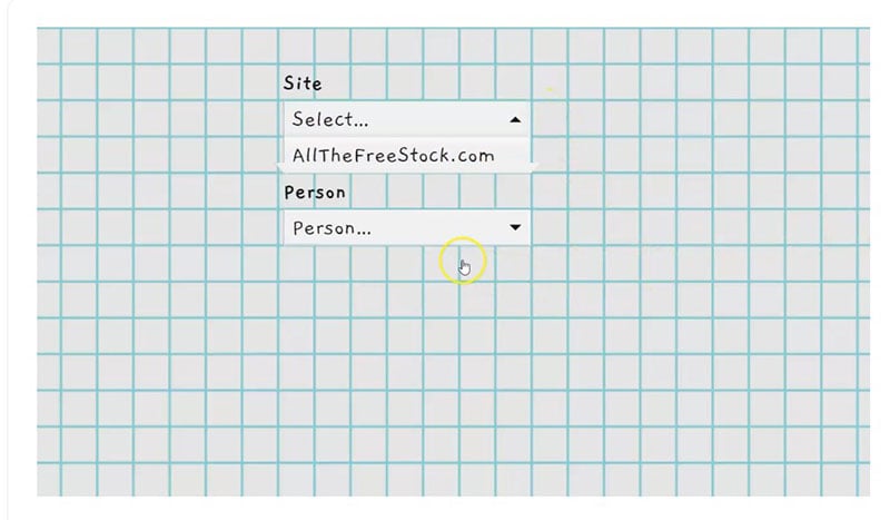
Designed by Jon Kanter, this is a charming unfolding animation that serves as a useful drop-down selection tool.
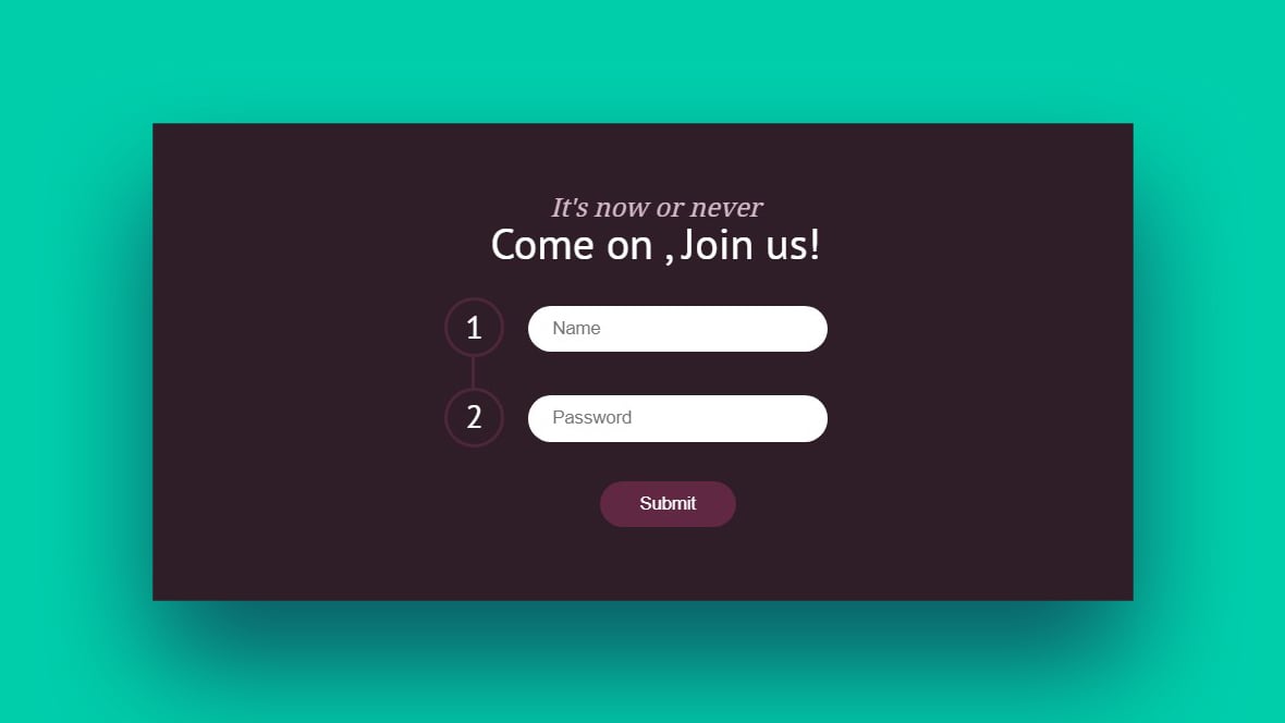
Login and Signup Combo Form
To reduce login times, you can combine the login forms for your site with the registration form for the site. This CSS input text code combines both forms into one, and puts them on a single page.
When a user clicks the sign in or register button, the forms are introduced by way of a fun animation, which can be fully customized.
Labels: Floating
This snippet’s floating labels use a minimalist style. However, when you focus on them, there is aninteresting effect; the labels change from gray to blue. When text is put into the box, it becomes small and moves to the top portion of the field using CSS transitions.
Contact Form: Responsive Material Design
The input text field for this contact form uses both sass and jQuery. It’s highly responsive and easy to use.
Checkbox Animation: Pencil and Paper
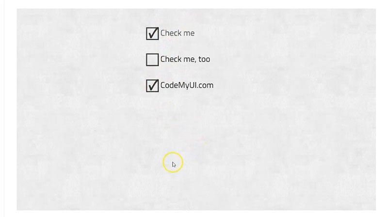
This design uses a hand-drawn pencil and paper animation, which is scaled to fit the text box properly, and used for filling in checkboxes.
Contact Form: Blackboard/Chalkboard
The entirety of this form is made using CSS, except the simple concrete wall background.
Contact Form: Vintage Inspiration
This form is both simple and effective. At present, validation isn’t included but is available upon request.
Text Input: Labels
This form has created a text box CSS design that is free of clutter and does not require the use of the hover feature. It ensures that labels are shown at all times, and it displays a placeholder text.
Text Field Placeholder Styles
This snippet is ideal for improving your UX, offering four different placeholder text styles for the text in your chosen fields. When you start to type, placeholder text shifts out of the way but remains in the user’s view, which proves to be helpful.
Material Design Form
Material Design Form is a minimalist design approach used on Google’s UI. It uses Pug for CSS and HTML preprocessing while also relying on Sass.
The form itself is lightweight and low maintenance, with design elements appearing the same on all modern browsers.
Contact Form: Under the Sea
With a custom jQuery form validation and simple CSS3 animations, this contact form is one of the most popular on our list.
Login Form: Password Search Light Reveal
This login form was designed by Ryan Mulligan, who spent several hours perfecting it. With this form, clicking the ‘reveal password’ icon triggers a searchlight to light up the asterisks in the password text field, revealing its content.
Single Input Form: 3D
This snippet stands out from the others due to its use of a creative CSS input style that reveals text upon the user hovering over it. The effect has a smooth and professional feel. This form design is ideal to polish a project without sacrificing flair and creativity.
Grayscale to Colour Card Payment Form: Flip Animation for CVV
Grayscale to Colour Card Payment Form is extremely functional yet surprisingly minimalistic. This CC form can be tested using a dummy card, which automatically detects the type of card you’re using.
As you type in your card number, it detects the card type and imprints the correlating colors on the greyscale card. Then, when you enter the CVV number, the card flips.
Contact Form: Elegant
The combination of unique font, fantastic icons, and responsive styling elements makes this contact form one of a kind and highly competitive. The icons keep the attention of users, who generally want to complete forms in as little time as possible.
FAQs about CSS input text
How do I style a CSS input text field to match my brand?
Think about your brand colors, styles—y’know, the vibe. Use CSS properties like color, background-color, border, and font-family to inject your brand’s DNA into those text fields. Keep it consistent—your input fields should feel like a natural part of your site’s aesthetic.
Can I add placeholder text that really stands out?
Absolutely, spice up that placeholder! With the ::placeholder pseudo-element, tweak things like font-style, color, and opacity. Make it inviting but not too loud; you want your users to engage, not be put off by a carnival in the text box.
What’s the secret to making input text responsive?
Here’s the scoop: media queries are your best pals. They’ll help you adjust the size, padding, and margins of your input fields to play nice with different screen sizes. Aim for a seamless user experience, whether they’re tapping on a phone or clicking on a desktop.
How can I use CSS to improve the accessibility of input text?
You’ve got to think about all users. Use label tags linked to your input fields, ARIA attributes where it helps, and make sure your text size and contrast ratios are on point. It’s about being inclusive—making sure everyone can get where they need to go on your site.
Are there ways to animate input text fields using CSS?
Animation adds that wow factor. With CSS transitions, you can add a dash of dynamism to focus or hover states. Think subtle—like a gentle highlight or a border that softly lights up. It’s like rolling out the red carpet for your users’ cursors.
Is there a method to validate input text with CSS only?
While CSS can visually flag up errors with pseudo-classes like :invalid, you’ll likely need a dose of JavaScript for full validation. CSS is your first line of defense; it makes sure the input text looks on point, but JS does the heavy lifting of actual data checking.
What are the best practices for using CSS frameworks with input text?
Framework time! Whether you’re team Bootstrap or love Foundation, consistency and customization are key. Start with their predefined classes, then add your flair to make those text fields feel at home in your design. Frameworks speed things up but never forget to add your unique touch.
How does cross-browser compatibility affect CSS input text styling?
It’s a game of testing and tweaking. Styling can look different from Chrome to Firefox to Safari. Use vendor prefixes where you have to, and keep an eye out for quirks in margin, padding, or font rendering. Aim for a harmonious look that says “welcome” in every browser.
Can CSS be used to style input text for dark mode websites?
Flip the switch for dark mode charm! Use CSS custom properties (variables) to define color schemes that adapt to light or dark preferences. When users go dark, make sure your input text goes soft on the eyes with an appropriate color palette. It’s all about going easy on those late-night eyes.
What is the role of CSS pseudo-classes in styling input text?
Pseudo-classes—think of them as CSS ninjas. They let you target input text when it’s feeling lonely (:empty), when it’s got the spotlight (:focus), or when a user’s hovering (:hover). They’re your secret toolkit for interactive, responsive, and just downright friendly forms.
Conclusion
Alright, let’s wrap it up. We’ve dug into some slick CSS input text examples that can really dial up the mojo on web forms. Bet your digital toolbox feels heavier, huh? From that first sparkly placeholder to the snazzy field that dances under a cursor – it’s all about making those input boxes inviting and intuitive.
Now, those form trails don’t have to be so drab. With a sprinkle of stylish CSS, that essential info can be fun to fill out. Yep, no one’s falling asleep on your watch.
Here’s a last nugget: the user’s journey should be smooth as silk. So keep those text inputs snappy, polished, and most critical, usable across the galaxy of devices out there. Use this know-how to craft text fields that make your users feel like VIPs every time they type. That’s the secret sauce. Now go on, style those forms to stardom. 🌟
If you liked this article with CSS input text code examples, you should check out this one with CSS timeline examples.
We also wrote about similar topics like CSS gallery examples, HTML calendar snippets, CSS animation examples, CSS accordion, CSS animated background, and styling radio buttons.


