
Ever stared at a jumbled mess of dates and events, wishing it all just… flowed? Step into my world of storytelling through CSS timeline examples, where boring lists transform into interactive journeys. This isn’t your grandma’s history class timeline — it’s a pixel-perfect visual voyage through time crafted with meticulous code.
By diving into this article, you’ll unearth how to make past, present, and future events pop on the screen. Forget the clunky time-travels of the old internet; embrace sleek designs that breathe life into projects, making them stand out in the sea of sameness. As we walk the timeline path together, you’ll learn:
- How to weave captivating animated timelines using CSS keyframes
- The secrets behind crafting a responsive slice of history
- And a peek into the toolkit of a pro: JavaScript libraries that set timelines ablaze with interactivity
Your takeaway? A treasure chest of inspiration to catapult your web narratives from mere data to a visual feast.
HTML and CSS timeline snippets
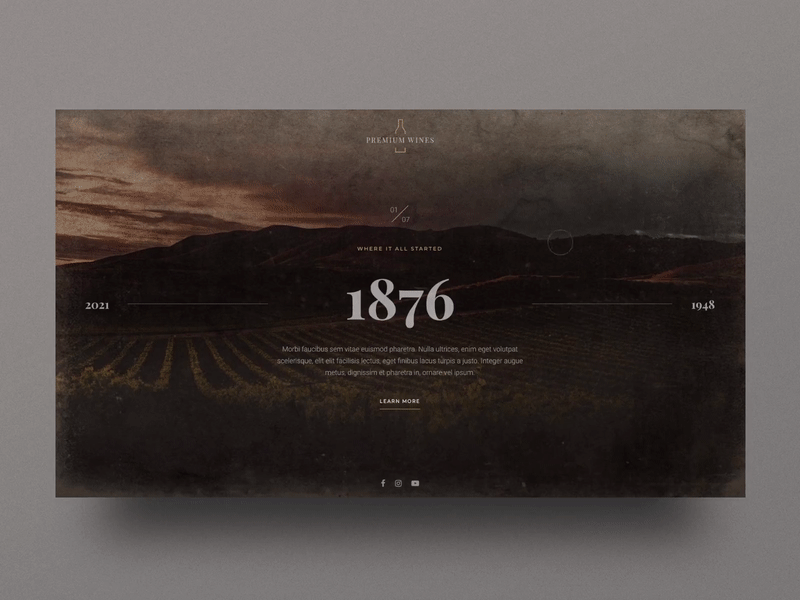
Winery Timeline Slider
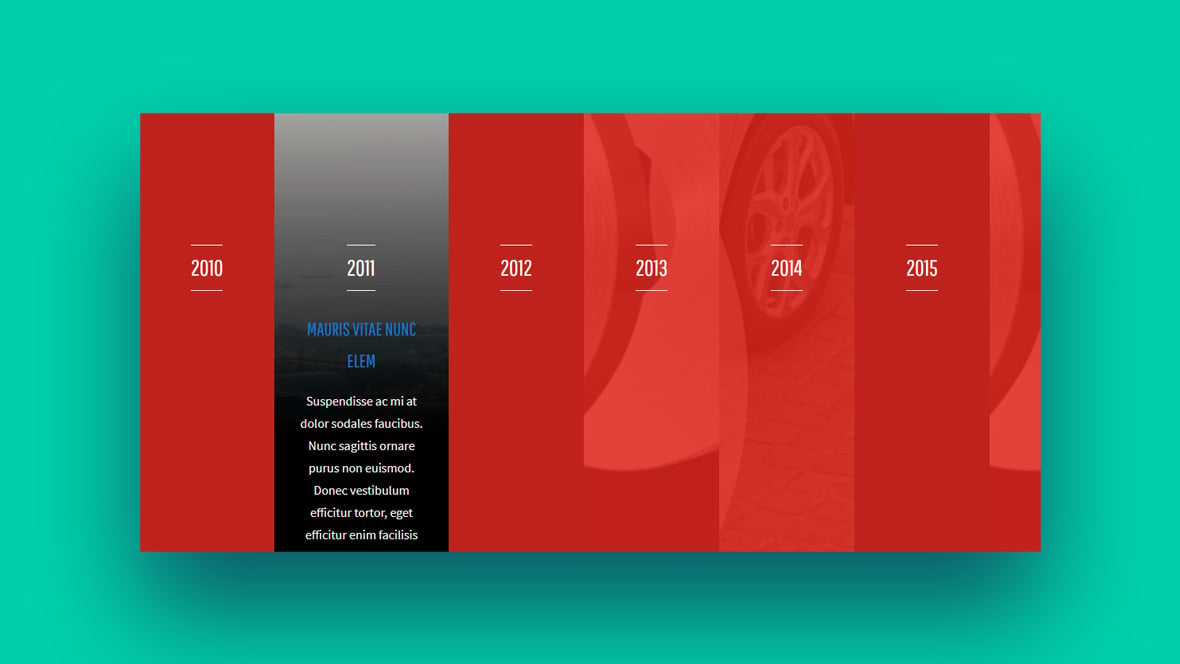
CSS Timeline by Kavixiu
This sleek and stylish timeline developed by Kavixiu is in a vertical format and is a great way of showcasing your information. It is designed with separate content blocks in each part where you can add your content. These blocks can be quite large which is great if you have a lot of information to display. You won’t be able to insert images using the default design, however, you’ll be able to edit the code to add them.
You can leave the dots on the timeline as is, or choose to add some subtle effects. And you can also do this with the content blocks. Check out the CSS animation examples to get some inspiration for more interactive designs. This timeline does give you a basic structure or use it as your base to add on interesting features and different colors.
Change Your View
Change Your View offers a unique and versatile way of showing your information when your space is limited. You can use your keyboard to navigate or choose to click or drag. It’s also possible to zoom and rewind. It looks awesome as well as giving users plenty of options for how they interact with the information presented.
Horizontal Timeline
Horizontal Timeline offers users a way of presenting their information on a horizontal timeline. It is quite an advanced tool that uses a slider to full advantage. This one is ideal for adding or explaining information about a specific milestone that appears on the timeline. It shows up as a simple line with a dot on it to mark each event. These events have more information in the form of dialogue boxes that appear either side of the timeline.
It’s easy to scroll forward or back through the timeline using a simple creative functional design. Some of its many possible applications include educational fields and professional settings. It uses a contrasting color scheme to catch the eye.
Bitcoin timeline with fixed header using flexbox
Created by Matys, this has a truly unique and flawless design concept with a professional-looking timeline. If you don’t want the header at the top, it’s easy to get rid of. Scrolling pushes the lower numbers away so you can see the information you want more clearly. It’s a great design!
Simple Responsive Vertical Timeline Layout
While this vertical timeline may look a little dated , it is a really elegant and simple design and offers a good way of highlighting key events in the timeline. It is best used for simple styles of timelines rather than ones with a great deal of information, as it can start to look bulky. If you are not entering a lot of text, then it is a great option.
Look Behind the Door
This HTML timeline looks nothing like any of the others on the list. While it is quite different, it remains intuitive for the user to access the important information. It is presented as a row of tall, thin panels. When you hover your mouse over one of these, you’ll find a bright image and descriptive text and amazingly it was created just with HTML and CSS.
CSS Timeline by Sava Lazic
This vertical CSS timeline design is elegantly animated with the information flowing in from each side as you scroll. This draws the eye to the new piece of information, which is a very clever concept. If you want a timeline that’s not just static, this could be a great choice for you. The design offers the space to add images and also buttons for a call to action. If your timeline is for the purpose of selling a product or service, these buttons can encourage the user to buy.
Nested And Color Timeline
This timeline is more colorful and creative than most and uses a simple card structure that forms a useful slider. This is a very effective design with a great template into which you just add your own information.
There are also text sections above the timeline, where you can add an introduction or other information. The timeline itself can be color-coded according to the category, which is a very handy feature.
Flexbox Timeline Layout
This CSS timeline can at first look rather crowded, but it’s important to note that you can edit the size of the boxes to avoid this. Lighter or less bright colors would also help and try using a duo tone palette or pastels.
As there is plenty of space to add pictures, this script could also be used for a blog.
Pure HTML and CSS Vertical Timeline
This HTML timeline was designed by Ross McNeil, who’s provided us with a stylish vertical display of events. You can enter quite a lot of text in these wide substance squares. They have arrows planted on the edges to refer you to the point it sits on the timeline. It’s a very effective design element.
You can’t include pictures in this timeline if you choose to use the default structure, however, you can edit the code to add pictures. You could also choose to add unobtrusive movement impacts if you want to.
Timeline Style Navigation
The Timeline Style Navigation makes great use of a simple CSS timeline. A vertical timeline can be viewed on the left side of the screen. This is great for timelines with lots of information because it leaves the main part of the screen free for text. Each slide is a different color so you can differentiate when you’ve moved onto the next part of the timeline. The one drawback here that you may want to fix is that the slide switches too quickly, after only a tiny amount of scrolling.
Responsive History Timeline
This stunning horizontal timeline design was crafted with history and event explanation in mind. It uses a slider feature to take you from one part of the line to the next and each section has spaces for images as well as texts to accompany each image. The navigational icons for the slider of the horizontal timeline live at the bottom of the page which is an intuitive way to scroll through the timeline.
The example given has a monochromatic palette of black and white, while the text in gold offers a stylish pop of color. This is a simple yet very effective format for imparting a lot of information.
Timeline Custom Counter with Gradient Border
This one offers a sleek, elegant and innovative design. The structure is well designed and will suit any length of content. The ‘timeline’ looks more like a snake slithering around the text blocks. It is an easy way of giving your site the facelift it needs to look more contemporary and stylish.
CSS Timeline with Custom Properties
This CSS timeline looks fantastic in mobile view and it’s very responsive. It offers a clean and easy to view and read design. It would be impressive on a Caste study page showing something like sales time frame improvements. The example shows a resume, which is an incredibly creative use of the design.
Top of the Charts
The Top of the Charts timeline provides an alternative and unexpected format. It has a unique format similar to that of a graph or chart. It remains simple while giving you a very different way of displaying information. The text is minimal, and hyperlinks are used instead to direct the viewer to more information.
FAQs about CSS timelines
How do you create a basic CSS timeline?
Start with your HTML structured—I’m talking a good ol’ ordered list to mark up your events. On the CSS side, think blocks and lines. Style your list items to block out events, and pseudoelements for connecting lines. Flexbox can align things neatly. Remember, repurpose when you can; don’t reinvent if a snippet fits the bill.
Are there any good CSS timeline libraries I can use?
Oh, absolutely. Libraries can be a real time-saver. Consider something like TimelineJS or Vis.js when you’re looking to streamline. They’ll give you a headstart with prebuilt styles and functions. These tools are like cheat codes for fast and professional-looking results in crafting your interactive timelines.
Are CSS timelines responsive by default?
Wishful thinking, but nah. You’ve gotta make ’em flex and bend with media queries. Work in percentages, use flexible units like vw (viewport width), and test on different devices. “Responsive” is your mantra here; let’s not leave any devices in the dark ages, yeah?
What is a vertical CSS timeline, and how is it different from a horizontal one?
Vertical timelines scroll top to bottom—you’re walking the line in the natural reading direction. The horizontal ones stretch left to right, like you’re timeline-hopping in a side-scrolling video game. It’s all about perspective and preference—some stories just tell better horizontally, others vertically.
Can CSS timelines include images and videos?
For sure, they aren’t just for text. Spice up your timeline with pics and clips that tell a thousand words. Mix ’em in with your HTML, then use CSS for making them pretty and fitting just right. Visuals break monotony and up the engagement factor, making your timeline a bona fide scroll-stopper.
How do you make an animated CSS timeline?
Animation’s the magic that brings your timeline to life. CSS keyframes will be your wand for fading, bouncing, or sliding-in events. Combine that with CSS transitions or animation-delay, for that theatrical timing. Watching your timeline come alive as you scroll—it’s kinda like directing your mini web-based theater.
Is it possible to make a CSS timeline interactive?
Oh, it is—and you should. Toss in some JavaScript for an extra kick. This duo—CSS for looks, JS for action—sets up for timelines that react to user hovers and clicks. Now, we’re partying with pop-up details, smooth scroll effects, or even real-time updates. Who said timelines gotta be static?
How do I ensure my CSS timeline is accessible to all users?
A big heart for asking. Accessibility is key. Use semantic HTML, focus on keyboard navigability, and don’t forget ARIA roles. Screen readers should glide through your timeline with ease. Every user deserves to time travel with your content, so put that inclusive hat on and make it happen.
What are the best practices for designing a CSS timeline for mobile devices?
Keep it simple—trim the fat. Screen real estate is gold on mobile. Prioritize swiping over clicking, enlarge touch targets, and streamline details. Balance aesthetics with functionality ’cause nobody likes pinching or zooming. A mobile-friendly timeline is like a good book—easy to pick up, tough to put down.
Can I integrate a CSS timeline with other web technologies like React or Vue?
You bet! These modern JS frameworks love playing nice with CSS. Build your timeline logic with React or Vue’s robust systems, then style with CSS. You get a recipe for dynamic, responsive, and state-of-the-art timelines that make your users’ experiences smoother than a freshly waxed surfboard.
Conclusion
And just like that, the curtain falls on our showcase of CSS timeline examples. We’ve rocketed through time and pixels, turning abstract moments into digital milestones that anyone can admire with a scroll and a click.
Let’s part with a checklist of golden nuggets:
- Flexibility is king. Responsive design isn’t optional; it’s essential.
- A picture says a thousand words, but a well-placed video in your timeline speaks volumes.
- Keep it playful but accessible. The more users that can join in on the fun, the better.
Think of timelines as stories, not just lines and dots. They’re narratives crafted with the DNA of design, coded for the modern web connoisseur. Whether you’re planning to ink a personal journey or chart the annals of an era, embedding those interactive, animated elements means you’re not just telling a tale—you’re giving your audience the front-row seats they deserve.
So go on, spin those yarns of yesteryears with sass and style. Because when it comes to memorable web experiences, it’s these timelines that’ll have ’em talking for, well, more time than we’ve got.
If you liked this article with CSS timeline examples, you should check out this one with CSS animation examples.
We also wrote about similar topics like CSS gallery examples, HTML calendar snippets, CSS input text examples, CSS accordion, CSS animated background, and styling radio buttons.


Thanks for getting all these widgets together, have something to consider 😉