
Imagine landing on a webpage where navigation feels like discovering a secret passage—a seamless blend of art and functionality. That’s the magic a well-crafted slide menu can conjure.
In the dance of pixels, where every click unravels a new scene, these unassuming design elements are pivotal in guiding users through the narrative of your site with grace.
In this digital landscape, I navigate the synthesis of aesthetics and user experience, crafting pathways that not only look good but feel intuitive. By delving into this article, you’ll learn how to elevate your website’s user interface with creative and practical slide menu examples.
Explore structurally sound yet visually stunning menus that promise to enhance website navigation. Uncover the subtleties of responsive design techniques that ensure your site’s effortless interaction across all devices.
Pure CSS Menus
Generative AI WordPress Template

Elevate your website with the mesmerizing sliding menu of our Slider Revolution template. Its captivating and vibrant aesthetic seamlessly adapts to any theme, whether it’s “Generative AI” or a diverse range of other topics.
Craft a clean and modern one-page design that effortlessly stands out from the crowd. Transform your online presence today by embracing the power of the “Generative AI WordPress Template” and embark on a journey to create unforgettable user experiences!
Creative Portfolio Website Slider

Introducing our remarkable Slider Revolution template with a captivating sliding menu. Designed to make a lasting impression, this one-page portfolio website template is crafted to showcase your work in a visually striking and interactive manner.
Illuminate your portfolio with this outstanding design, instantly captivating prospective clients from the moment they enter your site.
With its impressive features, you can effortlessly shine a spotlight on your work and create an unforgettable experience for your visitors.
Spaceman App Website Template

Experience the ultimate versatility with our Slider Revolution template featuring a dynamic sliding menu.
This mobile app website template is a treasure trove of possibilities, offering a stunning feature carousel, a captivating screenshot gallery, and an engaging testimonials slider.
Unleash the full potential of your mobile app with this all-inclusive template that caters to every aspect of showcasing your product.
From showcasing features to displaying eye-catching visuals, this template has got it all covered, providing an immersive and seamless user experience for your visitors.
Smart Living One-Pager V3
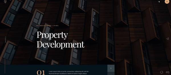
Effortlessly craft professional-level one-page websites with our Slider Revolution template featuring a dynamic sliding menu. Unlock the potential of your creativity with the unique “Smart Living” modules that are thoughtfully designed and ready to use.
With 3 example page setups included, you can quickly create stunning one-pagers that perfectly capture the essence of your project.
Save time and showcase your content with style using this versatile template, empowering you to create impressive and engaging websites in no time.
Köstlich Restaurant Website Template
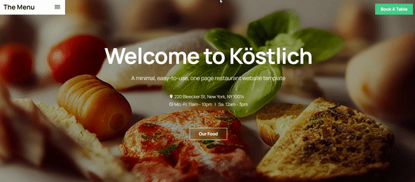
Introducing our revolutionary restaurant website template with a captivating sliding menu, designed to elevate your online presence.
This template features a unique vertical carousel design that will captivate your visitors and leave a lasting impression. Customize your website in a matter of minutes, thanks to its user-friendly interface.
Need to showcase more information? Simply duplicate a slide, update the image and texts, and you’re good to go. Effortlessly create a visually stunning and informative website that perfectly represents your restaurant.
Sliding Menu
Author: Onsen & Monaca
This first menu is super simple and uses only HTML.
Multi-level CSS
Author: Shven
This sliding menu imitates a book with tabs that adds 3D effects. When users click on the icon, a menu pops up from the left edge. When users click the icon again it returns to its original state.
Sidebar Nav Animation
Author: magnificode
This code displays menu icons on the left of the screen. With a click, words appear to identify what the icon represents.
transparency
Author: Brady Hullopeter
This is another menu that is pure CSS. The light blue background color makes the menu stand out.
Side navigation
Author: Cloudfrank
This small and simple navigation menu slides down with a mini animation.
Sliding menu
Author: Maxime Huylebroeck
The menu presented here first slides down and then slides over. The hamburger icon turns into a left arrow to indicate that pressing on it will slide the menu left again.
Nice sliding
Author: Thomas
This pure CSS menu has a light blue background color. A circle in the center directs users to hover the black line to make the menu appear.
Sliding share bar
Author: Nathaniel Naranjo (Noble-Nate)
This code pen presents a dark red slide menu with a Font Awesome icon. It slides out from the left side of the screen. It can be used to display other Font Awesome menu icons or other elements you want to hide off-screen.
push menu
Author: Marc Lioyd
A plus icon identifies the menu in this code pen. When users click on it, the menu pushes the main page content to the right to make space for the menu.
Slide Out Menu
Author: Max Kurapov
This code pen reveals a simple and elegant navigation menu. A bar with the word “menu” resides on the right side of the page. When users hover or click on it, a small menu appears.
UI with UX
Author: Twikito
This pure CSS menu has a hamburger icon, an off trigger area, and many pseudo-elements. It slides from the left of the page with an angled border. Its background color is bright pink and it uses a blur effect. On mobile devices, the blur effect might lag a little.
Fly-Out Nav
Author: Tiffany Rayside
This navigation menu displays icons on the left side of the web page. On click, the menu folds out.
CSS drawer
Author: Bardy Hullopeter
Here is a transparent menu that overlays the webpage. A click on the menu icon brings out a transparent bubble that then elongates into a rectangular menu. It is responsive, makes good use of animations, and allows users to see where they are on a website.
Off-screen nav
Author: Dannie Vinther
Here is another pure CSS sliding menu. This one is relatively simple with plain white and black colors. The menu icon is displayed in the header of a website. It uses :focus-within pseudo-class to help make it work.
CSS3 Only Menu
Author: Ragnar Þór Valgeirsson (rthor)
Another pure CSS code pen, this menu was a checkbox experiment. The width of the sliding menu reaches almost across the entire screen.
Pure CSS side reveal effect
Author: Antonija Simic
This is a pure CSS menu with a side slide reveal effect. It has a bright blue background color that looks great against a white color scheme. Users can add a link to each menu label.
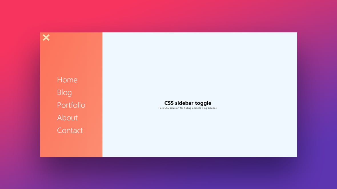
SIDEBAR TOGGLE MENU
Author: Jelena Jovanovic
The best part of this slide menu is its color scheme. Bright pink blends into purple that in turn blends into blue. This ombre style is a great way to add more color to a website.
Side Sliding Menu CSS
Author: Eduard L.
Here is another simple pure CSS menu that displays icons on the left side of the page. When a user clicks on the icons, the menu slides to expand.
JS Menus
Off-canvas menu
Author: Mark Murray
This off-canvas menu contains a hamburger menu icon in the upper left corner. On click, the web page is minimized to reveal a navigation menu header.
Left slide menu
Author: Roman
This next code pen contains a slide menu icon on the left side of the page.
3D Off-canvas navigation
Author: iamarend
Next on the list, here is a 3D slide menu. When the icon is clicked on, a menu overlays the page. The hamburger icon changes into an exit icon.
Sidebar
Author: Mari Johannessen
Here is a simple sliding menu. When not deployed, users can see a small curved section of a circle icon.
Slide-out
Author: Jonno Witts
This code pen displays a header menu that uses a large font and a white text color backed by a turquoise color.
Elastic SVG Sidebar
Author: Nikolay Talanov
This mobile slide-out menu has an interesting and responsive animation. Users press and slide the white sidebar out. The bar bows as if it were elastic until finally, it bounces to reveal the menu.
Sidebar Navigation
Author: Jay Holtslander
Here is a sliding menu with a dark theme that moves the web page to the right.
Slide Menu
Author: P.S.Blakemore
This code pen displays a simple menu that does not take up much space. It is transparent so users can still see the page underneath it. It is very smooth and has a unique design.
Offcanvas sidebar
Author: Devilish Alchemist
Here is a unique off-canvas sidebar slide menu that does not disappoint. The whole page twists to reveal a triangular menu.
Sliding Menu
Author: Daniel Maldonado
A bright green sliding menu overlays half of the webpage with this code pen. A hamburger icon identifies the menu in the right-hand corner of the page. After deploying the menu, the icon turns into an exit button.
Multi-level Menu
Author: Aaron Awad
Hovering reveals the labels of this menu. Clicking on the hamburger icon makes the menu stand in a position fixed on the page. This code pen uses a touch of JavaScript to make sure it runs smoothly.
Sidebar toggle
Author: Jorge C. S. Cardoso (jorgecardoso)
Here a sidebar navigation menu slides into place with a click on the hamburger menu icon. The background color of the menu starts as a faded orange but then brightens up to neon orange.
Sliding Menu
Author: Greg Klein
This sliding menu not only slides from off-screen to on-screen but also slides its menu icons down.
responsive sidebar
Author: Ferran Buireu
The author of this menu was able to include a logotype and an icon-based menu with little effort. It also supports ARIA to make it accessible to those with disabilities.
Sliding menu
Author: Sabine Robart
Here is a very unique menu style. Its design condenses several menu icons into a small area. When a user hovers over an icon, the area expands. Each icon is separated by different hues of purple.
Compact sliding menu
Author: Julia kuznetsova
Continuing the list of slide menus that use JavaScript is this compact menu. Like other menus, it starts with a menu icon in the left corner. The menu slides out and covers half the width of the page. The white text stands out starkly in the black background.
Full-screen slide menu
Author: senthil raja
This menu spins and slides from the left edge of the page across to fill the entire screen. A transition makes the icon change into a left-pointing arrow allowing users to exit the menu.
Slide Menu
Author: GM
Here is another CSS and JavaScript sliding menu that fills the whole screen. It uses a large font and white text over a blue background.
Slide menu
Author: Reza Khan Mohammadi
This code pen strives to create a menu with an iOS style. Unlike other slide menus, this one allows users to drag and swipe it open and shut. It is a lightweight menu and was designed with mobile devices in mind.
Website sketch
Author: Jaroslaw Hubert
Instead of using a menu icon, this code pen uses a toggle switch. When users flip the toggle switch, a menu slides down. When users click on one of the menu options such as Home, the label slides to the right as a click indication.
Splitscreen slide menu
Author: Onno
Often when users click on a menu icon the menu is attached to it. With this code pen, when a user clicks on the menu icon, the menu appears on the other side of the webpage. The menu splits the screen with the page and resizes the content.
Sidebar Interaction
Author: Siddharth Parmar
This code pen uses two slide transitions. The menu itself slides into view. The labels also slide a little when clicked on.
Fullscreen overlay
Author: Mirko Zorić
Here is a full-screen menu that overlays the webpage. Each section of the menu is represented by a different color. The sections slide down from the top in quick succession as if they were doing the wave.
Sidebar template
Author: Azouaoui Mohamed
Here is a sidebar template with a logotype, search box, social media buttons, and more. It works for both desktops and mobile devices.
Easy Sliding Menu
Author: Yago Estevez
This last code pen with JavaScript is an easy slide menu. It has a hamburger menu icon, exit button, angled border, and appealing font.
FAQs about CSS slide menus
How do I integrate a slide menu into my website?
Crafting the perfect drawer navigation starts with HTML for structure, CSS for styling, and JavaScript for interactive magic. Usually, it’s a case of slipping a clean chunk of code into your site’s framework. Think of it like implanting a dynamic piece into the puzzle that is your intricate website layout.
What is the best way to design a slide menu for mobile devices?
Embrace simplicity and thumb-friendly design. A mobile menu should appear unobtrusive, nestling away until summoned with a tap. Ponder over touch gestures; a flick should unveil menu options, and usability should be king. Accessibility isn’t just a buzzword; it’s the gateway to inclusivity in the mobile user experience.
Can slide menus improve website navigation overall?
Absolutely. A slide menu tidies up the virtual vistas without sacrificing accessibility. Like a trusted guide, it leads users gracefully from point A to B, infusing user interface elegance with the streamlined user experience. It’s all about connecting visitors to content with uncanny ease and bespoke flair.
Are there any accessibility concerns with slide menus?
Mindful consideration turns potential pitfalls into seamless inclusivity. Ensure your slide menu is narrated correctly by screen readers and spares no effort on accessibility standards. Keyboard navigability and clear focus states guard against exclusion, anchoring usability in universal design.
How do I ensure my slide menu is responsive?
Master responsive menu design by ensuring it plays nice with screens of all sizes. Employ responsive design techniques, always test across devices, and perhaps pick a front-end framework that offers responsiveness out of the box. Your slide menu should morph gracefully from desktop grandeur to mobile practicality.
What should I consider when using animation in slide menus?
Animations should be a waltz, not a race. Subtlety is key; use CSS3 transitions for smooth, natural movements. Keep performance in check—too much flair can lead to lag, pulling users out of the narrative. Aim for enhancements that bolster usability without overshadowing the content or website layout.
Do slide menus work well with all content management systems (CMS)?
Most definitely. Whether your digital home is built on WordPress, Joomla, or another Content Management System, slide menus adapt like chameleons. With myriad plugins and community wisdom at your fingertips, implementation can be as simple as choosing the right extension to complement your site’s architecture.
How do I track user engagement with my slide menu?
Leverage analytics tools to unveil the story behind clicks and hovers. Heatmaps, click tracking, and event monitoring offer insights that transform numbers into narratives, highlighting areas that captivate or need a touch more clarity. It’s a dance of iteration, combining UX design principles and cold, hard data.
What common mistakes should I avoid with slide menu design?
Avoid clutter; an overcrowded menu repels engagement. Ensure each entry is necessary and contributes to the user’s journey. Prioritize clarity—mystery belongs in novels, not navigation. Treat user interaction models with respect, and always optimize for quick access and relevance.
Can slide menus boost the SEO performance of my website?
Indeed, though indirectly. By decluttering your interface and enhancing usability, slide menus can reduce bounce rates and encourage deeper engagement—positive signals to search engines. Plus, structuring your site with clear navigation hierarchy and mobile adaptability aligns well with search engine preferences.
Conclusion
Throughout this exploration, we’ve delved into the realm of slide menu examples, each serving as a beacon of possibility in the ever-evolving landscape of web design. Slippery as fish, yet noticeable as a lighthouse, these menus have unveiled themselves to be the silent narrators of your digital story.
- Sleek off-canvas menus,
- Discreet yet accessible hamburger menus,
- Elegantly unfolding accordion menus— they’re all characters in the play of your user interface, brought to life with thoughtful consideration toward user experience and front-end development.
Today’s odyssey through various navigation designs—arctic in their simplicity, lush in functionality—concludes here. The tools and insights gleaned are yours to wield. Go forth with this compendium of creativity, and mold the navigation experience into something that not only directs but delights.
Your site’s menu is the gateway; ensure it’s an invitation, not a barrier. Here’s to crafting pathways that resonate with purpose and beckon users with the promise of discovery.
If you liked this article about slide menus, you should check out this article about CSS animations on scroll.
There are also similar articles discussing CSS page transitions, CSS modals, CSS tooltips, and CSS link hover effects.
And let’s not forget about articles on CSS hamburger menus, CSS range sliders, JavaScript menus, and CSS toggle switches.


