
Before & After Extra Configuration Options
Learn about the configuration options available to customize your before & after effects.
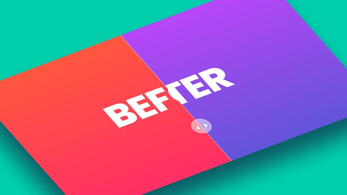
Table of Contents
Slide & Module Level Options
On the last page of the manual we covered the essentials of setting up effects using the Before & After addon [?]
Addons extend the functionality of Slider Revolution, adding new controls to the module editor and allowing you to do extra things with your design.
For example, using the particle addon you can create effects such as falling snow, and using the distortion addon you can create shimmering effects such as simulating being underwater.
There are dozens of addons available, all included with the full version of Slider Revolution..
Now, in this guide, we’ll dig further into the ways you can customize your before and after effects, using several configuration options available at both the slide and module levels.
Slide Before After Options
To access the slide [?]
A "slide" in Slider Revolution is a container into which multiple layers can be added, with layers in turn acting as containers for various forms of media such as images, text, video, audio, buttons, and special effects.
Slides are added to modules and edited via the module editor.
Within the module editor, each slide has its own animation timeline, background and collection of layers.
A single module can have one or many slides. A module with one slide is called a scene, and a module with multiple slides is called a slider or carousel. level options for your before & after effect go to the Slide Options tab, then the Before After sub-section:
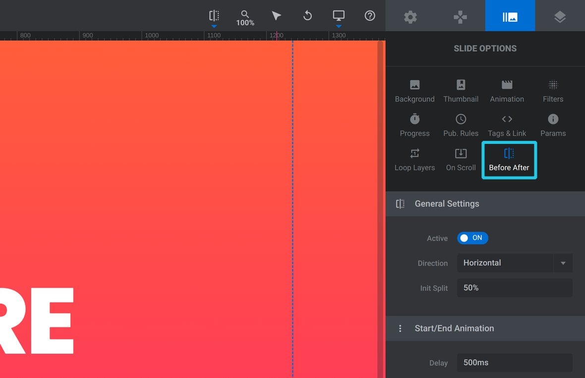
There you will find the following four panels:
- General Settings – the divider’s orientation and initial placement
- Start/End Animations – how the After environment appears & disappears
- Teaser Settings – add an enticing “bounce” animation to the arrows
- Arrow Settings – animate the arrows into place when they first appear
Let’s take a look at the configuration options in each of these panels.
General Settings
Below the Active option, the General Settings panel contains two basic options for the draggable divider:
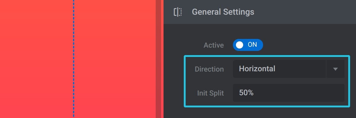
Direction
By default the draggable divider runs vertically and moves from left to right:
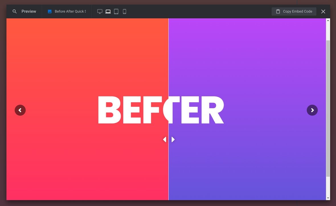
However, the Divider option can be changed from Vertical to Horizontal:
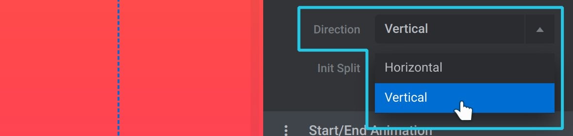
In this case the divider will then run horizontally and move top to bottom:
Init Split
The Init Split option defines where the divider will initially rest before being moved by the user:

It is set as a percentage, within the range of 0% to 100%.
If Divider is set to Horizontal, 0% sets the divider all the way to the left, and 100% all the way to the right.
If Divider is set to Vertical, 0% sets the divider all the way to the top, and 100% all the way to the bottom.
Start/End Animations
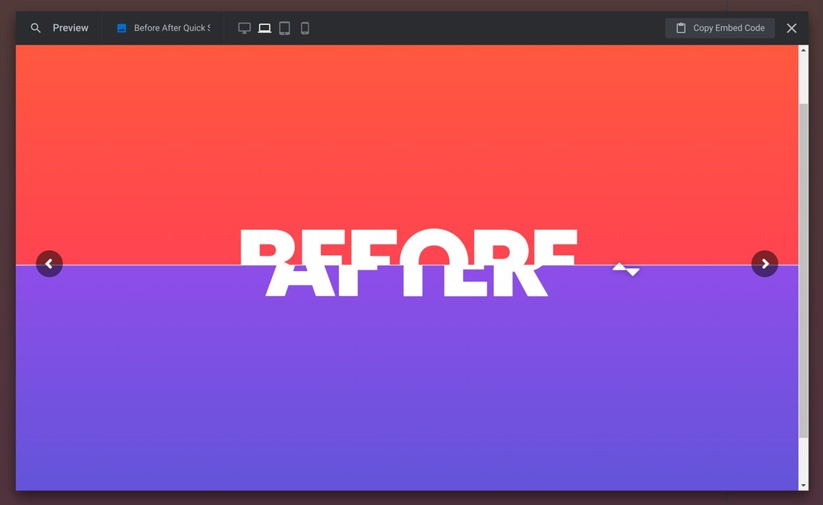
Initially the slide will show the Before environment, then the draggable slider [?]
A slider is a type of module that contains multiple slides. You can only see one slide at a time, a distinguishing features that makes sliders different from carousels.
The slides of a slider can be panned through either by using navigation controls such as arrows and tabs, or by clicking and dragging. They can also be set to automatically transition from one slide to the next. will appear and reveal the After environment as well. The options in the Start/End Animations panel allow you to configure how this reveal happens:
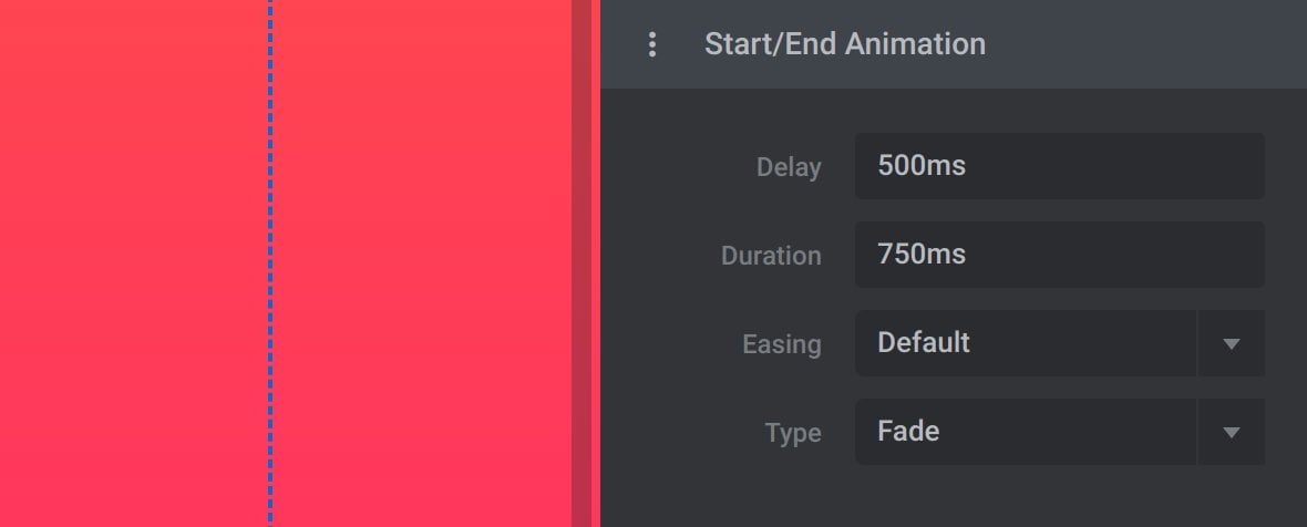
Delay
The Delay option configures the amount of time, in milliseconds, that should pass with only the Before environment showing until the After environment is revealed:

Duration
After the Delay period has elapsed, the divider will slide in from the edge of the screen, revealing the After environment as it goes along.
The Duration option sets, in milliseconds, how long the divider should take to move from the edge of the screen to the partition set under the Init Split option:

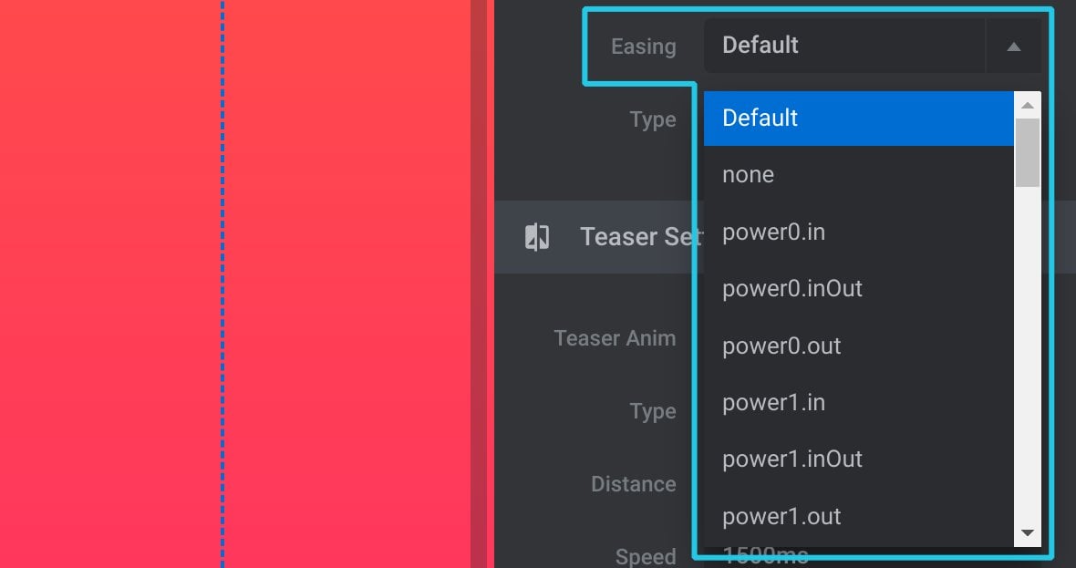
Easing
The Easing option sets the type of easing, i.e. rate of movement, that should apply to the divider as it animates in:
Type
The Type option determines the animation that applies to the After environment and the divider at the end of the slide:
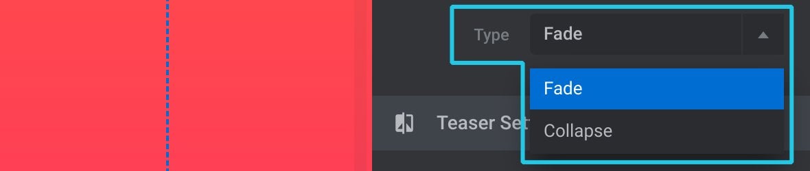
Choosing Fade will smoothly fade out both the After environment and the divider.
Choosing Collapse will instead reverse the animation that was created using the Delay, Duration and Easing options.
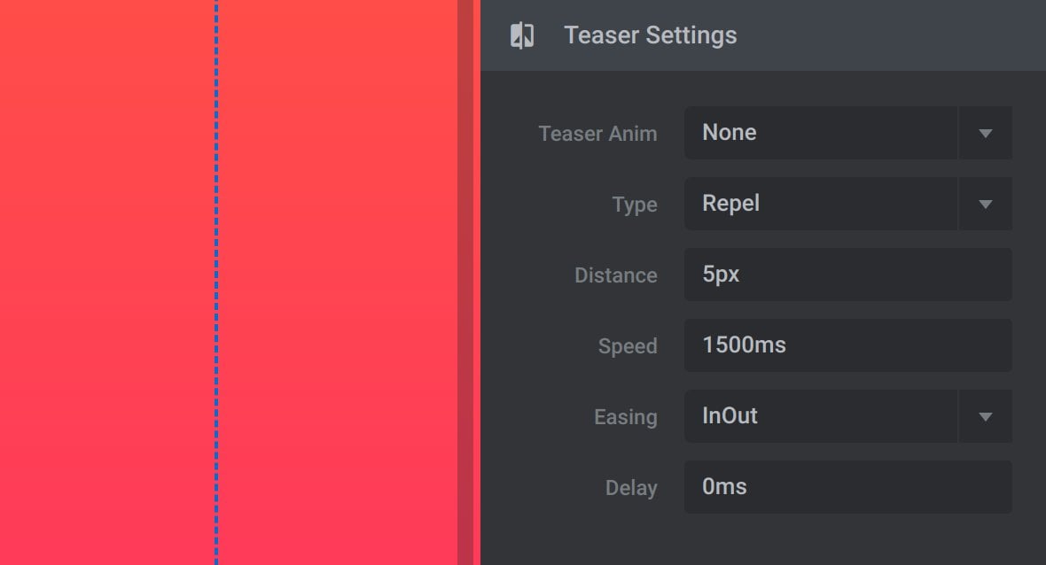
Teaser Settings
If you would like to add a visual signal to help people realize the divider is interactive, you can run an animation on its arrows to attract attention. We call this animation a “teaser”.
The teaser animation can be configured with the options in the Teaser Settings panel:
Teaser Anim
The Teaser Anim option allows you to configure when a teaser animation should occur. There are four possible settings:
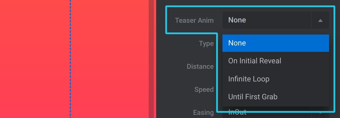
None
Don’t use a teaser animation at all.
On Initial Reveal
Run the teaser animation once when the slide appears.
Initial Loop
Continue running the teaser animation continuously.
Until First Grab
Run the teaser animation until the first interaction with the divider.
Type
The Type option determines whether the arrows should move together or apart during the teaser animation:
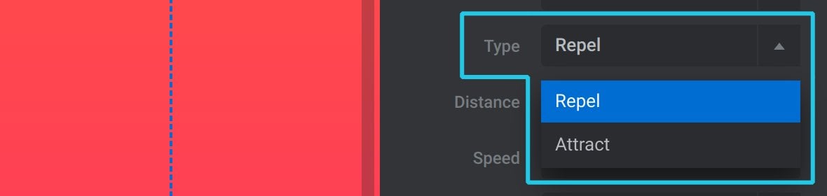
Set it to Attract to have the arrows move together.
Set it instead to Repel to have the arrows move apart.
Distance
Use the Distance option to set how far, in pixels, the arrows should move during the teaser animation:

Speed
The Speed option sets how long, in milliseconds, it should take to move the arrows by the amount set under the Distance option:

Easing
The Easing option sets the type of easing, i.e. rate of movement, that should apply to the arrows as the teaser animation runs:
Delay
Set the Delay option to any millisecond amount greater than zero to have the teaser animation wait before it starts to run:

Arrow Settings
Applying a transition animation to the arrows is another way you can help people spot that the divider is interactive. In this transition animation the arrows will begin at an offset position, then animate into their default position.
You can configure the arrow transition animation using the options in the Arrow Settings panel:
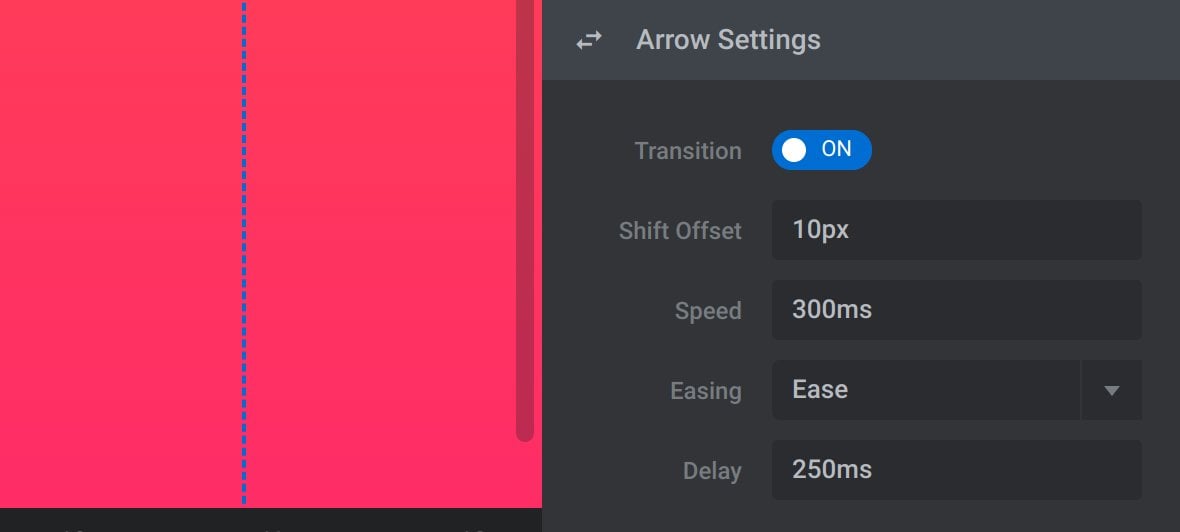
Transition
Toggle Transition to ON to activate the arrow transition effect:
Shift Offset
Use the Shift Offset option to set how far out from their usual position the arrows should be, in pixels:

Speed
In the Speed option set how long it should take, in milliseconds, for the arrows to move from their Shift Offset position to their default position:

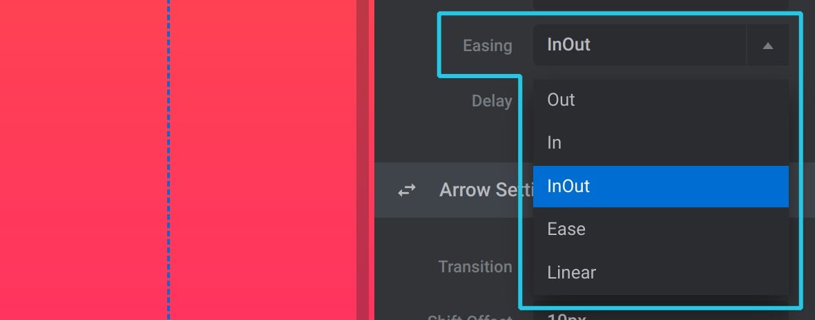
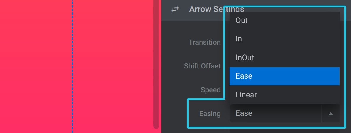
Easing
The Easing option sets the type of easing, i.e. rate of movement, that should apply to the arrows as they transition into place:
Delay
Set the Delay option to any millisecond amount greater than zero to have the arrows wait before they transition into place:

Module Before After Options
To access the module [?]
A module in Slider Revolution acts as a container for slides, which in turn act as containers for layers. Modules are created and edited with the module editor.
A "module" is a single, self contained piece of content. You can think of this as being similar to the way a post or page in regular WordPress is a self contained piece of content.
A module can represent any kind of content Slider Revolution is capable of creating, such as a slider, carousel, hero unit, navigation menu, posts display and so on.
Multiple modules can be combined to form rich content such as complete sites and landing pages. level options for your before & after effects go to the Module General Options tab, then the Before After sub-section:
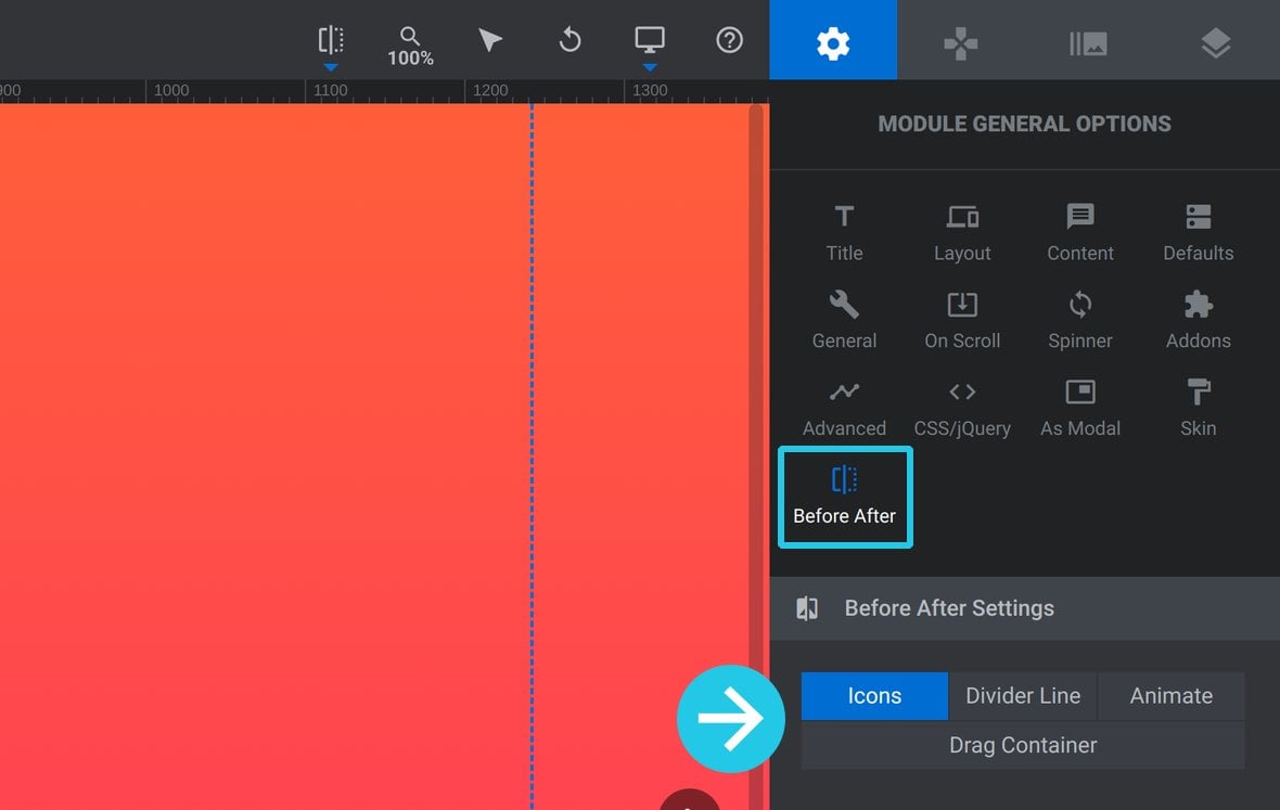
You’ll see tabs for the following 4 categories of options:
- Icons – the icons representing the “arrows” on the divider
- Divider Line – the visual styling of the divider’s line
- Animate – animate the divider’s position on mouse click
- Drag Container – style the container surrounding the divider’s arrows
Let’s take a look at the configuration options in each of these categories.
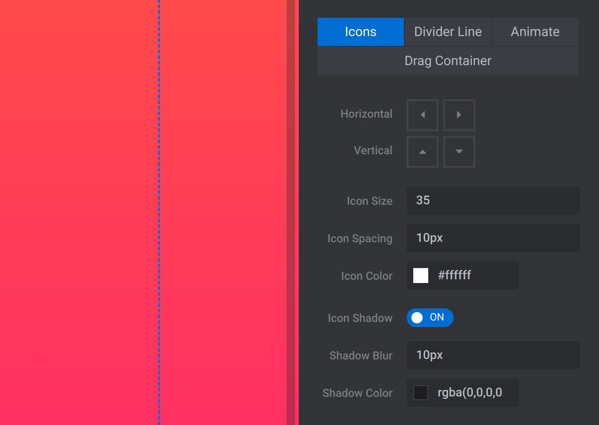
Icons
The Icons category of options allows you to configure the arrow icons on your divider:
Horizontal and Vertical
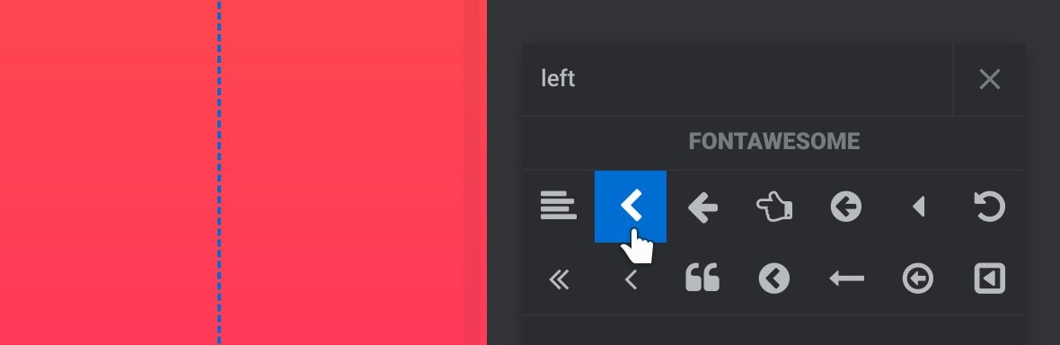
By default the divider uses small triangular icons, however you can replace these with other icons if you would like.
To do so, click the icon you would like to replace:

Then select a new icon from the range that appears:
Icon Size
Use the Icon Size option to set the size each icon should be, in pixels:

Icon Spacing
The Icon Spacing option sets how far apart the arrows should be, in pixels:

Icon Color
Set the color the arrows should be using the Icon Color option:

Icon Shadow
If you would like the arrows to have shadows, toggle the Icon Shadow option to ON:

When this option is activated the additional options Shadow Blur and Shadow Color will appear below.
Shadow Blur
Use the Shadow Blur to set how far the arrow shadows should be blurred, in pixels:

Shadow Color
Set the color of the arrow shadows with the Shadow Color option:

Divider Line
The Divider Line category of options allows you to configure the line part of your divider:
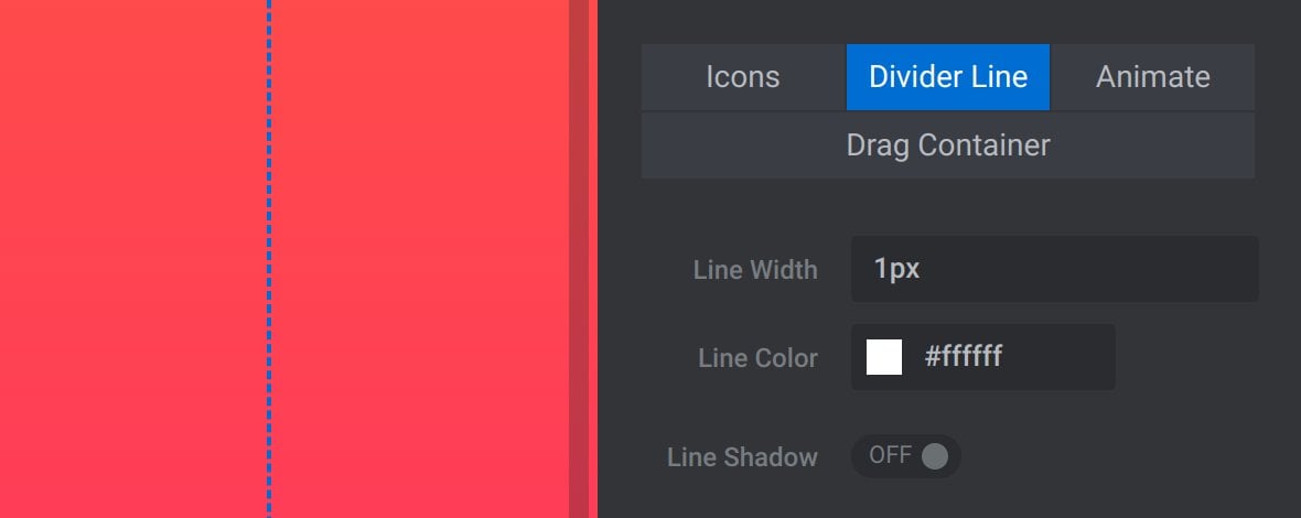
Line Width
Use the Line Width option to set the width of the divider line, in pixels:

Line Color
Set the color the divider line should be using the Line Color option:

Line Shadow
If you would like the divider line to have a shadow, toggle the Line Shadow option to ON:

When this option is activated the additional options Shadow Blur, Shadow Strength and Shadow Color will appear below.
Shadow Blur
Use the Shadow Blur to set how far the divider line’s shadows should be blurred, in pixels:

Shadow Strength
The Shadow Strength option sets the width of the divider line’s shadow, in pixels, before the shadow blur is applied:

Shadow Color
Set the color of the divider line’s shadow with the Shadow Color option:

Animate
Optionally set the divider to animate it’s position to anywhere on the stage a user clicks:
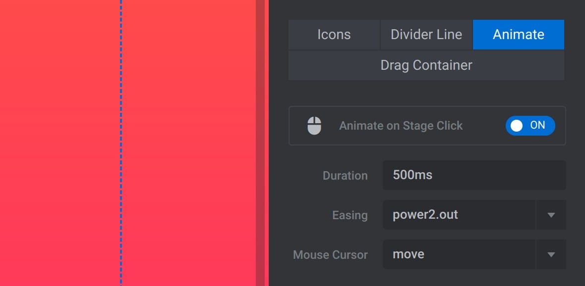
Animate on Stage Click
Toggle the Animate on Stage Click option to ON to activate the animate effect:

Duration
The Duration option sets the amount of time, in milliseconds, it takes to animate the divider from its initial position to the position of the user’s mouse click:

Easing
The Easing option sets the type of easing, i.e. rate of movement, that should apply to the divider as it animates to the new position:

Mouse Cursor
Set the type of mouse cursor that should be displayed when hovering over the drag container:

The exact way each cursor type displays will depend on the user’s operating system.
The cursor type names are drawn from CSS, so If you’d like a reference for what each name represents you can visit: https://developer.mozilla.org/en-US/docs/Web/CSS/cursor
Drag Container
The Drag Container is a square area around the arrows of the divider line. Dragging the divider can be initiated by dragging anywhere inside this area:

The Drag Container category of options allows you to configure the area:
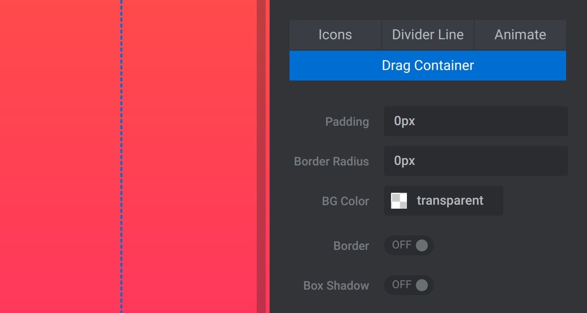
Padding
The Padding option sets the amount of space in the drag container on either side of the divider line:

This effectively means the total width of the drag container will be twice the Padding value.
Border Radius
Use the Border Radius option to give the drag container rounded corners:

The value can be set in pixels or as a percentage.
Tip: Setting a value of 50% will make the drag container look like a circle.
Note: You won’t see the effect of this option unless the drag container is made visible via a background [?]
A "background" in Slider Revolution is a type of layer that is always present in every module, and is always visually behind all other layers.
A background can be transparent, a flat color, a gradient, an image, or a video. It can be animated in the same way as other layers can be, however it cannot be deleted. color, border or shadow.
BG Color
Give the drag container a color using the BG Color option:

Border
If you would like the drag container to have a border, toggle the Border option to ON:

When this option is activated the additional options Border Width and Border Color will appear below.
Border Width
The Border Width option sets the width of the drag container’s border, in pixels:

Border Color
Set the color of the drag container’s border with the Border Color option:

Box Shadow
If you would like the drag container to have a shadow, toggle the Box Shadow option to ON:

When this option is activated the additional options Shadow Blur, Shadow Strength and Shadow Color will appear below.
Shadow Blur
Use the Shadow Blur to set how far the drag container’s shadows should be blurred, in pixels:

Shadow Strength
The Shadow Strength option sets the width of the drag container’s shadow, in pixels, before the shadow blur is applied:

Shadow Color
Set the color of the drag container’s shadow with the Shadow Color option:

Wrapping Up
That covers all the configuration options available for you to customize your before & after effects.
For a hands on walk through of creating an original before & after effect you might also like to follow our How to Create an Interactive Before-and-After Image Slider tutorial.