
Activate and Configure Bullet Navigation
Learn how to add navigation bullets to your Slider Revolution modules.
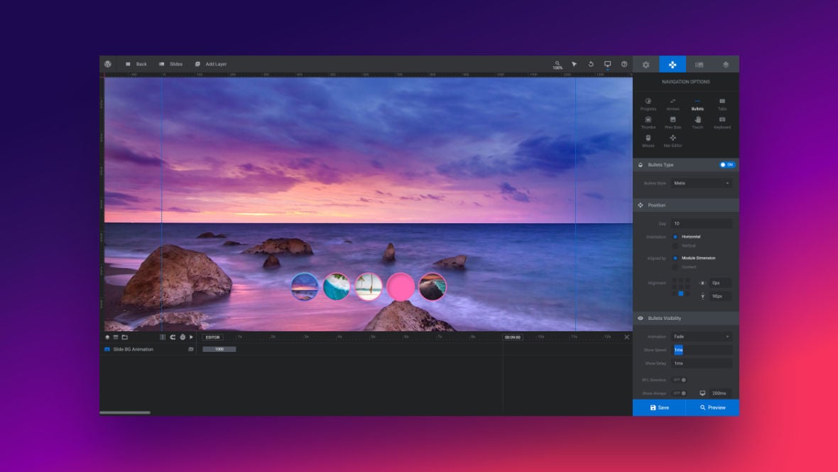
Table of Contents
What Do Navigation Bullets Do?
Navigation bullets are buttons that appear on a slide [?]
A "slide" in Slider Revolution is a container into which multiple layers can be added, with layers in turn acting as containers for various forms of media such as images, text, video, audio, buttons, and special effects.
Slides are added to modules and edited via the module editor.
Within the module editor, each slide has its own animation timeline, background and collection of layers.
A single module can have one or many slides. A module with one slide is called a scene, and a module with multiple slides is called a slider or carousel. that give the visitor a way to manually switch to a different slide.
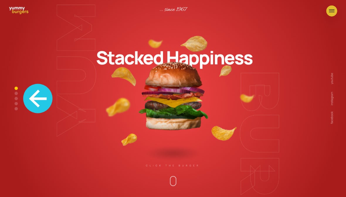
For example, the Fast Food Burger Restaurant Slider template uses small circular bullets on the left of the slide for navigation:
Navigation bullets can also feature text, images and animations that compel visitors to click and view the slides the buttons link to.
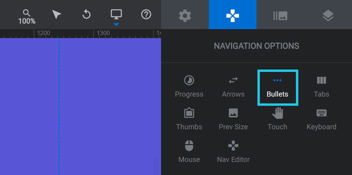
Activating Bullet Navigation
To add bullet navigation to your module, go to the Navigation Options tab, and then the Bullets sub-section:
Set the toggle in the Bullets Type panel to ON:

A number of panels and options that can be used for further configuration will appear below:
Configuring Bullets
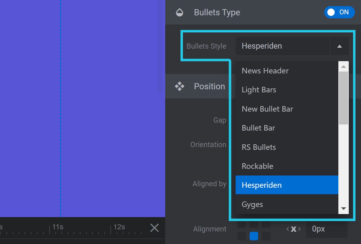
Bullets Style
In the Bullets Type panel, you can use the Bullets Style option dropdown to select from several different styles for your arrows:
Different bullet styles have varying shapes, colors, borders and backgrounds.
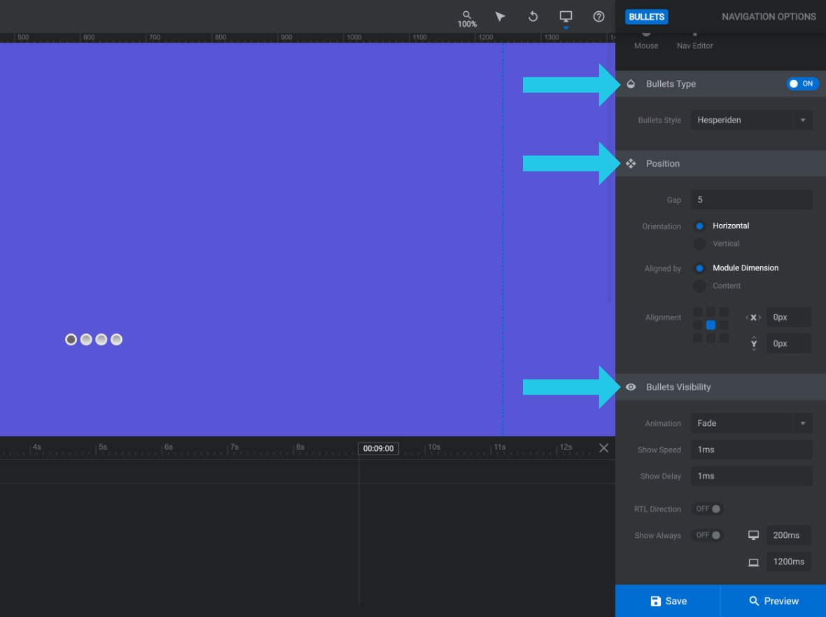
Position Panel
Below the Bullets Type panel you will see the Position Panel:
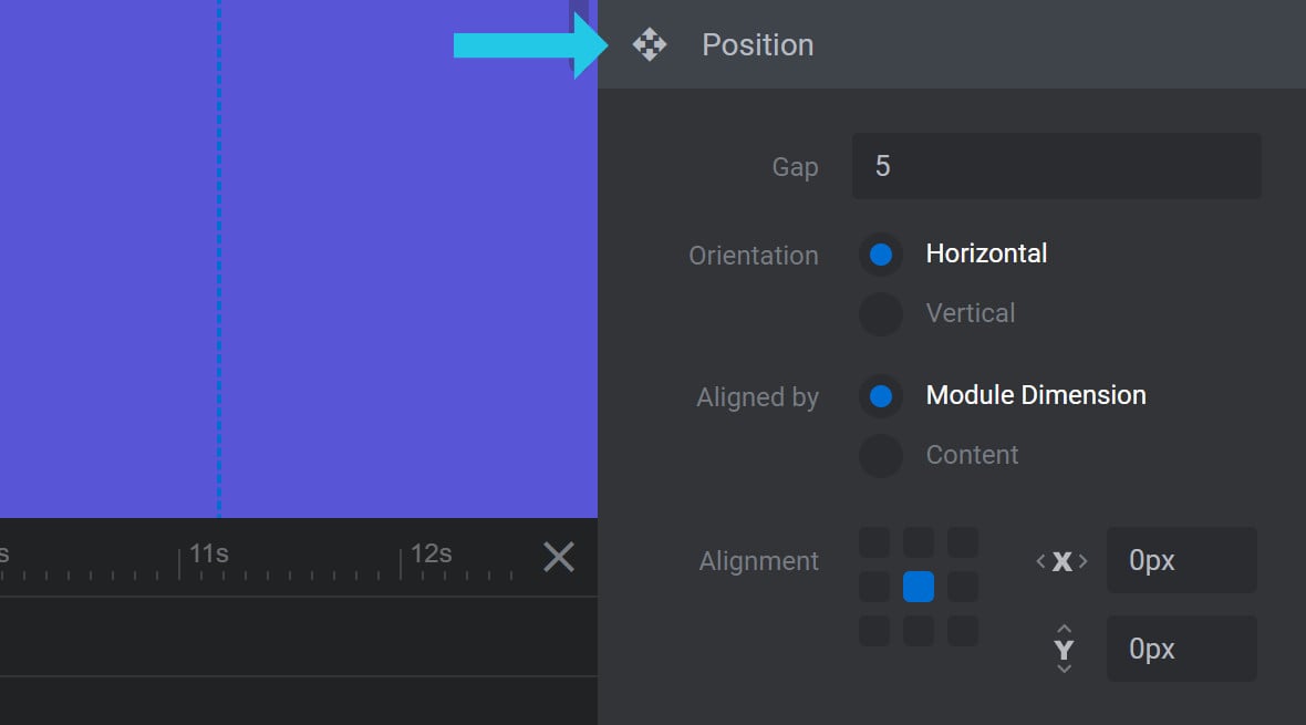
The options here apply to each Bullets Style used for navigation.
Gap
The Gap option is used to set the spacing (in pixels) between each navigation bullet:

For example, a value of 5 applies a spacing of 5 pixels between each navigation bullet.
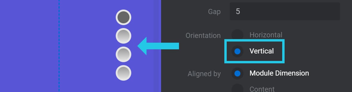
Orientation
The Orientation option allows you to specify whether you want to display the navigation bullets next to each other or on top of each other:

Select the Horizontal radio-button to display the navigation bullets next to each other:

Select the Vertical radio-button to display the navigation bullets on top of each other:
Aligned by
The Aligned by option allows you to decide how the navigation bullets will align relative to the module’s [?]
A module in Slider Revolution acts as a container for slides, which in turn act as containers for layers. Modules are created and edited with the module editor.
A "module" is a single, self contained piece of content. You can think of this as being similar to the way a post or page in regular WordPress is a self contained piece of content.
A module can represent any kind of content Slider Revolution is capable of creating, such as a slider, carousel, hero unit, navigation menu, posts display and so on.
Multiple modules can be combined to form rich content such as complete sites and landing pages. display:

If you select Module Dimensions, the navigation bullets will be pushed out to the further edges of the module:

If you select Content, the navigation bullets will stay inside the area on your canvas [?]
The canvas is the point and click design space in the module editor. It forms the largest area of the module editor.
In this area layers can be selected, moved and resized. Animations can also be previewed. marked with blue dotted lines:

Note: If Alignment (see below) is set to the center grid, which it is by default, selecting Module Dimensions or Content will have no effect.
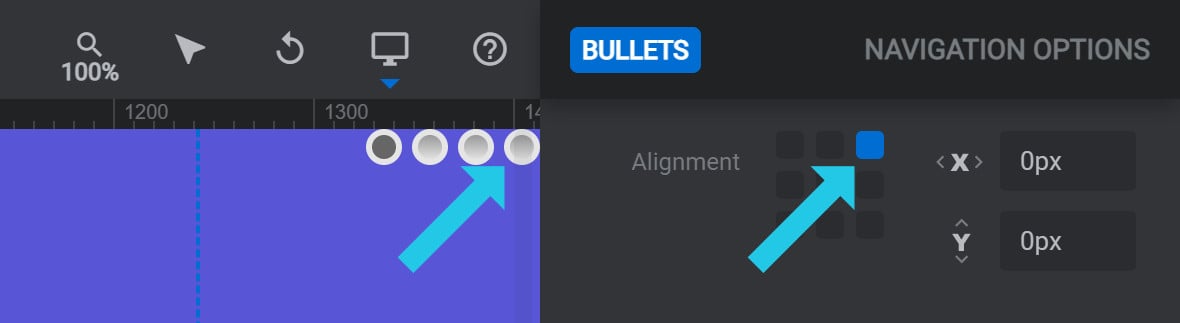
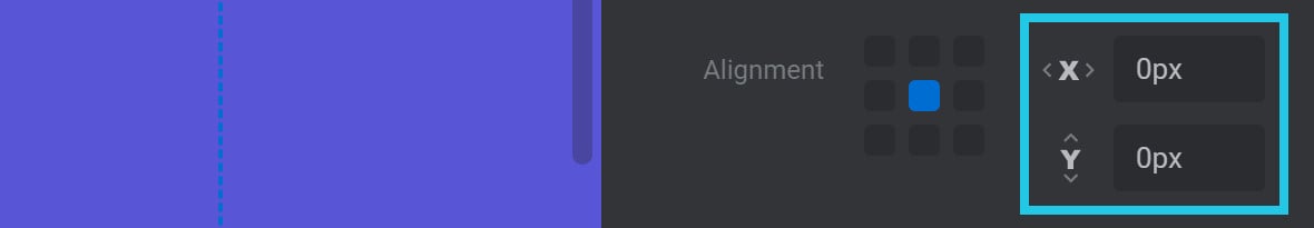
Alignment
The Alignment option allows you to set the horizontal and vertical alignment of your navigation bullets. You will see a grid of points representing the available alignment settings: the corners, edges and center:

For example, if you click the top right grid point, your navigation bullets will align to the top right corner:
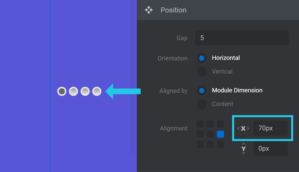
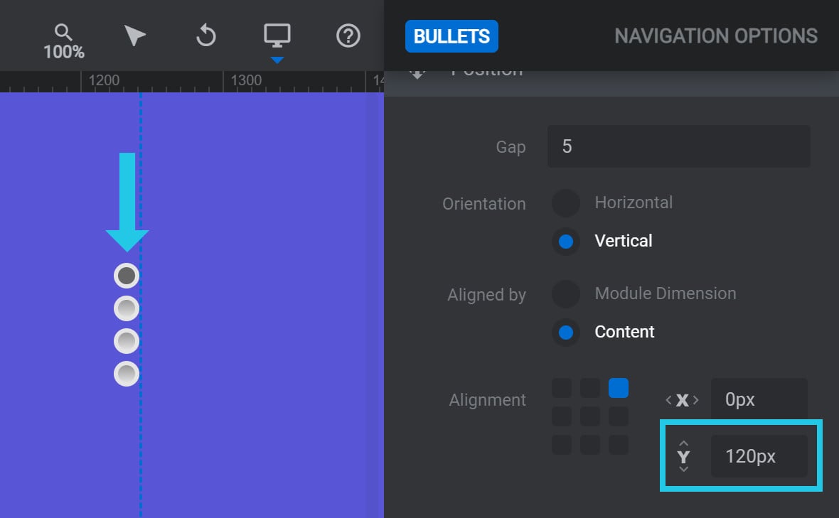
Offset X/Y
The Offset X and Offset Y options allow you to offset a navigation bullet’s position by a pixel (px) amount:
The Offset X option creates a horizontal offset. If the navigation bullets are left aligned, the offset will move the bar to the right. If the navigation bullets are right aligned, the offset will move the bar to the left.
For example, here is a navigation bullet with Orientation set to Horizontal, Aligned by set to Module Dimension, and Alignment set to the center right, with Offset X set to70px:
The Offset Y option creates a vertical offset. If the navigation bullet is top aligned, the offset will move it down. If the navigation bullet is bottom aligned, the offset will move it up.
For example, here is a navigation bullet with Orientation set to Vertical, Aligned by set to Content, Alignment set to the top right, and Offset Y set to 120px:
Bullets Visibility Panel
Below the Position Panel you will see the Bullets Visibility Panel:
The Bullets Visibility Panel contains a number of new configuration options as follows:
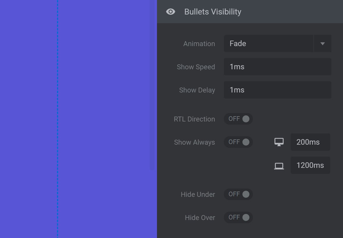
Animation
By default, Animation is set to make your navigation bullets fade in when they appear:

Click the Animation dropdown and you will see six additional animation options:
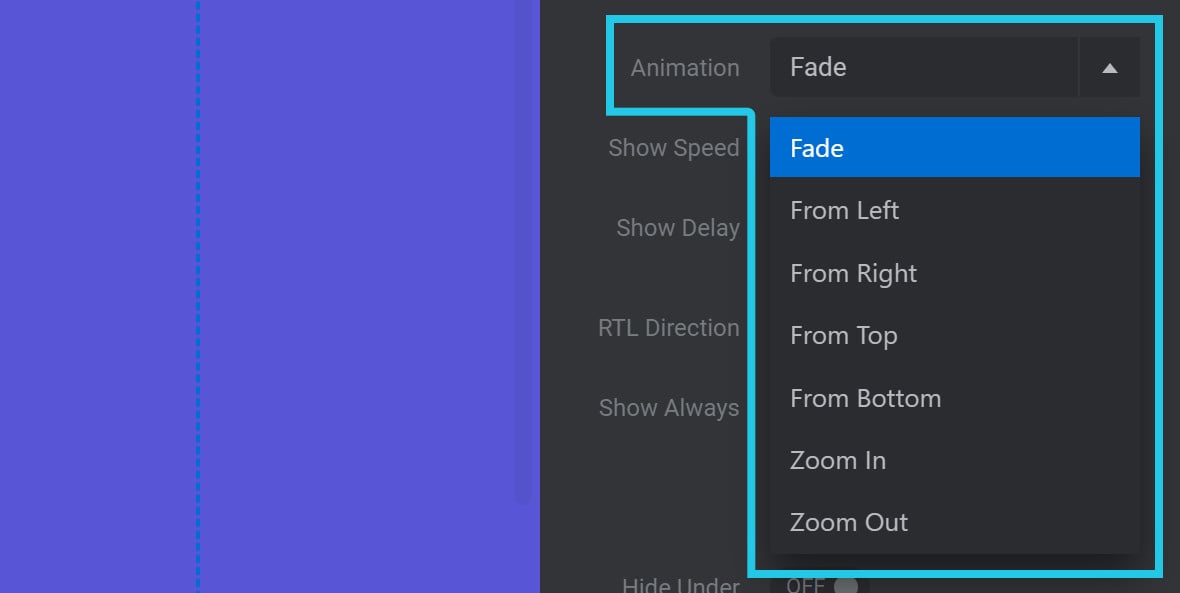
Select any of the available options to change the type of animation being applied, such as making the navigation bullets slide in from one of four directions, zoom in, or zoom out.
Show Speed
The Show Speed option allows you to set the time, in milliseconds (ms), that it takes for your navigation bullets to animate into view:

Show Delay
The Show Delay option allows you to set the time, in milliseconds (ms), that should pass before your navigation bullets begin animating into view:

RTL Direction
By default, clicking the right navigation bullet progresses to the next slide.
If instead you want the left navigation bullet to progress to the next slide, toggle RTL Direction to ON:

Show Always
If you’d like your navigation bullets to disappear when there is no mouse hovering over the module, toggle the Show Always option to OFF:

The navigation bullets will then disappear after a certain period of time, and reappear if the vistor hovers or taps the module.
When Show Always is set to OFF, the options Hide After: Desktop and Hide After: Mobile will appear:
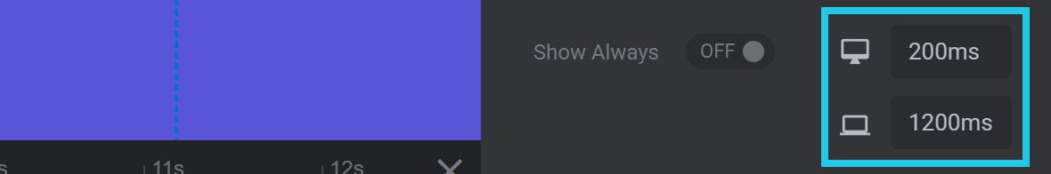
Hide After: Desktop
Use the Hide After: Desktop option to set the amount of time, in milliseconds (ms), before the navigation bullets should be hidden on desktop devices.
Hide After: Mobile
Use the Hide After: Mobile option to set the amount of time, in milliseconds (ms), before the navigation bullets should be hidden on mobile devices.
Hide Under
If you’d like the navigation bullets to be hidden when the browser window is narrower than a certain width, toggle the Hide Under option to ON:

Hide Under Limit
When Hide Under is set to ON, the option Hide Under Limit will appear:

Use the Hide Under Limit option to set the browser width, in pixels (px), under which the navigation bullets should be hidden.
Hide Over
If you’d like your navigation bullets to be hidden when the browser window is wider than a certain width, toggle the Hide Over option to ON:

Hide Over Limit
When Hide Over is set to ON, the option Hide Over Limit will appear:

Use the Hide Over Limit option to set the browser width, in pixels (px), over which the navigation bullets should be hidden.
Navigation Style Panel
The Navigation Style panel allows you to customize the appearance of your module’s navigation bullets:
Note: When you select a Bullets Style that cannot be customized, such as News Header, the Navigation Style panel will not display. When the Navigation Style panel does display, the options available will vary depending on your chosen Bullets Style.
To customize any navigation style, simply change that style’s value and the switch to the right of that value will automatically toggle to ON. You can revert to the default value at any time by toggling the switch back to OFF.
Navigation Style Options Per Bullet Style
Let’s now look at the different navigation style options that are available for each Bullets Style.
RS Bullets
If you select the RS Bullets style, the Navigation Style panel will have the following options:
Bullet Size
The Bullet-Size option is used to set the size of the navigation bullet.
Bullet Background
The Bullet-Background option is used to set navigation bullet color. The color chosen here does not apply to the active navigation bullet.
Hover Bullet BG
The Hover-Bullet-BG option is used to set navigation bullet hover color, as well as the color of the active navigation bullet.
Bullet Space
The Bullet-Space option is used to adjust the left and right margins around each navigation bullet.
Note: If you want to adjust the spacing between bullets, we recommend using the Gap option instead.
Hesperiden
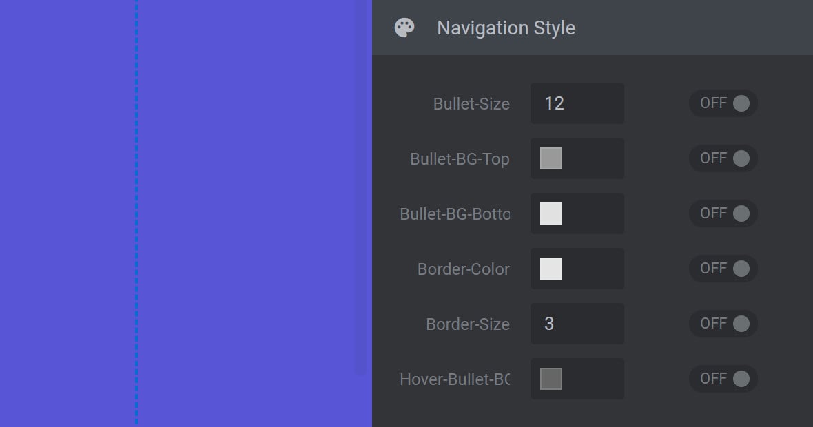
If you select the Hesperiden style, the Navigation Style panel will have the following options:
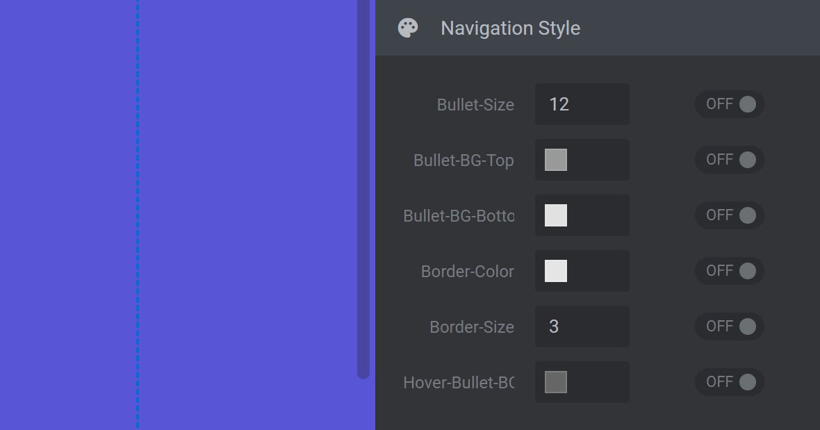
Bullet Size
The Bullet-Size option is used to set the size of the navigation bullet.
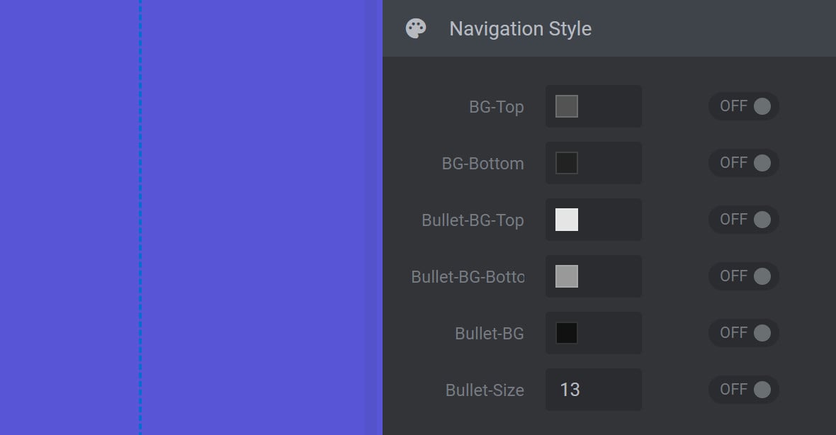
Bullet BG Top
The Bullet-BG-Top option is used to set the top half color of navigation bullets. The color chosen here does not apply to the active navigation bullet. Use in conjunction with the Bullet-BG-Bottom option to apply a gradient.
Bullet BG Bottom
The Bullet-BG-Bottom option is used to set the bottom half color of navigation bullets. The color chosen here does not apply to the active navigation bullet. Use in conjunction with the Bullet-BG-Top option to apply a gradient.
Border Color
The Border-Color option is used to set navigation bullet border color. The color chosen here stays visible on all navigation bullets, even when hovering.
Border Size
The Border-Size option is used to set the size of the border around each navigation bullet, but does not affect the inner size of the navigation bullet. The higher the value the thicker the border. A value of zero (0) means no border will be visible. The overall size of the navigation bullet including its border is determined by the combined values of the Border-Size and Bullet-Size options.
Hover Bullet BG
The Hover-Bullet-BG option is used to set the color of navigation bullets on hover, as well as the default color of the active navigation bullet.
Gyges
If you select the Gyges style, the Navigation Style panel will have the following options:
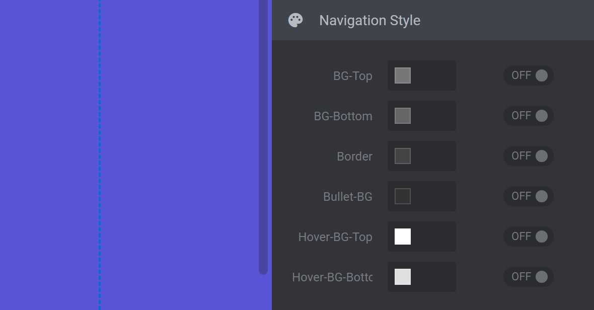
BG Top
The BG-Top option is used to set the top half color of the navigation bullets wrapper. Use in conjunction with the BG-Bottom option to apply a gradient to the navigation bullets wrapper.
BG Bottom
The BG-Bottom option is used to set the bottom half color of the navigation bullets wrapper. Use in conjunction with the BG-Top option to apply a gradient to the navigation bullets wrapper.
Border
The Border option is used to set navigation bullet border color. The color chosen here stays visible on all navigation bullets, even when hovering.
Bullet BG
The Bullet-BG option is used to set navigation bullet color. The color chosen here does not apply to the active navigation bullet.
Hover BG Top
The Hover-BG-Top option is used to set the top half color of navigation bullets on hover, as well as the default top half color of the active navigation bullet.
Hover BG Bottom
The Hover-BG-Bottom option is used to set the bottom half color of navigation bullets on hover, as well as the default bottom half color of the active navigation bullet.
Hades
If you select the Hades style, the Navigation Style panel will have the following options:
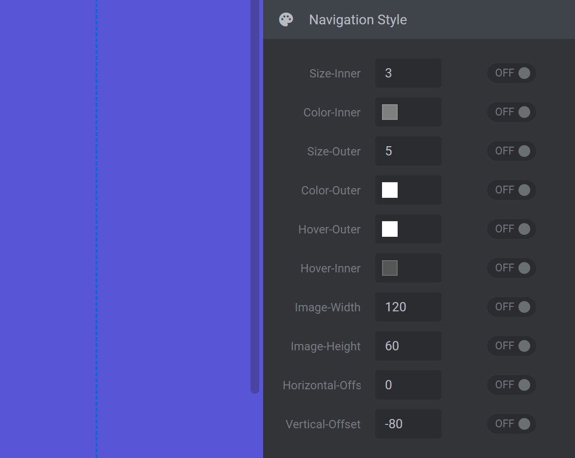
Size Inner
The Size-Inner option is used to set the size of the navigation bullet, but does not affect the size of the navigation bullet’s border. The overall size of the navigation bullet including its border is determined by the combined values of the Size-Inner and Size-Outer options.
Color Inner
The Color-Inner option is used to set default navigation bullet color. The color chosen here does not apply to the active navigation bullet.
Size Outer
The Size-Outer option is used to set the size of the border around each navigation bullet. The higher the value the thicker the border. A value of zero (0) means no border will be visible. Changes here do not affect the inner size of the navigation bullet. The overall size of the navigation bullet including its border is determined by the combined values of the Size-Inner and Size-Outer options.
Color Outer
The Color-Outer option is used to set navigation bullet border color. The color chosen here does not apply to the active navigation bullet.
Hover Outer
The Hover-Outer option is used to set the border color of navigation bullets on hover, as well as the border color of the active navigation bullet.
Hover Inner
The Hover-Inner option is used to set the navigation bullet’s inner color on hover, as well as the default border color of the active navigation bullet.
Image Width
The Image-Width option is used to control the width of the thumbnail preview that displays when a navigation bullet is hovered over.
Image Height
The Image-Height option is used to control the height of the thumbnail preview that displays when a navigation bullet is hovered over.
Horizontal Offset
The Horizontal-Offset option is used to horizontally position the thumbnail preview that displays when a navigation bullet is hovered over. A positive value will shift the thumbnail to the right. A negative value will shift the thumbnail to the left.
Vertical Offset
The Vertical-Offset option is used to vertically position the thumbnail preview that displays when a navigation bullet is hovered over. A positive value will shift the thumbnail lower. A negative value will shift the thumbnail higher.
Ares
If you select the Ares style, the Navigation Style panel will have the following options:
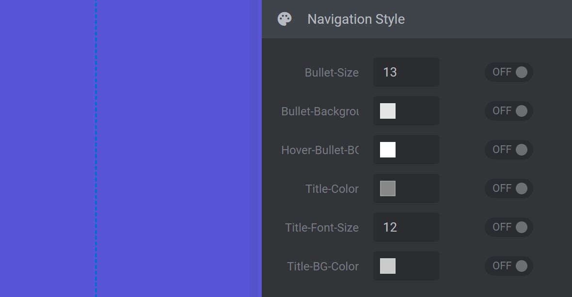
Bullet Size
The Bullet-Size option is used to set the size of the navigation bullet.
Bullet Background
The Bullet-Background option is used to set default navigation bullet color. The color chosen here does not apply to the active navigation bullet.
Hover Bullet BG
The Hover-Bullet-BG option is used to set the color of navigation bullets on hover, as well as the default color of the active navigation bullet.
Title Color
The Title-Color option is used to set the color of a slide’s title that displays when a navigation bullet is hovered over.
Note: The slide’s title is drawn from the Slide Title Field, found in the top middle toolbar of the Slide Options tab.
Title Font Size
The Title-Font-Size option is used to set the size of the slide’s title that displays when a navigation bullet is hovered over.
Note: The slide’s title is drawn from the Slide Title Field, found in the top middle toolbar of the Slide Options tab.
Title BG Color
The Title-BG-Color option is used to set the background color behind the slide’s title that displays when a navigation bullet is hovered over, but does not affect the title background color of the active navigation bullet.
Note: The title background color of the active navigation bullet is set using the Hover-Bullet-BG option.
Hebe
If you select the Hebe style, the Navigation Style panel will have the following options:
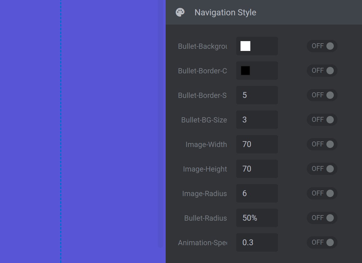
Bullet Background
The Bullet-Background option is used to set the inner color of navigation bullets, the border color of navigation bullets on hover, and the default border color of the active navigation bullet.
Bullet Border Color
The Bullet-Border-Color option is used to set the inner color of the active navigation bullet, the border color of all non-active navigation bullets, and the inner color of non-active navigation bullets on hover.
Bullet Border Size
The Bullet-Border-Size option is used to set the size of the border around each navigation bullet. The higher the value the thicker the border. A value of zero (0) means no border will be visible. This option does not affect the inner size of the navigation bullet. The overall size of the navigation bullet including its border is determined by the combined values of the Bullet-Border-Size and Bullet-BG-Size options.
Bullet BG Size
The Bullet-BG-Size option is used to set the size of the navigation bullet, but does not affect the size of the navigation bullet’s border. The overall size of the navigation bullet is determined by the combined values of the Bullet-BG-Size and Bullet-Border-Size options.
Image Width
The Image-Width option is used to control the width of the thumbnail preview that displays when a navigation bullet is hovered over. Changes made to this option will not affect the aspect ratio of the preview image.
Image Height
The Image-Height option is used to control the height of the thumbnail preview that displays when a navigation bullet is hovered over. Changes made to this option will not affect the aspect ratio of the preview image.
Image Radius
The Image-Radius option is used to set the amount of corner rounding to apply to the thumbnail preview that displays when a navigation bullet is hovered over. The higher the value, the greater the rounding. A value of zero (0) means no rounding will be applied.
Bullet Radius
The Bullet-Radius option is used to set the amount of rounding to apply to each navigation bullet, and to its border, as a percentage (%). The higher the percentage used, the greater the rounding. A percentage value of zero (0%) means no rounding will be applied.
Note: Be sure to include the percentage (%) symbol after your chosen value.
Animation Speed
The Animation-Speed option is used to set the time in seconds (s) that it takes for the thumbnail preview to complete its display animation upon hover. A value of one (1) means the thumbnail preview animation will take one second to complete. A value of 0.5will take half a second to complete.
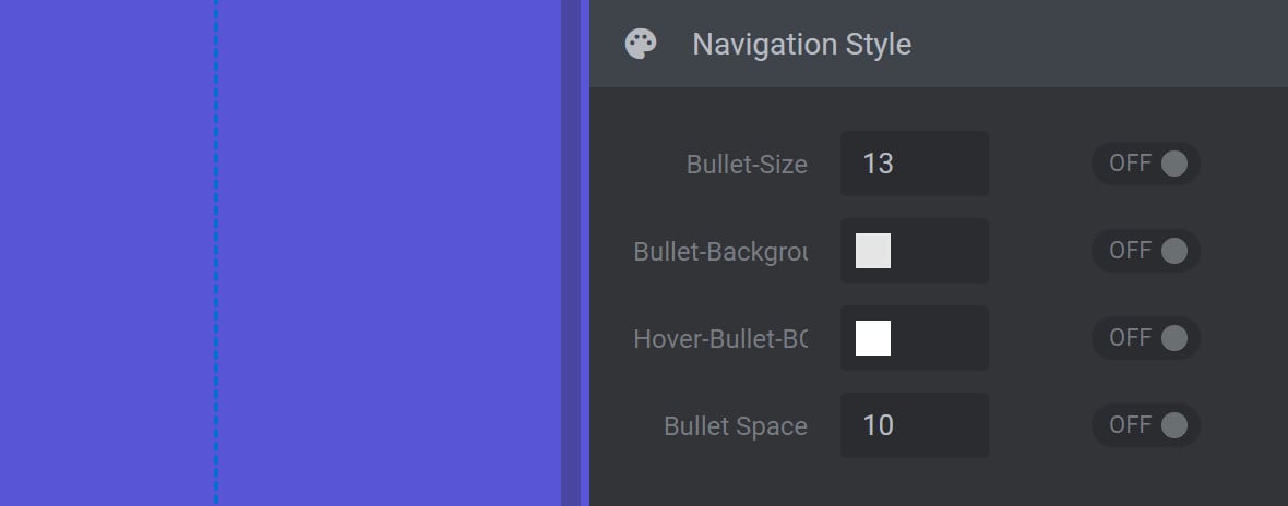
Hermes
If you select the Hermes style, the Navigation Style panel will have the following options:
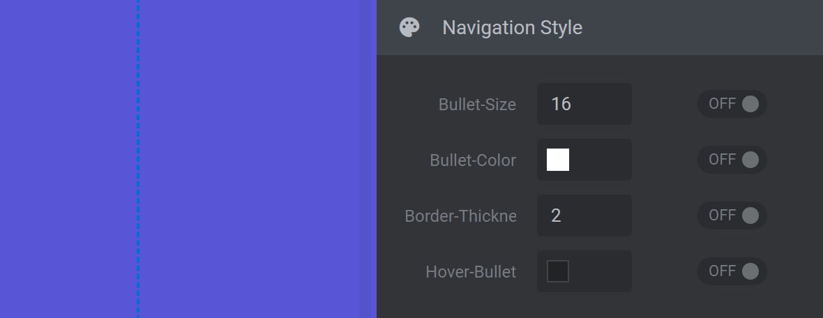
Bullet Size
The Bullet-Size option is used to set the size of the navigation bullet.
Bullet Color
The Bullet-Color option is used to set the inner color of the active navigation bullet, and the border color of all navigation bullets. The color chosen here remains visible on all navigation bullets, even when hovering.
Border Thickness
The Border-Thickness option is used to set the size of the border around each navigation bullet. The higher the value the thicker the border. A value of zero (0) means no border will be visible. Changes made to the size of the border do not affect the outer size of the navigation bullet.
Hover Bullet
The Hover-Bullet option is used to set the inner color of navigation bullets on hover. The color chosen here does not apply to the active navigation bullet.
Hephaistos
If you select the Hephaistos style, the Navigation Style panel will have the following options:
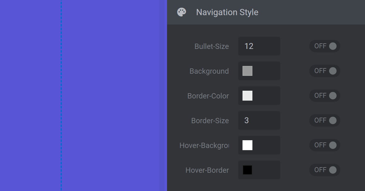
Bullet Size
The Bullet-Size option is used to set the size of the navigation bullet.
Background
The Background option is used to set inner navigation bullet color. The color chosen here does not apply to the active navigation bullet.
Border Color
The Border-Color option is used to set navigation bullet border color. The color chosen here does not apply to the active navigation bullet.
Border Size
The Border-Size option is used to set the size of the border around each navigation bullet. The higher the value the thicker the border. A value of zero (0) means no border will be visible. The overall size of the navigation bullet including its border is determined by the combined values of the Border-Size and Bullet-Size options.
Hover Background
The Hover-Background option is used to set the inner color of navigation bullets on hover, as well as the inner color of the active navigation bullet.
Hover Border
The Hover-Border option is used to set the border color of navigation bullets on hover, as well as the border color of the active navigation bullet.
Note: If Hover-Border is toggled to OFF, hover color will default to black.
Persephone
If you select the Persephone style, the Navigation Style panel will have the following options:
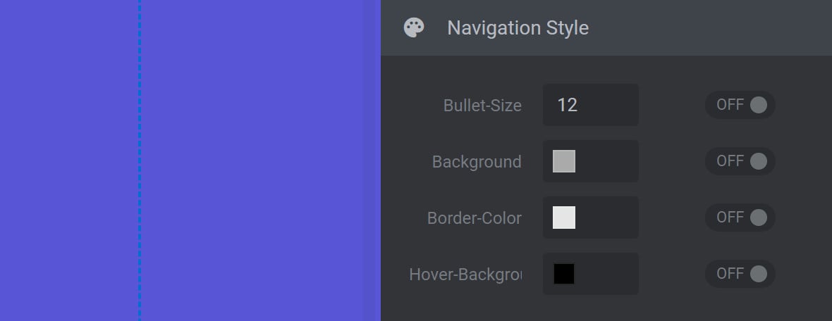
Bullet Size
The Bullet-Size option is used to set the size of the navigation bullet.
Background
The Background option is used to set navigation bullet inner color. The color chosen here does not apply to the active navigation bullet.
Border Color
The Border-Color option is used to set navigation bullet border color. The color chosen here stays visible on all navigation bullets.
Note: The size of the Persephone style border cannot be changed.
Hover Background
The Hover-Background option is used to set the inner color of navigation bullets on hover, as well as the inner color of the active navigation bullet.
Erinyen
If you select the Erinyen style, the Navigation Style panel will have the following options:
BG Top
The BG-Top option is used to set the top half color of the navigation bullets wrapper. Use in conjunction with the BG-Bottom option to apply a gradient.
BG Bottom
The BG-Bottom option is used to set the bottom half color of the navigation bullets wrapper. Use in conjunction with the BG-Top option to apply a gradient.
Bullet BG Top
The Bullet-BG-Top option is used to set the top half color of the active navigation bullet, and the top half color of navigation bullets on hover. Use in conjunction with Bullet-BG-Bottom to create a gradient.
Bullet BG Bottom
The Bullet-BG-Bottom option is used to set the bottom half color of the active navigation bullet, and the bottom half color of navigation bullets on hover. Use in conjunction with Bullet-BG-Top to create a gradient.
Bullet BG
The Bullet-BG option is used to set navigation bullet inner color. The color chosen here does not apply to the active navigation bullet.
Bullet Size
The Bullet-Size option is used to set the size of the navigation bullet as well as the size of the background wrapper.
Zeus
If you select the Zeus style, the Navigation Style panel will have the following options:
Bullet Color
The Bullet-Color option is used to set the inner color of the active navigation bullet, the border color of all navigation bullets, and the inner color of navigation bullets on hover.
Bullet Size
The Bullet-Size option is used to set the size of the navigation bullet.
Image Width
The Image-Width option is used to control the width of the thumbnail preview that displays when a navigation bullet is hovered over. Changes made to this option will not affect the aspect ratio of the preview image.
Image Height
The Image-Height option is used to control the height of the thumbnail preview that displays when a navigation bullet is hovered over. Changes made to this option will not affect the aspect ratio of the preview image.
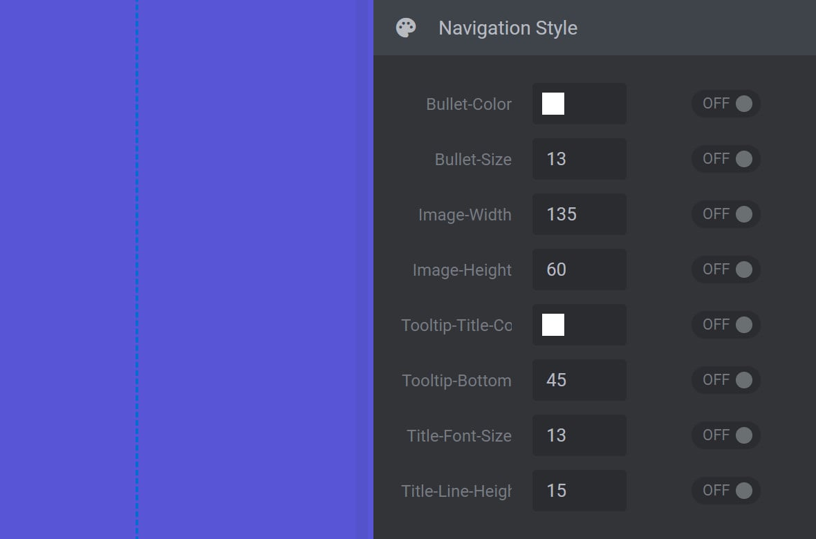
Tooltip Title Color
The Tooltip-Title-Color option is used to set the color of a slide’s title that displays when a navigation bullet is hovered over. The slide’s title is drawn from the Slide Title Field, found in the top middle toolbar of the Slide Options tab.
Tooltip Bottom
The Tooltip-Bottom option is used to vertically position the slide’s title that displays when a navigation bullet is hovered over. A positive value will shift the title up. A negative value will shift the title down. Movement of the title is relative to the bottom of the slide title’s container, the position of which can be identified by setting this option to zero (0).
Title Font Size
The Title-Font-Size option is used to set the size of the slide’s title that displays when a navigation bullet is hovered over. The slide’s title is drawn from the Slide Title Field, found in the top middle toolbar of the Slide Options tab.
Title Line Height
The Title-Line-Height option is used to set the minimum vertical height for each line of text in the slide’s title that displays when a navigation bullet is hovered over. The higher the value, the more spacing will be visible between lines. A value that is 1.5 times the value of the Title-Font-Size option is usually ideal.
For example, if the Title-Font-Size option is set to a value of 10, then a Title-Line-Height of 15 would be considered ideal.
Metis
If you select the Metis style, the Navigation Style panel will have the following options:
Size
The Size option is used to set the size of the navigation bullet.
Border Width
The Border-Width option is used to set the size of the border around each navigation bullet. A value of zero (0) means no border will be visible. This option does not affect the inner size of the navigation bullet. The overall size of the navigation bullet including its border is determined by the combined values of the Size and Border-Width options.
Tooltip Color
The Tooltip-Color option is used to set the color of a slide’s title that displays when a navigation bullet is hovered over. The slide’s title is drawn from the Slide Title Field, found in the top middle toolbar of the Slide Options tab.
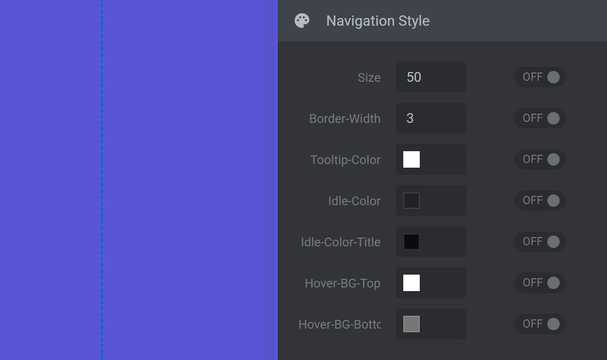
Idle Color
The Idle-Color option is used to set navigation bullet border color. The color chosen here does not apply to the active navigation bullet.
Note: The color chosen here will also be visible as the inner color of any navigation bullet related to a slide that does not yet have a slide background image.
Idle Color Title
The Idle-Color-Title option is used to set the background color behind the slide’s title that displays when a navigation bullet is hovered over.
Hover BG Top
The Hover-BG-Top option is used to set the color of the top half of a navigation bullet’s border when it is active or hovered over. Use in conjunction with the Hover-BG-Bottom option to apply a gradient. The color chosen here will also be visible as the top half of the background color of any navigation bullet related to a slide that does not yet have a slide background image.
Hover BG Bottom
The Hover-BG-Bottom option is used to set the color of the bottom half of a navigation bullet’s border when active or hovered over. Use in conjunction with the Hover-BG-Top option to apply a gradient. The color chosen here will also be visible as the bottom half of the background color of any navigation bullet related to a slide that does not yet have a slide background image.
Dione
If you select the Dione style, the Navigation Style panel will have the following options:
Size
The Size option is used to set the size of the navigation bullet, but does not affect the size of its border.
Border Size
The Border-Size option is used to set the size of the navigation bullet’s border. The higher the value the thicker the border. A value of zero (0) means no border will be visible. The overall size of the navigation bullet including its border is determined by the combined values of the Border-Size and Size options.
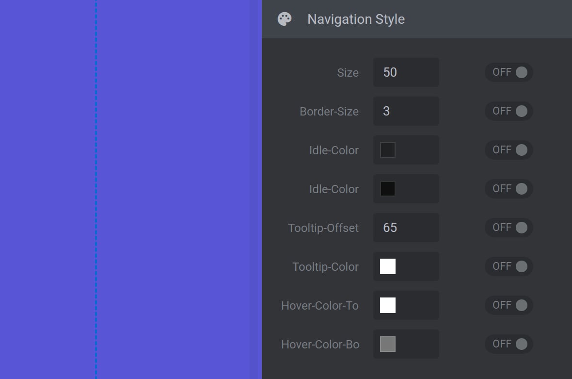
Idle Color #1
The first Idle-Color option is used to set navigation bullet border color. The color chosen here does not apply to the active navigation bullet. The color chosen here will also be visible as the background color of any navigation bullet related to a slide that does not yet have a slide background image.
Idle Color #2
The second Idle-Color option is used to set the background wrapper color that displays behind the slide’s title when a navigation bullet is hovered over.
Tooltip Offset
The Tooltip-Offset option is used to vertically position the slide’s title that displays when a navigation bullet is hovered over. A positive value will shift the title down. A negative value will shift the title up.
Tooltip Color
The Tooltip-Color option is used to set the color of a slide’s title that displays when a navigation bullet is hovered over. The slide’s title is drawn from the Slide Title Field, found in the top middle toolbar of the Slide Options tab.
Hover Color Top
The Hover Color Top option is used to set the top half color of a navigation bullet’s border when it is active or hovered over. Use in conjunction with the Hover Color Bottom option to apply a gradient. The color chosen here will also be visible as the top half of the background color of any navigation bullet related to a slide that does not yet have a slide background image.
Hover Color Bottom
The Hover Color Bottom option is used to set the bottom half color of a navigation bullet’s border when active or hovered over. Use in conjunction with the Hover Color Top option to apply a gradient. The color chosen here will also be visible as the bottom half of the background color of any navigation bullet related to a slide that does not yet have a slide background image.
Uranus
If you select the Uranus style, the Navigation Style panel will have the following options:
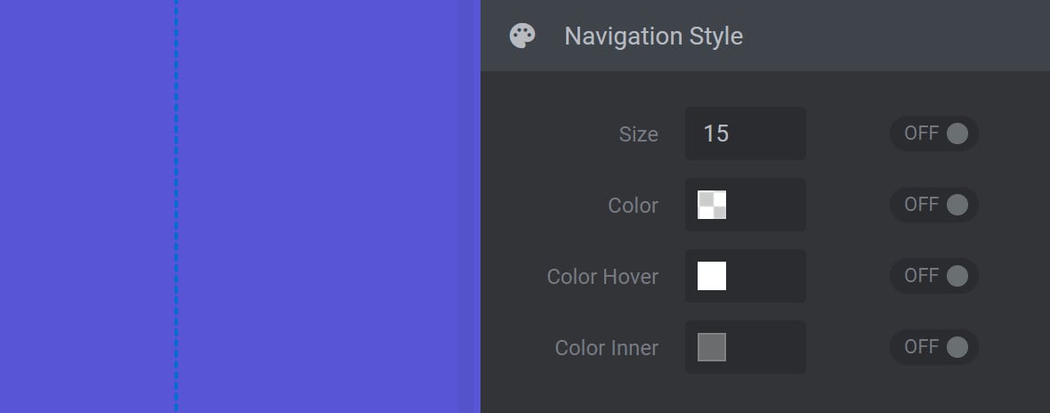
Size
The Size option is used to set the size of the navigation bullet.
Color
The Color option is used to set navigation bullet border color. The color chosen here does not apply to the active navigation bullet.
Color Hover
The Color-Hover option is used to set the color of navigation bullets on hover, as well as the color of the active navigation bullet.
Color Inner
The Color-Inner option is used to set navigation bullet inner color. The color chosen here does not apply to the active navigation bullet.
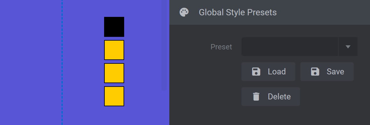
Global Style Presets Panel
After customizing a navigation bullet style, it can be saved for later use via the Global Style Presets panel:
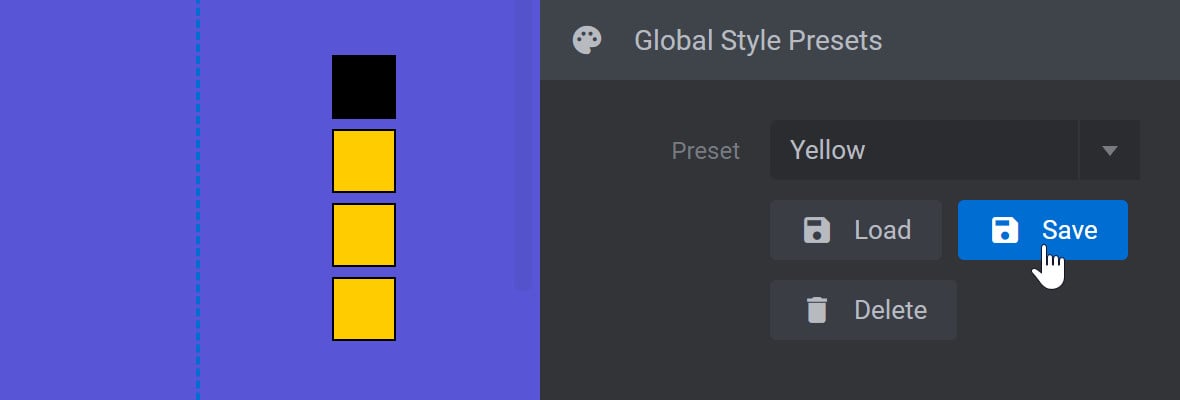
Save a Preset
To save a new custom preset, expand the Preset dropdown, type in a name for your preset:
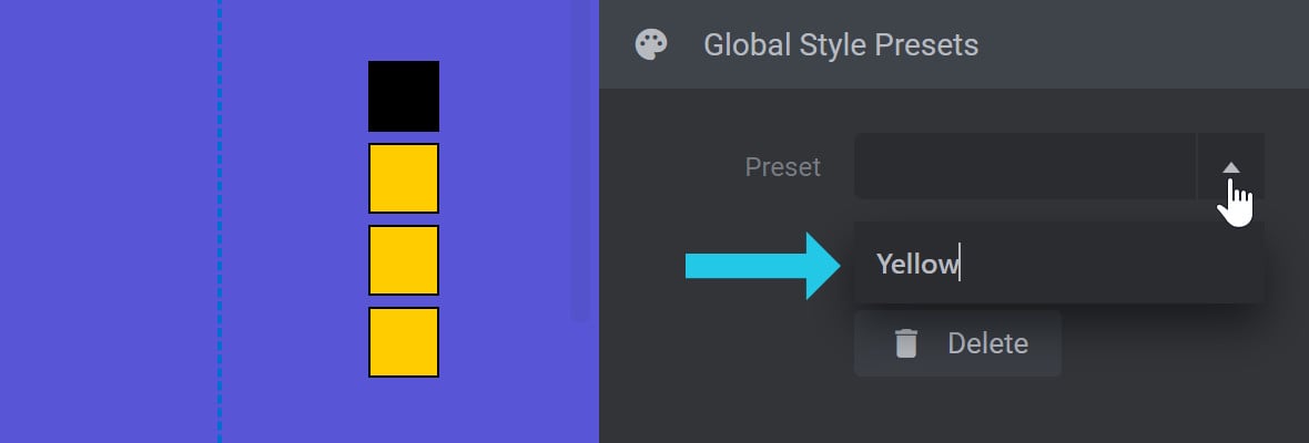
Press ENTER on your keyboard to commit the name, then click the Save button to save your current style under that name:
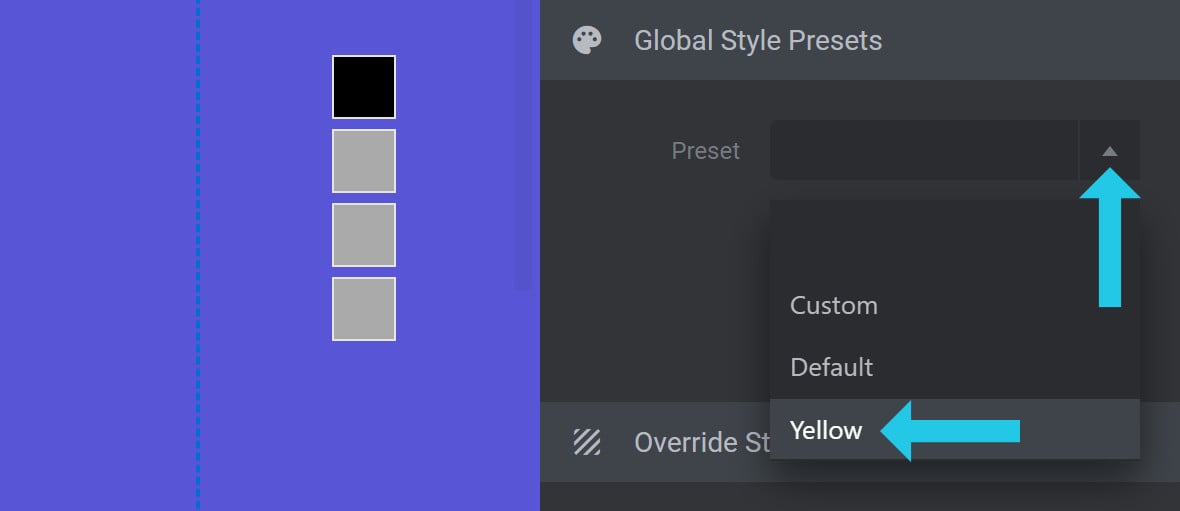
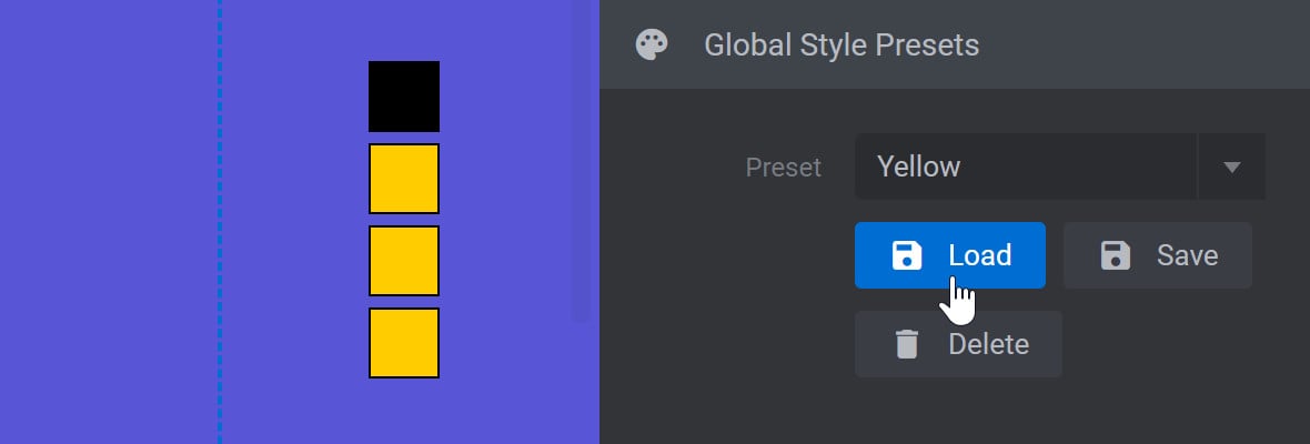
Load a Preset
To load a preset, expand the Preset dropdown and select the preset you want to use:
Then click the Load button to apply the selected preset:
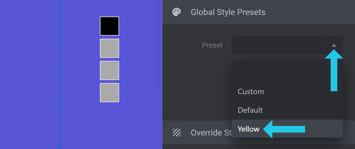
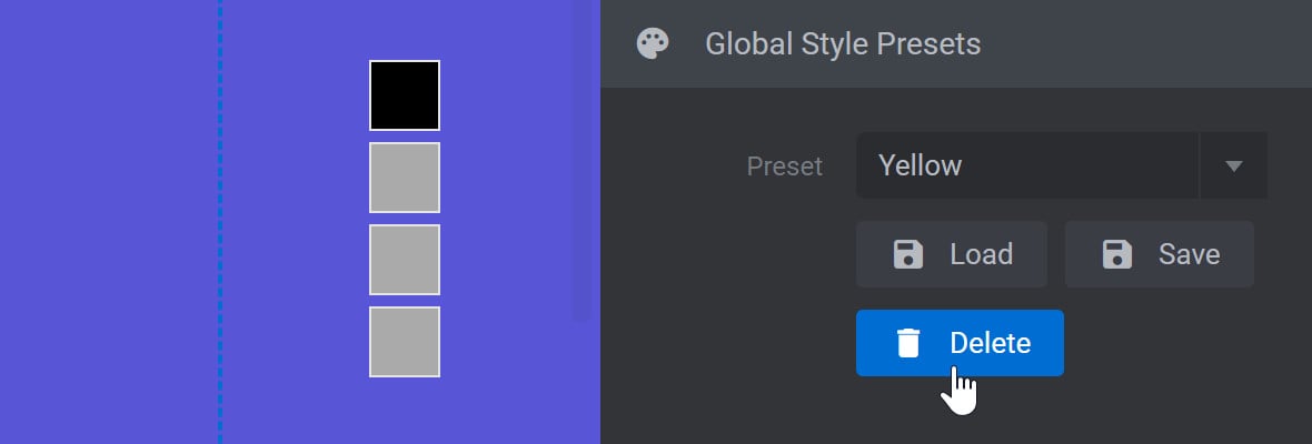
Delete a Preset
To delete a preset, expand the Preset dropdown and select the preset you want to remove:
Then click the Delete button to remove the selected preset:
Override Style on Slide Panel
The Override Style on Slide panel has all the same options as the Navigation Style panel:
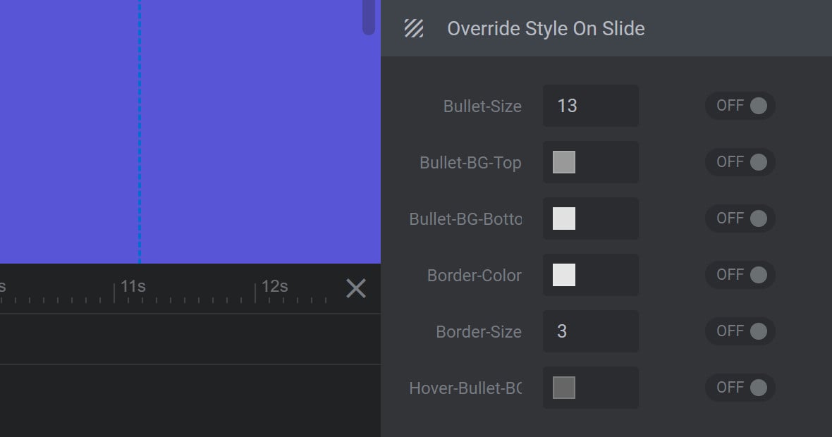
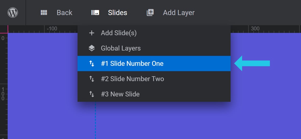
However, instead of affecting navigation bullets across the entire module, the options here will override the options chosen in the Navigation Style Panel for the currently selected slide only.
You can identify which slide you currently have selected by checking the slide that is highlighted blue in the Slides dropdown menu: