
Configuring Responsive Options
Learn about all the options related to responsive layouts in Slider Revolution, what they control and how to configure them.
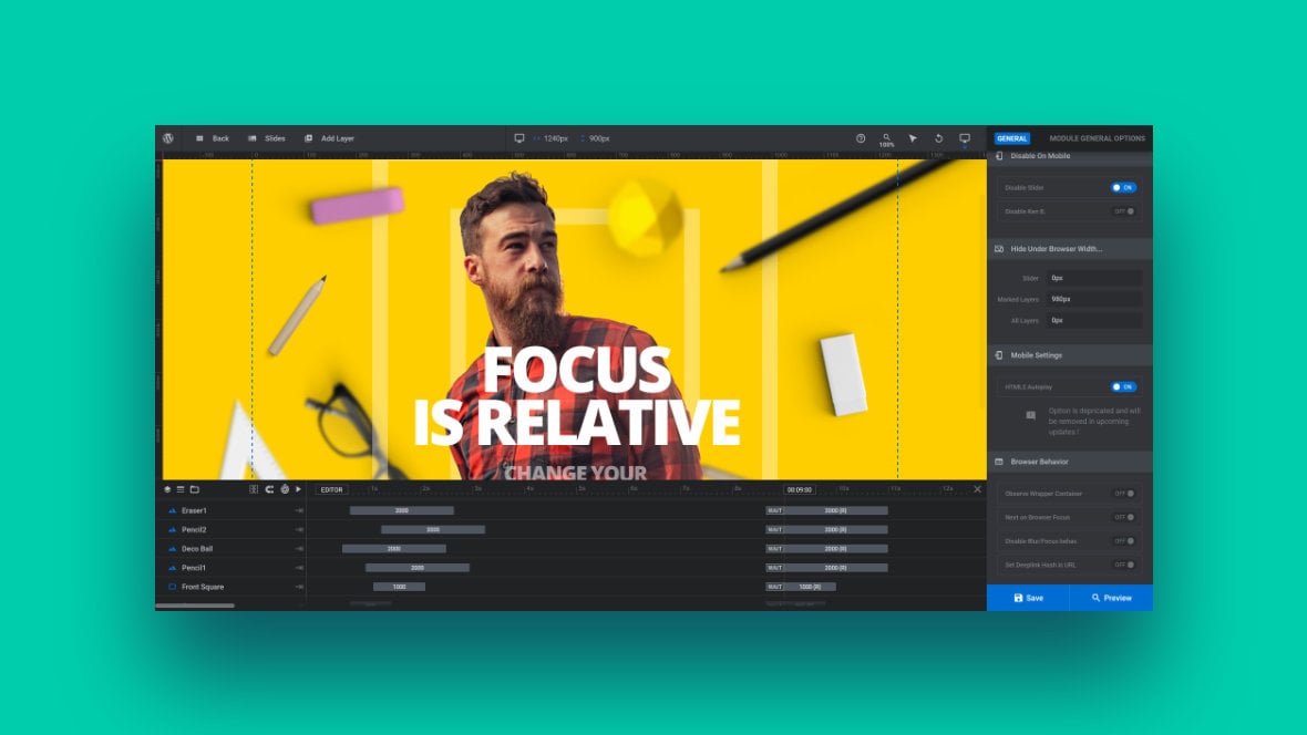
Table of Contents
Introduction and Recap
Earlier in the manual we introduced the concept of responsiveness, in the context of checking on template [?]
A "Template" is a premade module. It has pre-configured layers already in place.
It is designed to be ready for use, either as is or after being modified in the module editor.
Slider Revolution comes with several templates you can use, or alternatively you can create your own templates, thereby allowing you to easily reuse modules you have produced. based designs after you customize them.
So before we get into a full look at configuring responsive options in Slider Revolution [?]
Slider Revolution is a website content creation tool with a focus on captivating animation and stunning visual effects.
It began its life as a plugin for creating slideshows, but has evolved into a fully fledged piece of design software., let’s have a quick recap of what we covered earlier in the manual.
What Does “Responsive” Mean?
The word “responsive”, in the world of website creation, means ensuring your content is able to respond to any device type it is viewed on, providing an equally good experience to all viewers.
This typically means having multiple layout versions made to fit nicely on various screen sizes, ensuring images can be seen clearly, checking that text is legible and readable, and so on.
Responsive Adjustment Video
To get a full overview of the earlier section on adjusting customized template modules [?]
A module in Slider Revolution acts as a container for slides, which in turn act as containers for layers. Modules are created and edited with the module editor.
A "module" is a single, self contained piece of content. You can think of this as being similar to the way a post or page in regular WordPress is a self contained piece of content.
A module can represent any kind of content Slider Revolution is capable of creating, such as a slider, carousel, hero unit, navigation menu, posts display and so on.
Multiple modules can be combined to form rich content such as complete sites and landing pages. for responsiveness, watch our ‘Checking Responsiveness in Edited Templates‘ video:
Size Variant Basics
For a refresher on the basics of working with Slider Revolution’s four size variants, (desktops, notebooks, tablets and mobile phones), including how to preview and edit each size, read this guide:
Desktop, Notebook, Tablet and Mobile Size Variants
Adjusting for Responsiveness
For a rundown on how to identify common responsiveness issues related to sizing, crowding and positioning, read this guide:
Content Resizing Presets
Content resizing presets are a great way to establish a solid basis for your responsive layout. Slider revolution offers three content resizing presets that can be chosen from when creating a blank module using the module creation guide.
When you reach the third page of the guide you will be able to choose your desired presets:
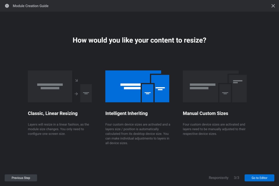
The three presets are named: “Classic, linear resizing”, “Intelligent inheriting” and “Manual custom sizes”.
Earlier in the manual we covered how each of these presets works and offered guidance on which to choose.
Now let’s look at the specific option configuration that is set by each of these presets.
Options Configured by Content Resizing Presets
The three content resizing presets set the defaults for two kinds of options.
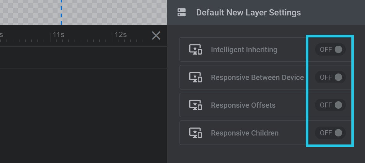
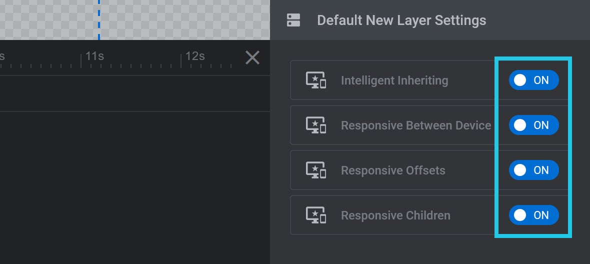
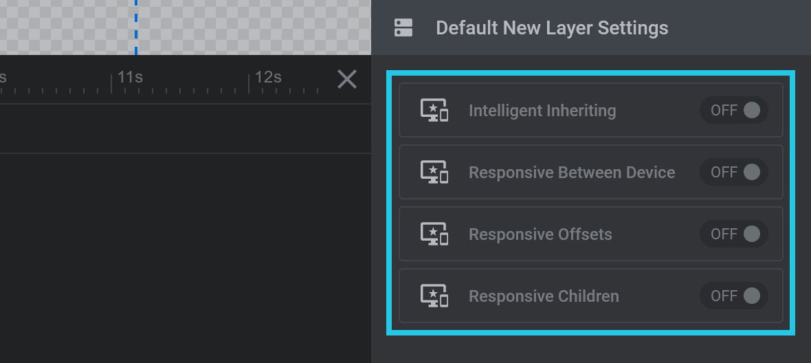
1) Whether the four options found under the Module General Options tab, Default New Layer Settings panel, Defaults subsection, are toggled ON or OFF:
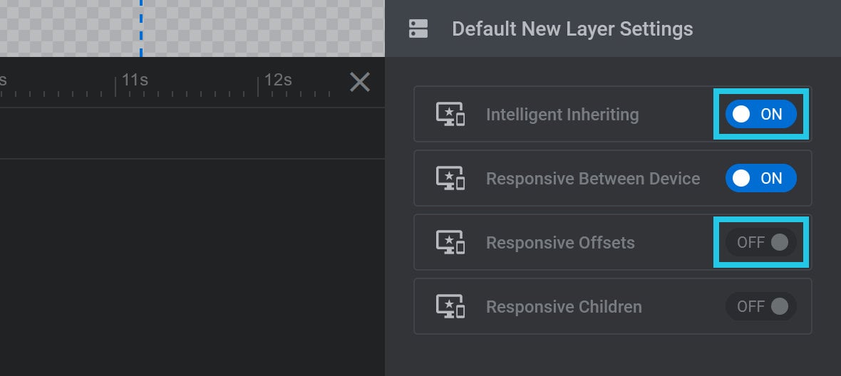
Note: We’ll cover what these four options do later in the guide.
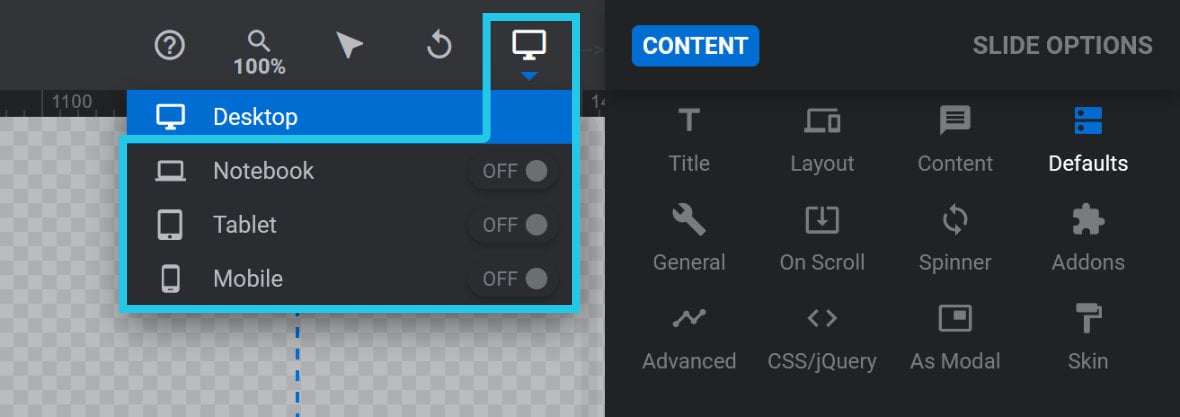
2) Whether the three sizes smaller than desktop are activated, i.e. Notebook, Tablet and Mobile:
Classic, linear resizing
The “Classic, linear resizing” preset sets all four Default New Layer Settings options to OFF:
The smaller size variants will all be inactive:
Intelligent inheriting
The “Intelligent inheriting” preset sets all four Default New Layer Settings options to ON:
The smaller size variants will all be inactive:

Manual custom sizes
The “Manual custom sizes” preset sets all four Default New Layer Settings options to OFF:
The smaller size variants will all be active:
Size Variants
Let’s go over how to manually activate Size Variants, how to set Size Variant dimensions, what breakpoints are, and how to change breakpoint defaults if required.
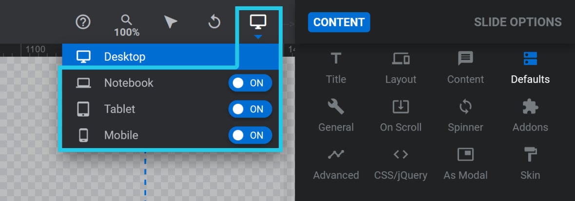
Activating Size Variants
There are two ways to activate size variants in your module.
The first way is to click the size variants switcher on the right end of the top toolbar. From there you can switch the toggle for any size variant to ON:
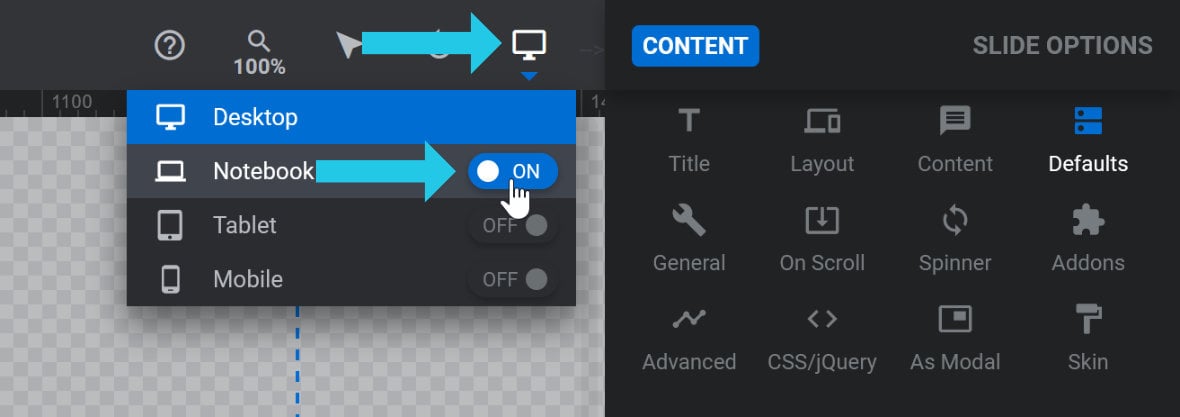
The second way is to go to the Module General Options tab, Layout sub-section, Layer Area Size panel. There you can toggle any size variant to ON:
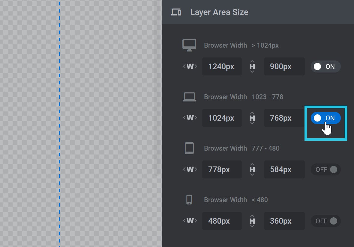
Set Size Variant Dimensions
Each size variant has a set of dimensions. For example, here we can see the tablet variant uses a width of 1024 pixels and a height of 768 pixels:
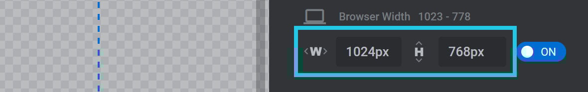
These dimensions determine two key things.
First, the variant dimensions set the layer [?]
Layers are containers for visual, audio or layout items and are added to slides. For example, text, button, image, audio, video, group and row are all types of layers.
Layers are added to slides via the module editor. size on the canvas [?]
The canvas is the point and click design space in the module editor. It forms the largest area of the module editor.
In this area layers can be selected, moved and resized. Animations can also be previewed. when designing that variant in the module editor [?]
The "Module Editor" is the tool used to create & modify modules.
Through this visual, drag & drop, no-code interface you can add various types of layers, animation and special FX to your modules, as well as managing slides and configuring options..
Second, the dimensions control the aspect ratio of the variant. When a size variant is active in the browser its layout will proportionally shrink to fit the viewport width, but its aspect ratio will be retained.
Breakpoints
Each size variant is triggered at a particular Breakpoint, i.e. when the browser viewport is at a specific width. You can think of a breakpoint as the point where the layout breaks into another size.
For example, the default breakpoint that triggers a switch to the mobile size variant is 480px:
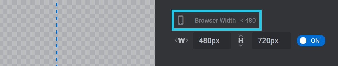
In other words when the width of the browser viewport is any less than 480px, the mobile size variant layout will be shown.
Global Default Layout Grid Breakpoints
Generally speaking, the default breakpoints that ship with Slider Revolution will cover the majority of design use cases.
However, if you do need to change the default breakpoints you can do so under Slider Revolution’s Global Settings panel.
Read more about how to make these changes in our Global Settings guide.
Responsive Behavior
For each layer there are four key responsive behavior options found in the correspondingly named Responsive Behavior panel.
To locate the panel select a layer, go to the Layer Options tab, Size & Pos sub-section section, and scroll down to the third panel:
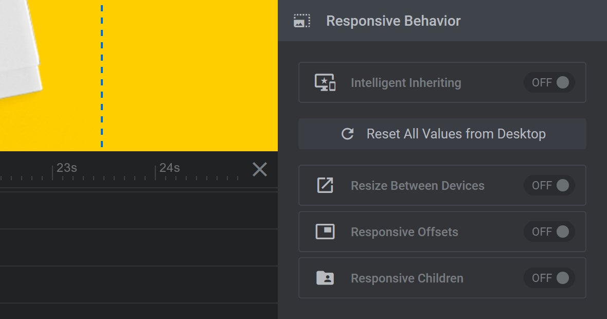
The four options found in this panel are the same for which defaults can be set under the Default New Layer Settings panel mentioned earlier.
Intelligent Inheriting
Intelligent Inheriting is a function that attempts to automatically generate layouts for each active size variant.
It does this by inheriting layout settings from a larger size variant, for example the desktop layout. It then automatically makes adjustments to suit a smaller size layout, for example a laptop size layout.
This means if Intelligent Inheriting is toggled to ON for a layer, its size and position will automatically generate for each active size variant. It is, however, also still possible to fine tune the layer’s size and position from there.
On the other hand if Intelligent Inheriting is toggled to OFF, the layer’s size and position will need to be set manually for each active size variant.
Values from Desktop
When Intelligent Inheriting is toggled to ON, the Inherit All Values from Desktop button appears below it:
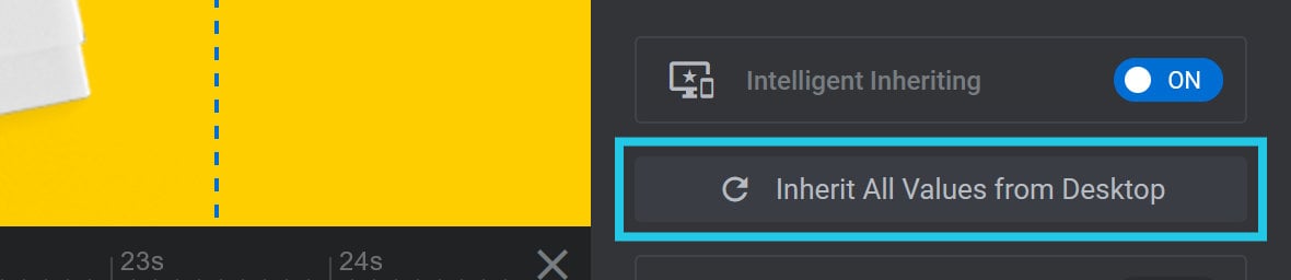
This Inherit All Values from Desktop button can be used if you’ve been making layout adjustments to a layer at smaller size variants and want to start over. Clicking the button reverts all the layer’s size and position values back to those originally inherited and adjusted from the desktop layout.
When Intelligent Inheriting is toggled to OFF, the Reset All Values from Desktop button appears below it:
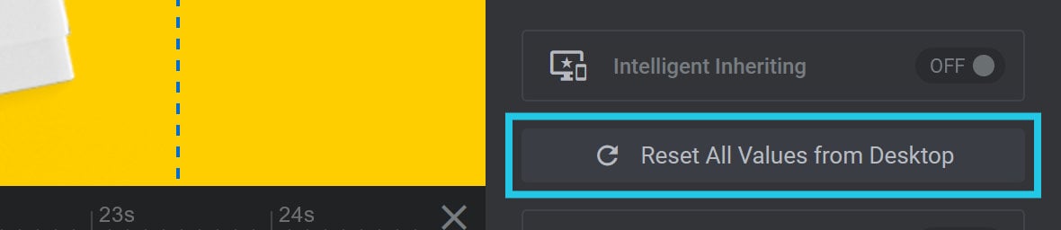
Clicking the Reset All Values from Desktop button sets the layer’s size and position, at every active size variant, to the exact same values used in the desktop layout.
Resize Between Devices and Responsive Offsets
Even if you have Intelligent Inheriting switched off, and only have the Desktop size variant active, the Resize Between Devices and Responsive Offsets options can add basic responsive behavior to your layout.
These options will modify layer size and offsets at each of the four size variant breakpoints, even if those size variants are inactive.
Toggle Resize Between Devices to ON and the layer will responsively change its size:

Toggle Responsive Offsets to ON and the layer will responsively reposition itself.:

Note: The responsive behavior generated by these options cannot be seen in the module editor, only on the front end of your site.
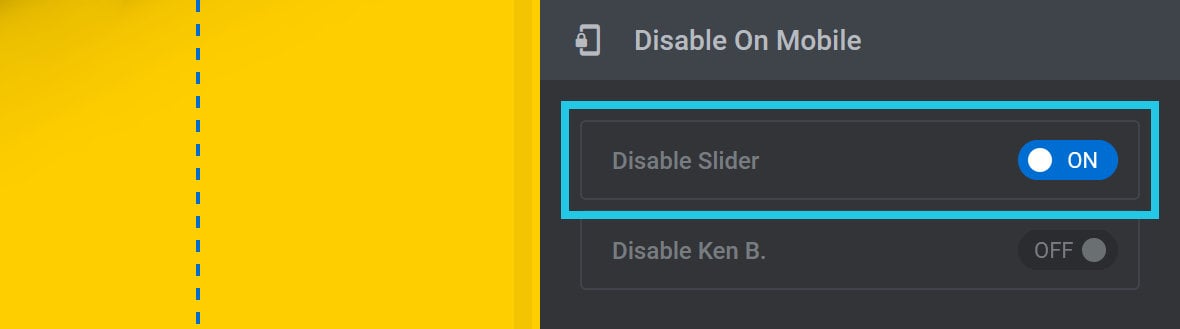
Disable on Mobile
In some cases you may have a module that, for one reason or another, is not suitable for a mobile size layout. If so, you can hide the module completely on mobile phones.
To do so, go to the Module General Options tab, General sub-section, scroll down to the Disable On Mobile panel, and toggle Disable Slider to ON:
Hide Under Browser Width
It is also possible to hide either the entire module, or specified layers, whenever the browser viewport width is narrower than a specified amount.
This can be done under the Module General Options tab, General sub-section, Hide Under Browser Width panel:
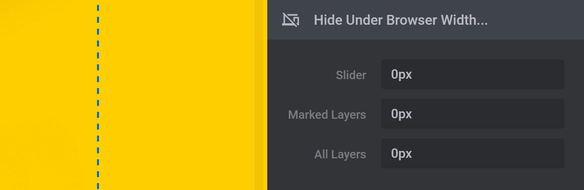
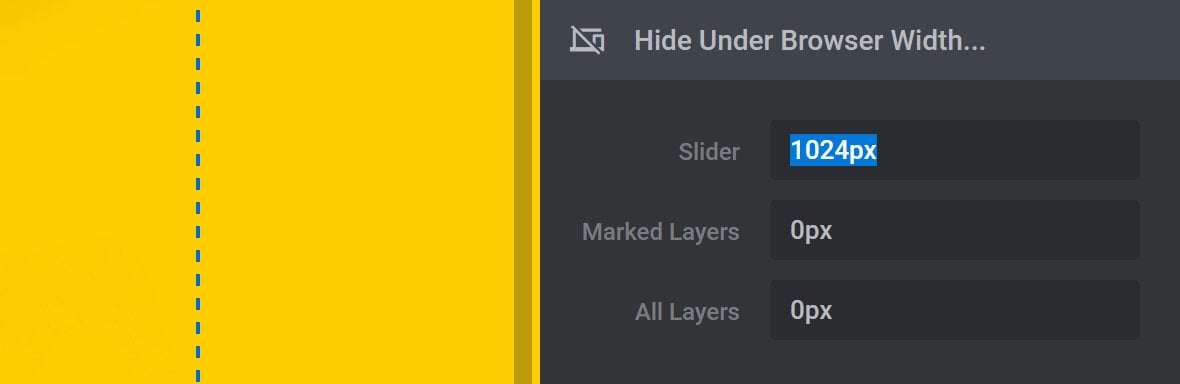
Slider
Enter any pixel(px) value higher than zero into the Slider [?]
A slider is a type of module that contains multiple slides. You can only see one slide at a time, a distinguishing features that makes sliders different from carousels.
The slides of a slider can be panned through either by using navigation controls such as arrows and tabs, or by clicking and dragging. They can also be set to automatically transition from one slide to the next. field and the entire module will be hidden whenever the browser viewport is narrower than that amount:
Marked Layers
Use the Marked Layers option to set a value below which specified layers will be hidden:
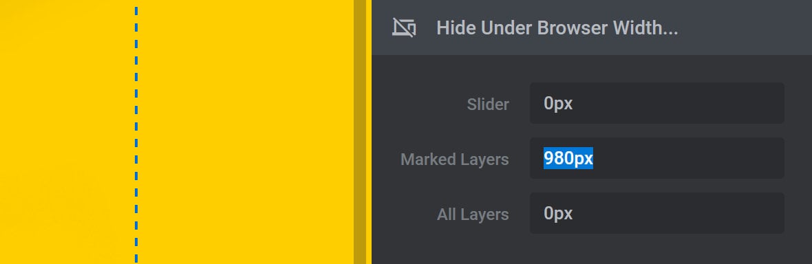
The way to “mark” a layer to be hidden is by using the Hide Under Width option which is described in the next section of the guide.
All Layers
Use the All Layers option to set a value below which all layers will be hidden:
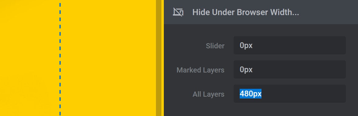
The background [?]
A "background" in Slider Revolution is a type of layer that is always present in every module, and is always visually behind all other layers.
A background can be transparent, a flat color, a gradient, an image, or a video. It can be animated in the same way as other layers can be, however it cannot be deleted. layer will still be visible, so your module can show an image or video even when all the other layers are hidden.
Layer Visibility
Layer Visibility per Device
Layers can also be hidden on a per size variant basis, for example, hiding a layer only on tablet and mobile sizes.
To do this, select the layer you want to hide and go to the Layer Options tab, Visibility sub-section:
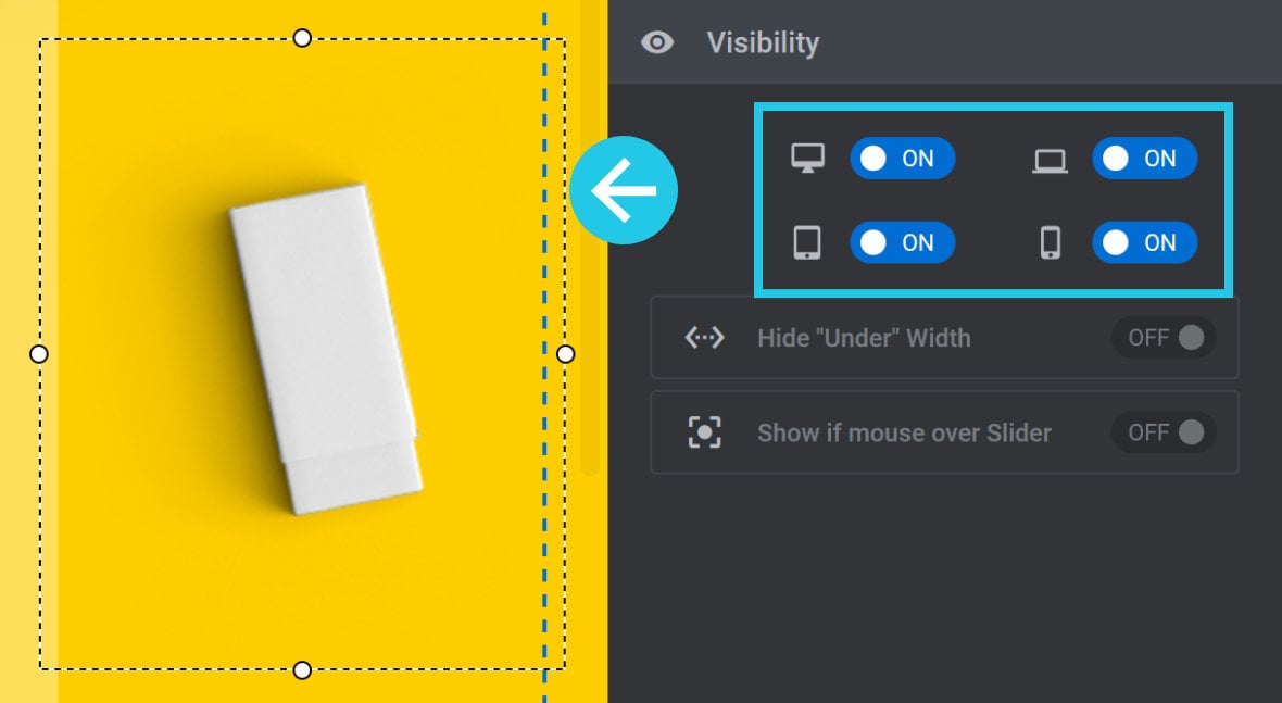
In the Visibility panel you’ll see icons and toggle switches for each of the four layout variants. For any size variant on which you’d like to hide the selected layer, toggle the corresponding switch to OFF.
Hide Under Width
If you’ve set the Marked Layers option, (described earlier), to something other than 0px, toggling the Hide Under Width option sets the selected layer as “marked”:
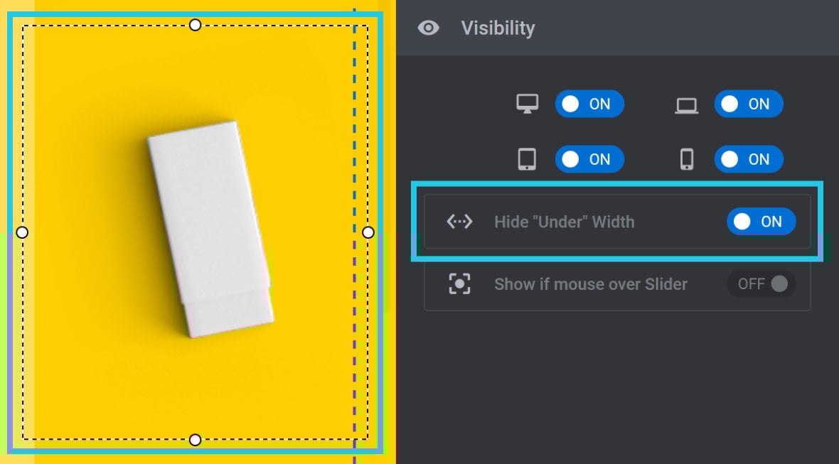
This means the layer will be hidden when the browser viewport is less than the width specified in the Marked Layers option.