
Make Custom Navigation Skins Using the Navigation Editor
Learn how to use the tools for creating unique arrow, bullet, tab and thumb styles.
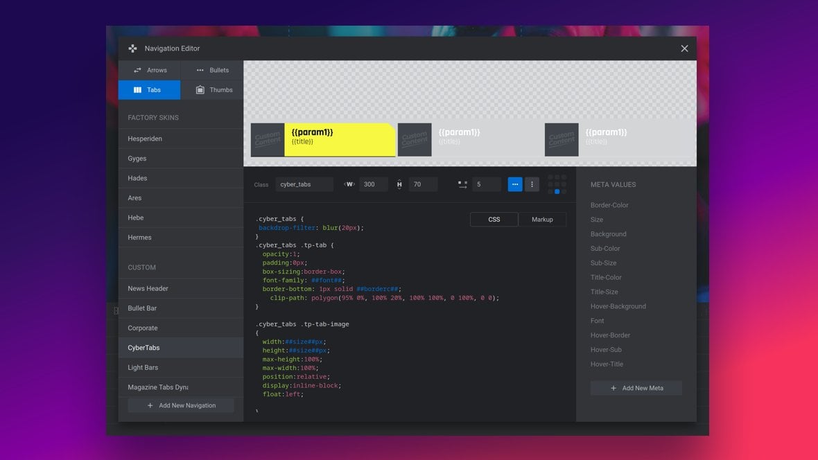
Table of Contents
What is the Navigation Editor?
The Navigation Editor is a fully in-built tool within the Module Editor [?]
The "Module Editor" is the tool used to create & modify modules.
Through this visual, drag & drop, no-code interface you can add various types of layers, animation and special FX to your modules, as well as managing slides and configuring options. that allows you to create custom styling for the four different types of module [?]
A module in Slider Revolution acts as a container for slides, which in turn act as containers for layers. Modules are created and edited with the module editor.
A "module" is a single, self contained piece of content. You can think of this as being similar to the way a post or page in regular WordPress is a self contained piece of content.
A module can represent any kind of content Slider Revolution is capable of creating, such as a slider, carousel, hero unit, navigation menu, posts display and so on.
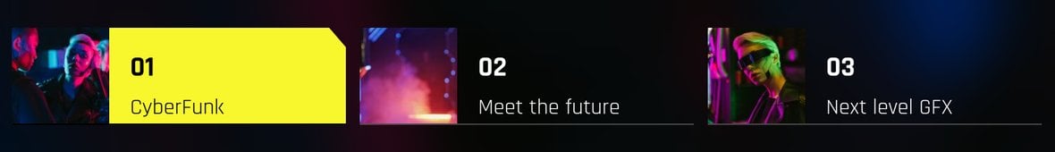
Multiple modules can be combined to form rich content such as complete sites and landing pages. navigation: Arrow, Bullet, Tab and Thumb:
Custom navigation styles are also referred to as “skins”, and can be created either through customizing an existing skin, or creating a new skin from scratch.
Once a skin is created it becomes available as a navigation style in any module, and can applied to the navigation type for which it was made:
A skin can be further customized on a module by module basis through the overrides in the Navigation Style panel, sometimes alternatively labeled the Style Global panel:
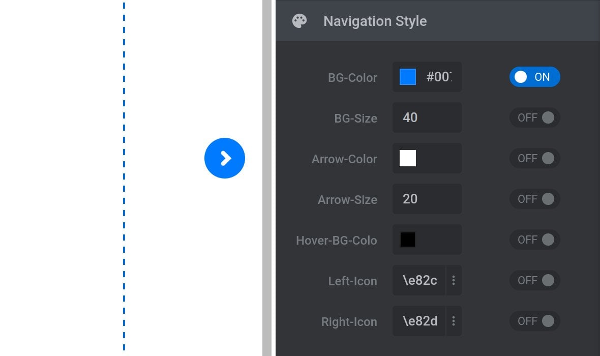
To learn about using the Navigation Style or Style Global panel for each navigation type see the following guides: Arrow Navigation Style, Bullets Navigation Style, Tab Style Global, Thumb Style Global.
Navigation Editor Basics
Let’s begin with a look at how to open the Navigation Editor and switch between navigation types.
Open the Navigation Editor
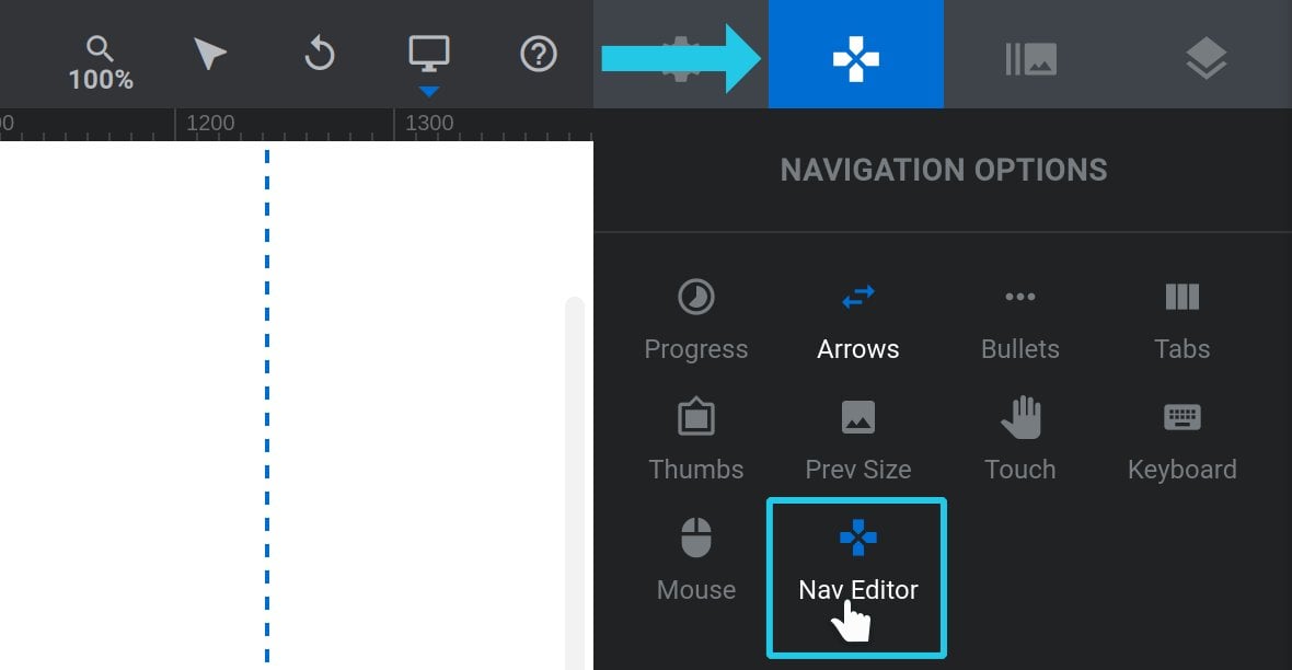
To open the Navigation Editor go to the Navigation Options tab and click the Nav Editor sub-section:
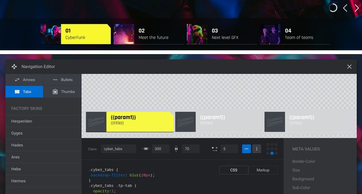
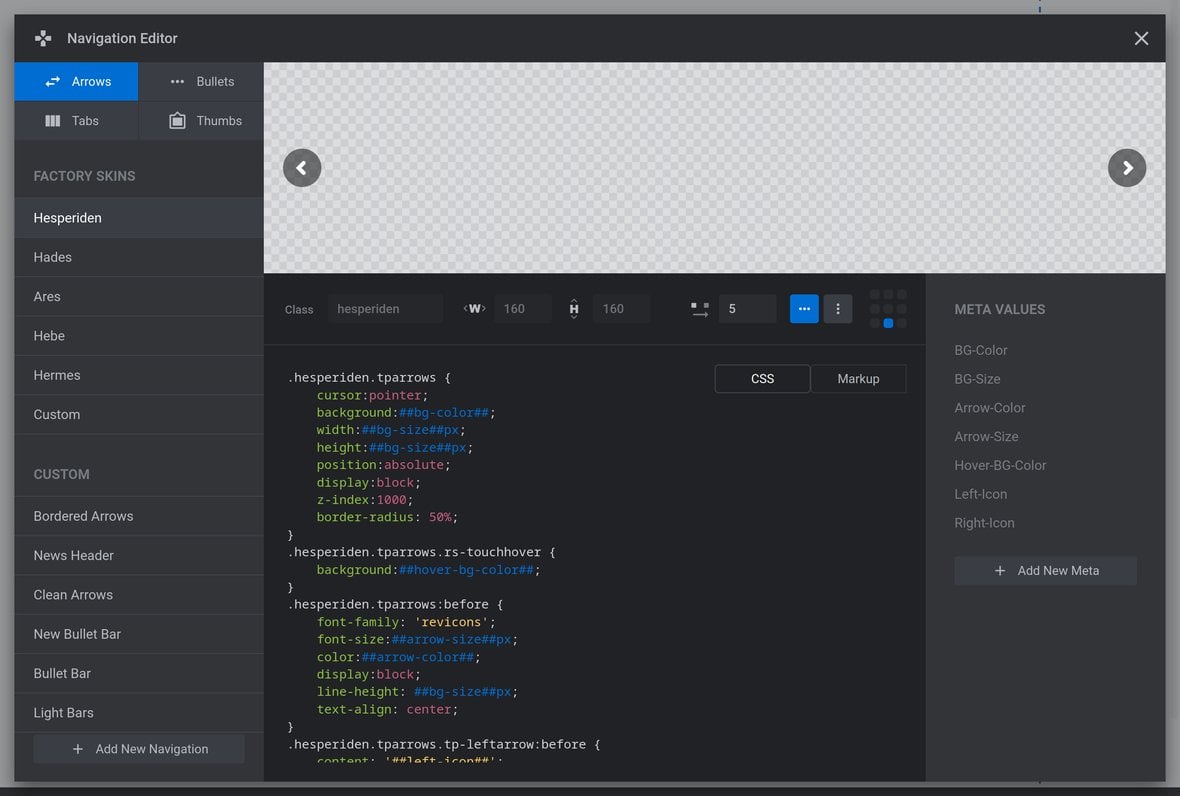
The Navigation Editor will open in its own self contained window:
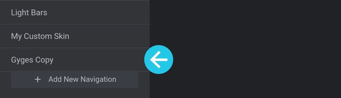
To close the Navigation Editor again, click the X button at the top right:
Switching Navigation Type
In the top left corner of the Navigation Editor you will see four buttons: Arrows, Bullets, Tab and, Thumbs:
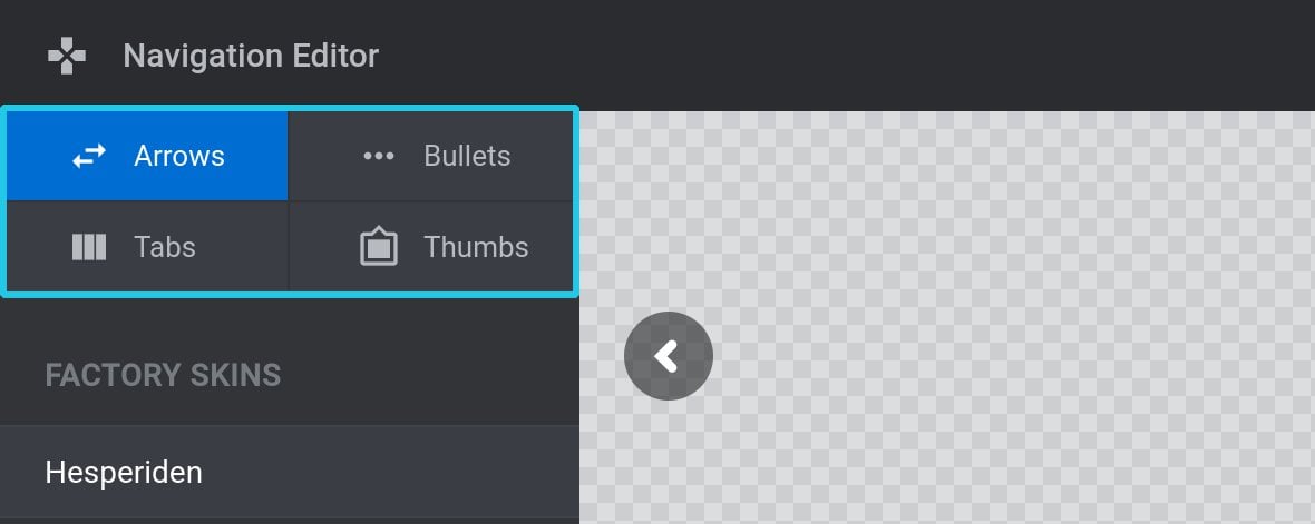
These buttons allow you to switch between the skins available for each navigation type.
Navigation Skin Management
Next, let’s see how skins are organized in the Navigation Editor.
Factory and Custom Skins
There are two types of navigation skins. First, Factory Skins that are pre-installed and cannot be removed nor edited in any way. Second, Custom skins that either you made yourself or came from module templates [?]
A "Template" is a premade module. It has pre-configured layers already in place.
It is designed to be ready for use, either as is or after being modified in the module editor.
Slider Revolution comes with several templates you can use, or alternatively you can create your own templates, thereby allowing you to easily reuse modules you have produced..
Factory Skins are listed at the top of the left sidebar:
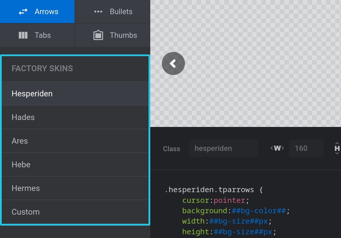
Custom skins are listed below the factory skins:
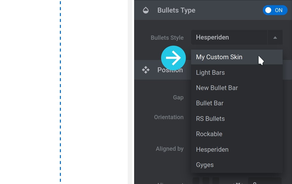
Select a Skin
Select any skin by clicking is name in the left sidebar:
The selected skin will appear in the preview window at the top of the editor:
The skin’s code and meta values, (which we’ll talk about shortly), will occupy the bottom right option of the window:
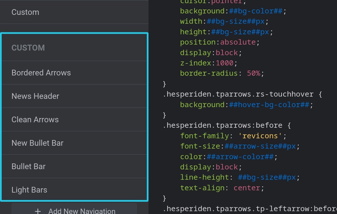
Add a New Navigation Skin
There are two ways to add a new navigation skin. You can either create a brand new skin from scratch, or you can duplicate and edit an existing skin.
New Skin from Scratch
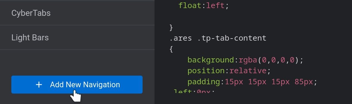
To create a skin from scratch, click the Add New Navigation button a the bottom of the left sidebar:
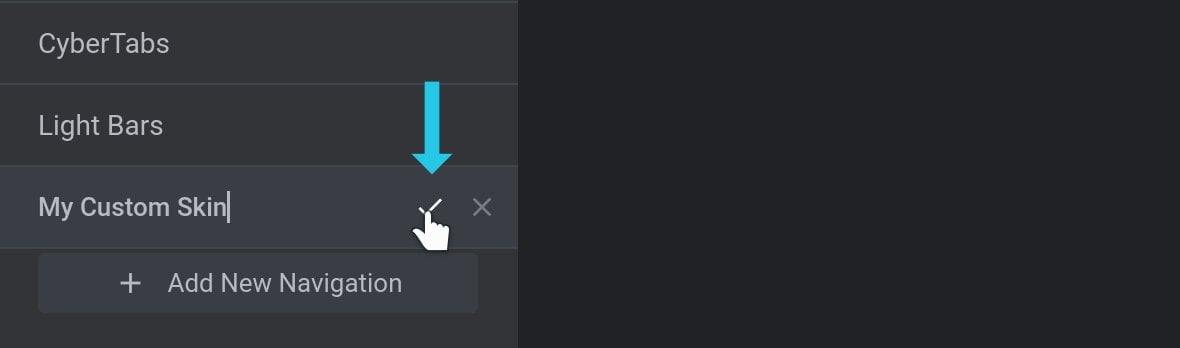
A new entry will appear at the bottom of the Custom list, ready for you to set the name of the skin. Type in your preferred name, then click the tick icon to save:
Your custom skin can now be selected from the list, ready for editing.
Duplicate Skin
To instead customize an existing skin, hover over its name and click the small double page icon on the right to duplicate it:
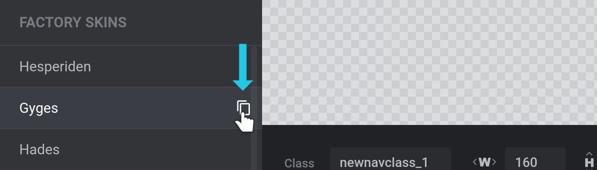
The duplicate will appear at the bottom of the Custom list:
Note: We have breakdowns of the Navigation Style options for several skins, both factory and custom, in our dedicated guides to each navigation type. You may find these helpful when customizing skins.
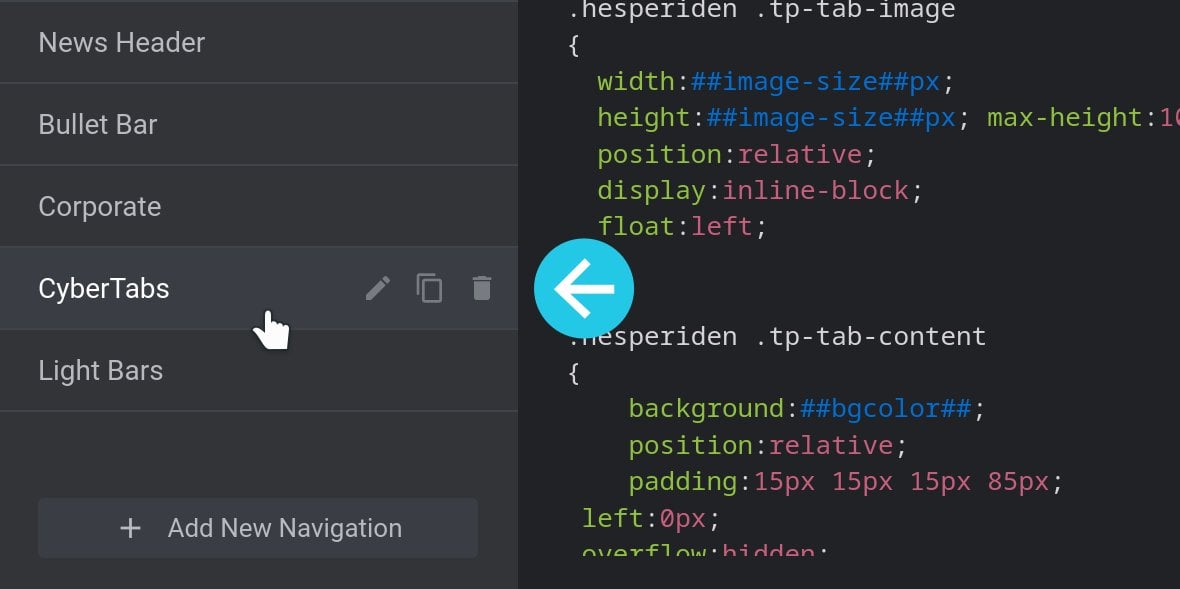
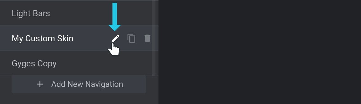
Rename Skin
To rename any Custom skin, hover over it in the left sidebar and click the small pencil icon at its right end:
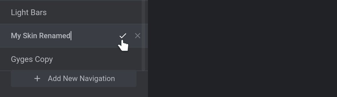
You can then enter your preferred name, and click the tick icon to save:
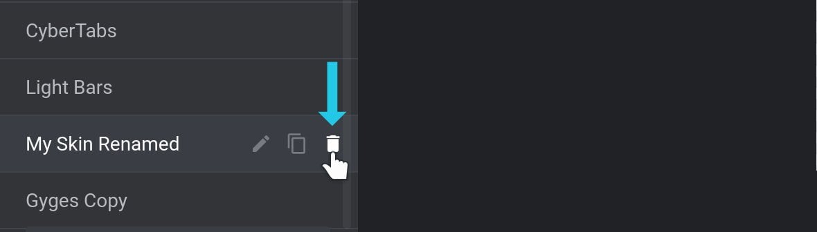
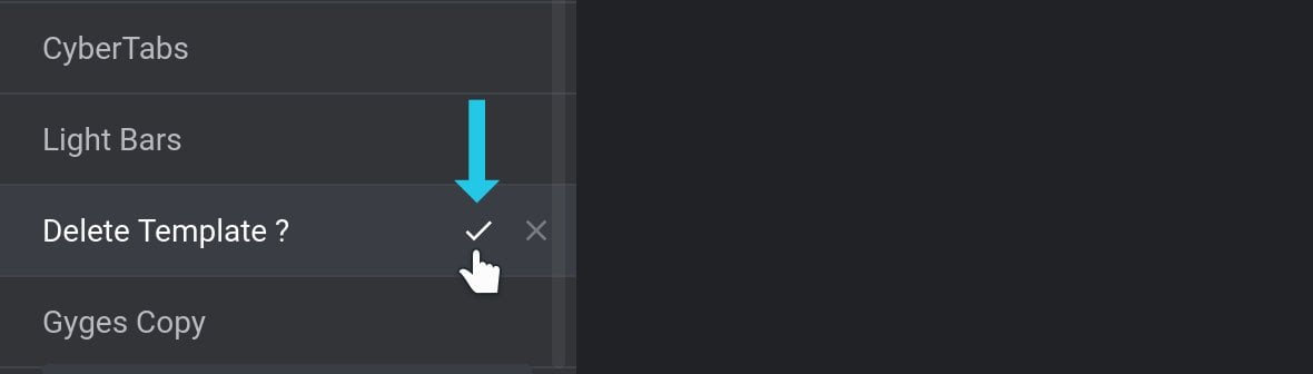
Delete Skin
To delete any Custom skin, hover over the entry and click the small trashcan icon at its right end:
A notice reading “Delete Template?” will appear. Click the small tick icon to its right to proceed:
Navigation Skin Standard Options
Below the preview window you will find the standard options common to all navigation skins:
They are as follows.
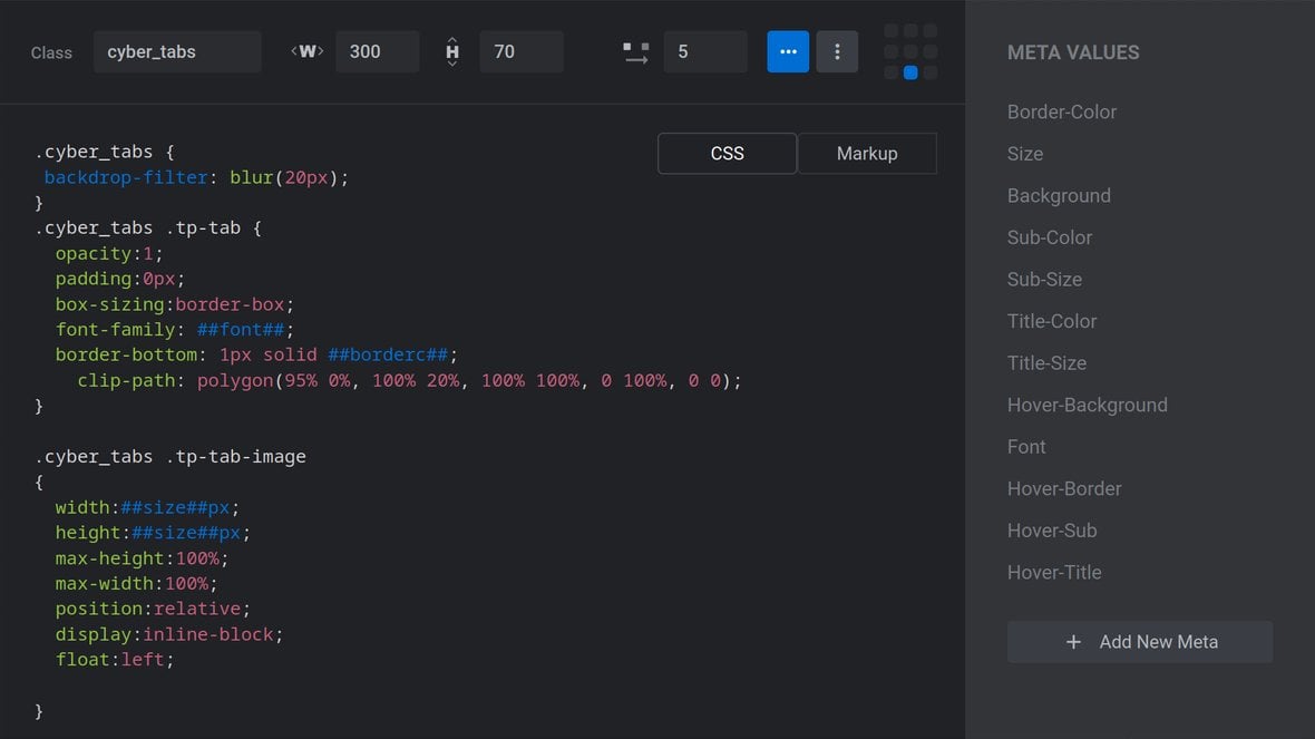
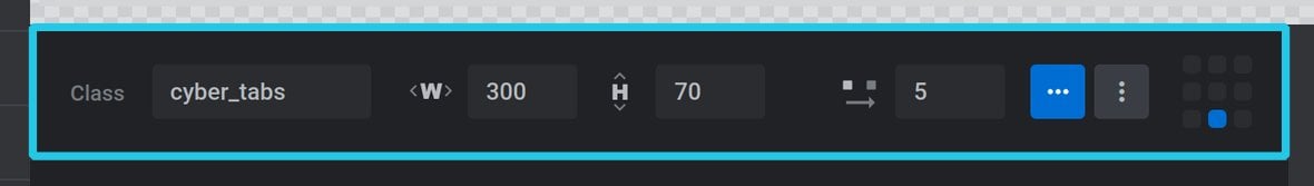
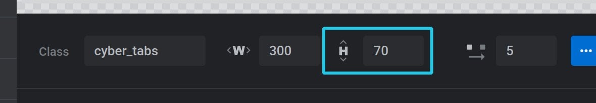
Class
In the Class field, set a CSS class name that will be used to target your navigation for styling:
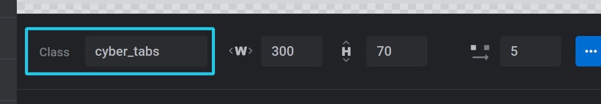
Note: It is not necessary to prepend the class name with a dot.
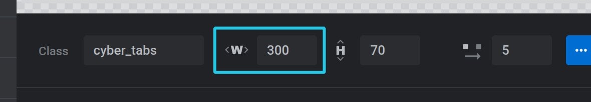
Width
If thumbnails are used in the skin, the Width option specifies how many pixels(px) wide each thumbnail image should be:
Height
If thumbnails are used in the skin, the Height option specifies how many pixels(px) high each thumbnail image should be:
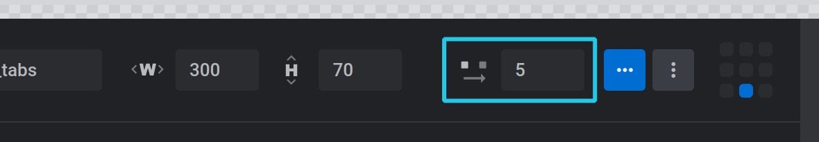
Spacing
The Spacing option sets the distance in pixels(px) between bullets, tabs, or thumbnails:
Orientation
The Orientation option determines whether bullets, tabs, or thumbs should be arranged horizontally or vertically:
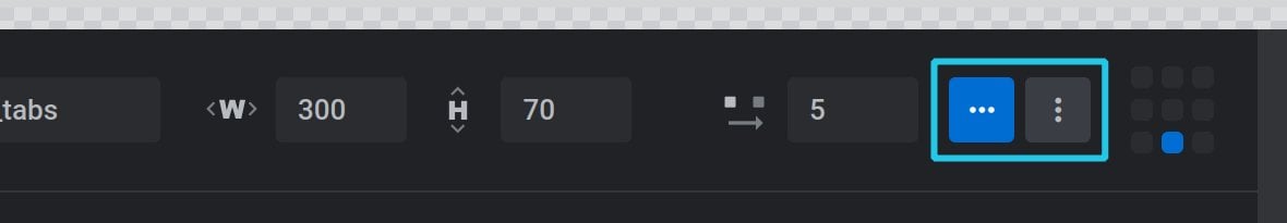
The first button (three horizontal dots) represents horizontal orientation, while the second button (three vertical dots) represents vertical orientation:
Alignment
The Alignment option allows you to set the horizontal and vertical alignment of your navigation items. You will see a grid of points representing the available alignment settings, i.e the corners, edges and center:
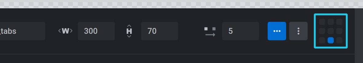
For example, if you click the bottom center grid point, your navigation items will align to the bottom center.
Code Editor Overview
The code editor portion of the Navigation Editor is comprised of two parts. The text editor, taking up the lower middle area, and the meta sidebar to its right:
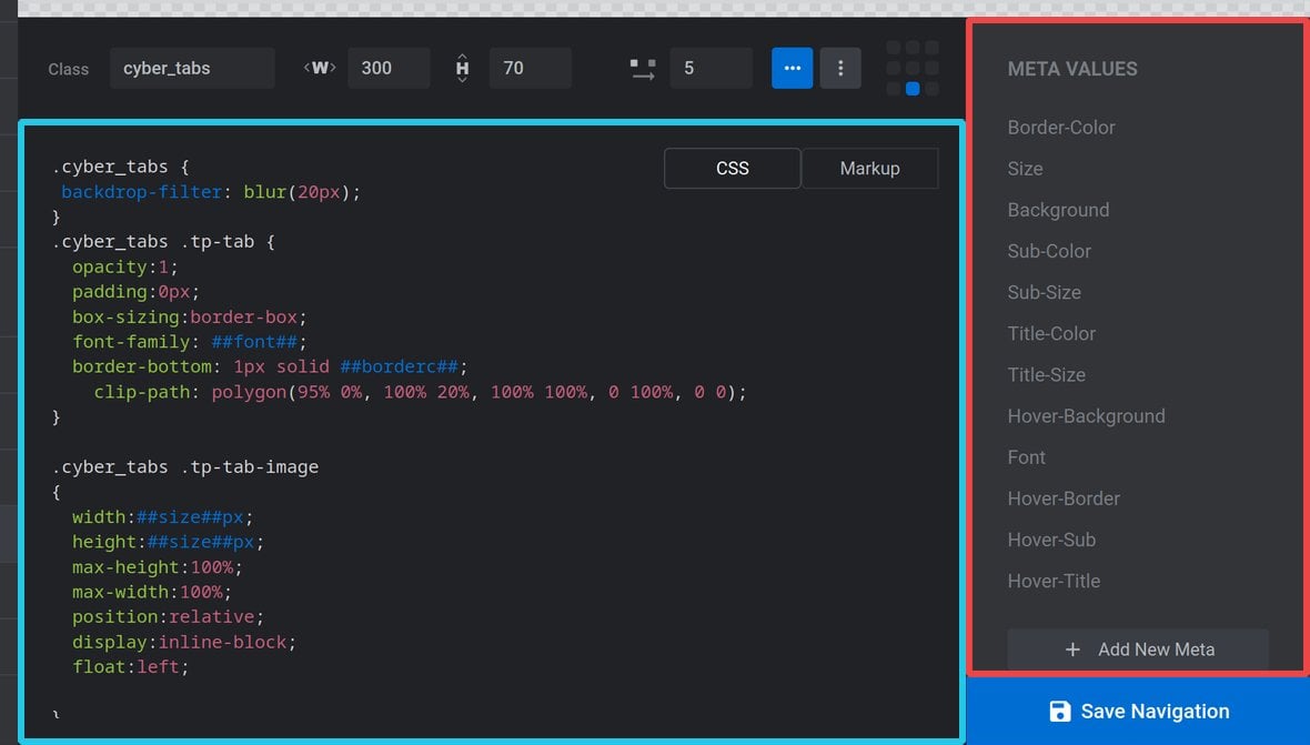
Text Editor
The text editor is used for adding and modifying the CSS and markup of your skin:
Use the CSS and Markup buttons at the top right of the text editor area to such between these two types of code.
Meta Sidebar
The sidebar to the right of the text editor is used for working with CSS and markup metadata related to your skin.
CSS META VALUES
When the text editor is in CSS mode, the right sidebar will display CSS META VALUES:
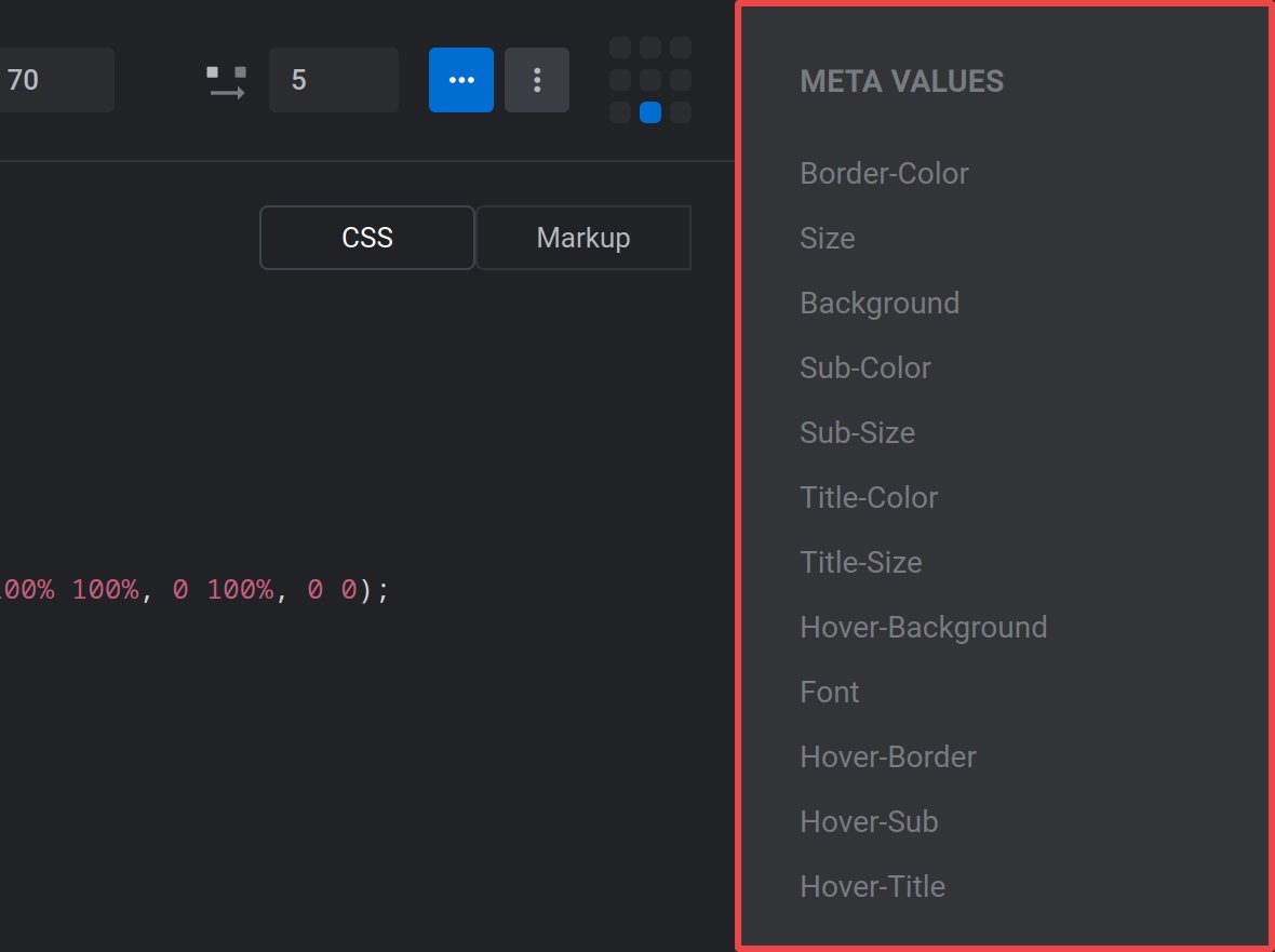
CSS meta values allow you to make custom options that will appear in the Navigation Style panel for the navigation type you are working on, and integrate those options into your skin:
This functionality allows for even further navigation customization on a module by module basis.
We’ll cover how to work with CSS meta values in just a moment.
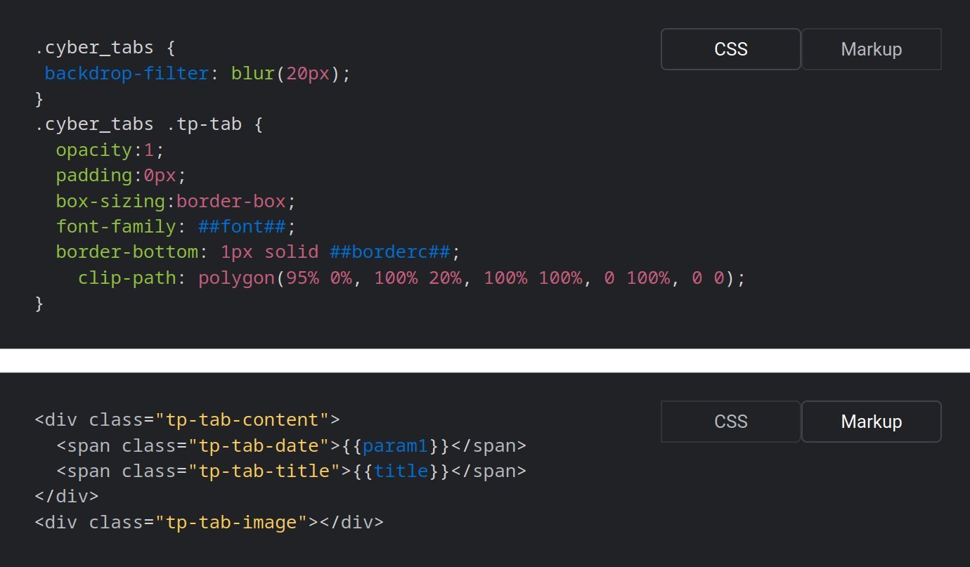
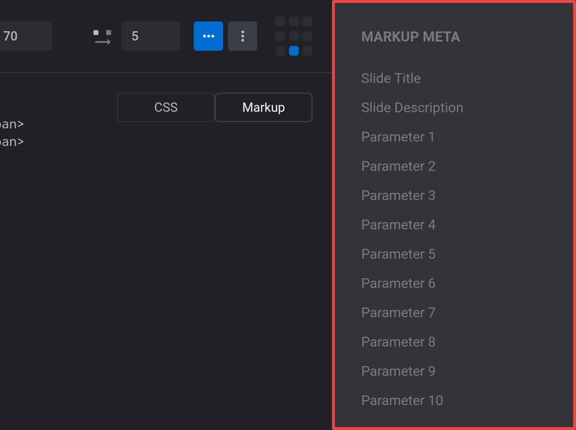
MARKUP META
When the text editor is in Markup mode, the right sidebar will display MARKUP META:
Markup meta allows you to insert data such as the slide [?]
A "slide" in Slider Revolution is a container into which multiple layers can be added, with layers in turn acting as containers for various forms of media such as images, text, video, audio, buttons, and special effects.
Slides are added to modules and edited via the module editor.
Within the module editor, each slide has its own animation timeline, background and collection of layers.
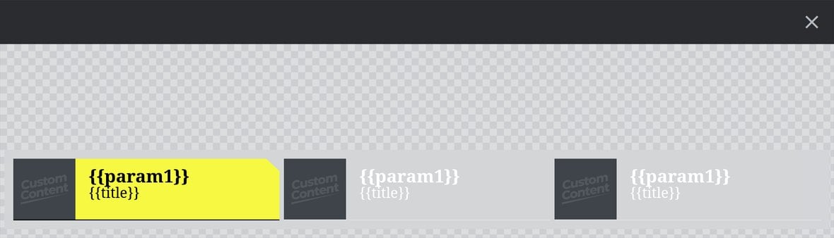
A single module can have one or many slides. A module with one slide is called a scene, and a module with multiple slides is called a slider or carousel. title or slide description into your navigation. Click the meta item in the right sidebar and a placeholder text snippet will be inserted into the markup. For example, clicking Slide Title will insert the snippet {{title}} into your code:
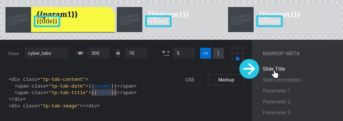
When your navigation is live that placeholder will be replaced with the metadata it represents:
Custom Parameters
You will notice several meta items named Parameter 1, Parameter 2 and so on, each of which insert the meta snippets {{param1}}, {{param2}} etc. into your code. These are custom parameters that can be defined to display several different types of content.
To define parameters for a slide go to the Slide Options tab, then the Params sub-section:
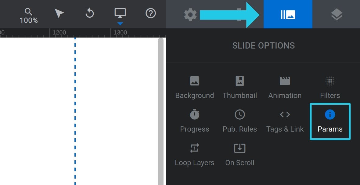
Type a meta data snippet into any of the parameter fields. For example, if your module uses post content you might want to type {{date}} into the Parameter 1 field in order to show a post’s publish date:
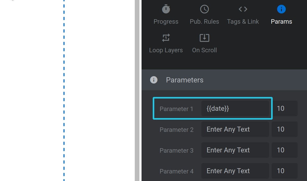
Then wherever you use the snippet {{param1}} in your code, it will be replaced by the post date.
Note 1: Parameters are slide specific, not module wide. If you want a parameter to be the same across all slides you will need to manually define it across all slides.
Note 2: To learn more about meta data snippets, refer to the Additional Text Content Options – Add Meta Data section of this manual.
Working with CSS Meta Values
Insert Meta into Code
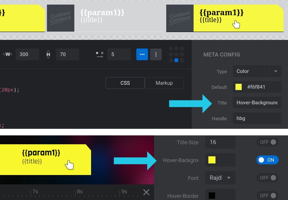
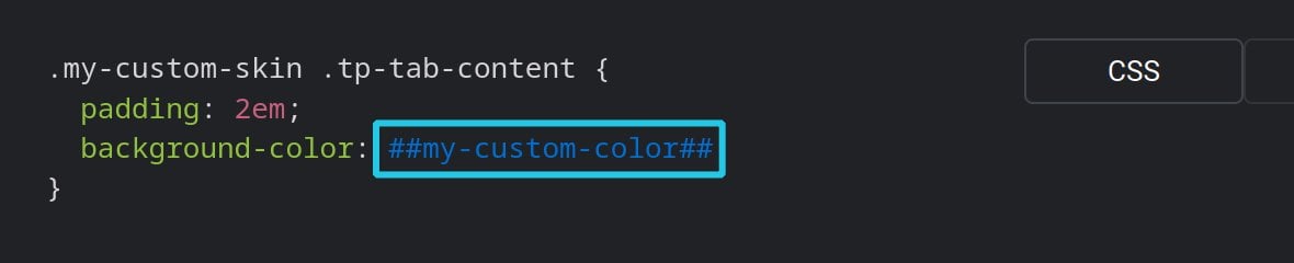
Each CSS meta value has a unique handle associated with it. The handle takes the form of a string of text between two pairs of hashes, e.g ##my-custom-color##:
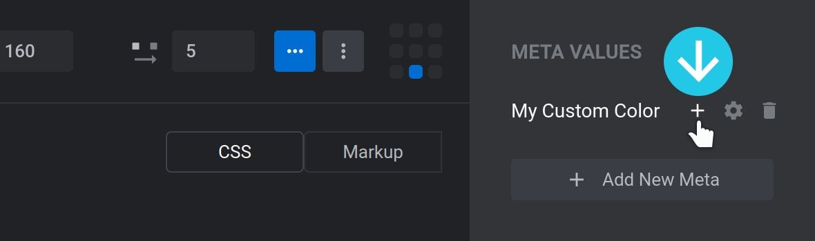
To insert a meta value into your CSS, place your cursor where you want it to be added in code, hover over the value in the right sidebar, then click its + icon:
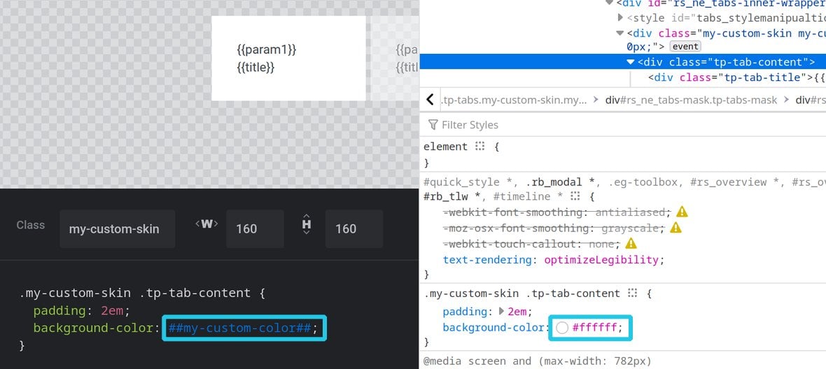
When a skin is applied to navigation, any instance of a meta value’s handle in the CSS will be replaced with its current setting.
For example if a meta value was set to #FFFFFF (white), any instance of its handle in the skin’s CSS would be replaced with #FFFFFF (white):
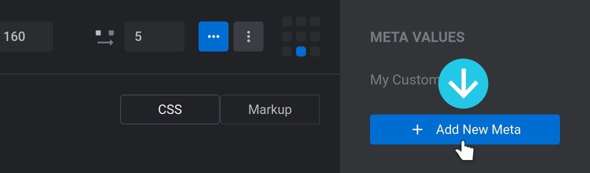
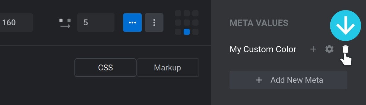
Add New Meta
To add a new meta value to your skin, click the Add New Meta button in the right sidebar:
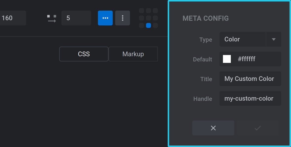
A panel title META CONFIG will replace the content of the right sidebar. Configure its options as described in the next section.
Configure Meta
Meta values can be configured via the META CONFIG panel in the right sidebar:
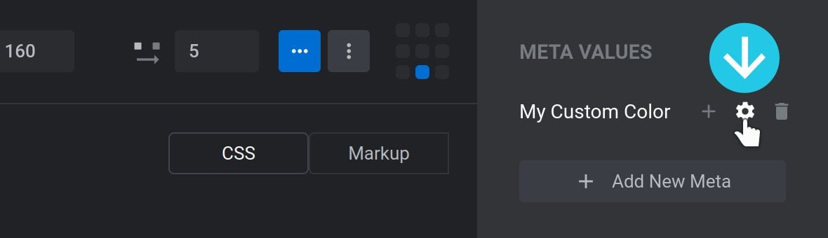
This panel appears automatically when you first create a new meta value, and can otherwise be accessed by hovering over a meta value and clicking its gear icon:
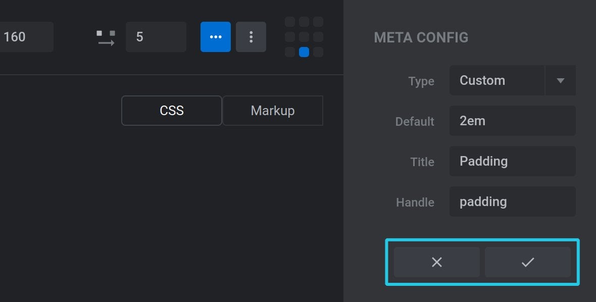
Once you have finished configuring a meta value, click the tick button at the bottom to save changes, or the cross button to discard changes:
The four options available for configuration are as follows.
Type
The Type option provides a dropdown list that allows you to choose from one of the four types of CSS meta value:
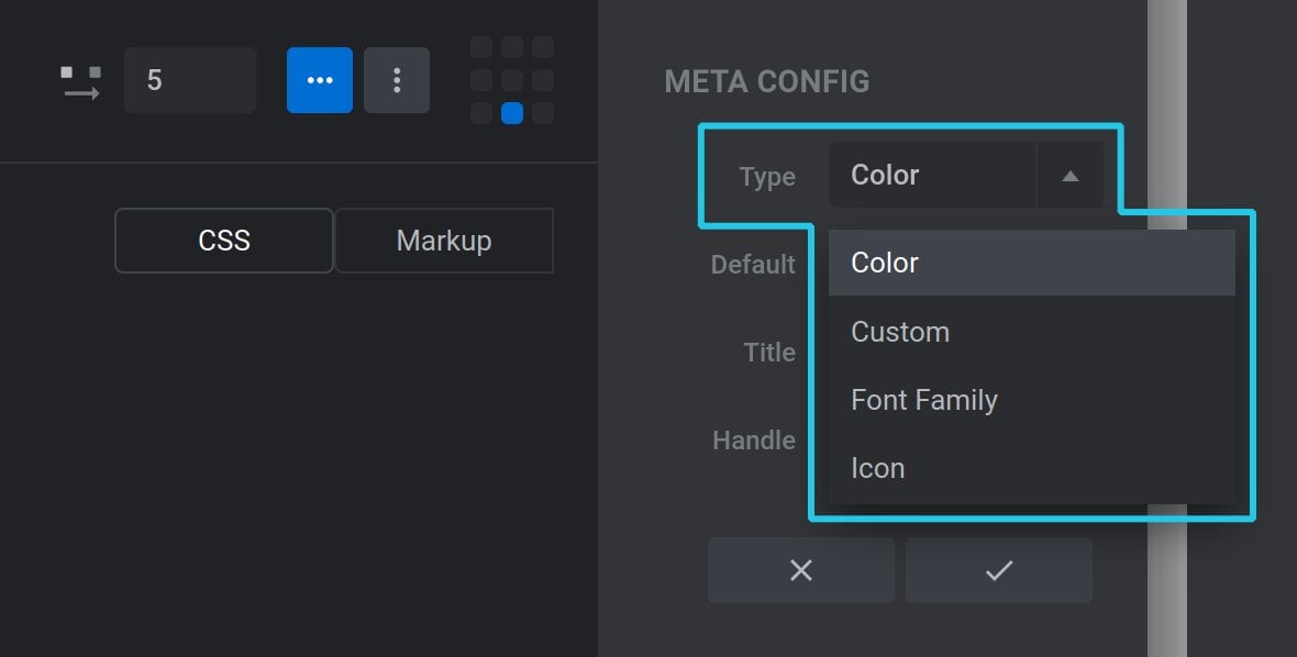
Those four types are: Color, Custom, Font Family and Icon.
Color
The Color type presents as a color picker field in the Navigation Style panel. It outputs a hexcode or rgba value in code.
Custom
The Custom type presents as a text field in the Navigation Style panel. It outputs the content of that text field verbatim in code.
Font Family
The Font Family type presents as a dropdown list of available fonts in the Navigation Style panel. It outputs a font name, or font stack, in code.
Icon
The Icon type presents in the Navigation Style panel as a text field into which a custom value can be added or, if the three dots at the end of the field are clicked, a small popup window with a range of icons to choose from. In code it outputs a string, representing a glyph from a font icon pack, for example \e81e.
Default
Use the Default option to provide the default setting for each meta value:

Title
The Title field is required, and is used to give an easily readable name to the option:

The Title will appear in the META VALUES sidebar of the Navigation Editor. It will also be the label for its corresponding option in the Navigation Style panel.
Handle
The Handle field is required, and is used to create the handle snippet that gets inserted into code:

The field accepts only lower case letters, numbers, and hyphens.
Delete Meta
To delete a meta value, hover over it in the right sidebar and click its trashcan icon:
Saving Your Work
To save your work click the blue Save Navigation button at the bottom right of the editor:
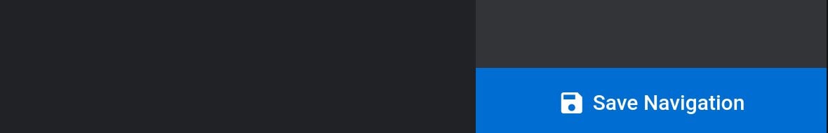
Note: If you attempt to exit the editor while the are unsaved changes you’ll get a prompt to stay in the editor so you can save then exit again.