
Slider Revolution Modules as Modals
Learn how to make any module pop up in a modal, aka lightbox, format.
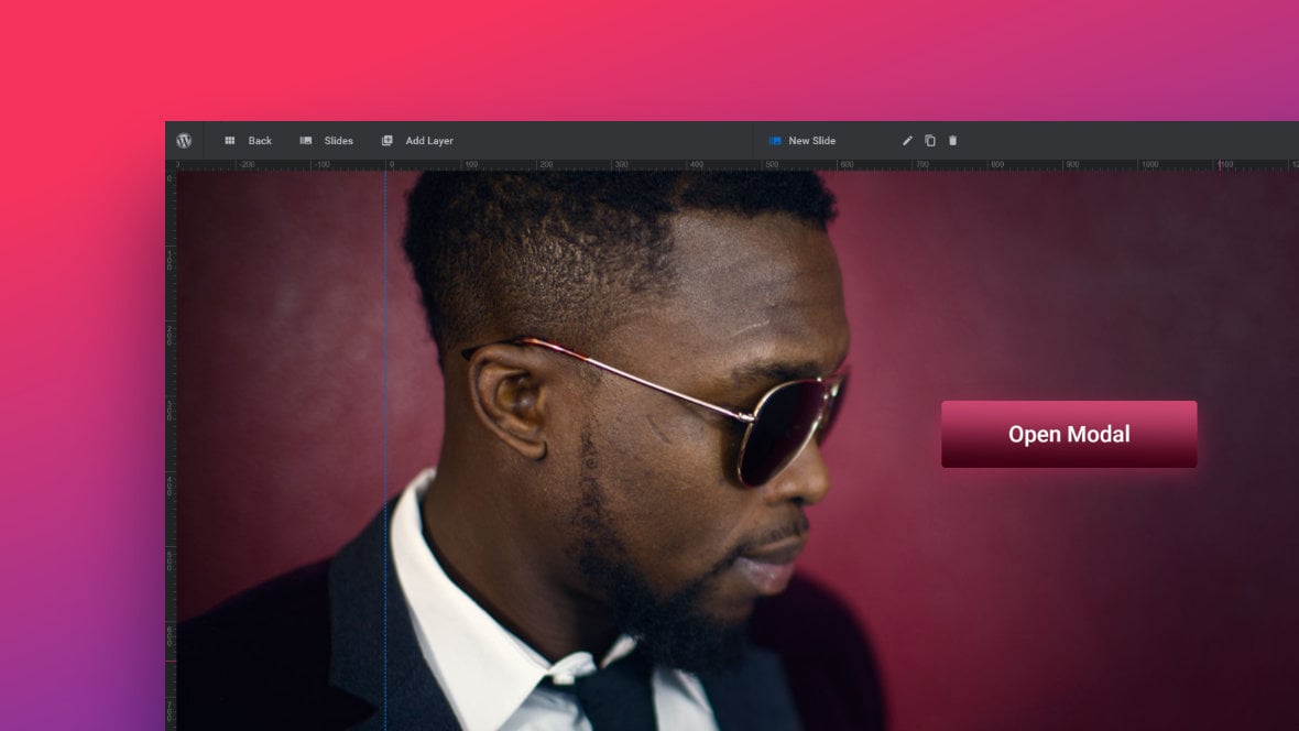
Table of Contents
Slider Revolution Modal Functionality
Slider Revolution [?]
Slider Revolution is a website content creation tool with a focus on captivating animation and stunning visual effects.
It began its life as a plugin for creating slideshows, but has evolved into a fully fledged piece of design software. has in-built functionality that lets you use any module as a modal popup, aka lightbox.
There are just three steps to take advantage of this feature:
1) Configure how the module will look when opened as a modal popup.
2) Add a button to close the modal popup again after opening it.
3) Setup a button click, or other event, outside the modal that triggers it to open.
Let’s go through each of these three steps.
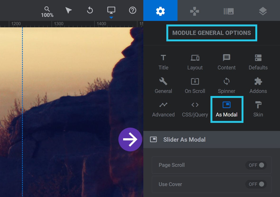
Configure Modal Appearance
There are a number of options available to configure the appearance and behaviour of the module when acting as a modal popup.
These can be found by going to the Module General Options tab, As Modal sub-section, Slider as Modal panel:
Page Scroll
Toggle the Page Scroll option to ON to allow page content to be scrolled even while the modal is open:

Use Cover
It is possible to have a colored background [?]
A "background" in Slider Revolution is a type of layer that is always present in every module, and is always visually behind all other layers.
A background can be transparent, a flat color, a gradient, an image, or a video. It can be animated in the same way as other layers can be, however it cannot be deleted., i.e. a “cover”, appear behind an open modal:
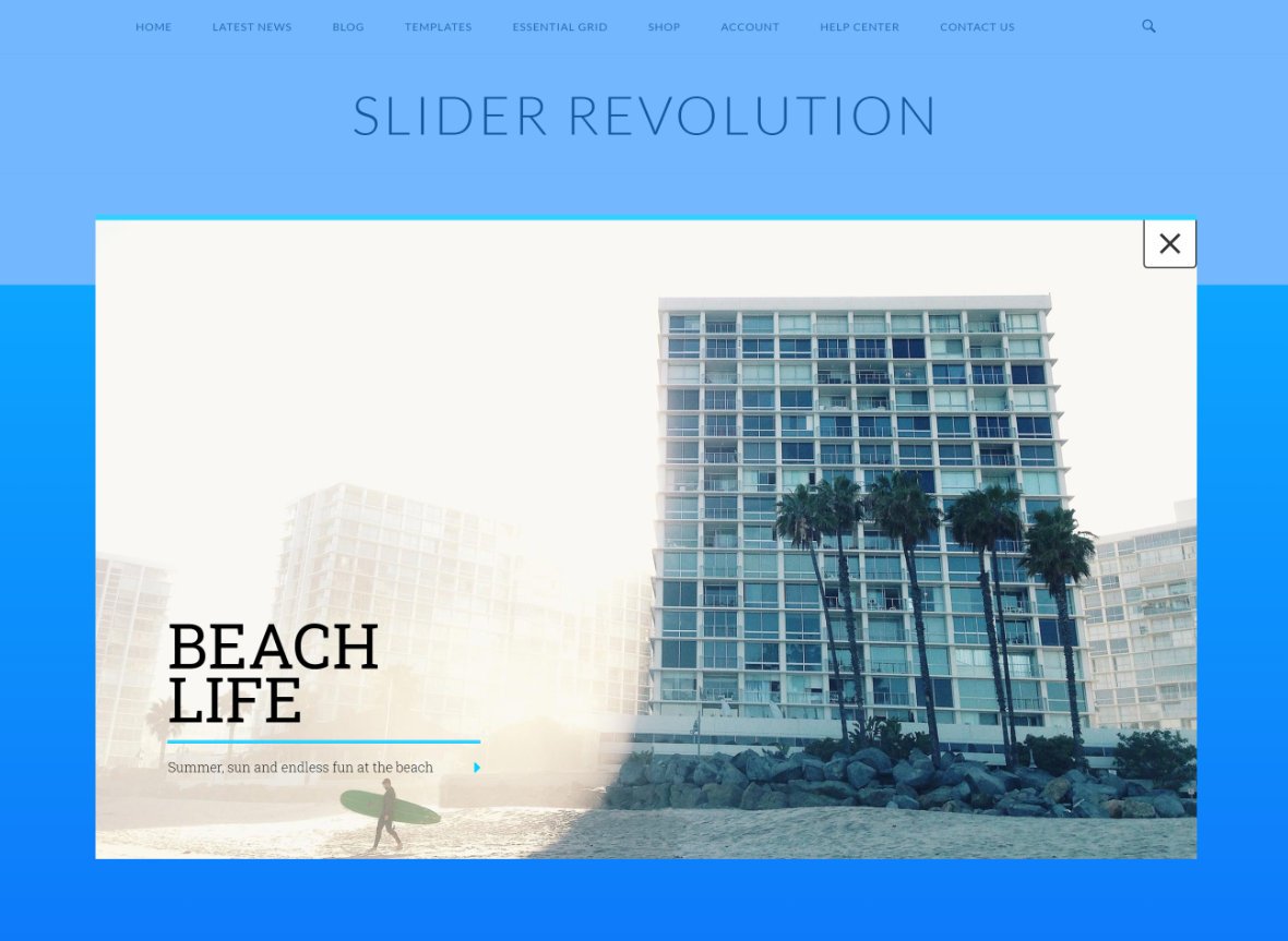
To activate this feature toggle Use Cover to ON:

Cover Color
If Use Cover is set to ON, the Cover Color option will appear below:

Use this option to set the color and transparency level your cover will have.
Note: For guidance with using the color selection tool, refer to Intermediate Editing – Selecting Colors.
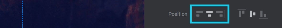
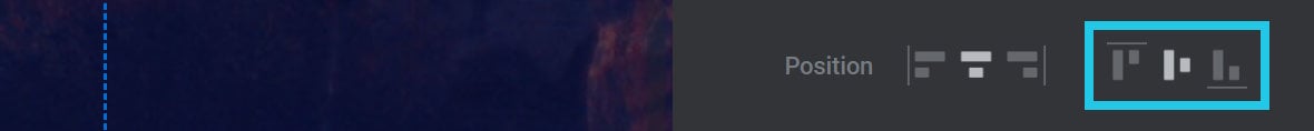
Position
The Position option allows you to set the modal’s horizontal and vertical alignment:
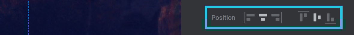
The first three icons allow you to choose between left, center and right horizontal alignment:
The last three icons allow you to choose between top, middle and bottom vertical alignment:
General Speed
The General Speed option allows you to set, in milliseconds(ms), how quickly the modal will disappear when closed:

Body Class
Use the Body Class option to set a custom class name that will be added to the page’s <body> element when the modal opens, and removed again when it closes:

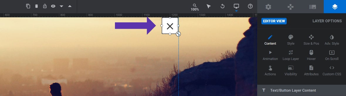
Add Close Button
Your modal popup will need a way to be closed again once opened. It is possible to close a modal by clicking anywhere outside it, but you should also add a “close” button to be sure there is a method that’s visible at a glance.
To create a close button, first add a Button layer [?]
Layers are containers for visual, audio or layout items and are added to slides. For example, text, button, image, audio, video, group and row are all types of layers.
Layers are added to slides via the module editor., give it a label such as an “X” icon, and align it to the top right corner of your module [?]
A module in Slider Revolution acts as a container for slides, which in turn act as containers for layers. Modules are created and edited with the module editor.
A "module" is a single, self contained piece of content. You can think of this as being similar to the way a post or page in regular WordPress is a self contained piece of content.
A module can represent any kind of content Slider Revolution is capable of creating, such as a slider, carousel, hero unit, navigation menu, posts display and so on.
Multiple modules can be combined to form rich content such as complete sites and landing pages.:
Note: For guidance on adding button layers, refer to Intermediate Editing – Text, Buttons & Shadows.
Next, add an action to the button to make it close the modal. To do this, with the button selected go to the Layer Options tab, Actions sub-section:
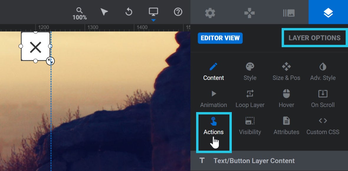
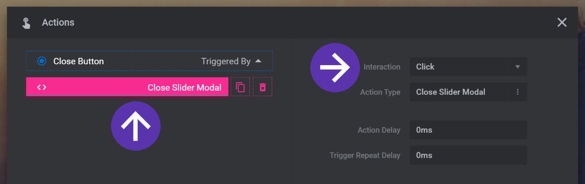
In the Actions window that appears, locate the Slide Actions section, and in that select the Close Slider Modal action:
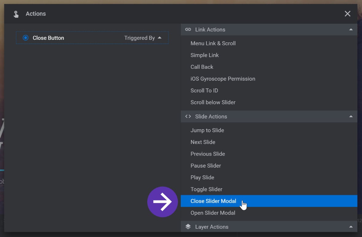
You will see that this adds the Close Slider Modal action to the button, and that it will be triggered by click interaction:
Note: If your module contains multiple slides [?]
A "slide" in Slider Revolution is a container into which multiple layers can be added, with layers in turn acting as containers for various forms of media such as images, text, video, audio, buttons, and special effects.
Slides are added to modules and edited via the module editor.
Within the module editor, each slide has its own animation timeline, background and collection of layers.
A single module can have one or many slides. A module with one slide is called a scene, and a module with multiple slides is called a slider or carousel., you will need to copy and paste your close button layer onto each slide. Alternatively, copy and paste your close button layer onto a Global Layer [?]
A global layer is a special type of layer that appears on every slide of a module. You can have as many as you like in a module, and they are useful for adding items you always want to display, such as a logo, social media link or contact phone number.
Global layers are added in their own section of the module editor, have their own timeline, and are assembled in much the same way as you would create a regular slide.
Global layers are grouped together and can either all appear in front of your other layers, or all behind your other layers. However, you cannot have some global layers appear in front and some behind..
Open Modal
Once your module is all set to be used as a modal popup, you need a way to trigger opening it. There are two primary ways to do this.
One way is to use a second module, and inside it create a button or link that opens the modal popup.
The other way is to embed the modal invisibly in a post or page, then use an HTML link to open it.
There are additional methods, which will be discussed later in the section on Modal Block Options, but for now we’ll focus on these two methods.
Open From a Second Module
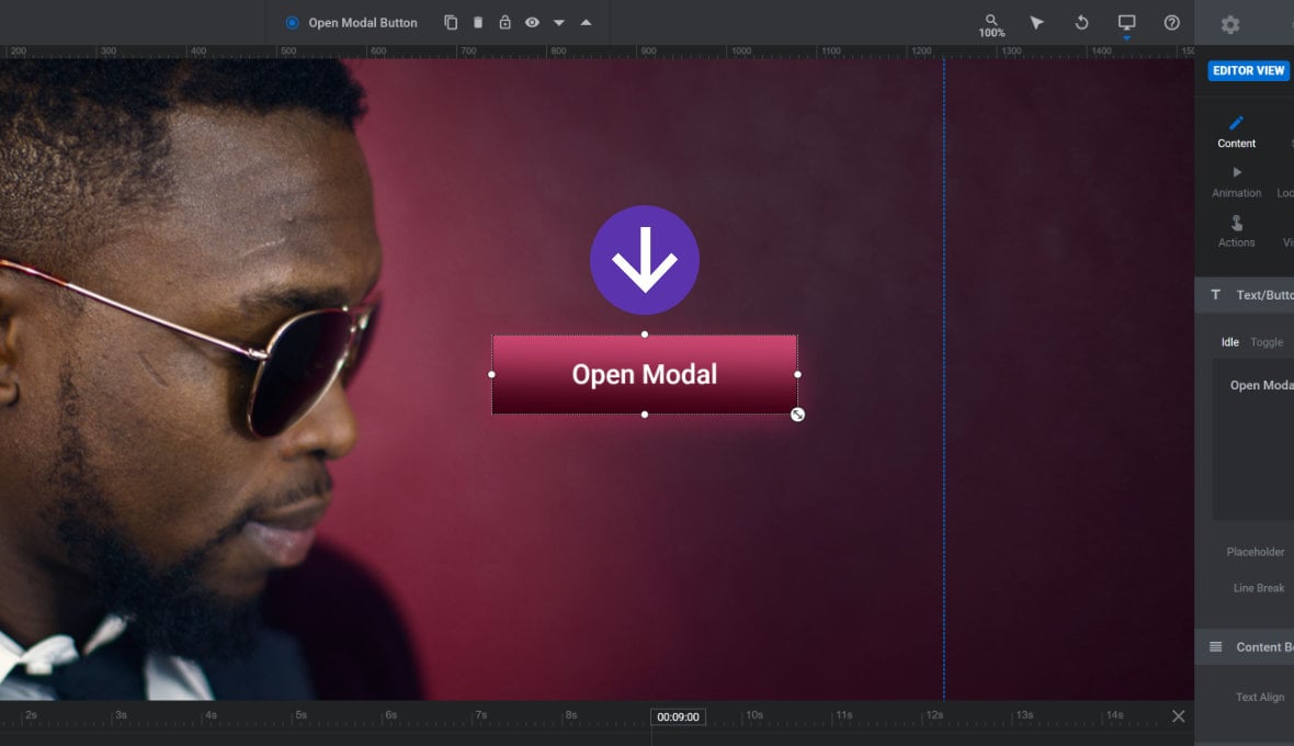
In a second module, add a Button layer:
Note: You can actually use any type of layer for this process that you want, it doesn’t necessarily have to be a button.
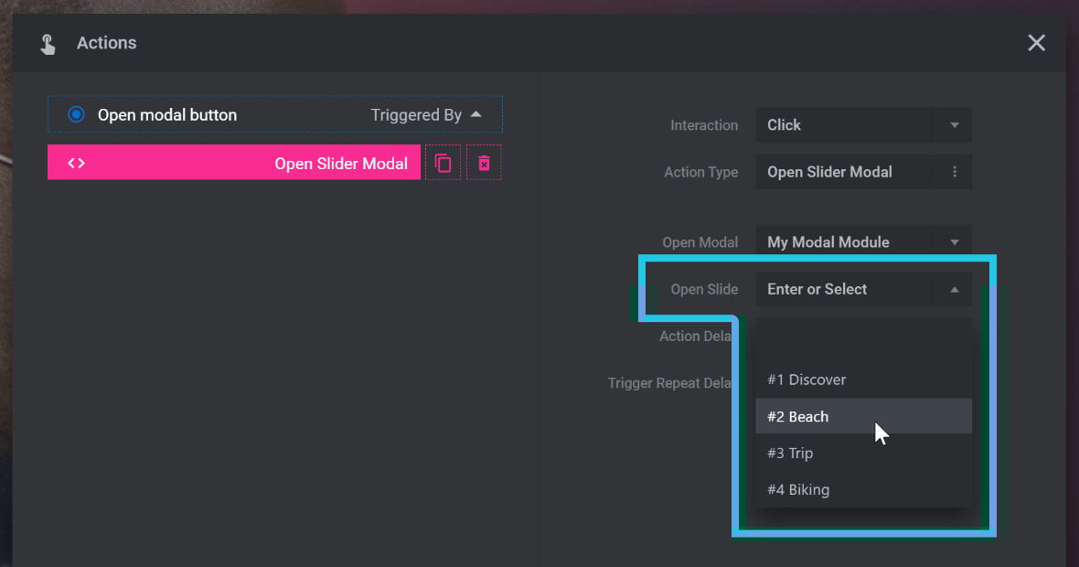
With the layer selected, open the Actions window, and in the Slide Actions section select the Open Slider Modal action:
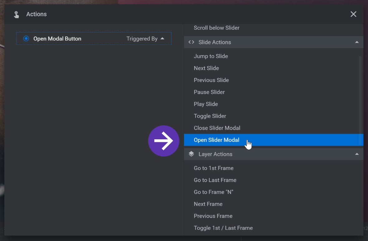
The Open Slider Modal action will be added to your button:
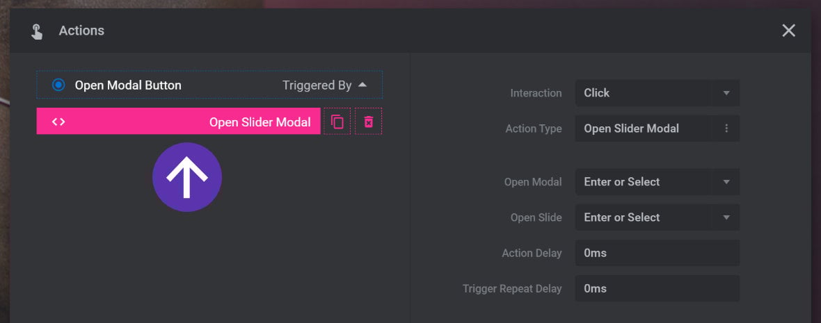
On the right side of the Actions window, expand the Open Modal option and select your modal module from the drop-down list. You can also type the name of your modal module into the blank field at the top of the drop-down list to find it directly:
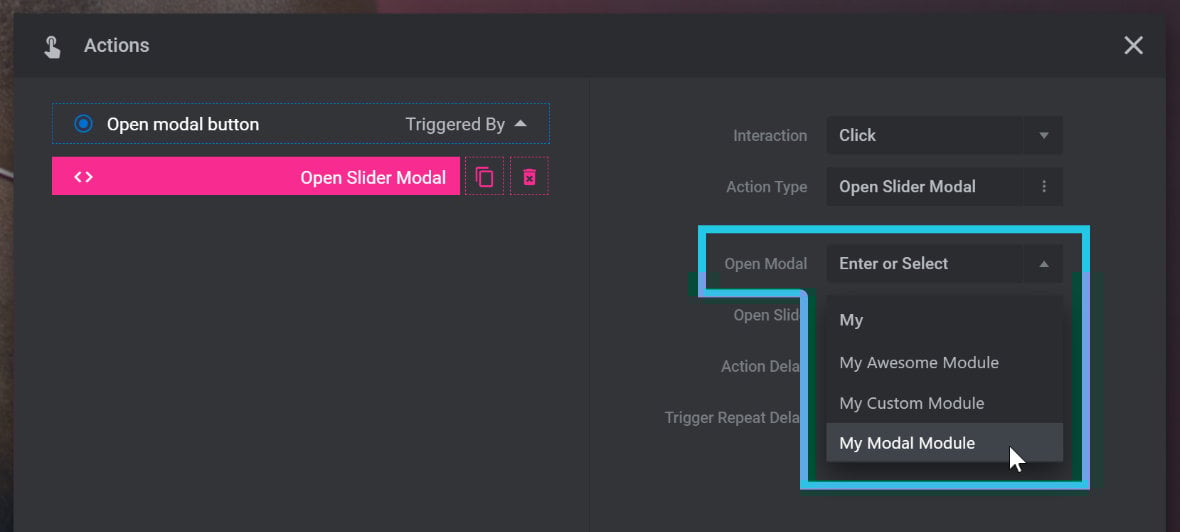
Once you’ve selected a module, you can also optionally use the Open Slide option to determine which slide the module should start on when opened:
That’s all the preparation you need to do in your second module. Next up, add that module into some WordPress content:
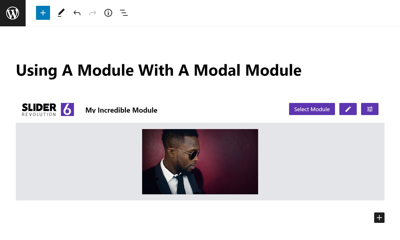
Now when you visit your content and click the button you added to your second module, your modal module will be fetched and displayed:
Open From an HTML Link
You can also open a modal directly from an HTML link, without needing to use a second module.
To do so, add a Slider Revolution block to your WordPress content in the usual way, and when the block gallery opens, locate the Use as Modal option at the top right and toggle it to ON:
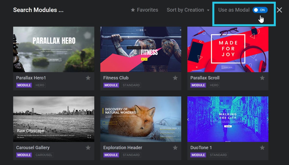
Now browse for the module you want to open as a modal, and select it.
At this point, if you preview your content you will not see the module you just added. It is ready to appear, but it won’t appear until specifically triggered.
The next step is to add an HTML link that will trigger the modal to show.
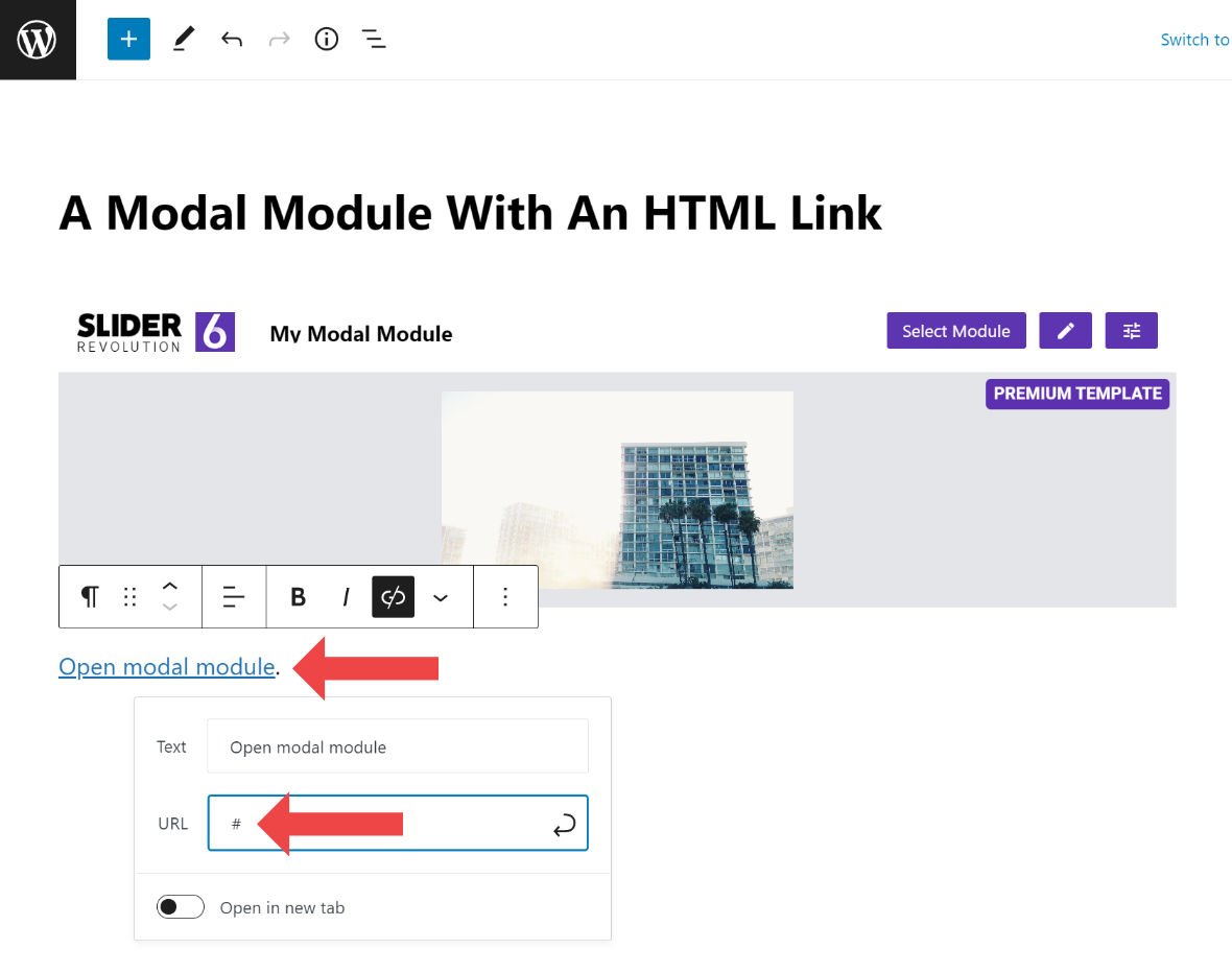
Start by adding some text of your choosing, add a link to that text, and then for the link type a single # into the URL field:
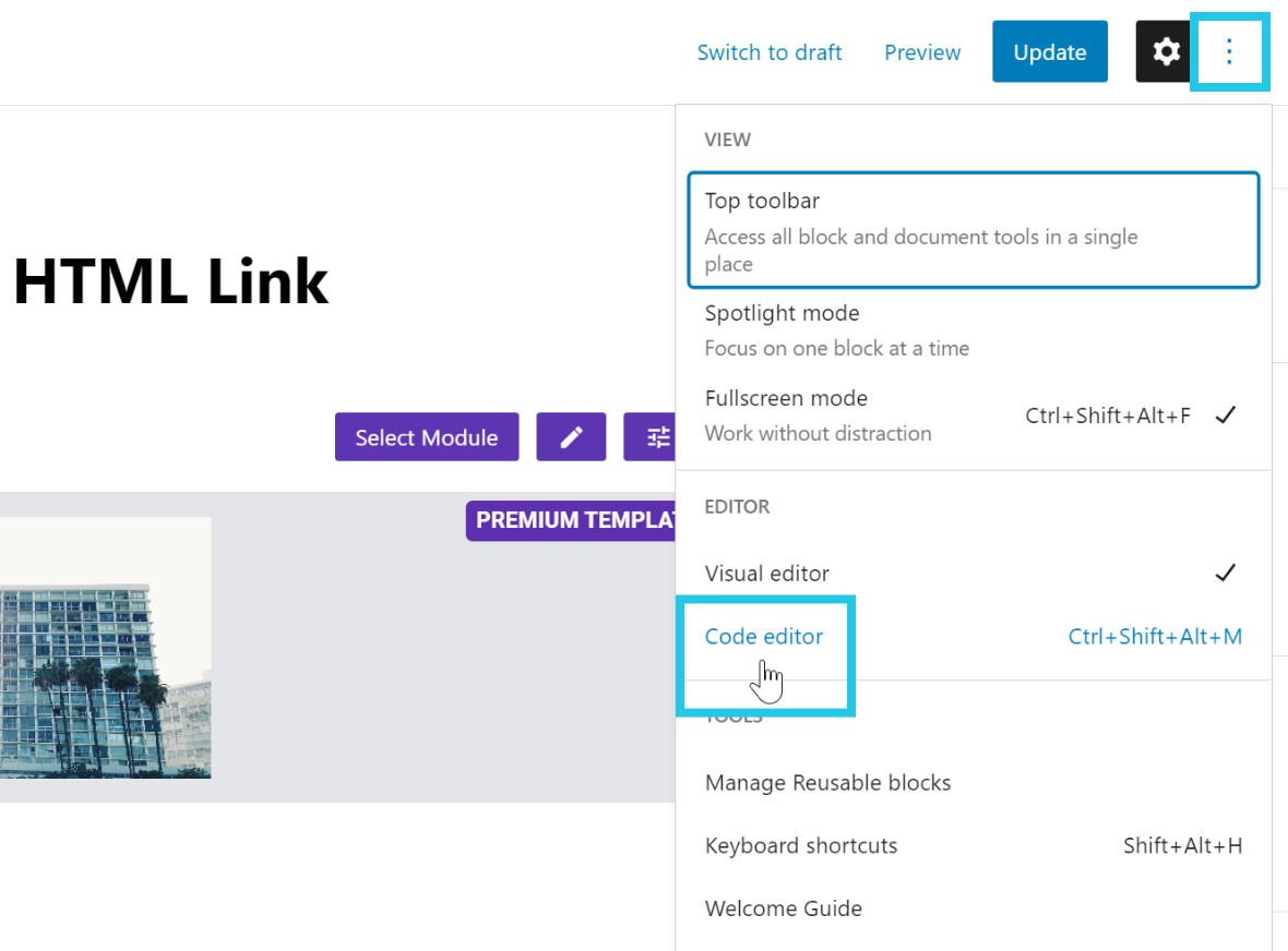
Now switch into the WordPress code editor by clicking the three dots at the top right corner, then in the menu that appears click the Code editor item:
Locate the text link you just added, which should look something like this:
<!-- wp:paragraph -->
<p><a href="#">Open modal module</a>.</p>
<!-- /wp:paragraph -->
After the "#" add a space then paste in this text:
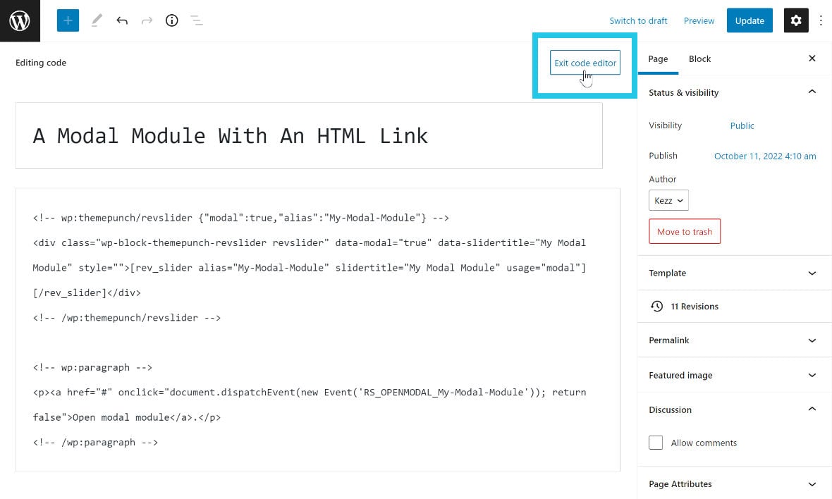
onclick="document.dispatchEvent(new Event('RS_OPENMODAL_slider-alias-here')); return false"Now replace the portion of that text that reads slider-alias-here with the alias of the module you want to open. For example, if your module’s alias was My-Modal-Module your entire link code would end up looking like:
<a href="#" onclick="document.dispatchEvent(new Event('RS_OPENMODAL_My-Modal-Module')); return false">Open Modal</a>Note: If you need help finding your module’s alias check out our Custom Module Setup guide.
Click Exit Code Editor at the top right of the editing space:
Save and view your content, and now when you click the link you just created you should see your modal popup appear.
Modal Block Settings
When you add a Slider Revolution block as a modal, it will include a collection of options specific to modal functionality.
You can access these by clicking the options button at the right end of the block:
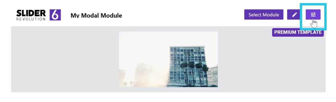
The options will appear in a settings window:
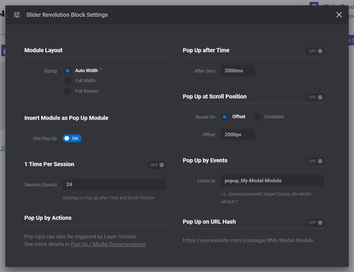
Let’s see what each of these modal related options control:
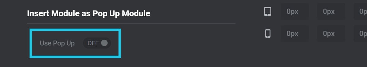
Use Pop Up
If you no longer want to use the module in modal form, toggle the Use Pop Up option to OFF and the module will revert to being embedded in the regular fashion:
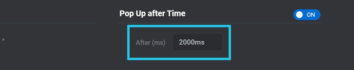
Pop Up After Time
Rather than directly opening a modal via the methods described above, you can also configure your modal to automatically open after a period of time.
To activate this feature toggle the Pop Up After Time option to ON:
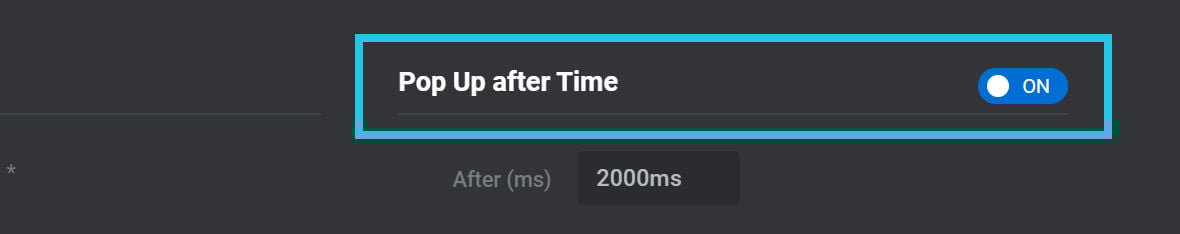
After (ms)
If using the Pop Up After Time feature, you should also set the amount of time that should pass before the modal popup appears.
Enter your preferred time, in milliseconds(ms), into the After (ms) field:
Pop Up at Scroll Position
An additional way to automatically open a modal is to trigger it by page scrolling. To use this feature, toggle Pop Up at Scroll Position to ON:
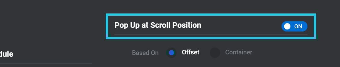
Based On
The Based On option determines the specify way scrolling will trigger the modal to open. There are two possible settings: Offset and Container:

Set the option to Offset if you’d like the modal to open upon scrolling a certain distance from the top of the page.
Set the option to Container if you’d instead like the modal to open when scrolling reaches a certain “container”, i.e. section of content on the page.
Offset
If you set Based On to Offset, an additional Offset field will appear below:
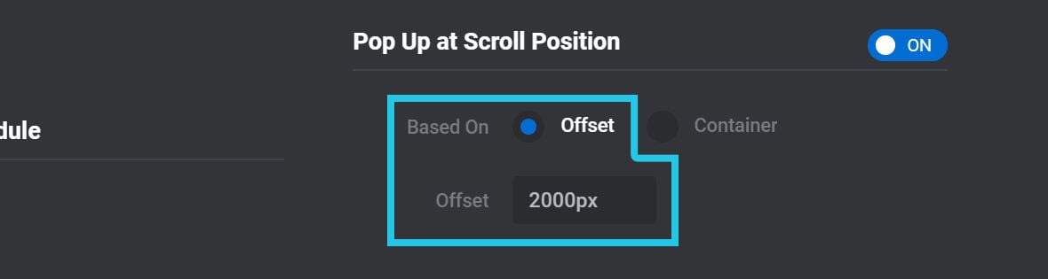
In that field, enter the distance the page should be scrolled from the top, in pixels(px), before the modal is opened.
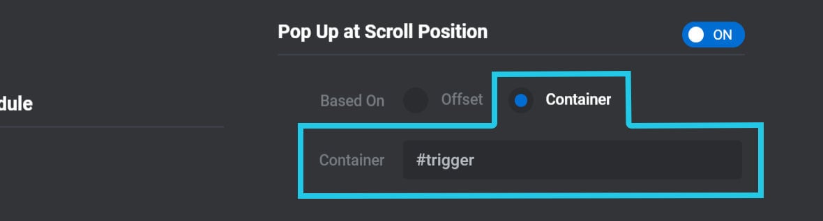
Container
If you set Based On to Container, an additional Container field will appear below.
In that field, enter the ID of the container that should trigger the modal once it scrolls into view. For example, if the ID of the triggering container was trigger, you would enter #trigger into the Container field:
Pop Up by Events
It’s also possible to use JavaScript events to trigger a modal popup, and to define a custom event name of your choosing.
To use this feature, toggle the Pop Up by Events option to ON:
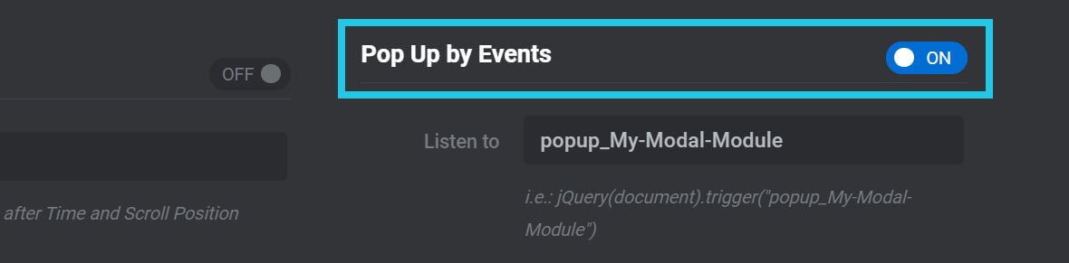
Listen to
In the Listen to field you can define the name of the custom event that will trigger the modal.
For example, you could set the Listen to option to my_custom_event:
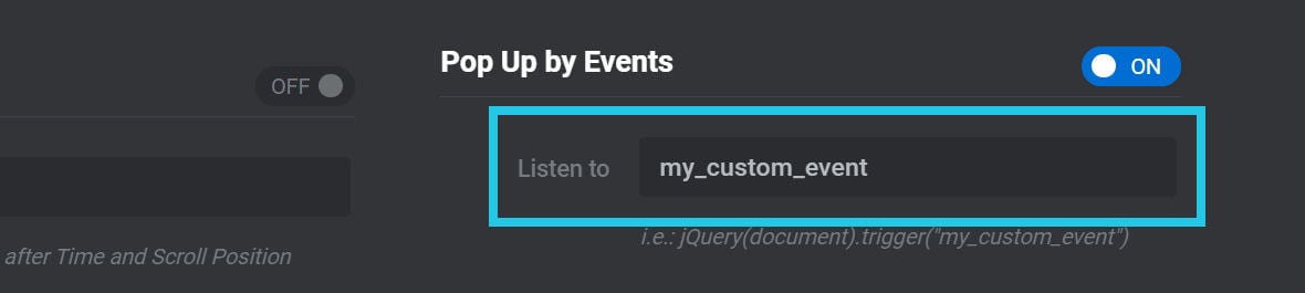
You could then trigger the modal with:
document.dispatchEvent(new Event('my_custom_event'));Or:
jQuery(document).trigger('my_custom_event');Pop Up on URL Hash
If the Pop Up on URL Hash option is toggled to ON, the modal popup can be triggered by adding a hash and the module’s alias to the end of the page URL:
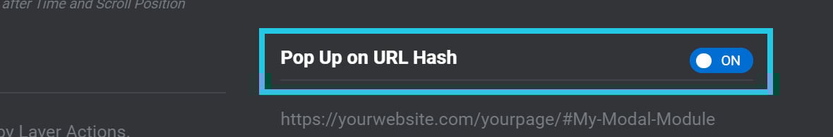
For example, if the alias was:
my-modal-module
…and the page URL was:
https://yourwebsite.com/yourpage/
…you could trigger the modal with the URL:
https://yourwebsite.com/yourpage/#my-modal-module
1 Time Per Session
If you are automatically triggering a modal with scrolling or time, you may want to ensure a user is only shown the popup once per session.
If so, toggle the 1 Time Per Session option to ON:
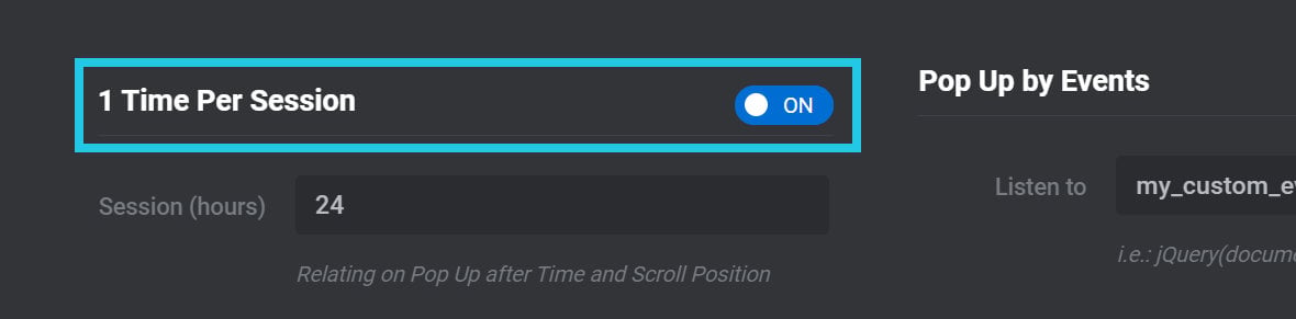
Session (hours)
If limiting a modal to appearing once per session, use the Session (hours) option to define the length of a session:
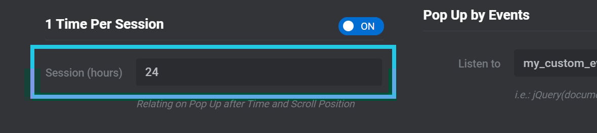
By default a session is defined as lasting 24 hours.