
Standard Background, Spacing and Border Styling Options
In this guide, learn about the standard styling options available in multiple layer types.
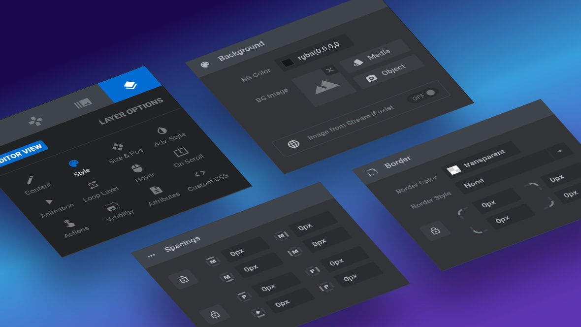
Table of Contents
Introduction
In almost every layer [?]
Layers are containers for visual, audio or layout items and are added to slides. For example, text, button, image, audio, video, group and row are all types of layers.
Layers are added to slides via the module editor. type’s Style sub-section you’ll find standard options for controlling background, spacing and border styling.
In this guide we’ll go through how to use all those options, then you’ll be equipped to put them into action on any of the layer types we’re about to cover within this current section of the manual.
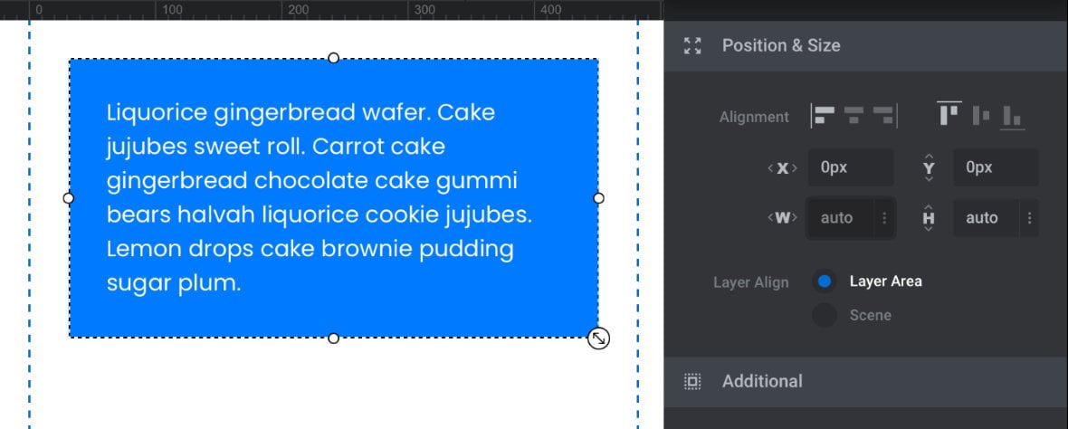
Note: Whenever styling options are used they apply relative to the layer’s container rectangle, at whatever size the rectangle may be, as configured in its width and height options.
Background Styling Options
Note: The backgrounds being described here are those of each individual layer, as opposed to the special Background [?]
A "background" in Slider Revolution is a type of layer that is always present in every module, and is always visually behind all other layers.
A background can be transparent, a flat color, a gradient, an image, or a video. It can be animated in the same way as other layers can be, however it cannot be deleted. layer type found on every slide [?]
A "slide" in Slider Revolution is a container into which multiple layers can be added, with layers in turn acting as containers for various forms of media such as images, text, video, audio, buttons, and special effects.
Slides are added to modules and edited via the module editor.
Within the module editor, each slide has its own animation timeline, background and collection of layers.
A single module can have one or many slides. A module with one slide is called a scene, and a module with multiple slides is called a slider or carousel..
The options for styling layer backgrounds are found in either the first or second panel of the layer Style sub-section:
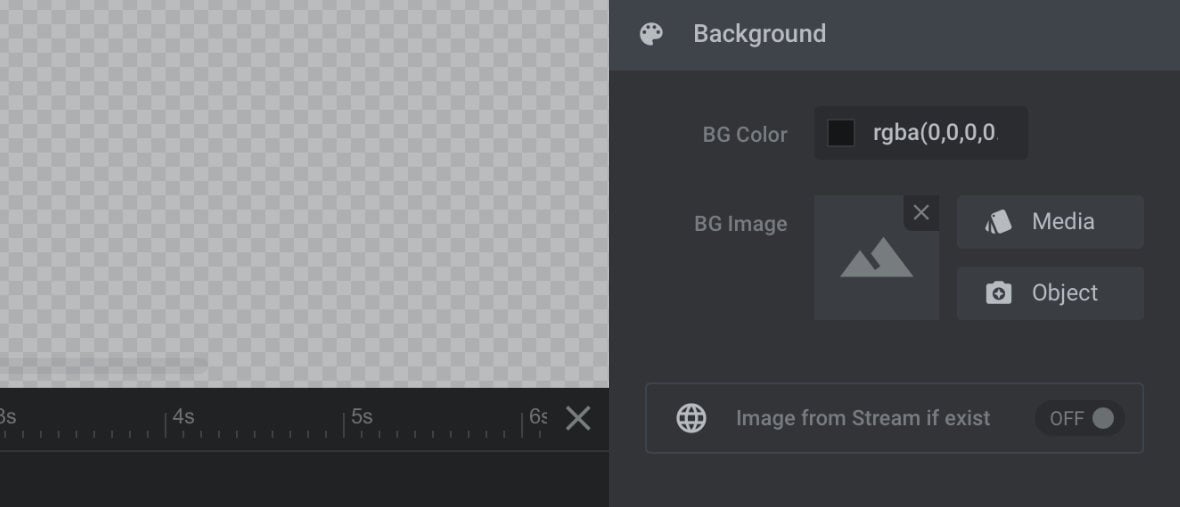
Background styling options give you the opportunity to fill a layer’s container rectangle with either color or an image.
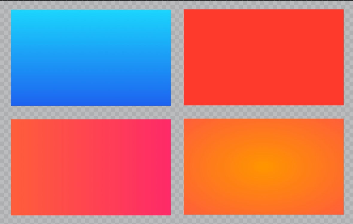
BG Color
BG Color, short for background color, is transparent by default.
However if you instead select a color, that color will fill up the area of the layer’s container rectangle, behind any layer content such as text:
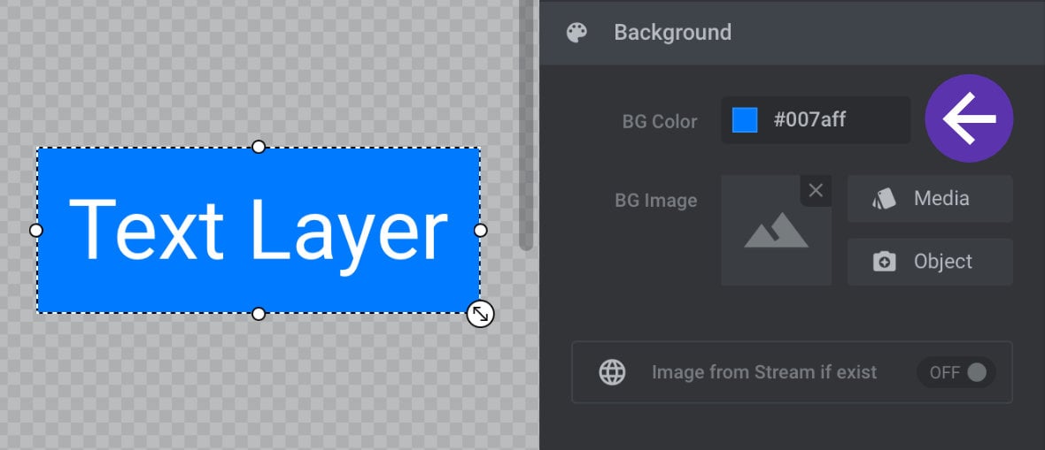
You can use either flat colors or gradients for backgrounds:
BG Image
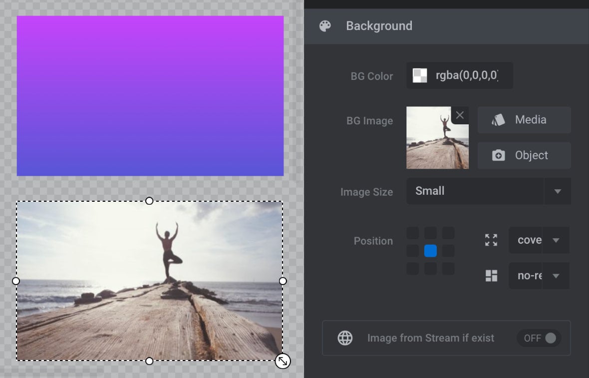
Instead of a background color, you also have the option to use a background image.
You can select an image to use in the background in the same way you would any image in Slider Revolution – by choosing an image of your own from the Media Library or one from the included Object Library:
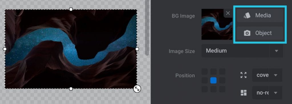
Once selected, the image will fill up the background of the layer’s container rectangle.
Image from Stream if Exist
Rather than manually selecting a background image, this setting allows you to dynamically pull in an image from a stream you have already setup in the module [?]
A module in Slider Revolution acts as a container for slides, which in turn act as containers for layers. Modules are created and edited with the module editor.
A "module" is a single, self contained piece of content. You can think of this as being similar to the way a post or page in regular WordPress is a self contained piece of content.
A module can represent any kind of content Slider Revolution is capable of creating, such as a slider, carousel, hero unit, navigation menu, posts display and so on.
Multiple modules can be combined to form rich content such as complete sites and landing pages., such as a stream of Twitter posts or Flickr photos.
Note: We’ll be stepping through how to set up streams later in the manual.
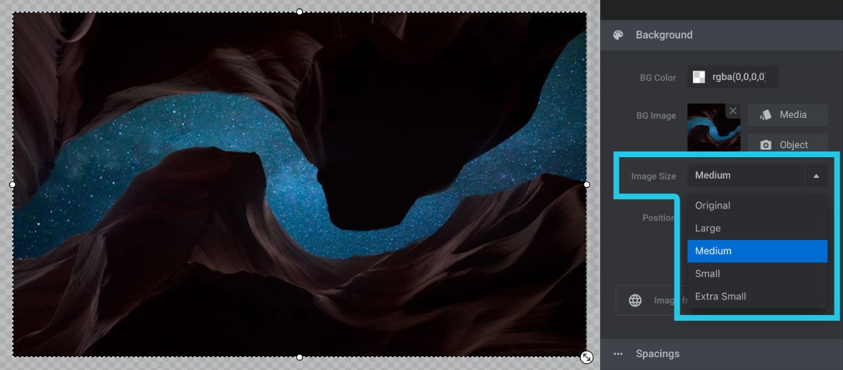
Image Size
When you add a background image to a layer its dimensions will automatically be adjusted to match the layer dimensions. However, this automated adjustment only changes the size at which the image appears, it doesn’t modify the dimensions of the actual image file. This means the image file could potentially either be much larger or smaller than its display size on the canvas.
If an image file is much larger than its display size that means it has a higher file size than necessary, and hence will load slower that it needs to. And if an image file is much smaller than its display size it might appear blurry.
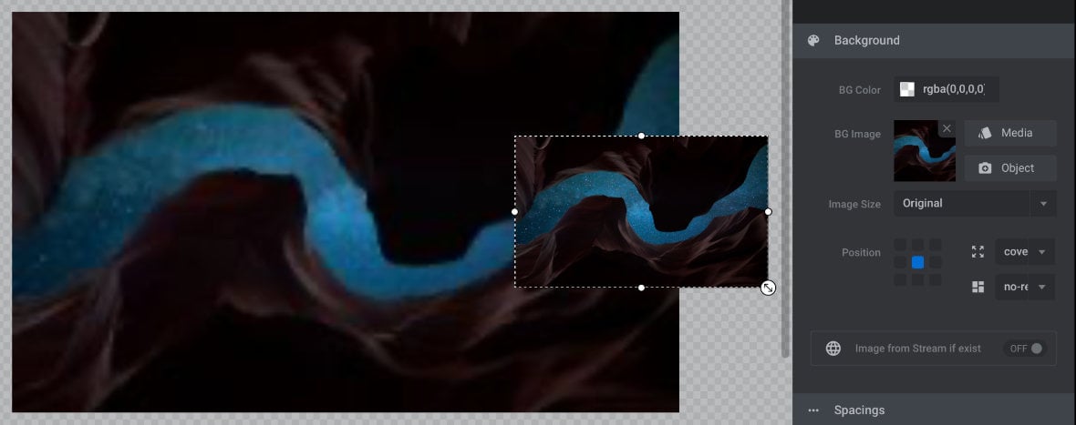
For that reason, after adding a background image you should choose a Screen Size option that matches the display size you’ll be using for it as closely as possible. This way you will get a balance of load speed and image quality.
View each Screen Size setting from smallest to largest, then choose the smallest one that doesn’t cause any visible artefacts or blurring at the display size you’re using on the canvas:
If you change the display size later, you can come back and choose a different Screen Size option any time.
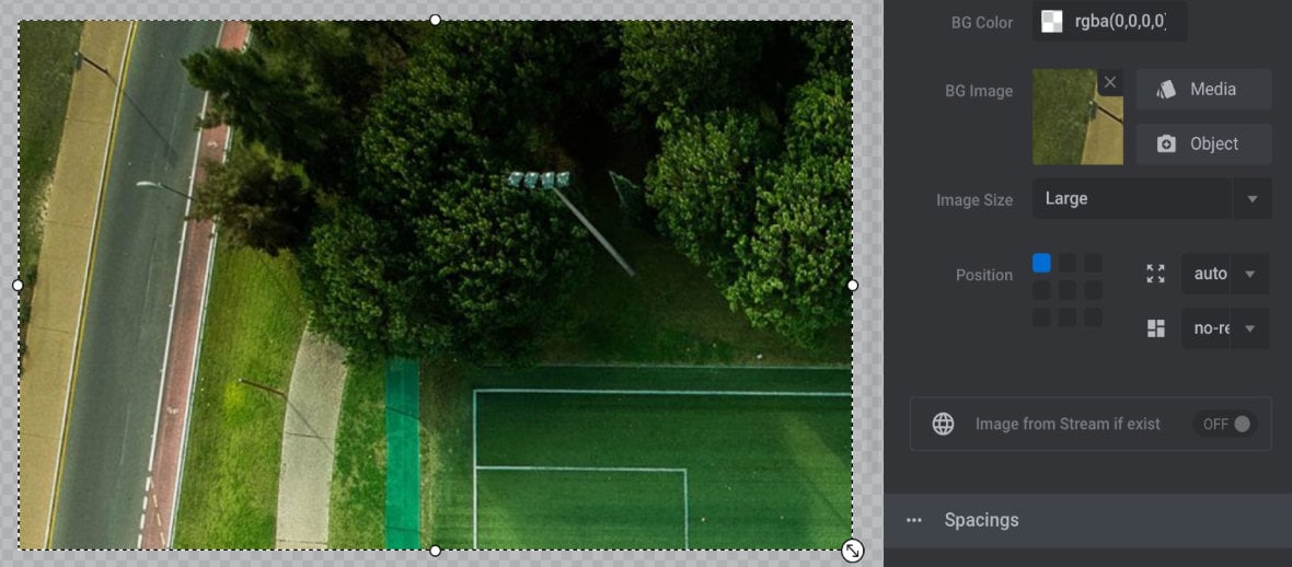
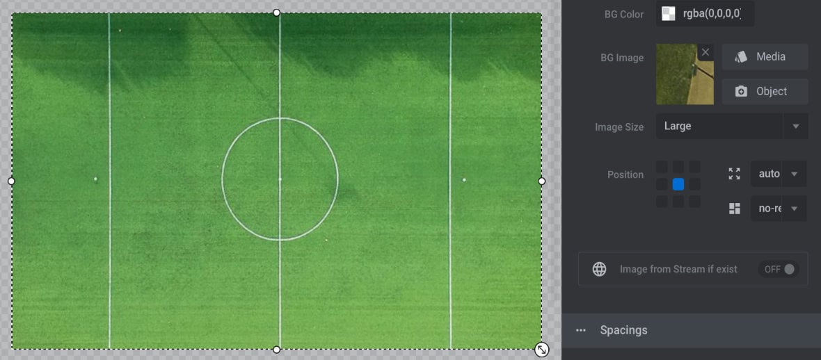
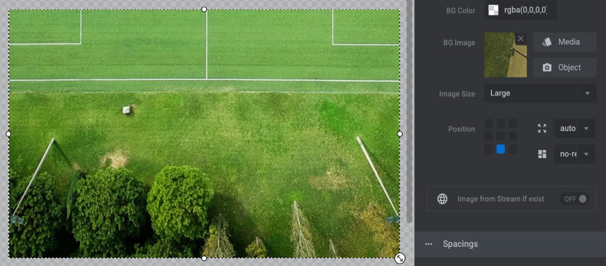
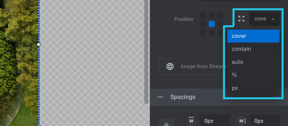
Position
The Position option allows you to set how the background image will be aligned within its container, and is represented by a 3 x 3 grid corresponding with the corners, edges and center of the layer:
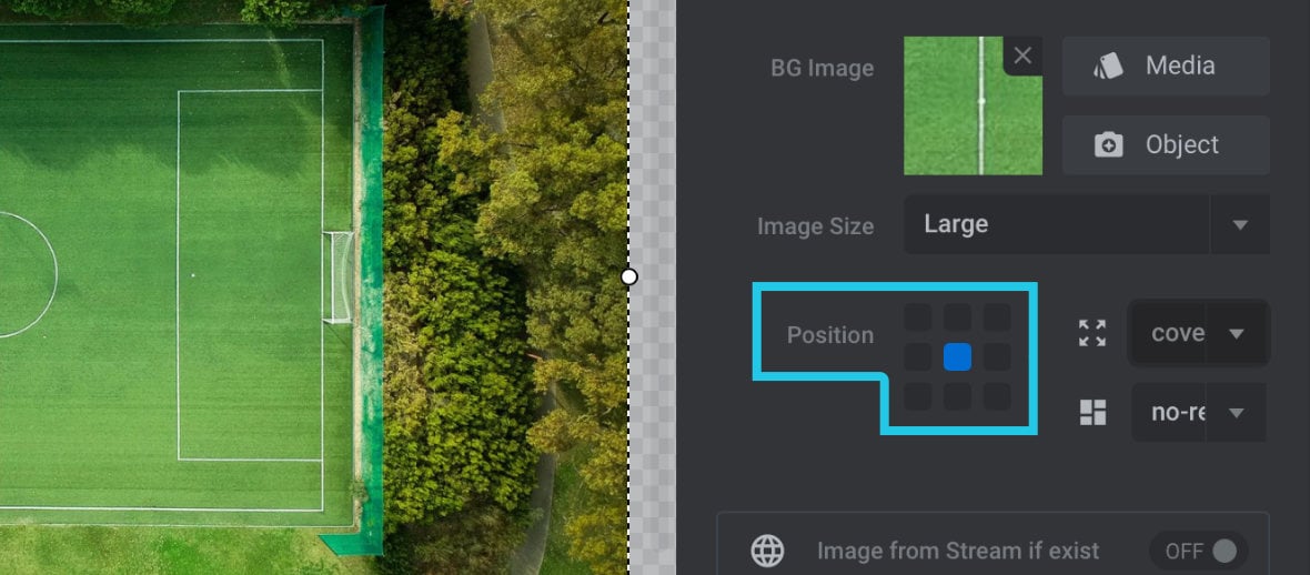
Click on any of the 9 points in the grid to set the alignment. For example, to pin the image to the top left corner, click the top left grid point:
To center align on both axis click the middle point:
To align to the middle bottom, click the middle bottom point:
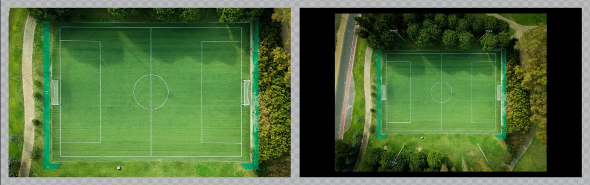
BG Image Fit
The BG Image Fit option controls how the image sizes itself within the layer:
There are five available settings.
cover
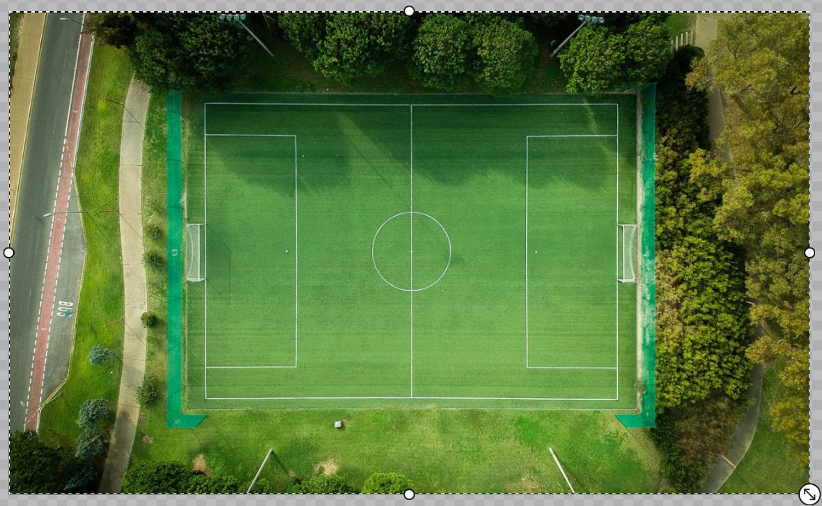
When you chose the cover setting the background image will always fill up the layer, even if a bit of the sides gets trimmed off in order to make that happen.
contain
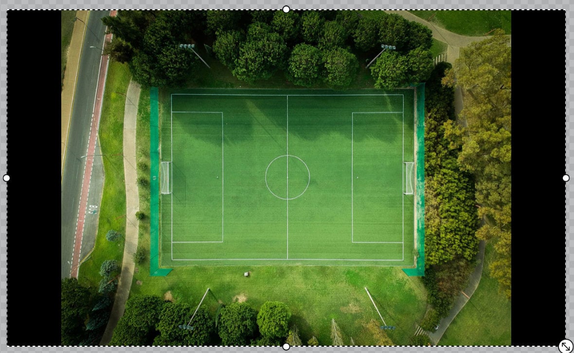
With the contain setting the priority is containing the image inside the layer. The image will be scaled up as large as it can go without trimming off any edges.
auto
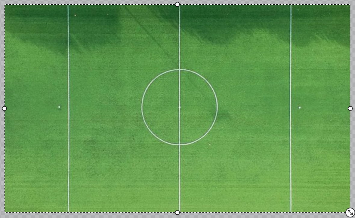
There will be no image resizing when the auto setting is used, the image will just be displayed at its actual size. If you use this setting be sure to choose your Image Size option carefully, because that will be the only means of controlling the display size of the image.
% (percentage)
The % (percentage) setting allows to to set your background image’s width as a percentage of the layer’s width.
When this setting is selected a new % field will appear below, into which you can add your desired percentage value:
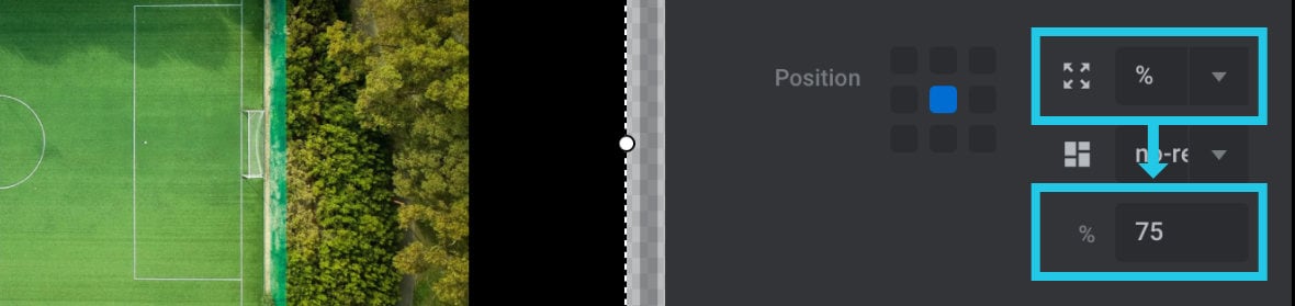
If the value is set as 100% the image will always be the same width as the layer, however you can also set a value higher than 100% to make the image wider, or less than 100% to make it narrower:
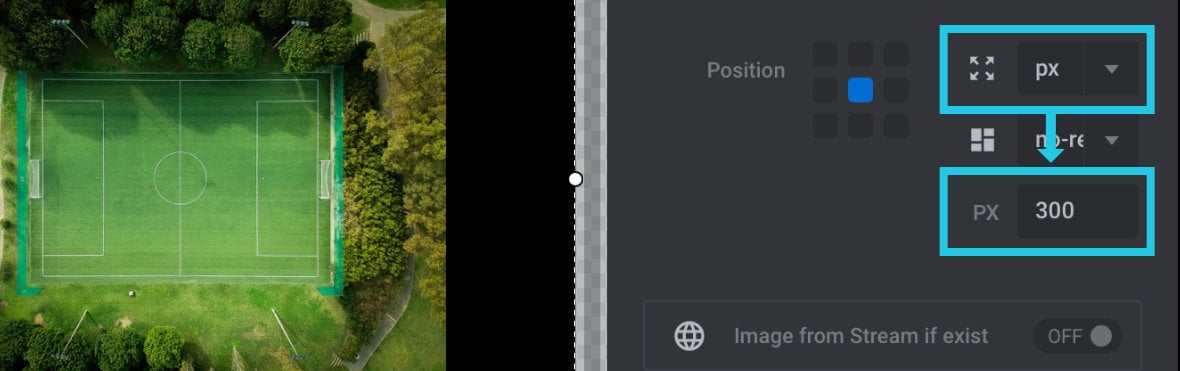
px (pixels)
The px setting allows you to set a fixed pixel width to your background layer. Similarly to the percentage option, if you choose this option a new field will appear into which you can add your desired pixel width:
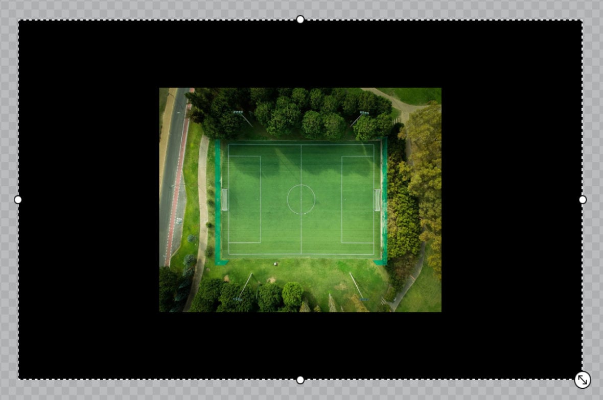
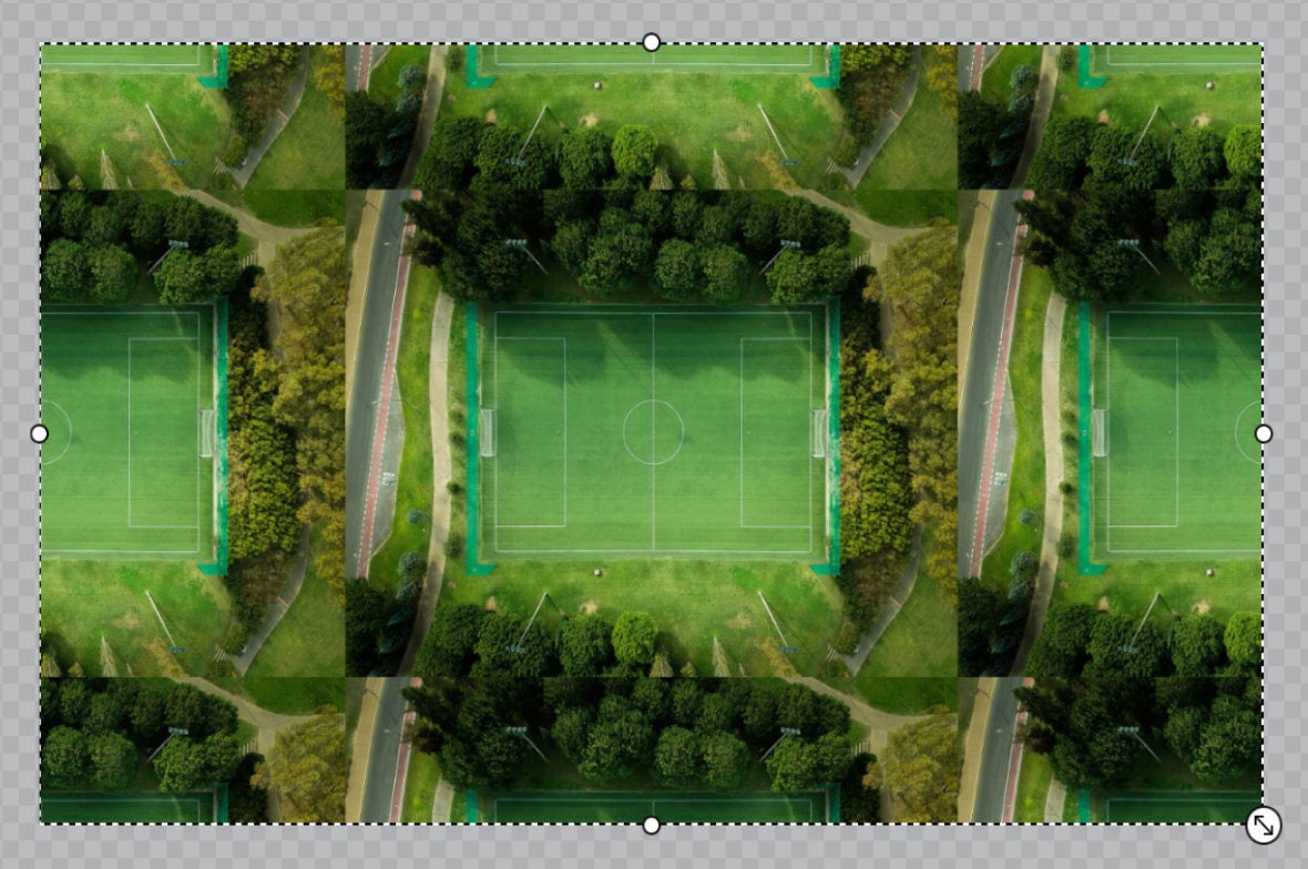
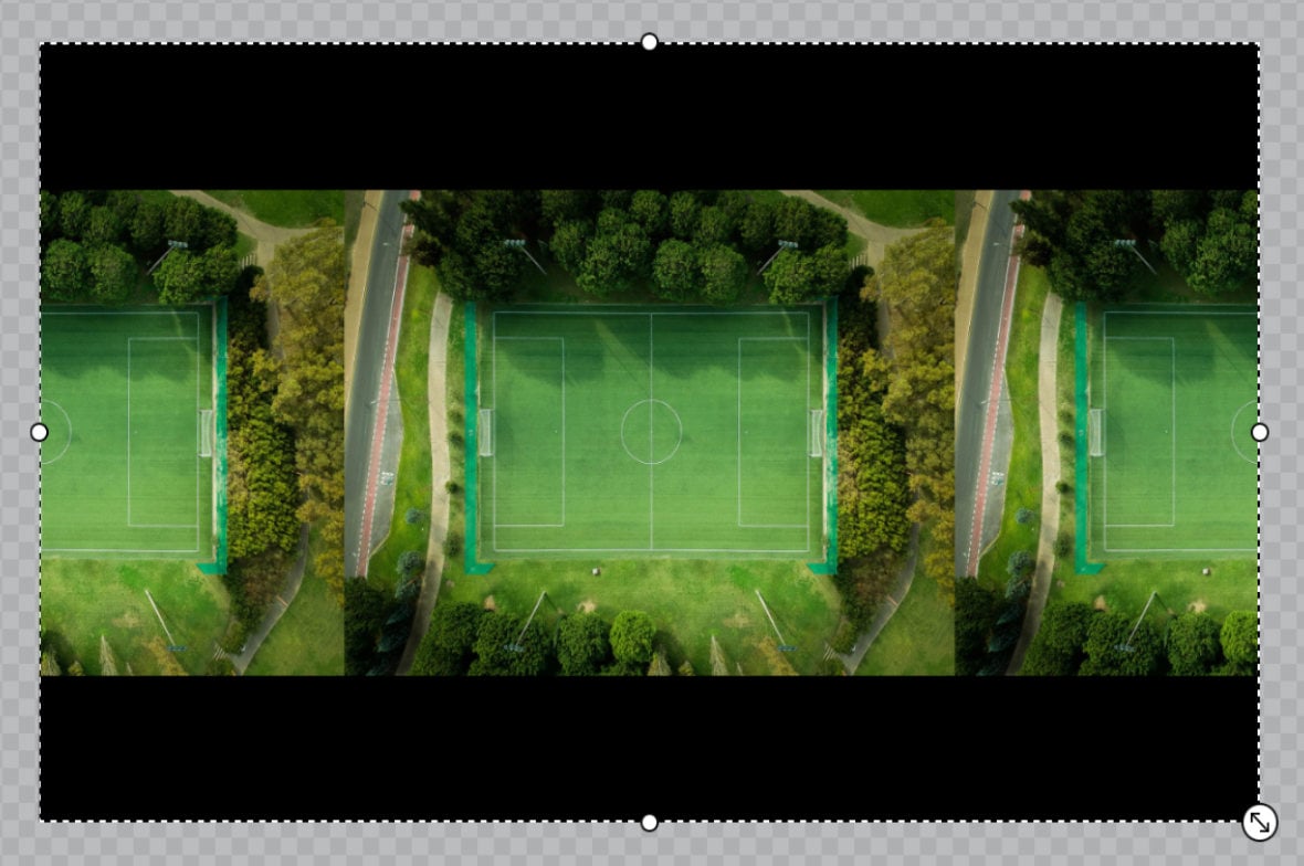
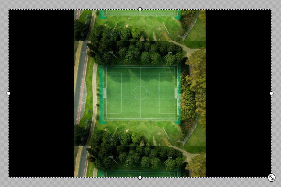
BG Image Repeat
The BG Image Repeat option allows you to determine whether your image should tile along the horizontal and vertical axes. There are four settings to choose from.
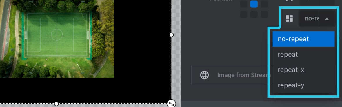
no-repeat
Background image doesn’t repeat in either direction:
repeat
Background image repeats in both directions:
repeat-x
Background image repeats horizontally:
repeat-y
Background image repeats vertically:
Stream Size
The Stream Size option performs the same function as the Image Size option, but applies to images loaded from streams.
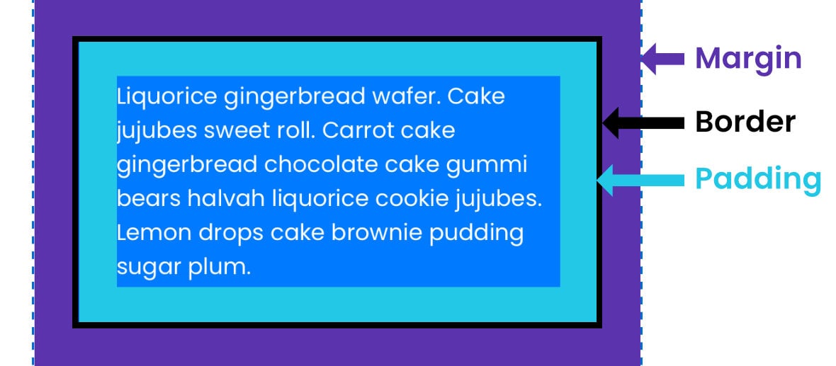
Spacings
When you create a layer, initially there is no built in spacing either outside or inside its container rectangle. However, it is possible to add such spacing, referred to as margins and padding, in order to create breathing room around content.
Before we get into how to set margins and padding, let’s learn what each one is and the reason to use them.
What are Margins?
Margins create space around the outside of a layer’s container rectangle.
You can think of margins as a way to offset a layer’s position from other items outside itself, such as the boundaries of a slide, or other layers contained in the same layout column. (We’ll be covering using layout columns soon).
For example, if a layer has a left margin of 30px, it will be offset by 30px from the left boundary of the slide. This means even if it’s x position is 0, it will look like its x position is 30px:
This is particularly helpful in smaller layouts to make sure layers aren’t crammed up against the narrower boundaries.
It’s also useful in layout columns to keep layers from crowding one another.
What is Padding?
Padding creates space around the inside of a layer’s container rectangle.
You can think of padding as a way to offset a layer’s content from its own container’s edges, such as adding space around text to enhance readability.
For example, if a text layer is set to have 30px of padding on all four sides, there will be a 30px gap between the text and the layer’s container rectangle (all the way around):
Setting Margin and Padding
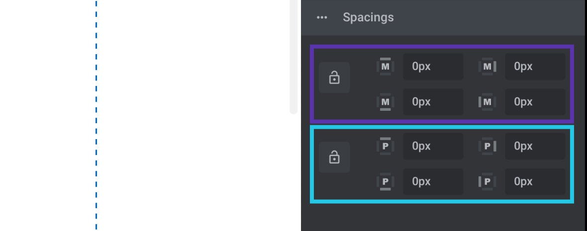
In the Spacings panel you will find the options for both margins and padding.
Each has four fields representing the layer’s top, right, bottom and left edges.
The fields in the top half marked with a capital M control margins, and the fields in the bottom half marked with a capital P control padding:
You will also notice that the label for each field is surrounded by four grey bars, with one of those bars being lighter than the others:
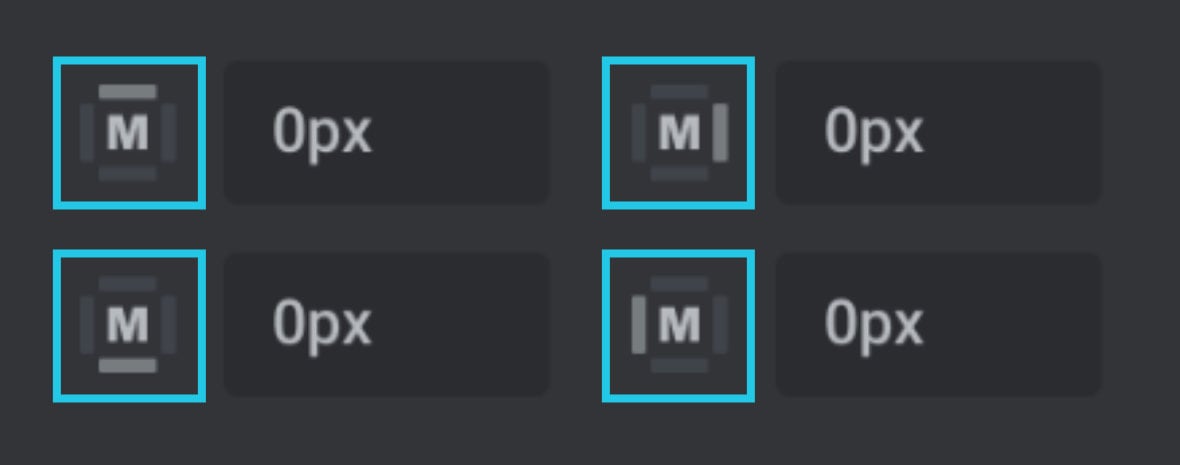
The side on which the bar is light represents the side of the layer that field will effect.
Set All Sides at Once
By default, if you change a spacing field value only one side at a time will be effected. However, if you want to have uniform spacing on all sides you can click the lock icon to the left of either the margin or padding fields:
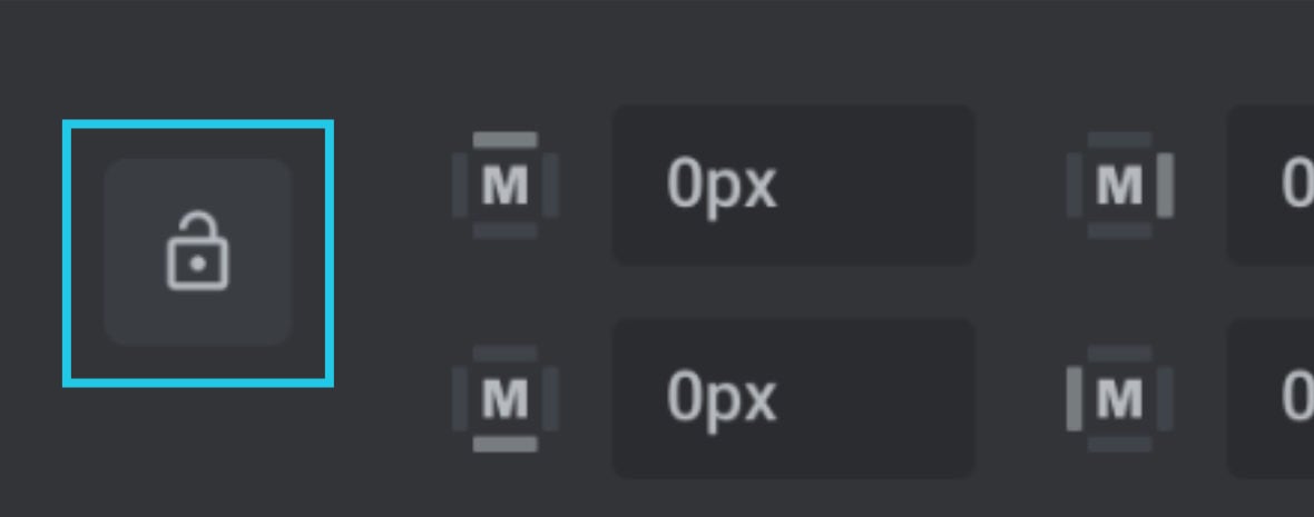
With this lock active, when you change one margin or padding field, its accompanying three other fields will update to the same value as well.
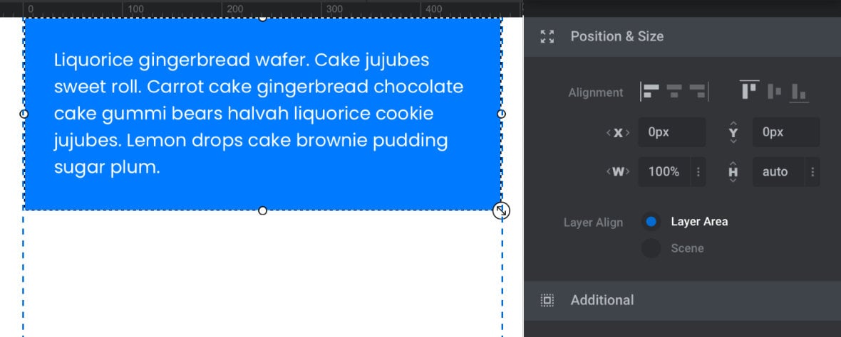
Tip: Auto Height and Width
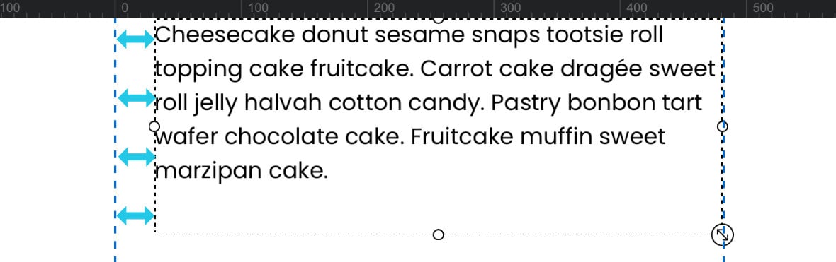
In many cases you will get the most value out of using margin and padding if you have your layer’s width and or height set to auto.
For example, this text box has a fixed height of 160px and 30px of padding, but you can’t see the bottom padding taking effect:
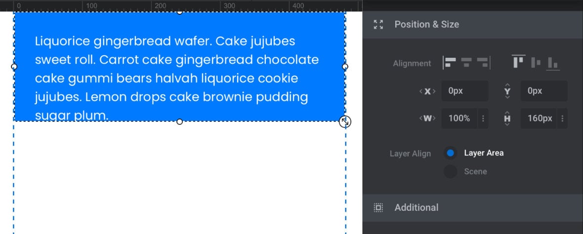
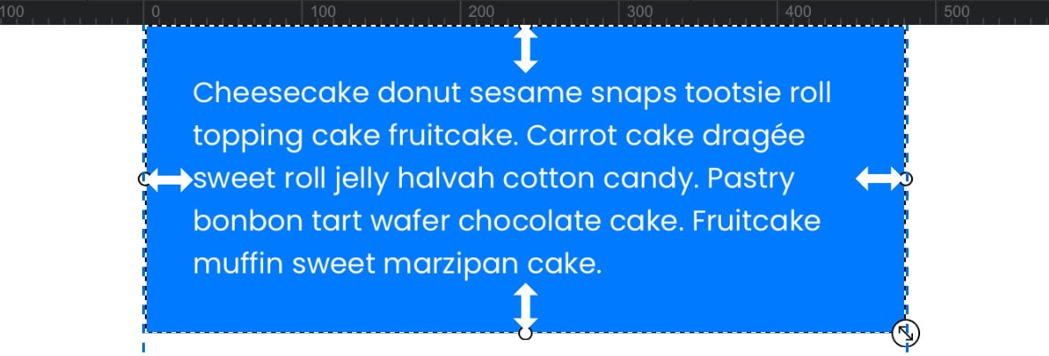
If the height is changed to auto the layer can adjust to fit both the text content inside and the specified padding amount:
In this example the text layer has a fixed width of 100% and a margin of 30px, but it isn’t being offset from the right boundary of the slide:
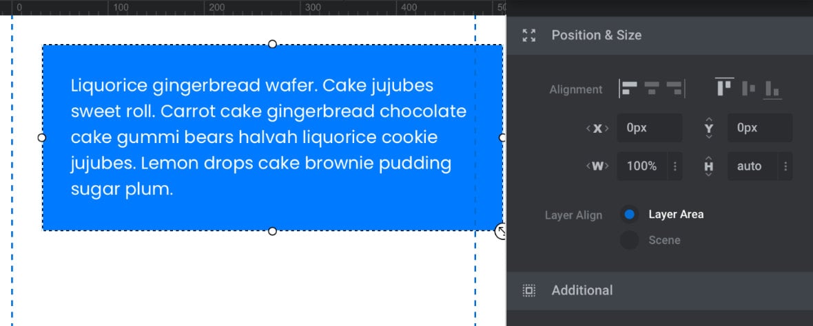
When the width is changed to auto the box can be dynamically resized to account for the margin:
Border Styling Options
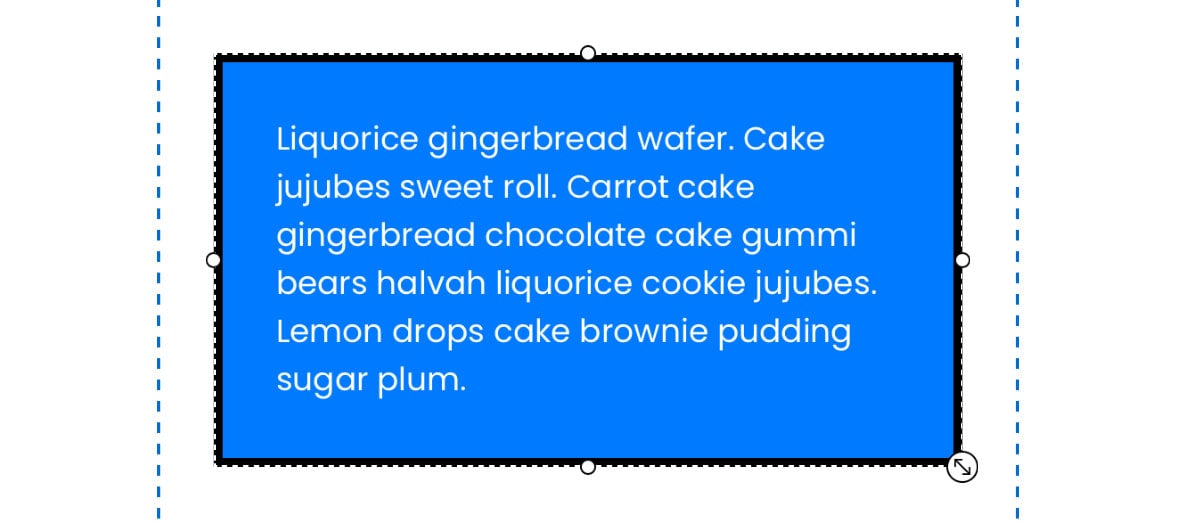
The last styling option we’ll be taking a look at is adding borders around a layer’s edges.
Note: Borders sit on the edge of a layer’s container rectangle, outside any padding spacing and inside any margin spacing.
Border Color
Border Color allows you to select the color you would like your border to be.
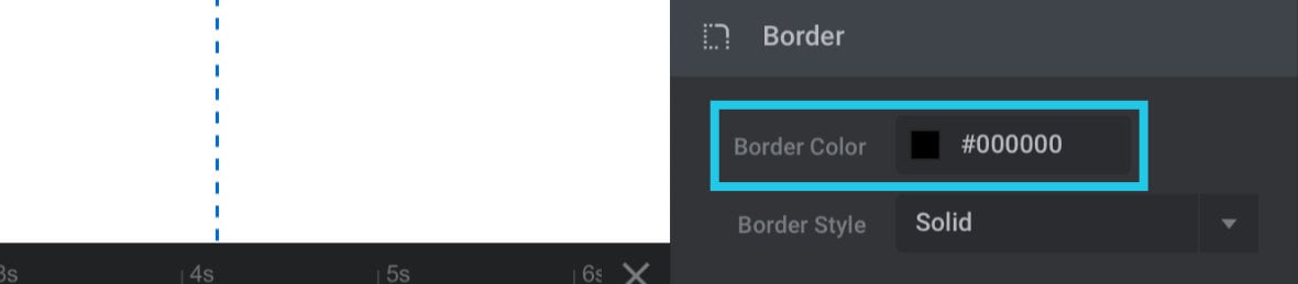
Note: You won’t see your selected color until Border Style and Border Size options are changed, as detailed below.
Border Style
The Border Style option determines whether or not a border should be shown, and if so, what its style will be.
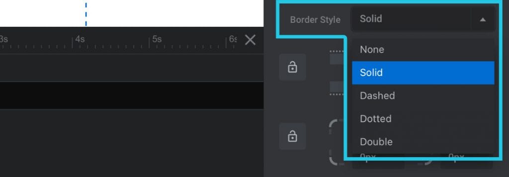
There are five available settings:
None
Don’t show any border at all.
Solid
Shows a border as a single solid line.
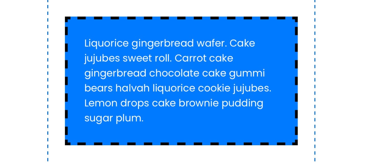
Dashed
Shows a border as a single dashed line.
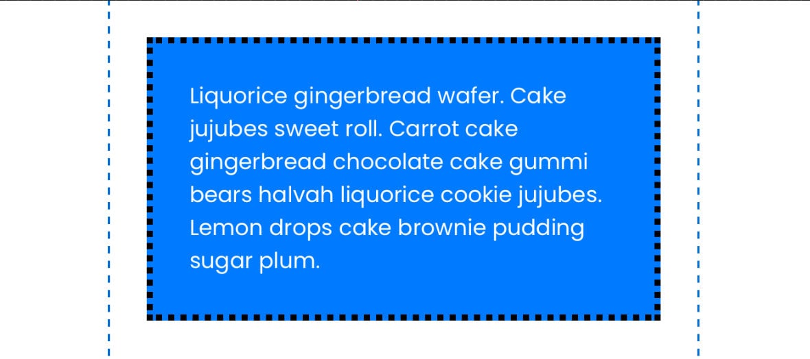
Dotted
Shows a border as a single dotted line.
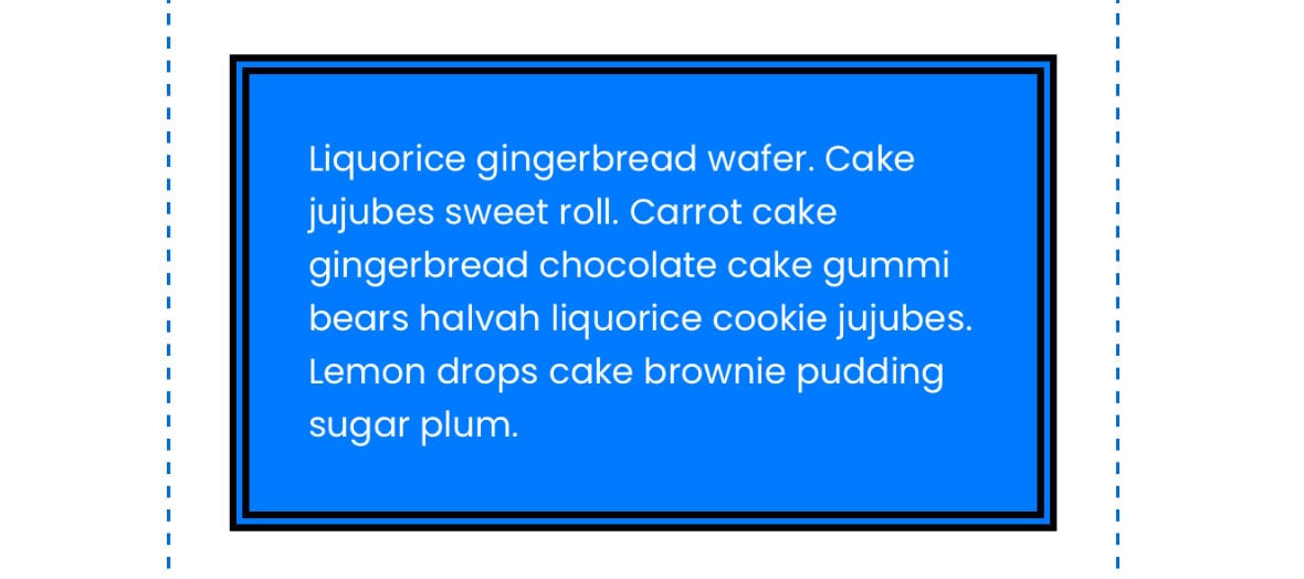
Double
Shows a border as two solid lines.
Border Size
Once you select any Border Style setting other than None, the Border Size options appear:
As we saw above with margin and padding options, there are four fields here representing each of the four sides of the layer, and the side of the label with the lighter dotted line tells you which side the setting effects:
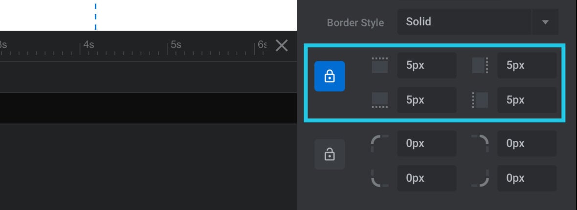
Again, you can toggle on the lock button to set all four sides at once.
Note: Until you have a value off at least 1px on one side, your border will not be visible.
Border Radius
By default borders have sharp corners, however it is possible to round them off using the Border Radius option.
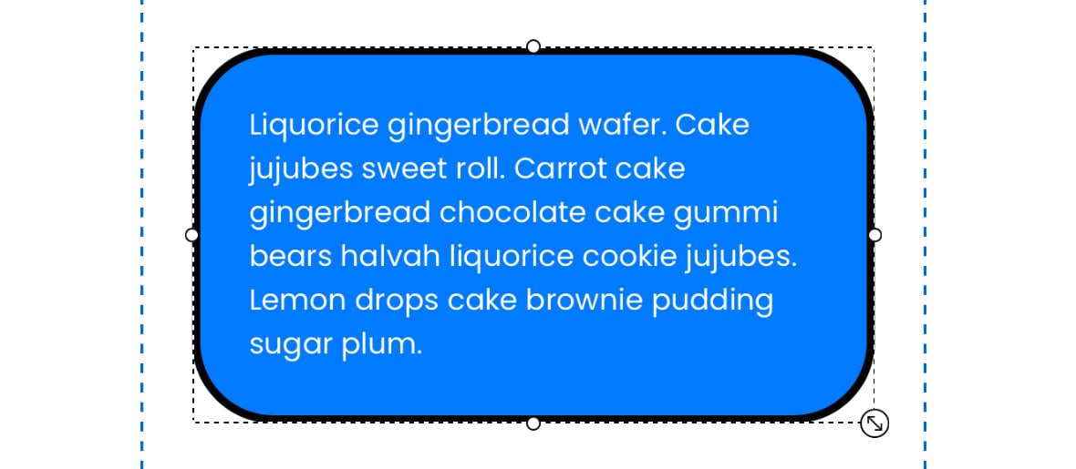
Once again, we have fields representing each of the individual four corners, and a lock toggle to change all the corners at once:
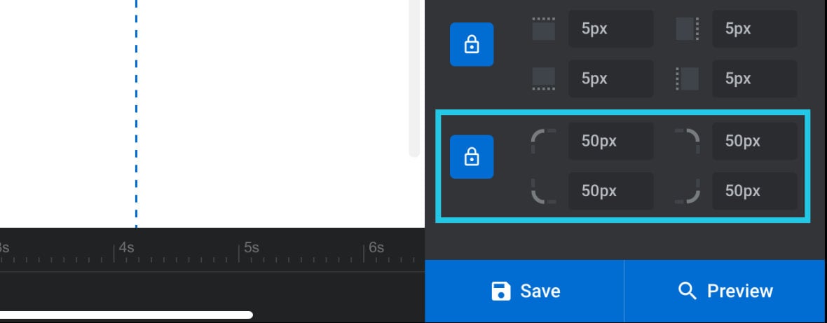
Even if you have your border set to be invisible, you can still use the Border Radius option to create rounded corners on a layer. Just set the rounding options to whatever you want and ignore the other options.
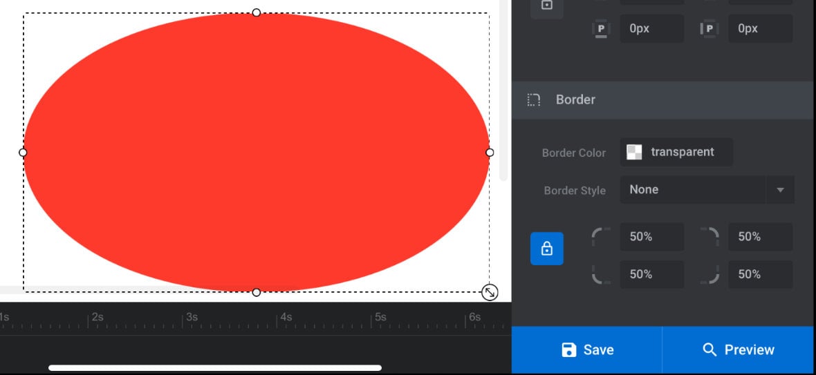
Creating Ellipses
A handy trick to know is if you set the Border Radius for each corner to 50% you can turn a layer into a circle or ellipse:
Up Next: Custom Text Content
Next up we’re going to step through how to make your own custom text content layers in Slider Revolution. We’ll talk about how to control the content of text layers, and then how to configure their style.
But first, we’ll start with a quick recap of what we’ve learned about text layers so far.