
Add and Configure Thumb Navigation
Learn how to add thumbs navigation to your Slider Revolution modules.
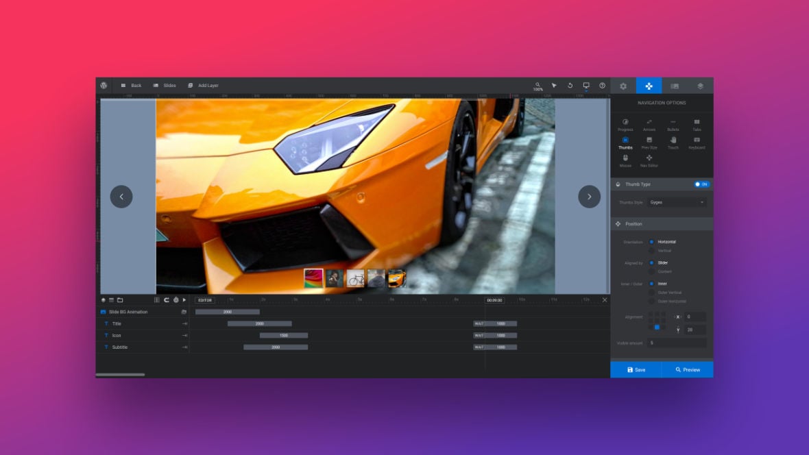
Table of Contents
What are Navigation Thumbs?
Navigation thumbs are tab-like buttons that appear on a slide [?]
A "slide" in Slider Revolution is a container into which multiple layers can be added, with layers in turn acting as containers for various forms of media such as images, text, video, audio, buttons, and special effects.
Slides are added to modules and edited via the module editor.
Within the module editor, each slide has its own animation timeline, background and collection of layers.
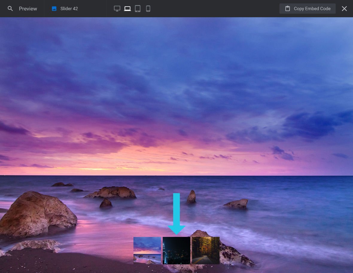
A single module can have one or many slides. A module with one slide is called a scene, and a module with multiple slides is called a slider or carousel. featuring the background image of the slide they link to. These thumbs allow your visitors to manually switch to a different slide whilst also giving them a small preview of that slide.
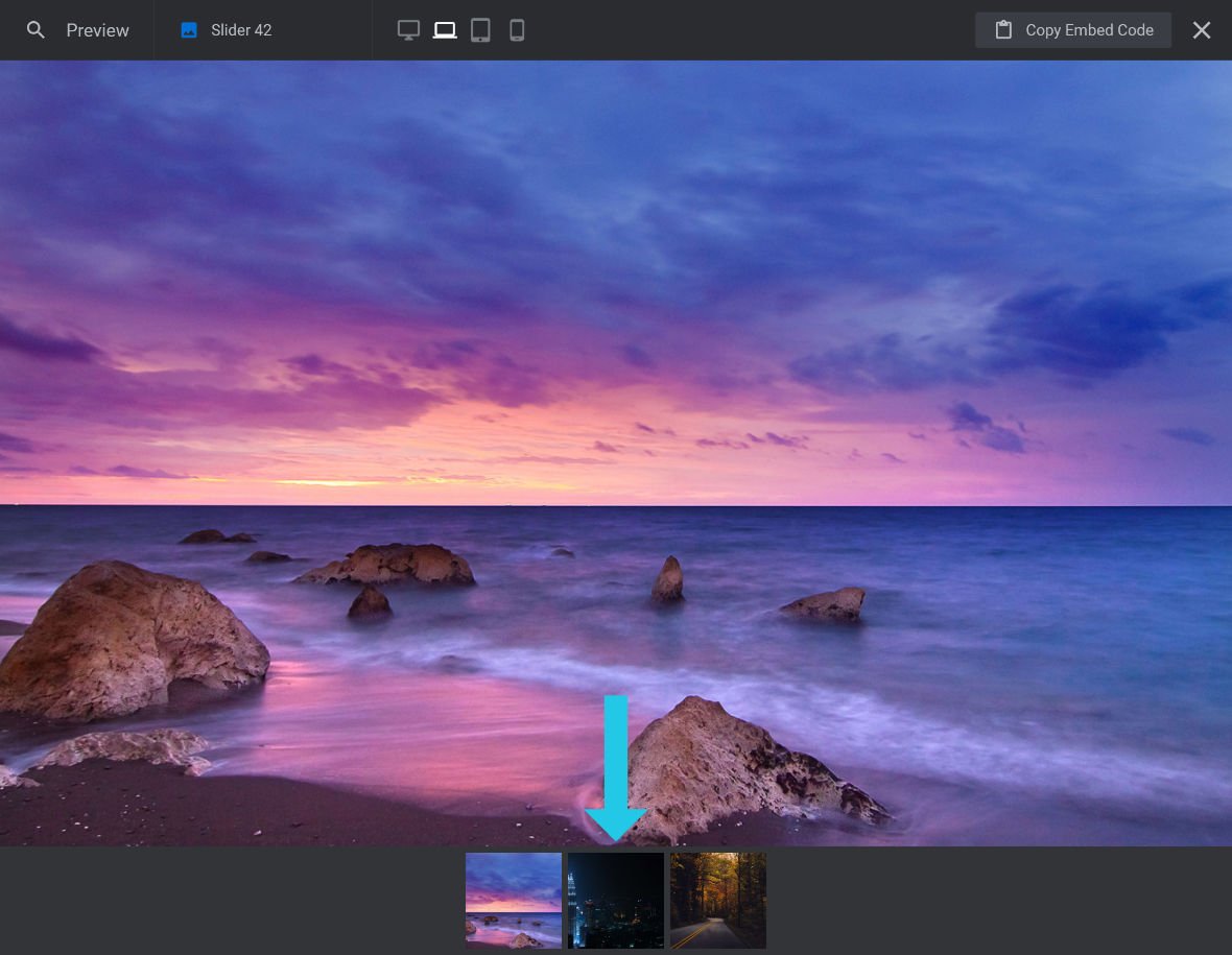
For example, the Classical Carousel template [?]
A "Template" is a premade module. It has pre-configured layers already in place.
It is designed to be ready for use, either as is or after being modified in the module editor.
Slider Revolution comes with several templates you can use, or alternatively you can create your own templates, thereby allowing you to easily reuse modules you have produced. uses thumbs along the bottom for navigation:

Activating Thumb Navigation
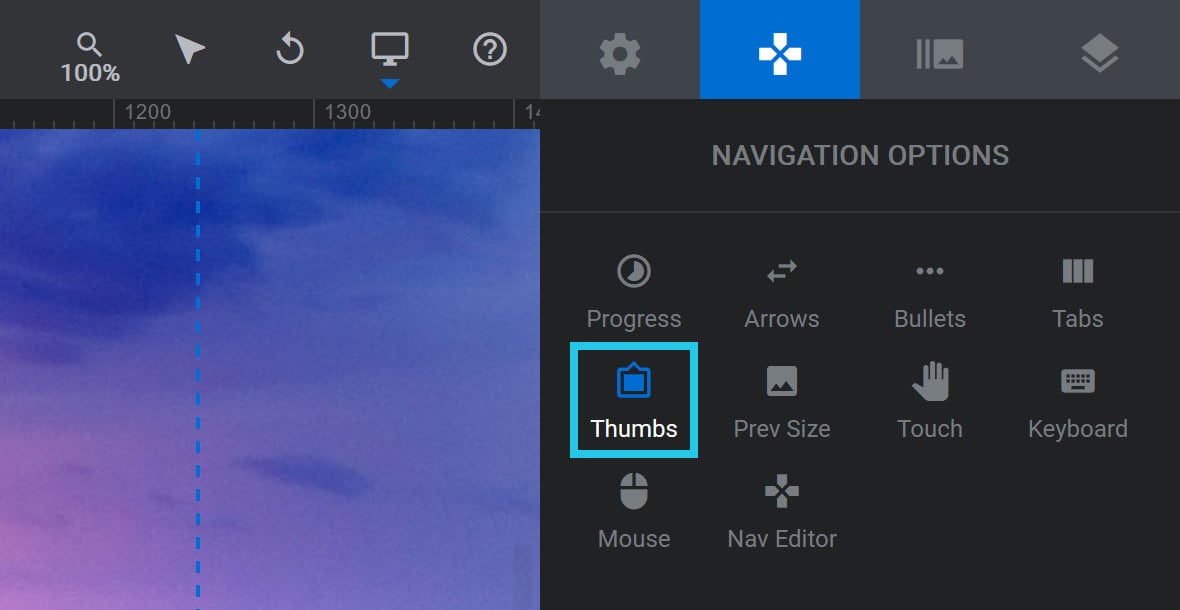
To add thumb navigation to your module [?]
A module in Slider Revolution acts as a container for slides, which in turn act as containers for layers. Modules are created and edited with the module editor.
A "module" is a single, self contained piece of content. You can think of this as being similar to the way a post or page in regular WordPress is a self contained piece of content.
A module can represent any kind of content Slider Revolution is capable of creating, such as a slider, carousel, hero unit, navigation menu, posts display and so on.
Multiple modules can be combined to form rich content such as complete sites and landing pages., go to the Navigation Options tab, and then the Thumbs sub-section:
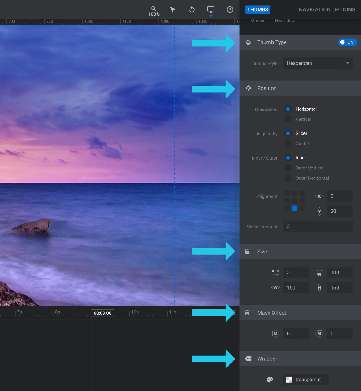
Set the toggle in the Thumb Type panel to ON:

A number of panels and options that can be used for further configuration will appear below:
Configuring Thumbs
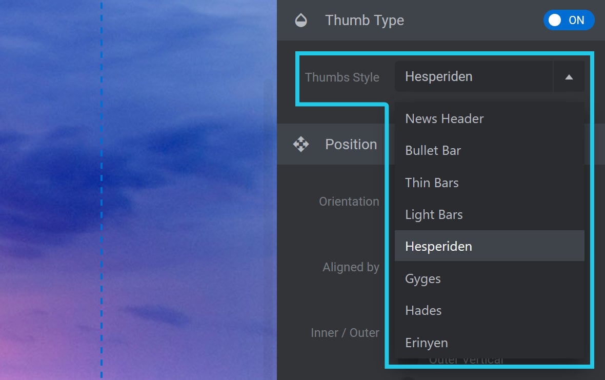
Thumbs Style
In the Thumb Type panel, you can use the Thumbs Style dropdown to select from several different styles for your thumbs:
Thumb styles typically feature an image, but can also be comprised of different shapes, different colors, borders, custom information on hover, and so on.
Position Panel
Below the Thumb Type panel you will see the Position panel:
The options here apply to each Thumbs Style used for navigation.
Orientation
The Orientation option allows you to specify whether you want to display each thumb next to each other or on top of each other:

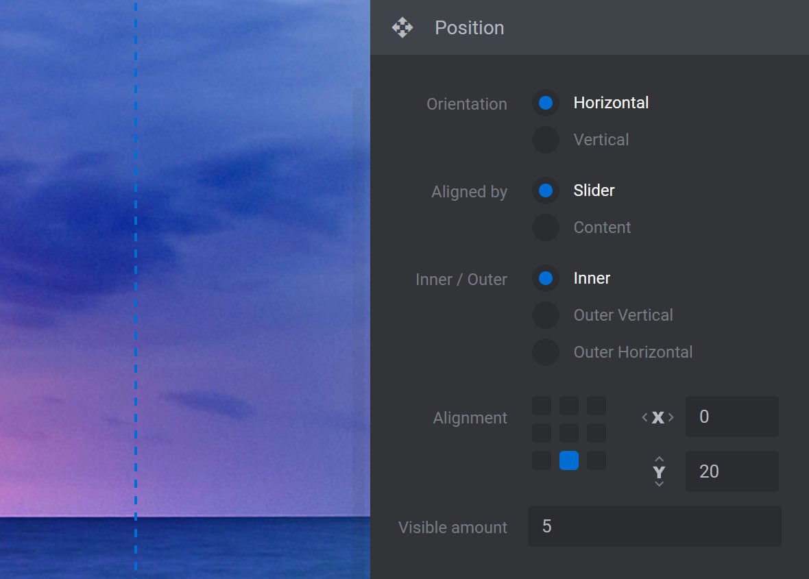
Select the Horizontal radio-button to display the thumbs next to each other:

Select the Vertical radio-button to display the thumbs on top of each other:
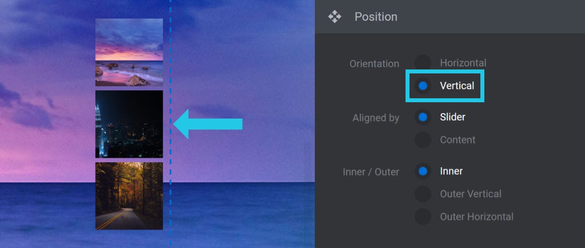
Note: In both of the examples shown above, the Thumbs Style used is the default Hesperiden style, with the thumbs resized to 50% of their default size.
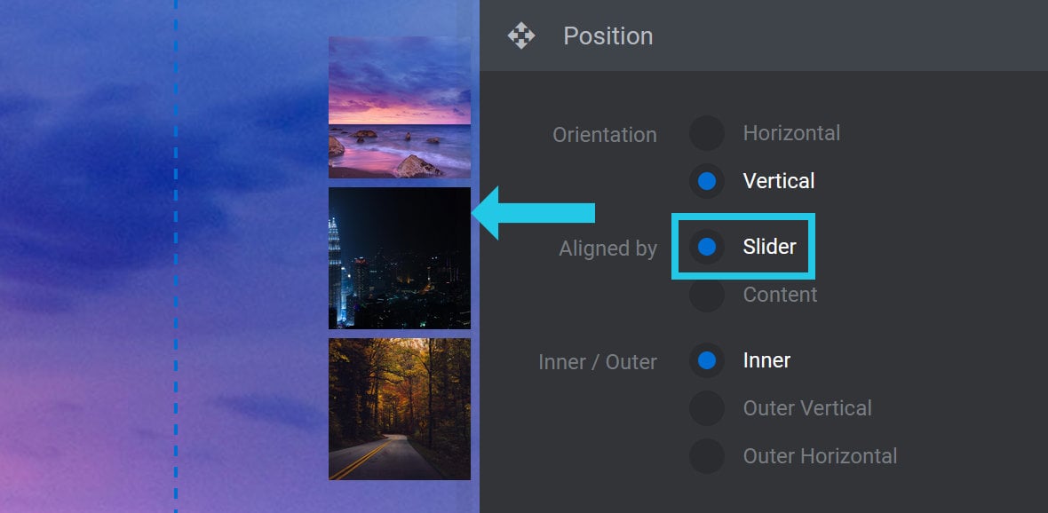
Aligned by
The Aligned by option allows you to decide how the thumbs will align relative to the slider’s [?]
A slider is a type of module that contains multiple slides. You can only see one slide at a time, a distinguishing features that makes sliders different from carousels.
The slides of a slider can be panned through either by using navigation controls such as arrows and tabs, or by clicking and dragging. They can also be set to automatically transition from one slide to the next. display:

If you select Slider, the navigation thumbs will be pushed to the further edges of the slider [?]
A slider is a type of module that contains multiple slides. You can only see one slide at a time, a distinguishing features that makes sliders different from carousels.
The slides of a slider can be panned through either by using navigation controls such as arrows and tabs, or by clicking and dragging. They can also be set to automatically transition from one slide to the next.:
If you select Content, the thumbs will stay inside the area on the canvas [?]
The canvas is the point and click design space in the module editor. It forms the largest area of the module editor.
In this area layers can be selected, moved and resized. Animations can also be previewed. marked with the blue dotted lines:
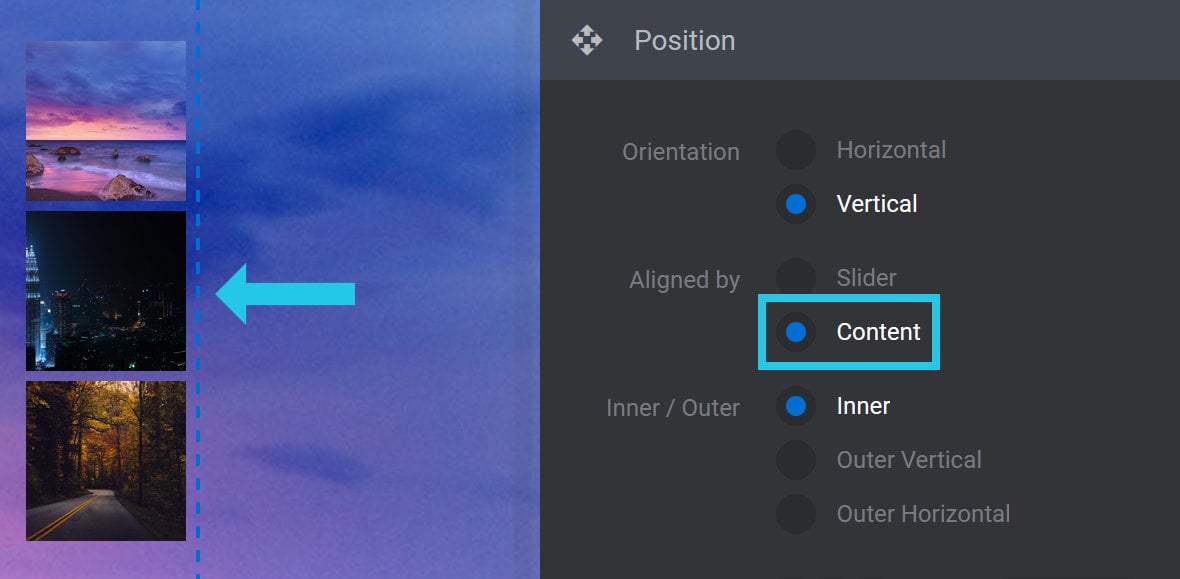
Note: If the Alignment option is set to the center grid, which it is by default, selecting Slider or Content will have no effect.
Inner / Outer Vertical / Outer Horizontal
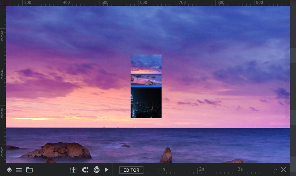
The Inner, Outer Vertical and Outer Horizontal options allow you to quickly align the navigation thumbs inside or outside the slider’s main content area, i.e., inside or outside the area marked with dotted blue lines:

Inner
Select the Inner option when you want your navigation thumbs to display inside the content area of your slide, i.e., inside the area marked with dotted blue lines.
When the Inner option is selected, which it is by default, you can use the Alignment option to manually select any one of nine possible alignment grid points. In each case, the thumbs will be displayed over the content of the slide, as illustrated in the example preview below:
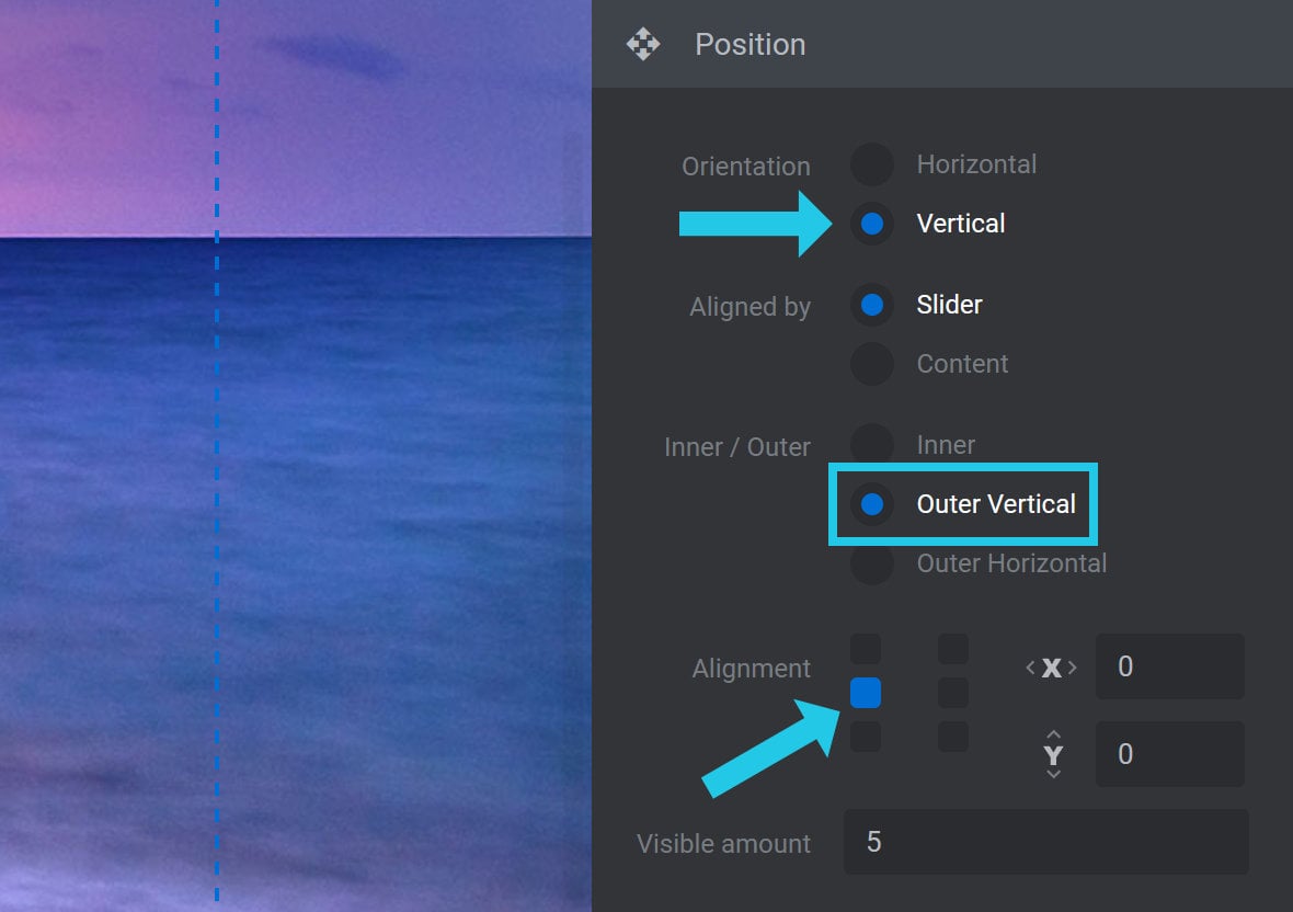
Outer Vertical
The Outer Vertical option is used to vertically position the navigation thumbs outside of the slider’s content, either to the left or right side:

Selecting Outer Vertical will set Orientation to Vertical, and it will also set Alignment to the left-middle grid point:
You can then use the Alignment grid to further refine the position of the thumbs, either to the left-top or left-bottom, or to the right-top, right-middle, or right-bottom positions.
While the navigation thumbs will be respositioned on the canvas to reflect the Outer Vertical settings, in practice you will need to preview your module to see how they display outside of the slider’s content:
Note: When Outer Vertical is selected, the width of the slider’s content will be automatically decreased to create space for the navigation thumbs to be visible outside of it. The aspect ratio of the slider’s content will be retained.
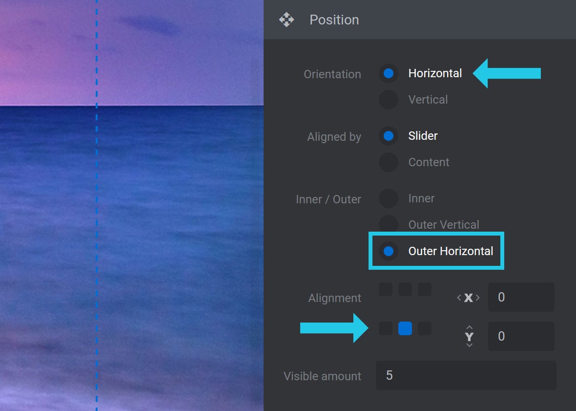
Outer Horizontal
The Outer-Horizontal option is used to horizontally position the navigation thumbs outside of the slider’s content, either to the top or bottom:

Selecting Outer Horizontal will set Orientation to Horizontal and Alignment to the bottom-middle grid point:
You can then use the Alignment grid to further refine the position of the thumbs, either to the bottom-left or bottom-right, or to the top-left, top-middle, or top-right positions.
While the thumbs will be repositioned on the canvas to reflect the Outer Horizontal settings, in practice you will need to preview your module to see how they display outside of the slider’s content:
Note: When Outer Horizontal is selected, the height of the slider’s content will be automatically decreased to create space for the thumbs to be visible outside of it. The aspect ratio of the slider’s content will be retained.
Alignment
The Alignment option allows you to set the horizontal and vertical alignment of your navigation thumbs.
You will see a grid of points representing the available alignment settings: the corners, edges and center:

Note: If Outer Vertical or Outer Horizontal are selected, the middle-vertical or middle-horizontal row of grids will not be visible. If you need to resolve this, go to the Inner / Outer option and select Inner. Alternatively, you can refine the position of the available grid points using the Offset X / Y option.
Select a grid point to align the navigation thumbs to that point. For example, if you click the top-right grid point, your thumbs will align to the top-right corner:
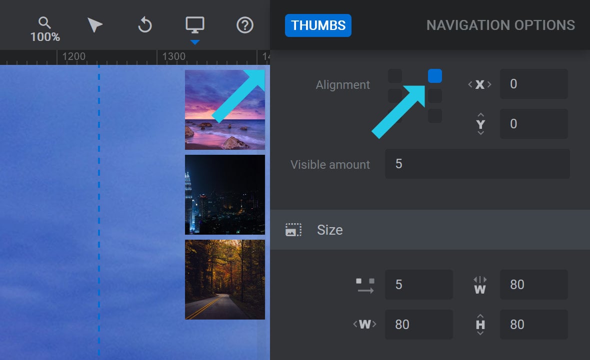
You can then fine tune the alignment of the thumbs using the Offset X / Y option.
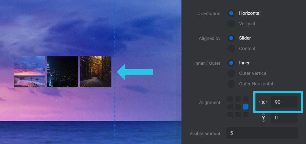
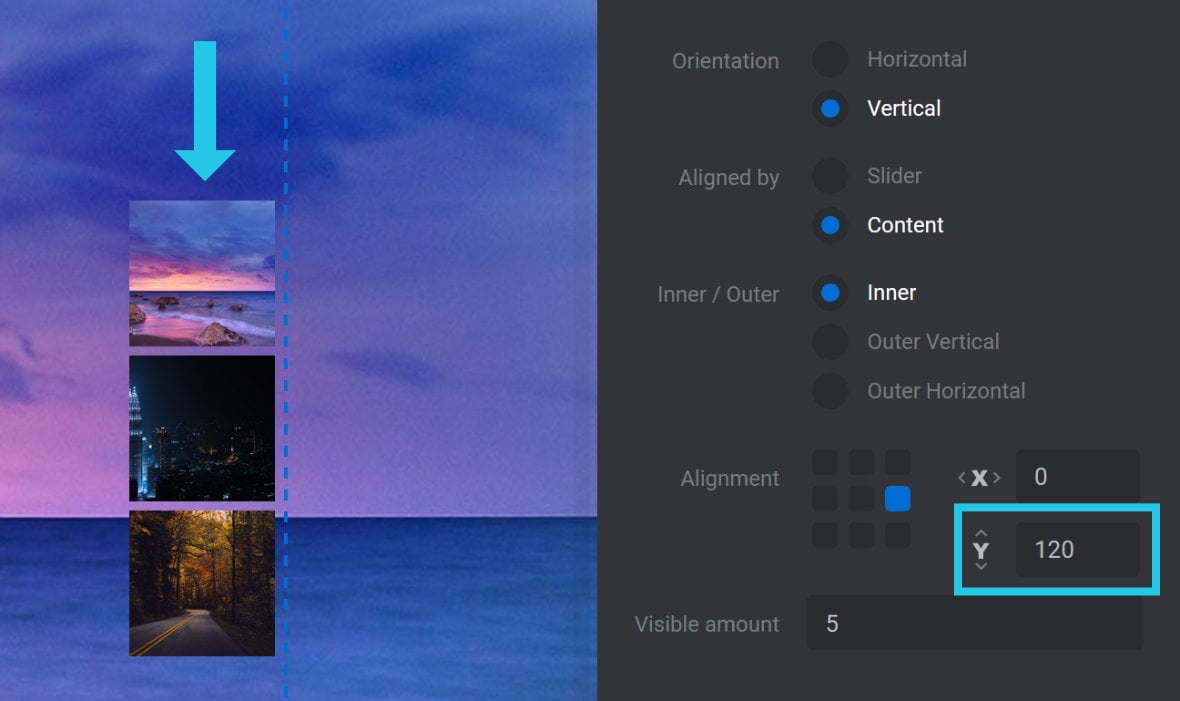
Offset X / Y
The Offset X and Offset Y options allow you to offset a navigation thumb’s position by a specified amount of pixels (px):

The Offset X option creates a horizontal offset. If the navigation thumbs are left aligned, the offset will move the bar to the right. If the thumbs are right aligned, the offset will move the bar to the left.
For example, here are navigation thumbs configured with Orientation set to Horizontal, Aligned by set to Slider, Inner / Outer set to Inner, and Alignment set to the center-right, with Offset X set to 90px:
The Offset Y option creates a vertical offset. If the navigation thumb is top aligned, the offset will move it down. If the thumb is bottom aligned, the offset will move it up.
For example, here are navigation thumbs configured with Orientation set to Vertical, Aligned by set to Content, Inner / Outer set to Inner, Alignment set to the center-right, and Offset Y set to 120px:
Visible Amount
The Visible Amount option can be used to specify the maximum number of navigation thumbs to display:

If Visible Amount is set to 1, the only navigation thumb displayed will be the one that relates to the active slide, i.e., the currently viewed slide, while no other thumbs will be visible. It is therefore recommended that Visible Amount be set to a minimum of 2 or more.
It is possible to set the Visible Amount option to a value that is higher than the number of slides you currently have in your slider. Doing so may influence the thumb layout on the canvas to account for the additional thumbs. However, when previewed or published, Slider Revolution [?]
Slider Revolution is a website content creation tool with a focus on captivating animation and stunning visual effects.
It began its life as a plugin for creating slideshows, but has evolved into a fully fledged piece of design software. will not display superflous thumbs if the slides for the additional thumbs have not yet been added to the slider.
Size Panel
Below the Position panel you will see the Size panel:
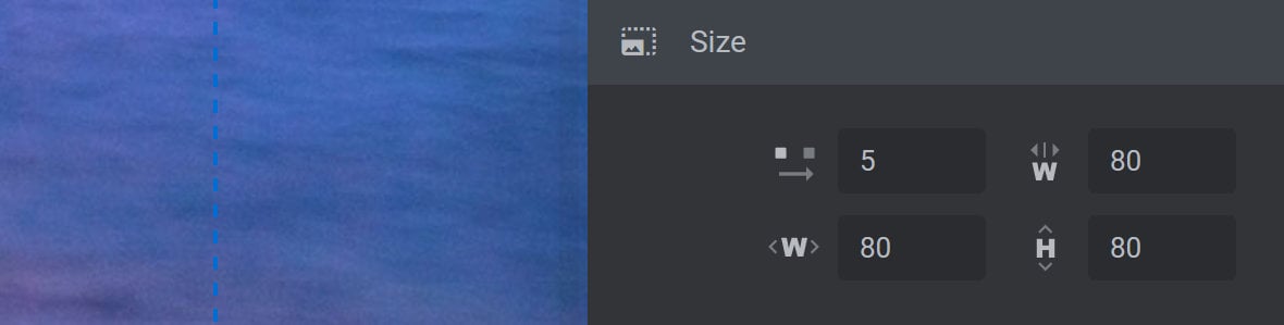
The options in the Size panel can be used to control the size of the navigation thumbs as well as the spacing between them.
Spacing
The Spacing option allows you to set the space between each individual navigation thumb in pixels (px):
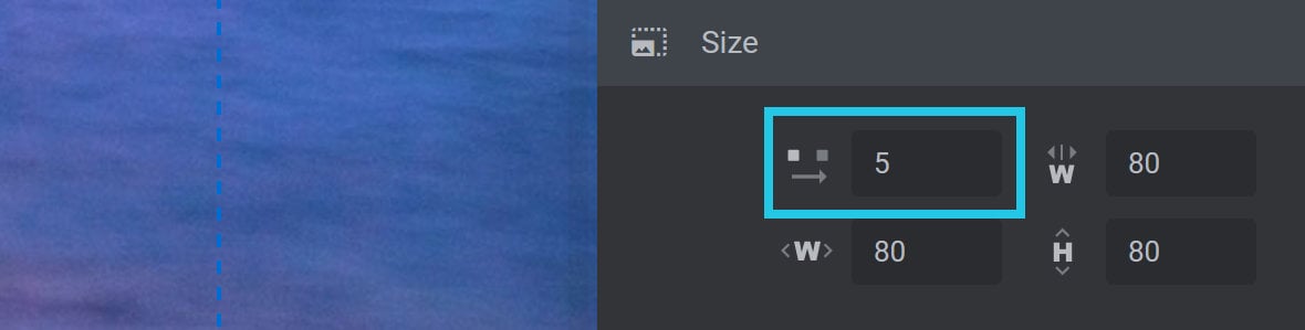
Increasing the Spacing value will increase the amount of space between navigation thumbs. Decreasing the value will decrease the amount of space.
Note: The Spacing option does not affect the amount of spacing around each navigation thumb, it only affects the space that separates one navigation thumb from the next.
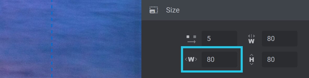
Minimum Width
The Minimum Width option allows you to specify the minimum width that a navigation thumb can be displayed at:
Navigation thumbs will be hidden when the slider is resized for layouts with a width that is smaller than the value specified here in pixels (px).
Note: The value chosen for Minimum Width should be equal to or lower than the value set for the default Width of the navigation thumbs.
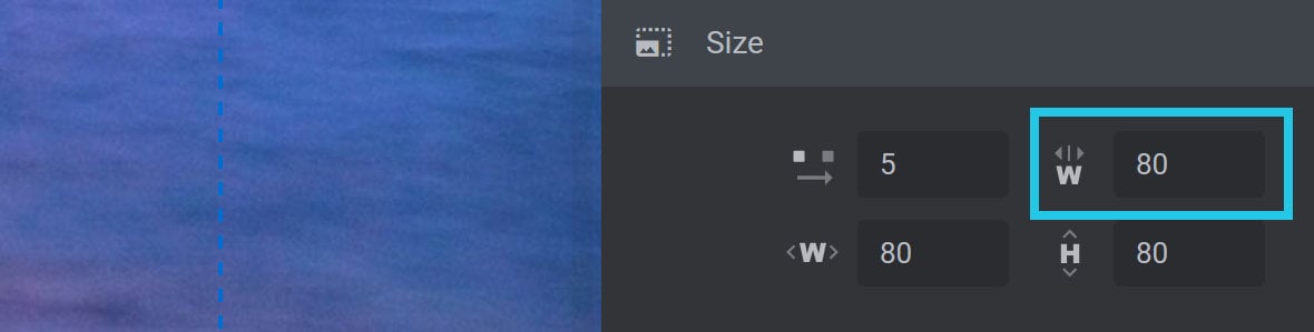
Width
The Width option allows you to specify the width of the navigation thumbs when the slider is viewed at its full size:
Note: The width of the navigation thumbs will automatically resize where necessary to suit smaller layouts. In some cases this can cause the thumbs to become too small. To maintain a minimum thumb size on smaller layouts, use the Minimum Width option.
Height
The Height option allows you to specify the height of the navigation thumbs when the slider is viewed at its full size:
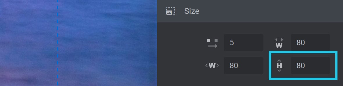
Note: The height of the navigation thumbs will automatically resize where necessary to suit smaller layouts, but will do so by maintaining the correct aspect ratio in relation to the value set in the Width option. If the thumbs appear too small on smaller layouts, solve this by adjusting the value set in the Minimum Width option.
Mask Offset
Mask Offset functionality allows you to add space around the edges of your navigation thumbs, offsetting their position from the inside of the Wrapper by a specified amount. This gives you additional control over the visibility of your navigation thumbs.
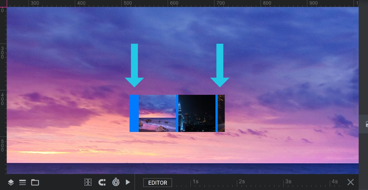
For example, here is a set of navigation thumbs that have been offset from the inside of their wrapper (shown in blue) by 20px horizontally. We’ve used the browser’s developer tools to highlight the position of the navigation thumbs relative to their wrapper, which allows us to more clearly see the 20px of horizontal offset to the left of the left-most thumbnail:
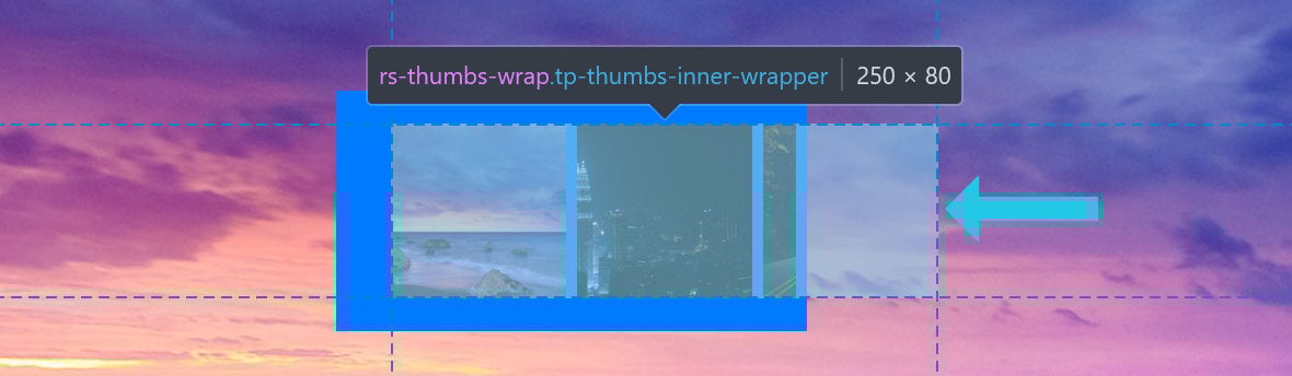
For context, the above image is taken from a slider with three slides but that has been set to display only two thumbnails at a time. This is why the third navigation thumb on the right isn’t fully visible (i.e., most of it has been masked, or rendered invisible).
Adding 20px of horizontal offset creates 20px of more viewable space horizontally, on both sides of the thumbs. As a result, a 20px section of the 3rd thumbnail is now visible, while the rest of the 3rd thumbnail remains masked.
The Mask Offset function can therefore be used to create unique navigation displays by allowing you to show or hide specific areas of your navigation thumbs.
This functionality can be configured using the two options available in the Mask Offset panel: Mask Horizontal Offset and Mask Vertical Offset:
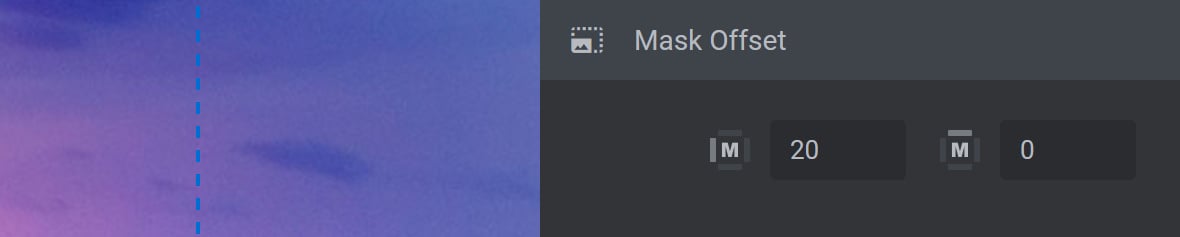
Mask Horizontal Offset
The Mask Horizontal Offset field allows you to add an offset amount on the left and right ends of the navigation thumbs, in pixels (px):
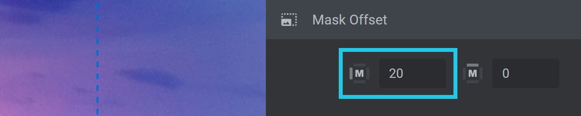
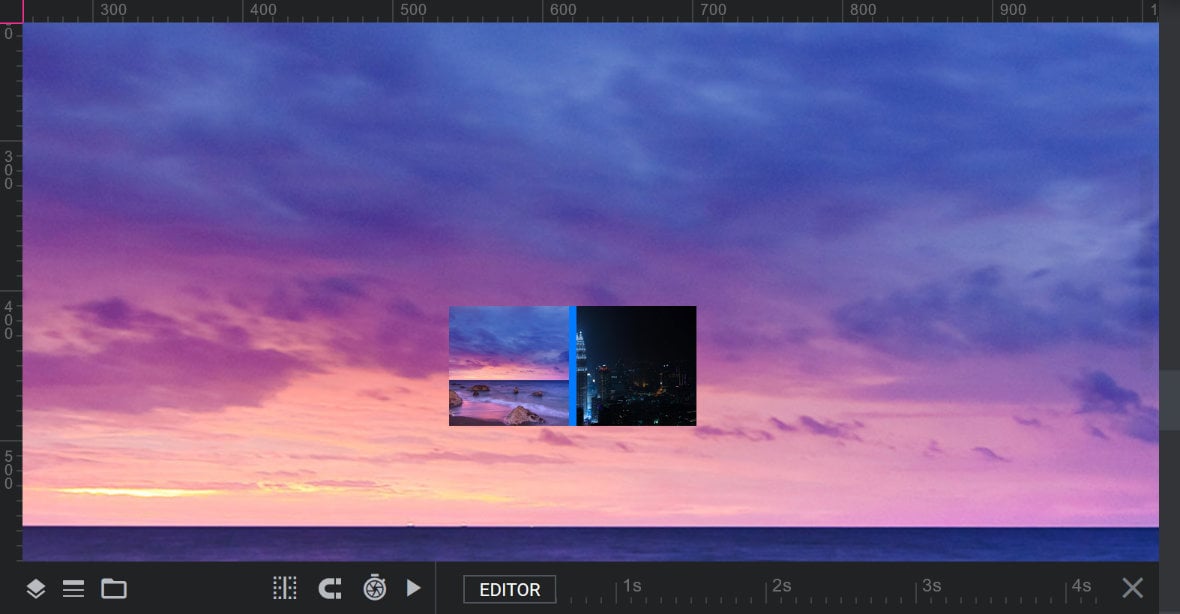
In the image above, Mask Horizontal Offset is set to a value of 20 pixels. In the image below, we’ve set the Wrapper option to blue and its Padding to 0 so that we can highlight the 20px of additional spacing visible either side of the thumbs on the canvas:
By comparison, here’s how the same navigation thumbs look on the canvas when no horizontal offset is applied:
While the canvas will give you a preview of how your offset amount will look on each end (as per the first image above), in practice you will typically only see an offset on one side at a time.
For example, when viewed live, with the navigation thumbs at their start (i.e., all the way to the left), the mask offset will allow a 20px section of the right-most thumb to be visible:

When the navigation thumbs are at their end (i.e., all the way to the right), the mask offset will now show a 20px section of the left-most thumbnail instead:

Note: The Mask Horizontal Offset option is typically used when Orientation is set to Horizontal.
Mask Vertical Offset
The Mask Vertical Offset field allows you to add an offset amount on the top and bottom of the navigation thumbs, in pixels (px):
In the image above, Mask Vertical Offset is set to a value of 20 pixels. In the image below, we’ve set the Wrapper option to blue and its Padding to 0 so that we can highlight the 20px of additional spacing visible on the top and bottom of the navigation thumbs on the canvas:
By comparison, here’s how the same navigation thumbs look on the canvas when no horizontal offset is applied:
While the canvas will give you a preview of how your offset amount will look on each end (as per the first image above), in practice you will typically only see an offset on one side at a time.
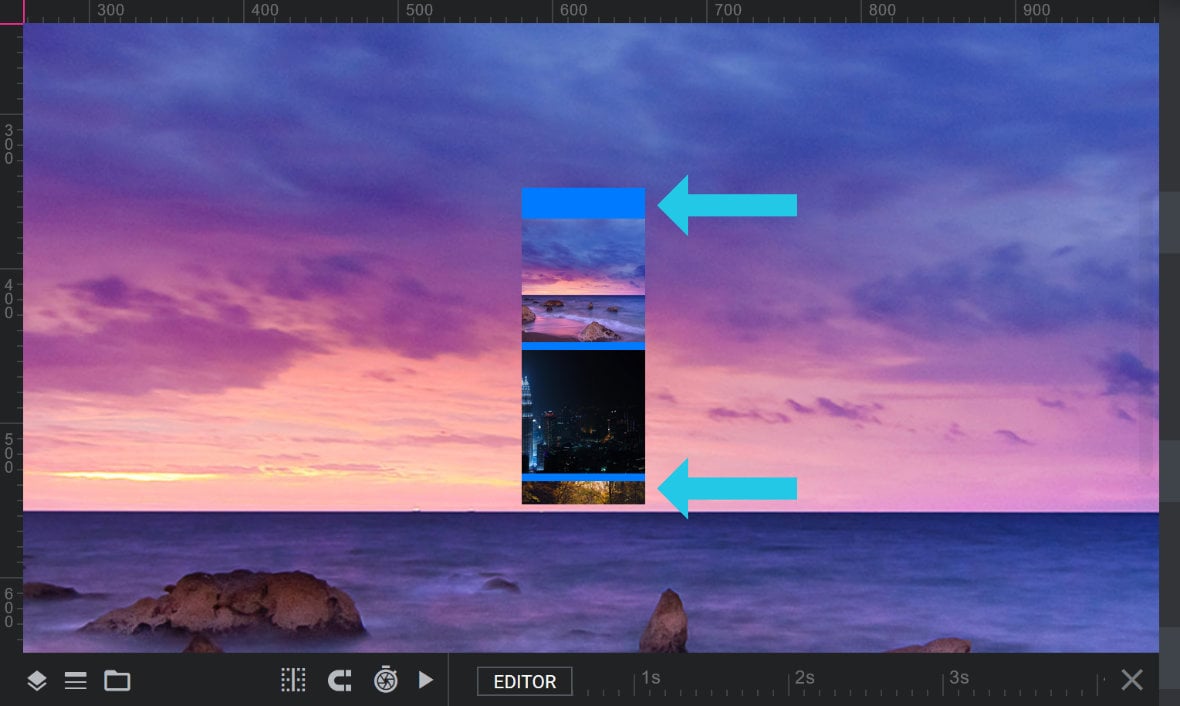
For example, when viewed live, with the navigation thumbs at their start (i.e., all the way to the top), the mask offset will allow a 20px section of the bottom-most thumb to be visible:

When the navigation thumbs are at their end (i.e., all the way to the bottom), the mask offset will now show a 20px section of the top-most thumbnail instead:

Note: The Mask Vertical Offset option is typically used when Orientation is set to Vertical.
Wrapper
The Wrapper panel is where you can change the color of the main wrapper containing the navigation thumbs, create space around the wrapper, and change the wrapper to occupy the full width of the module if required:
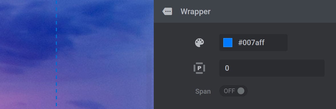
Color
The Color option allows you to modify the color of the main wrapper that contains the navigation thumbs:

For further help on color selection, refer to the Tools of the Color Selection Dialogue Box tutorial.
Note: The color of the navigation thumbs main wrapper is transparent by default.
Padding
The Padding option allows you to adjust the padding or space around the navigation thumbs outer wrapper, in pixels (px):

By default, Padding is set to 0 pixels. To increase padding, use positive values only.
For example, a value of 5 in the Padding field will add 5px (5 pixels) of space to all sides of the outer wrapper (as highlighted in blue in the example image below):
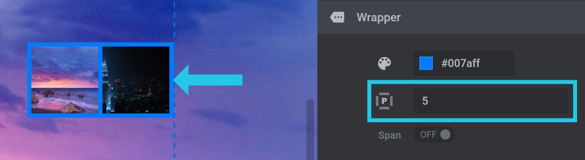
Note: Adjustments made to Padding only affect the spacing of the top, right, bottom and left sides of the outer wrapper, but do not affect the space between navigation thumbs. To adjust the space between thumbs, refer to the Spacing option.
Span
The Span option allows you to modify the main wrapper so that it spans the full width of the module:

Span is set to OFF by default, meaning the main wrapper has no dedicated line breaks, allowing other elements to be displayed adjacent to it.
Toggle to ON to change the main wrapper to occupy the full width of the module, as highlighted blue in the following example:
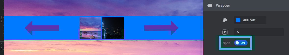
When toggled ON, the navigation thumb wrapper has its own dedicated full-width block, preventing other elements from being displayed adjacent to it.
Thumbs Visibility Panel
Below the Wrapper panel you will see the Thumbs Visibility panel:
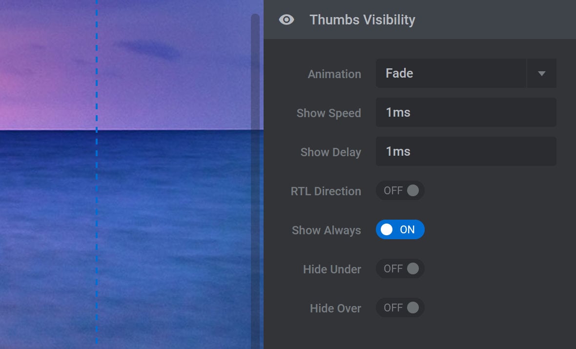
The Thumbs Visibility panel contains a number of new configuration options as follows:
Animation
By default, Animation is set to make your navigation thumbs fade in when they appear:

Click the Animation dropdown and you will see six additional animation options:
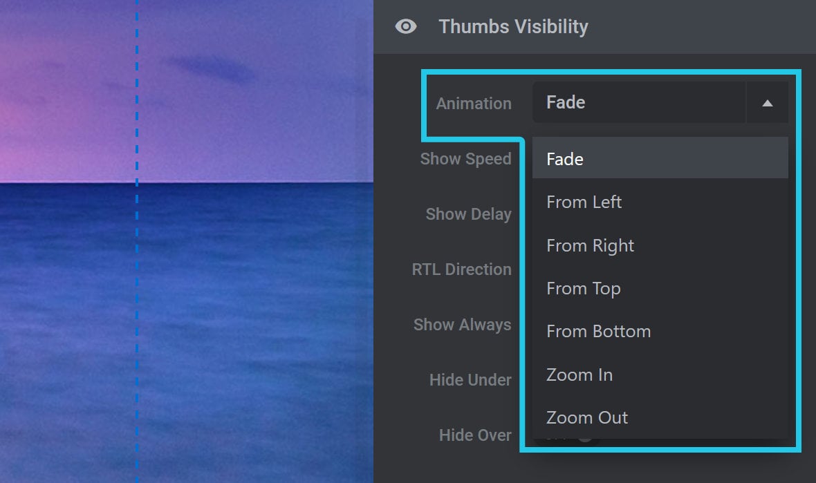
Select any of the available options to change the type of animation being applied, such as making the navigation thumbs slide in from one of four directions, zoom in, or zoom out.
Show Speed
The Show Speed option allows you to set the time, in milliseconds (ms), that it takes for your navigation thumbs to animate into view:

Show Delay
The Show Delay option allows you to set the time, in milliseconds (ms), that should pass before your navigation thumbs begin animating into view:

RTL Direction
By default, navigation thumbs are displayed in the same order as the slides appear in the slider. Toggle RTL Direction to ON to reverse that order:

Note: Reversing the order of the navigation thumbs does not reverse the display order of slides in the slider.
Show Always
Show Always is ON by default, meaning navigation thumbs will always be visible to the user:

If you’d like your navigation thumbs to disappear when there is no mouse hovering over the module, toggle the Show Always option to OFF. The navigation thumbs will then disappear after a certain period of time, and reappear if the visitor hovers or taps the module.
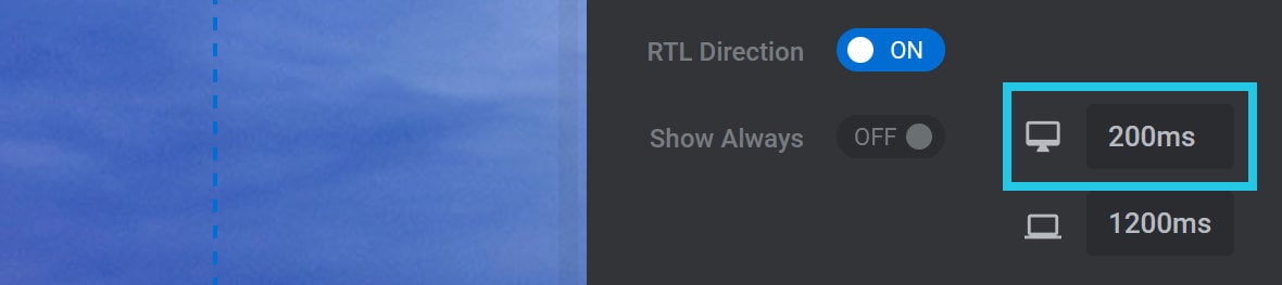
When Show Always is set to OFF, the options Hide After: Desktop and Hide After: Mobile will appear:
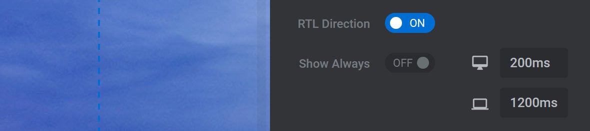
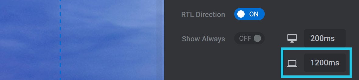
Hide After: Desktop
Use the Hide After: Desktop option to set the amount of time, in milliseconds (ms), before the navigation thumbs should be hidden on desktop devices:
Hide After: Mobile
Use the Hide After: Mobile option to set the amount of time, in milliseconds (ms), before the navigation thumbs should be hidden on mobile devices:
Hide Under
If you’d like the navigation thumbs to be hidden when the browser window is narrower than a certain width, toggle the Hide Under option to ON:

Hide Under Limit
When Hide Under is set to ON, the option Hide Under Limit will appear:

Use the Hide Under Limit option to set the browser width, in pixels (px), under which the navigation tthumbs should be hidden.
Hide Over
If you’d like your navigation thumbs to be hidden when the browser window is wider than a certain width, toggle the Hide Over option to ON:

Hide Over Limit
When Hide Over is set to ON, the option Hide Over Limit will appear:

Use the Hide Over Limit option to set the browser width, in pixels (px), over which the navigation thumbs should be hidden.
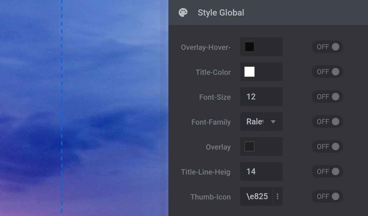
Style Global Panel
The Style Global panel allows you to customize the appearance of your module’s navigation thumbs:

The options available in the Style Global panel will vary depending on your chosen Thumbs Style.
For example, the options you see in the image above are available for use with the Hesperiden Thumbs Style. By comparison, the options you see in the image below are available for use with the Zeus Thumbs Style:
To customize any style, simply change that style’s value and the switch to the right of that value will automatically toggle to ON. You can revert to the default value at any time by toggling the switch back to OFF.
Note: The Style Global panel will not be available if you have selected a Thumbs Style that is custom, such as News Header, Bullet Bar, Thin Bars, or Light Bars.
Style Global Options Per Thumbs Style
Next, let’s look at the different style options that are available for each Thumbs Style:
Hesperiden
If you select the Hesperiden style, the Style Global panel will have the following options:
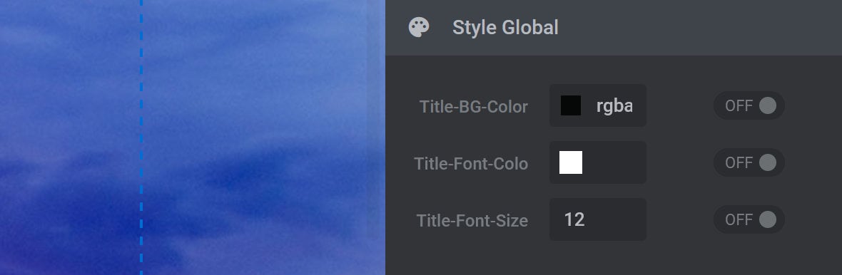
Title BG Color
The Title-BG-Color option is used to set the background color that displays behind the slide’s title when the navigation thumb is hovered over.
Title Font Color
The Title-Font-Color option is used to set the color of a slide’s title that displays when a navigation thumb is hovered over.
Title Font Size
The Title-Font-Size option is used to set the size of the slide’s title that displays when a navigation thumb is hovered over.
Note: The slide’s title is drawn from the Slide Title Field, found in the top middle toolbar of the Slide Options tab.
Gyges
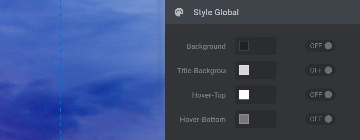
Background
The Background option is used to set the color of the thumb’s inner shadow, and also sets the color of the border around inactive thumbs, i.e., thumbs for slides not currently being viewed.
Title-Background
The Title-Background option is used to set the background color that displays behind the slide’s title when the navigation thumb is hovered over.
Hover Top
The Hover-Top option is used to set the top-half color of a navigation thumb’s border on hover, as well as the top-half border color of the active navigation thumb. Use in conjunction with the Hover-Bottom option to apply a gradient to the thumb’s border.
Hover Bottom
The Hover-Bottom option is used to set the bottom-half color of a navigation thumb’s border on hover, as well as the bottom-half border color of the active navigation thumb. Use in conjunction with the Hover-Top option to apply a gradient to the thumb’s border.
Hades
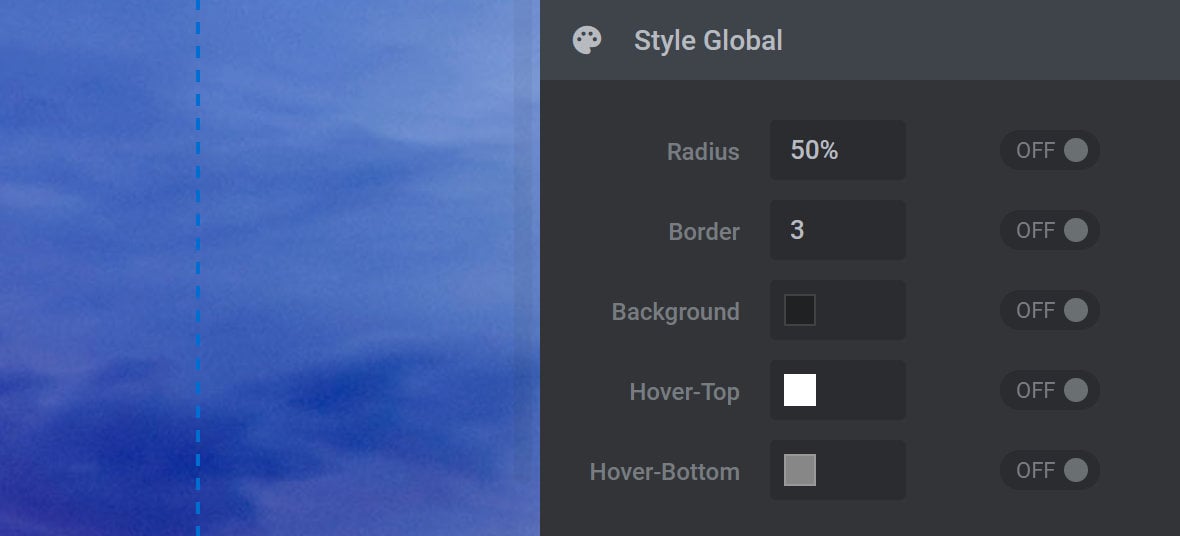
Radius
The Radius option is used to set the amount of corner rounding to apply to the thumbnail. The higher the value, the greater the rounding. The default value of 50% creates enough rounding to form a perfect circle.
Note: When adjusting, include a percentage annotation with your value. i.e., 75%.
Border
The Border option is used to set the size of the border around each navigation thumb. The higher the value the thicker the border. A value of zero (0) means no border will be visible.
Note: Size increases to the border will expand the border inside the thumbnail, which in turn reduces the amount of visible space available to display the slide’s preview image. The preview image will automatically resize to compensate for this.
Background
The Background option is used to set navigation thumb border color. The color chosen here does not apply to the active navigation thumb.
Hover Top
The Hover-Top option is used to set the color of the top-half of a navigation thumb’s border when the slide it relates to is inactive, i.e., not currently being viewed. Use in conjunction with the Hover Bottom option to apply a gradient to the thumb’s border.
Hover Bottom
The Hover-Bottom option is used to set the color of the bottom-half of a navigation thumb’s border when the slide it relates to is inactive, i.e., not currently being viewed. Use in conjunction with the Hover Top option to apply a gradient to the thumb’s border.
Erinyen
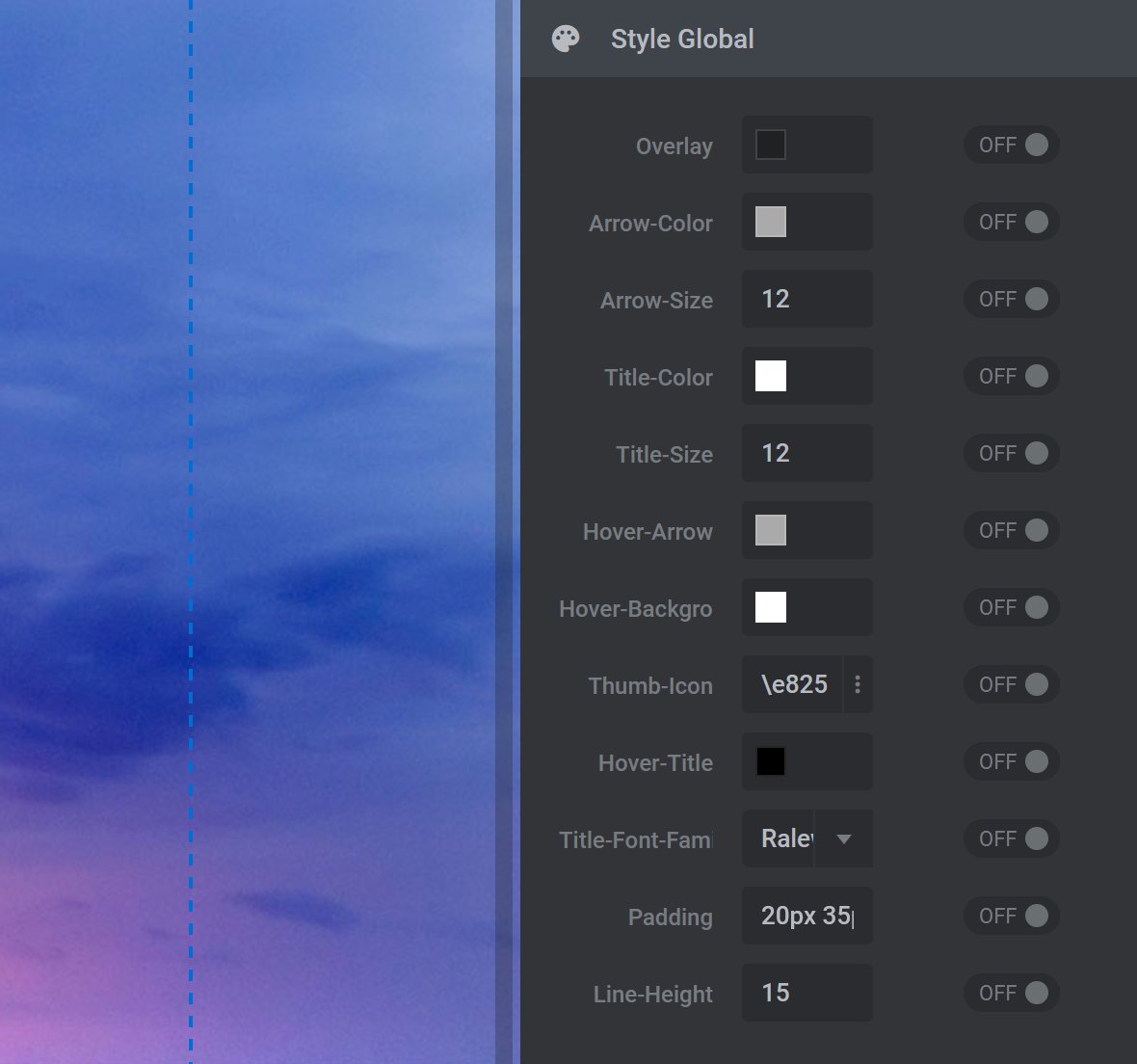
Overlay
The Overlay option is used to set a color to overlay the navigation thumb preview image. The color you set here will apply to all inactive navigation thumbs, i.e., thumbs related to slides not currently being viewed.
In the Color Selection Dialogue Box, use the Opacity Slider to make the color more see-through. If the Opacity Slider is left at its default value of 100%, the color will not be see through.
Arrow Color
The Arrow-Color option is used to set the color of the right arrow icon on all inactive navigation thumbs, i.e., thumbs related to slides not currently being viewed.
Arrow Size
The Arrow-Size option is used to set the size of the right arrow icon as it appears on all navigation thumbs.
Title Color
The Title-Color option is used to modify the color of the post title as it appears on all inactive navigation thumbs, i.e., thumbs related to slides not currently being viewed. The post title is visible on the canvas as {{title}}.
Note: The slide’s title is drawn from the Slide Title Field, found in the top middle toolbar of the Slide Options tab.
Title Size
The Title-Size option is used to modify the size of the post title on all navigation thumbs.
Hover Arrow
The Hover-Arrow option is used to set the hover color of the right arrow icon when its corresponding navigation thumb is hovered over.
Hover Background
The Hover-Background option is used to set the background color of navigation thumbs when they are active or hovered over.
Thumb Icon
The Thumb-Icon option is used to set the type of icon to appear on all navigation thumbs. A medium size right-angled bracket is the icon set by default. Available selections are shown in the image below:
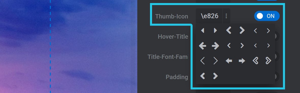
Hover Title
The Hover Title option is used to set the slide title color of inactive thumbs on hover, as well as the color of the active thumb’s slide title.
Note: The slide’s title is drawn from the Slide Title Field, found in the top middle toolbar of the Slide Options tab.
Title Font Family
The Title-Font-Family option is used to select the font to apply to the slide title on all navigation thumbs.
Padding
The Padding option is used to modify the space around the slide title, i.e., around content populated by the {{title}} meta data snippet. The default value is 20px 35px 20px 20px with each value corresponding to the amount of space above, to the right, below, and to the left of the slide title. Each value is separated by a space.
For example, the default values of 20px 35px 20px 20px apply as follows: 20px (top padding), 35px (right padding), 20px (bottom padding), and 20px (left padding).
Toggle ON to modify, and be sure to include px after your chosen value change, i.e., px for pixels.
Note 1: Modifications to Padding may not be immediately visible on the canvas as the {{title}} meta data snippet is small and may not reflect the actual length of a slide’s title in practice. Use the Preview function to view the impact of any changes you make to Padding.
Note 2: To modify, we recommend copying the values in the Padding field, pasting them into a text document, modify them in the text document, delete the existing values in the Padding field, and then paste the modified values back into the Padding field.
Line Height
The Line-Height option is used to set the minimum vertical height between each line of text in the navigation thumb slide title. The higher the value, the more spacing will be visible between lines. A value that is 1.5 times the value of the Title-Size option is usually ideal.
Note: If the slide title does not wrap, i.e., the slide title spans only one line, the value used for Line-Height will only be visible as space above the slide title.
Zeus
Overlay Hover RGBA
The Overlay-Hover-RGBA option is used to set a color to overlay the navigation thumb preview image. The color you set here will only apply to inactive navigation thumbs on hover, i.e., thumbs related to slides not currently being viewed, but will always apply to the active navigation thumb.
In the Color Selection Dialogue Box, use the Opacity Slider to make the color more see-through. If the Opacity Slider is left at its default value of 100%, the color will not be see through.
Title Color
The Title-Color option is used to modify the color of the post title as it appears on all navigation thumbs. The post title is visible on the canvas as {{title}}.
Note: The slide’s title is drawn from the Slide Title Field, found in the top middle toolbar of the Slide Options tab.
Font Size
The Font-Size option is used to modify the size of the post title on all navigation thumbs.
Font Family
The Font-Family option is used to select the font to apply to the slide title on all navigation thumbs.
Overlay
The Overlay option is used to set a color to overlay the preview image of inactive navigation thumbs only, i.e., thumbs related to slides not currently being viewed. The color you set here will not apply to the active navigation thumb.
In the Color Selection Dialogue Box, use the Opacity Slider to make the color more see-through. If the Opacity Slider is left at its default value of 100%, the color will not be see through.
Note: The color set here will disappear on hover, allowing the user to see the slide preview image without an overlay. If an overlay color has been set using the Overlay-Hover-RGBA option, the user will see that overlay on hover instead.
Title Line Height
The Title-Line-Height option is used to set the minimum vertical height between each line of text in the navigation thumb slide title. The higher the value, the more spacing will be visible between lines. A value that is 1.5 times the value of the Font-Size option is usually ideal.
Note: If the slide title does not wrap, i.e., the slide title spans only one line, the value used for Line-Height will only be visible as space above the slide title.
Thumb Icon
The Thumb-Icon option is used to set the type of icon to appear on all navigation thumbs. A medium sized right-angled bracket is the icon set by default. Available selections are shown in the image below:
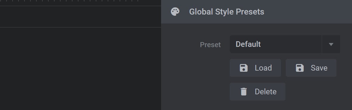
Global Style Presets Panel
If you have selected a custom Thumbs Style, such as News Header, Bullet Bar, Thin Bars, or Light Bars, the panel you will see after the Thumbs Visibility panel will be the Global Style Presets panel:
Note: For all other Thumbs Style selections, the Global Style Presets panel will appear under the Style Global panel.
The Global Style Presets panel can be used to save a customized navigation thumb style for later use as a preset.
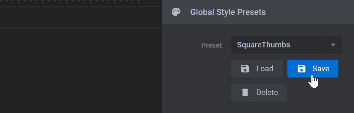
Save a Preset
To save a new custom preset, expand the Preset dropdown, then type in a name for your preset:
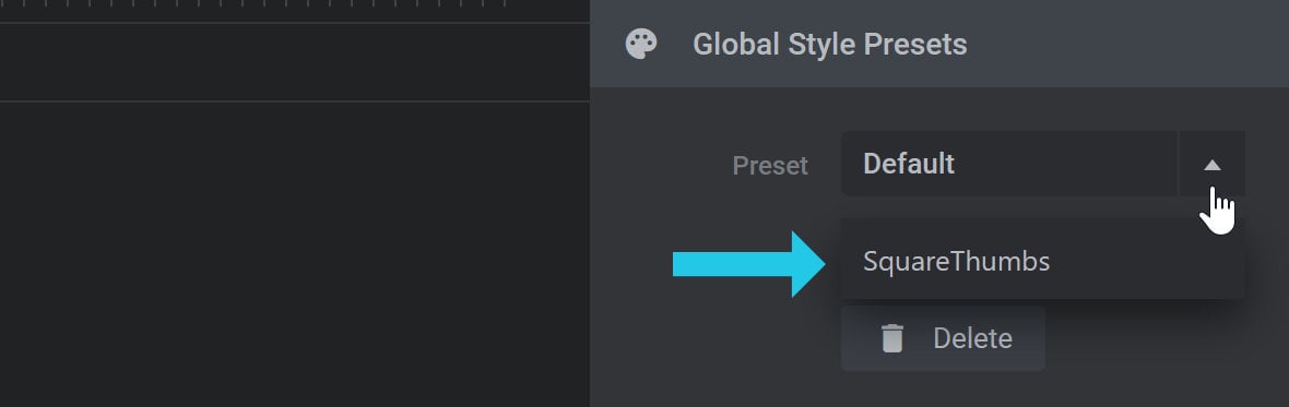
Press ENTER on your keyboard to commit the name, then click the Save button to save your current style under that name:
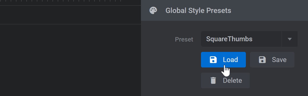
Load a Preset
To load a preset, expand the Preset dropdown and select the preset you want to use:
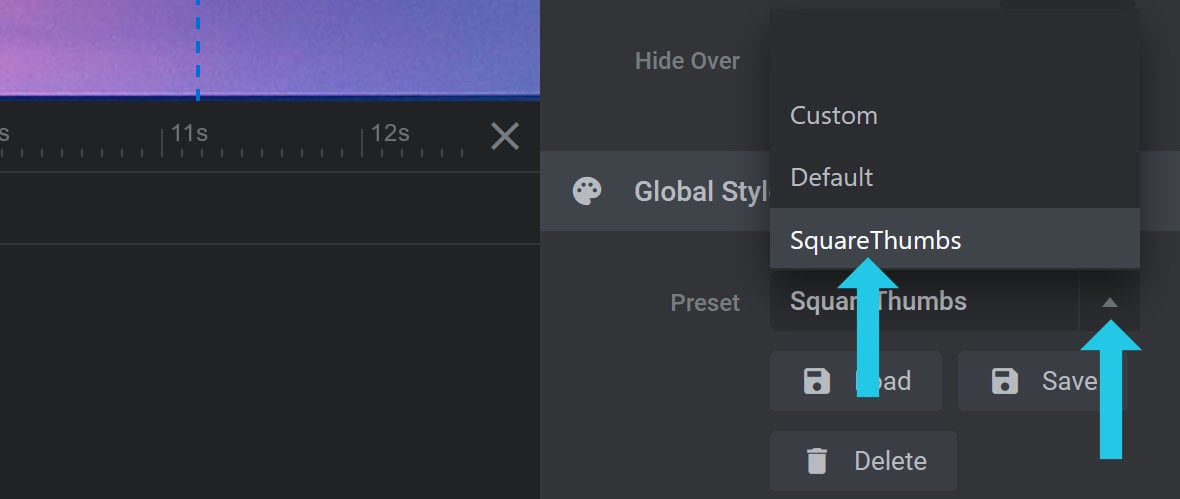
Then click the Load button to apply the selected preset:
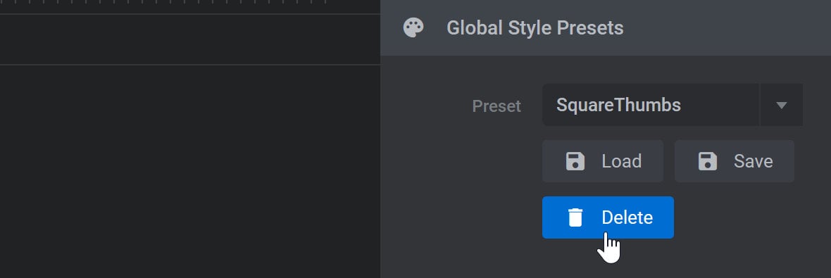
Delete a Preset
To delete a preset, expand the Preset dropdown and select the preset you want to remove:
Override Style on Slide Panel
The Override Style on Slide panel has all the same options as the Style Global panel:
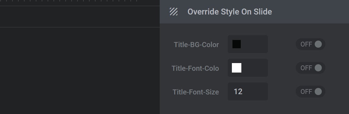
However, instead of affecting navigation thumbs across the entire module, the options here will override the options chosen in the Style Global panel for the currently selected slide only.
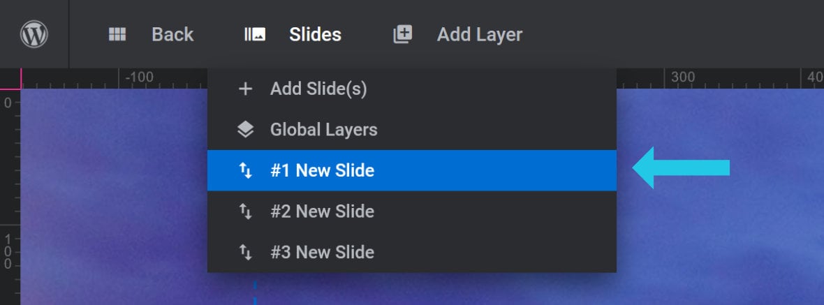
You can identify which slide you currently have selected by checking the slide that is highlighted blue in the Slides dropdown menu: