
There are millions of apps out there. How will you ensure that smartphone users are able to find yours?
Answer: By utilizing search engines like Google. When you create a mobile app landing page, you’ll have more control over how many people are able to discover your product. And with a creative hero section design — with a surprising hint of motion — you’ll have users eager to install your app on their phone ASAP.
In this tutorial, we’re going to take the App Website Template and demonstrate how to create a hero image that shows off your product in all its glory.
Table of Contents:
- Step 1: Install the hero section module
- Step 2: Delete global layers (optional)
- Step 3: Create your phone screen imagery
- Step 4: Upload the phone screen images into the template
- Step 5: Add a link to the middle phone screen
- Step 6: Update the background
- Step 7: Edit the caption and headline
How to create a great looking hero section for your mobile app landing page
When users discover your mobile app from a link on Google, social media, or another platform where you or other users have promoted it, what will they discover? Will it be a mobile app landing page that looks like this?
Or how about one that looks like this?
The basic layout is the same. However, you can see how changes to things like the background texture and font style can transform the overall look and feel of the hero section. In this tutorial, we’ll show you how to update this template so you can put your own creative spin on it.
Step 1: Install the hero section module
With Slider Revolution open inside of WordPress, select “New Module from Template”. Then do a search for “app website”. This will pull up the following matching templates:
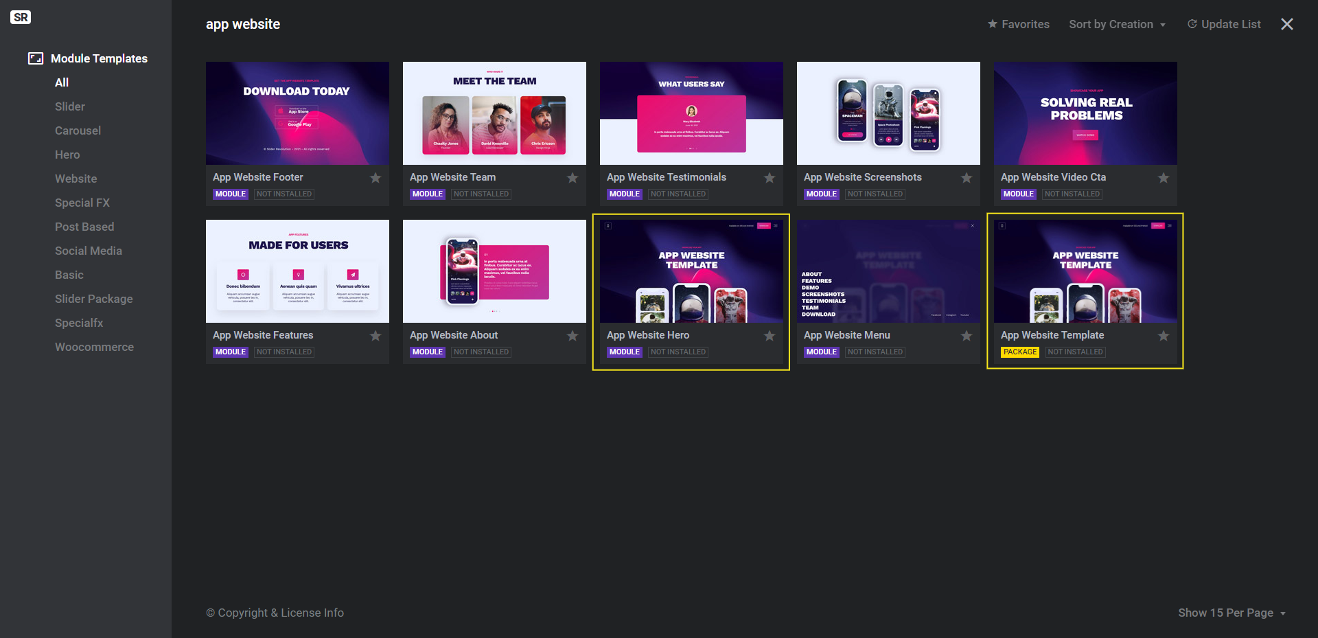
You have two options:
Option 1: Install the App Website Template package (in yellow) to build out your entire mobile app landing page using this template.
Option 2: Install the App Website Hero module (in purple) to create only the hero section from this template.
To install, hover over the option you’re going to use, click the plus-sign icon, and then install the one you need (i.e. template vs. package).
Note: You can follow the rest of the steps in this tutorial regardless of which option you go with. It’s just good to understand the differences between the two files based on what you intend to create. It’ll save you time down the road if you can install the right package from the get-go.
Learn more:
Step 2: Delete global layers (optional)
In this template, there is a set of global layers that appear at the top of the hero section. They include critical header elements like the app’s logo as well as the Download button.
These global layers will be useful to hold onto if you’re building out your entire mobile app landing page with this template. However, if you’re using this template just to create a hero section, then you don’t need these layers. You can customize the header design using your WordPress theme.
To access these layers, go to “Slides” in the top toolbar and select Global Layers:
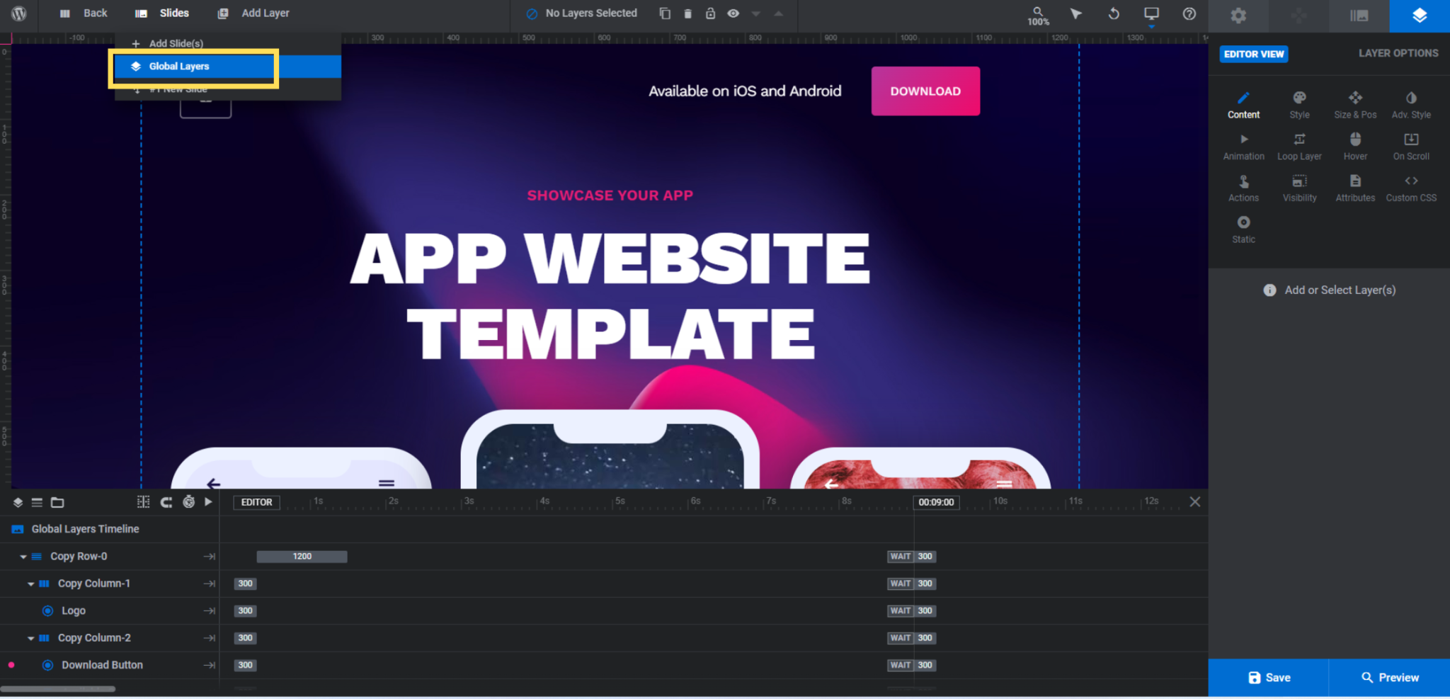
If you’d like to delete the layers, select Copy Row-0 and hit the Backspace or delete key. This will remove all the global layers at once. Otherwise, select the layers one at a time and edit them from the “Layer Options” on the right.
Learn more:
Step 3: Create your phone screen imagery
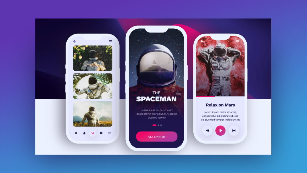
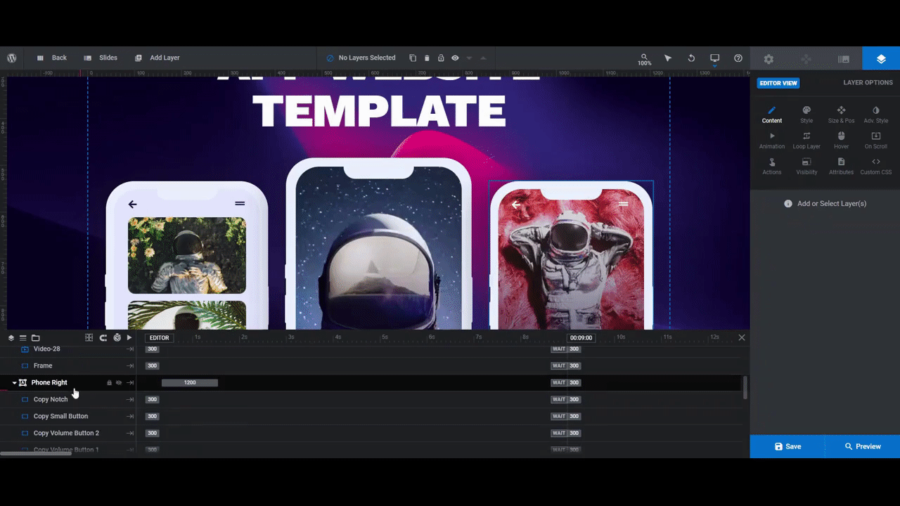
There are three phones in this hero section. All of the components within each are grouped under Phone Left, Phone Middle, and Phone Right.
Unless you want to make the phone shells a different color, you can skip editing the following layers:
- Notch
- Small Button
- Volume Button 2
- Volume Button 1
- Right Button
- Frame
Note: If you’d like to turn the phones from their current color to white or black, for instance,, select them one at a time in the timeline editor. Then go to “Layer Options” and “Style” to change the BG Color.
As for updating the screen content, here are some tips to help you craft your imagery:
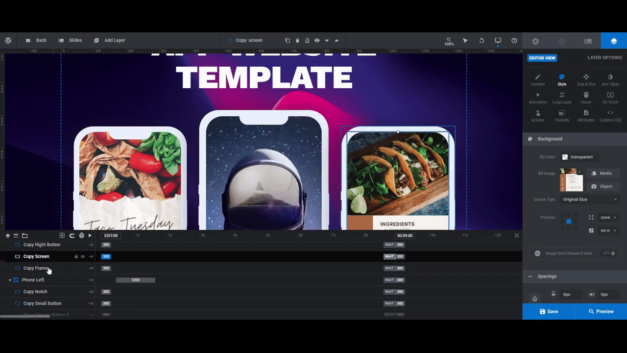
For the Phone Left layer, Copy Screen is a 310px by 672px photo.
Take a screenshot from inside your app and use your image editing software to size it to those exact dimensions. Alternatively, you can create a custom graphic to promote your mobile app.
For the Phone Right layer, follow the same guidelines as you did for Phone Left to generate your Copy Screen image.
For the Phone Middle layer, there are two components that make up what you see.
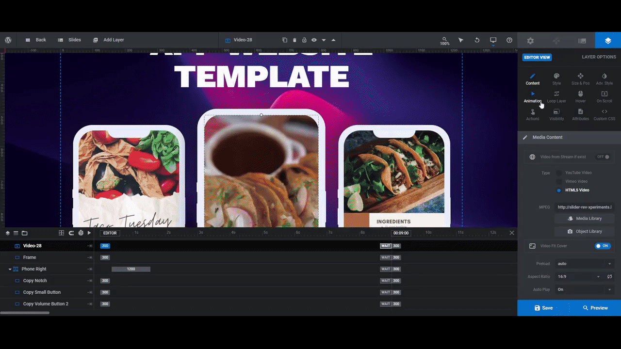
Video-28 is a 355px by 769px video of an astronaut in front of a moving sky. Screen is a transparent image with the title “The Spaceman”, a pink dash, and “Get Started” button.
Note: For our new Phone Middle file, we merged Video-28 and Screen together to create a single MP4 file. We did this inside of Canva which enables us to lay text, buttons and other graphics over our videos and photos:
You’re free to create the middle phone graphic effect however makes the most sense to you.
One last thing to note is the call-to-action button in the Phone Middle video.
In the original template design, if someone clicks anywhere on the middle screen, it will drop them down to the next section where the app store links are. Another option would be to direct users to a Download page or pop-up where they can choose their preferred app store.
We’ll address setting up the link in a separate step. For now, just consider whether you want this phone screen to have a link built into it. If so, make sure you design a call-to-action button for the video that suggests to users what the next step is (e.g. “Download the App”, “Install Now”, etc.).
Step 4: Upload the phone screen images into the template
Once you’ve created and saved your phone screen imagery to the right sizes, upload them into the Slider Revolution template.
To do this for Phone Left and Phone Right, select the corresponding Copy Screen layer in the timeline editor. Then go to “Layer Options”, “Style”, and replace the BG Image with your new one:
To update the Phone Middle graphic, there are two things to do. If you’re deleting the transparent Screen layer as we are, select it from the timeline and then hit your Backspace or delete key. Otherwise, update it the same way you did the other phone images.
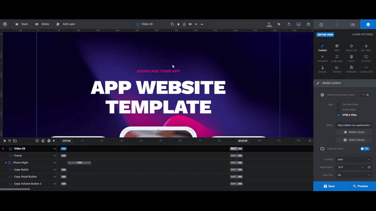
Then select Video-28 and go to “Layer Options” and “Content”. Open the Media Library and upload your new video graphic:
When you’re done, save your changes.
Learn more:
Step 5: Add a link to the middle phone screen
Now that the phone images are in place, the link needs to be added to the center screen.
If you have kept the Screen layer, then there is already a link set up under “Layer Options” and “Actions”. It will just need to be updated so that it points to the section or page you want to direct visitors to.
If only the Video-28 layer remains, then you’ll need to create a new link. To do this, select the layer and go to “Layer Options” and “Actions”.
You’ll find all kinds of actions on the right side of this screen.
- To direct visitors to a different page, choose Simple Link. Then add the URL.
- To make the page scroll down beneath this slider (to whichever section you place below it), select Scroll below Slider.
- To make the page jump to a specific section, choose Scroll to ID. You’ll have to add an ID to the section/element either in your WordPress page builder or in Slider Revolution.
When you’re done setting up the link, exit out of the modal. Your changes will autosave.
If you open up the preview of your hero section, you’ll see that the cursor changes when you hover over the video graphic of your middle phone. This signals to visitors that something happens when they click on it.
Learn more:
Step 6: Update the background
There are a few things we need to do in order to update the background of this hero section.
First, go to “Slide Options” and “Background”. The purple and pink background image is currently set as the background. To replace the image, click the “Media Library” button to upload your own:
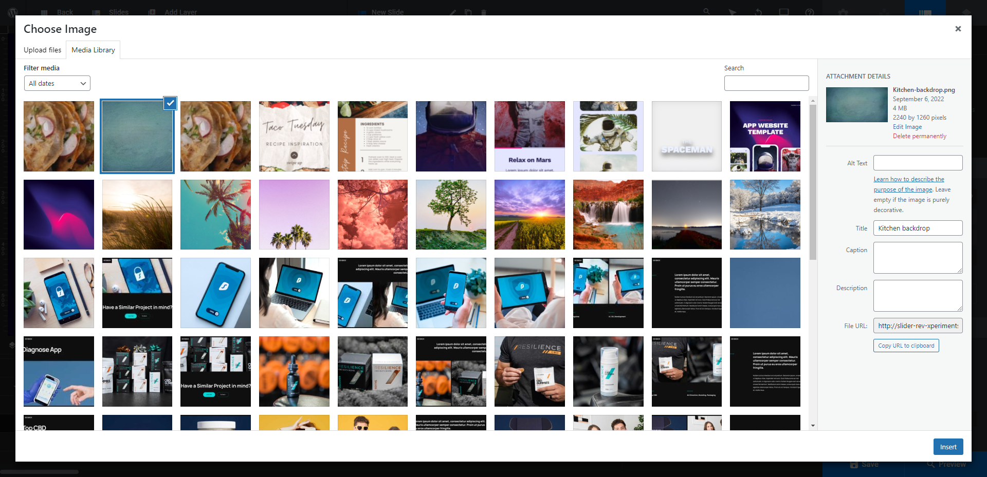
Pro tip: Because you want the mobile app images and video to be the main attraction, it’s best to use a background that’s simple in terms of content. So a texturized photo will work as will a solid or gradient color. If you want to apply a color, skip going to the Media Library. Instead, switch the background type to “Colored” and set the custom color(s).
If you’re using a background image, you’ll want to customize the transition effect applied to it. You’ll find this setting under “Slide Options” and “Animation”.
This hero section template uses an Advanced animation called Water Surface Medium. A water effect doesn’t fit well with our recipe planner app, so we’re going to choose something a bit more subtle — the Vertical Cut:
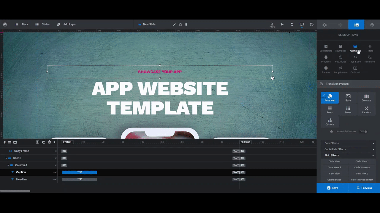
Take your time perusing the other transition animation effects. Hover over them one at a time and each effect will play out in the canvas on the left.
The last thing to do in this step is to update the module’s background. This is the color that appears as the hero section loads into view. Go to “Module Options” and “Layout” to locate this setting.
You’ll find it under the section called Module Background. Click on the BG Color and add your new color in the modal:
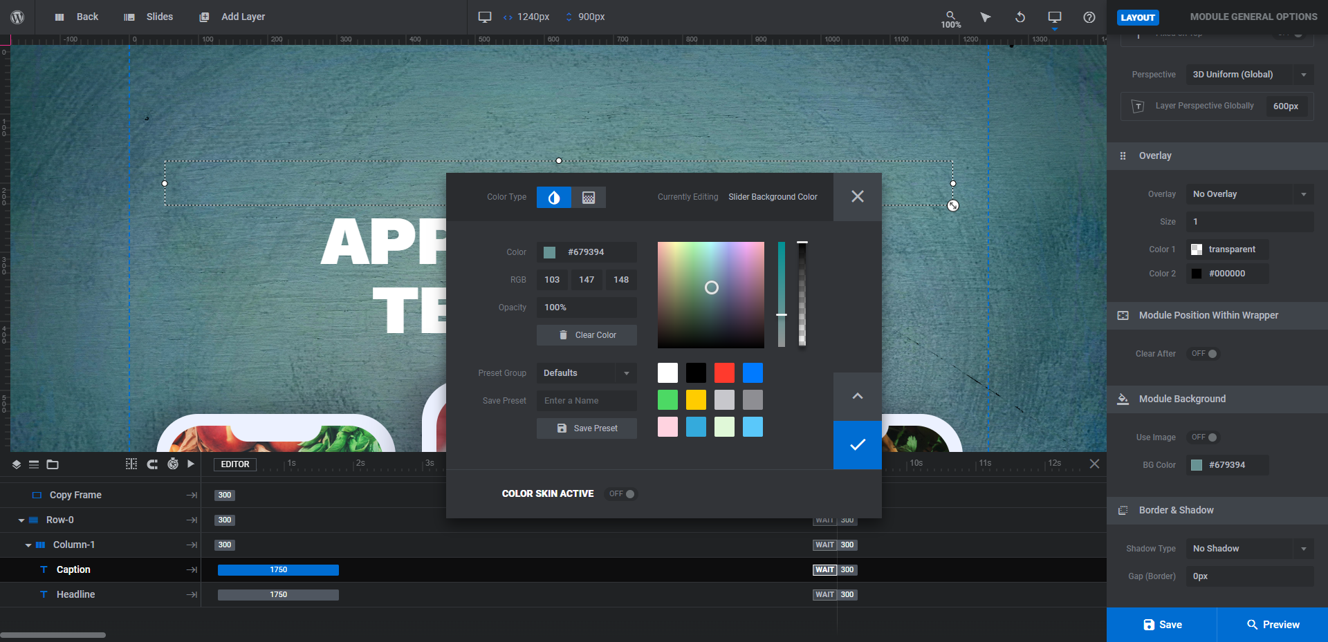
White is always a safe choice. You can also use a color that appears in the slide’s background image. When you’re done, save your changes.
Learn more:
- Changing Template Background Colors and Images
- Setting Slide Transition Animations
- The Tools of the Color Selection Dialogue
Step 7: Edit the caption and headline
Finally, there are two text layers that need editing in this hero section template:
- Caption is the smaller line that says “Showcase Your App”
- Headline is the bigger line that says “App Website Template”
To update your text layers, select them one by one in the canvas or from the timeline editor. Then go to “Layer Options” and “Content” to update what each says:
You may need to change the way the typography is styled. These settings are under “Layer Options” and “Style” for basic settings like color, size, and font or “Adv Style” for other settings like text shadows, stroke, and more.
Save your changes and give your new mobile app hero section a preview. If you’re happy with your changes, continue on with editing the rest of the app website template or insert this module into your home page.
Learn more:
Generate excitement for your new mobile app with a creative hero image design
Mobile apps have tons of competition in the Google and Apple app stores. Until a new mobile app can build up a substantial amount of installs and positive reviews, it’s going to take time to boost its visibility in the app stores’ search results.
With a mobile app landing page that users can find in Google and other search engine results pages, you can increase the momentum (and visibility) around even the newest of apps. And if you want to ensure that happens, you need to come up with a design that really knocks your visitors’ socks off.
Whether you choose to use the entire App Website Template or just the hero module, you’ll be off to a good start.


