
Adding more content to a website can sometimes feel like bringing home a new piece of furniture and wondering if you have space to fit it. You don’t want things to feel overcrowded and uncomfortable, but you also don’t want to have to remove something to make room for the new thing you’re excited about.
A website carousel or slider is a great solution for this. These natural space-savers allow you to display different options or offerings in a single section on the page.
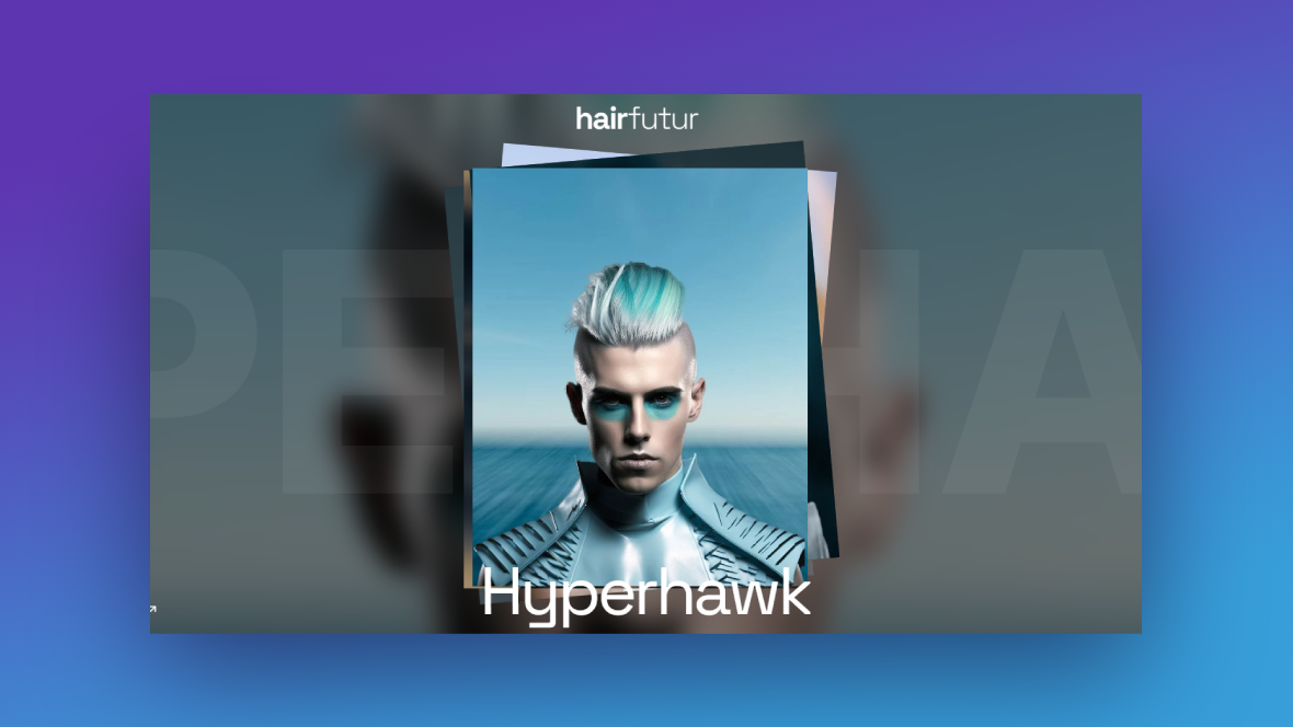
In the following tutorial, we’re going to show you how to take the Modern Hair Salon Showcase template and repurpose it for your own needs.
Table of Contents:
- Step 1: Edit the background images
- Step 2: Customize the slide transition effect
- Step 3: Update the images of your options or offering
- Step 4: Edit each slide’s text
- Step 5: Update the static slide text
How to create a slider that displays a variety of options or offerings
Whether you’re looking to add a bunch of offers to the hero section, promote different variations of a product, or give readers some options to choose from, this slider design will come in handy:
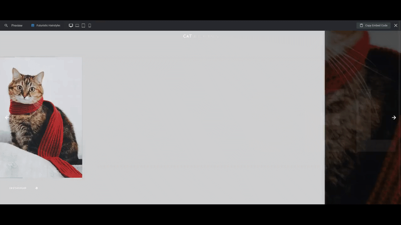
In the tutorial below, we’re going to show you how a carousel promoting different hairstyle options can easily be turned into a scalable and easily editable showcase of adoptable pets for an animal shelter website:
Here are some resources to help you get started if you’re new to Slider Revolution:
Step 1: Edit the background images
You’re going to use the same image in each slide’s background as you do for the first image that shows up in the card stack. It should be an 800px by 1000px photo. Also, try to make the subject of your photo fill as much of the space as possible.
To update the background, go to “Slide Options” and “Background”. Click on the Media Library button to upload your new file.
Do this for all five slides.
Note: If you want to remove options or add more, you can do so from the “Slides” dropdown in the top toolbar. To delete options, click the trash can icon next to any of the slides. To add more, click the duplicate icon.
Save your changes when you’re done.
Learn more:
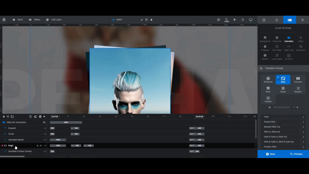
Step 2: Customize the slide transition effect
While we’re customizing the slides, let’s tackle the transition effect that appears in the background between each slide. You’ll find this setting under “Slide Options” and “Animation”.
At the moment, you’ll find that the slides are set to Skew Horizontal. Take some time to test out other settings by opening up the transition effect categories and types and hovering over the names. You’ll see a preview of each in the canvas on the left.
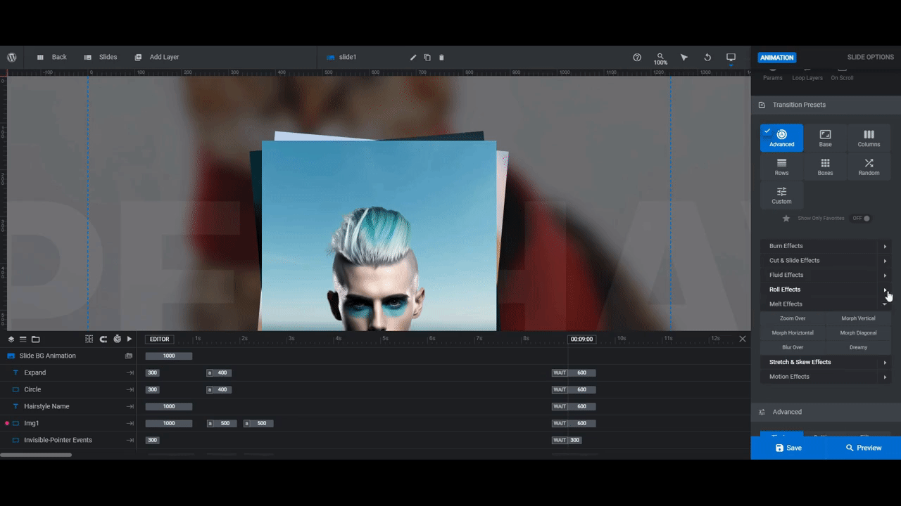
When you find the one you want, select it, save your changes, and then apply the same setting to each slide.
Learn more:
Step 3: Update the images of your options or offering
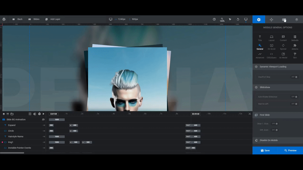
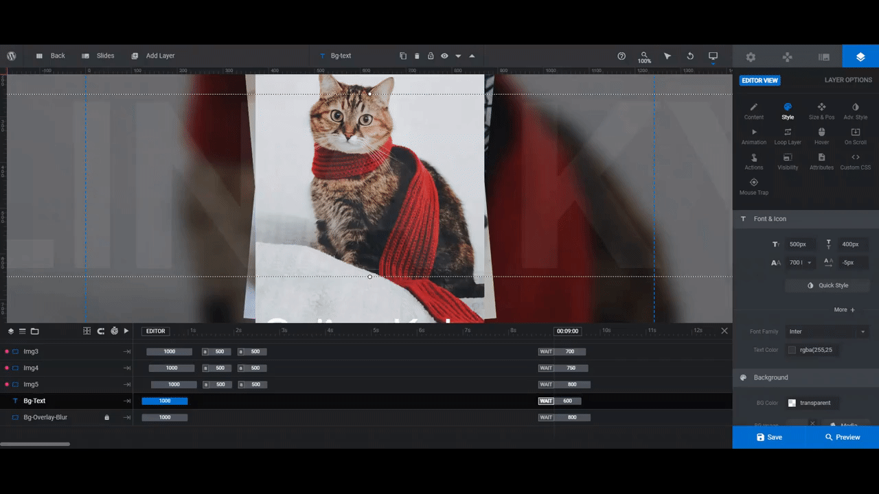
Go to the timeline editor at the bottom and you’ll find that there are five Img# layers in each slide.
Img1 is the photo that sits on top of the card stack. It should match the image you set as the background of that slide.
The remainder of the images are the ones you’re using in the other slides. The reason why they’re in each slide is so that, when someone clicks on the “click the image” text in the center, all of the other options will splay out across the screen.
To update these image layers, select them one at a time in the timeline editor. Then go to “Layer Options” and “Content” to upload your replacement photos.
Note: You want to make sure that Img2, Img3, Img4, and Img5 match up with the slides they’re connected to. Otherwise, the click-through effect won’t work correctly.
To ensure this happens, go to “Layer Options” and “Action” before uploading each of these images.
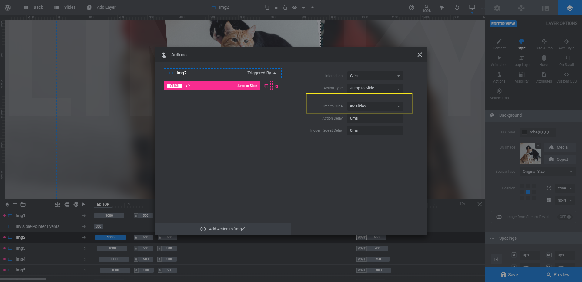
The Jump to Slide action will tell you which slide the card is connected to. Make sure the image you assign to it matches. If you discover later on when testing out the slider that it doesn’t, that’s okay. Just go back to the actions and edit the slide number next to Jump to Slide.
Learn more:
Step 4: Edit each slide’s text
There are three text layers in each slide:
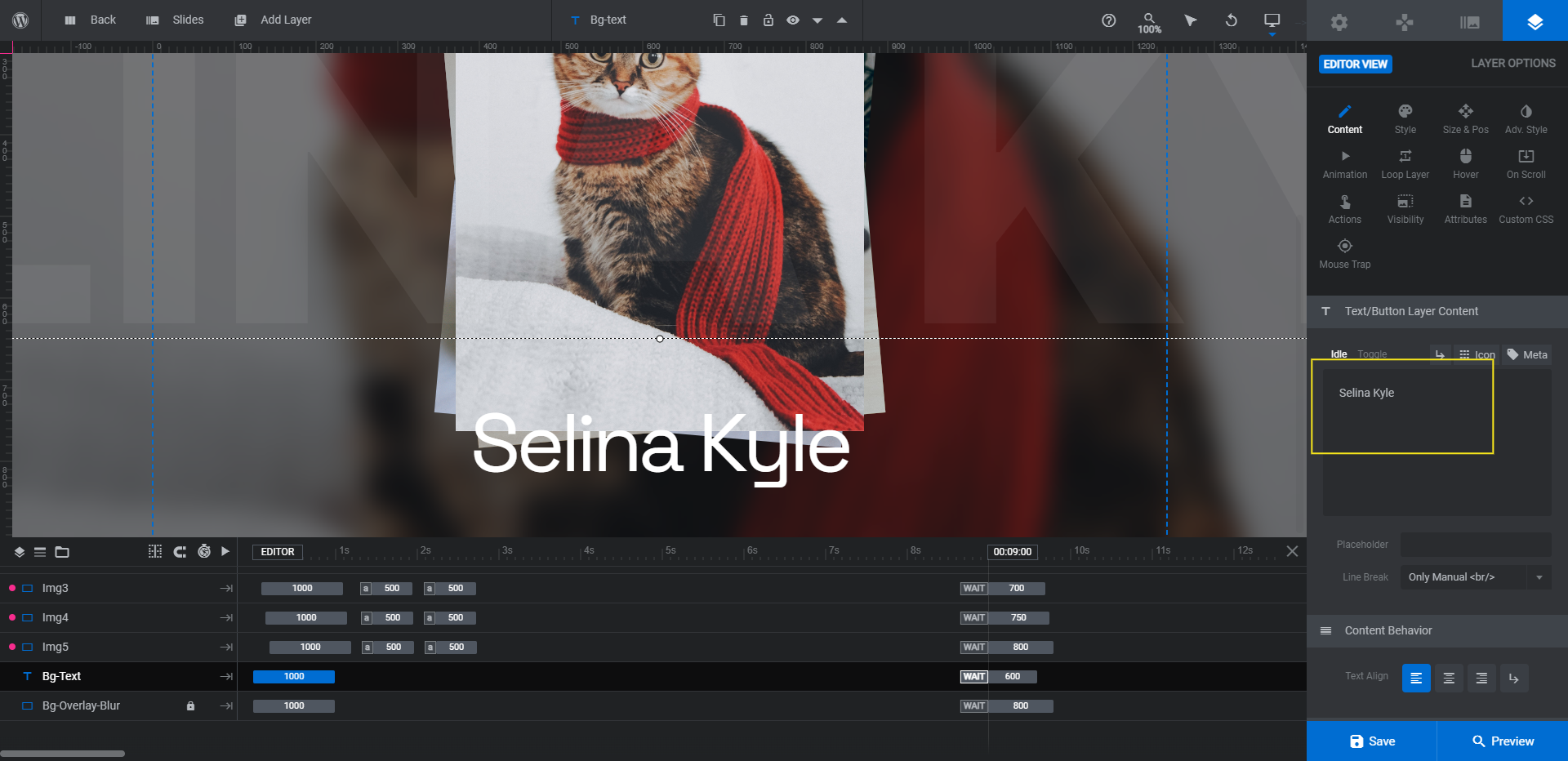
- Hairstyle Name is the name that prominently stands out at the bottom of the card.
- Bg-Text is the semi-transparent, oversized name (same as the hairstyle) that runs across the background.
- Expand is the “click the image” text that appears when someone hovers over the card.
Let’s start with editing what the text says. You can leave Expand as is. To edit the other two layers, select them in the timeline. Then go to “Layer Options” and “Content” to update the text.
Next, let’s update the font and general style of the text layers. Go to the “Style” panel to change the font, color, weight, spacing, and more.
Note: If you change the font for the Bg-Text layer, make the same change for the Expand layer. This will keep the number of font styles in each slide to a minimum.
Learn more:
Step 5: Update the static slider text
The individual slides are done. Now let’s move onto Global Layers. You’ll find them by opening the “Slides” dropdown in the top toolbar.
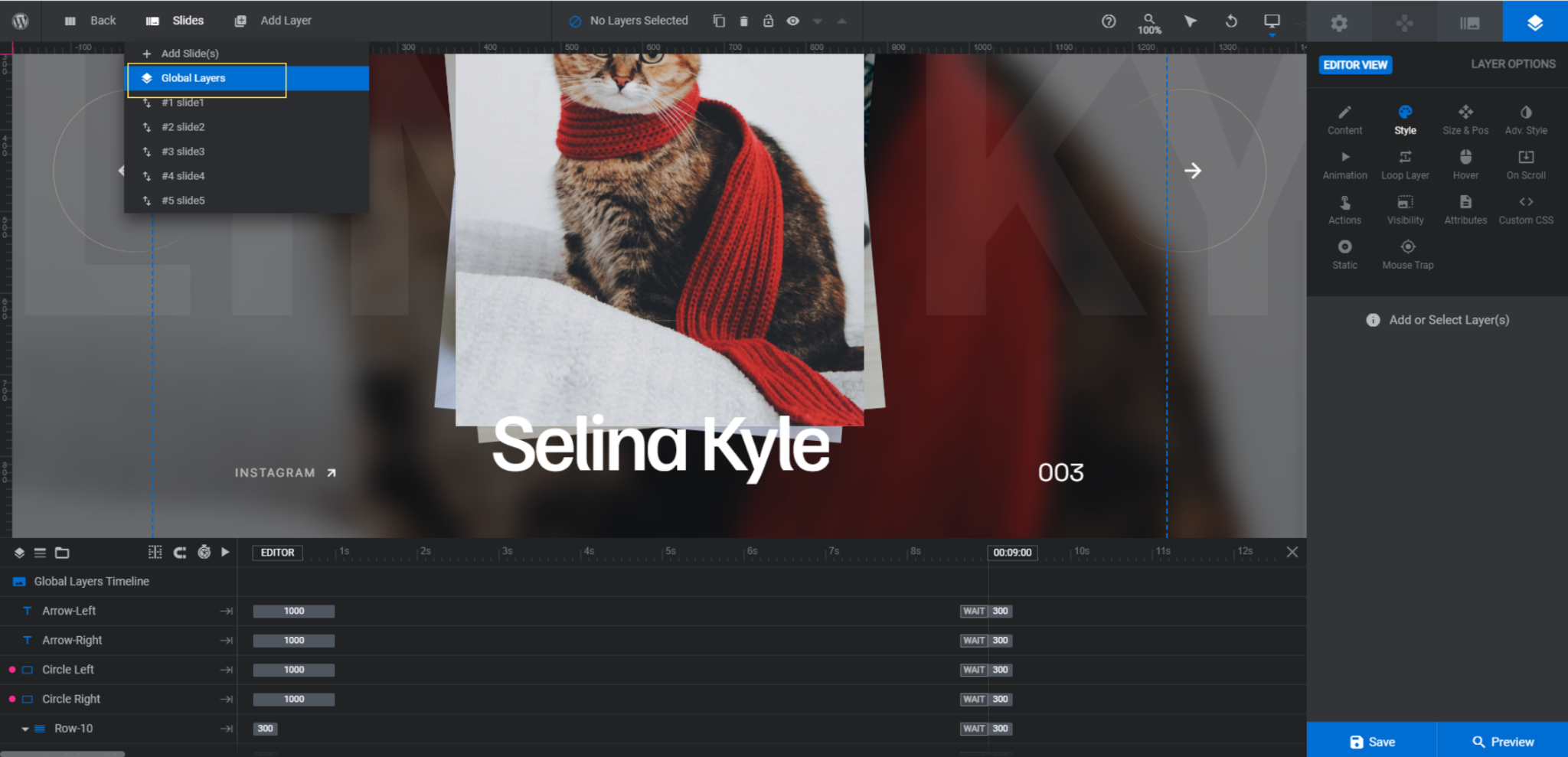
Global layers are ones that appear on top of the slider. So even as the slides change, these elements stay where they are and are visible at all times.
In this particular slider, we have the following global layers:
- The navigation arrows and circles
- The header row of links
- The bottom row containing the Instagram link and slide counter
You don’t need to do anything to the navigation arrows unless you want to change the arrow type (under “Content”) or color (under “Style”).
Let’s instead focus on the text elements.
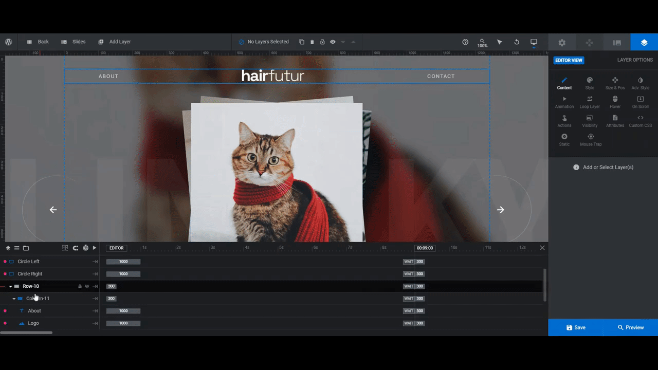
The top row is Row-10. It has the following layers:
- About
- Logo
- Contact
The header of our site will already have the About and Contact page links in it, so we can delete them. To do that, select them in the canvas or timeline editor. Then hit the Backspace or delete key.
We’re going to replace the Logo with a custom logo for the slider to let people know these are our “cat superstars” (i.e. the ones who have been waiting for a home for too long). To edit this image layer, select it and upload your new file under “Content”.
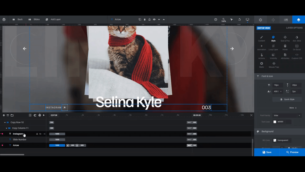
Lastly, there’s Copy Row-10. This row contains three elements:
- Arrow (next to the Instagram link)
- Slide Number
We’re going to keep all of these in here. The slide number is useful for telling visitors how many options there are to look at. And the Instagram button will be our call-to-action. It’s also a good way to stay in touch with people even if they’re not visiting the website every day.
Here’s what needs to be done in terms of editing.
The font for all three layers should match the fonts you used for the text in the slides. You can use just one of the fonts or both.
The Instagram and Arrow links also need to be updated so that visitors are directed to your business’s own Instagram page. To do this, select the layers one at a time. Go to “Actions” and edit the details of the Simple Link that’s in there.
When you’re done, exit out of the modal. Then open the preview of the slider and test out your new slider.
When you’re happy with how it displays your different options or offering, save your changes. You can now add it to any page using the module shortcode or by embedding it with the Slider Revolution widget in your page builder.
Learn more:
- Special Layers: Rows, Groups, Backgrounds & Global
- Editing Links in Template Modules
- Module Title/Shortcode
Display various options and offerings with a one-of-a-kind slider
Using the Modern Hair Salon Showcase template, we have turned our adoptable cats into superstars. It didn’t take much work either. The pieces were already in place to create an attractive and one-of-a-kind slider to display our options and offerings. All we needed to do was upload our own imagery and edit the text. Now it’s your turn to do the same.


