
In ecommerce photography, the products always take center stage. That said, these photos don’t always provide any context or tell a story about what the product can do or where or when it can be used. This information can be useful to shoppers and they usually need to go digging around the product’s description or even in the customer reviews to find it.
A product slider that transports your product from one setting to the next can visually tell that story to your shoppers. What’s more, it’ll give them less work to do when researching your products.
In this tutorial, we’ll show you how to create an exciting ecommerce product slider with the help of our Motion Blur Portfolio Showcase template.
Table of Contents:
- Step 1: Delete the video slides
- Step 2: Clean up the Global Layers
- Step 3: Strip down the slides to the elements you need
- Step 4: Add new background images
- Step 5: Replace the image of the man with your product image
- Step 6: Edit text layers
- Step 7: Add a call-to-action button
How to create a one-of-a-kind ecommerce product slider
An ecommerce site is nothing without its product imagery. Shoppers depend on these visuals to get an up-close-and-personal look at items they want to buy online or at the store.
Instead of giving them a row of thumbnails with mundane backgrounds to peruse, consider taking it a step further with a product slider equipped with special effects. In a matter of seconds, your shoppers would see all the ways they could put your product to use.
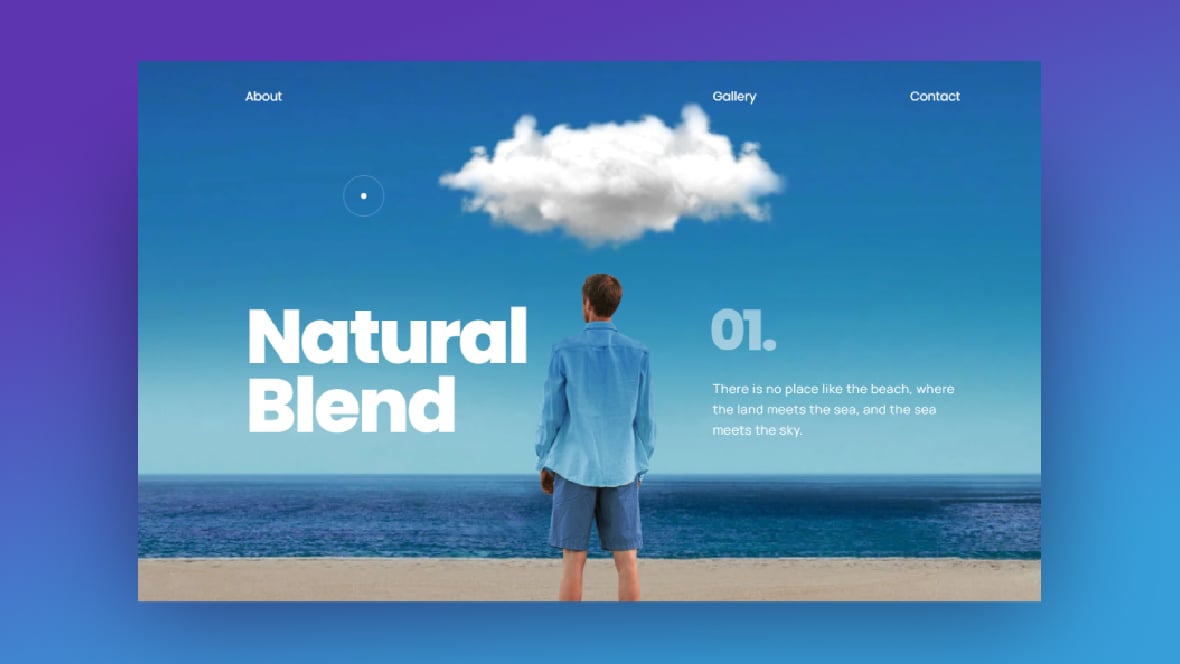
Slider Revolution’s Motion Blur Portfolio Showcase template is just one example of how this might look:
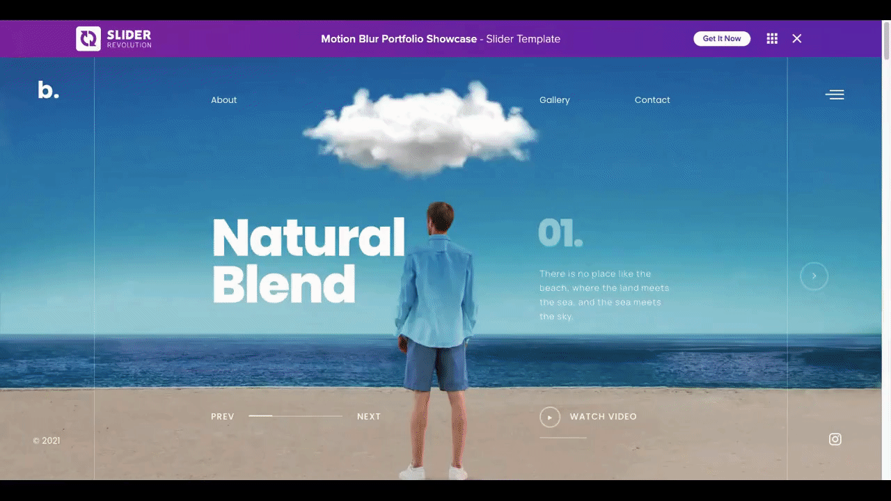
In the following tutorial, we’ll show you how to use this same template to put a product like a coffee thermos at the center of your ecommerce slider:
Need a Slider Revolution refresher before getting started? Read these first:
Step 1: Delete the video slides
When you step inside the newly installed template, the first thing you may notice is how complex the design is. There are lots of moving pieces that come together to create this visually stunning effect.
Based on what kind of environments you want to frame your products against, you may decide to preserve all of these elements. If you’d prefer to create something scaled back — like the slider design we’ve created today — you can follow these steps to a T.
Let’s focus first on the slides.
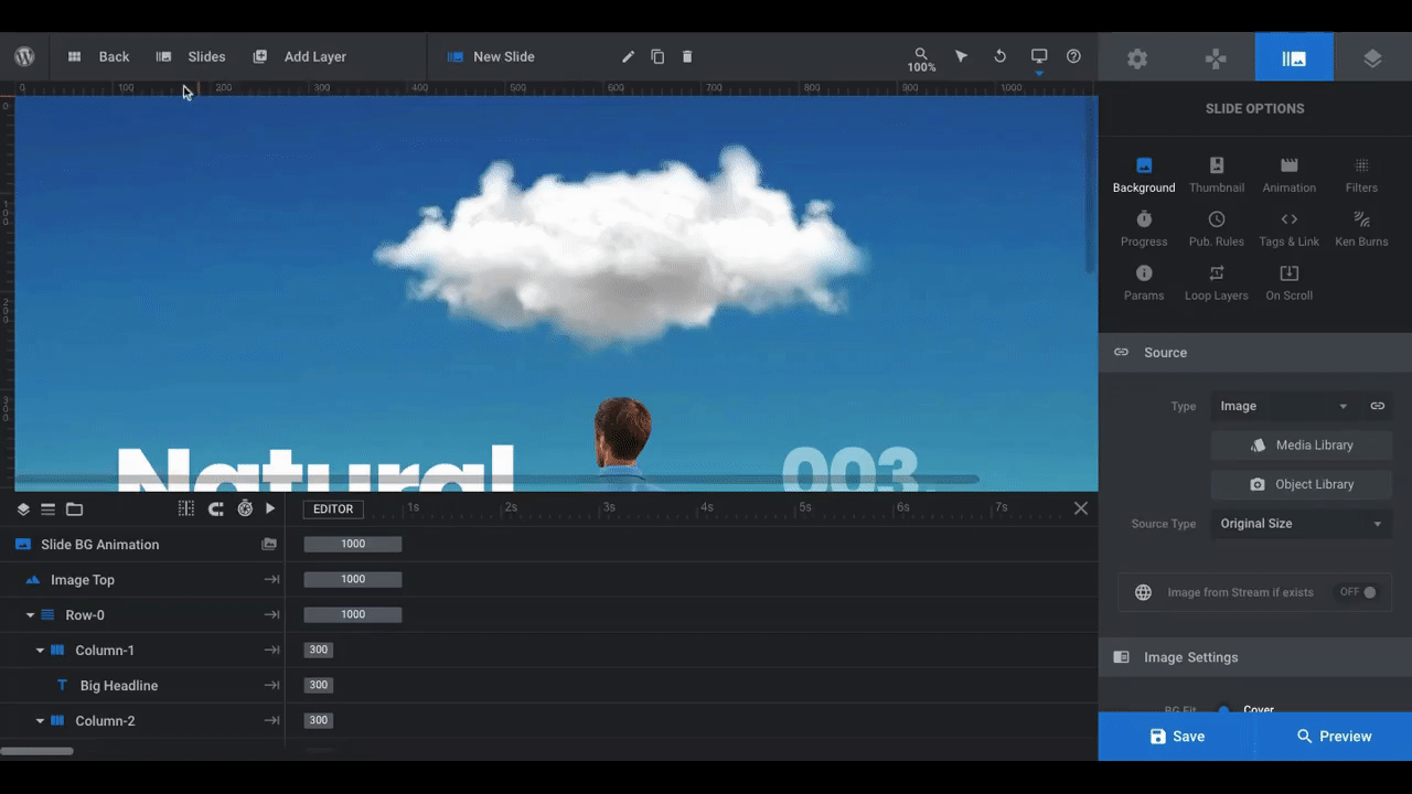
There are eight slides in this module template. You can find them all under “Slides” in the toolbar:
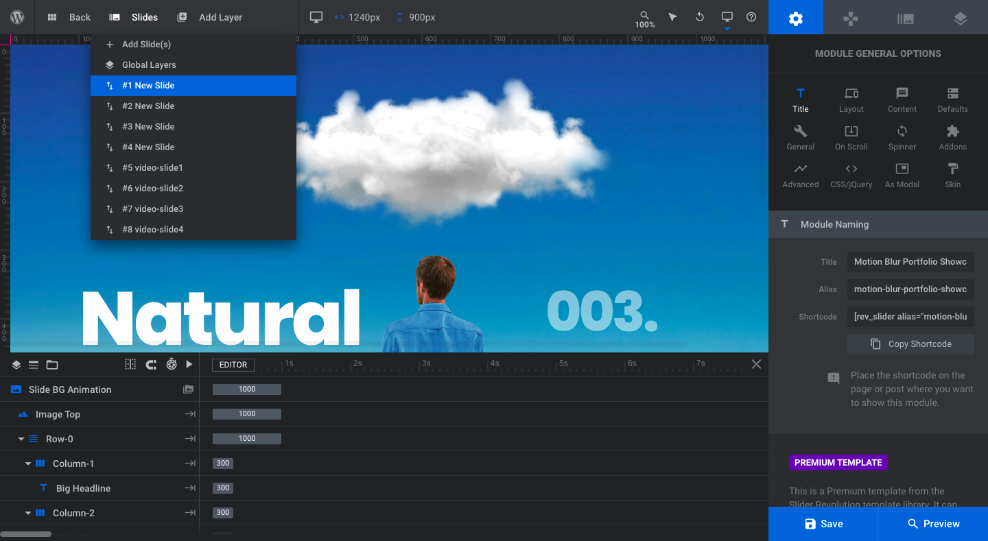
The way the template works is that there are four image slides where we see the backdrop change around the man (in addition to the color of his clothes). When visitors click on the “Watch Video” button on each slide, a corresponding video version of the slide appears in a modal.
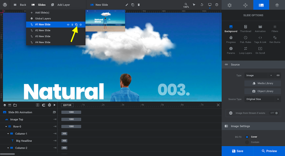
We don’t have a video counterpart for our slides, so we’ll be getting rid of the four video slides. To delete a slide, hover over it and click on the trash can icon:
One last thing we’ll do in this step is add an extra slide since our product slider will have five images. Instead of adding a new blank slide, though, we’re going to duplicate one of existing ones.
To do this, open up “Slides” once more, hover over any of the slides, and click on the duplicate icon:
Pro tip: Sliders are most effective when you limit how many images are shown. Usually, between three and five is best.
Learn more:
Step 2: Clean up the Global Layers
You’ll find the Global Layers under the “Slides” toolbar dropdown:
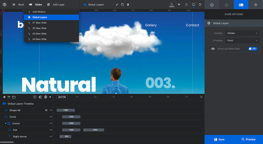
Global Layers are the ones that stay in place regardless of which slide the visitor looks at. This particular template is set up with different kinds of global layers:
Header global layers
If you’re not going to build out a header for your website using your WordPress theme, you’ll probably want to keep the one inside of this template. If this module will serve as a section on your home or product pages, however, you won’t need this header.
To delete the logo and menu elements, remove the following layers and layer groups (which will remove everything beneath them as well):
- Menu-Button
- Menu
- Logo
- Navigation
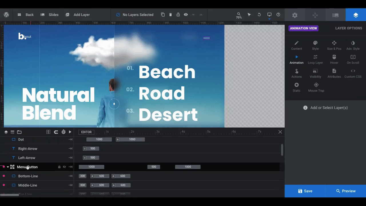
Slider navigational global layers
This slider doesn’t use one of the Slider Revolution navigation elements (like Arrows, Progress Bar, etc.). Instead, it has a custom navigation system built in as Global Layers.
We’re going to keep the navigational elements as they are, which means we’ll leave the following layers and layer groups alone:
- Shape-46
- Circle
- Left-Line
- Right-Line
- Left-Detector
- Right-Detector
Footer layers
If we were going to create a microsite using the slider and its content to form the basis of the site, then we would need a header and footer. That’s not what we’re doing here, so we’re going to strip out the footer elements the way we did with the header.
There are just two:
- Copyright
Select each and delete them from the design. When you’re done, save your changes.
Learn more:
- Special Layers: Rows, Groups, Backgrounds & Global
- Global Layers
- Selecting Layers via the Canvas or Timeline
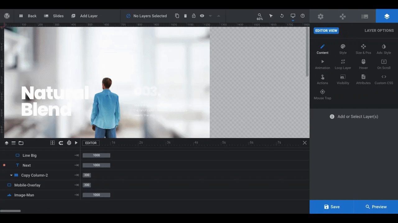
Step 3: Strip down the slides to the elements you need
Start by opening up your first slide under “Slides”. What we want to do is identify which layers or layer groups to remove so we can more easily focus on the ones that need editing.
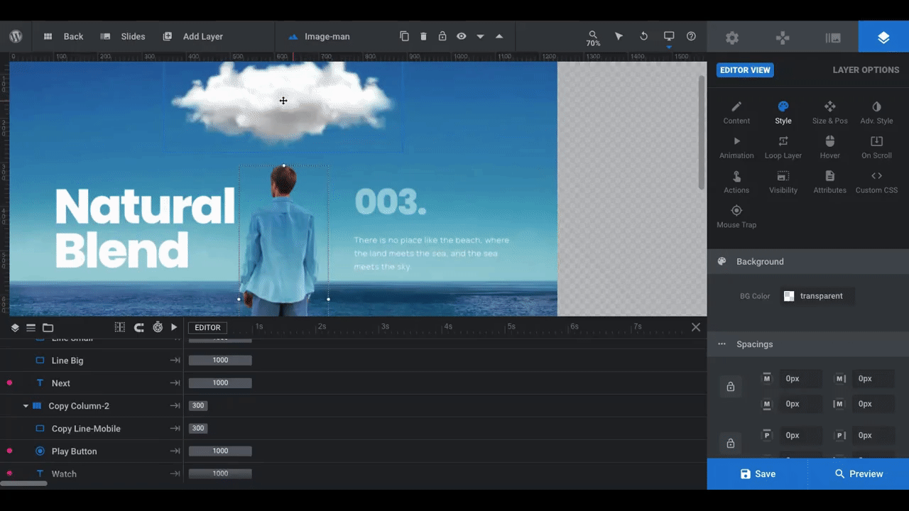
There are a number of components in this slide:
- Image Top is the atmospheric element at the top of the slide (like the cloud or rainbow)
- Row-0 contains the columns and content found in the center of the page
- Bottom-Row contains the “Prev”, “Next” and “Watch Video” buttons
- Mobile-Overlay is a semi-transparent dark gray overlay that appears over the ground component on mobile so that the white text is easier to read
- Image-Man is the photo of the man in the center of the slide
For our simplified design, we’re going to remove the following layers:
- Image Top
- All of the components under Copy Column-2, but not the column container
This step will need to be repeated for all of your slides. Do that now before moving onto the next step.
Step 4: Add new background images
You have a couple choices when it comes to creating your own module design.
The first is to show off product variations against the same background image (or color backdrop). If that’s what you want to do, configure the same background for each of your slides in this step.
The second is to show off the same product image against different background environments. If that’s what you want to do, upload a different background image for each of your slides instead.
The process will be more or less the same. It’ll just look a little different from what we’re about to do if you’re going with the first option.
To start, open up #1 New Slide again. Go to “Slide Options” and “Background”. Set up your new background under “Source”. Then, do the same for all the other slides:
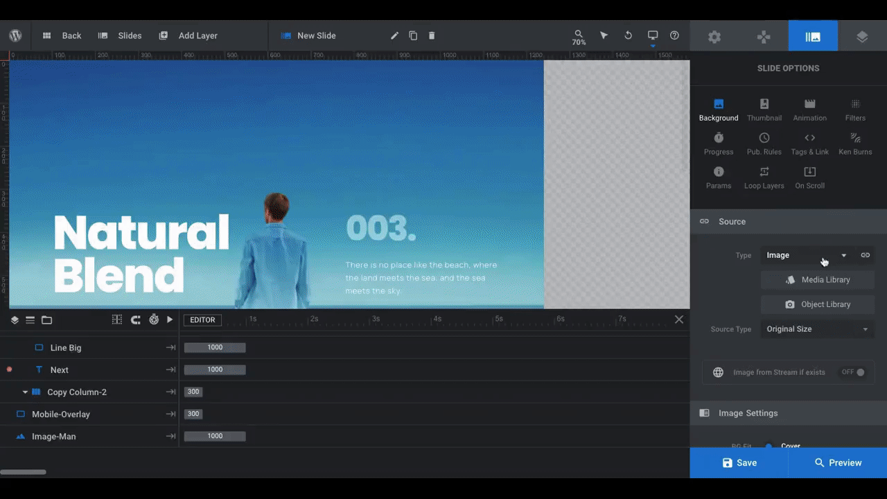
If you need to resize or move your background around, scroll down to “Image Settings” and make the adjustments there.
It’s also a good idea to edit the Mobile-Overlay layer during this step, if it’s needed. First, switch the editor view to “Mobile”:
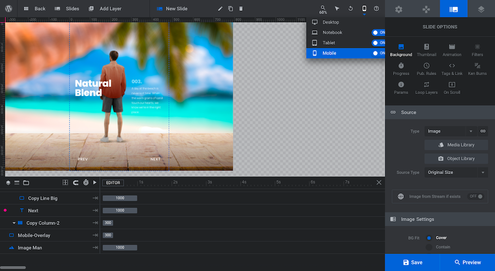
Click on Mobile-Overlay in the timeline to reveal the layer in the canvas editor above:
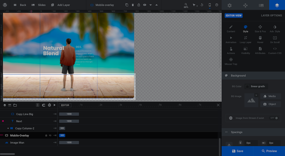
This is a vertical gradient, with it starting out fully transparent at the top, making its way to a 50% transparency at the bottom. All it does is add a little darkness to the bottom of the screen so the white text layers (the Global Layers) will show up more prominently.
If you don’t like the positioning of the layer, you can adjust the size of it under “Size & Pos”.
Learn more:
Step 5: Replace the image of the man with your product image
Next, let’s tackle the main product image.
Pro tip: If you’re going to use a photo of a person — like to show off clothing — edit it so it’s the same size as the current image (which is 203px x 606px). That’ll save you the trouble of resizing or scaling the photo once it’s inside of WordPress.
We’re going to replace the image of the man with our coffee thermos product. To do this, we’re going to click on the current image, go to “Layer Options” and “Content”, then upload our product photo:
We’ve gone through and replaced the image in each slide while also changing the “Source Type” to Large.
Upon examination of our slides, it looks like we need to move our thermos photo up a bit so it more naturally “sits” on each of the surfaces. To do this, we go to “Size & Pos” to change the Y-axis positioning to 120px.
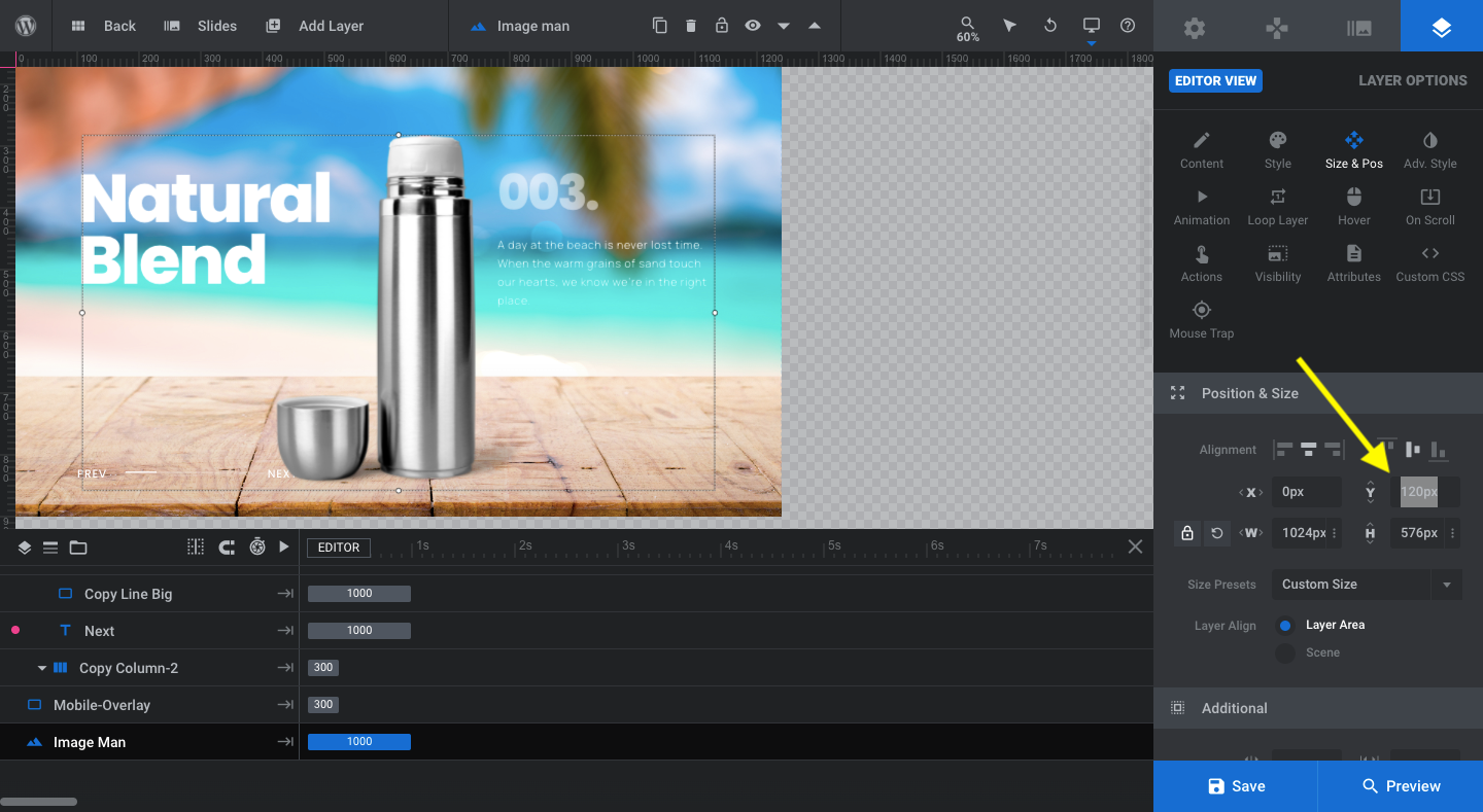
Pro tip: If you change your product photo’s position, make sure to apply the same position to it on each slide so the transition effect doesn’t feel inconsistent or sloppy.
If you’ve made any changes to size or positioning, do a quick check through the Notebook, Tablet, and Mobile sizes. You want to ensure that any changes done on Desktop don’t compromise the end result on smaller screens.
Learn more:
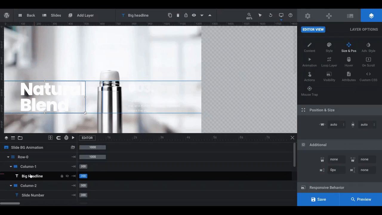
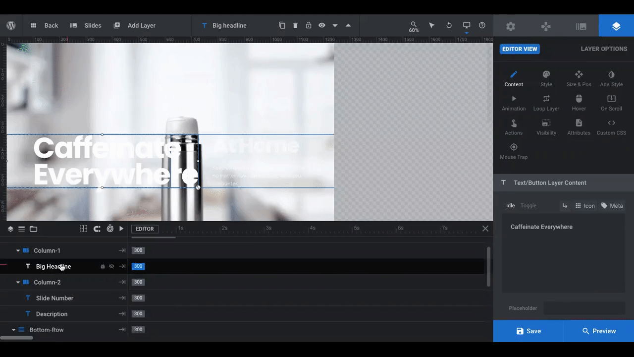
Step 6: Edit text layers
First, we need to edit what the text layers actually say. Then, we’ll update the styles.
To edit your text layers, click on the corresponding layer in the canvas or timeline. Then go to “Layer Options” and “Content”. Replace the text in the editor box:
Repeat this process for all of your slides. Don’t forget to edit the text for the “Prev”/ “Next” layers at the bottom if you want them to say something else.
Next, we’re going to customize the styles so they’re on brand and so the text fits well around our product imagery.
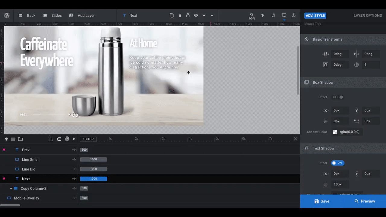
Under “Style”, we changed the Big Headline and Slide Number (now a sub-headline) to a font called Yanone Kaffeesatz. We also gave them a lift by adding a 15-pixel Text Shadow under “Adv Style”.
We then changed the Description to Arial font as well as altered the size and color.
Whatever changes you make to this slide, make them to all the other slides, too. Also, don’t forget to update your “Prev” and “Next” styles if they need it.
Learn more:
Step 7: Add a call-to-action button
We don’t have a video to show our shoppers, but that doesn’t mean we don’t want to call them to take action. In place of the video button, we’re going to add a “Buy Now” button.
Pro tip: If you’re putting this ecommerce product slider at the top of the product page, then the button should be relevant to that page — like “Add to Cart” or “Learn More”. A “Buy Now” button makes more sense for the home page.
To add a new button layer, go to “Add Layer” in the toolbar and select “Button”. This will open a bar with predesigned button options:
Select the button that’s closest to what you’d like to use in terms of design and size. It will add it to the top corner of the slide.
You can either drag it to the spot where you want it to go on the canvas or you can use the timeline at the bottom to drag it under Copy Column-2. That’s what we’ve done here. The button now goes where the video button used to be.
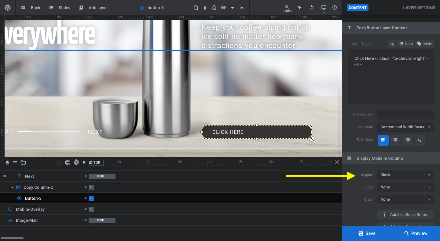
Note: By default, the button will be set to “Block” (full-width) and the text will be left aligned. To create more balance in the button design, go to “Content” and “Text/Button Layer Content”. Set the “Text Align” setting to centered and the button text will move to the middle.
If you prefer, you can reduce the size of the button under “Display Mode in Column”. Change the “Display” setting to “Inline-Block”:
You can now edit the button’s design just as you did the text layers:
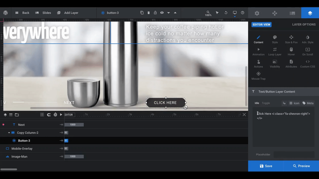
Use “Style” settings to change the font, text color, and size. You can also update the button’s background color here.
Use “Size & Pos” if you want to alter the dimensions or positioning of the button.
Then use “Adv Style” if you want to apply any special settings to the button design. We used this to add a Box Shadow effect and make the button stick out more.
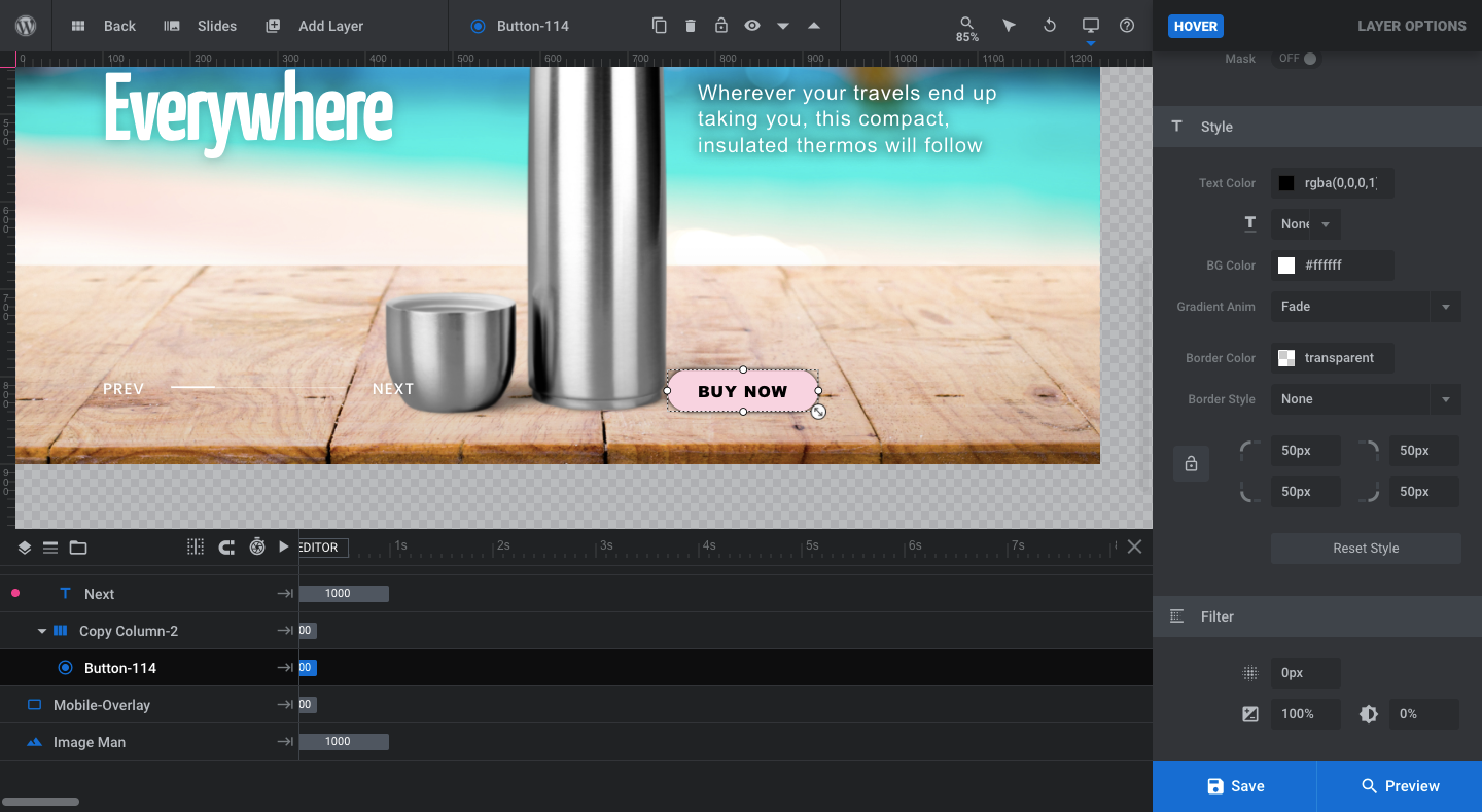
Note: The button has a hover effect programmed into it. So, when a visitor hovers over it, it transforms into a white background with black text. If you don’t like this style, you can change it by going to “Hover” and scroll down to “Style”:
When you’re done setting up your button, apply the same design to all of your slides. Or, if you’d like, you can leave it off of all slides except the last one.
Also, be sure to check again on the other device variants to make sure the button is in the right place and is properly sized for those screens.
Learn more:
Level up your product sliders with Slider Revolution
More context is always good when it comes to online shopping. The only problem with that is shopper attention span. Your home page and product pages could easily spell out what the products do and all the different ways to use them, but will anyone want to read through all of that text?
Probably not.
With a beautifully designed ecommerce product slider, though, you wouldn’t have to. Or, at the very least, you wouldn’t have to worry about shoppers missing those important details that get buried in the product descriptions.
To create something like this on your own would require a lot of time and likely a lot of coding. With Slider Revolution, none of that is necessary. With the help of the Motion Blur Portfolio Showcase template and about an hour of your time, you could have your own custom slider up and running.


