
As people spend more time online these days, it’s going to take an extra special experience to get them to stop and pay attention to one website over another.
Color gradients have been trending these past few years, so it’s common to see them on websites — as backgrounds, buttons, fonts, and more. That doesn’t mean that gradients aren’t a web design trend worth exploiting though. All you need to do is create a unique take on the trend.
Slider Revolution has made this easy to do. In the following tutorial, we’ll show you how to modify the Background Effect Hero template to create your own dreamy gradient background design.
Table of Contents
- Step 1: Figure out your theme
- Step 2: Edit the text layer
- Step 3: Create your gradient background
- Step 4: Edit the layers
- Step 5: Edit the particle effect
- Step 6: Edit the CTA button
- Step 7: Customize the other slides
- Step 8: Customize the global layers
How to create a unique gradient background for your home page
When you want to add an eye-catching gradient background to your site, don’t bother starting from scratch. The Background Effect Hero template will do most of the work for you. All you have to do is make some personal design choices and then implement them.
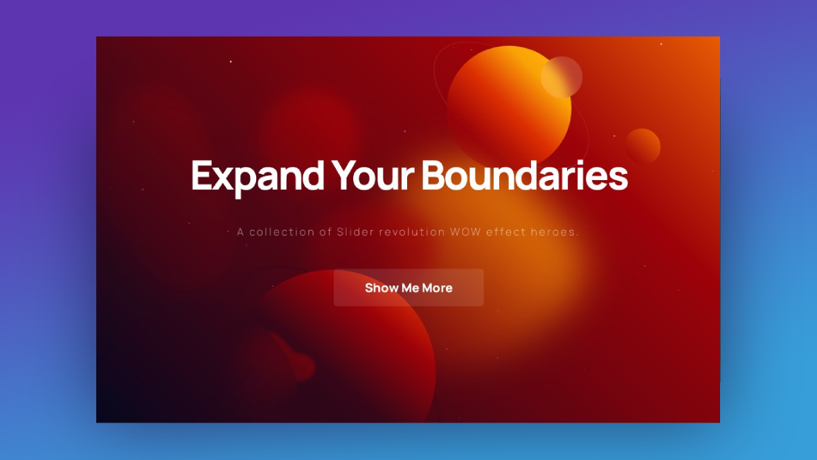
In this tutorial, we’re going to show you how to edit this template:
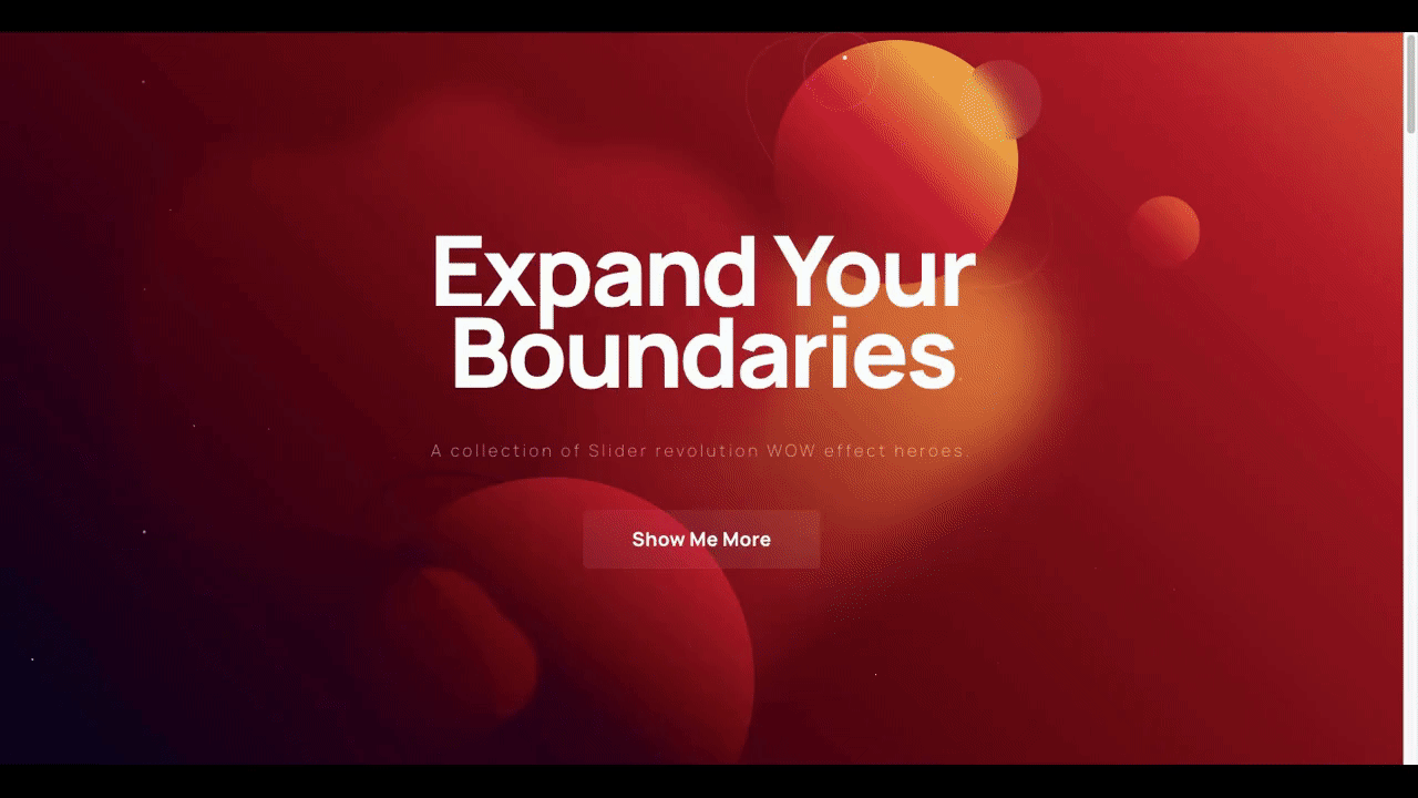
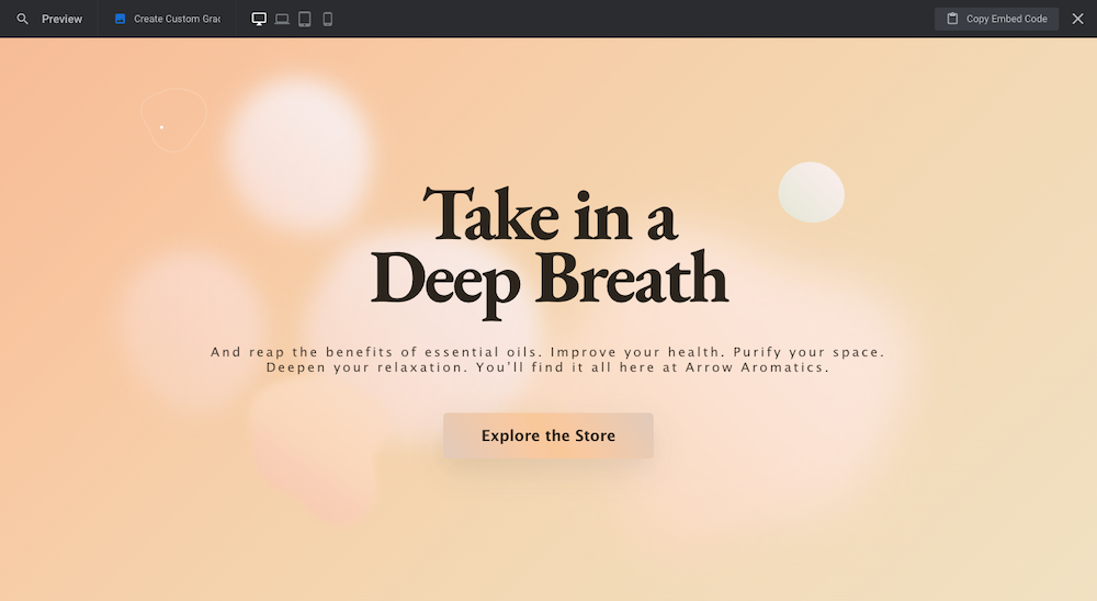
And turn it into something that looks like this:
By the way, if this is your first time using Slider Revolution, it’s not a bad idea to acquaint yourself with the Slider Revolution plugin. Learn more here:
When you’re ready, install the template in your Slider Revolution plugin and we’ll get started:
Step 1: Figure out your theme
Within this template, there are four slides, mostly composed of the same elements and textures. Solid planet shapes. Lava lamp-like orbs. Particle effects. And vibrant gradient backgrounds.
The combination creates a dreamy, almost hypnotizing atmosphere for the visitor.
Now it’s up to you to decide how much of this design and theme you want to preserve. Ask yourself the following questions:
- How many slides do you need? Is there one particular style you like over the others?
- Do you want to create a simpler gradient module without any objects or special effects?
- Would you like to remove the solid objects and keep only the morphing blobs in the foreground and background? Or vice versa?
- Do you want to keep the floating particle effect?
- Are there any other objects or components you want to add to these slides?
As you can see from the various slides, you can create all sorts of vibes and environments from this template.
The first slide (the red one), for instance, has a dark and intense color palette and the shapes on it give it an otherworldly feel. The third slide (the green one), on the other hand, almost feels like you’re underwater.
Figure out what you want to do with this module and the general style you want to give it. Then, move onto the next step.
Step 2: Edit the text layer
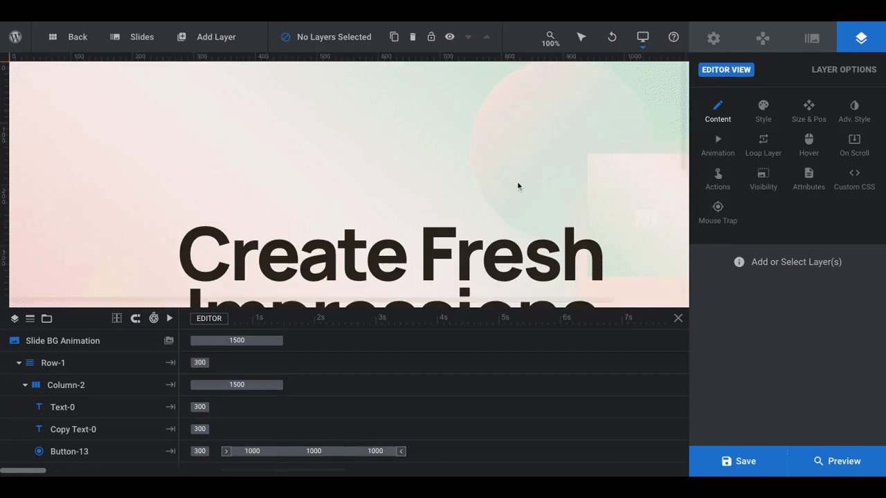
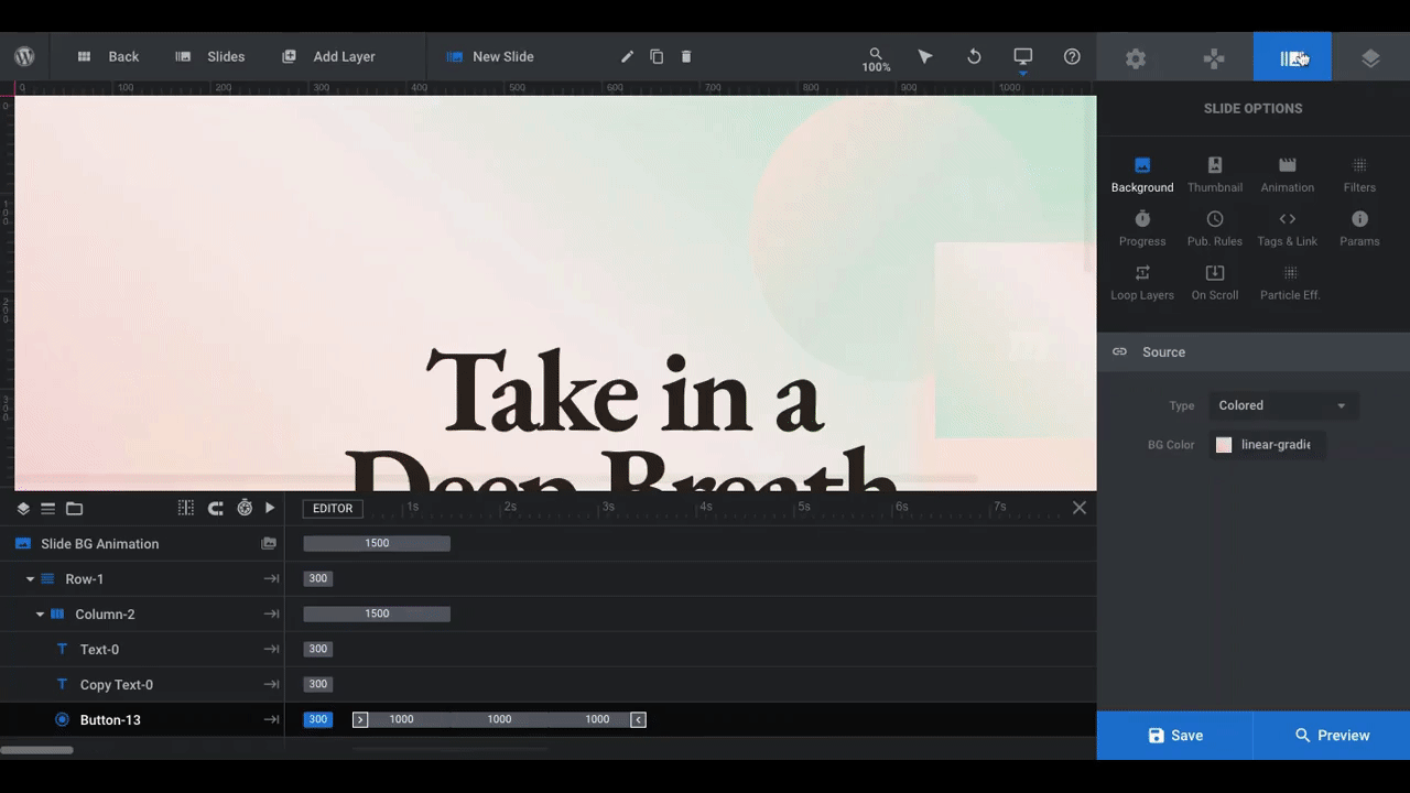
Open the first slide you want to work on. You’ll find it under “Slides” in the toolbar at the top. For our purposes, we’re going to customize Slide #4:
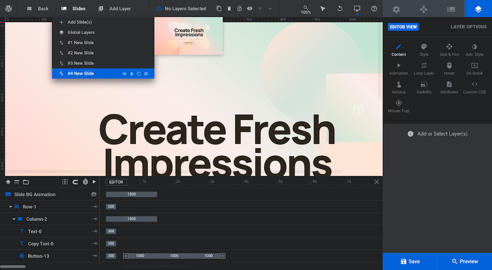
There are three areas of text to edit in this slide. When designing a hero section like this, it’s generally a good idea to lay it out the way it is here:
- Big headline up top
- Smaller paragraph text below
- Button at the bottom
Unless you’re planning to deviate from that formula, all you need to do here is edit the text and change the styles.
To edit what the text says, click on the header first. This will open the Layer Options on the right. Go to “Content” and replace the existing text with your own.
Repeat this step for the paragraph text as well as the button text.
To change the existing styles — like the font, text size, and color — click on the Style tab and update the text layers there:
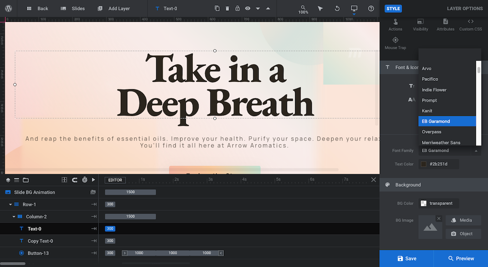
You may need to make additional changes to the text later, like if the color doesn’t contrast well with the background. That’s okay. If that happens, just return to this area of the editor to make your changes.
Learn More:
Step 3: Create your gradient background
When plotting out the gradient background, you have to consider what sort of reaction you want it to get.
A lighter and softer gradient with less of a color contrast will create a more comfortable and relaxed environment. On the other hand, a gradient with more intense colors or an extreme color contrast will create a stronger reaction.
If you need help putting together a color gradient scheme, start with a tool like Coolors. Click on the “Browse Gradients” tab and explore the endless array of gradient samples there:
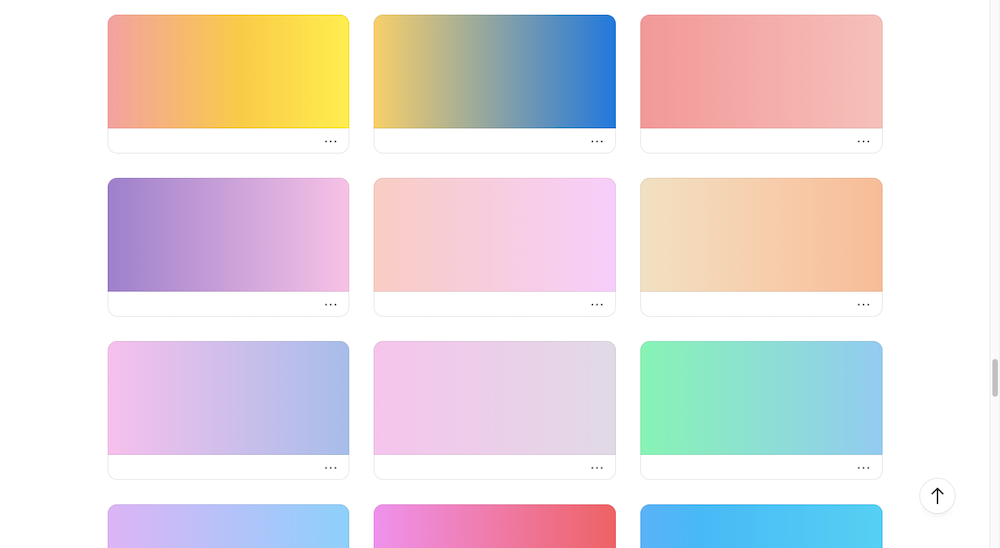
If you find one that resonates with you and that works well with your branding, hover over it to find out what the colors are within it.
If you want to create a gradient with all kinds of wacky colors within it, you can use Coolors “Create a Gradient” tool to design yours. However, if you want to create a smooth gradient that transitions from one color to the next, Color Designer’s Gradient Generator is a better option:
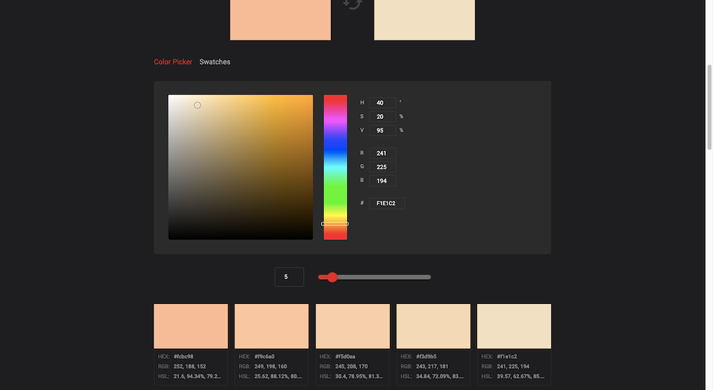
The tool asks you to input the starting color of your gradient and your ending color. Simply click on each box and then enter the HEX code you got from Coolors.
Down below, you’ll find a scale of colors that exist between them. You can decrease or increase the number of colors depending on how subtle or extreme you want the color changes to be along the gradient.
Plus, when you’re creating a gradient for a space as large as a module background, you’re going to need to fill in more values than just two. Otherwise, you risk your gradient ending up with that ugly murky color in the middle when there aren’t enough colors available.
Write down all the colors you plan to use somewhere since you’ll also need them in the next step when you edit your objects.
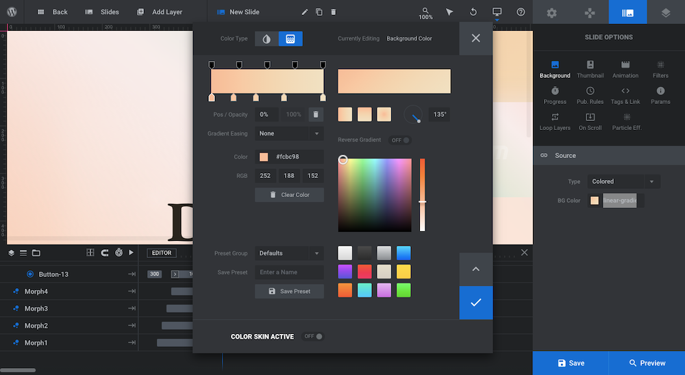
Pro tip: To save time reproducing your gradient or tweaking the colors when it comes to other objects, save your gradient from the color modal:
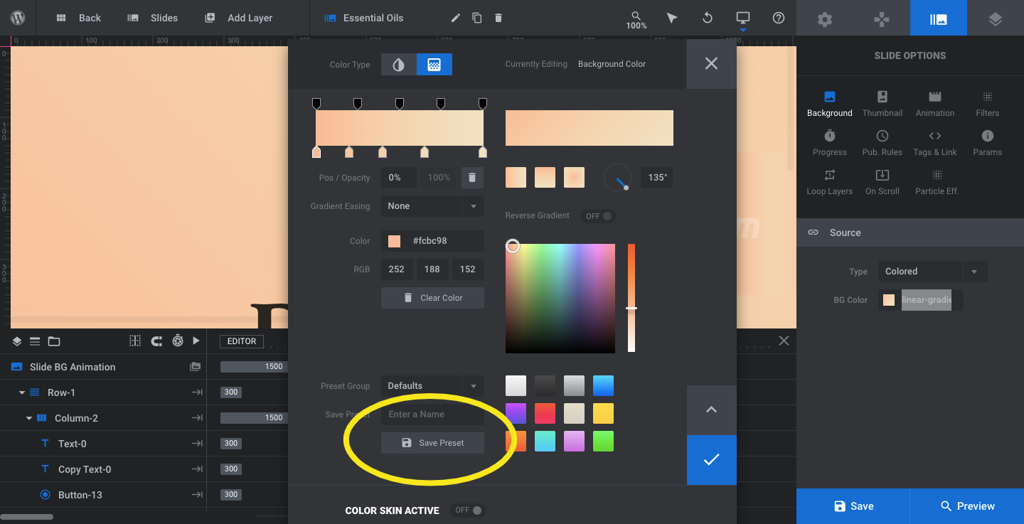
To edit the background of your slide, open Slide Options in your editor. Go to “Background” and “Source”.
You can add images, videos, pull in content from other sources, and apply colors to your background. To create a color gradient, keep “Colored” selected and click on the BG Color field to open the editor:
There are two settings here: one for a solid color background and one for a gradient. The gradient is currently configured. We want to stay where we are and edit the colors.
To change the colors, click on the pointers along the bottom of the gradient bar. Enter the corresponding HEX codes in the “Color” field.
If you want to use less colors, click on the pointer you want to remove and then hit the trash can (delete) icon just below the bar. To add colors back in, simply click on the gradient bar and it’ll create a new pointer for you.
There are a few more settings you may want to customize here:
Pos/Opacity: The first field (Pos) determines where the color changes along the gradient. If you don’t want them equally spaced out, you can change the percentage values or drag the pointers along the gradient bar.
The second field (Opacity) refers to how transparent or opaque the color is. To make it anything but 100% opaque, click on the pointers on the top of the gradient bar. When clicked, the Opacity field will open up and you can change the value.
Gradient Type: The three gradient blocks on the right side allow you to change the gradient type: horizontal, vertical, or radial.
Gradient Rotation: You can further adjust the direction in which the gradient moves. In the example above, we’re using a horizontal gradient (left to right). However, we’ve set the rotation angle to 135° so that it points down and to the right.
You can see a preview of the gradient in the preview box above it.
Learn More:
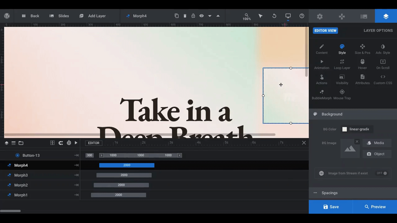
Step 4: Edit the layers
In this step, you’ll remove the objects you don’t need, add any new ones you want, and then customize the way they look and maybe even the way they act, too.
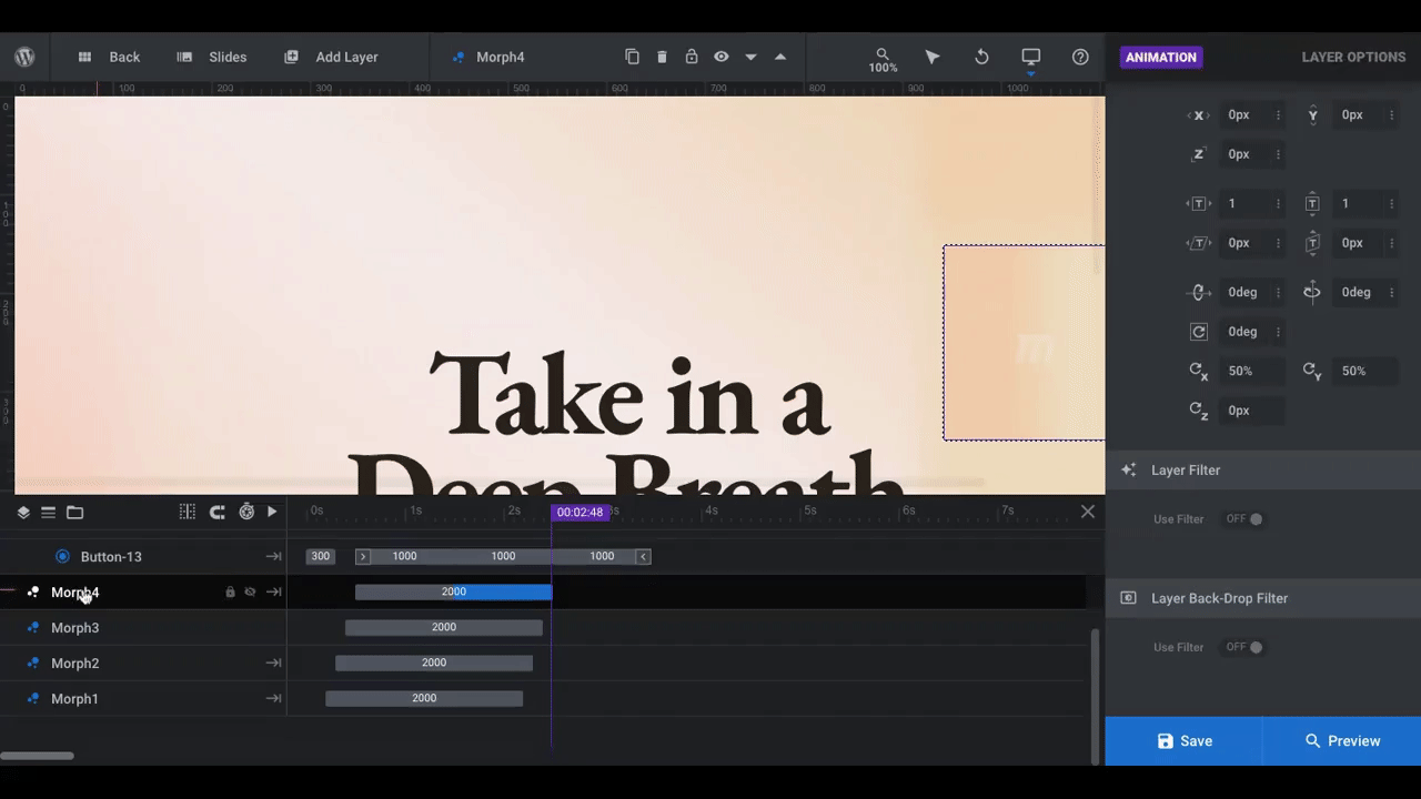
Depending on which slide you’ve chosen to start with, you may have different object layers to customize. This one, for instance, only has the circular planets and the bubble morphs. Be sure to check your slide’s timeline to see if there are any other objects you need to address.
Pro tip: The current slide layout does a nice job of framing the text in the center, which is ultimately the area you want to draw visitors’ eyes to. If you want their focus elsewhere, consider how and where your layers are placed so you can naturally draw their focus there.
Since we’re trying to create a relaxing and flowing atmosphere for our essential oils shoppers, we’re going to remove the solid planet shapes and keep the flowing morphs:
To delete layers, either click on them in the visual editor above or the timeline editor below. Then hit the “delete” button on your keyboard to remove them.
Pro tip: You can delete or edit multiple layers at once. Either hold the “control/ctrl” key and select all relevant layers or active the “add to selection” mode in the top menu bar (right next to the stage zoom). This is also useful if you want to quickly apply your saved gradient to them.
Next, we’re going to edit the morph layers so they blend with the new color gradient we’ve created. Otherwise, they’d look like this:
Pro tip: There are advanced settings built into every object and special effect. If you want to preserve them, modify the existing components rather than to create new ones.
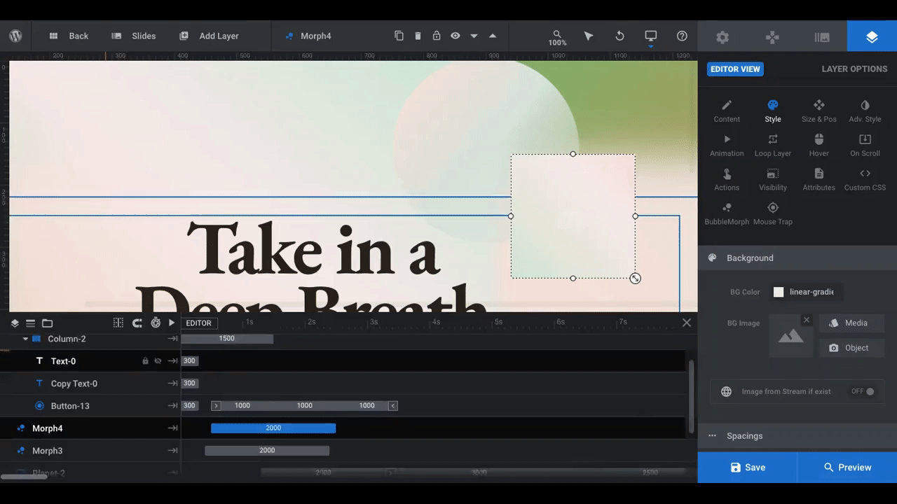
There are a number of characteristics of the bubble morphs we need to address.
The first is color and opacity, which you’ll manage under Style and by opening the premade gradient (the same as with the background gradient).
All four of the morphs in this template use different color gradients:
You don’t want them to deviate too far from the main gradient background or else they’ll stick out (unless that’s what you want them to). So find variations of your existing gradient that add subtle texture and depth without being too disruptive.
Pro tip: This is why that Gradient Generator tool is so helpful. Use the tool at the bottom to expand the number of colors along the gradient and use ones that look good against the background but don’t disrupt it too much.
Go through and edit each bubble morph one at a time:
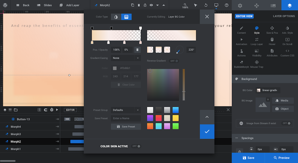
Play around with:
- Number of colors
- Color combinations
- Transparency
- Gradient weighting
- Gradient type
- Gradient direction
If you’d like to edit the individual morph settings, locate the “BubbleMorph” setting under Layer Options:
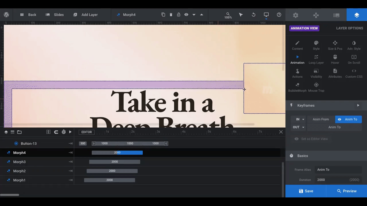
You may not want to adjust anything and that’s fine. However, just know that there are additional settings to configure if you want to adjust the bubble’s movements, shadow, or border.
One last thing to consider is filtering. In this slide template, you can see the bubble morph in the top-right clear as day. That’s because there is no filter applied to it.
To edit this setting, open Layer Options and then go to “Animation” and “Layer Filter” at the bottom:
To add a blurry filter to the bubble, toggle the setting on. You can change the depth of the blur as well so that some of the bubbles appear sharper than others. Feel free to experiment with these settings to find the one that’s best for you.
Learn More:
Step 5: Edit the particle effect
The slide we’ve edited above does not have a particle effect. However, some of the other slides in this Slider Revolution template do.
If you want to apply this setting to your slide and it’s not currently active, go to Slide Options and then click on “Particle Eff”:
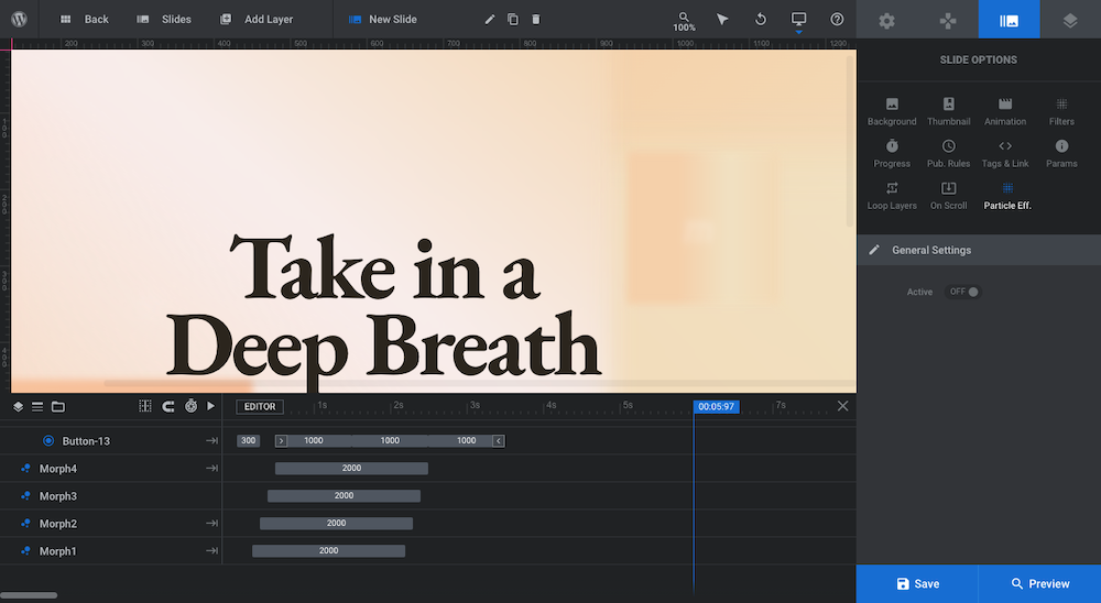
One you’ve toggled the setting on, feel free to make adjustments to the settings.
Learn More:
Step 6: Edit the CTA button
Based on the color gradients you choose for the slide, you may need to edit the color and design of the button. Consider the following:
Button color: Do you want it to have a solid color or gradient?
Button transparency: Do you want it to have an opaque or transparent look?
Button border and shading: Do you want the button to stick out more as a button? Or remove the shading and make the whole design flat?
Button animation: Do you want to keep the animation as is? Do you want to use a different one? Or remove the animation altogether?
To edit the color, transparency, border, and shading, go to Layer Options and “Style”. To edit the animation, go to the “Animation” tab instead:
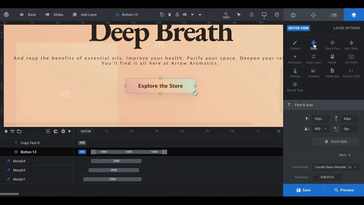
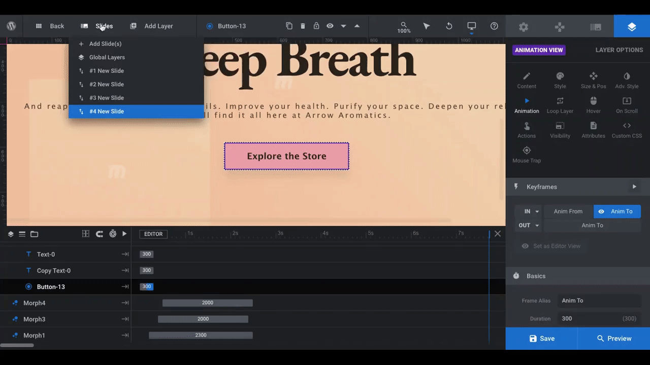
In this particular slide template, the button has a gradient color scheme. Not only that, the animation is set up with staggered keyframes to create a motion effect. When the module loads, it looks as though the gradient moves.
If your goal is to create a simpler and calmer design, it might be best to remove the keyframes and simplify the animation. That’s what we’ve done here. To remove the keyframes, click on them and then click the trash can in the bottom-right corner below the animation settings.
By removing the animation from the button, we’ll allow the bubble morphs to create a slow, flowing background motion that puts visitors at ease and gives them the space to consider the main message in the hero section. An animated button would only distract from that.
Learn More:
- Adding and Configuring Button Layers
- “FROM” and “TO” Animation System
- “IN” and “OUT” Default Animations
Step 7: Customize the other slides
Depending on what you’re going to use this module for, you may need all four slides, you may only need one, or you may need something else.
Pro tip: The number of slides you use depends on how much info you want to put in this section. If you want to highlight a number of benefits or features as the template does, then multiple slides makes sense. If you want to share a singular message, then one slide will do.
The first thing you’ll do in this step is to use the Slides manager in the toolbar to adjust the module accordingly:
To remove any of the slides, hover over them and click on the trash can icon.
To edit the slides, select the one you want to work on. Then return to Step 2 and repeat the process until you’ve finished customizing all of your slides.
Learn More:
Step 8: Customize the global layers
This Slider Revolution template doesn’t have a traditional navigation. So, there’s nothing under Navigation Options to edit.
Instead, the left, right, and bottom arrows that visitors use to explore the slides have been created under Global Layers. You’ll find them under Slides in the toolbar.
If you’ve designed your module to have only one slide, then you should delete all of the Global Layers. To do this, click on them either in the visual editor or timeline and then hit the “delete” button on your keyboard:
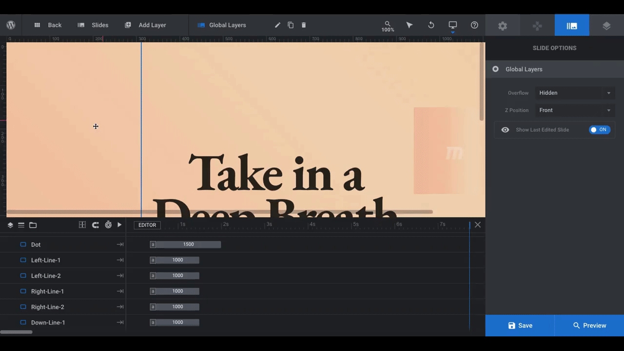
If you’ve designed the module as a slider, you can customize the navigation design and special effects, if you’d like. You’ll find those settings under two areas in Layer Options:
- BubbleMorph
- Mouse Trap
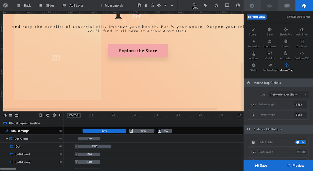
Pro tip: If you kept the bubble morphs in your design, you should keep the navigation effects as they are. They’re designed with a compatible morph-like effect, which enhances the overall effect of the slider.
Learn More:
- Special Layers: Rows, Groups, Backgrounds & Global
- Mouse Hovers for Layer Content
- Mouse Hover Settings
Wow your visitors with a background gradient that’s unique and fresh
Color gradients have become as popular as they are because they not only look great, but they’re super effective in drawing a user’s attention right where you want it to be. So, whether it’s your homepage hero image or some other key section on the site, a gradient background can do wonders for lifting engagement.
With the help of Slider Revolution templates, create your own today.


