
The duotone effect is an interesting one. You basically strip out the original color from the photo or illustration, change it to grayscale, and then apply two colors to it — one for the highlights and one for the shadows.
Duo-toning might seem like a difficult technique to achieve, but there are actually a bunch of tools that make it easy to create this effect for a WordPress website. In this tutorial, we’ll show you how to use the Modern Portfolio Website template in combination with image editing software to painlessly reproduce this fun color contrast effect on your own.
Table of Contents:
- Step 1: Install the Portfolio About slide
- Step 2: Create your duotone image
- Step 3: Replace the image
- Step 4: Update the background color
- Step 5: Edit the shape colors
- Step 6: Add and style your text
How to Add a Duotone Effect to Your Site
You could realistically add a duotone effect to any Slider Revolution template. If that’s what you’re looking to do, then skip down to Step 2 to learn how to create a duotone image of your own.
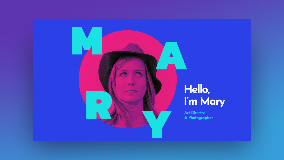
However, if you want a template that was designed specifically to make duotone images stand out (as opposed to whole backgrounds), then the Modern Portfolio Website template is a good choice:
You can use this template to create an entire page full of edgy duotone images. Or you can strip out individual slides from the module template to create a single section with a duotone image:
Regardless of which route you want to go, this tutorial will help you repurpose the template and make it your own.
Step 1: Install the Portfolio About slide
The Modern Portfolio Website template can be used to build a:
- One-page website
- Home page
- Slide or section (on any page)
The purpose of this tutorial is to show you how easy it is to repurpose this particular template and create a dramatic duotone effect of your own. So we’re not going to go through the editing process for the entire template.
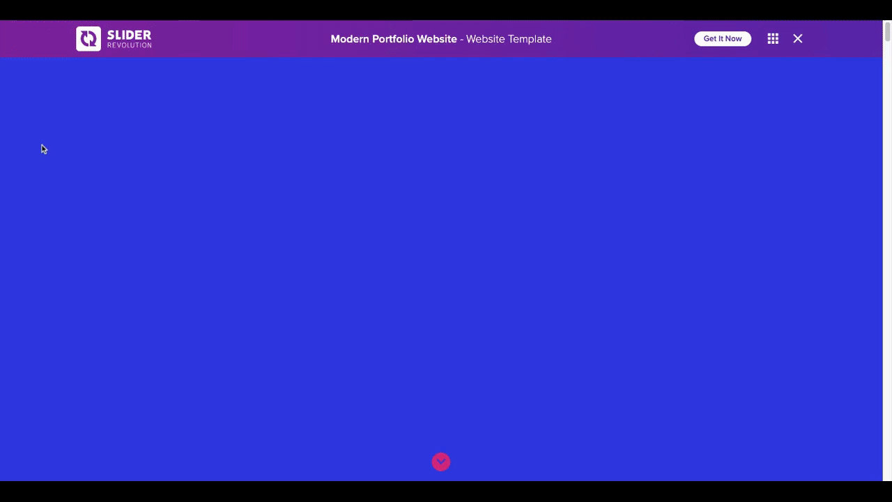
Instead, we’re going to install only one slide from the template — the About slide that appears below the hero image.
To install just that one slide, open up “Module from Template” and do a search for “Modern Portfolio”. Hover over the template thumbnail and you’ll find three icons:
- The eye allows you to preview the template
- The folder allows you to view the individual slides within the template
- The plus-sign allows you to install the full website template
We’re going to open the folder, locate the About slide, and install it:
With the slide installed, you can now create your duotone image and customize the module template around it.
Learn more:
Step 2: Create your duotone image
You can use any image editing software to apply a duotone effect to your website images. If you want a fast and easy way to create a duotone, we’d suggest using Canva. You have the option of using one of their preset duotones or customizing them to create your own.
Pro tip: While you can artificially heighten the contrast between your image’s highlights and shadows, it’s best to start with one that already has a good degree of contrast. Another way to deepen the contrast is to choose two colors for your duotone that are on opposite ends of the light and dark spectrum.
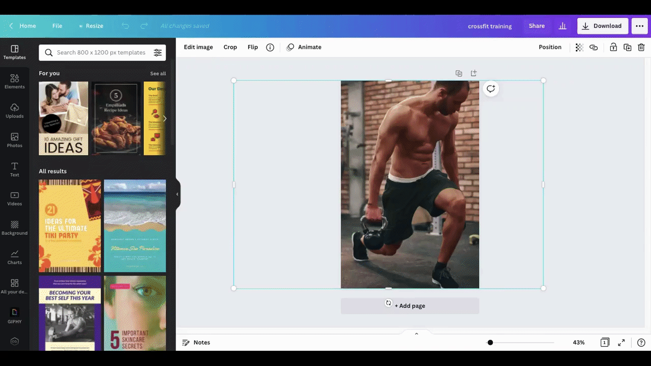
Here’s what we did with our image:
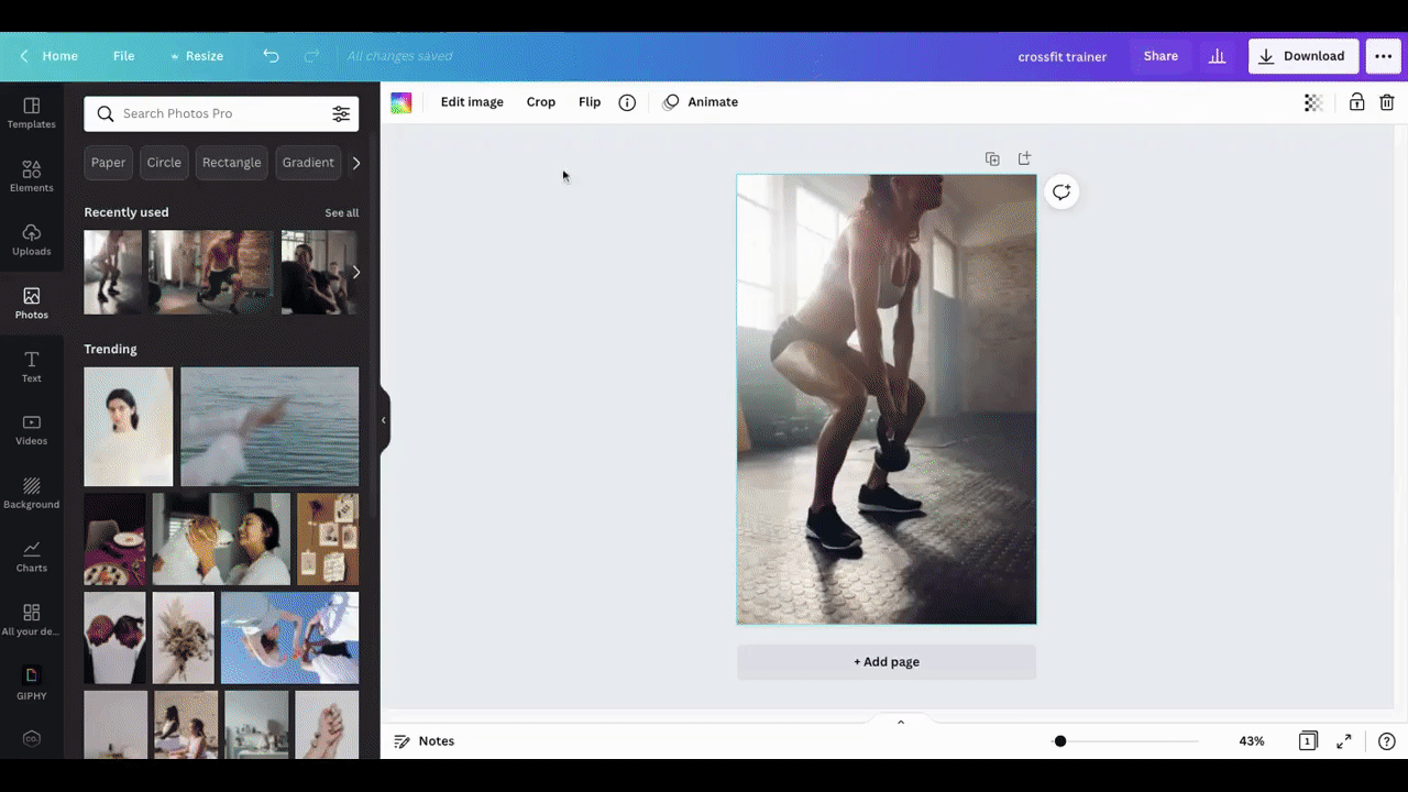
We liked the hot and intense vibe the Cherry duotone gave off. So, we applied that to the image of our Crossfit trainer.
Canva also allows you to customize your duotone. Here’s a quick example of how you might do that:
We started with the Amber duotone effect. (You can start with any of them if you’re planning to create a custom duotone, by the way). Then we changed the Highlights to a dark amber color and the Shadows to a monochromatic shade of brown.
The end result is an image that feels gritty, but not too artificial or over-the-top. That’s definitely something to think about when creating your duotone effect since the colors you choose should be more than just decorative. They should convey a mood that’s in line with the surrounding content and branding.
Going forward, we’ll use our cherry-red duotone photo.
Note: To create a duotone effect for image layers, you’ll have to use external photo editing software like Canva. However, to apply a duotone effect to a background image, you can use Slider Revolution’s built-in feature.
Go to “Module Options” and “AddOns”. Scroll to the bottom and click on “Duotone”:
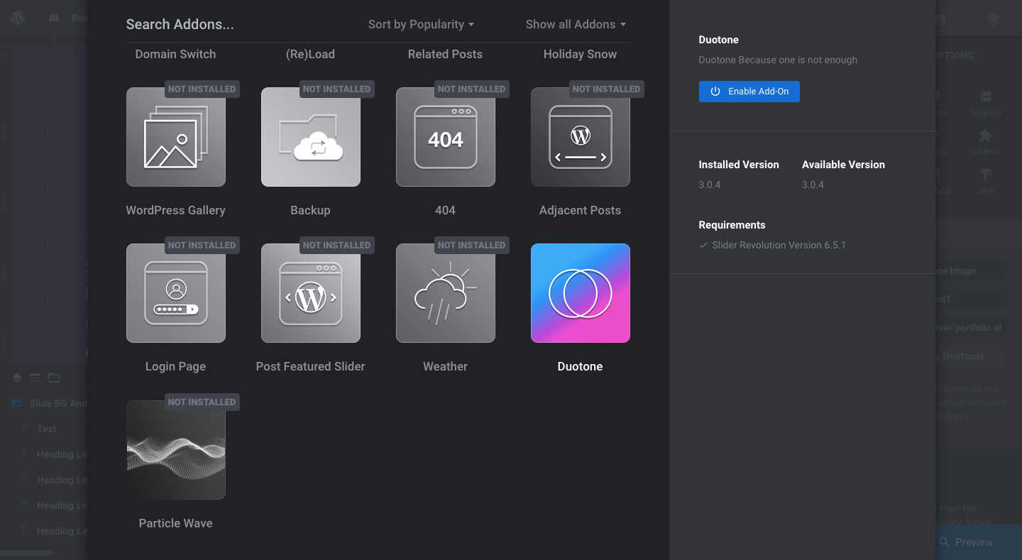
If it’s not already enabled, click the “Enable Add-On” button on the right. Then, go to “Slide Options” and the new “Duotone” setting:
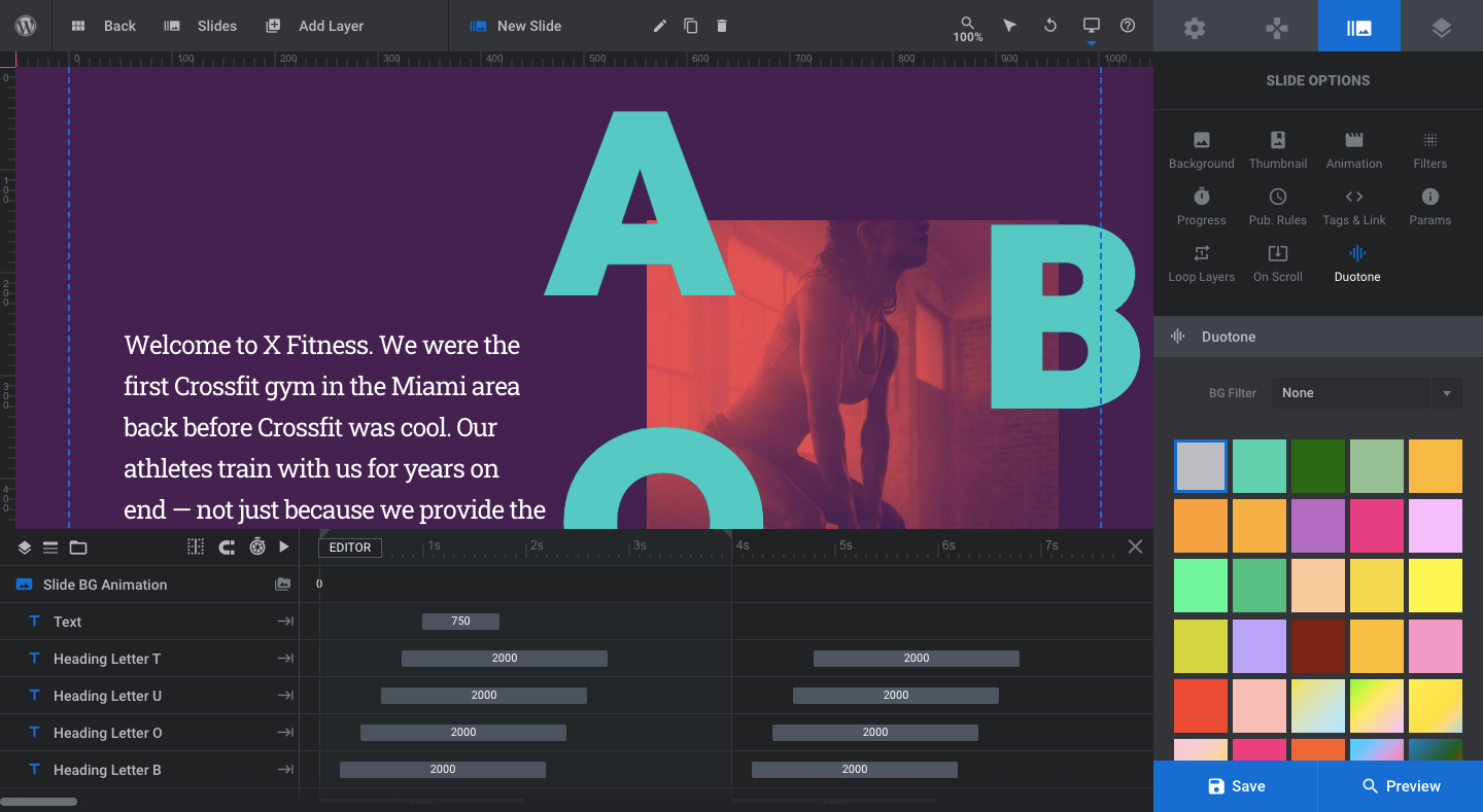
You can choose from over two dozen pre-made duotone effects. Click the one you want to apply to your background image and hit the “Save” button.
Learn more:
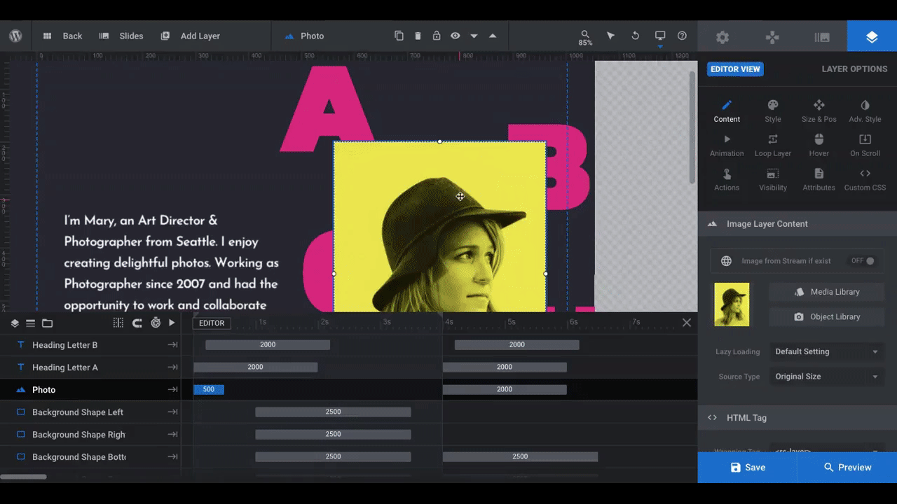
Step 3: Replace the image
Return to Slider Revolution so you can replace the template’s photo with your own.
Click on the Photo layer in the canvas or timeline. Then, go to “Layer Options” and “Content”. From there, you can upload the new image:
Check the Preview of the slide. Does the new image feel too small or large for the space? How do the “ABOUT” letters look? Do they still overlap with the image without compromising the subject in the center of it?
If you need to make adjustments, go to “Size & Pos” settings:
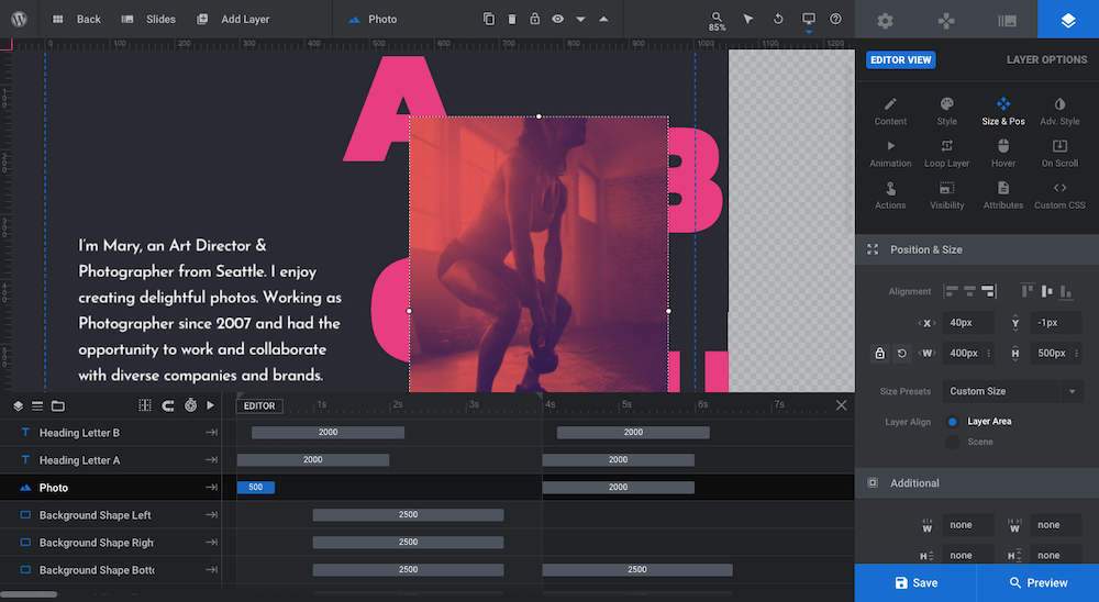
Under the alignment options, you can change the image’s position along the x- and y-axis. You can also edit how wide and tall the image is.
When you’re done, save your changes. Then, go to the responsive view in the toolbar and make sure your image still looks okay on smaller devices after resizing or repositioning.
Learn more:
- Module Editor Overview
- Selecting Layers via the Canvas or Timeline
- Editing Images in Template Modules
- Desktop, Laptop, Tablet and Phone Size Variants
Step 4: Update the background color
You can use this slide on the home page or a dedicated About page. So long as the section appears beneath the fold, you can preserve the scroll-triggered color transition that takes place in the background.
The bright blue background color that appears at first is the same background color as the slide above it. When you’re building out your page, you’ll likely create your sections one after the other. Just copy the color’s HEX code from the top slide/section and apply it as the background color for this one.
Go to “Slide Options” and “Background”. Open up the “BG Color” modal and enter your HEX code in the color field:
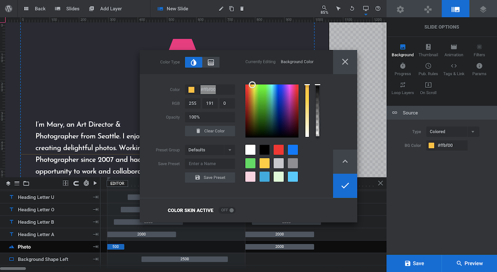
Pro tip: This color will only appear for a couple seconds while the visitor scrolls. So it’s okay if it clashes with the colors used in the duotone image and text in this slide. It’ll go away shortly. The important thing is that all the permanent colors in this slide contrast well.
You won’t be able to see the background color when you’re editing the slide. If you want to check it out before moving on, open the Preview.
Learn more:
Step 5: Edit the shape colors
The “background” color you see when working on the slide is formed by four overlapping shape layers:
- Background Shape Left
- Background Shape Right
- Background Shape Bottom
- Background Shape Top
To edit the color of the shapes, click on them one by one in the timeline or canvas. Then, go to “Layer Options” and “Background”. Open the “BG Color” modal to replace the existing color with your own.
Repeat this process using the same color for all four blocks:
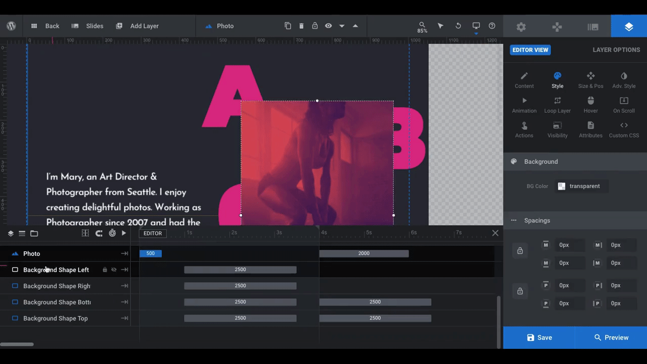
Note: The shape layers are animated so that they slide into place to cover the previous slide’s background color. It’s best not to adjust anything but their color since they’ve already been properly positioned and timed.
As far as choosing your background color goes, it depends on what kind of visual environment you want to create.
The original slide template was a quirky take on a dark theme. For an art director with a hipster flair, that color palette was perfect. It’s up to you to figure out what kind of visual mood you want to create with your duotone image and the surrounding color palette.
For our Crossfit website, we wanted to create an intense environment. So, that’s why we went with a deep purple background color. We actually pulled it from the bottom-right corner of our duotone image using ImageColorPicker.com:
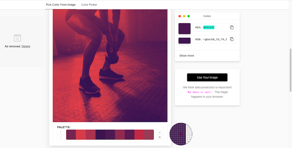
So while the purple stands out in contrast to the lighter cherry colors in the image, it still complements them nicely. It also creates an interesting blending effect along the darker edges.
Learn more:
Step 6: Add and style your text
The last component to edit is the text — both the “ABOUT” lettering as well as the description to the left of it.
First, let’s edit what the description says.
Pro tip: Try to keep your description about the same length as the one in the template in order to maintain a proper balance between the text and image.
Click on the Text layer in the canvas or timeline. Then, open “Layer Options” and “Content”. Replace the existing content in the text box with your own:
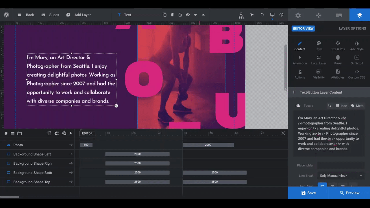
Note: The current text in the slider uses a series of breaks (<br />). This is what forces the text to break at specific points. If you’d prefer to use a standard line break where your text naturally wraps, set it either as “Width Based” or “Content and Width Based”. Before you save your changes, check on the text in the smaller screen views to ensure that it still fits nicely beside the image.
Depending on what you’re using this slide for, you may want to change the “ABOUT” letters. We’re going to leave them as is since we’re using this to introduce home page visitors to our gym. If you decide to change them, you can always remove or add more layers, though try not to add more than one or two additional letters. You want to keep this scattered heading easy to read.
Now, let’s tackle the styling of the text.
To edit the font and color of your Text layer or the Heading Letter layers, open up “Layer Options” and go to “Style”:
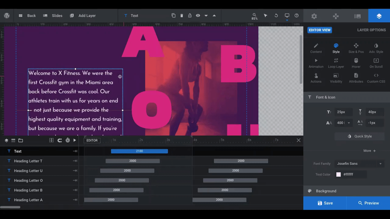
We’ve changed the description text to Roboto Slab, which feels a bit stronger and sturdier than the original font. We’ve also updated the heading letters to Outfit, which has slimmer lines. We also changed the color of the heading to #4CC9C3.
Depending on the font you use, you may need to adjust the sizing for your description so that it remains readable as well as your header so that it doesn’t interfere with the image too much. You can make this change from the “Size & Pos” settings.
Learn more:
Will You Be Playing Around with Duotone Effects This Year?
Duotone image effects might not top every list of web design trends. However, it’s a color trend that’ll never really go out of style — so long as you know how to choose the right colors for the digital environment you’re creating.
With the help of a Slider Revolution template and some easy-to-use image editing tools, you’ll be able to reproduce this exciting duotone effect whenever you want.


