
When someone visits a blog, publication, or other content-centric website, they expect to see flat photos and illustrations on the home page promoting each of the posts. What if you presented them with something that defies their expectations — a content showcase that’s full of depth and color and motion?
In this tutorial, we’re going to demonstrate how to edit the Cinematic Wildlife Slider template to do just that. This template can be repurposed for editorial sites of any size and style — from small blogs to popular publications.
Table of Contents:
- Step 1: Install the template
- Step 2: Update the global layers
- Step 3: Delete slides you don’t need
- Step 4: Edit the background image
- Step 5: Edit the foreground image
- Step 6: Customize the text layers
- Step 7: Update the button
- Step 8: Update the navigation buttons
How to create a beautiful content showcase for your home page
The home page should instantly tell visitors and readers what kind of content you publish as well as the quality of that content. Your headlines will do some of that work, but the imagery you choose (or create) can be a big help as well.
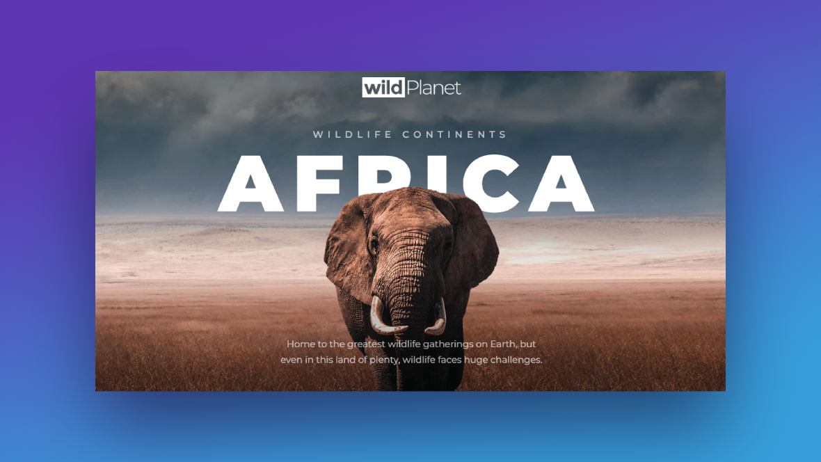
If you want to create a hero section that brings your content to life and communicates to visitors what it’s all about, then the Cinematic Wildlife Slider template is a good one to use as your base:
In this tutorial, we’ll demonstrate how fast and easy it is to edit this template and use it to create a content showcase for any blog, podcast, or digital publication:
When you’re ready, begin the tutorial here:
Step 1: Install the template
When you search for “Cinematic Wildlife” from the module templates, you’re going to find three relevant matches:
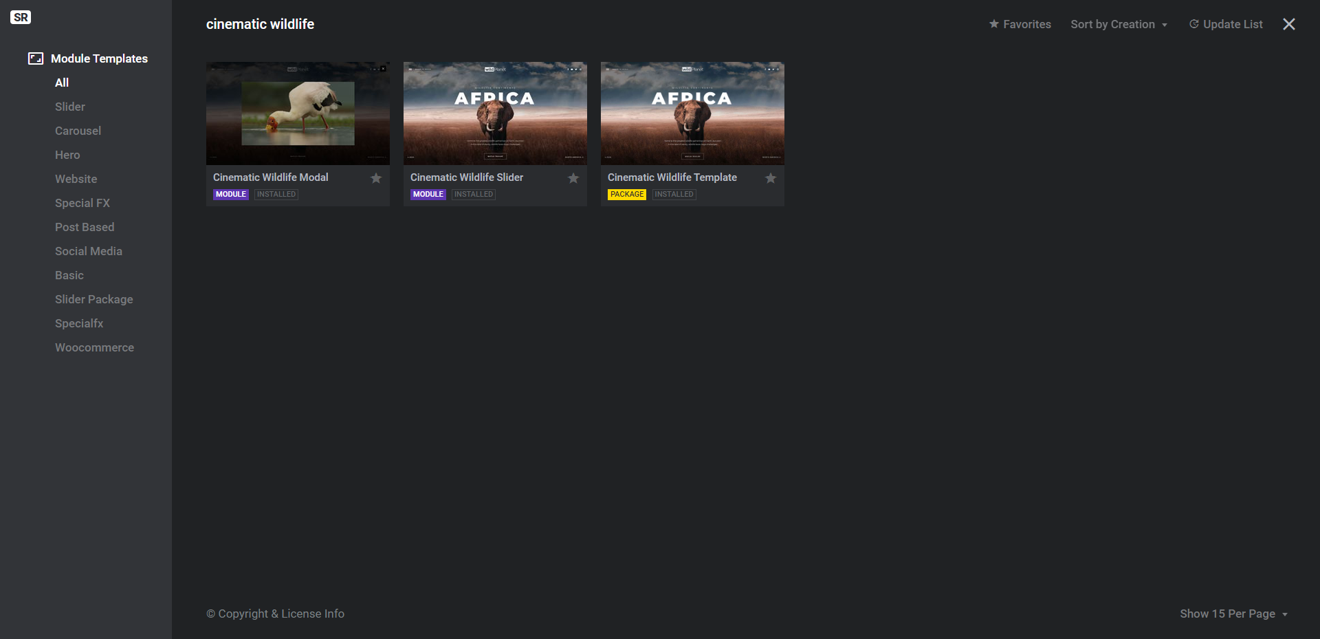
The package (with the yellow label) contains both the slider module and video modal.
If you want your call-to-action button to open a video that visitors can watch, then download the package. This way, you won’t have to build the modal from-scratch.
If you want your call-to-action button to open a page instead, you only need to install the slider module template.
Learn more:
Step 2: Update the global layers
Go to “Slides” in the toolbar and open up “Global Layers”. Here you’ll find the layers that appear on top of the slider regardless of which slide the visitor is looking at:
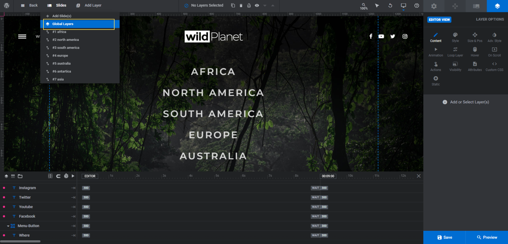
These layers will be useful if you are creating a microsite where the slider and its modal content make up the majority of the content. You can also keep them if you don’t plan on using the header created by your WordPress theme.
If you don’t need them — for instance, if you’re going to put this content showcase slider at the top of the home page — then select the following layers from the timeline:
- Logo
- Social-Icons
- Menu-Button
- Navigation-Menu
You can select all of them at once by holding down the Ctrl or command key. Click Backspace or delete to remove them from the slider. Then return to your slides.
Learn more:
Step 3: Delete slides you don’t need
There are seven slides in this content slider. In order to effectively capture visitors’ attention and motivate them to explore your content, keep the maximum number of slides to seven. Anything more will be overwhelming.
You might even want to pare the slider down so you can show off a small selection of truly stellar content. That’s what we’re going to do.
Pro tip: Before you go deleting any slides, take a look at each of them. While they’re identical in terms of the layers that appear in each, the Front-Image graphic differs in size from slide to slide.
Don’t stress too much about the dimensions, but do pay attention to the shape of it. If you can find ones with a shape similar to the subject you plan to put in the foreground, it’ll reduce the amount of editing and resizing you have to do.
Once you’ve found the slides you want to keep, go to the “Slides” list. Hover over each slide you want to delete and click the trash can icon beside it to remove it:
At the same time, you can drag-and-drop the slides around if you want them to appear in a different order. Also, if all of your foreground images are roughly the same size and shape, you can delete all of the slides but one. Then click the duplicate icon next to the slide in order to copy it as many times as you need to.
Learn more:
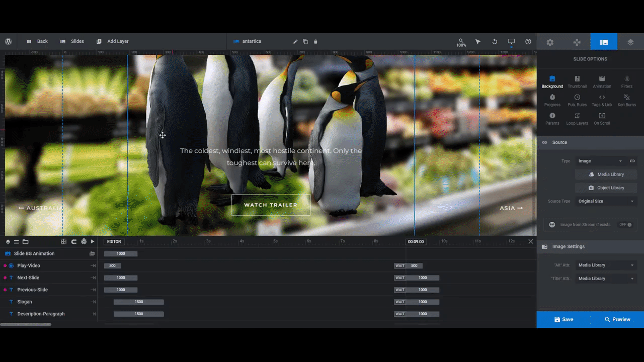
Step 4: Edit the background image
The layered photo effect you see in each of the slides comes from two elements. The first is the background image.
To change out the existing background photos in the slides, open the first slide to edit it. Go to “Slide Options” and “Background” to upload your new photo to the media library:
When you’re done updating each of your slides, save your changes.
Learn more:
Step 5: Edit the foreground image
The second element that creates our slider’s layered effect is the foreground image. In the timeline editor, it’s referred to as Front-Image.
Note: In order to create the same layered effect as in the slider, you’ll need to create or choose photos that have no backgrounds. Then, when you export them, make sure they have a transparent background so the photo you just uploaded to the background of the slide will show through behind them.
To edit the Front-Image layer in each slide, select it in the timeline or canvas. Then go to “Layer Options” and “Content” to upload a new photo:
In some cases, the photos will fall perfectly into place and at the right size. If they don’t, use the “Size & Pos” settings to resize and reposition the images:
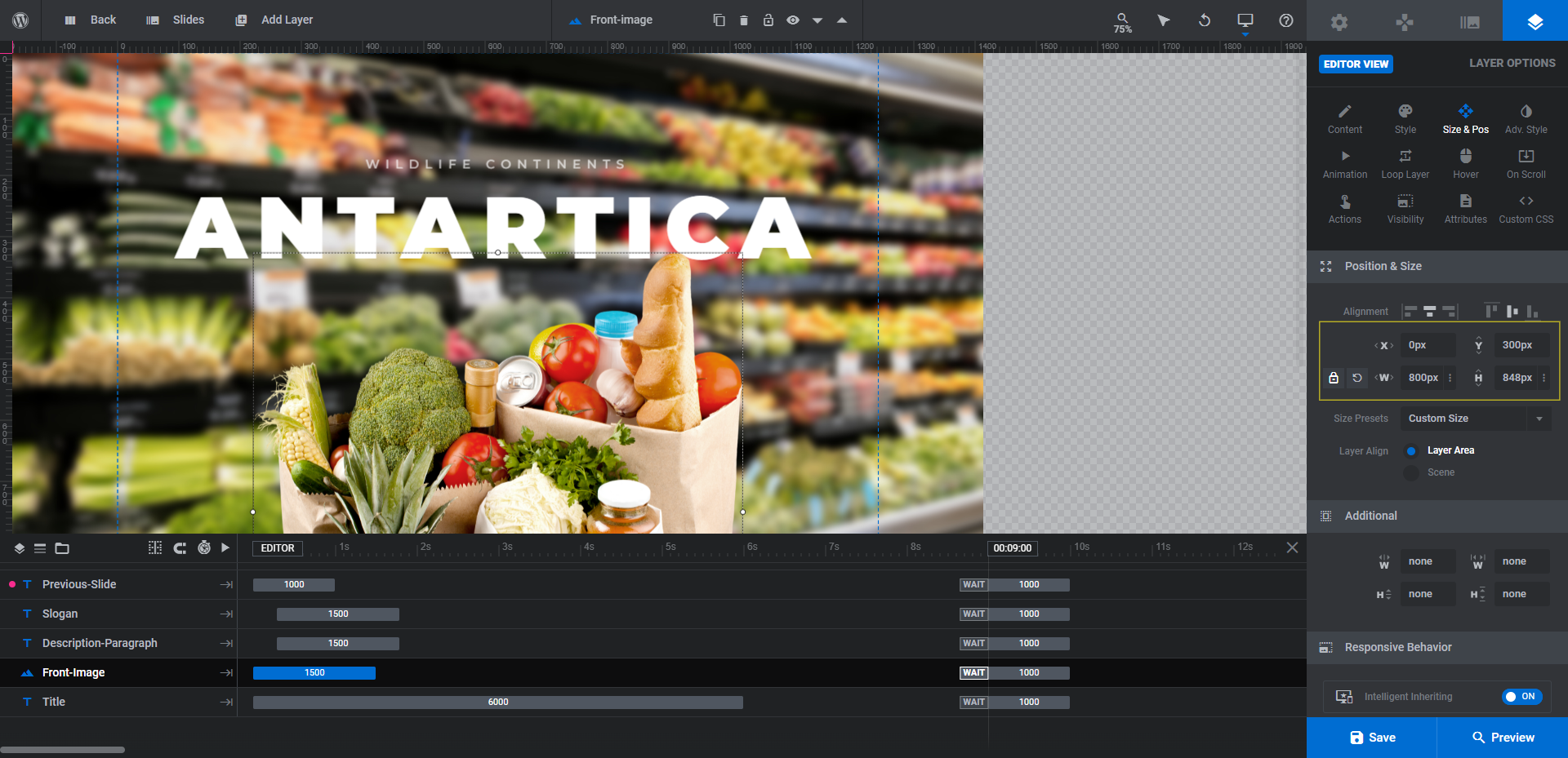
Use the X and Y settings to move the photo up and down. Use the W and H settings to change the dimensions of it.
Anytime you change the size of an existing image layer, you also need to review it in responsive mode to ensure that the changes work on smaller screens. Use the responsive variant switcher in the toolbar to switch between the devices:
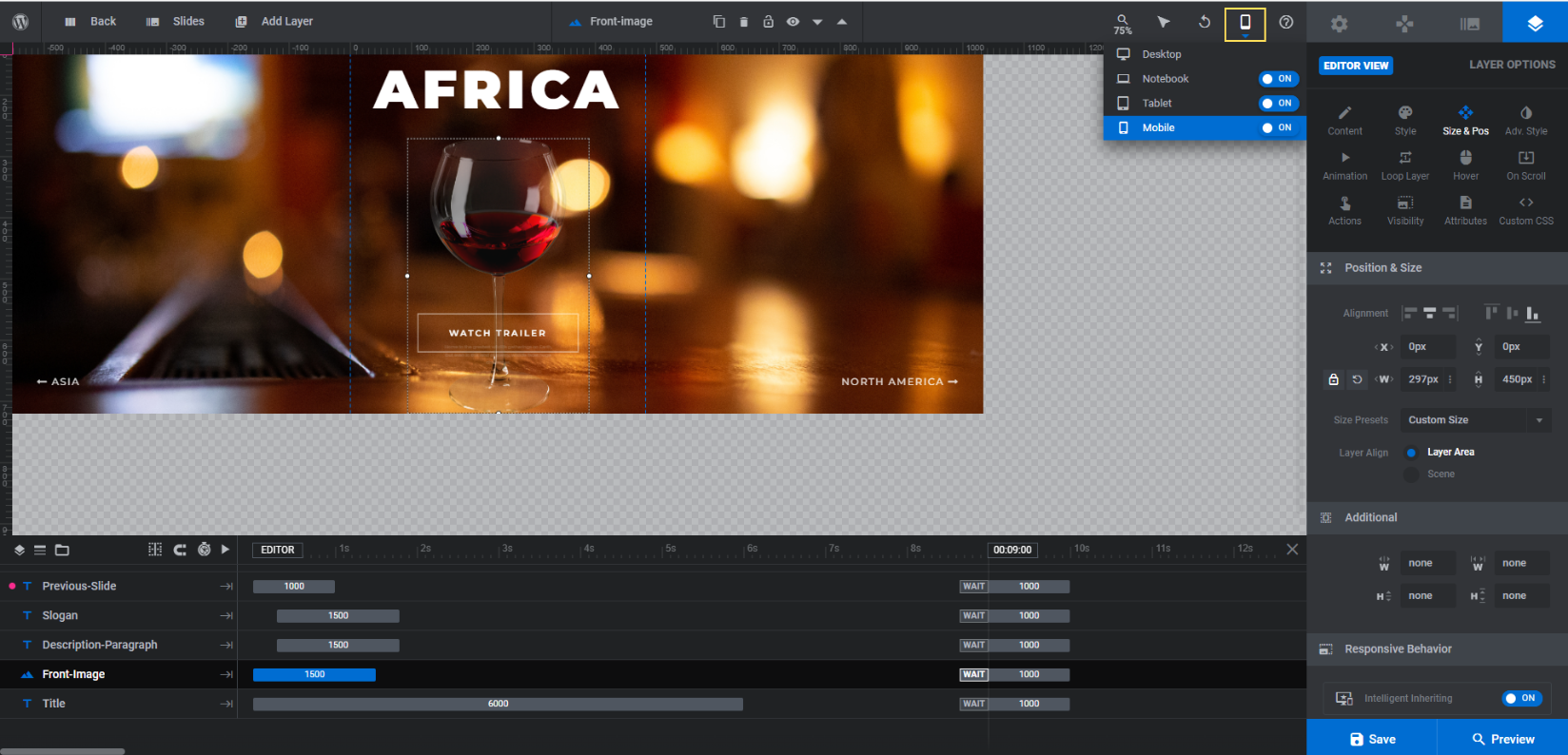
Note: When making changes to the size or position of image layers in this mode, it will only apply to the variant you’re working on.
When you’re done, save your changes.
Learn more:
- Editing Images in Template Modules
- Desktop, Laptop, Tablet and Phone Size Variants
- Adjusting for Responsiveness
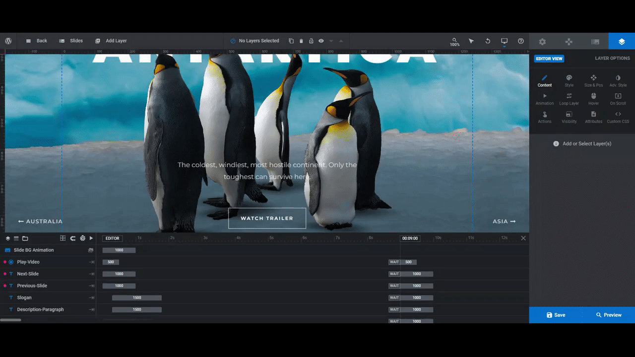
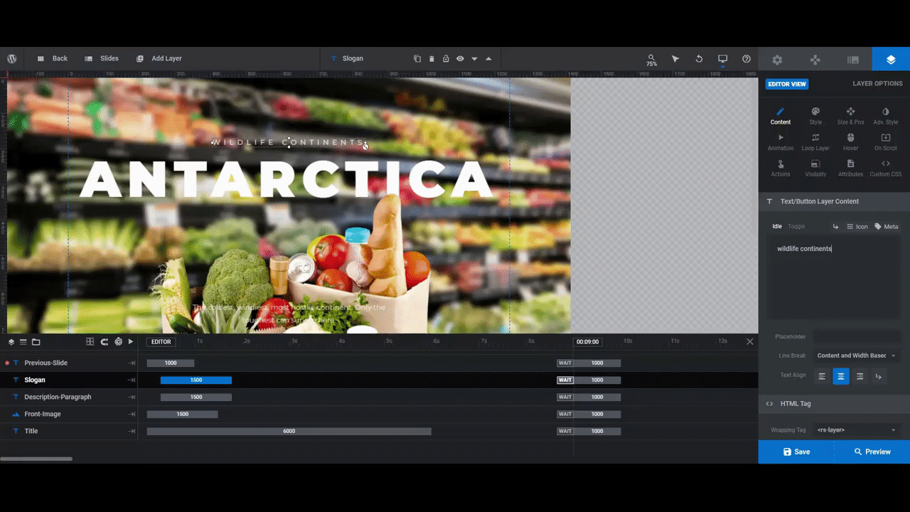
Step 6: Customize the text layers
There are three text layers in the slides:
- Slogan is the subtitle at the top.
- Title is the big headline.
- Description-Paragraph is the description at the bottom.
Because we’re promoting blog posts in our slider, we’re going to remove the Description-Paragraph layer. This is a good one to keep if your titles are super short and don’t provide a ton of detail about what will be found on the corresponding page (or video, in the case of the template).
You can also keep this layer if you want to provide additional details like who wrote/created the piece or the date of publication.
In addition, we’re going to incorporate the Slogan layer into the headline and change up the styling a bit so we can fit a longer title into this space without overwhelming the imagery.
To make changes to these layers, select them in the timeline or canvas. Then use “Content” to edit what the text says and “Style” to change the font, color, weight, size, and more:
When you’re done editing one slide, do a responsive check before moving on. If you’re adding more text and changing up the sizes and styles, it can have a big impact on how the text fits on smaller screens.
Once you’ve finalized the text in the slide, save your changes and the move onto the next.
Learn more:
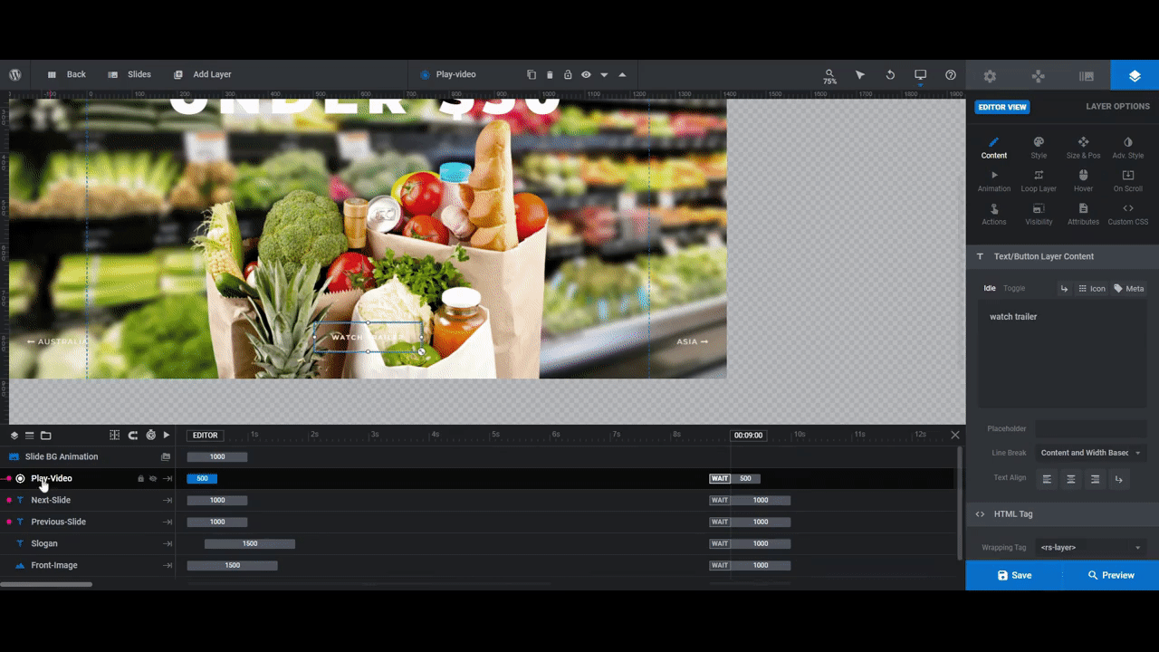
Step 7: Update the button
Editing the Play-Video button is similar to the text layers, with a few extra steps.
“Content” settings allow you to update what the button says.
“Style” allows you to change the text font, color, and styling. You can also use these settings to update the button’s background and border color.
“Hover” allows you to customize how the button’s appearance changes when someone hovers over it.
“Action” allows you to update what happens when someone clicks on it. Right now, it’s programmed to open the video modal. You can change it to a simple link in order to direct visitors to a different page. You can also set it to scroll beneath the slider to keep them moving down the home page.
When you finish with the first button, save your changes. Then make the same exact changes to the buttons on the other slides. The only difference is that they’ll link to the individual articles/pages that the slide references.
Learn more:
Step 8: Update the navigation buttons
Currently, there are two types of navigation in the slider.
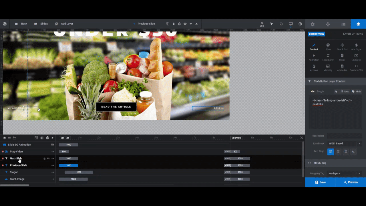
The first type can be seen in the lower left and right corners. These are text layers called Next-Slide and Previous-Slide.
If your content showcase is set up similarly to the template’s with a short title of only one or two words, you can keep these layers. You’ll just need to edit what the labels say on each slide. This can be done by selecting the layers and going to “Layer Options” and “Content”:
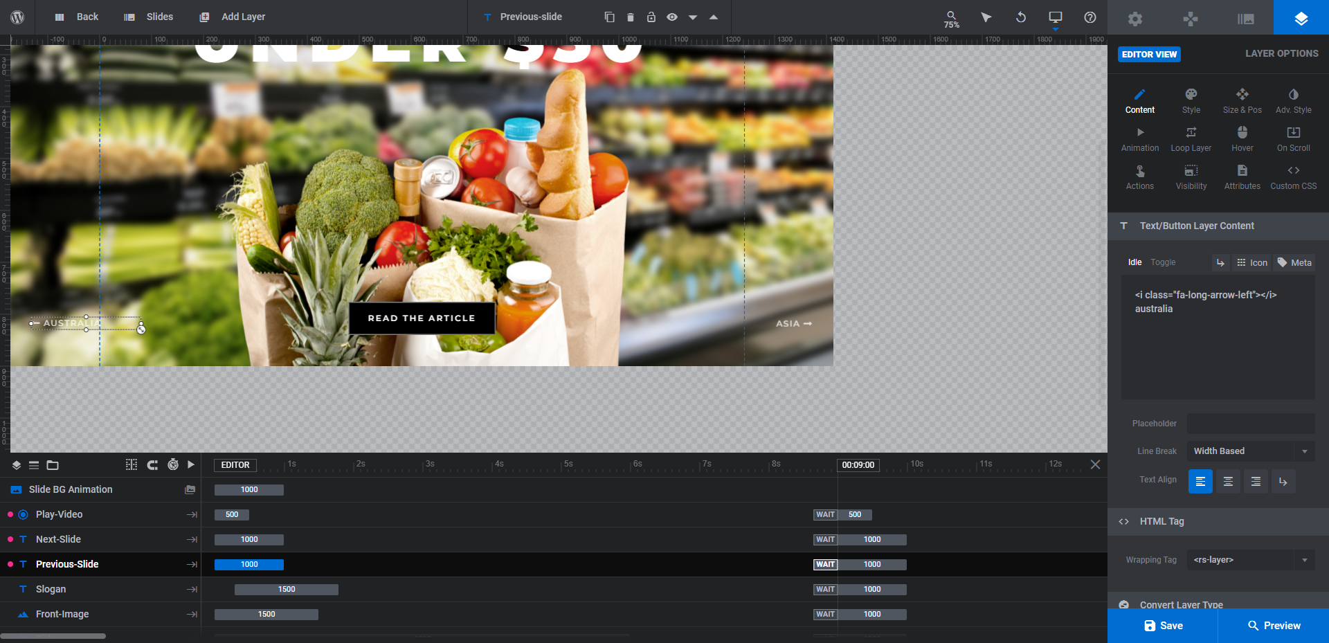
Note: The left and right arrow icons have been generated within the text layer. They appear in the text box as a string of code that looks like this:
<i class=”fa-long-arrow-left”></i>
Be sure to leave that piece of text there and only update the label when making changes to your navigation buttons.
The other type of navigation is a light grey progress bar that loads at the bottom of the slider, letting visitors know how long before the next slide appears. This has been created under “Navigation Options” and “Progress”:
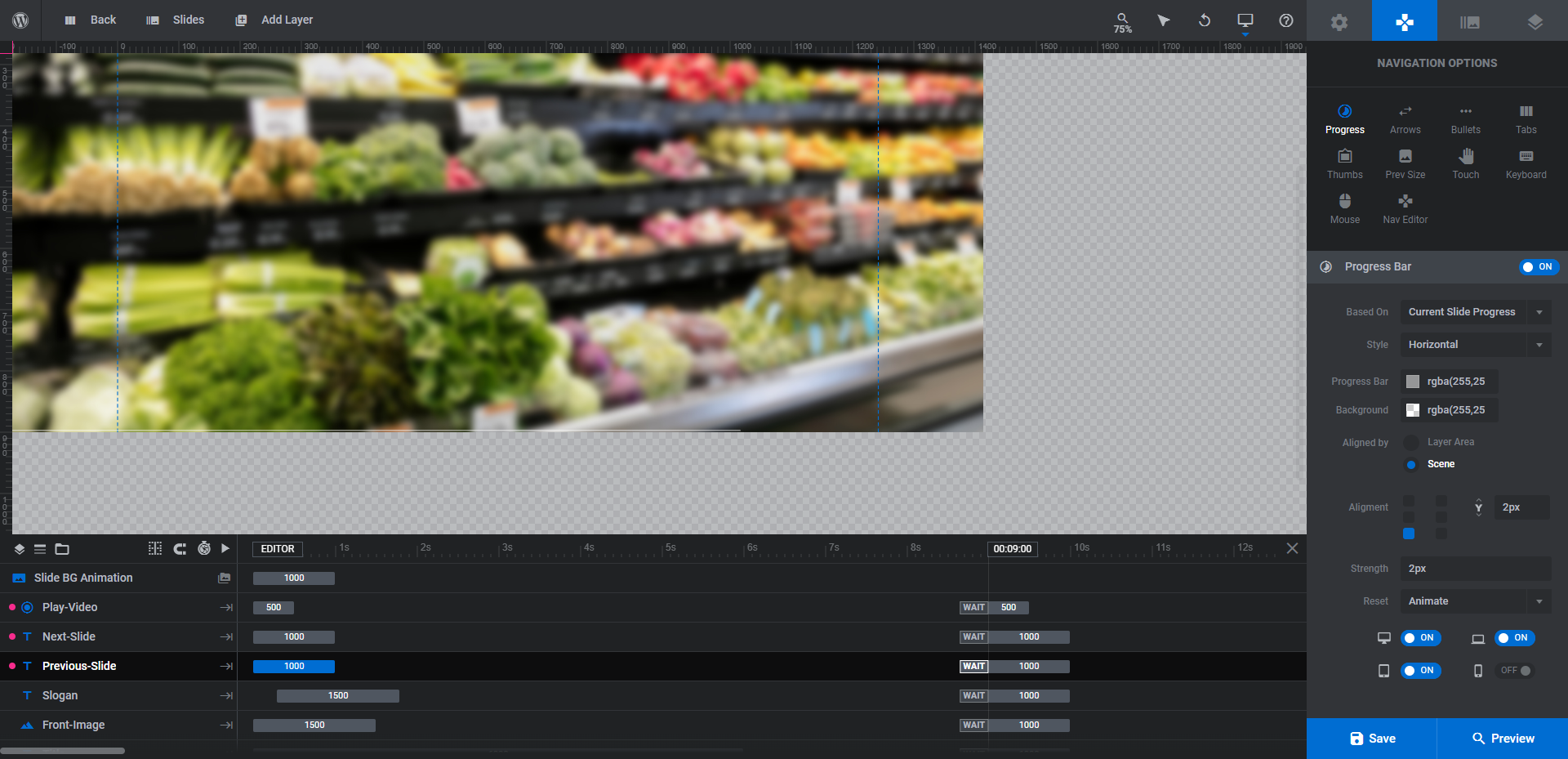
You can make customizations to the design or even the placement of the bar from this panel.
We’re going to leave the progress bar as it is. However, we’re going to delete the next/previous buttons and generate our own navigation buttons. Our titles are too long and descriptive to shorten, so we’re going to add traditional arrowheads to the slider instead.
To do the same thing, go to “Navigation Options” and “Arrows” and then configure the arrow style and placement:
When you’re done, preview the changes on the frontend of the website. Make sure the arrows are in a good spot and respond to the visitors’ hover and click the way you want them to. If you’re happy with how it all turned out, save your changes.
Learn more:
Showcase your content in a new and exciting way on your website
Typically, online publications greet new visitors and readers on the home page with a grid of content — flat images paired with headlines and brief synopses. Why not do something a little different and kick things off with a beautiful content showcase instead?
With the Cinematic Wildlife Slider, you’ll have a fast way to bring your best, most popular, or more recent content to life. Once you’ve customized it for your publication, it’ll be easy to keep it updated with your latest and greatest content, too.


