
Time and time again we see much-loved products and styles from the past make a comeback in retail and ecommerce. But how do you create a web design that pays homage to the retro or vintage history of the product without making the UI look old and outdated?
The trick is to find fresh and modern ways to play with retro trends.
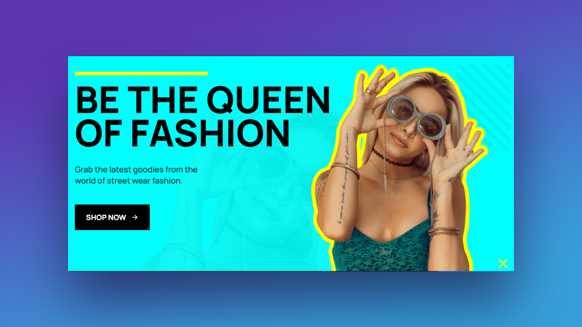
In this tutorial, we’re going to show you how to create a home page slider that mixes retro neon touches with vintage silhouettes. We’ll be using the Fashion Shop Slider template to show you how to create this colorful retro effect without having to build it from-scratch.
Table of Contents:
- Step 1: Create and upload the subject images
- Step 2: Delete the background shapes
- Step 3: Change the slide background colors
- Step 4: Update the accent colors in the slides
- Step 5: Edit the text and button layers
- Step 6: Remove the global layers
- Step 7: Create the new navigation
How to create a shop slider with a colorful retro effect
If your shop and/or products draw inspiration from ‘80s and ‘90s trends, then neon colors and silhouette retro effects are a really cool way to add a touch of retro without going overboard. All the pieces are already there for you in the Fashion Shop Slider template:
Now all you need to do is customize it with your own model or product photos, color palette, and copy. In this tutorial, we’ll show you how we’ve turned this template into a shop slider for a sunglasses vendor:
If this is your first time using Slider Revolution or it’s been awhile, give these a read first:
Step 1: Create and upload the subject images
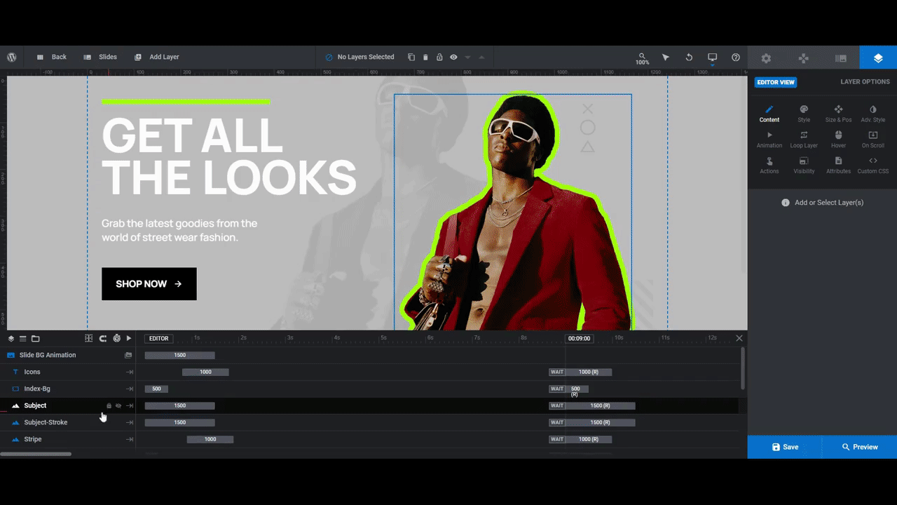
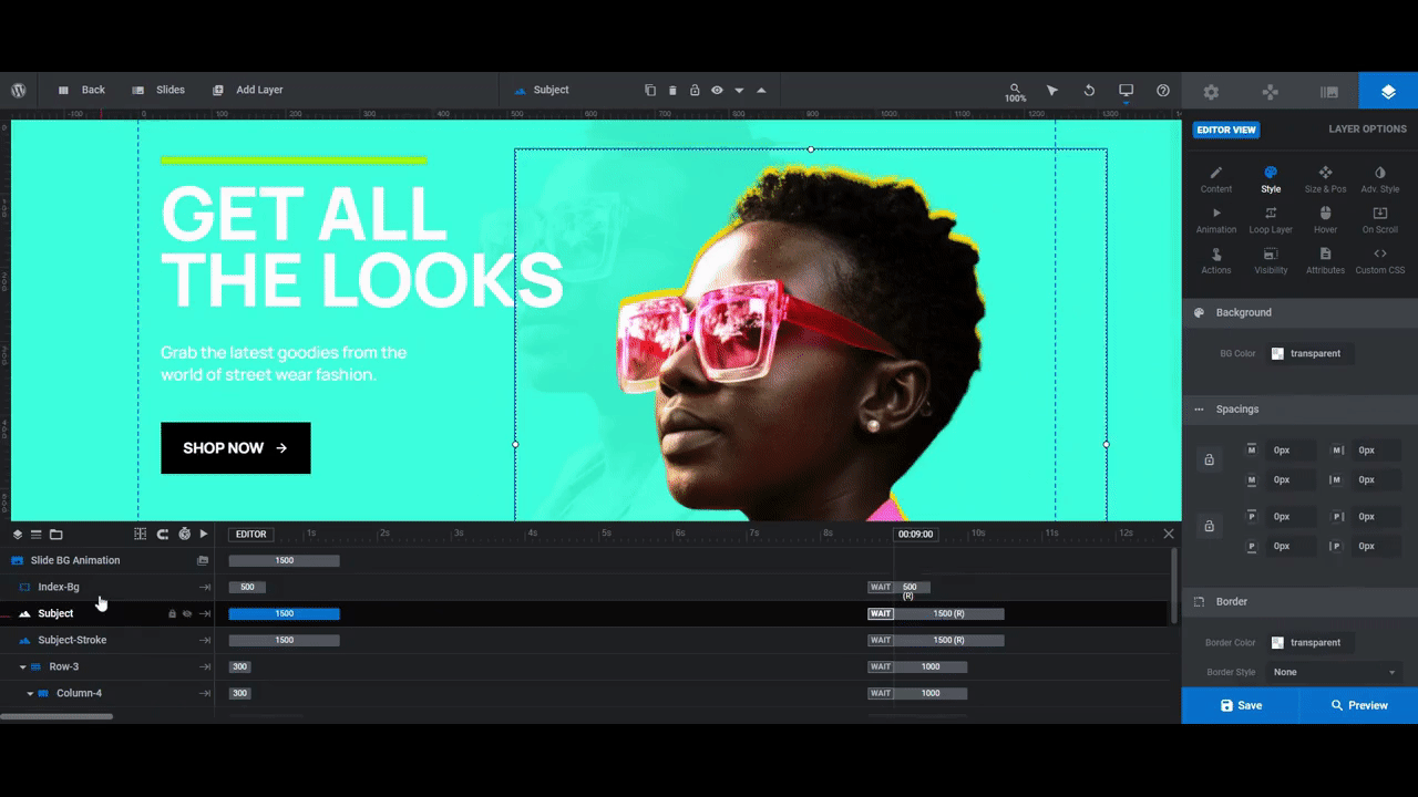
Each slide in the template has three layers that depict the model or product featured in it:
- Subject is the photo on the right that’s in full color
- Subject-Stroke is the colorful silhouette that sits behind the main photo
- Subject-Background is the greyscale version of the main photo in the background
To create these three graphics, we’re going to need a design tool. We’ll be using Canva to demonstrate the easiest way to get this done.
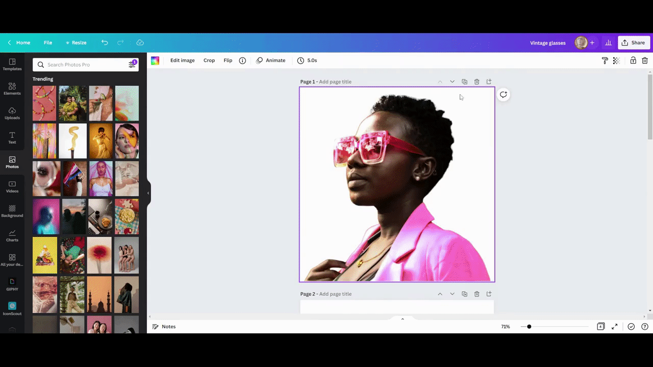
The first thing to do is get the untouched photos of your model or product from your client. In order to use them in this template, they need to be exported with a transparent background.
You can upload your product photos into Canva and then use the Background Remover tool to strip out the background elements:
When you download the PNG file from Canva, just remember to click the Transparent Background checkbox so the background will be empty.
Pro tip: If you’re using photos of models as the template does and as we are, try to crop the image as close to the borders of the subject as possible. This will reduce the amount of resizing and repositioning you’ll have to do in Slider Revolution.
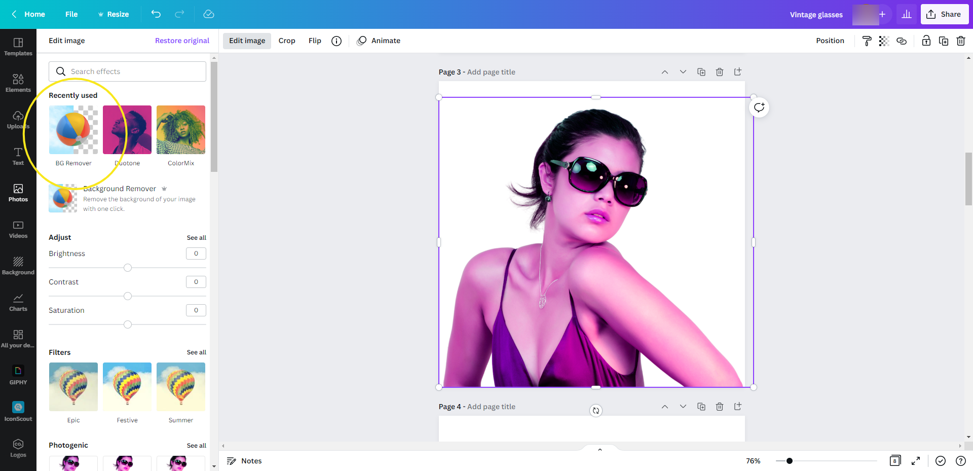
To create the silhouette retro effect, the first thing to do is duplicate each of your photos — the versions with the backgrounds stripped out.
Next, select the duplicate image, click “Edit Image”, and then open up the Duotone settings. It doesn’t matter which duotone setting you use, so select any of them.
Finally, double-click the duotone swatch to reveal its color settings. To create the silhouette effect, you’ll set both the Highlights and Shadows to the same color:
When you’re done, download this file the same way you did the first one. You’re now ready to edit your Slider Revolution template.
Go to “Slides” in the toolbar and tackle each of the slides one by one. Update the three subject layers with your new graphics. Select them from the timeline editor, go to “Layer Options” and “Content”, then upload your new image to the Media Library.
Use the regular image with the transparent background for:
- Subject
- Subject-Background
Use the neon silhouette graphic with the transparent background for:
- Subject-Stroke
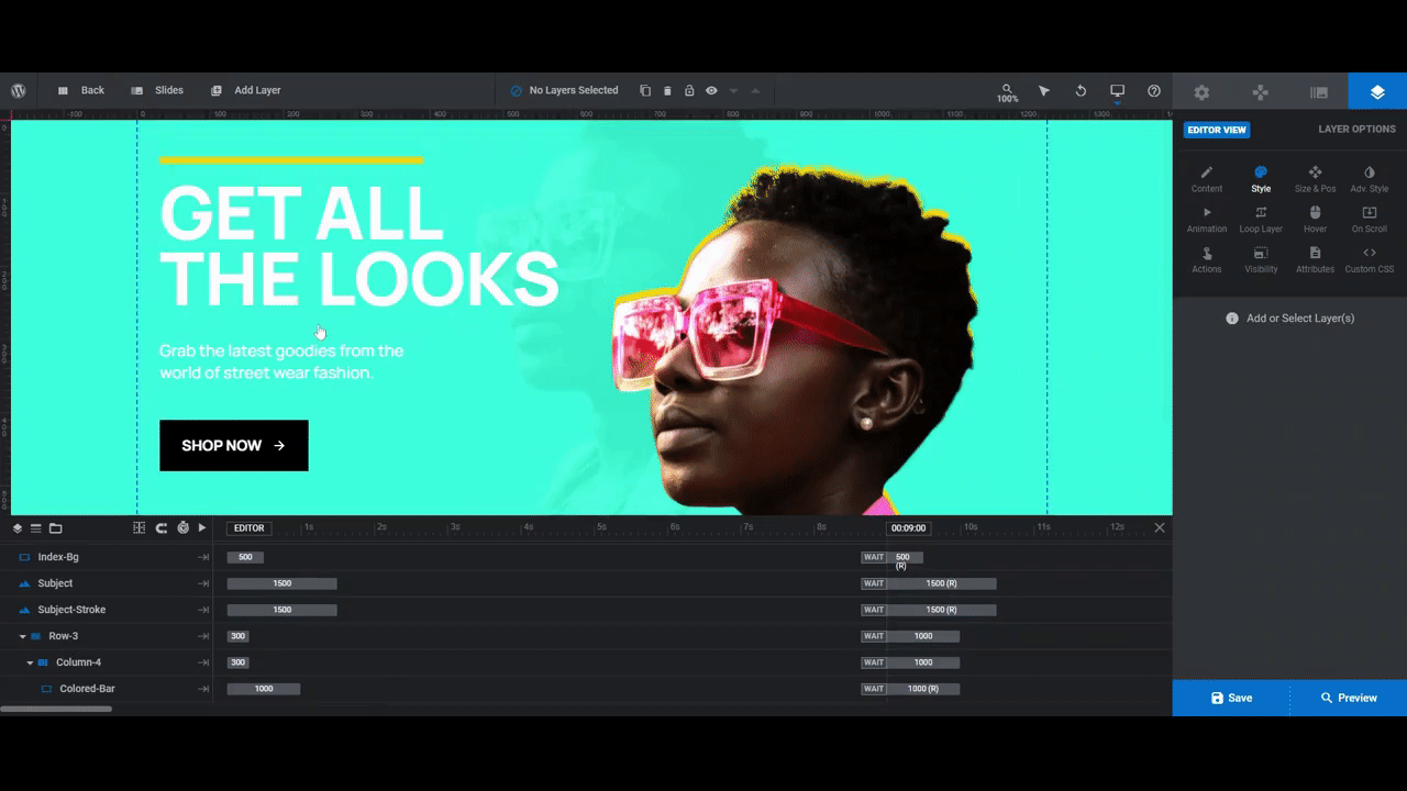
Preview your site after you’ve uploaded the new images to each slide. If you want to adjust the size or position of the silhouette background effect so it’s more or less prominent, use “Size & Pos” settings to do so. You can increase or decrease the size of the silhouette as well as move it up and down.
Note: If you make drastic changes to the size or position of any of these graphics, it’s important to do a responsive check in this step. You can do this from Preview. Just click the device variants at the top to make sure you’re happy with the results.
If you want to make device-specific changes, return to the editor, and switch to the responsive view you want to work in:
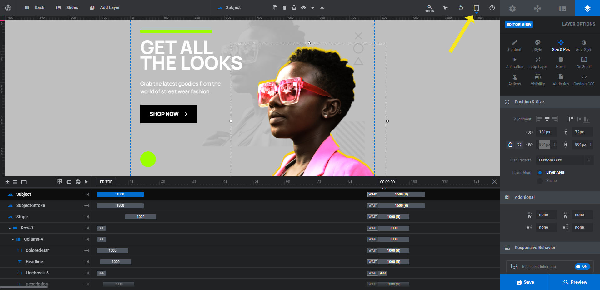
Any edits you make here apply to the current device you’re working on, so the desktop design won’t be affected.
Learn more:
- Selecting Layers via the Canvas or Timeline
- Editing Images in Template Modules
- Desktop, Laptop, Tablet and Phone Size Variants
- Adjusting for Responsiveness
Step 2: Delete the background shapes
There are two shape layers in the background that we’re not going to keep in our shop slider design:
- Icons
- Stripe
Note: If you want to add a branded element (i.e. Icons) or background texture (i.e. Stripe) to your design, keep these layers in the template. If you need help customizing them, use the links under Learn more below.
If you decide you want to delete them, select them in the timeline editor, then hit the Backspace or Delete button on your keyboard. Remember to do this for all four slides.
Learn more:
Step 3: Change the slide background colors
With the subject imagery and silhouette effect in place, we can now update the background colors.
To do this, go to “Slide Options” and “Background”. When you click on BG Color, it’ll open the color selection dialogue. You can select one of the preset colors in the bottom-right or add your own in the Color field:
While you have the option to add images, videos, and color gradients to the background of Slider Revolution designs, neither of those options would be appropriate here unless you plan on stripping out the neon colors and silhouettes. Flashier backgrounds usually mean simplifying the rest of your design.
Learn more:
Step 4: Update the accent colors in the slides
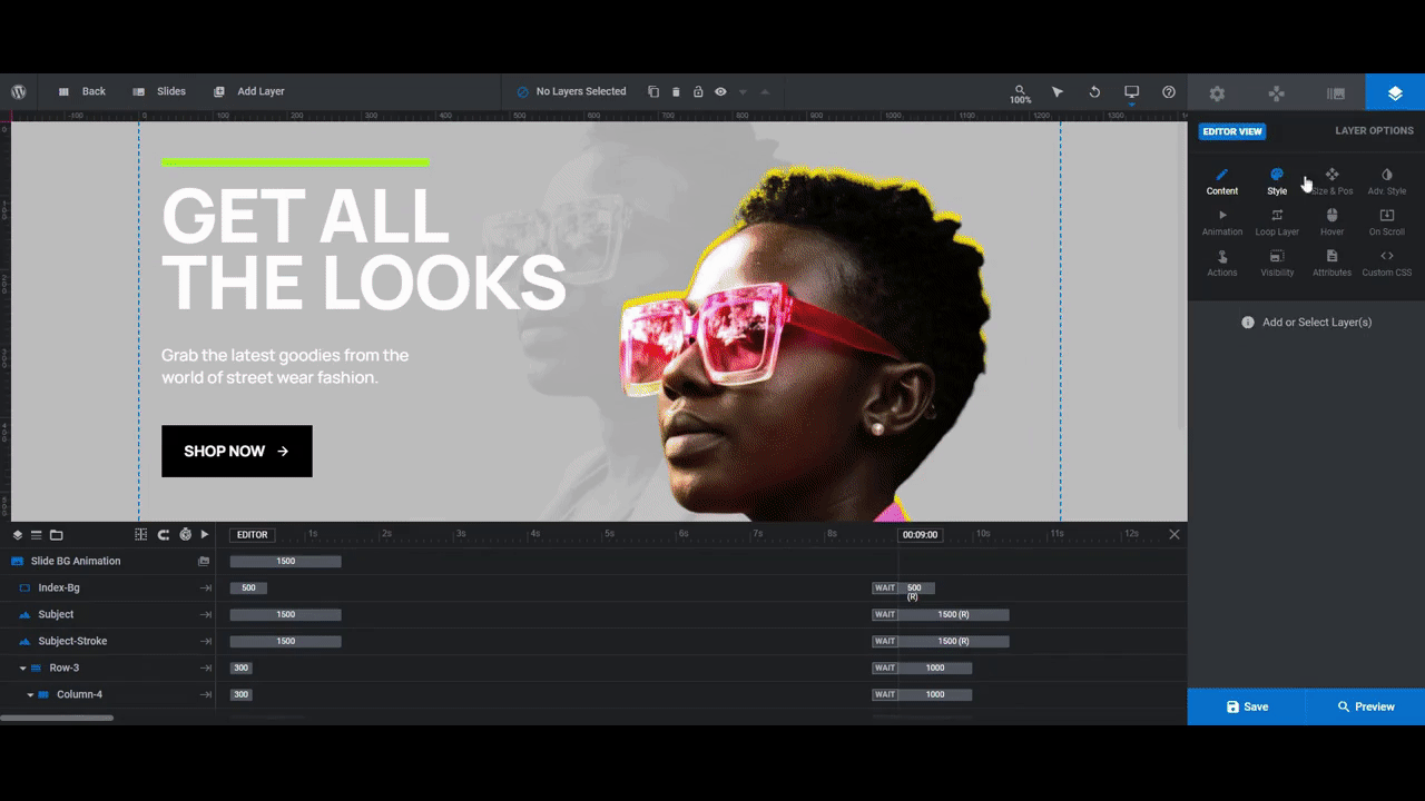
There are two layers in each slide that match the color used in your silhouette:
- Colored-Bar is the thin strip of color above the Headline.
- Index-Bg is the small circle that appears behind the slide index number.
In this step, we’re going to update both of these layers to match the corresponding silhouette accent color in the slide.
To do this, select the layers in the timeline editor or canvas. Then go to “Layer Options” and “Style”. Under “Background”, click the color swatch next to BG Color. You can set the matching color from there:
Repeat this process for each slide.
Learn more:
Step 5: Edit the text and button layers
Each slide includes two promotional layers of text:
- Headline to capture the visitors’ attention.
- Description to elaborate on the selling point.
The Button then directs them to the next step in their journey.
To edit what each of these layers says, select them in the timeline, and then go to “Layer Options” and “Content”. You can add your new text there.
Note: If your text runs too far over to the right or you simply want to balance out the lines better, you can use <br /> to force a line break within your copy. You can type this into the content field or use the return-line arrow above it.
To edit the fonts of each of these layers, go to “Style” settings. Make sure you’re consistent with the fonts you use throughout the shop slider.
Although you can adjust more than just the copy and style of these layers, it’s best to keep your changes to a minimum. Everything here has been carefully sized, positioned, and timed — that goes for the text as well as the Button. Unless you’ve decided to use darker backgrounds and need to make your button lighter, there shouldn’t be much else to edit.
Before you move on, preview your work. Make sure that none of your text gets hidden behind your images and that it doesn’t cover the slide index below it. Do this for each of the responsive variants, too.
Learn more:
Step 6: Remove the global layers
This final step is a two-parter. We’re going to remove the existing navigational elements under Global Layers. Then, we’re going to add our own navigation using Navigation Options.
While the shop slider auto-rotates, visitors can also control the pace of the slides using the Slide-Index, Total-Slides, and Left and Right arrows under Global Layers. You’ll find all of this by going to “Slides” in the top toolbar and then opening up the global layers.

What we’re going to do is delete all of these layers. To delete them simultaneously, hold down the Ctrl button on your keyboard as you select them. You then only have to hit the Backspace or Delete key once.
Note: If you remove these elements, you’ll also want to go back to your slides and delete the Index-Bg layers since they’re no longer needed.
Learn more:
Step 7: Create the new navigation
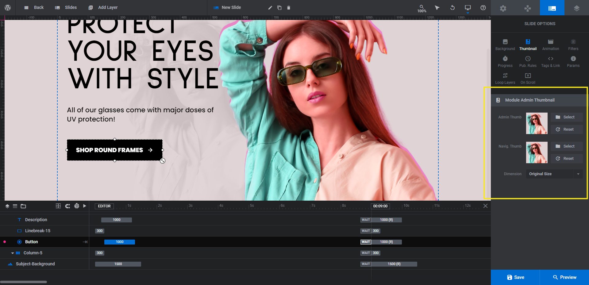
The next thing we’re going to do is update the slide thumbnails and names. Go back to “Slides” and start with your first slide. Then go to “Slides Options” and “Thumbnail”.
The Admin. Thumb is the one that appears when you hover over the slides from under “Slides” in the toolbar. It’s a good practice to keep this updated so your slides master is up-to-date and easy to use. The Navig. Thumb is the one that appears when you create a thumbnail navigation, which we’ll set up shortly.
To change them out, first click the Reset button. This will pull in the slide’s current background color. Then, click the Select button next to each and insert the Subject image from your media library:
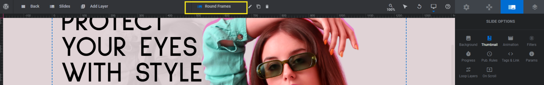
Before you move onto the next slide, update the name of the slide. We’re going to name each after the style of sunglasses we’re promoting.
You’ll find the slide name in the middle of the toolbar. Select it and then enter a new one:
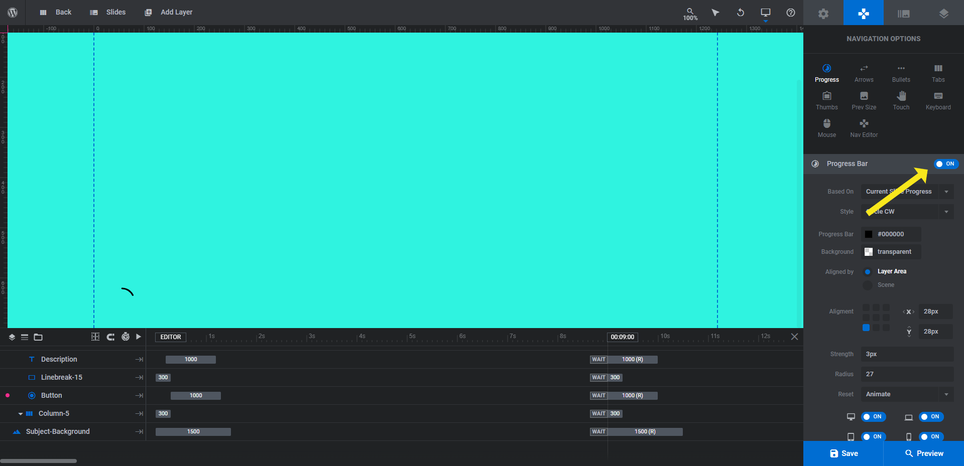
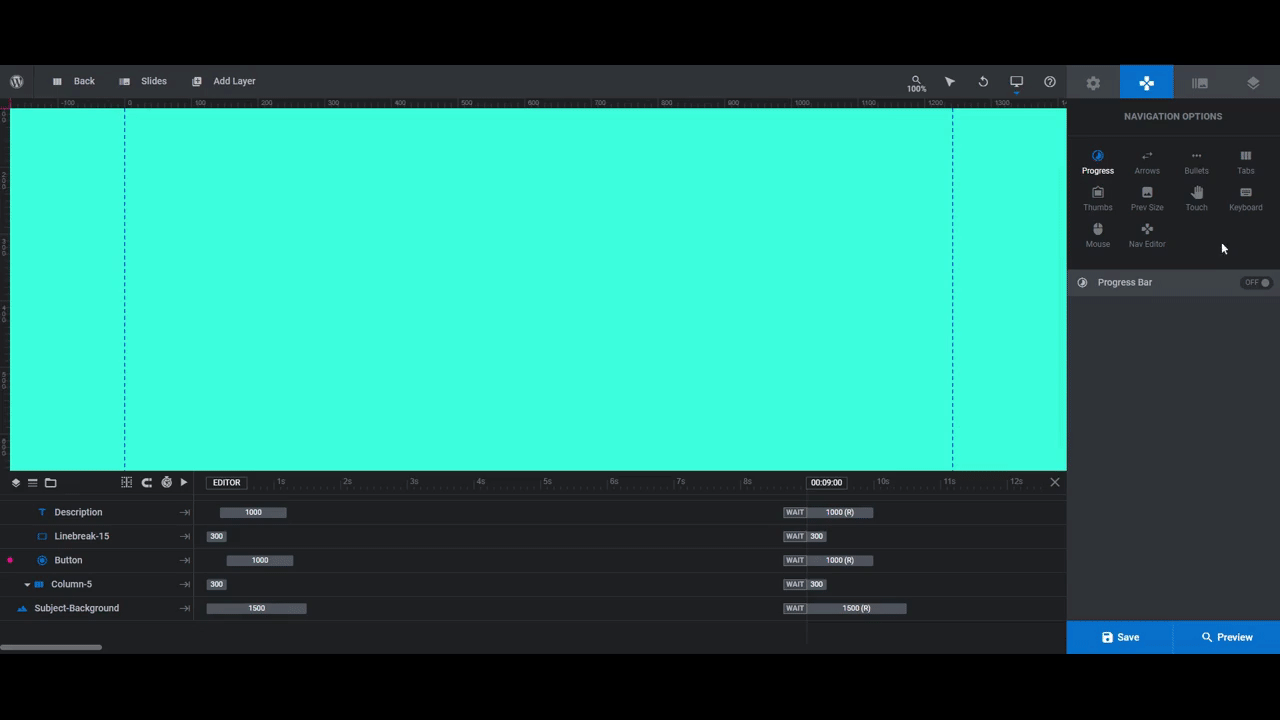
When you’re done updating all of your slides, open up “Navigation Options”. Go to “Progress” and disable the setting:
Next, go to “Bullets” and turn the navigation setting on. While “Thumbs” also allows us to display thumbnail images as a form of navigation, there’s a particular bullet style we want to use called Metis:
After selecting the style, we set the bullets bar to vertical and then moved it to align center-right. To move it away from the edge of the slider, adjust its position using the x-value. We moved ours in by 20px to add a little breathing room.
While we could change the colors to reflect our fun retro style, we want the focus to remain on our content. So the steely colors work just fine for our purposes.
Note: If you don’t have different product categories or styles to promote in each of the slides, you may want to use a regular bullet navigation or keep the original one from the template. The thumbnails are great because they allow shoppers to preview the styles along with the category names (which are revealed when they hover over them). However, this might not make sense for your needs, so keep that in mind as you customize your navigation.
When you’re done setting up your navigation, save your changes and preview your work once more. When you’re happy with the results, you can add this slider to your ecommerce home page.
Learn more:
Modernize retro design trends like neon colors and silhouettes to create better engagement
You don’t need to use the extreme version of any of the retro trends here — that goes for the silhouette effect as well as the neon colors. The point is to draw attention to your products with a fun retro effect, not to outright shock and fatigue visitors’ eyes.
So if you only want to use neon highlights and make the silhouettes feel more like gentle halos, do that. Or you can go crazy with it and create a shop slider that looks like a spectacle. Just make sure it’s on brand and that the copy is easy to read.
Whichever direction you decide to go, the Fashion Shop Slider template is the best place to start in order to create this modern take on two fun retro trends.


