
Visitors are used to encountering animations and other special effects at the top of the home page. While that’s a great way to get visitors to stop and notice the content in your hero section, it’s not the only important bit of content that appears on the home page.
In this tutorial, we’ll show you how to use the Brutal Website Template‘s motion-filled call-to-action section to drive up engagement on your home page.
Table of Contents:
- Step 1: Install the Brutal Callout Template
- Step 2: Add your own video background
- Step 3: Update the module background to match
- Step 4: Customize the headline
- Step 5: Customize the call-to-action button
- Step 6: Edit the bubble morphs (as needed)
How to increase engagement with a motion-filled call-to-action
Not everyone will land on a home page and instantly be ready to click the call-to-action button. That’s why home pages are often chock full of information that proactively answer visitors’ questions and put their minds at ease.
When they finally feel ready to click, they shouldn’t have to scroll to the top of the home page to do it. Instead, a well-placed call-to-action section — be it in the middle of a lengthy home page or just above the footer — makes it convenient for them to convert:
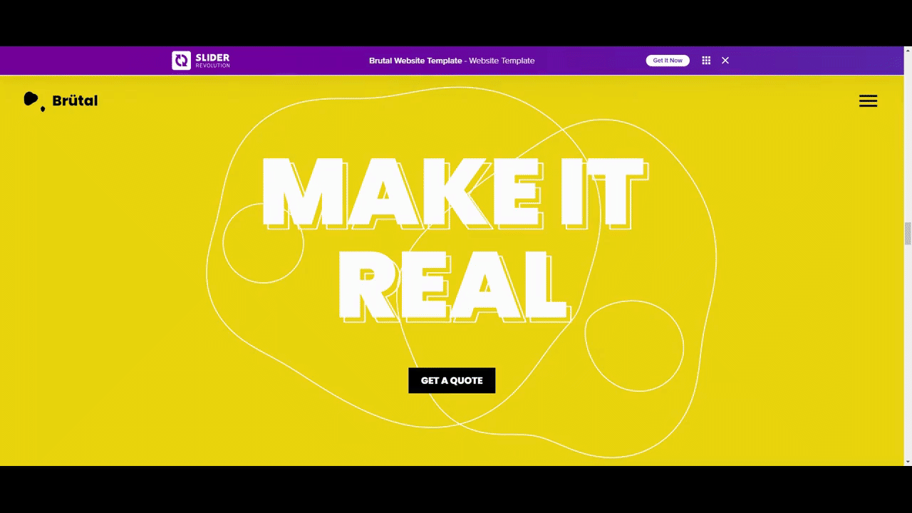
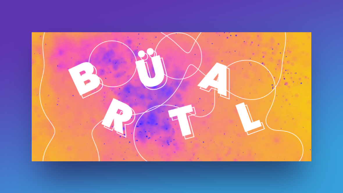
This callout section might look like a complex one to make, but it’s not. The key is to find a background video that’s visually interesting without overwhelming your message. In the following tutorial, we’ll show you how to take the above template and turn it into this:
Let’s get started.
Step 1: Install the Brutal Callout Template
In Slider Revolution, open up a “New Module from Template”. Do a search for “brutal website”. It will pull up a template package of the same name (note the yellow label below it):
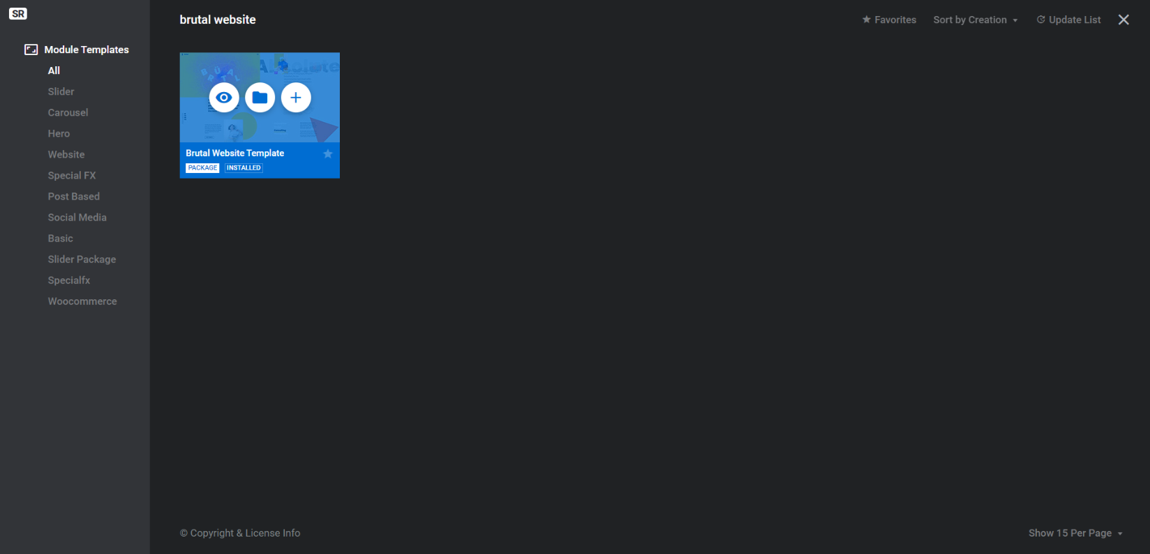
Hover over it and click on the folder icon in the middle. This will reveal the individual modules (with purple labels) that make up the website template. The one we’re customizing today is called Brutal Callout Template:
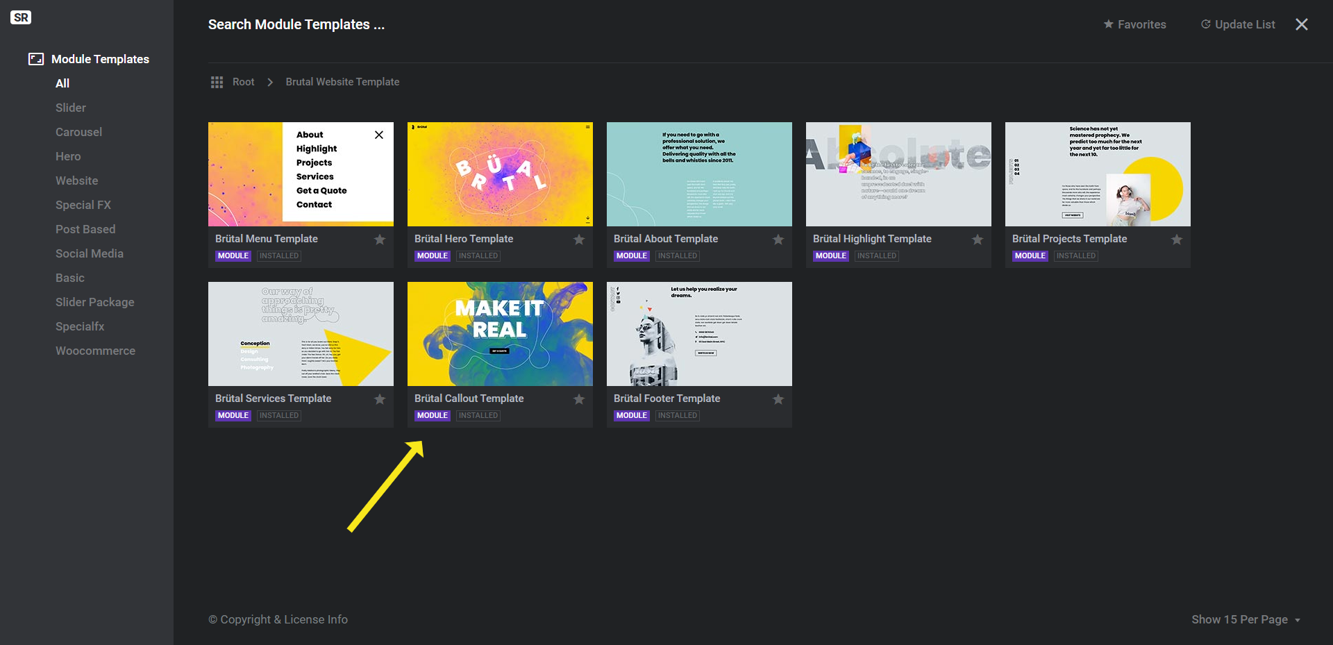
Hover over it and click the plus-sign. To install just the call-to-action section, click Install Template & Addon(s).
Note: If you want to create your home page entirely from this template, install the full template package instead. The following steps will be the same.
Learn more:
Step 2: Add your own video background
The blue-green smoke flow and yellow background have been created by inserting an MP4 video into the background of the slide. To swap it out for your own, go to “Slide Options”, “Background”, and upload your replacement video file to the media library:
Pro tip: This slide design is most effective when the background video leans more towards simple than complex. So it’s best to find or create a video with abstract concepts or flowing motions as opposed to people or things actively doing something.
Learn more:
Step 3: Update the module background to match
The yellow background color you see in the Brutal Website Template is built into the video file. However, in order to create a seamless transition from the loading screen to the video, a module background color has been set to that same yellow.
In order to even out the color transition in your slide, you’ll first need to identify the primary background color of your video.
An easy way to do this is to take a screenshot of your video file. Then go to ImageColorPicker.com. Upload your image, hover over any area of it, and the tool will tell you what the HEX code is:
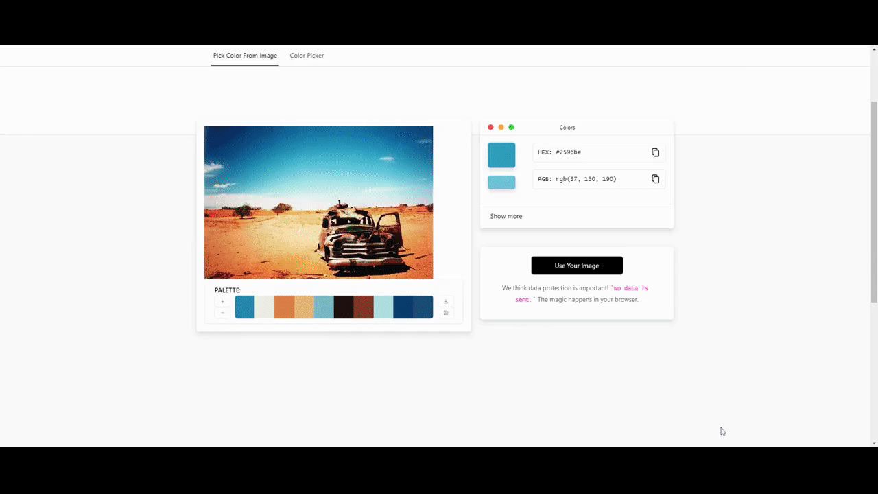
Copy the color and then return to Slider Revolution.
Open up “Module Options”, go to “Layout” settings, and scroll down to the “Module Background” section. Click the color swatch next to BG Color and enter your new HEX code into the Color field:
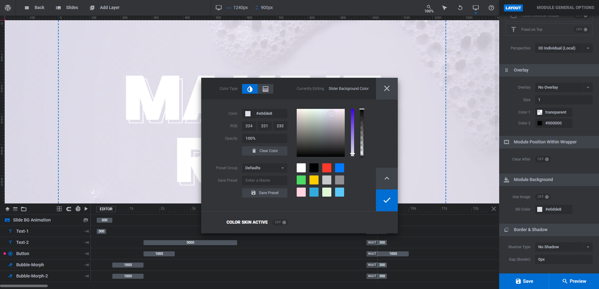
Save the new color and close the selection modal. To make sure the color seamlessly transitions from loading screen to video, click on “Preview” and give it a look now.
Learn more:
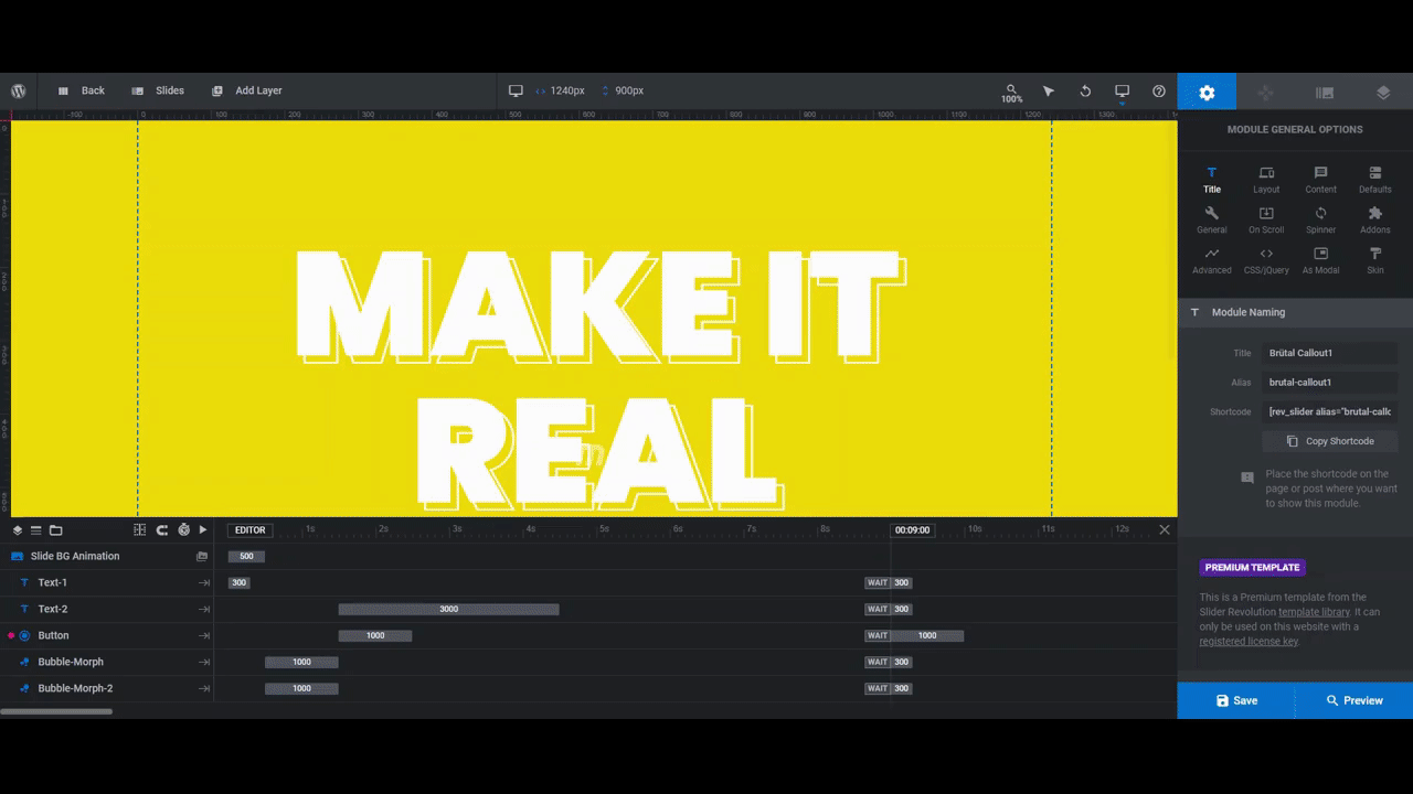
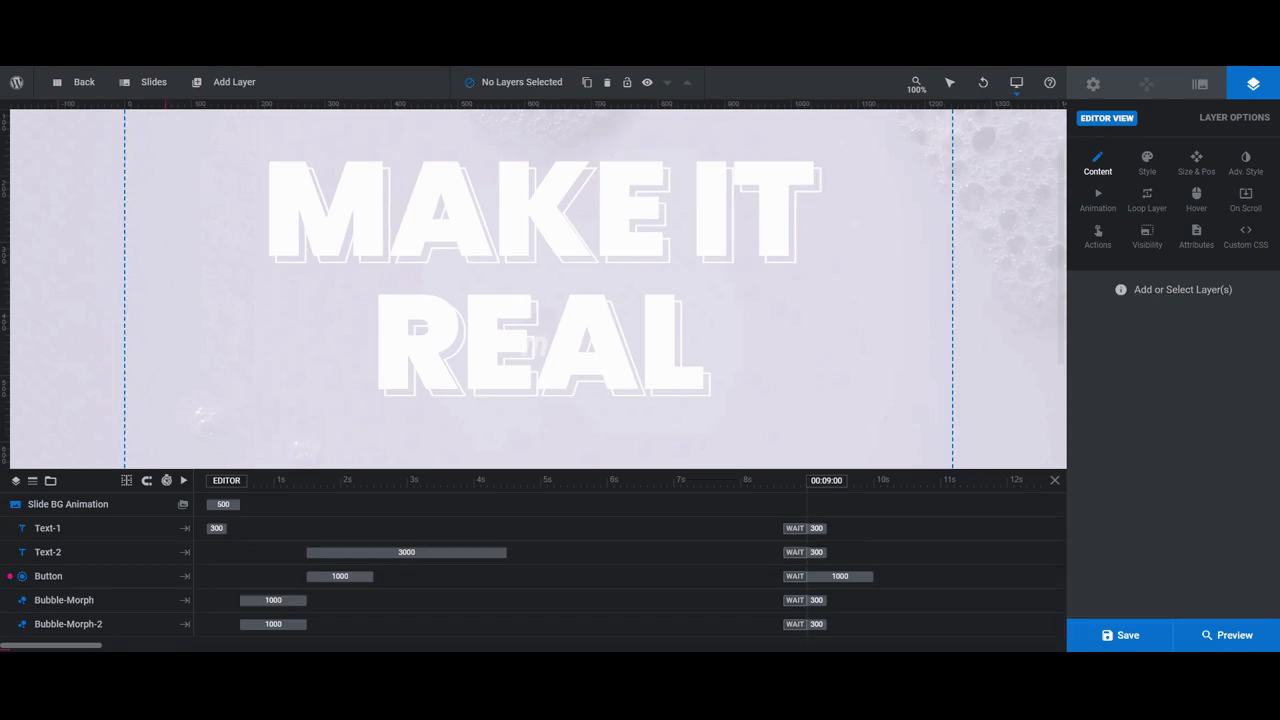
Step 4: Customize the headline
There’s a single line of text in this call-to-action section. However, it’s been created using two text layers:
- Text-1 is the solid text layer in front.
- Text-2 is the outlined text layer in the back.
Both the font choice and the outlined layer effect work well when you have a brand that you want to make a bold statement for. We are redesigning this template, however, for an ecommerce company that creates gentle body care products for infants, so we want our headline to exude some of that gentleness as well.
Pro tip: If you can, try to keep the number of words or length of your headline as close to the one in the template as possible. To infuse the headline with your brand’s personality, you can make adjustments to the font and weight.
However you decide to customize the headline, you’ll find all the controls you need under “Layer Options”. Select the text layer you want to work on, go to “Layer Options”, and then use the various settings to make your updates:
- Change what the text says under “Content”.
- Edit the font, style, size, and color under “Style”.
- Make additional edits to things like rotation, shadows, strokes, and more under “Adv Style”.
- Customize the text’s “IN” and “OUT” transition settings under “Animation”.
In addition, if you want to remove the outlined text layer, all you need to do is select it in the timeline editor at the bottom and then hit the Backspace or delete key to remove it.
One other thing to note is what to do if your new headline runs too long or you want to force certain words to sit alongside others. To do this, use the return-arrow key that sits above the text editor field. When you drop the break into the text, it will automatically force everything after it to the next line.
Learn more:
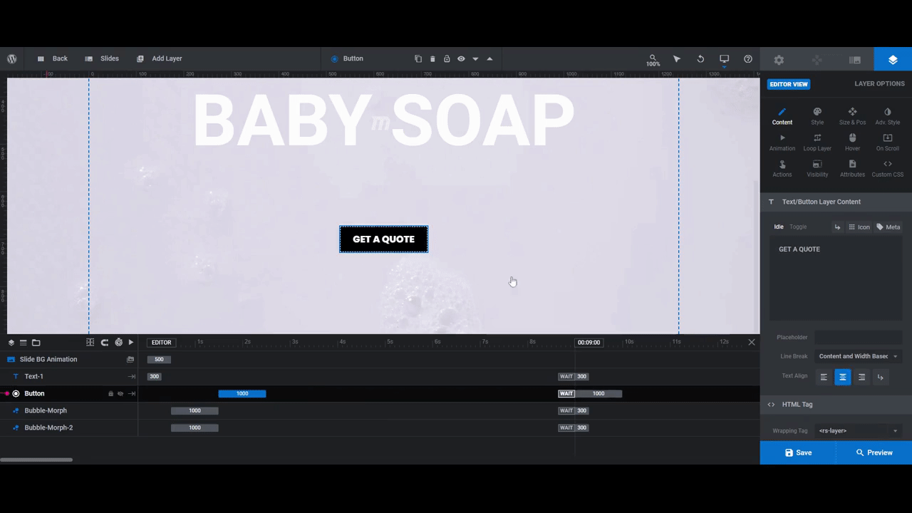
Step 5: Customize the call-to-action button
The button in the call-to-action section is a critical component. Not only does the offer or promise need to be attractive, but so too does its design.
Editing what the button says as well as the basic look of it can be done from the same “Layer Options” you used to edit the text. There are a few extra things you may decide to edit as well:
- Edit the background color and border under “Style”.
- Apply a shadow under “Adv Style”.
- Adjust the way the button looks when someone hovers over it under “Hover”.
Another thing you’ll need to edit is where your call-to-action button links to. Open up the “Actions” settings. Right now, there’s a Scroll To ID setting in there. This will only be useful if you want visitors to be directed to a different section on the home page.
To delete this action, click the trash can icon to the right of it:

To add a link to a separate page, click “Add Action to ‘Button’” at the bottom of the modal. It will automatically generate a simple link, which is what you want:
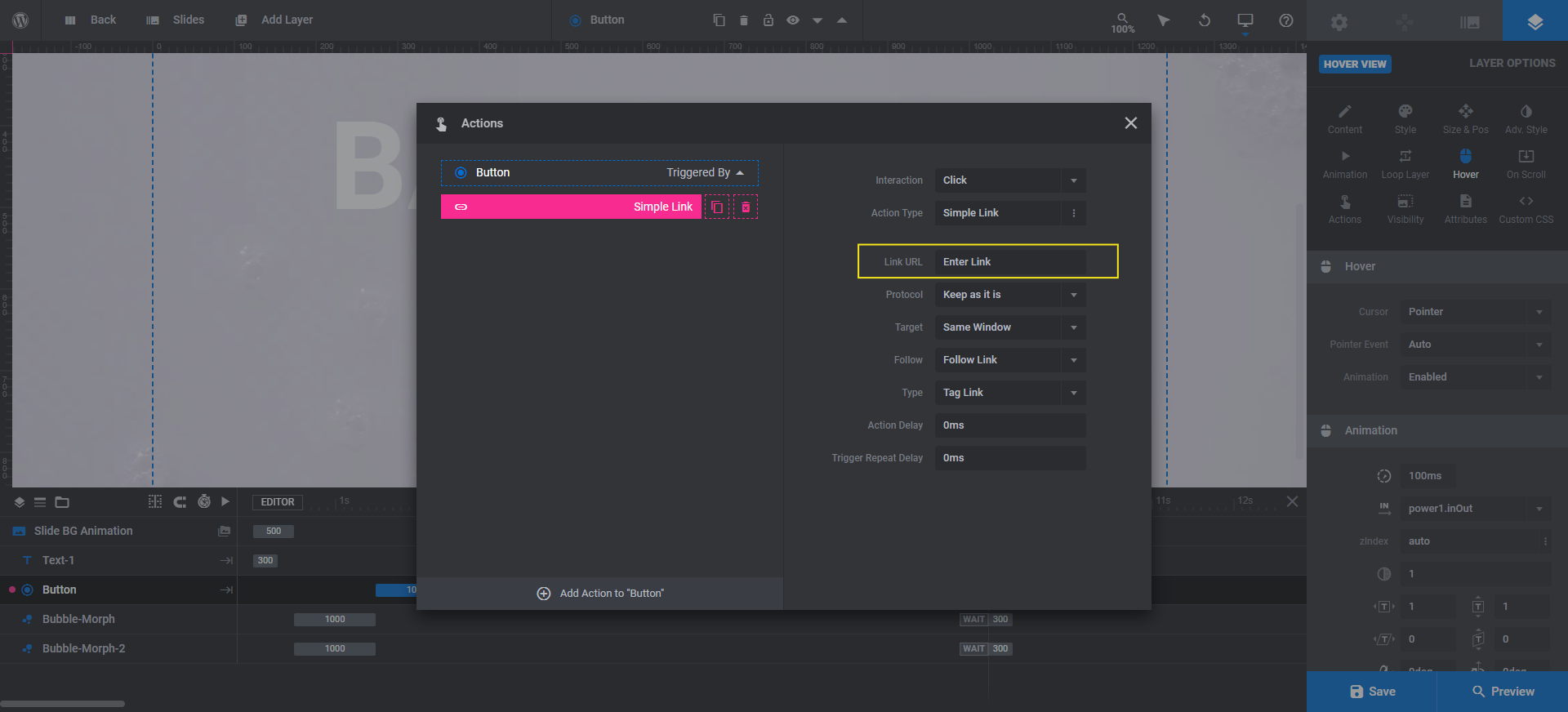
Update the Link URL so that visitors are taken to the correct page on your website. Exit out of the modal and save your changes.
Learn more:
Step 6: Edit the bubble morphs (as needed)
The last piece to edit is the animated bubble morph. There are two of them:
- Bubble-Morph
- Bubble-Morph-2
Just as you adjusted the text so that it was more in-line with your brand and the boldness of it, you can make similar adjustments to the bubble morphs. There are a few settings under “Layer Options” you can do this with.
Because we’re using a visually stimulating video background in this design, we want to ensure the bubble morphs don’t detract too much from it. We simply want them to draw attention to our headline.
Select the floating bubble morph you want to edit first. Then go to “Layer Options” and “Bubble Morph”. Under the “BubbleMorph Settings” section, you can:
- Change the number of bubbles that appear
- The speed at which they move
- The buffer area that the bubbles will stick to
You can also use the “Border Style” settings to thin out or thicken the bubble lines.
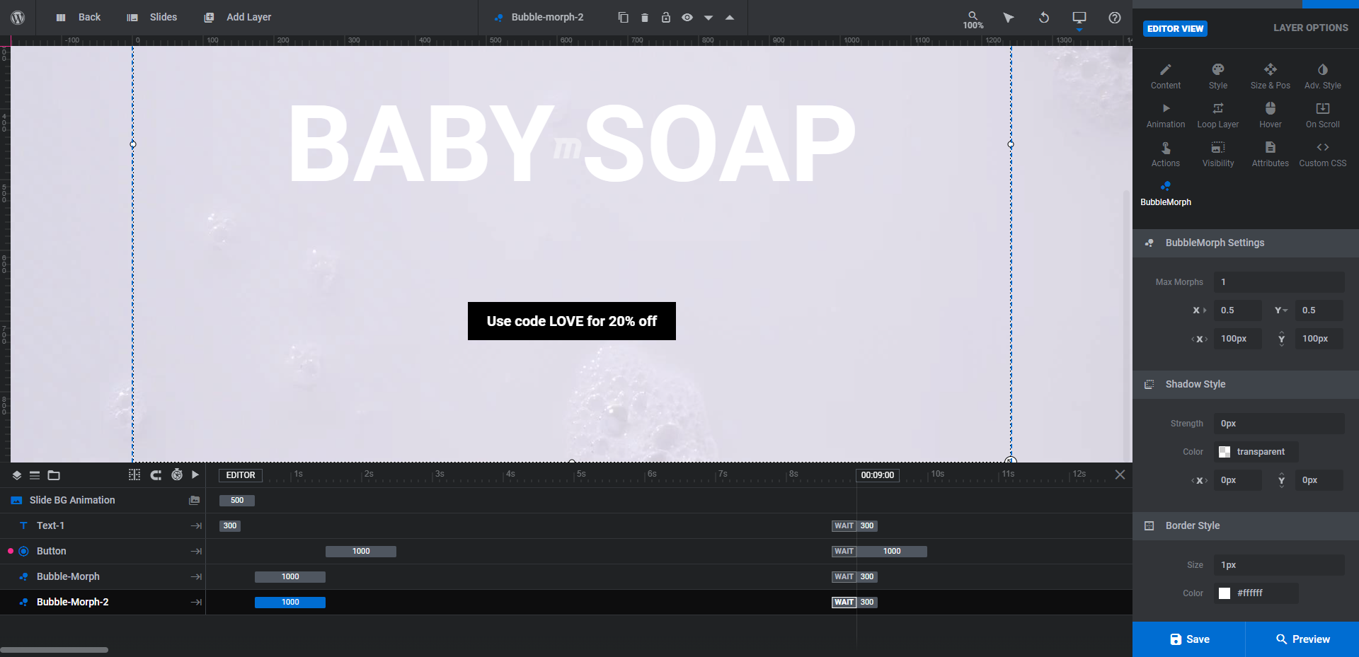
To create a gentler, more subtle bubble effect to go with our slide’s theme, we reduced the number of bubbles in each morph to 1 and set the line thickness to 1px. We also slightly sped up the movement of the bubbles so they were more in line with the bubble video backdrop speed.
Learn more:
Make a bigger impact with your home page’s callout
Even with the coolest of hero image designs, there will be some visitors that aren’t quite ready to click the call-to-action button. That’s okay. This is why we build call-to-action sections into the home page. Once visitors have gotten the information they need and are ready to convert, the call-to-action is easy to access.
To ensure that visitors don’t miss the call-to-action section, it needs an eye-catching design. And with the help of the Brutal Website Template, you’ll be able to do just that.


