
One of the problems with hopping onboard a popular design trend is the potential for it to become ubiquitous. We’ve seen this happen in recent years with SaaS companies and other digital product vendors that have illustrated websites. They’re everywhere.
There’s nothing wrong with a minimally-designed illustrated site if it aligns with the company’s vibe — like a productivity SaaS that wants to simplify users’ lives. But what about cutting-edge companies, ones that are trying to advance innovation and take technology to the next level?
One way to break free from this cookie-cutter illustrated mold is by creating a more futuristic-looking website design. In this tutorial, we’ll show you how to repurpose the Cyber Glitch Effect Slider template to create something your site visitors won’t be expecting.
Table of Contents:
- Step 1: Remove all slides but one
- Step 2: Replace the background
- Step 3: Edit text and button
- Step 4: Customize the typography
- Step 5: Duplicate the slides and swap out the content
- Step 6: Edit the navigation controls
How to create a cyberpunk-inspired futuristic website design
Futuristic design may mean something different to everyone. The important thing to remember is that you want to stay away from a dystopian design. The future and, by proxy, the technology and brand you’re promoting should look exciting.
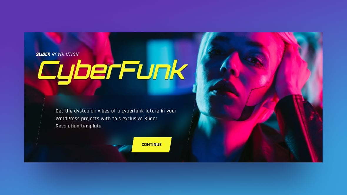
The Cyber Glitch Effect Slider template demonstrates just one way to approach a futuristic-looking design:
Don’t worry. Once you read through this tutorial, you’ll see how easy it is to put your own unique spin on this cyberpunk style:
If you’re a first-time Slider Revolution user, read through these quick-start guides first:
Then, you can tackle the tutorial:
Step 1: Remove all slides but one
Any time you’re creating a slider where each slide will use the same styles, components, and layout, it’s a good idea to trim down your Slider Revolution template to just one slide to start. It’s a much faster way to create and customize a whole slider’s worth of content.
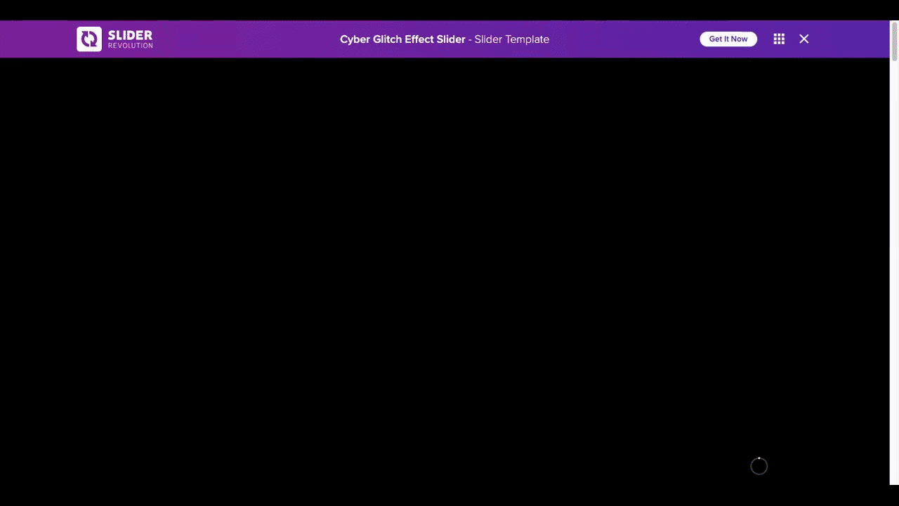
Open the Cyber Glitch Effect Slider template and go to “Slides” in the toolbar:
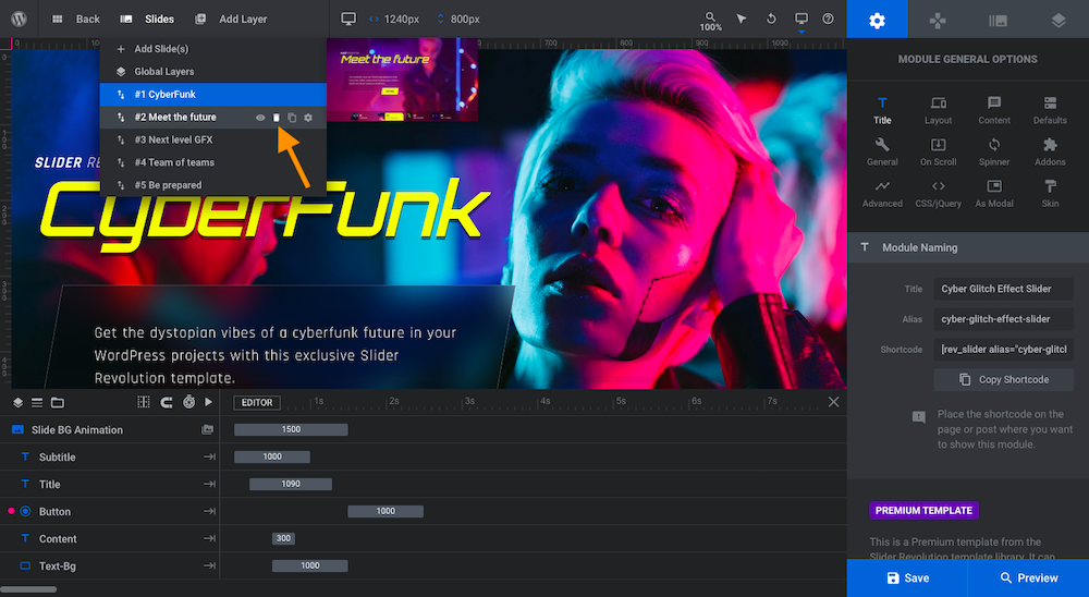
There are five slides in this template. Delete four of the five by hovering over them and clicking the trash can icon. It doesn’t matter which ones you choose.
Don’t worry about Global Layers. We won’t be using them today.
Learn more:
Step 2: Replace the background
In this step, you’re going to upload a new background image or video to your slide. You’re also going to tweak the animation and animation filter if you’d like to.
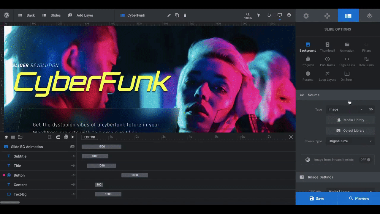
Go to “Slide Options” and “Background”. Under “Source”, you can choose from:
- Image
- HTML5 Video (upload)
- YouTube Video (embed)
- Vimeo Video (embed)
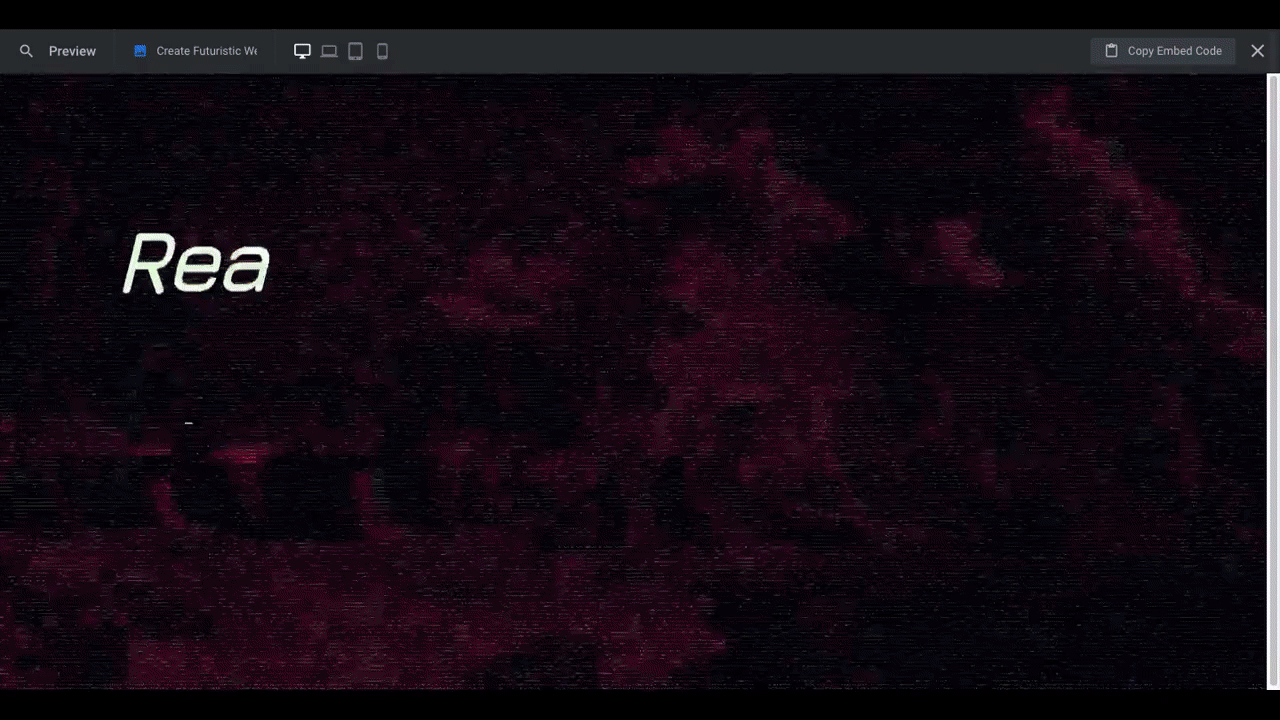
We have a photo to upload, so we’re going to keep “Image” selected and then open the “Media Library”:
Pro tip: When sorting out which background graphics to use, try to find imagery that preserves the cyberpunky style of the original template. You don’t need to choose photos of people that look like they live inside the Matrix or anything like that. However, neon lighting and duotone color palettes will go well with the glitch transition effect in the slider.
Speaking of special effects, let’s take care of that while we’re customizing our background. Go to “Animation” and scroll down to the “Melt Effects” that are currently open.
The background uses a combination of the Morph Vertical animation along with the Glitch & Noise filter, which you can find under the next “Advanced” section and “Filters” tab:
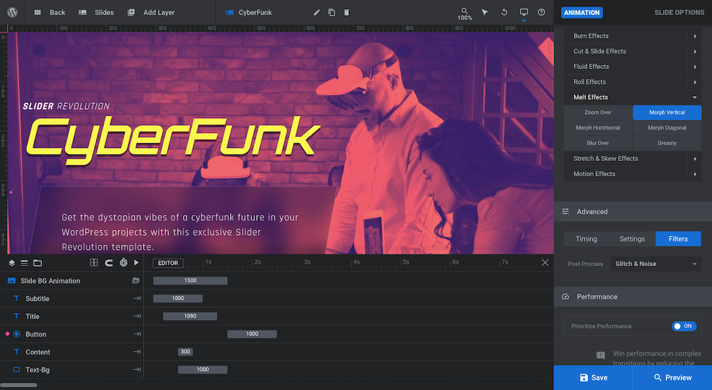
To change the glitchy and radio staticky transition of each slide, choose your alternate settings here. Just remember that any time you change the transition preset, you’ll have to reset the advanced filter again.
We’re going to keep the existing effect for our slide, so no changes are needed on our end.
Learn more:
- Changing Background Template Colors and Images
- Setting Slide Transition Animations
- Using Presets to Quickly Apply Animations
Step 3: Edit text and button
With the image and animation settled, it’s time to turn your attention to the text on the slide. There are four text layers to focus on:
- Subtitle — the white “Slider Revolution” text at the top
- Title — the yellow “CyberFunk” header
- Button — the yellow “Continue” button
- Content — the description block in the center
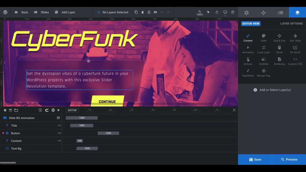
If you don’t want to keep some of these layers, click on them in the visual canvas or in the timeline at the bottom. Then, hit “delete” on your keyboard. That’s what we’re going to do with the Subtitle layer.
To edit the layers that remain, click on them, go to “Layer Options”, and locate the text box under “Content”. Replace the current text with your new text:
You have some flexibility in terms of how much text you put in the Content layer. However, you don’t want your Title, Subtitle, or Button to be much longer than the amount of text in the template. This will ensure that you can use visually interesting subjects in your graphics and they won’t get lost too much behind the text layers.
Learn more:
Step 4: Customize the typography
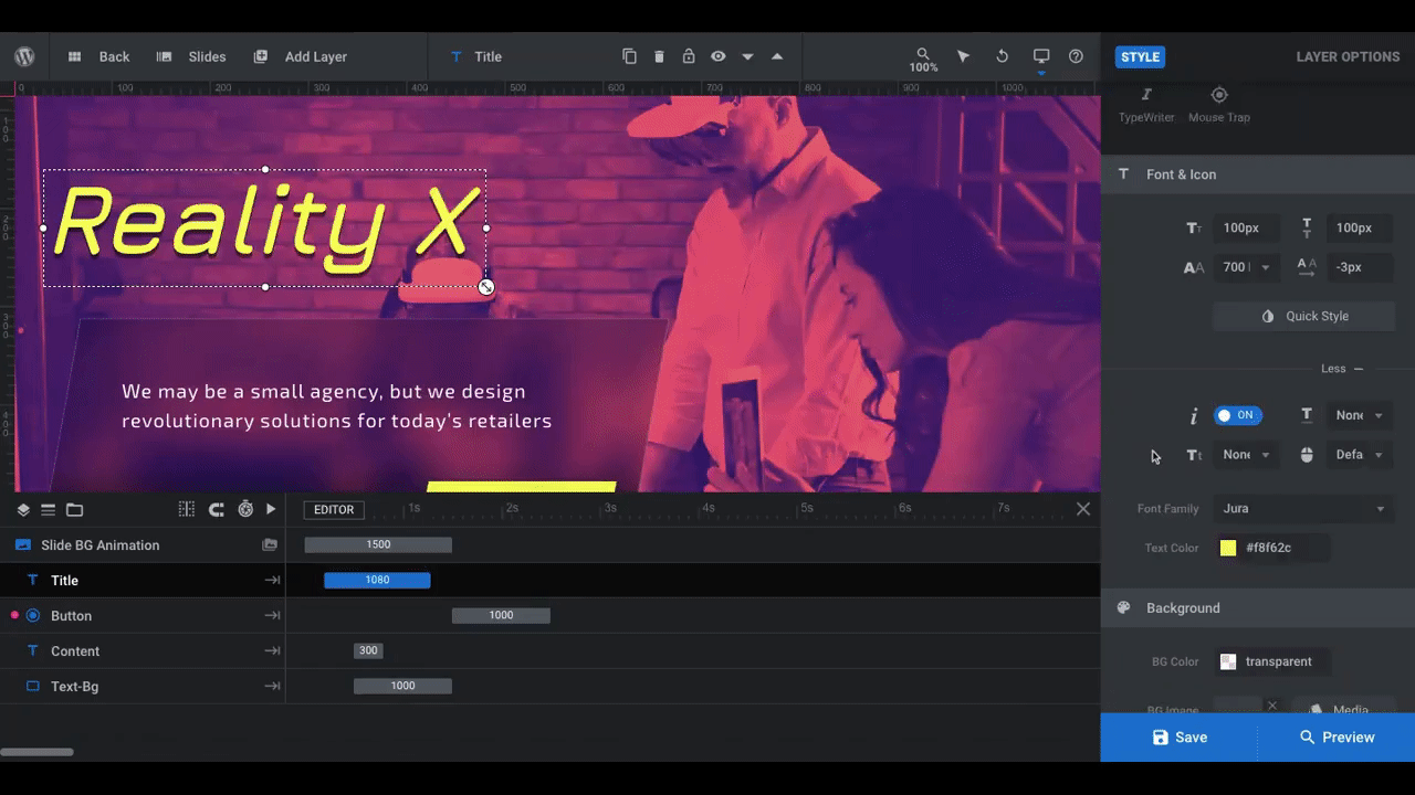
To update the font to match your branding, open “Style” settings:
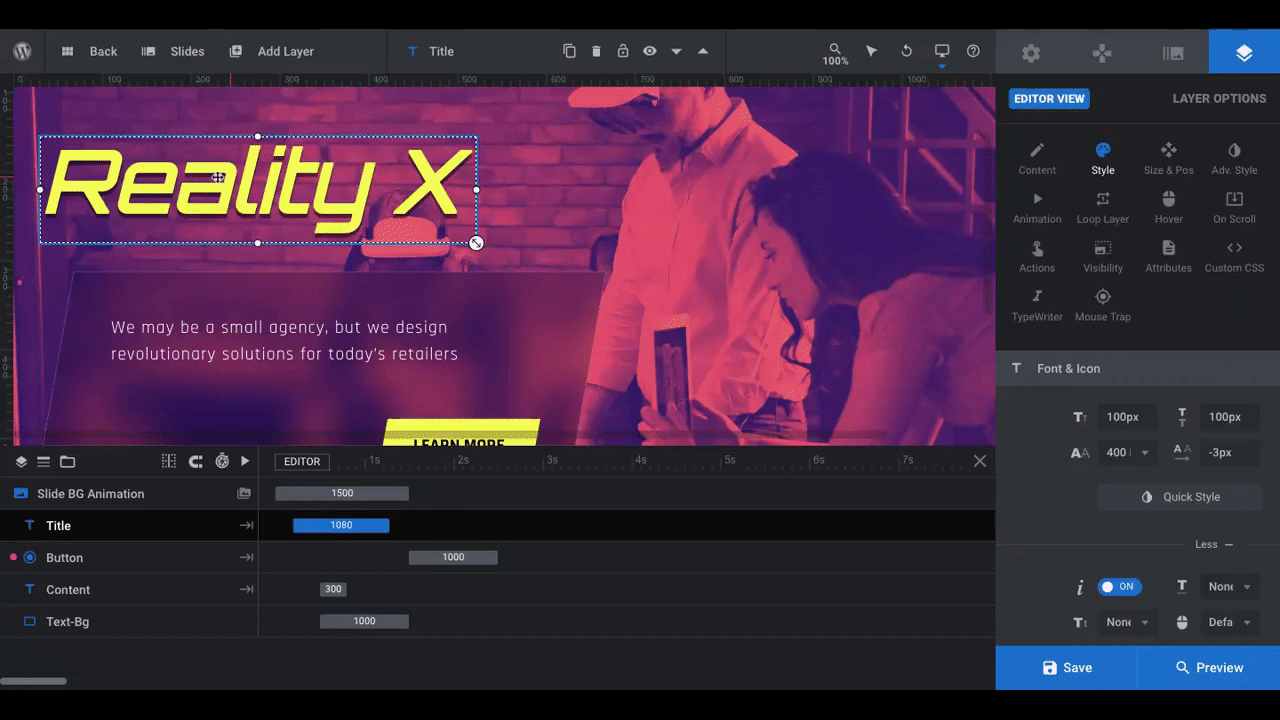
From here, you can change the font family, size, weight, color, and spacing.
Pro tip: If you change the color of the Title layer, the color of the button background as well as the navigation tabs at the bottom will change, too. That’s because they’re all programmed to use the Highlight color, which you’ll find under “Modal Options” and “Skin”:
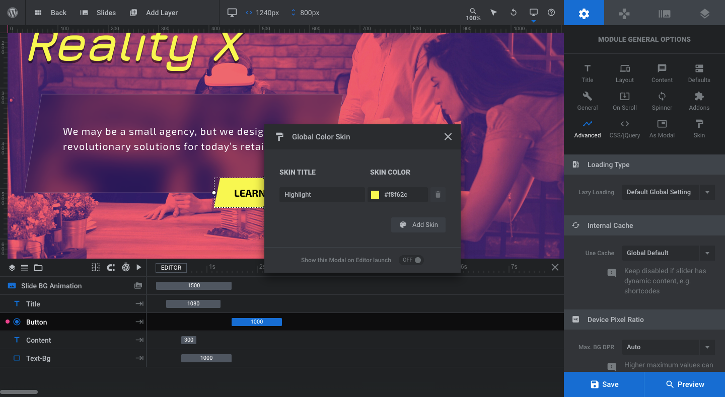
To detach the button (and, later, the navigation) from the global color skin, open the color modal and switch off the toggle for “Color Skin Active”:
There’s not much to update in terms of text positioning or sizing unless you decide to use significantly more or less text on your slide. We did cut down the amount of text in our content layer, so we used the “Size & Pos” settings to shift that layer down a bit so it felt more centered over the blurred section.
If there’s anything else you want to change in terms of the aesthetics of your text or button layers, “Size & Pos” and “Adv Style” are the two areas to make those changes.
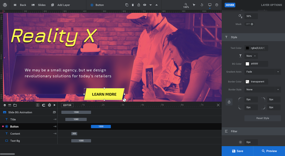
Pro tip: The button has a hover effect enabled. If you change the color of the button, remember to change the color of its hover state. You can make this change under “Layer Options”, “Hover”, and “Style”:
Another thing you may want to adjust is the typewriter effect in the Content layer. When each slide loads, the text types out across the screen. A blinking cursor sits at the end of the segment until the next slide opens.
To edit how the typewriter effect appears, click on the Content layer and open the “TypeWriter” settings:
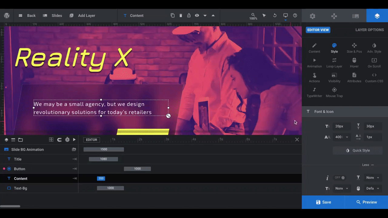
To deactivate the blinking cursor at the end, toggle the setting under “Typewriter General”. If you want to keep it but change how it looks, use the settings under “Blinking Effect”.
You can also alter when the TypeWriter effect starts and how quickly it types out the words under “Typing Behavior”. Because we have less text than in the template, we’re going to slow down the typing so visitors aren’t stuck with a blinking cursor for so long after they stop reading.
Learn more:
Step 5: Duplicate the slides and swap out content
If there are any last changes you want to make to the look or functionality of your slide, make them now. The next step is to duplicate the slide, so you want it as close to perfect as possible so you don’t have to spend time implementing the same changes on all the slides after the fact.
Before you start, open up “Slide Options” and go to “Thumbnail”:
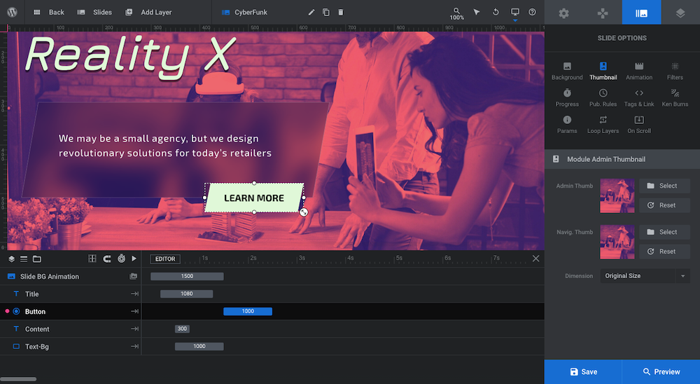
This slider design includes tiny thumbnails along with slide names as an optional form of navigation:

If you’re planning to keep this navigation element in your slider, you need to update the thumbnails as well as the name for each slide. Even if you don’t, it’s still a good practice since it’ll keep your slider designs better organized and easier to manage in the future.
The quickest way to update the thumbnails is to click the “Reset” button next to them. This will automatically replace the old template’s thumbnail with the thumbnail of your new image (or video).
Next, edit the slide’s name in the toolbar:

With that done, you’re now ready to duplicate your slide and customize the remainder of your content. To do this, open up “Slides”, hover over your newly named slide, and click the duplication icon:
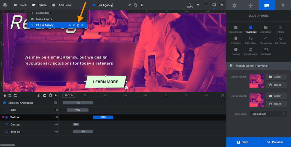
Do this as many times as you need to to create your other slides. The template had five slides in it. Yours should have between three and five. An odd number of slides is usually best.
Go back through Steps 2, 3, and 5 for each slide. When you’re done, save your changes.
Learn more:
Step 6: Edit the navigation controls
Go to “Navigation Options”. Here you’ll find that there are three navigational elements enabled:
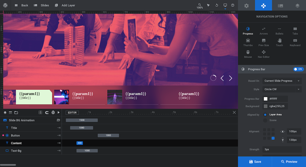
“Progress” refers to the small circle beside the arrows in the bottom-left corner. The circle fills up to let visitors know how long they have before the slide rotates. If you’d prefer, you can change it to a Horizontal or Vertical line along the edge of the slider. You can also change the progress indicator to reflect the slider’s progress instead of the individual slide’s.
“Arrows” refers to the left and right arrows beside the Progress circle. These arrows give visitors the ability to switch slides without having to wait for the current one to finish loading.
“Tabs” refers to the tab blocks at the bottom of the slide. They work as a sort of progress indicator, letting visitors know how many more slides there are to view. They also work like arrows, enabling visitors to skip around to other slides.
The Tabs are a great addition if you have more than a few slides in your module as well as if your slider is telling a logical story. That doesn’t apply to what we’re doing here. Ours is a pretty standard home page hero slider.
What we’re going to do then is deactivate the Tabs and adjust the look and positioning of the remaining two navigational controls:
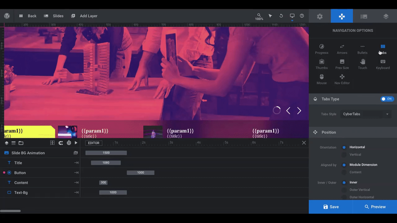
This will allow visitors to control the flow of the slider while clearing the way so they can more easily focus on our content.
Learn more:
What sort of futuristic website will you create with your slider?
SaaS companies and other digital product vendors tend to go the way of minimal, illustrative design to promote their brands. If you or your client are about to launch a new product in the tech space, your site needs to stand out from these lookalike websites and companies.
The best way to do this is to give your home page hero image an electrifying look. With this futuristic-looking website template as your base, you can easily and quickly get your brand’s “vision” for the future up and running.


