
When you think about masonry layouts, you probably imagine something like Pinterest where the images fall into place one beneath the other in vertical columns. The problem with this type of grid is that it’s easy for visitors to mindlessly scroll downwards through the content, never really paying attention to what they’re looking at.
When presenting your work to prospective clients or customers, you don’t want them to lose focus. This doesn’t mean that a masonry grid layout can’t be used to show off your portfolio. All that’s needed is a reconfiguration of the masonry concept so that it feels new and engaging all over again.
In this tutorial, we’ll demonstrate how to take the Masonry Gallery Carousel template and create a horizontal masonry layout to showcase your work.
Table of Contents:
- Step 1: Replace the images
- Step 2: Edit the text
- Step 3: Customize the font
- Step 4: Update the navigation style
How to design a horizontal masonry layout for your portfolio
From the hover-triggered text reveal to the sliding animation, this asymmetrical grid template was built for maximum engagement:
In this tutorial, we’ll show you how to preserve this horizontal masonry layout and still come up with a portfolio slider that’s all your own:
If you need a Slider Revolution refresher before you begin, read through these guides first:
A note about removing or adding slides to the masonry carousel
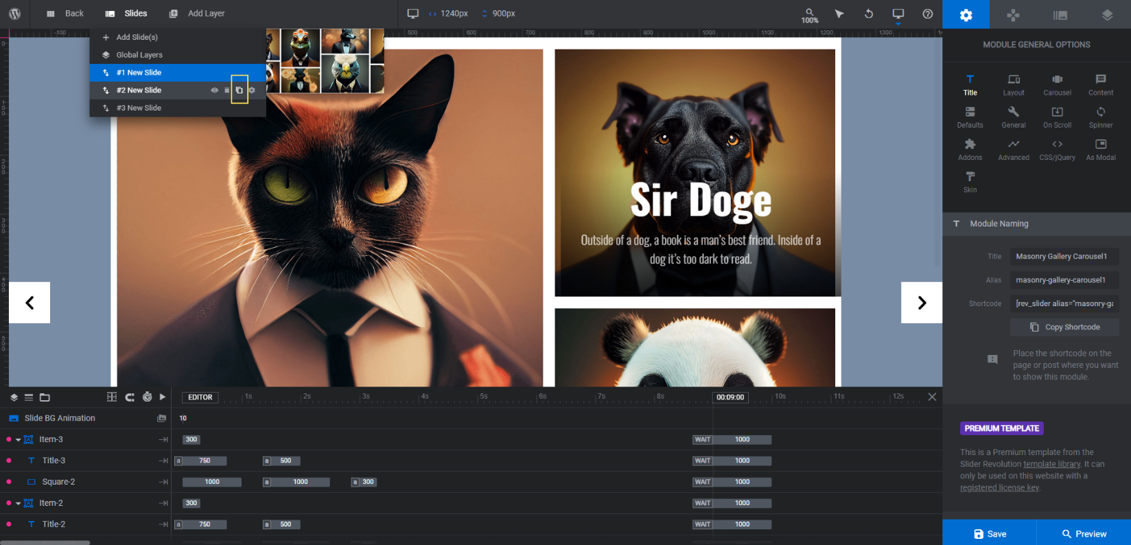
The sliding carousel effect has been created with three slides in Slider Revolution.
Typically, you have the flexibility to remove or add as many slides as you want to your template. However, in order for this gallery carousel to work, there need to be at least 3 slides.
The slides in this template have a total of 10 images/cards. If you don’t yet have 10 projects or samples to show off, get creative with what you include. You can show some behind-the-scenes or work-in-progress photos as well as ones from unpaid or personal work.
Once you’ve accumulated more than 10 samples to show off, replace your older images with new ones. At that point, you might also want to add extra slides and more images to the carousel.
To do this, go to “Slides” in the toolbar. Click the duplicate icon next to the masonry layout you want to replicate:
Note: You can drag-and-drop the slides in the “Slides” dropdown if you want them to appear in a different order in the carousel.
Try to cap your slides to 5 to ensure that the carousel and all your portfolio content within it loads quickly.
Learn more:
Step 1: Replace the images
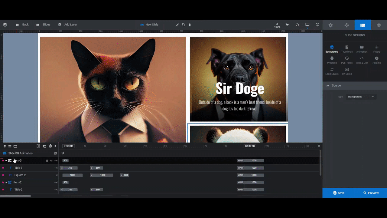
Each slide has grouped elements called Item-#. Within each of these groups is the image and text content for each block in the grid. You’ll find them down in the timeline editor.
In this step, we’re going to focus on the shape layers called Rect, Square, or Vertical-Rectangle. These are the image components of the group.
To reduce the amount of editing you do in Slider Revolution, it’s a good idea to resize your images before you upload them to the editor. All of the images in the template are 1024px by 1024px — even the rectangular ones.
This sizing strategy will work if you have a single subject sitting in the center of the image. However, if your portfolio images are more complex than that, you might lose some of the important surrounding details if you size them all this way.
If you want to size your images to the exact space in the module, here are the approximate dimensions (in pixels) for each of them:
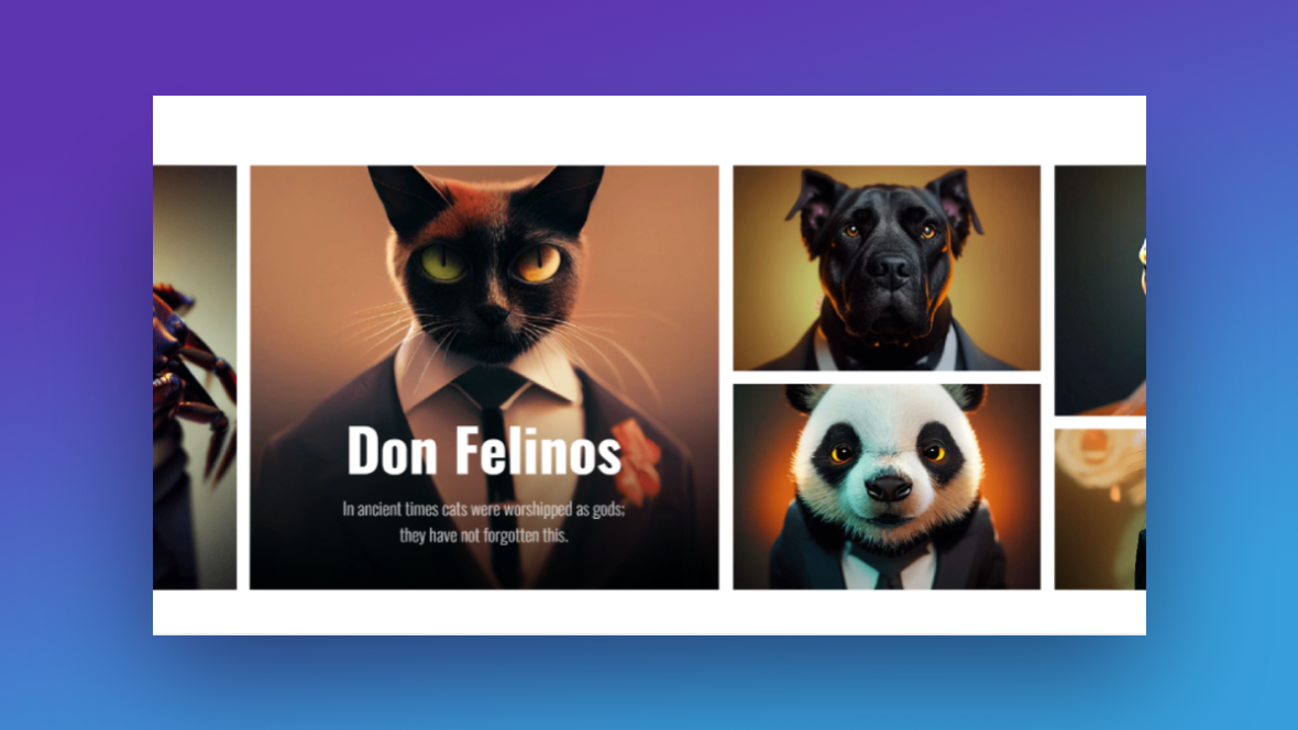
In Slide 1:
- Vertical-Rectangle (cat): 725×860
- Square-1 (dog): 475×420
- Square-2 (panda): 475×420
In Slide 2:
- Vertical-Rectangle (frog): 538×510
- Rect-4 (rabbit): 538×330
- Square-1 (wolf): 660×330
- Square-2 (bird): 660×510
In Slide 3:
- Square-1 (snake): 600×465
- Square-2 (goat): 600×375
- Vertical-Rectangle (crab): 600×860
Once you’ve finished resizing your images, return to Slider Revolution and start with Slide 1. Work your way through the shape layers to replace the existing ones with your own.
Click on the shape layer in the timeline or canvas editor and then go to “Layer Options” and “Style”. Click on the “Media” button to upload your file:
Save your changes. Then do the same thing in Slides 2 and 3.
Learn more:
Step 2: Edit the text
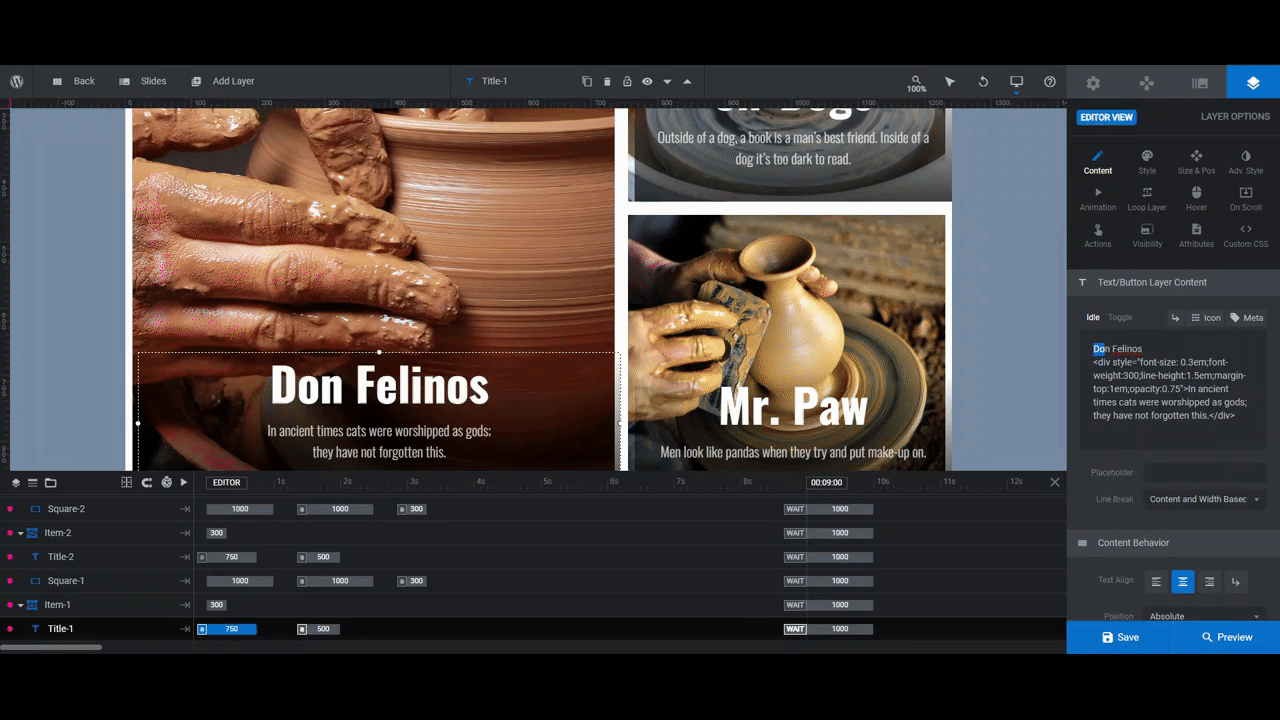
The text layers are part of the Item-# groups as well. You’ll find them in the timeline as Title-#.
Select the first text layer in Slide 1. Then go to “Layer Options” and “Content”. You’ll be editing what the text says in the editor box.
Unlike other Slider Revolution templates you may have worked with, the headline and description are not separated into different layers in this one. Instead, they’re contained within the same layer.
You’ll see this inside the text editor. Here is what it looks like for the first one:
Don Felinos
<div style=”font-size: 0.3em;font-weight:300;line-height:1.5em;margin-top:1em;opacity:0.75″>In ancient times cats were worshipped as gods;
they have not forgotten this.</div>
Everything before <div style is the headline text. Everything between the style specifications and the closing </div> is the description. Edit these strings of text carefully.
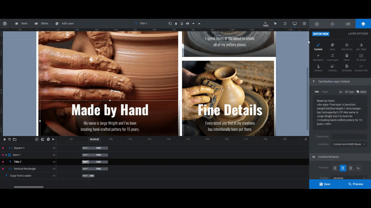
Pro tip: For the best results, try to replace the existing text with the same amount of text. This way, you won’t have to worry about modifying the text size or styles too much in the next step.
The text will automatically wrap when it reaches the bounds of the container. However, you may want to force a break before it reaches that point. You can do this by inserting your cursor into the text where you want it to wrap and then clicking the return icon above the editor. Likewise, you can manually enter <br /> at the breakpoint.
Repeat this process for all of the blocks in Slides 1, 2, and 3. When you’re done with the text in each slide, save your changes.
Learn more:
Step 3: Customize the font
The font you use in this masonry grid should be reflective of your brand as well as your work as a creator.
If you haven’t yet selected brand fonts for your website, consider keeping the font used in the template. It’s called Oswald and its styles can be modified enough to make it convey different tones.
For instance, select one of your text layers and go to the “Style” tab. Click the dropdown arrow next to the weight field (it’s set as 700 Bold).
Play around with the different settings to see if you can find a style — be it by changing the weight, spacing, case, etc. — that best conveys the mood or personality of your business:
Note: The changes you make to the size, height, or weight of your font under “Style” only apply to the headline. In order to modify the style of the description, go back to the “Content” tab and update the coded styles in the text editor accordingly.
While Slider Revolution makes it easy to change all kinds of things with relation to the font, you’ll have more luck if you keep edits to a minimum. The clean, white sans serif font shows up well against these blocks and is easy to read.
Once you’ve found the right font style, apply those same changes to all of the text blocks in your slides.
Learn more:
Step 4: Update the navigation style
The last component we’re going to customize is the navigation. Go to “Navigation Options” and “Arrows”.
The template is using an arrow style called Gallery Arrows. They’re well-placed and the design is pronounced enough so that they stand out well against the background graphics. However, just as we toned down the heaviness of the font to match our business’s style, we need to do the same with the arrows.
You’ll find everything you need to either change the arrow style or modify the existing one right here. To specifically change the weight of the arrows, scroll down to “Navigation Style”. Then enter a new value next to Icon Size:
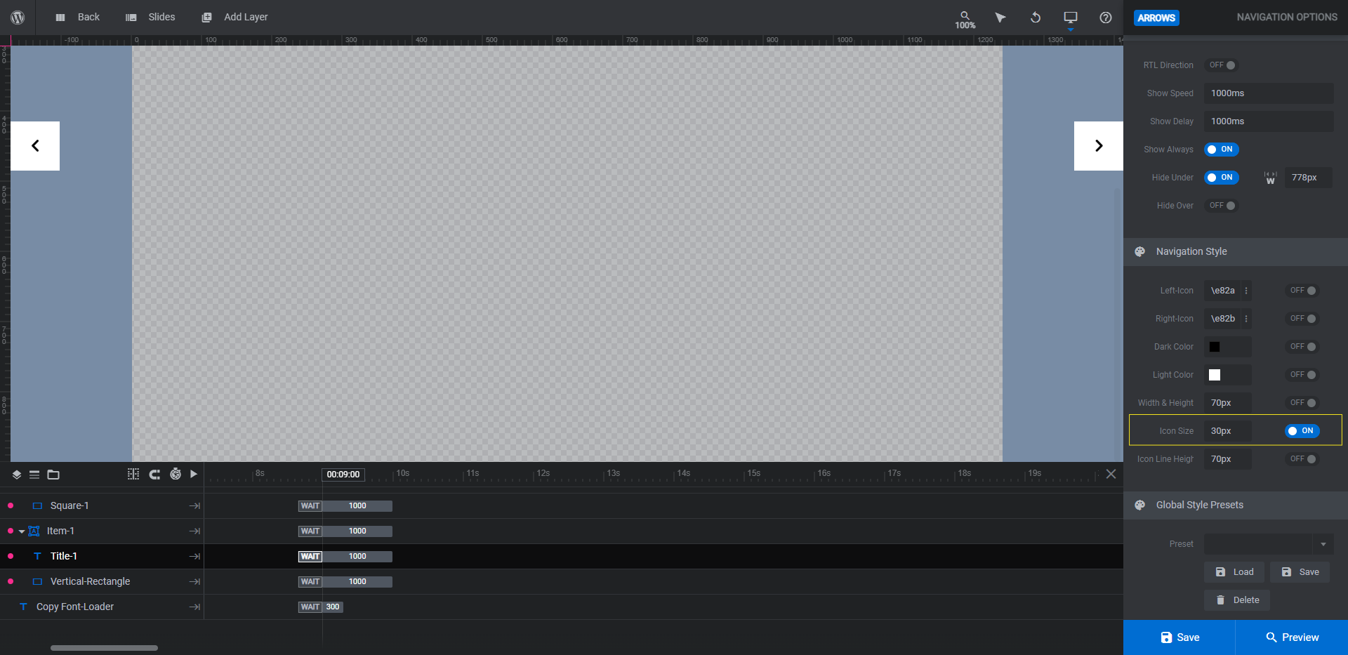
Preview your changes on the frontend of the site to make sure your new navigation style stands out well along the edges of your gallery. If you’re happy with the changes, save them. You can now add this horizontal masonry grid to your site.
Learn more:
Boost engagement by designing a masonry portfolio grid that goes against tradition
There are so many other ways you can modify the Masonry Gallery Carousel template to make it your own. You could change the sliding animation, for instance. You could also experiment with filters. Or you could make each item link out to a portfolio page.
There are many directions to go with this horizontal masonry layout. That said, all that’s really needed is a few modifications — mainly to your portfolio content — to create something super attractive and engaging for your prospective clients to flip through.


