
Isometric design is a really neat way to show off what you do on a website. Even though web pages are by their very nature flat, we can create what look like three-dimensional objects using a combination of imagery, shapes, and colors.
The good news is that you don’t need to be a skilled illustrator or animator to create beautiful isometric designs. At least not when you use Slider Revolution.
In this tutorial, we’ll show you how fast and easy it is to customize the Furniture Store Isometric Slider and use it to promote everything from products to services.
Table of Contents:
- Step 1: Get rid of the header elements
- Step 2: Replace the model images
- Step 3: Customize the cube colors
- Step 4: Update the slide background colors
- Step 5: Edit the text layers
How to create an isometric design with Slider Revolution
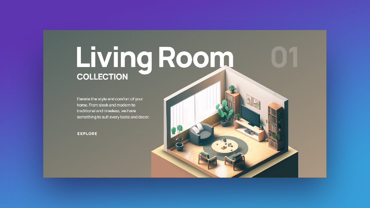
You can use isometric design to showcase a variety of things on websites. In our template, we use it for a furniture store:
You can do more than show off furniture models with this template. In the following tutorial, we’re going to demonstrate how to use this template to explain your web design services to prospective clients.
If you’re looking for an introduction to Slider Revolution before beginning, check out these guides:
Step 1: Get rid of the header elements
This slider template comes with various header and branding elements just in case you want to use them. If you don’t, it’s easy enough to strip them out.
First, go to “Slides” in the top toolbar and click on “Global Layers”. These are ones that are visible at all times in the slider.
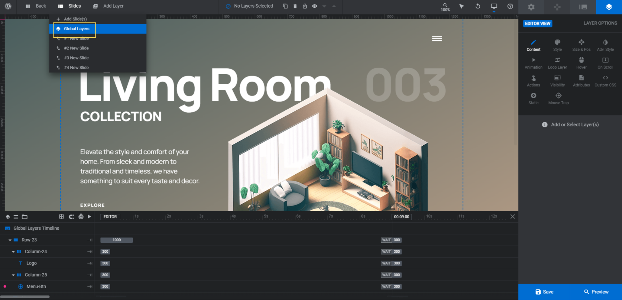
Next, identify the global layers that you don’t need:
- Row-23 contains the logo and hamburger menu icon.
- Menu is the pop-over navigation menu.
- Row-7 contains your navigation arrows.
- Year is the current year on the left side of the slider.
- Ig is the Instagram icon link on the right.
The only things we’re going to keep are the navigation arrows beneath our text.
Before you do any deleting, locate the Menu group. Then click the crossed-out eyeball that appears to the right of it.
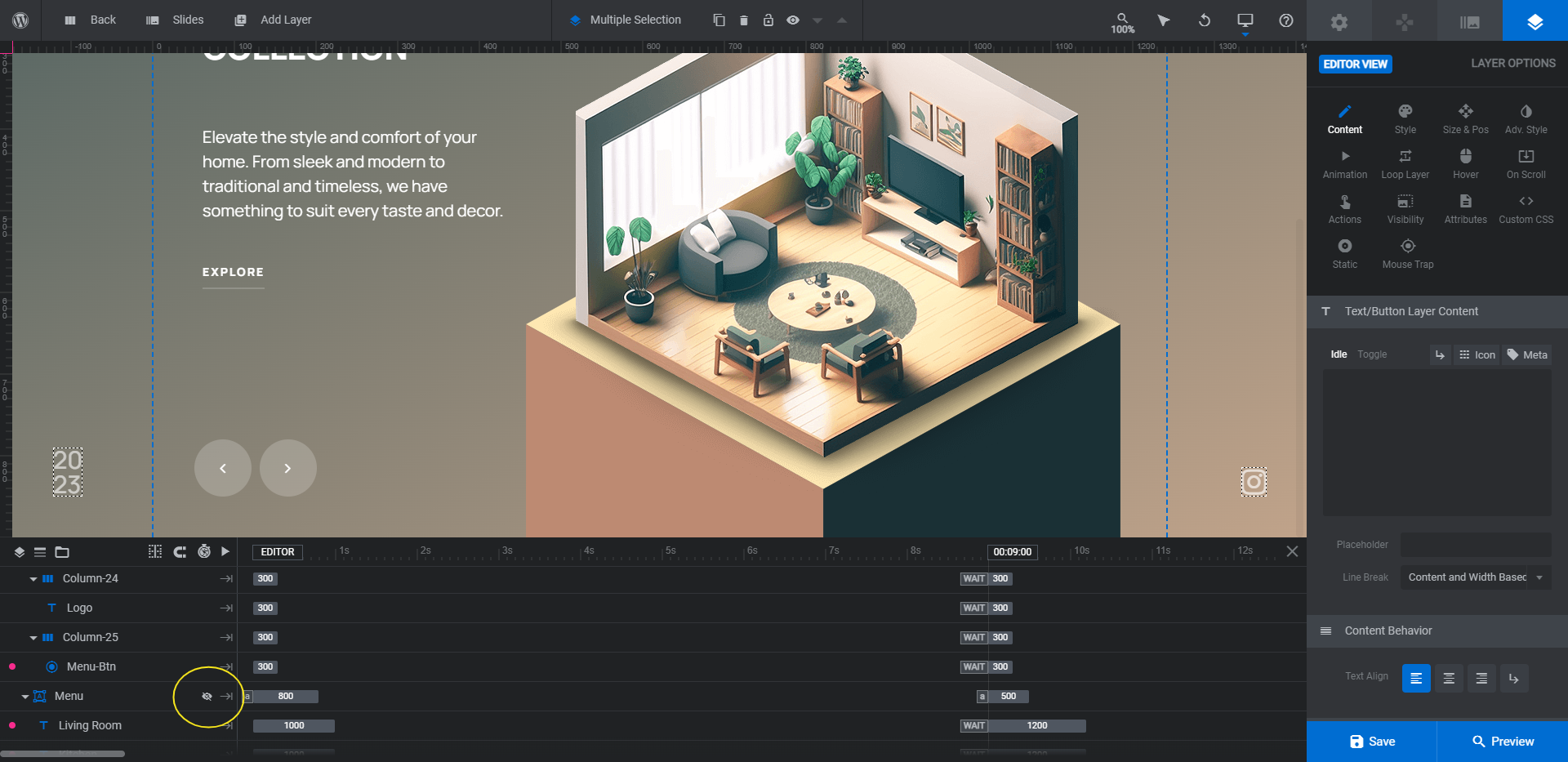
If you want to delete this group of layers, it needs to be visible.
You can now delete the layers you don’t need. Hold down Ctrl or command on your keyboard. Then click on the top-level containers or layers. For us, that will be Row-23, Menu, Year, and Ig. Hit Backspace or delete to remove them.
Learn more:
Step 2: Replace the model images
The furniture model that slides into place on top of the isometric platform is a layer called Livingroom-Img.
Before you replace the image, let’s talk about how to go about creating yours.
First, the size of each of the models in the slides varies slightly. To get the best results, try to size your image to around 650px by 650px. You can always adjust the size in Slider Revolution.
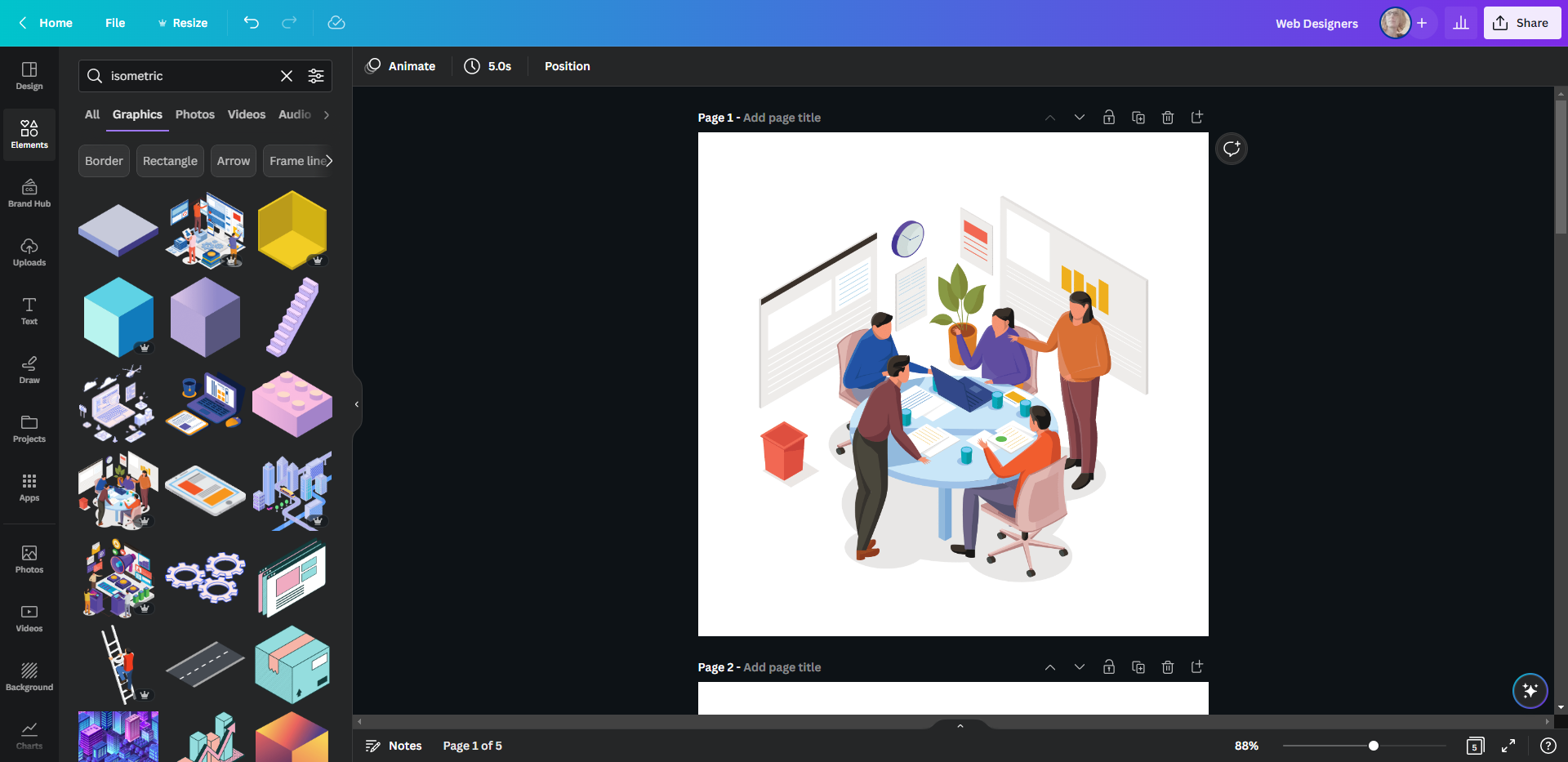
In terms of where to find images that fit this isometric platform, do a search for “isometric” in your stock image repository. For instance, if you search for “isometric” in Canva’s image library, you’ll find a huge collection of isometric shapes, illustrations, objects, rooms, and more.
Whether you use stock imagery or your own, be sure to export them with a transparent background to give them a truly 3D look in your slider.
Once you have your images exported, go into Slider Revolution. Find the Livingroom-Img layer in each slide. Then go to “Layer Options” and “Content” to upload the replacement image to the Media Library.
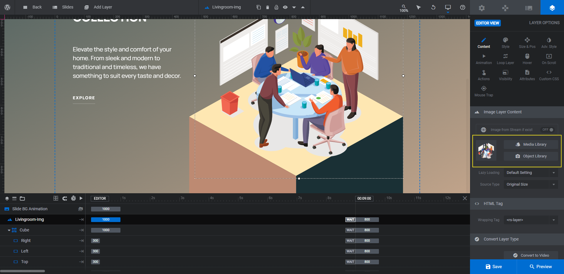
If your new image doesn’t quite fit, go to “Size & Pos” to make adjustments. X and Y will move it horizontally and vertically. W and H will change the width and height.
Save your changes and do the same for the other slides.
Pro tip: As best you can, set all of your images to the same size and position. That way, the transition from slide to slide will feel more smooth.
Learn more:
Step 3: Customize the cube colors
The isometric platform that rises up from the bottom of the slide has been created using three strategically placed and rotated shape layers:
- Right
- Left
- Top
To change the colors, select the Cube layers from the timeline editor. Then go to “Layer Options”.
You can modify the BG Color under either “Content” or “Style”:
Note: You don’t need to use dark and light complementary colors in order to create the 3D platform effect. Just choosing colors with good contrast that mesh well with your product image above will suffice.
Save your changes and repeat this step on all your slides.
Learn more:
Step 4: Update the slide background colors
The background of each slide has a color gradient. To update it, go to “Slide Options” and “Background”.
To change it to a solid color or a different gradient, click on BG Color and then add your colors:
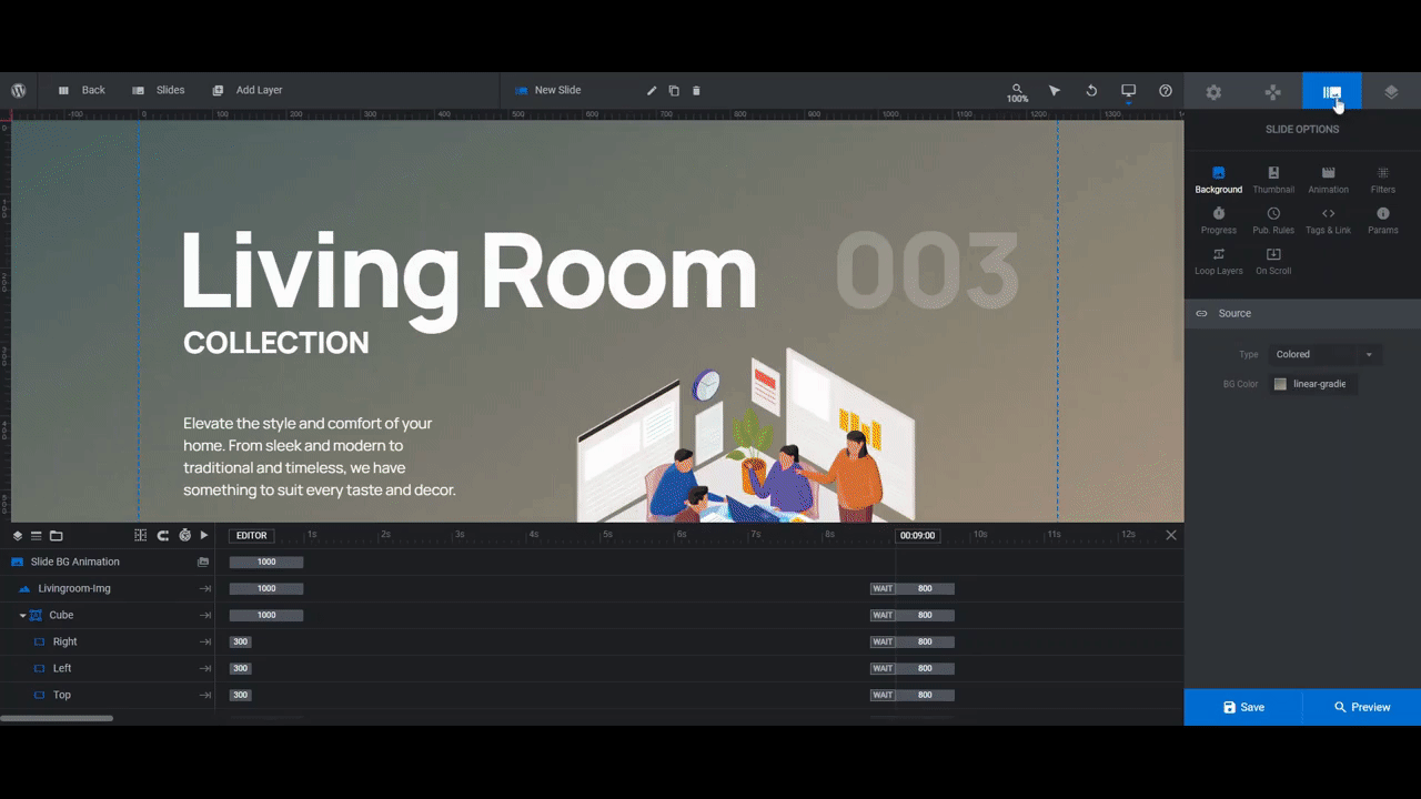
You can use the other tools in the color selection dialogue to add more colors and complexity to your gradient. You can also change the direction and angle of it as well.
When you’re done, save your changes. Then update the backgrounds in the other slides.
Learn more:
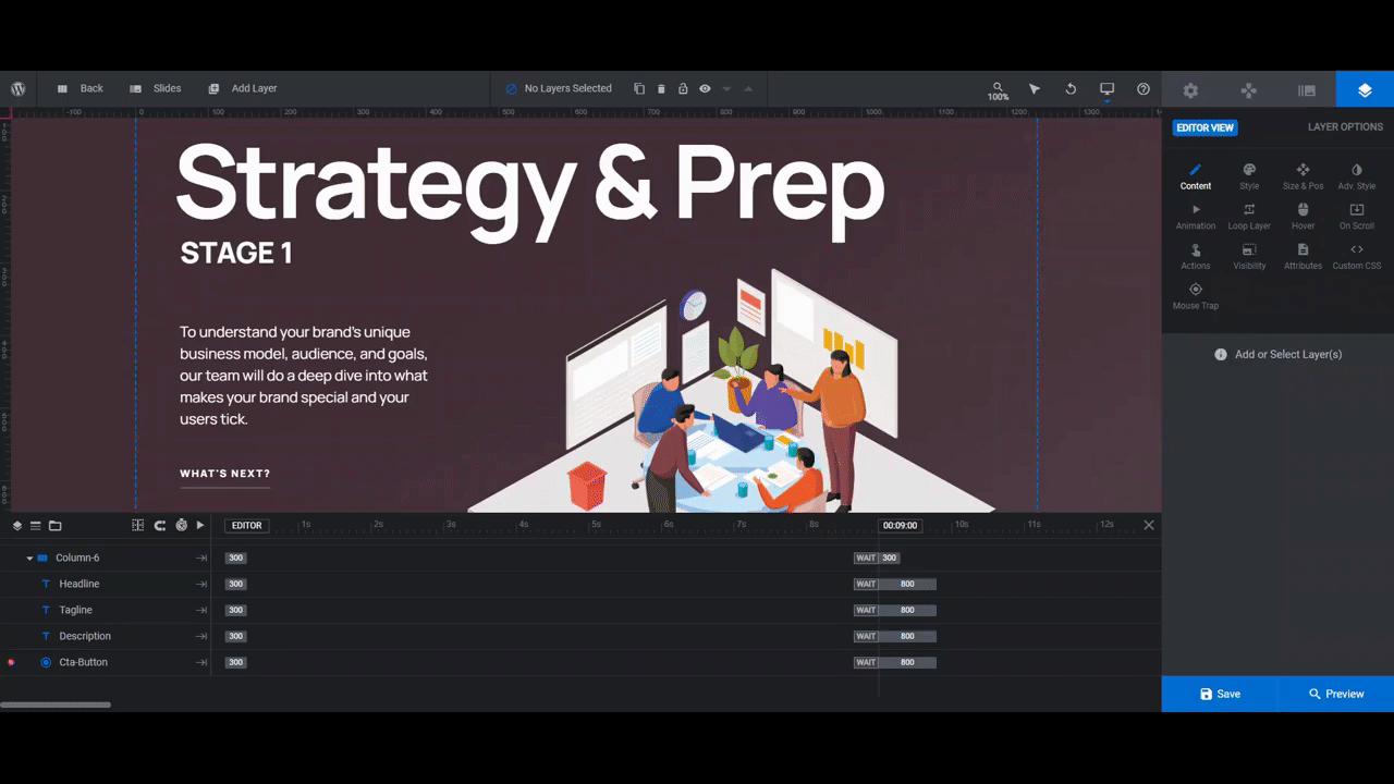
Step 5: Edit the text layers
The last thing we need to do is customize the text layers:
- Headline
- Tagline
- Slide Number
- Description
- Cta-Button
Note: If you don’t need any of these layers, you can delete them as you deleted the Global Layers in step 1. For instance, we’re going to delete Slide Number as our Tagline will act as an ordering system for each slide.
To edit what each layer says, select it in the timeline editor or canvas. Then go to “Layer Options” and “Content”. Replace the text in the box:
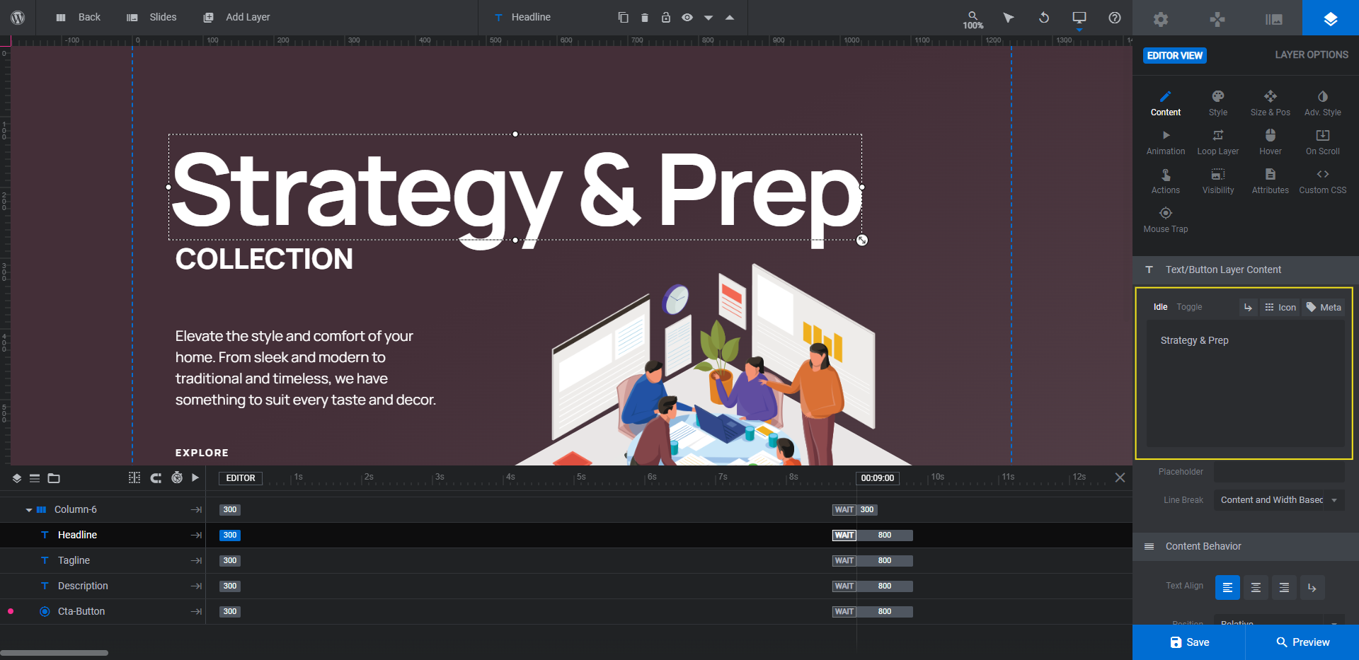
To change the font, color, and general styling of the text layers, use “Style” settings:
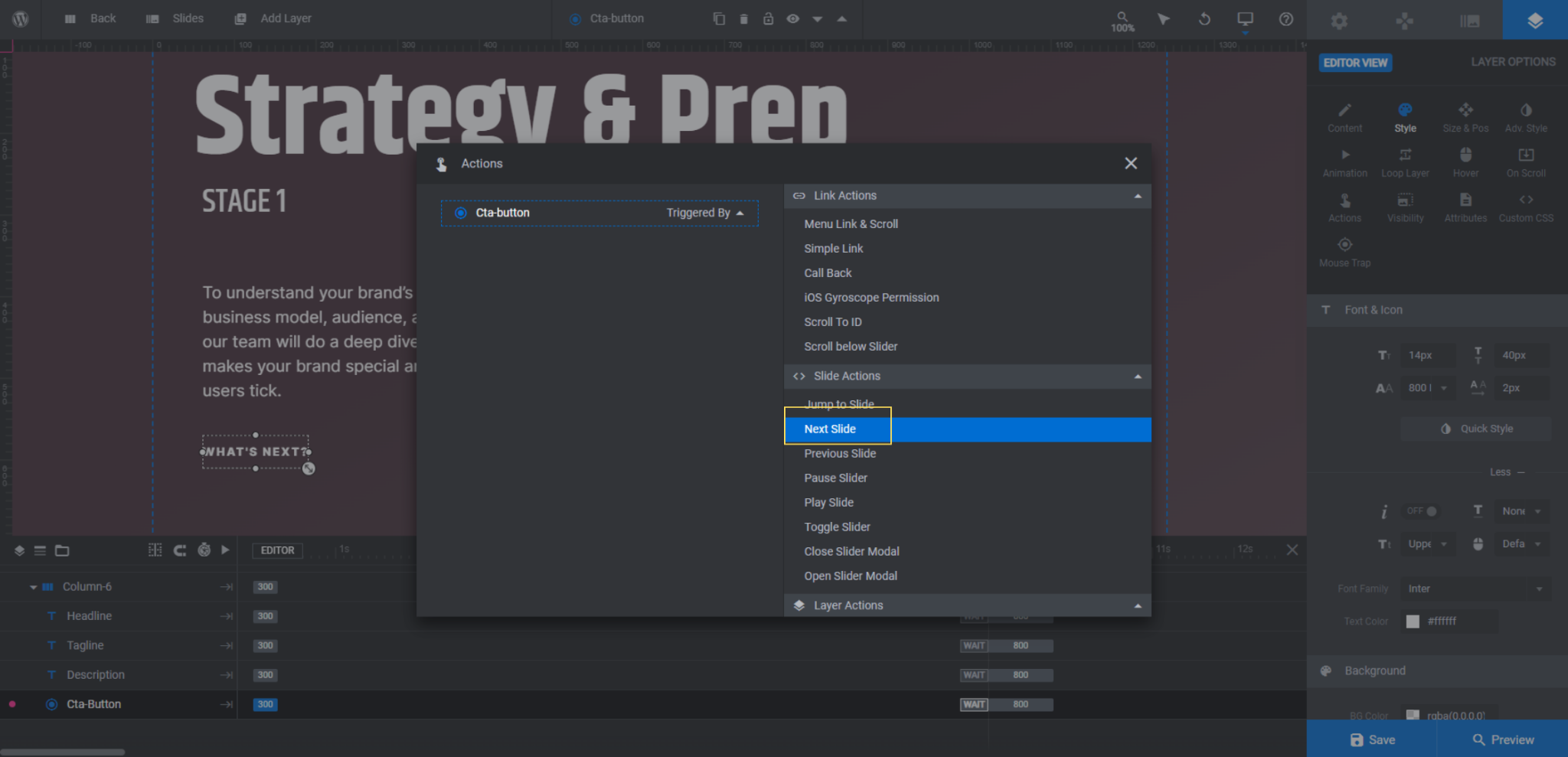
The last piece to edit is the Cta-Button link. To customize the link, select the layer in the timeline. Then go to “Layer Options” and “Actions”.
Right now, there is a Simple Link programmed for each button:
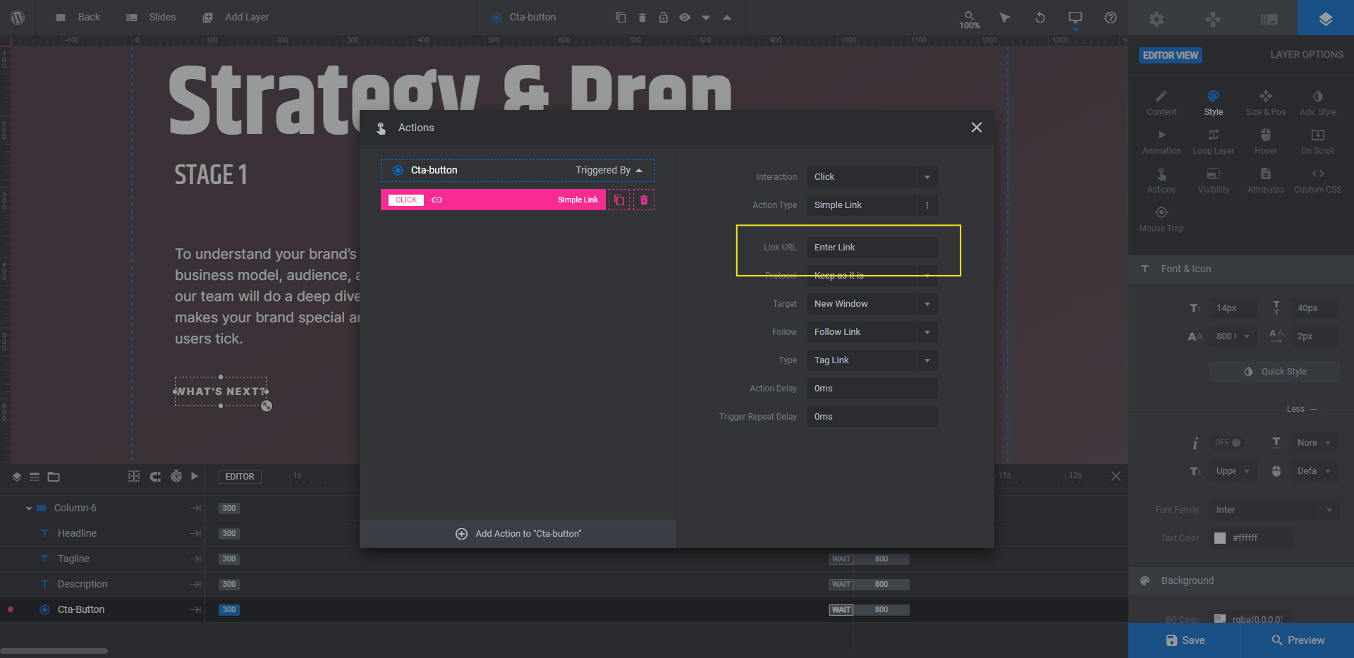
If you want each slide to direct visitors to a corresponding product or service page, then keep the simple link and add your custom Link URL into the field.
Another option is to set the link to direct visitors to another section on the same page. That’s a common action in the hero section. To set that up, click the trash can icon next to the Simple Link action and replace it with Scroll To ID or Scroll Below Slider.
For our slider, we’re going to do things a little differently. Because we’re explaining what our service entails, we don’t want visitors to leave until the very last slide. So we’re going to program the first three slides to direct visitors to the next slide. (They can also use the arrows at the bottom to do this.)
To set this up on your end, add the action called Next Slide:
For the last slide, add a Simple Link or Scroll Below Slider action.
When you’re done setting up each slide’s action, close the pop-up to save your changes. Then save your changes in Slider Revolution.
Learn more:
Make your flat designs look three-dimensional with isometric design
There’s nothing wrong with flat design. It keeps things clean and simple. However, when you have a product, story, portfolio, or something else important to show off to website visitors, adding an extra dimension to it is a good way to call attention to what matters most.
With the Furniture Store Isometric Slider, you’ll have your own eye-catching isometric design ready to go in five easy steps and no more than an hour or two.


