
When you look at websites for companies like Apple and Tesla, you instantly know that these are high-end, luxury products. All it takes is a handful of words, a sharp design, and larger-than-life product imagery to instantly impress visitors and convince them of the product’s high-ticket value.
You don’t need to sell expensive products like these companies do in order to reap the benefits of a sleek hero image design though.
In the following tutorial, we’re going to show you how to create intrigue around your hardware or software product using the AI & Robotics Website Slider template. In the end, you’ll create a slider design that leverages the formula that works so well for big technology companies.
Table of Contents:
- Step 1: Delete every slide but one
- Step 2: Edit the slide background color
- Step 3: Delete the shape layer
- Step 4: Replace the robot graphic
- Step 5: Update the particle wave color
- Step 6: Edit the slide’s text and button layers
- Step 7: Duplicate the slide and customize the content
- Step 8: Edit the global layers
- Step 9: Update the navigation
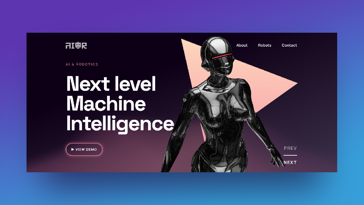
How to create a slider design that instantly impresses visitors
High-tech design tends to be minimal in terms of content, but big on the wow factor. That’s what we want to accomplish here as well.
In order to create this effect for your slider design, you’ll start with the AI & Robotics Website Slider template:
When we’re done with this tutorial, the template will look like this:
If this is your first time using Slider Revolution, we’d suggest you review these resources before you begin the tutorial:
Side note: This template comes with two components. When you install the template, you’ll see both of them under your Modules:
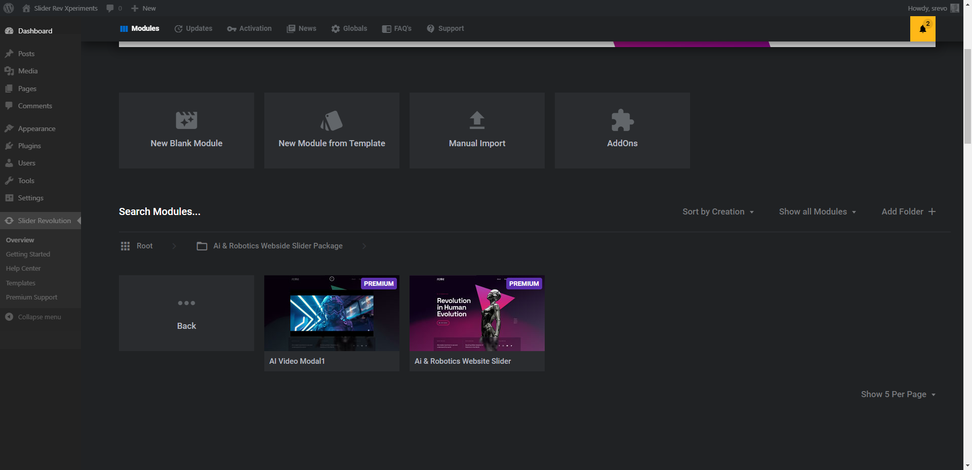
In our example below, we’re not using the AI Video Modal1 component. This contains the video player that pops up when the user clicks on the View Demo button. If you have a video to share, keep this component here and edit it after you’ve completed all the steps below. If you want to program the call-to-action button to do something else, delete this modal and just focus on the AI & Robotics Website Slider.
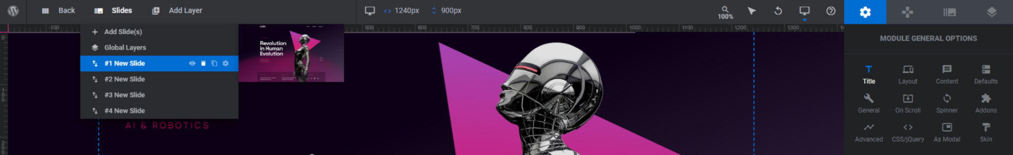
Step 1: Delete every slide but one
To minimize the amount of time you spend customizing this template, we’re going to delete all of the slides but one to start. To do this, go to “Slides” in the top toolbar. Hover over three of the four slides (it doesn’t matter which) and hit the trash can icon next to each to delete them:
By doing this, we can perfect all of the nitty gritty details like typography, colors, sizing, and so on. When we duplicate the slide later, we’ll have much less work to do as we customize the remaining slides.
Learn more:
Step 2: Edit the slide background color
There is a dark background color set under “Module Options” and “Layout” as well as a semi-transparent background gradient set under “Slide Options” and “Background”. To edit either of these, click on the BG Color setting.
We’re going to leave the module background color as it is and focus on customizing the background color gradient under “Slide Options”:
Once you’re happy with your color pairing, save your changes.
Learn more:
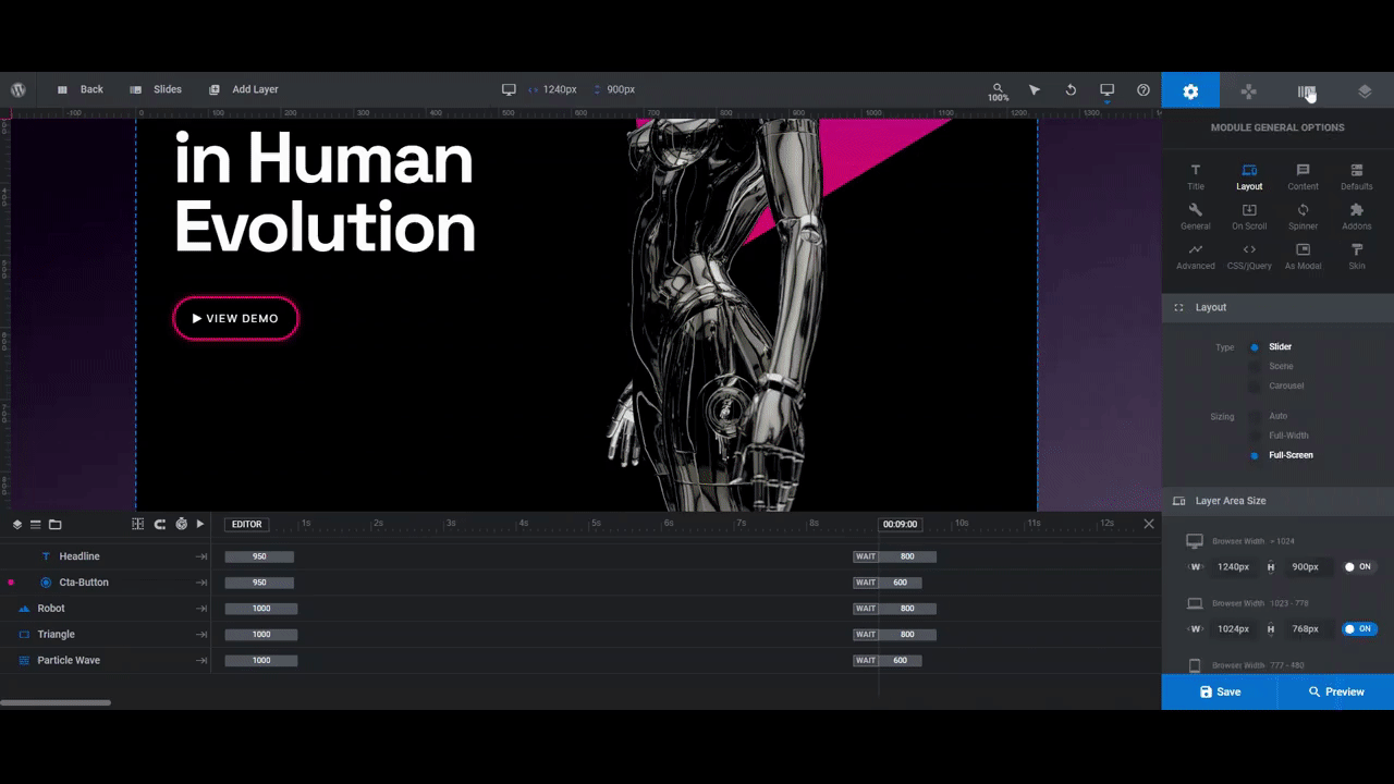
Step 3: Delete the shape layer
The Triangle shape layer looks good when you have an actual piece of hardware to showcase in front of it — like the robot in the template. However, we’re promoting the experience of virtual reality in this slider design, so we want our models’ faces and 3D bodies to provide the intrigue and wow factor.
As such, we’re going to delete the layer from our design. To do the same, locate the layer called Triangle in the timeline editor. Hit the “Backspace” or “delete” button on your keyboard to remove it.
Learn more:
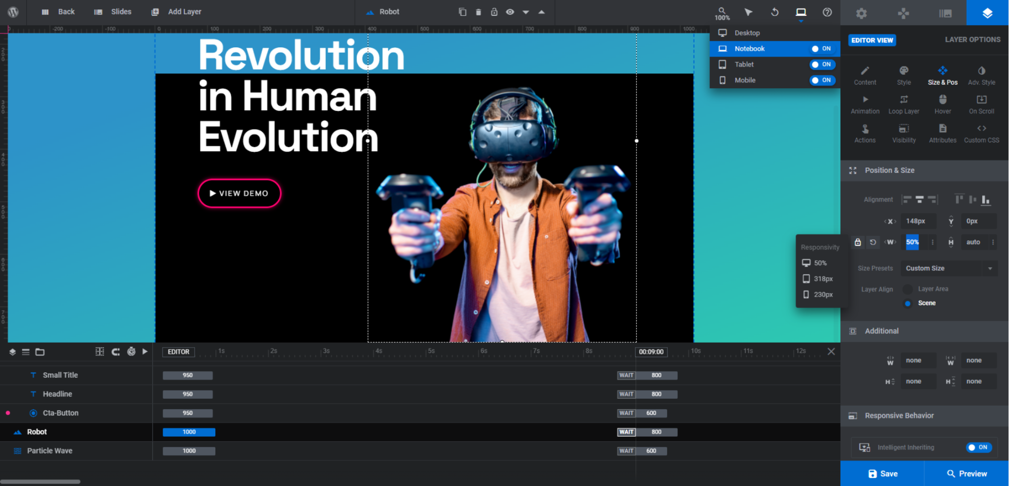
Step 4: Replace the robot graphic
When choosing an image to replace the robot, aim for something that’s similar in size and proportion. This way, when you replace the robot graphic (instead of adding a completely new one), your new image won’t disrupt the existing design and will naturally fit within the template’s slider layout.
In addition, the image needs to be a cut-out, which means it has no background. A transparent background will allow the rest of the slider design to shine through behind the image.
To swap out the robot graphic for your own, select the Robot layer in the timeline editor. Go to “Layer Options” and “Content”. Click on “Media Library” and upload your new graphic:
If the image doesn’t fill the space as well as the one in the template does, go to “Size & Pos” settings and make your adjustments there. We changed the width of our image to 50%:
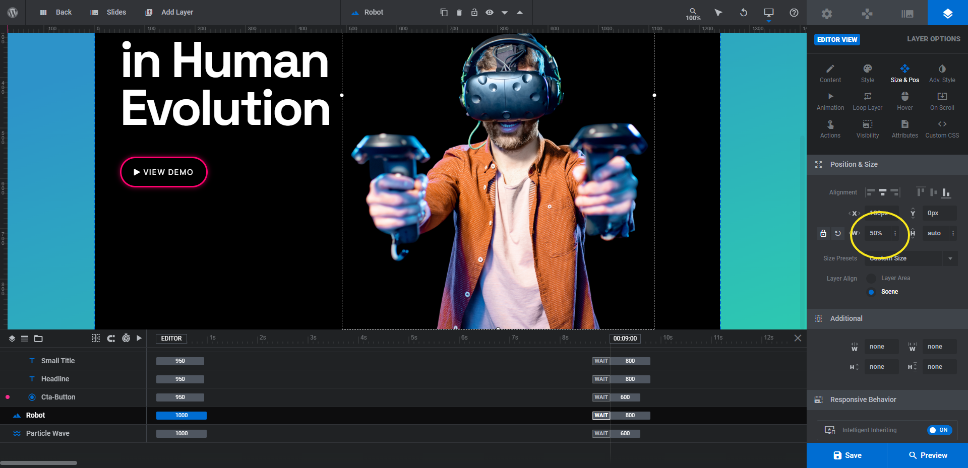
Note: If you alter the size of your image in any way, make sure to preview the changes on the frontend of the site. The first thing to check for is that the image fits well in the space. The second is that the resized image looks good on all devices.
If you need to tweak the image’s size for laptop, tablet, or smartphone users, go back to the Slider Revolution editor and open the responsive view:
When you make changes in one of the variant views, it won’t affect any of the larger screen sizes. For instance, if we change the Notebook image width to 500px, the Desktop image will remain at the custom 50% we set it at.
Learn more:
- Editing Images in Template Modules
- Desktop, Laptop, Tablet and Phone Size Variants
- Adjusting for Responsiveness
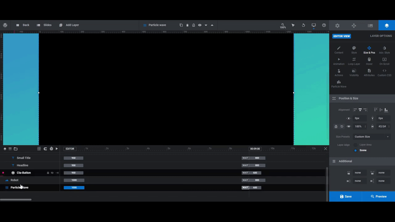
Step 5: Update the particle wave color
There is a particle wave shape that fills the lower two-thirds of the slider design. It’s a subtle particle wave that appears as a blurred shape floating behind the scenes.
We’re going to keep the particle wave design and animation as they are. All we want to do is update the colors so they complement the rest of the colors in our new slide design.
To do this, click on the Particle Wave layer in the timeline editor. Go to “Layer Options” and “Particle Wave” settings. You’ll find the color gradient to edit under “Particles”:
All we changed were the primary colors which are configured along the bottom of the gradient editing bar. To edit the opacity of the colors, select one of the pointers along the top of the bar:
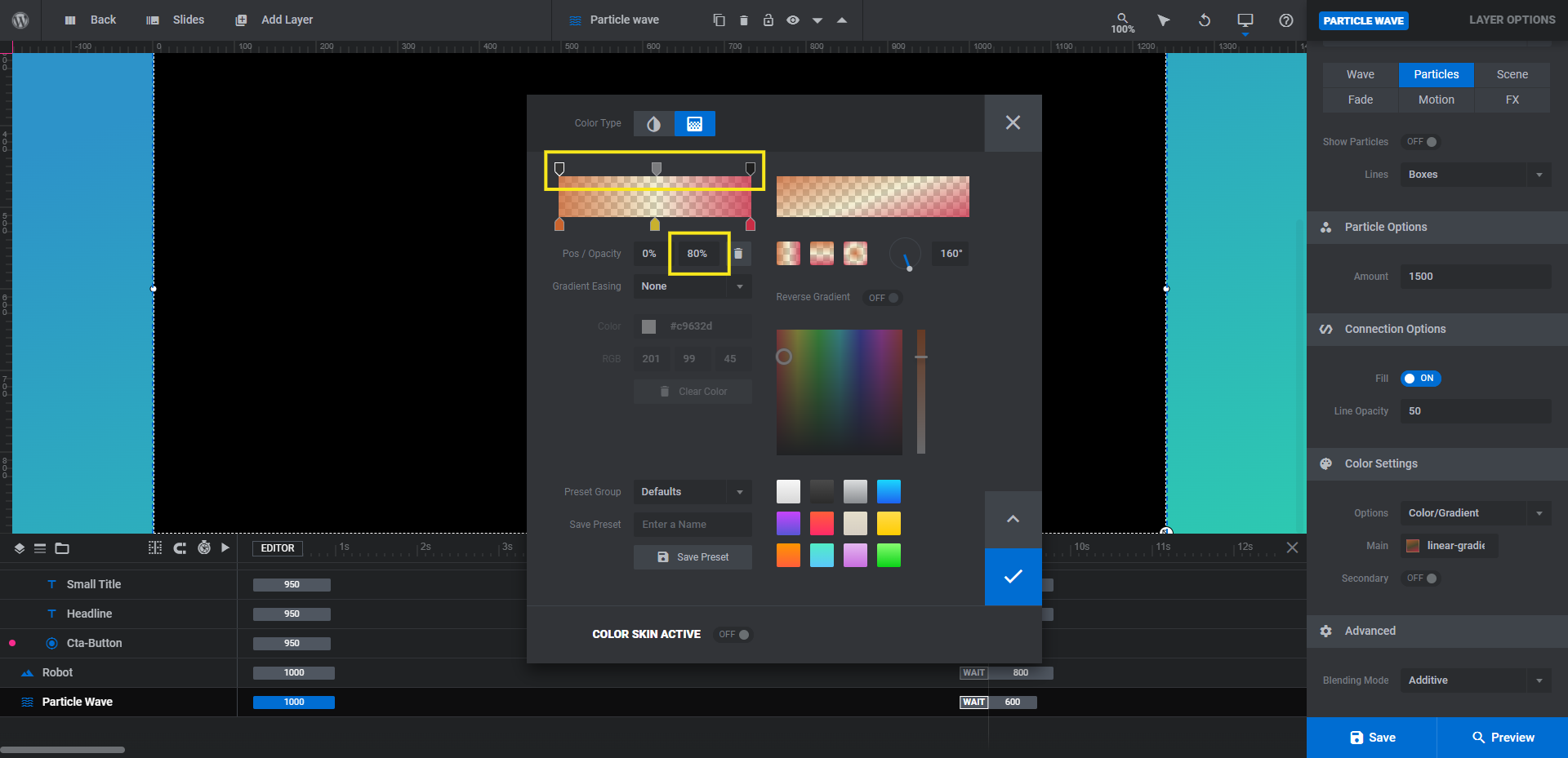
Then, update the opacity/transparency percentage in the field below.
When you’re done, preview the particle wave effect on the frontend of the site. Make sure the gradient colors provide a nice contrast to the background colors as well as your main image.
Learn more:
Step 6: Edit the slide’s text and button layers
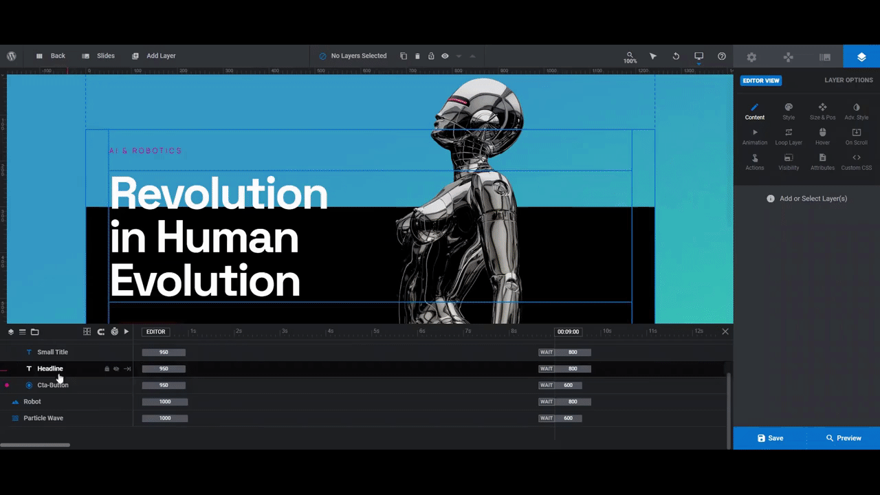
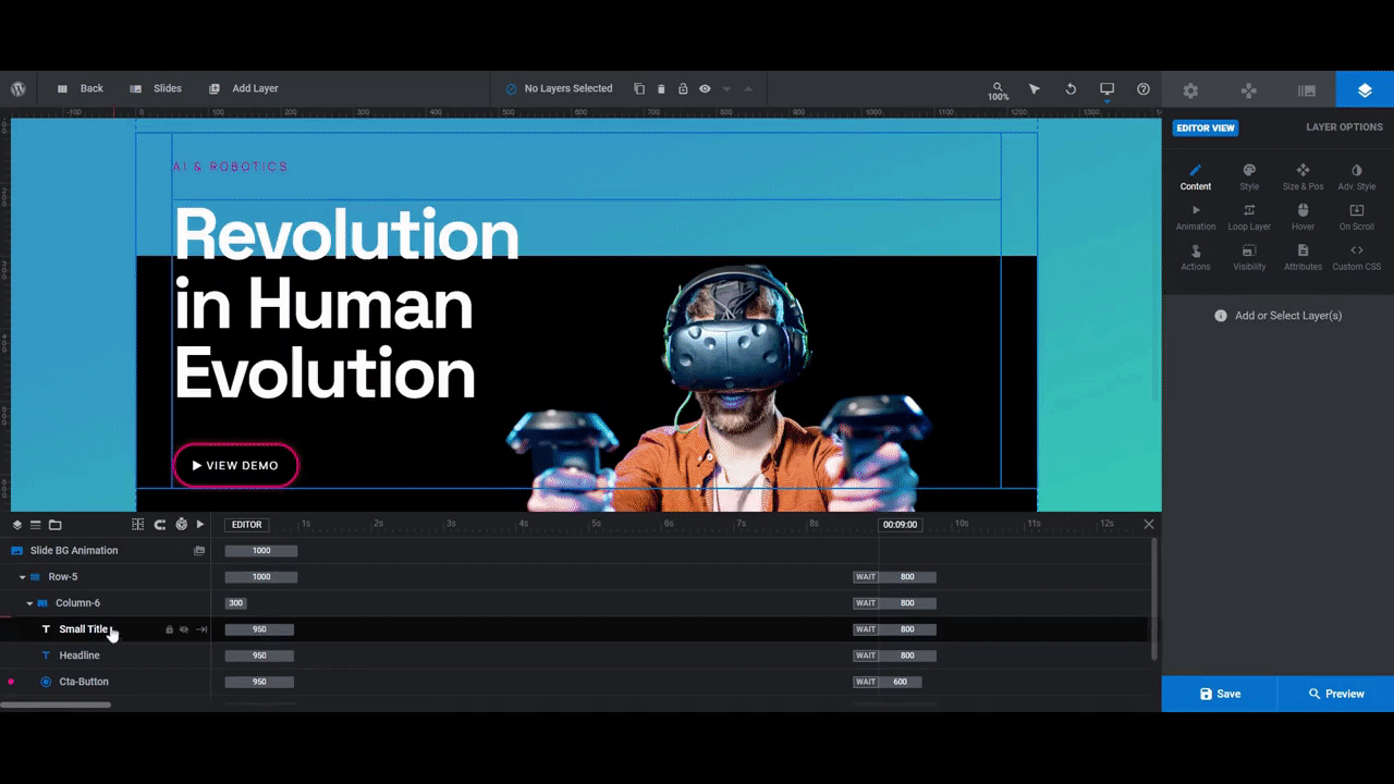
There are three text layers found in each slide under Row-5 and Column-6:
- Small Title is the pink label at the top of the column.
- Headline is the big descriptor in the center.
- Cta Button is the outlined button at the bottom.
To edit them, select them one by one in the timeline editor and use “Layer Options” to customize.
You can edit what the text says under “Content”.
Pro tip: If any of your text runs too far over to the right, you can force the line to break by inserting <br /> wherever you need it. You can also add it by hitting the return-arrow icon above the field where you edit the text.
You can change the font, style, and color of the text under “Style”. You can also edit the background and border color of the button shape here.
You can do more advanced customizations like rotating text, adding a box or text shadow, enabling text stroke, and more under “Adv Style”.
For the button, use “Hover” settings to adjust the button’s background and border colors.
Note: We mentioned in the beginning that we would not be using the video modal part of this template. To keep the button from opening it, click on Cta Button in the canvas or timeline and go to “Layer Options” and “Actions”:
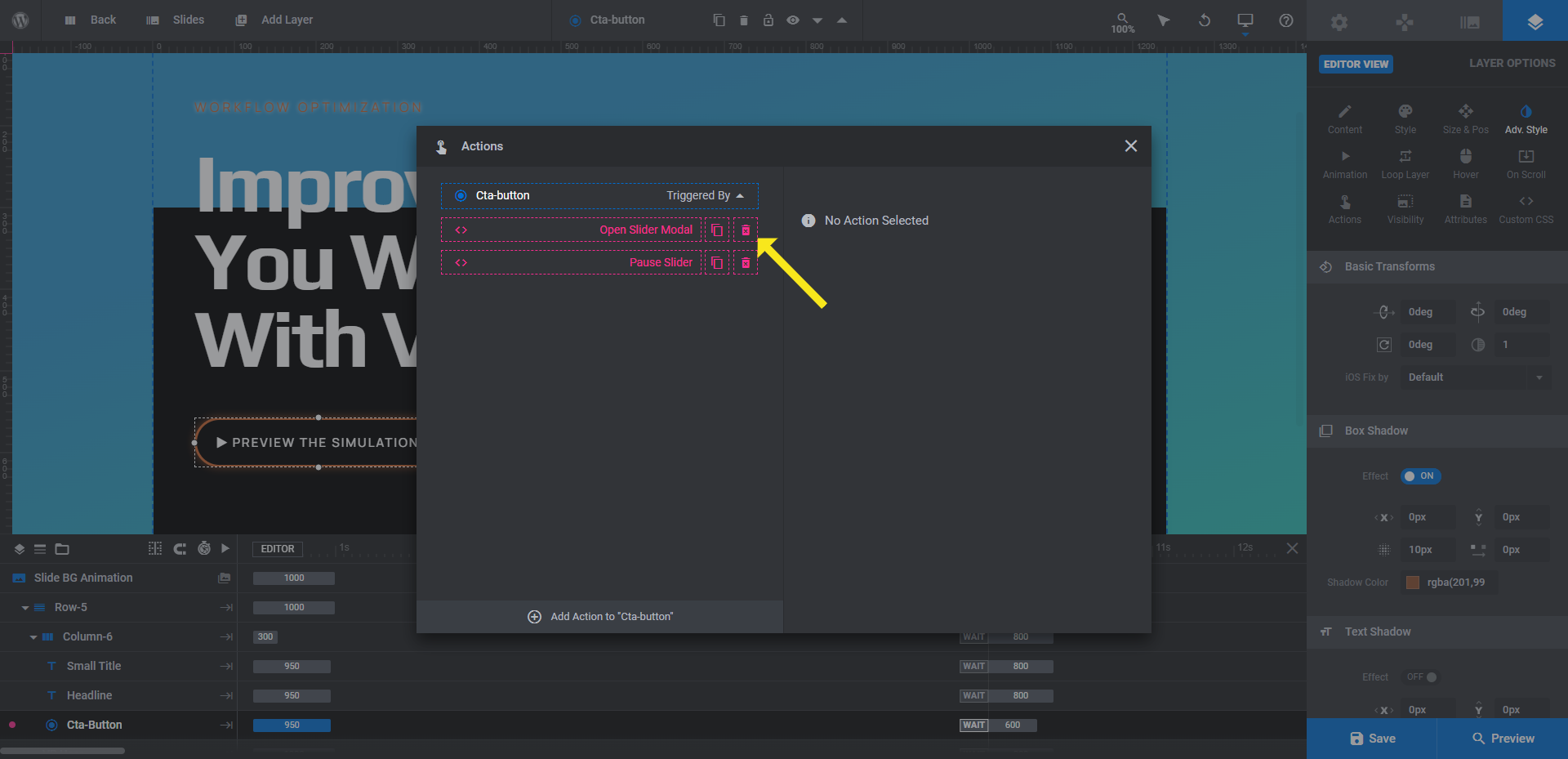
The first setting opens the video modal. To delete it, click the trash can icon next to it. You can leave the slider pause action as is.
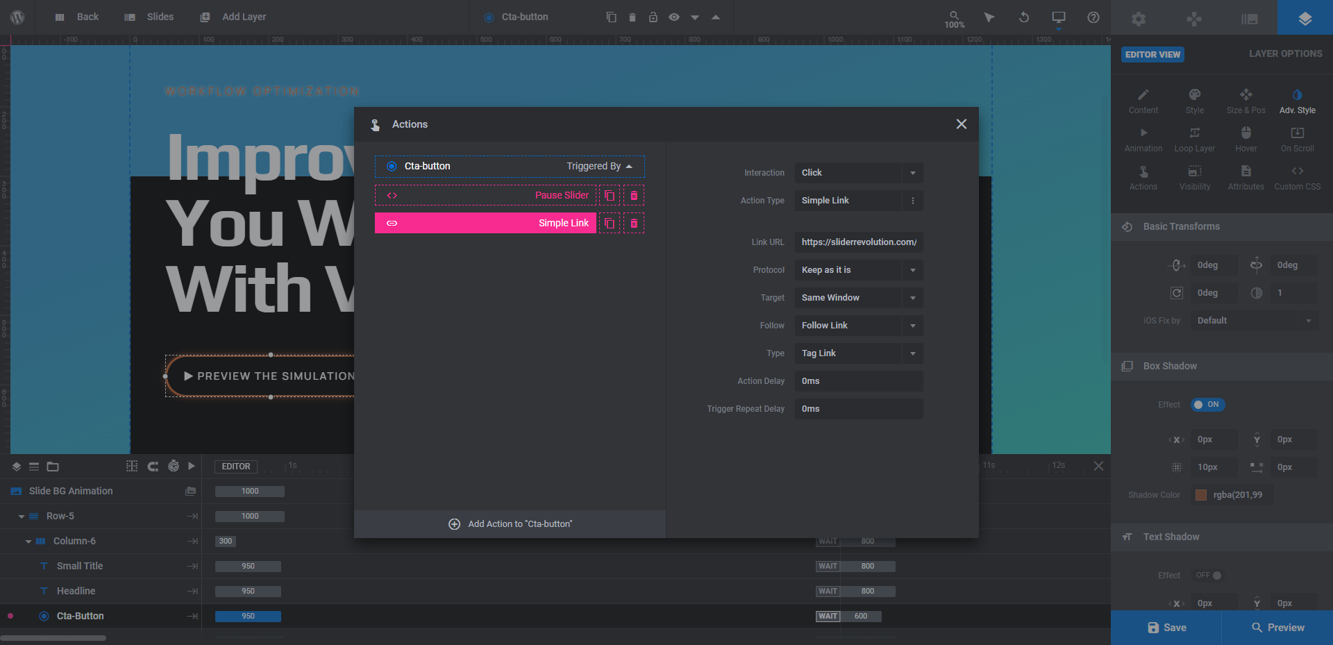
To add a link, click Add Action to Cta-button at the bottom. The default setting (i.e. to add a simple link) is the one you want to use to make the button link out to another page:
Make your customizations, close the panel, and then save your changes.
One more thing:
Preview your work on the frontend to make sure that the text is big enough to read and contrasts strongly against the background colors. Make your final tweaks to the text and button design before you move on.
Learn more:
- Editing Text from Template Modules
- Adding and Configuring Button Layers
- Editing Links in Template Modules
Step 7: Duplicate the slide and customize the content
With your slide design finalized, you can now duplicate it and customize the content in the new slides.
First, go up to the top toolbar, hover over “Slides” and click the copy/duplicate icon next to the slide you just finished creating. Do this for as many slides as you want to create.
When you’re done, go back through these steps and do the following:
- Step 2: Edit the “Slide Options” background gradient colors.
- Step 4: Replace the graphic.
- Step 5: Edit the particle wave gradient colors under “Particle Wave”.
- Step 6: Update the wording of the slide text layers as well as the color of the Small Title.
- Step 6: Update the button’s text, colors, and hyperlink.
You won’t need to do all the major setup we just went through — like sizing the image, setting up fonts, etc. Just focus on moving the new content pieces into place.
When you’re done, preview your work. Be sure to review your changes across all the responsive variants to ensure that everything looks good for all users. Save your work when you’re finished finalizing the slides.
Step 8: Edit the global layers
There are additional text layers that need editing. These layers can be found when you go to “Slides” in the toolbar and select “Global Layers”. Regardless of which slide appears on the screen, these global layers will always be present.
There are three rows of text here:
Row-34 contains header elements — a logo and navigation links. If your theme has a header already, then you don’t need this part built into your slider design.
The fastest way to delete everything in this row is to select Row-34 in the timeline and then hit the “Backspace” or “delete” button on your keyboard.
Row-17 is where the “Prev” and “Next” navigation links on the right side of the slider live.
While we like how these links are contained within the invisible borders of the slider content, we’re going to get rid of them and add more obvious navigation controls in the next step.
Again, to delete this component, select the row from the timeline and remove the whole thing at once.
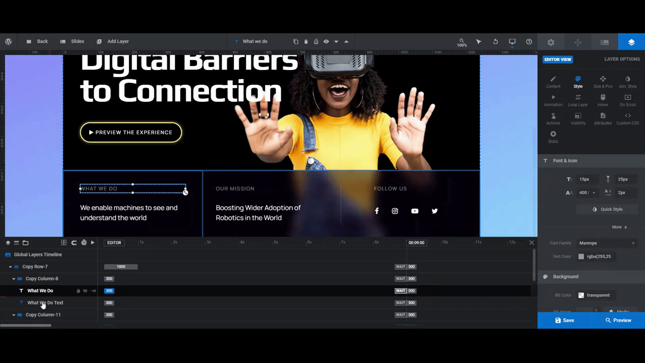
Copy-Row-7 is the other row of text in this slider. This gives us a place to briefly explain what the company does as well as to give users links to follow us on social media.
Edit the text layers the same way you did the layers in each slide. There shouldn’t be much to do aside from editing what the text says and changing the font:
The other thing to change is which social media icons appear and then to link them to your accounts.
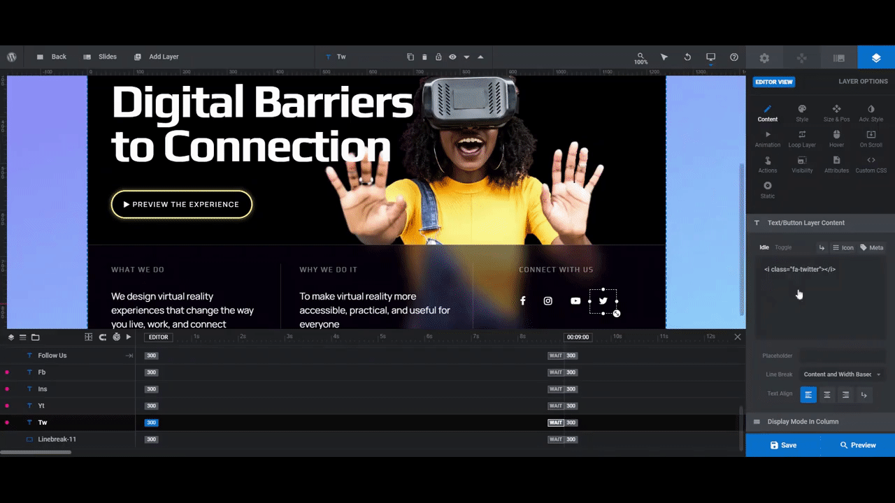
To edit the social media icons, select them in the timeline editor or canvas one at a time. Go to “Layers Options” and “Content”. Just above the text box you’ll see a button that says “Icon”.
Do a search for the social media channel you want to replace the selected one with. Click the icon you want to use and it will add it into the text editor. However, it’s going to leave the old icon text in there, so remember to remove it so you only have one icon showing:
To update the link, do as you did for the button and go to “Actions”. The link action is already set up. You just need to customize the link.
Learn more:
Step 9: Update the navigation
The last thing to do is update the existing navigation progress bar and to add in our own arrows.
To start, go back to your slides. It doesn’t matter which one you open. You just need to be in a slide in order to access “Navigation Options”.
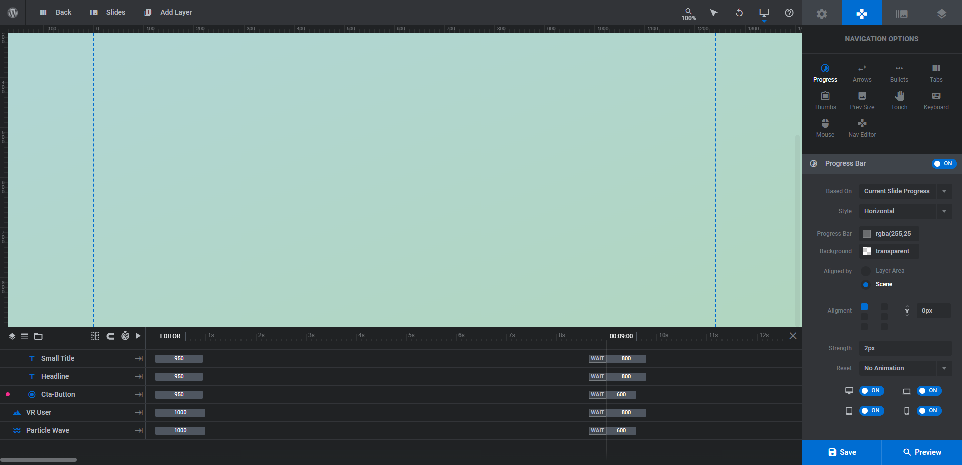
Progress is currently configured. It places a horizontal bar along the top of the screen that shows the current slide’s progress.
The only thing we’re going to change is the color so that it’s white. This will make it more prominent against our vibrant backgrounds:
Next, we’re going to enable the Arrows navigation. We’re going to keep it simple and set the arrow style to Clean Arrows and then leave the rest of the settings as they are:
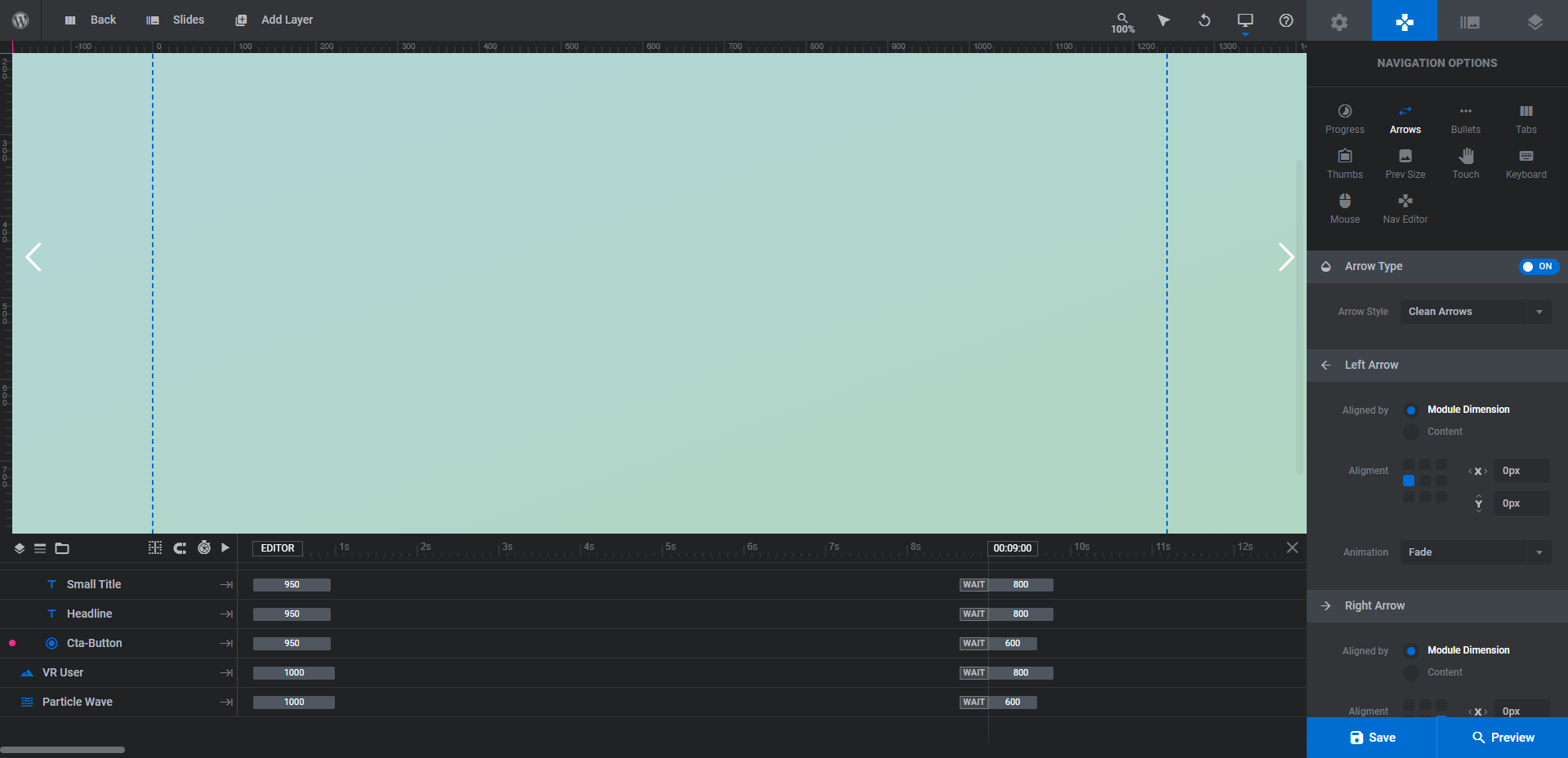
The small arrowheads on the left and right sides of the screen will be easy for our users to find and use without overwhelming the main slider design we’ve created.
When you’ve finished setting up your navigation, preview your work and save your changes once more. Your new slider design is now ready to go.
Learn more:
Make a strong impression with a minimal yet bold slider design
High-end luxury products have websites that look just as high-tech and expensive. But you don’t need to be selling $1K smartphones or $100K smart cars in order to build one of these for yourself.
If you want to instantly impress first-time visitors to your website and existing customers with your web design, create a slider design that begs for attention. With the AI & Robotics Website Slider template, you won’t have to spend anywhere near as much as companies like Apple or Tesla did for theirs (or spend as long building it either).


