
There are tons of design trends you can use to get visitors to stop and pay attention to the main hero section on your home page. The only problem is that once a trend gets overplayed, it quickly loses that cool factor that made it so special in the beginning.
If you want to make sure your visitors take notice of what you’ve created as well as the messaging contained within it, you need to give them a reason to. A sliced-and-diced slider animation effect they won’t find anywhere else is a sure-fire way to do that.
In this tutorial, you’ll learn how to use Slider Revolution’s Website Intro Slider template to easily build a hero slider of your own with an impossible-to-miss Slicey effect.
Table of Contents:
- Step 1: Come up with a strategy for the slider
- Step 2: Update the background image in each slide
- Step 3: Update the text layers in each slide
- Step 4: Edit the button text and design in each slide
- Step 5: Edit the slider navigation
How to create a slider animation effect that’ll get visitors to stop every single time
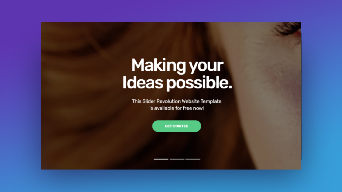
When you see a slider that looks like this, what’s your first thought?
You’re probably wondering how you can create something like that for your site and how much time it’s going to take to recreate it. So long as you start with the Website Intro Slider template and know how to get the best results from it, you can create your own impressive slider animation effect quickly and painlessly. Like this one:
If this is your first time in Slider Revolution, read up on the basics of the plugin before you get started with the tutorial below:
Step 1: Come up with a strategy for the slider
You can make as many modifications as you want to Slider Revolution templates. That’s the great thing about using this plugin — you can have as much or as little control over the premade slider designs as you want.
That said, if you want to get the best results from the Website Intro Slider template, we’d recommend updating the main content — the background image, text layers, and button — and leaving everything else as is.
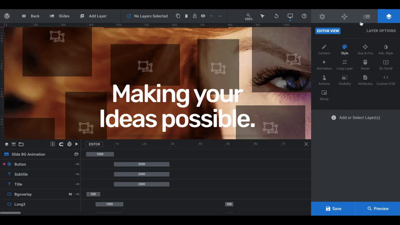
This is what the first slide looks like on the backend of the Slider Revolution editor:
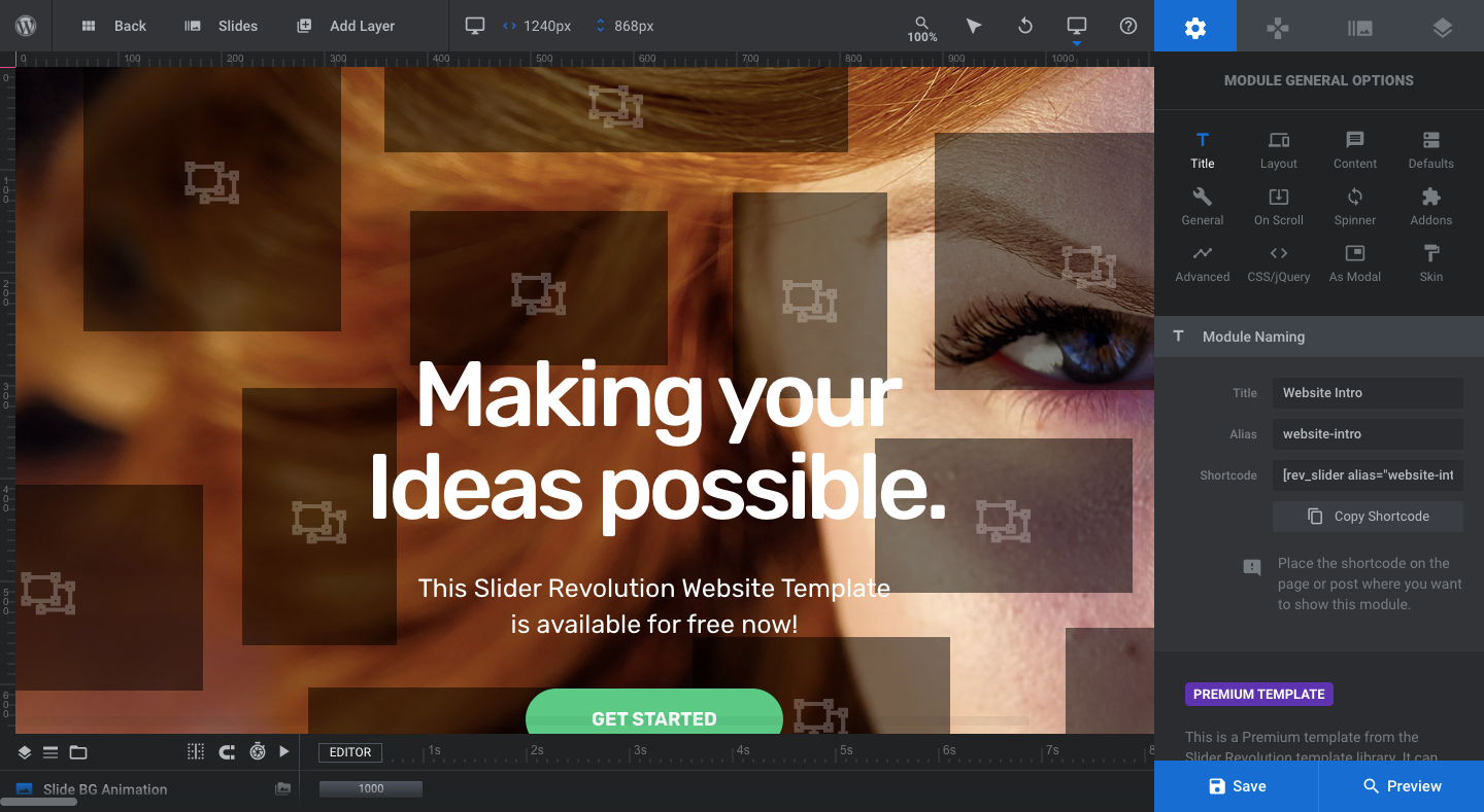
The Slicey layers have been carefully sized, positioned, and animated around the slide. This layout does a good job of offering a sneak peek at the background imagery while perfectly framing the hero slider’s message.
If you’re using this template because you like how it looked, let it do the hard work for you so you can focus on choosing imagery and writing copy that impresses your visitors.
Speaking of imagery and copy, here are some pointers to help you figure out what to put in your slides:
- Come up with a consistent visual theme for the slider
- Write copy that incrementally reveals more details about your brand with each new slide
- Use photos instead of illustrations or color backgrounds
- Choose descriptive photos that visually tell a story instead of decorative ones
Once you’re done laying out the details for your slider, move onto the next step.
Learn more:
Step 2: Update the background image in each slide
There are a couple of things to keep in mind when adding your own background images to this slider template.
The first is that you want the text in the center of the graphic to remain the focus of the slide. While there are ways to adjust the styling of the text so that it contrasts well with any background imagery, it’s not a bad idea to pick visuals that frame the text well so your messaging has room to breathe.
Another thing to consider is the content of the imagery. If you look at the template example, there’s a lot of flavor in each photo. Bright colors. Dramatic content. Intriguing details. This is why decorative images that do little more than add texture or act as a filler won’t work as well in this slider.
Take your time playing around with different imagery until you find the right ones for this slider. When you’re ready, go to “Slide Options” and “Background” to add your image:
Use the “Slides” controller in the toolbar at the top to switch between the various slides and add in your other imagery.
Pro tip: After you swap out the photos, re-label each slide so it’s easier for you to manage your slides from the toolbar. First, go to “Slider Options” and “Thumbnail”. Click the “Reset” button next to each thumbnail:
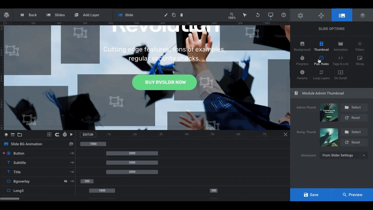
This will pull in the new background image for the slide. When you switch between slides from the toolbar, you’ll now see the correct image for each.
One last thing to do is update the name of the slides so you have an accurate description to go with the image:
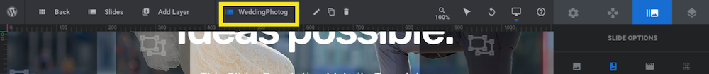
Just click on the name field in the toolbar and type over it with the new name.
Learn more:
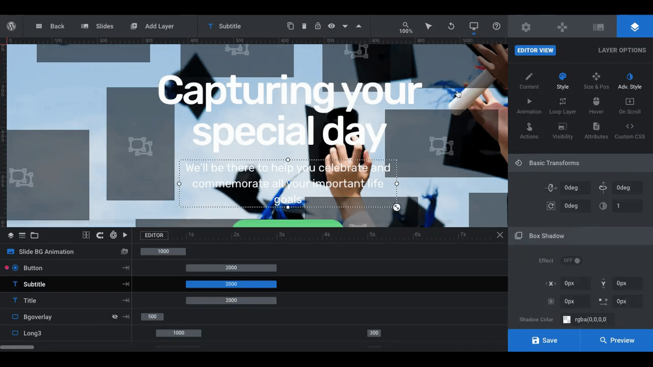
Step 3: Update the text layers in each slide
Hero images usually have three text layers in them:
- A short and engaging header
- A descriptive and lengthier subheader
- A call-to-action button
In this step, we’re going to tackle the first two.
When writing copy for a multi-image slider, it’s always best to craft copy that’s more or less the same length from slide to slide. That way, the slider has a more cohesive feel and no one slide requires more work or focus than the others. It also gives the text a consistent look from slide to slide.
Just as you did with the images, spend some time writing your copy behind the scenes. Aim for headers with no more than five words and subheaders that are no more than a sentence long.
When you’re ready, click on the header layer in the first slide. Go to “Layer Options” and “Content”. Input the new copy into the text editor:
Repeat this for each slide.
Pro tip: If there’s a specific spot where you want your text to wrap, add a <br/> to the spot in the text editor and it’ll force the text to drop to the next line.
Next, let’s update the style of the text. You can use the other “Layer Options” for this:
- “Style” to update the font, size, and text color
- “Size & Pos” to update the text size and position on the slide
- “Adv Style” to add additional stylings like rotation, shadows, and text strokes
Whatever you decide to change on the first slide, make the same changes to the others for a consistent look and feel throughout the slider:
Before you make any changes to the font color or shadows, open the preview of the slider using the blue “Preview” button in the bottom-right corner. There’s a dark overlay on top of each slide, so white text should look good against most backgrounds.
Pro tip: If you decide to change the font color to a brand-specific color, that’s fine. Just try to keep it on the lighter so that it contrasts nicely with the dark overlay.
By the way, you can edit the slide overlay if you’d like it to be lighter, if you’d prefer to give it a branded color twist, or if you simply want to remove it.
In order to see and edit the shape layer overlay, go to the timeline editor and click on the layer called “Bgoverlay”. When the eyeball is crossed out, this means you won’t see the overlay while in the editor but you will when you preview the slider on the frontend.
Click on the eyeball icon to reveal the setting in the editor:

The “Layer Options” settings will then open up for you on the right and you can make any adjustments you’d like to the overlay.
Learn more:
Step 4: Edit the button text and design in each slide
When editing the button, follow the same basic guidelines as you did for the text:
- Align the style with your brand
- Make sure the color contrasts well with the background
- Keep the messaging and design consistent from slide to slide
To edit the button, use the settings under “Layer Options”:

Note: This will only edit the normal state of the button. To change the hover state, go to “Hover” settings and scroll down to “Style”:

From here you can change the color of the text and button background, the border styling, as well as the button’s animation. By the way, if you’d like to make the button look the same in both the normal and hover states, make the colors and styling the same for both.
Pro tip: If you set custom colors for the button, text, overlay, or any other layer in the slide, save them in the color modal as a preset:

This way, you won’t have to copy-and-paste your HEX codes into each slide. Simply select the color from the palette on the right.
Learn more:
Step 5: Edit the slider navigation
The last element to edit in your slider is the navigation and it’s optional.
The template contains two navigational guides:
- Progress bar at the very bottom of the screen that indicates how long before the slide moves to the next
- Bullets near the bottom of the screen that indicate which slide the visitor is on and allow them to instantly navigate to a different one
You can leave both of these elements in place or you can try mixing-and-matching other navigation options.

If you want to use any of the others, click the toggle at the top of the setting to switch them on. You can then customize the settings to your liking.
It’s up to you which ones you use. That said, you don’t want to overload the slide with too many arrows and bars and bullets and so on. Try to keep your navigational guides to a minimum (two styles max).
Learn more:
Impress your visitors with a hero slider they’ve never seen before
The hero section on the home page is an important one. So why risk visitors scrolling right past it?
A sliced-and-diced slider animation effect is guaranteed to stop them in their tracks. All you have to do is install the Website Intro Slider template, pick out your own images, add your copy, and customize the styles.


