
One of the reasons why we tend to build websites using similar designs and functionality is because predictability in design improves usability. However, if you provide the right visual cues to visitors, they’ll quickly adapt to something unexpected — especially if all you’re doing is changing the direction in which things move.
A timeline is one of those website elements that could be designed horizontally just as well as it could vertically. But rather than create a timeline that’s visible all at once, this tutorial is going to show you how to turn each key date on your timeline into its own slide.
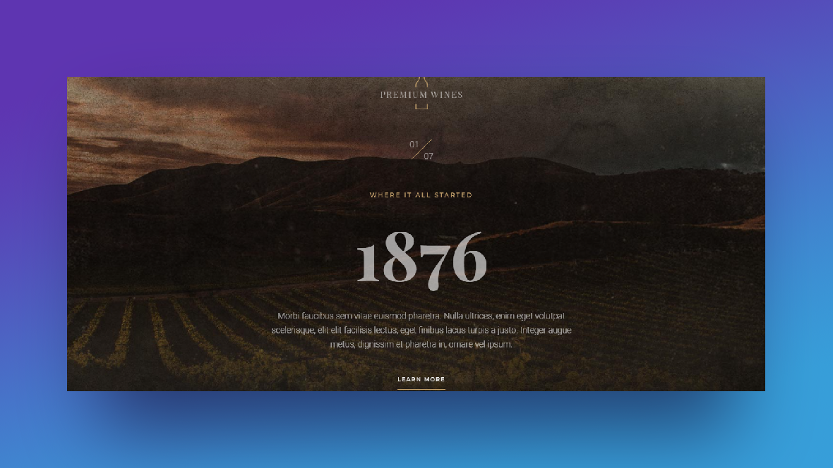
We’ll be using the Winery Timeline Slider template as our starting point. Follow the tutorial below to learn how to create a horizontal or vertical slider timeline.
Table of Contents:
- Step 1: Delete all the slides but one
- Step 2: Create and upload your new background image
- Step 3: Remove unneeded layers
- Step 4: Edit remaining text layers
- Step 5: Move the dates around
- Step 6: Transpose navigational layers
- Step 7: Create a vertical slider animation
- Step 8: Duplicate the slide and build out the full timeline
How to design a horizontal or vertical slider timeline with Slider Revolution
A timeline is an effective and efficient way of giving visitors a highlight reel from a brand’s (hi)story. When you turn it into a slider, you can pair each key milestone with a complementary image, which will allow you to provide extra context for each date.
The following tutorial will be based on the Winery Timeline Slider template:
If you want to create a horizontal slider timeline, follow all the steps below except for Steps 5 through 7. To create a vertical slider, follow all of the steps to create a timeline similar to this:
If this is your first time using Slider Revolution, read through these quick-start guides before you begin:
Step 1: Delete all the slides but one
Each of the slides in this timeline will be dedicated to a single date. While they’ll all have a unique image and content, the other components (including the animation) will stay the same.
The best way to create this timeline slider is to pare down the template to just one slide. We’ll hash out the design and functionality with the remaining slide. Then, we’ll duplicate it as many times as we need to to build out the rest of the timeline.
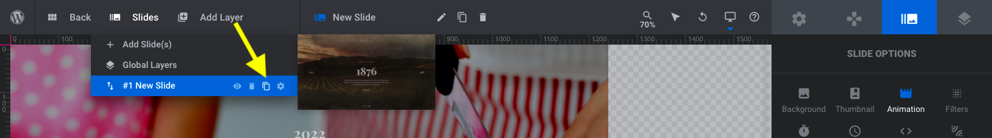
Go to “Slides” in the toolbar. Hover over the slides one at a time and then click the trash icon to delete them:
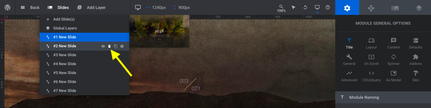
It doesn’t matter which one you keep. Just delete 6 of the 7 existing slides. All that should remain when you’re done is the Global Layers and one “New Slide”.
Learn more:
Step 2: Create and upload your new background image
The images you use in the timeline should follow the same theme since they’re part of the same story. There are a couple of ways to handle this.
If you’re using illustrations or cutout images, then you don’t necessarily need to worry about using the same colors. Where you do want to maintain consistency, however, is in the style and layout of the slide. This will help visitors’ eyes stay focused from slide to slide.
With photograph backgrounds, though, you want them to have a similar look — just like in the template. One option is to apply a filter so they all end up with the same color and vibe.
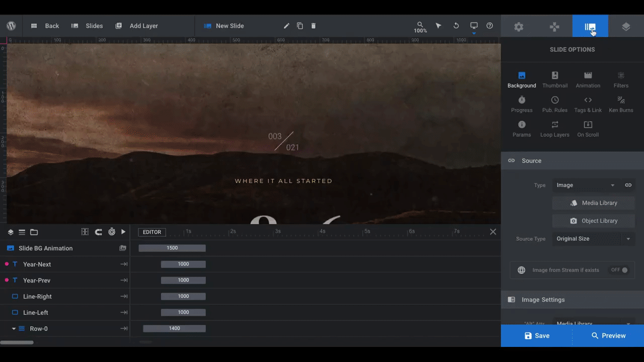
First, upload your new background image. Go to “Slide Options” and “Background”. Then, open the “Media Library” to upload the file:
Pro tip: Because there’s already a lot of motion built into this slider, it’s best to stick to solid color backgrounds or photos. Videos and even gradients might steal too much of the attention away from the story being told along the timeline.
With the new image in place, go to “Filters”. From here, you can apply one of Slider Revolution’s premade filters to your background photo:
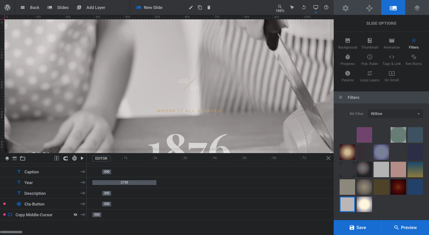
There are a couple goals an image filter will help you achieve:
- Give each image the same look and mood.
- Darken an image enough so that brighter text shows up well against it.
Another option is to create your own image filter or update the photo’s settings using image editing software. Notice the difference when we upload this version of the original photo darkened by 75%:
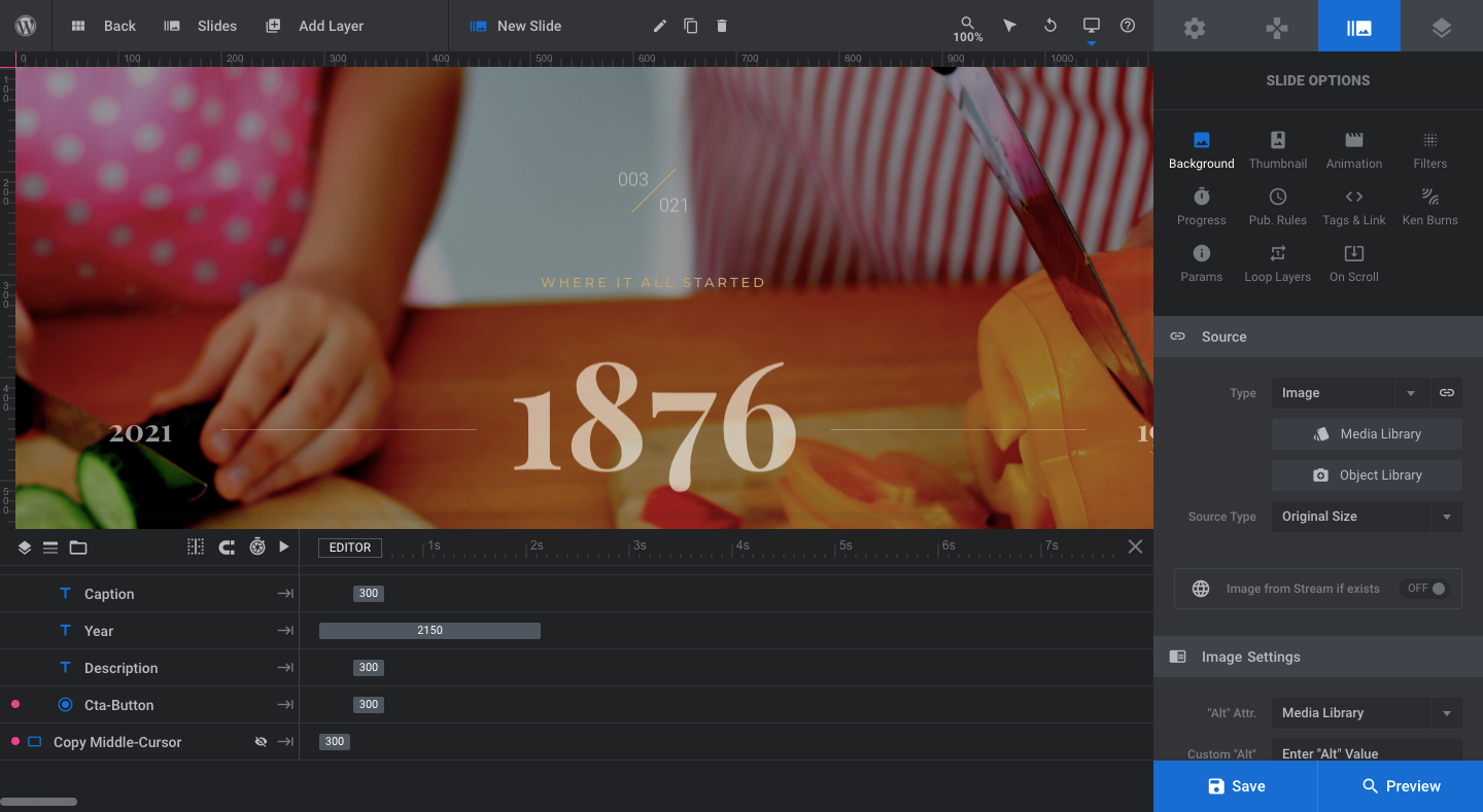
We get to keep the color of the food, but the overall darker photo makes the colors of the text on top of it pop more.
Take some time to find your own balance. You want a background that’s visually interesting, but won’t overpower the text. And it should be a style that can be applied to all of your imagery.
Learn more:
Step 3: Remove unneeded layers
If you’re using this template to create a timeline website or landing page (where the timeline is the only thing on it), then these edits won’t be necessary. However, if you’re going to add this slider timeline to a Home or About page, for instance, you’ll need to strip out some layers.
Let’s start with the layers in this slide.
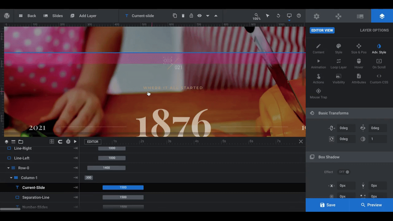
Our timeline is going to be smaller than the original (i.e. four slides instead of seven). Because of this, the slide counter at the top isn’t necessary to include. So, we’re going to delete three layers under Column-1:
- Current-Slide
- Separation-Line
- Number-Slides
This is going to be a timeline on our About page. So, the purpose of the module is to tell our story, not to encourage visitors to take action (which makes more sense if the timeline promotes an enterprise’s history or the history of their products). As a result, we’re also going to take out the call-to-action CTA-button layer.
Note: You can remove as many or as few layers as you want. It all depends on what the purpose of your timeline slider is and where it will go on the website.
Next, go to the “Slides” dropdown in the toolbar and click on “Global Layers”. These layers remain in place as the user moves from slide to slide.
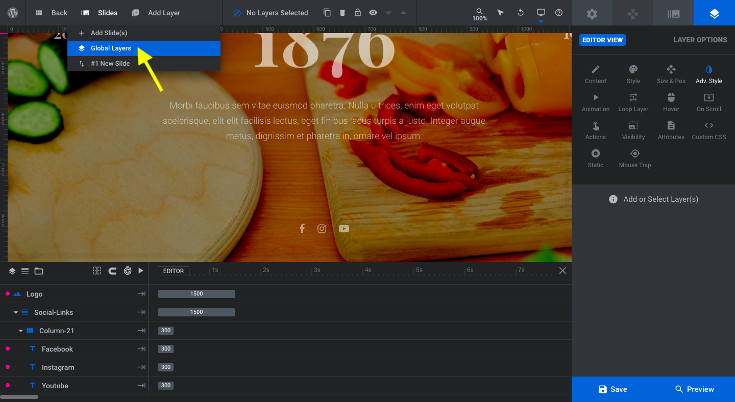
We’re going to remove the Logo and Social Links. These elements will appear in the header and footer of our site and don’t need to be duplicated here.
To delete them, click on the layers in the timeline editor and hit the “delete” button on your keyboard.
Learn more:
Step 4: Edit remaining text layers
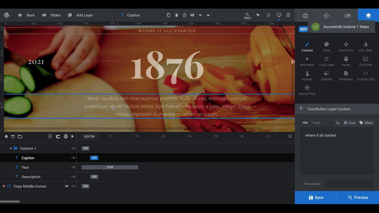
Return to your slide after saving your changes. What we’re going to do now is edit what each of the remaining text layers say. Click on the layers one at a time, then go to “Layer Options” and “Content” to replace the text with your own:
Some notes on the layers:
Caption is the golden-colored text that appears at the top. You can change what this says from slide to slide or keep it the same throughout. Regardless, make it short and quippy.
Year refers to the big number in the center. If you’re working with a shorter timeline, you might want to use months instead of years here.
Description is a short paragraph that explains the milestone. Try to make it no more than three or four lines.
Year Prev is the small number that appears on the left of the timeline slider. This will be the year of the previous slider. As this is the first slide in the sequence, this number should be whatever the last slide will be.
Year Next is the small number that appears on the right of the slider. This will be the next slider’s year. It doesn’t have to be a consecutive number (like 2019 and 2020). If there are long stretches between each milestone (like 1947 and 1952), that’s fine, too.
Next, let’s change the look of the text layers:
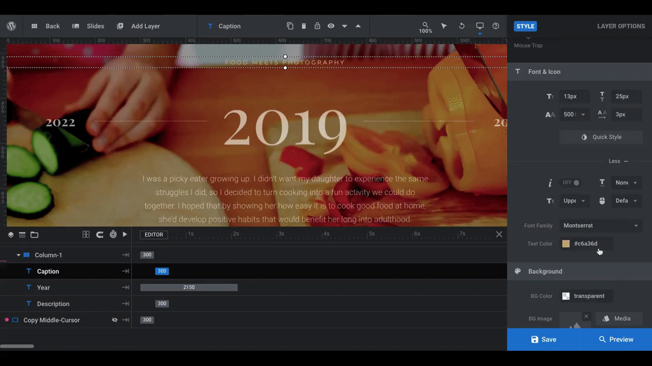
We’ve done a few things here:
- Changed the font for the caption and description.
- Increased the font size and changed the color of the caption.
- Decreased the transparency of the year and description so they stand out more.
You can make all of these superficial changes to the text layers under “Style”.
Learn more:
Step 5: Move the dates around
For those of you creating a horizontal slider, skip ahead to Step 8. If you’re going to repurpose this template as a vertical slider, the next thing to do is move the Year-Prev and Year-Next layers to the top and bottom.
Click on Year-Prev in the timeline and go to “Layer Options” and “Size & Pos”. You’ll make a couple adjustments to move it into place.
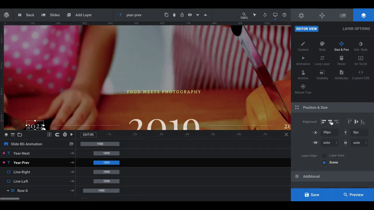
Next to “Alignment”, click the icons to center-align and top-align the layer. Then, move it down the y-axis so it’s closer to the text layers in the center.
Pro tip: How much space is available will depend on how much text you added to your layers as well as how big the fonts are. We moved our Year-Prev layer down by 150px, but we can always make adjustments later if we feel it needs to be closer.
Repeat this process for Year-Next. This time, though, center- and bottom-align the layer. Then move it up along the y-axis so it sits between your centered text layers and the bottom of the slide. For reference, we moved ours up by 65px.
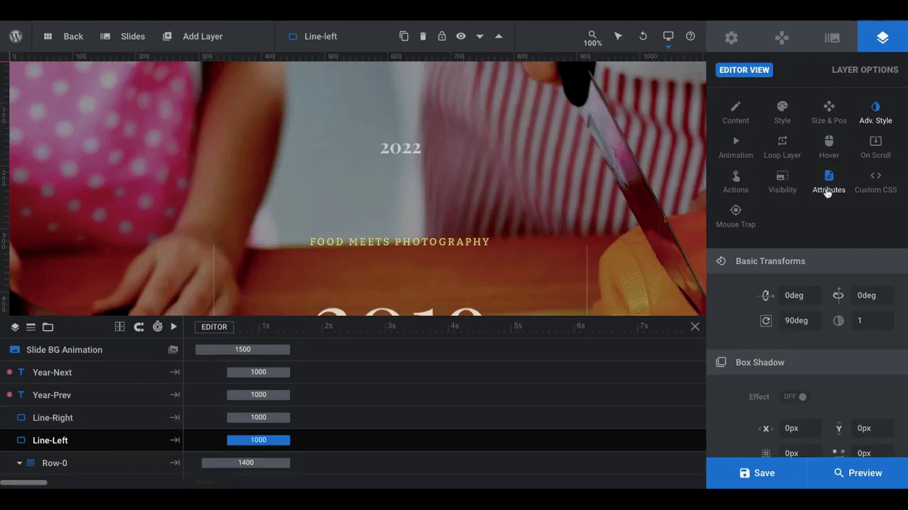
You’ll also need to move the line layers. Go to “Adv Style” to rotate them:
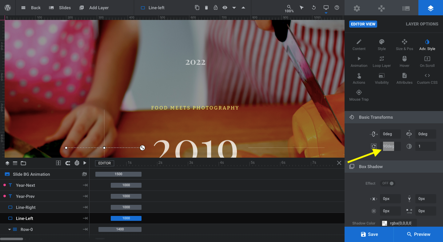
In the rotation field under “Basic Transforms”, change the value from “0deg” to “90deg”. Repeat this for both Line-Left and Line-Right. This will make them vertical.
To move these lines into place, do what you did for the year layers. Center and then either top- or bottom-align the lines. Then, move them along the y-axis so they sit between the year and text layer:
The lines are going to be too long for the available space. To shrink them up and finalize their positioning, click on the width field (it’s width because these were originally horizontal lines):
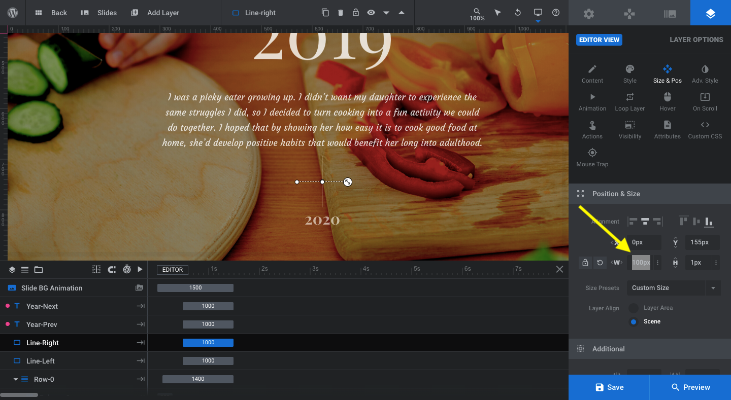
Replace the 20% value with a specific value in pixels. We’ve set ours to 100px. With the size fixed, you can now use the y-offset once again to move the line into place between the text layer and the year. Do this for both lines.
Note: Because we’re moving existing layers around to different parts of the slide, it’s important to do a responsive check before moving on:
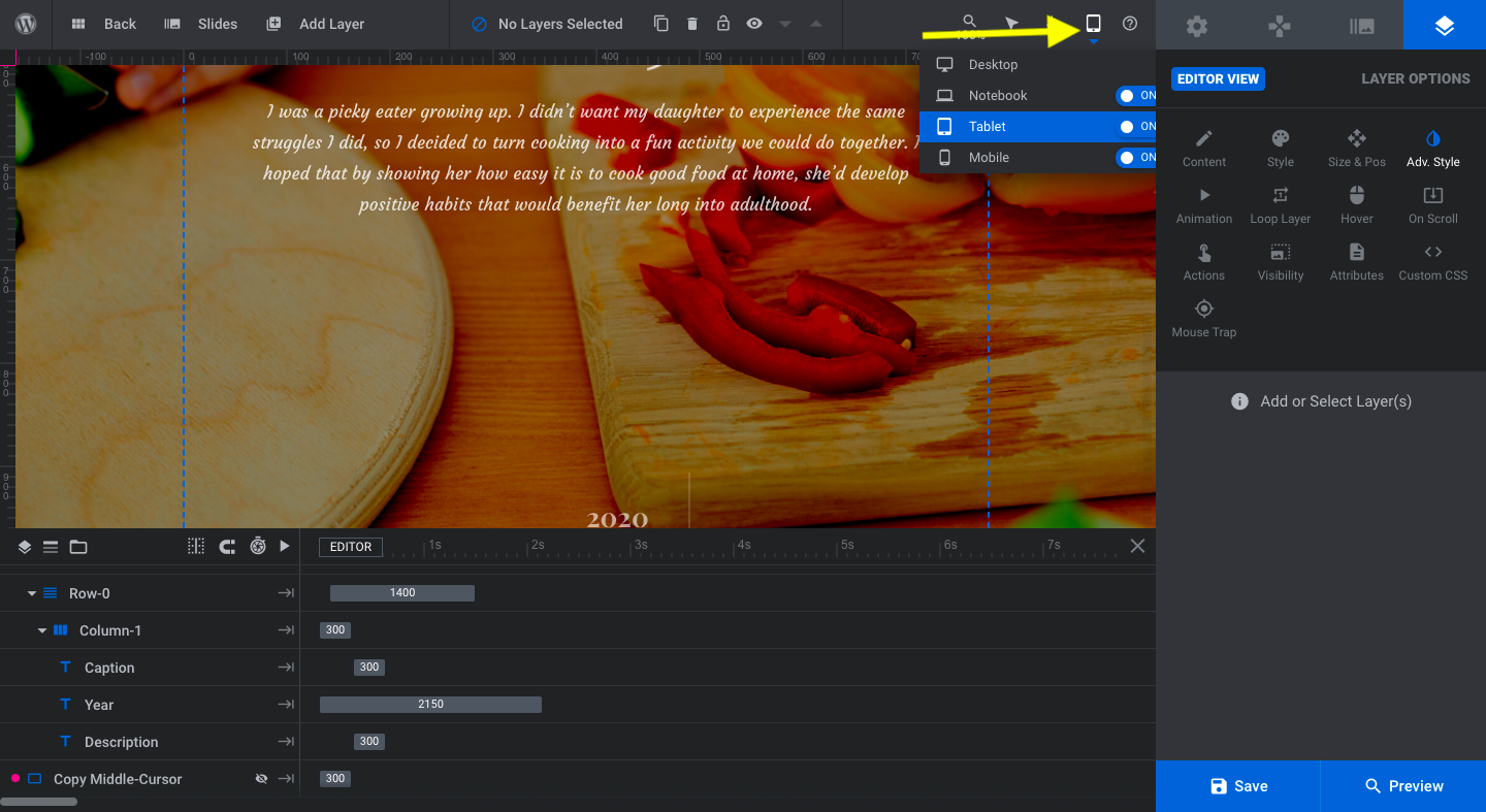
The Mobile version of this template doesn’t use these layers, so you don’t have to worry about checking that one. The ones you do have to worry about are Notebook and Tablet.
Start with Notebook. If the lines and years aren’t properly centered or stacked, fix their settings just as you did from the Desktop view. Then, move onto the Tablet layout and make any changes that are needed there.
Learn more:
Step 6: Transpose the navigational layers
The Winery Timeline Slider template doesn’t use “Navigation Options” like some of the other Slider Revolution templates do. Instead, the navigational guides have been manually created under “Global Layers”.
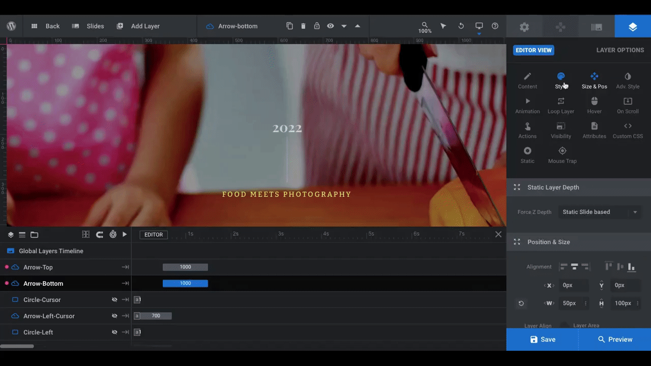
What we need to do now is reposition them. Let’s start with the left and right arrows that visitors see when they hover over those areas of the slide.
We’re going to reposition the left arrow as a top arrow — the same thing we did with the Year-Prev layer. We’re also going to turn it 90 degrees like we did the lines. Then, we’ll turn the right arrow into a bottom arrow and also turn that one around by 90 degrees:
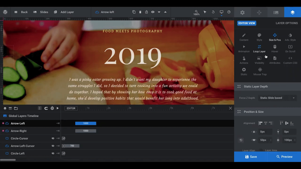
Pro tip: Rename your layers as you update the navigation so they accurately reflect where each element sits on the slide. Select the layer, locate the name in the toolbar (next to the blue cloud icon), and then enter the new name. So, Arrow-Left can become Arrow-Top and Arrow-Right will become Arrow-Bottom.
By the way, the color of these arrows matches the original color of the caption. If you want to change them to match the caption, go to “Style”. The quickest way to make this change is to open the SVG Color modal and toggle on “COLOR SKIN ACTIVE”:
If you changed the caption color in the earlier step, then you changed the global “Skin” color (found under “Module Options”). By enabling it here, it automatically switches the arrow’s color to the global preset.
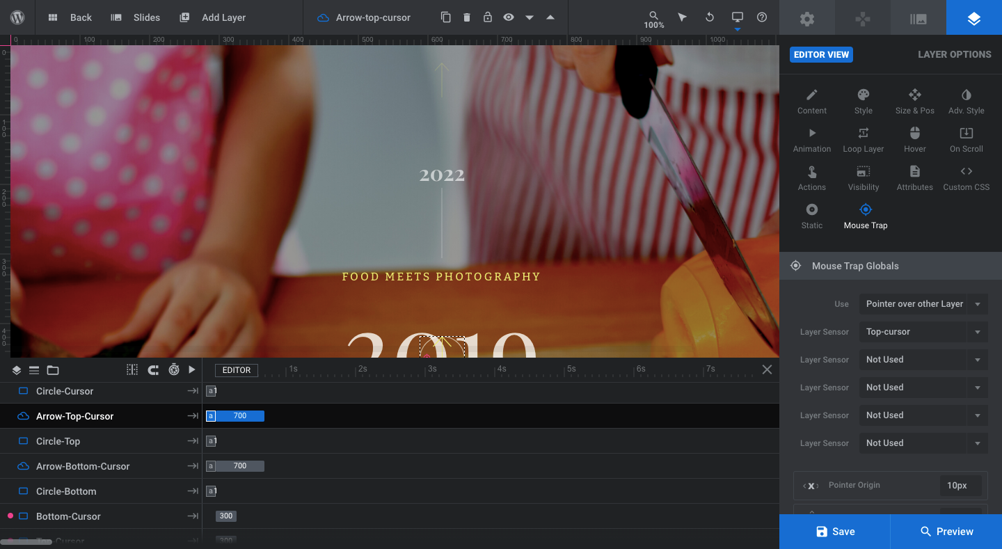
Next, we need to adjust the cursors and circle mouse traps. To get editing access to them and see them in the canvas above, hover over each and click the hidden eye icon:
Here’s what you’ll do to each:
Circle-Cursor: Leave it be.
Arrow-Left-Cursor:
- Go to “Style” and change SVG color to global skin color.
- Go to “Adv Style” and rotate by 90 degrees.
- Go to “Mouse Trap”, click on “Layer Sensor”, and select “Top-cursor”.
- Rename to Arrow-Top-Cursor.
Circle-Left:
- Rename to Circle-Top.
Arrow-Right-Cursor:
- Go to “Style” and change SVG color to global skin color.
- Go to “Adv Style” and rotate by 90 degrees.
- Go to “Mouse Trap”, click on “Layer Sensor”, and select “Bottom-cursor”.
- Rename to Arrow-Bottom-Cursor.
Circle-Right:
- Rename to Circle-Bottom.
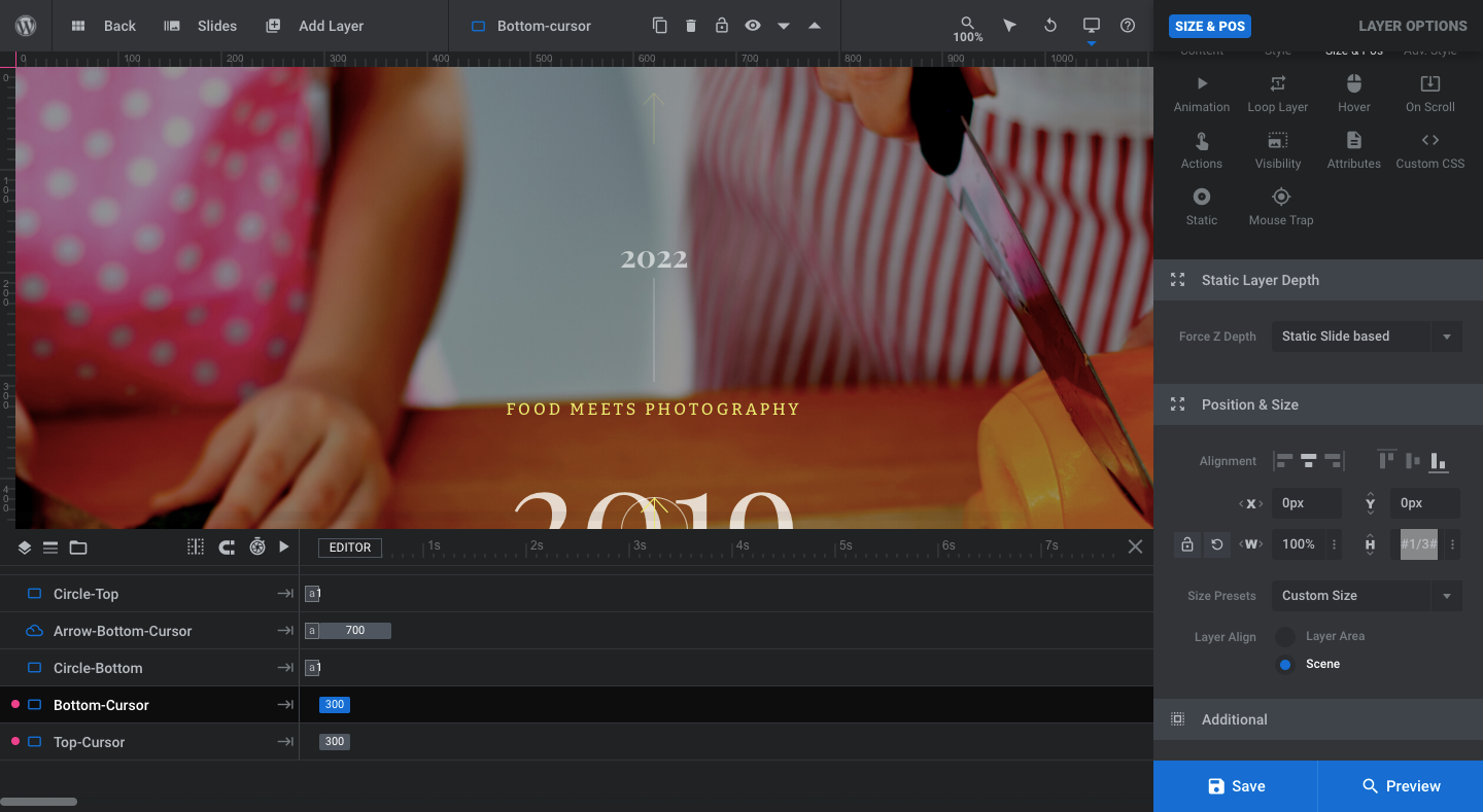
Right-Cursor:
- Go to “Size & Pos” and move it to the center and bottom.
- Swap the width and height values, so that width is 100% and height is #1/3#.
- Rename to Bottom-Cursor.
Left-Cursor:
- Go to “Size & Pos” and move it to the center and top.
- Swap the width and height values, so that width is 100% and height is #1/3#.
- Rename as Top-Cursor.
Save your changes to finish configuring your bottom and top mouse traps.
Learn more:
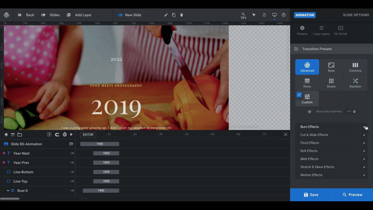
Step 7: Create a vertical slider animation
Go back to your slide. Open up “Slide Options” and “Animation”. Currently, a “Custom” transition preset is configured.
To convert this into a vertical slider, you can use any of the presets specifically designated as “vertical”. You’ll find a ton of options under “Advanced” and “Base”.

Spend some time testing them out — by hovering over them — and find the movement that resonates best with the theme of the slider. It’s okay if you find a transition that you like, but don’t love. Use the “Advanced” settings below to customize the timing and any other settings available (depending on which preset you choose).
When you’re done, save your changes.
Learn more:
Step 8: Duplicate the slide and build out the full timeline
The last thing we have to do is duplicate our slide to create our vertical slider timeline and then add the custom text and imagery to each new slide. So, make sure you’re 100% happy with the design and functionality before you carry out this last step.
Open up your slide master in the toolbar and hover over the slide you just finished creating. Click on the duplicate icon:
Do this for as many slides as you need to complete your timeline.
Next, go through them one-by-one to edit the background images and what all the text layers say. Don’t forget about the Year-Prev and Year-Next years so they reflect which slides come directly before and after them.
One last housekeeping matter: Once you’re done finalizing your vertical slider, go through and give each slide a unique name (like the year) and update the thumbnail image under “Slide Options”. This way, it’ll be easier to manage your slider if you make changes to it in the future.
Make your website timelines more interactive with a slider design
It doesn’t really matter which direction your timeline slider goes in. However, you have to admit there’s something neat about a timeline that moves vertically. It almost mirrors the action of flipping a calendar page.
With the help of the Winery Timeline Slider template, your horizontal or vertical slider timeline will exceed your visitors’ expectations and surprise them in new and unexpected ways. The best part? It won’t take you long to repurpose this template and make it your own.


