
When we think about a product imagery, we generally imagine a gallery or slider that shows off all the views or variations of a product. What if you reversed that concept and instead showed off the product in a variety of scenarios?
While there’s no replacing the product gallery or slider that appears on single product pages, this concept would be a cool way to design the hero image. Not only would it give you the chance to show off one of your most popular products, but to also highlight its versatility and value.
In the following tutorial, we’ll show you how to use the Traveller Carousel template to create a super engaging product carousel for your store’s home page.
Table of Contents:
- Step 1: Update the background image for each slide
- Step 2: Replace the traveler graphic
- Step 3: Edit the text and CTA in the Global Layers
- Step 4: Edit the location text in the slides
- Step 5: Update the spinning badge
How to create an engaging product carousel for the home page
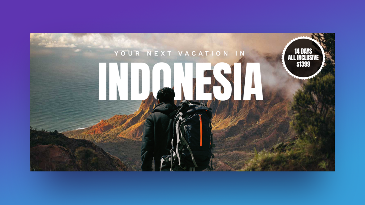
This is the original concept for the Travel Blog Carousel template:
It could be used just as well to promote travel blog content or travel destination packages.
As you’ll see in the following tutorial, this can easily be edited and used for other kinds of websites. We’ll take you through the process of turning this into a product carousel that demonstrates how one outfit can be worn in a variety of situations:
If you need a Slider Revolution introduction before we start the tutorial, read through these guides first:
Step 1: Update the background image for each slide
The first thing you see when you open your newly installed template is a Global Skin Color pop-up. Dismiss it for now. We’ll deal with it after all our visuals are in place.
What we want to focus on in this first step is the background image in each slide. While the replacement of one image for another is easy in Slider Revolution, there are a couple of additional steps we have to take in this particular template.
Let’s start by replacing the background graphic in each slide.
To do this, go to “Slides” in the toolbar and select the first slide to start. Go to “Slide Options” and “Background”. Click on Media Library and upload your new file:
Pro tip: After you edit the background image, also edit it under “Thumbnail”. All you have to do is click the “Reset” button next to the two thumbnail images and it’ll pull in your new one. By doing this, your Slides master in the toolbar will accurately reflect the content in each of your slides.
As you go through the other slides to replace the imagery, you’re going to find some differences. Slide #2, for instance, has a background HTML5 video instead of an image:
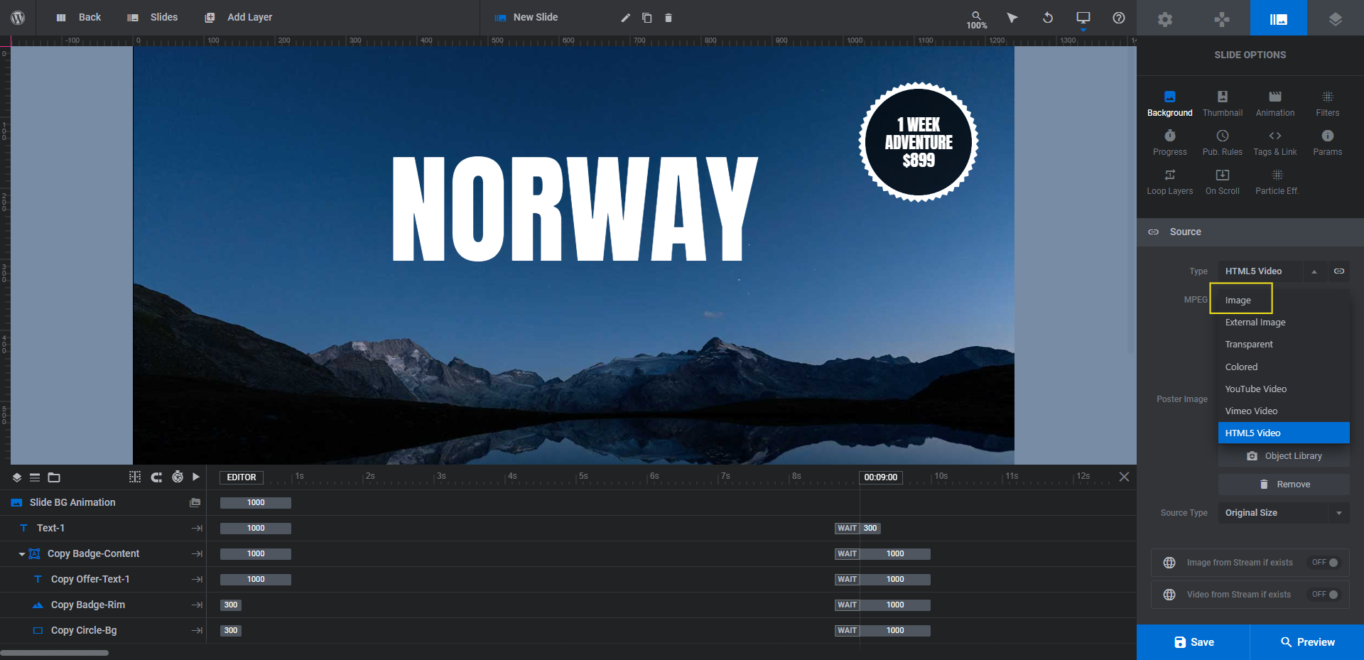
If you want to use images for all of your slides, click the “Type” dropdown and then select Image. You can then upload your PNG or JPG to the media library. Conversely, you can add more video backgrounds to your carousel if you’d like.
Another change you may need to make is to enable or disable the Particle Effect addon. It is currently enabled in Slide #4:
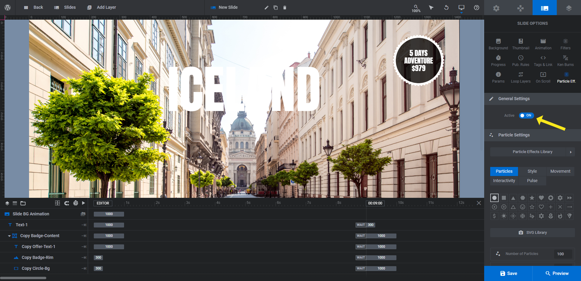
To turn it off, switch the toggle next to “Active” to OFF. Since we’re advertising a spring/summer collection, it doesn’t make sense to use a snowy particle effect. However, this will definitely come in handy when we update our hero section with our winter collection, so keep that in mind if you plan to revamp this design seasonally.
Learn more:
Step 2: Replace the traveler graphic
The Traveller layer is always visible in the product carousel. To achieve this effect, the graphic is part of the Global Layers of this template.
Go to “Slides” in the toolbar and select Global Layers. This will open up a different set of layers from the ones you see in your slides.
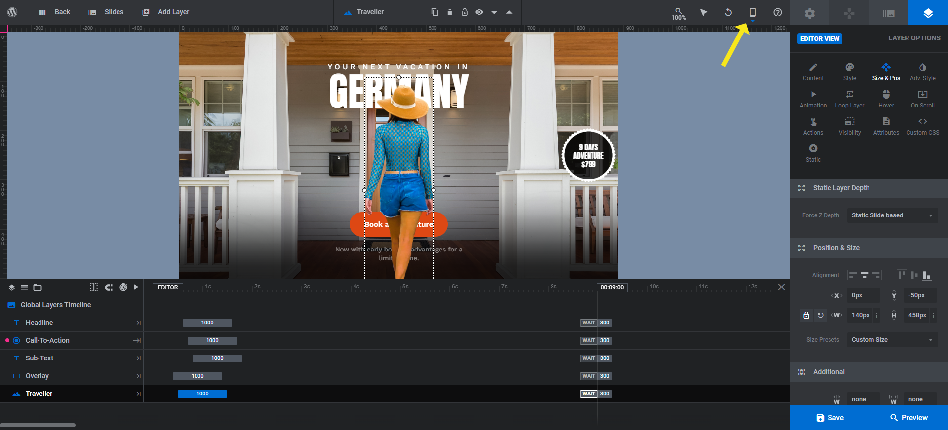
To edit the central figure in our carousel design, select the Traveller layer in the timeline editor. Then go to “Layer Options” and “Content”. Upload your replacement graphic to the media library from here:
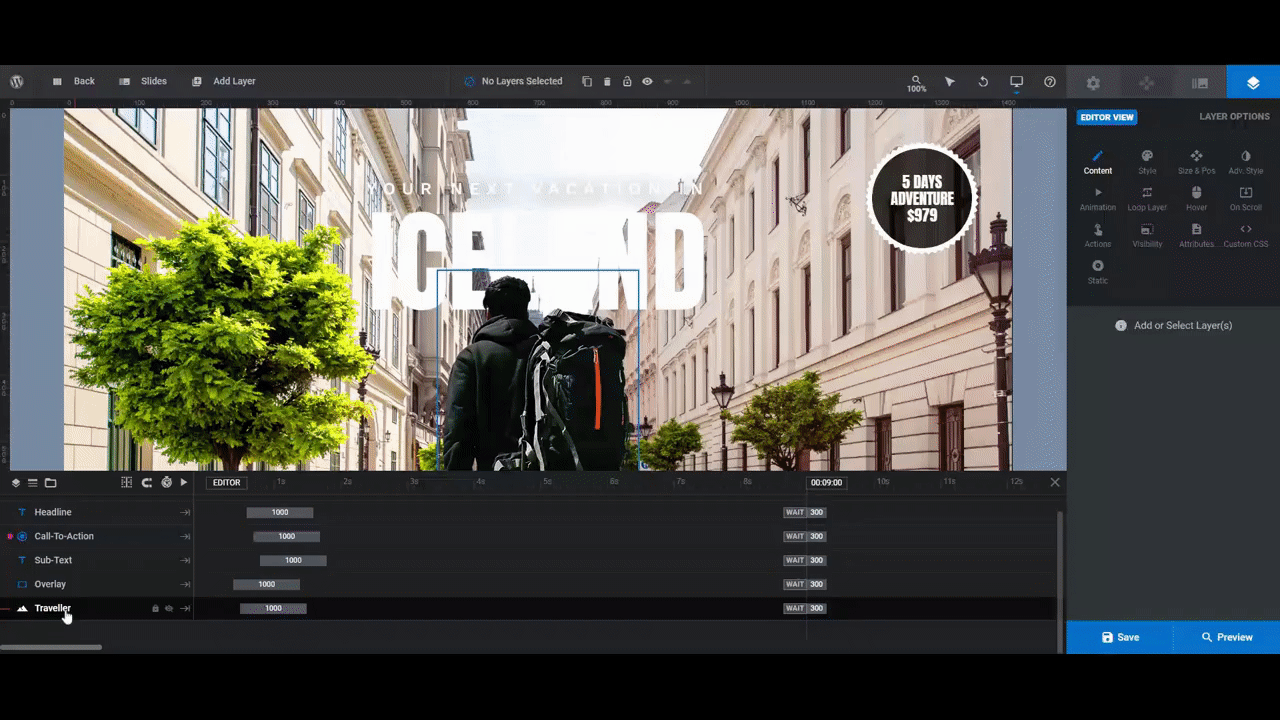
Notice how much larger our graphic is than the template’s. If this happens to you (or it’s smaller), go to “Size & Pos” to resize it.
Pro tip: The Traveller layer is 300px by 646px. It is also a cut-out image, meaning it has a transparent background. When selecting or creating your own graphic, try to keep the size/dimensions roughly the same as this one so you can minimize how much editing you have to do to the graphic once it’s uploaded.
If you make any changes to this layer, open up the Preview and check how it appears in responsive mode:
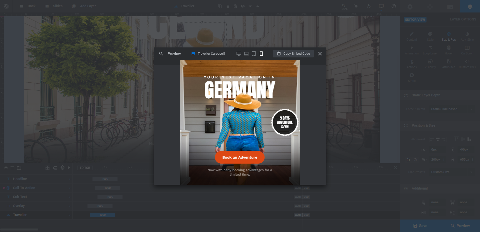
You may find that while the image looks great on desktop, it’s distorted on smaller devices. If that’s the case, return to the editor and select the size variant you want to edit from the toolbar:
Go back to “Size & Pos” and then enter a custom size under the W field. This will enable you to create pixel-perfect sizes of your imagery on every major device.
Learn more:
- Editing Images in Template Modules
- Special Layers: Rows, Groups, Background & Global
- Desktop, Laptop, Tablet and Phone Size Variants
- Adjusting for Responsiveness
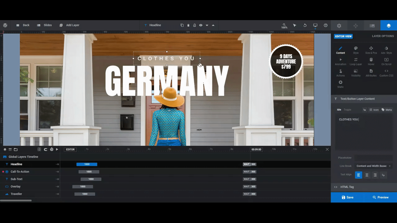
Step 3: Edit the text and CTA in the Global Layers
While we have the Global Layers open, let’s finish editing the rest of them before we move back to the slides.
There are four other layers here:
- Headline — The text that reads “Your Next Vacation In”
- Call-To-Action — The “Book an Adventure” button
- Sub-Text — The small note that appears beneath the button
- Overlay — The semi-transparent overlay that appears in the bottom area of the slides
We’re going to leave the Overlay alone since it makes our Sub-Text easy to read on top of each of the backgrounds. It also helps to strengthen our shoppers’ focus on the text and graphics above it.
For the text layers, we’re going to select them one-by-one and then edit them under “Layer Options”:
- Use “Content” to edit what the text says.
- Use “Style” to adjust the font, weight, and color.
- Use “Size & Pos” if you need to update the size or position of the text layer.
- Use “Adv Style” to do advanced customizations, like adding a text shadow.
All three of these layers can be edited using these settings. The only one that requires additional work is the Call-to-Action button layer.
After you’ve edited the text and general font styling for your button, you may want to edit the color of the button as well as its hover state.
You can edit the button’s color under “Style” and “Background”. Click the color swatch next to BG Color to open the color selection dialogue:
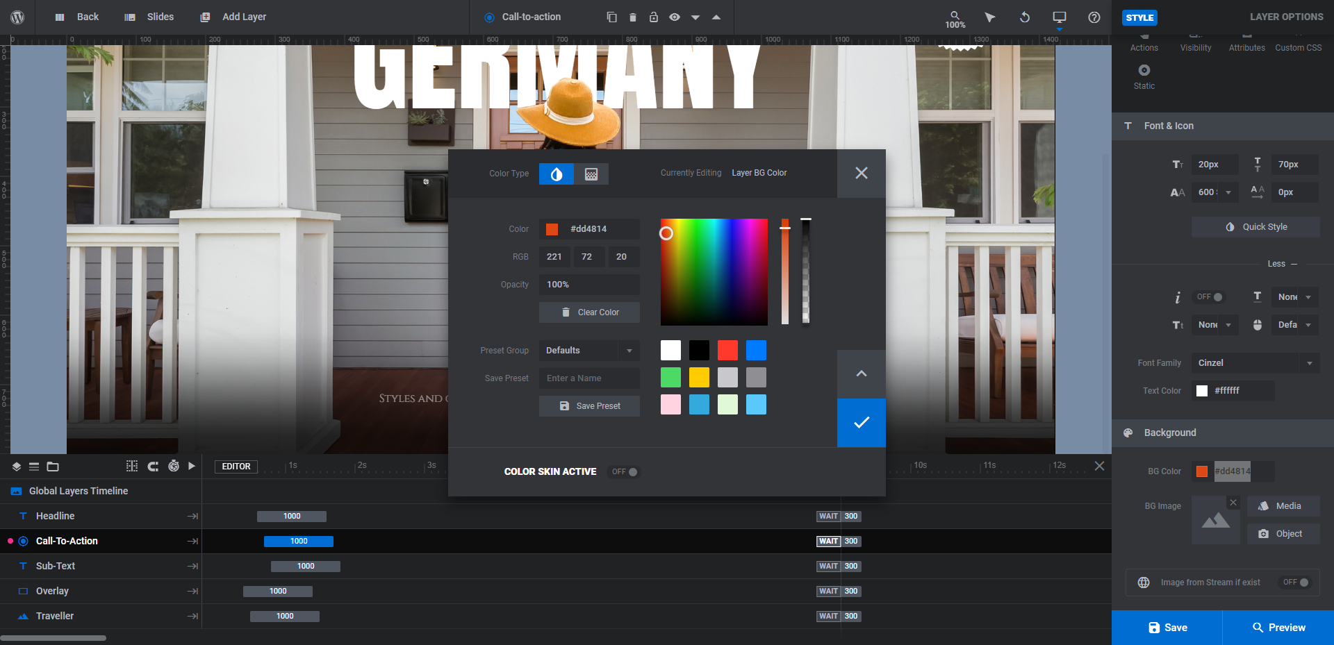
Note: This color can also be changed if you go to “Module Options” and “Skin”. This will open the Global Skin Color pop-up you saw in the beginning. This is a great tool to use if you want to make the same color changes to key areas of your design across multiple slides.
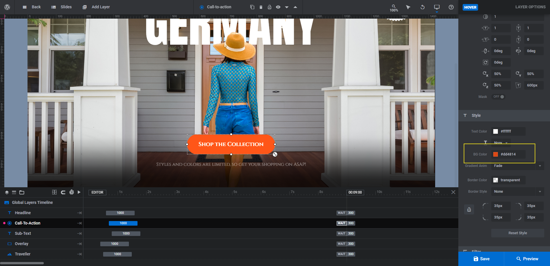
Next, go to “Hover”, scroll down to “Style”, and update the BG Color there:
When you’re done, save your changes.
Learn more:
- Editing Text from Template Modules
- Adding and Configuring Button Layers
- The Tools of the Color Selection Dialogue
Step 4: Edit the location text in the slides
With the Global Layers done, we can go back to the slides and finish up. Let’s first tackle the Text-1 layer which displays the changing location names in our template.
You’ll do the same thing you did in Step 3 to edit the global text layers. The only difference is you’ll have to go through each slide to locate this layer and customize it:
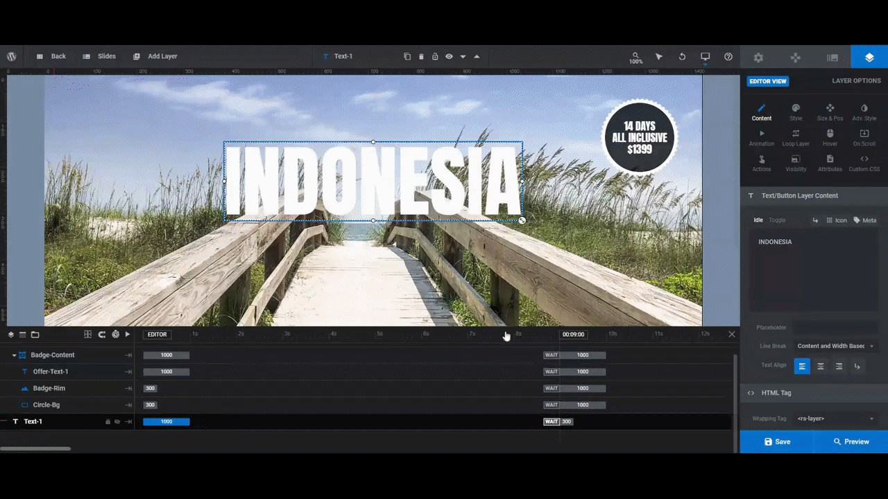
Before you move on, preview your work on the frontend and make sure that the text colors you chose for the slides and global layers work well together. If there are any contrast issues between the text colors, the text with the button design, or the text with the background, hammer out those issues now.
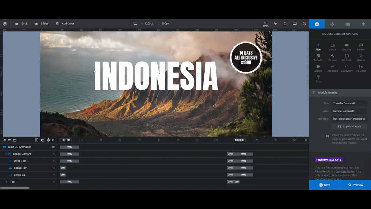
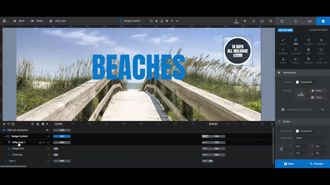
Step 5: Update the spinning badge
The last element to edit in this template is the spinning badge in the top-right corner. It’s a group of layers called Badge-Content in each slide and it has three components:
- Offer-Text-1 is the text inside the badge.
- Badge-Rim is the spinning white edge around it.
- Circle-Bg is the semi-transparent filling of the badge.
We’re going to leave Badge-Rim and Circle-Bg alone. The only thing we want to change is the interior text.
Do the same as you did with the other layers to edit the text. This goes for what the text says as well as how it’s styled.
Note: To force a break in your badge text, either use the return-arrow icon above the text field to insert the break or type <br /> between the two words. And if you want to italicize any of your words the way we did, place <i> and </i> around the word.
We did something else to the badge text. We rotated it by 15 degrees. To do this for your own badge, go to “Adv Style” and change the rotation setting from 0deg to your desired rotation.
When you’re finished, save your changes and preview them. If you’re happy with your new product carousel, you can add it to the hero section of your home page.
Learn more:
Create more engagement with a product carousel that rocks
As you can see in this tutorial, we didn’t do a major overhaul of the original template design. All it took were some tweaks to the imagery and the text styles to put a unique twist on the whole thing.
There’s a lot more that can be modified in the Travel Blog Carousel template, like the Ken Burns image effects, the carousel settings, and more. If you’re looking for a way to take your ecommerce home page to the next level, start with this template and see what kind of engaging product carousel design you can come up with for your brand.


