
When customers hear a sales pitch, they generally aren’t wooed and won over by lists of the product’s features or the service’s process. While those details will eventually factor into their decision-making process, their primary concern is going to be:
“What’s in it for me?”
The hero image on your website can provide a short and snappy answer to that question. But why try to sum up the power of your solution with maybe 50 or so words when a picture alone is worth a thousand words?
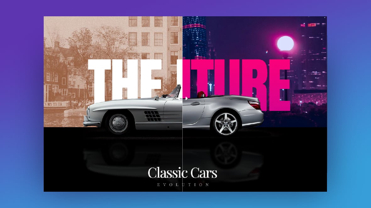
In this tutorial, we’ll show you how to make a more effective pitch on the home page with a before-and-after image slider. We’ll demonstrate how to take the Classic Cars Before After Hero Template and repurpose it for the solution being sold.
Table of Contents:
- Step 1: Find and create your Before and After photos
- Step 2: Add your Before and After photos to the slider
- Step 3: Edit the main text layers
- Step 4: Update the bottom half of the slider
- Step 5: Edit the slide background
- Step 6: Configure the image slider
How to create a before-and-after image slider for your ecommerce site
In a matter of seconds, a before-and-after photo can convince a customer that this product or solution is the exact one they’ve been looking for. While you could just place Before and After photos side-by-side, this approach misses out on the big reveal.
That’s one of the great things about selling on the web — you make more interesting and engaging sales pitches and marketing experiences than you can on other platforms. The before-and-after image slider we’re looking at today is the perfect example of this.
By turning this before-and-after into a slider, your visitors can make the big reveal themselves:
There are tons of ways to make this template work for you. In the following tutorial, we’ll show you how we’ve repurposed this slider for a wellness company:
If this is your first time editing a Slider Revolution template, take a few minutes to review these quick-start guides:
Step 1: Find or create your Before and After photos
In order to create a slick transition as the slider moves over the different images, you’ll need photos that line up well. Same size (height and/or width). Same position. And same subject.
For our design, we want to create a before-and-after slider that shows off some of the results customers can expect to see when they lose weight and get fit with Orlando Fitness. To do this, we’re going to use a pre-weight loss photo for the left side of the slider:
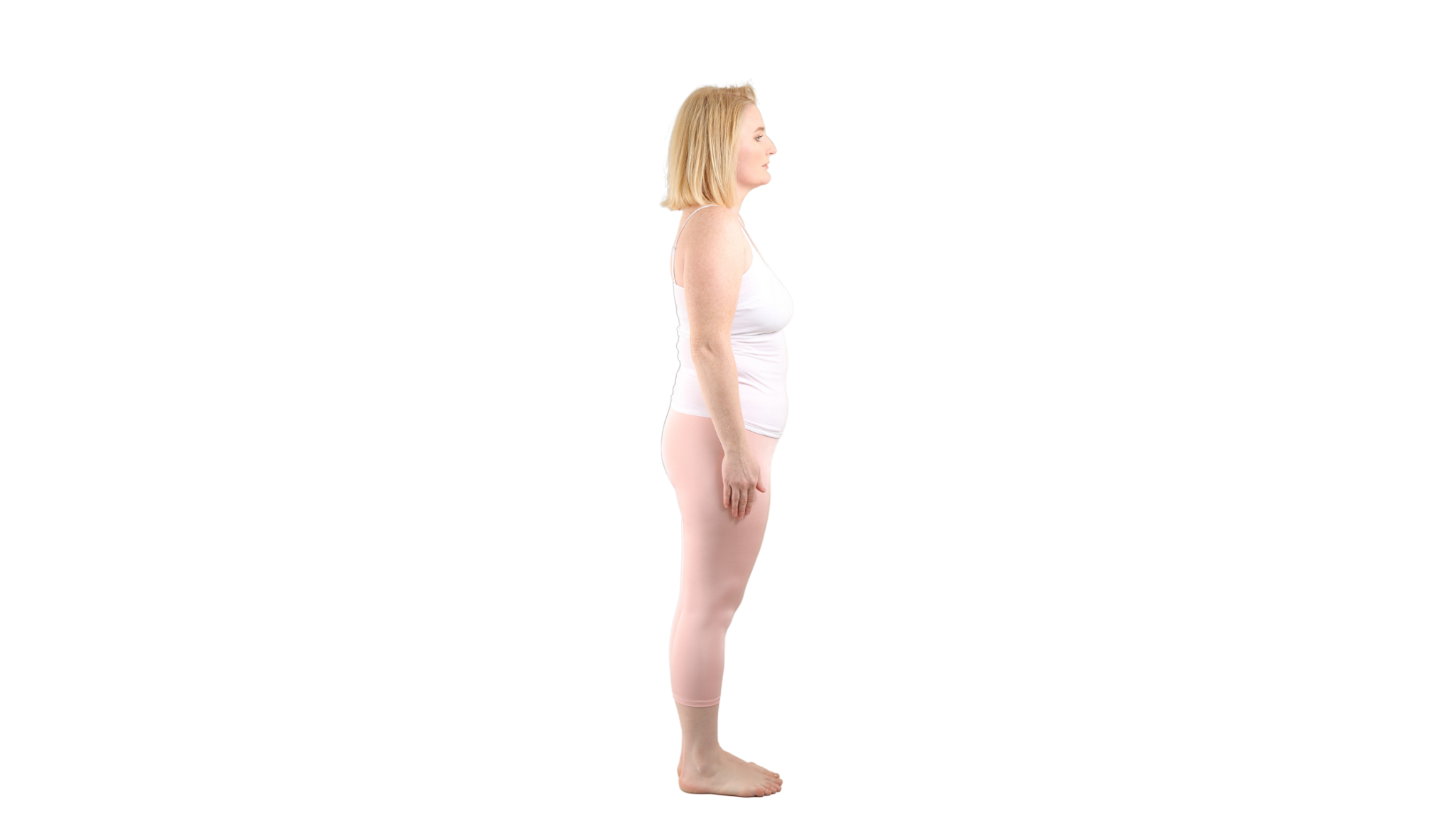
And a post-weight loss photo for the right:
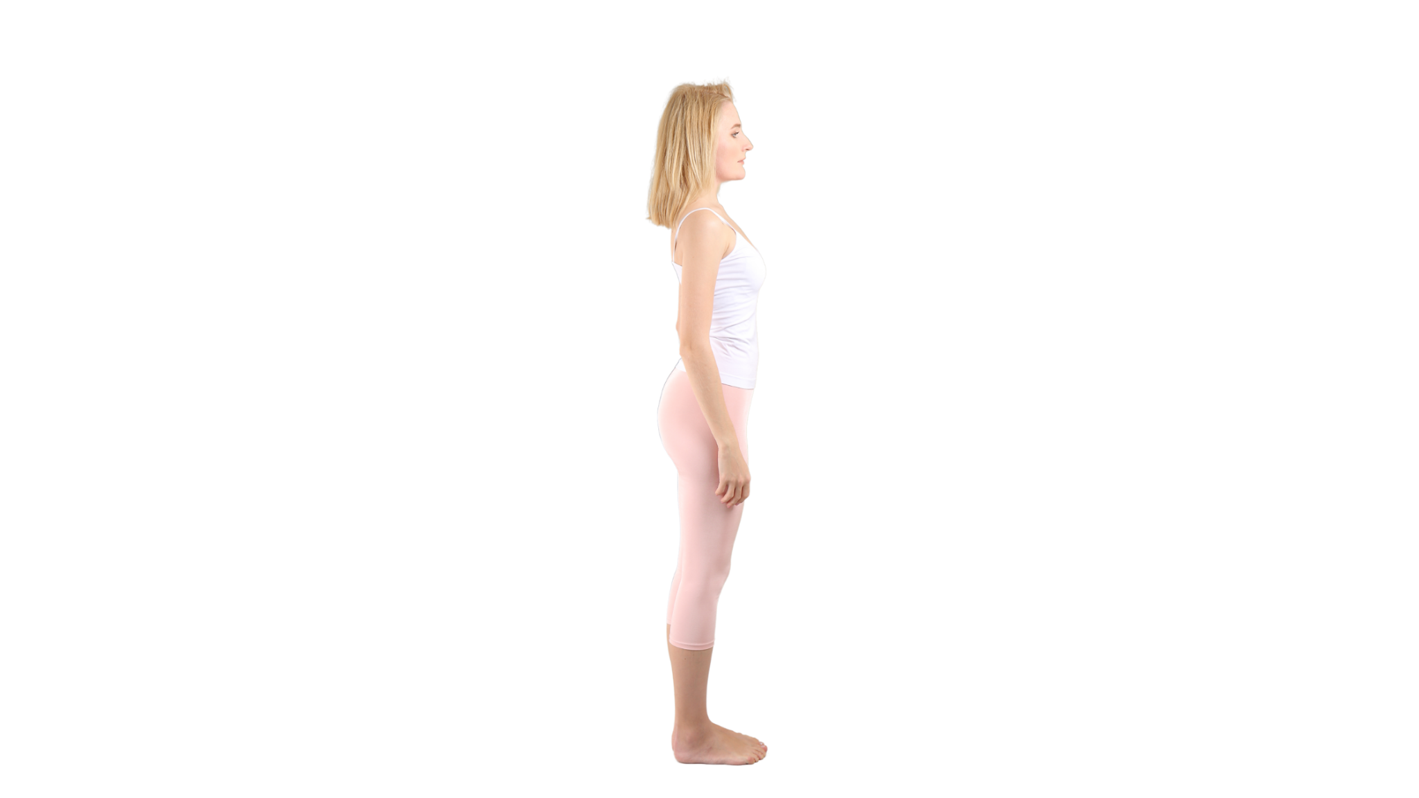
It’s the same woman in both photos, wearing the same thing. We’ve also made sure that the height is the same from photo to photo, so the slider will smoothly transition from one to the other.
Pro tip: The Slider Revolution template uses a number of elements to create the layered effect you see. In order to preserve this effect, you’ll need to find or create Before and After photos that are cutouts. There are two ways to do this.
The first is to find images that are cropped around the edges of the subject (in this case, that would be the woman’s body). The other way is to strip out the background, if there is one, and then download the image with a transparent background. The results will be the same.
Step 2: Add your Before and After photos to the slider
There are two image layers in the template slider. The first is the image of the car. The second is the reflection of the car.
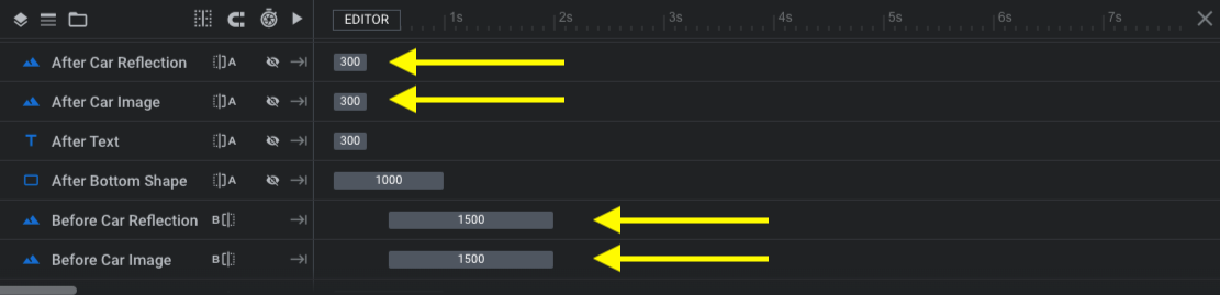
Even if you want to create a similar effect with a reflection of your product, you’ll have to update the “Reflection” layers with one of your own. For our purposes, we don’t need a reflection, so we’re going to remove those layers entirely.
To do this, click on “After Car Reflection” and hit the “delete” button on your keyboard. Do the same for “Before Car Reflection”.
To preserve the current settings for the car and make them apply to your new image, don’t delete the “After Car Image” or “Before Car Image” layers. Instead, click on them one at a time. Then, go to “Layer Options” and “Content” to swap in your new images.
Open the Media Library under “Image Layer Content” and upload your new images for each:
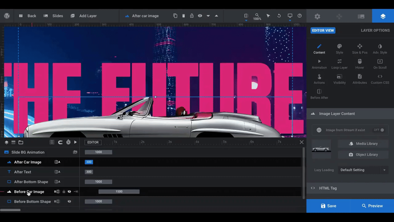
Because of the way the car images are set up, yours will also import at the “Original Size”. Depending on what kind of image you’re replacing the cars with, they might come in too big or too small.
There are a couple of ways to edit the size. For instance, you can choose a preset size from “Source Type”:
If you’d prefer to set a custom size or use a different preset, go to the “Size & Pos” settings and enter new dimensions or select from one of the “Size Presets” there. You can also adjust the image’s position on the slide:
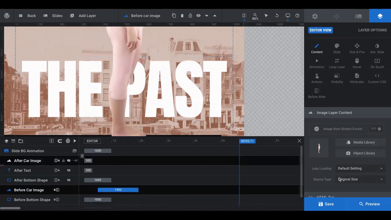
We’ve chosen to keep the size as is and vertically middle-align the photos so we can see as much of the body as possible.
Pro tip: If you make any major modifications to the positioning of the graphic, or you use a portrait image instead of a landscape one, remember to check your design in responsive mode.
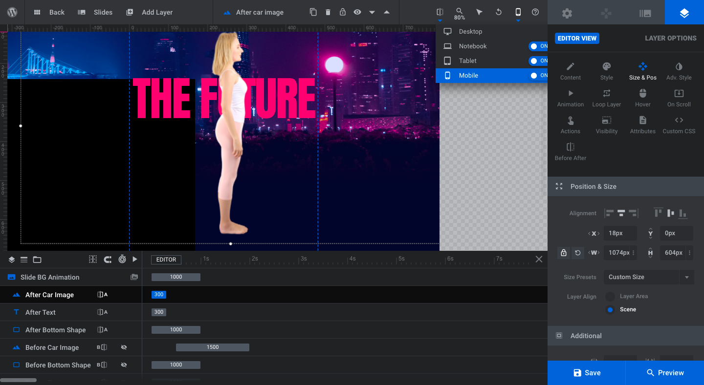
This will ensure that the graphic is properly sized and positioned across all devices.
Learn more:
Step 3: Edit the main text layers
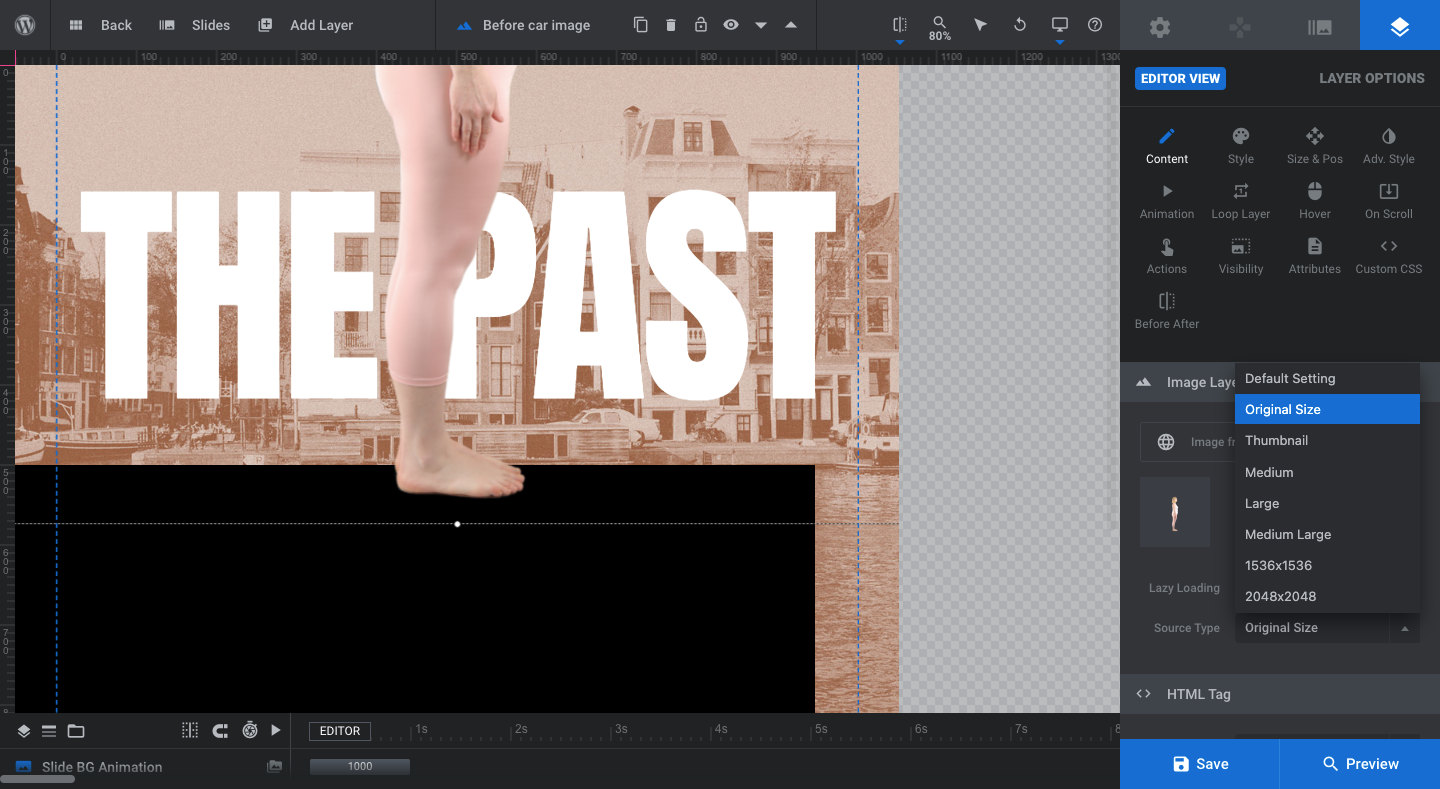
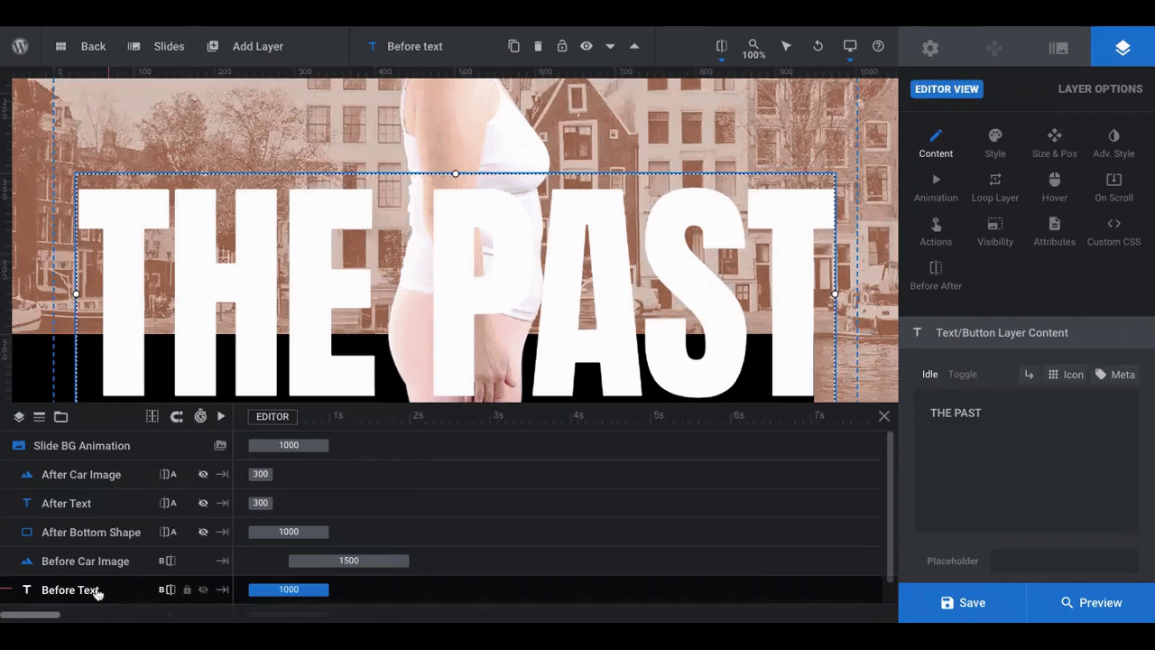
The Before version of the slider reads “The Past”. The After version of the slider reads “The Future”. To change what the text says in each, find the layers in the timeline.
Select “Before Text”. Then, go to “Layer Options” and “Content”. Replace what it says in the text editor. Do the same for “After Text”:
Pro tip: If you’re not going to use the same text for the Before and After images, try to come up with a header or slogan that starts with the same word. Like “The Past” and “The Future” or “Better Body” and “Better Life”. That way, when visitors see the two halves of the slider at once, the text spanning across Before and After still displays a coherent message.
To change the styling of the font or the font itself, go to “Style”. Remember to apply the same style changes to both the Before and After text layers:
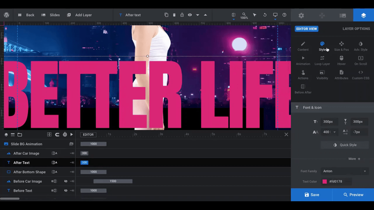
We’ve changed our text to a Montserrat “Bold” font, and lowered the size slightly to 250px.
You may also want to adjust the position and styling of the text. You can do this under “Size & Pos” as well as “Adv Style”.
Pro tip: Don’t get too hung up on colors in this step. The new background you add to the slide may require a different color with a stronger contrast. So start with your brand colors for now, but keep an open mind in case you need to change them (or your background choices) later.
Learn more:
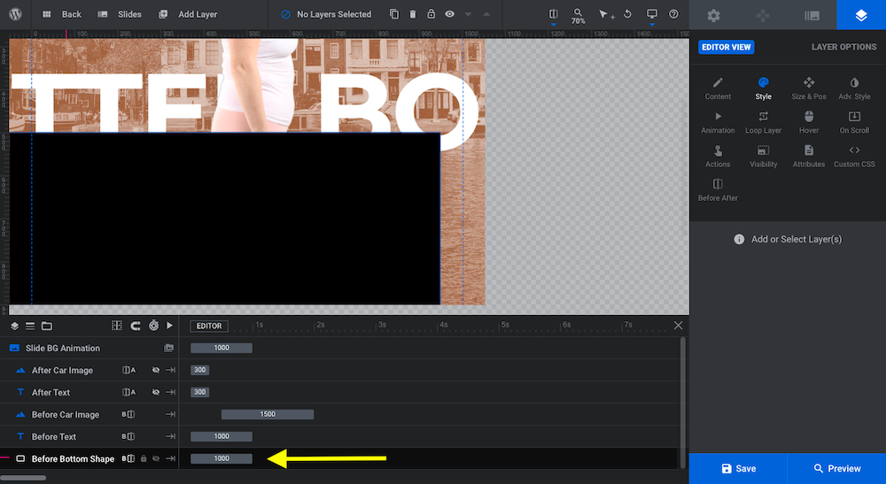
Step 4: Update the bottom half of the slider
The template has four layers in the bottom half of the slider:
- Reflection image
- Black bottom shape
- Headline
- Subheadline
We’ve already addressed the reflection image. As for the black bottom shape, it depends on what kind of image you’ve replaced the cars with. A landscape image might look good sitting atop the black box. A portrait image like ours won’t though, so we’re going to delete it.
If you decide to keep yours, but want to update the color or content, use your “Layer Options” to edit it. If you decide to do away with it, select the “Bottom Shape” in the timeline and hit the “delete” key. Make sure to do this for both.
For the two text layers down here, you’ll need to go to the “Slides” controller in the toolbar at the top. Then, select “Global Layers”:
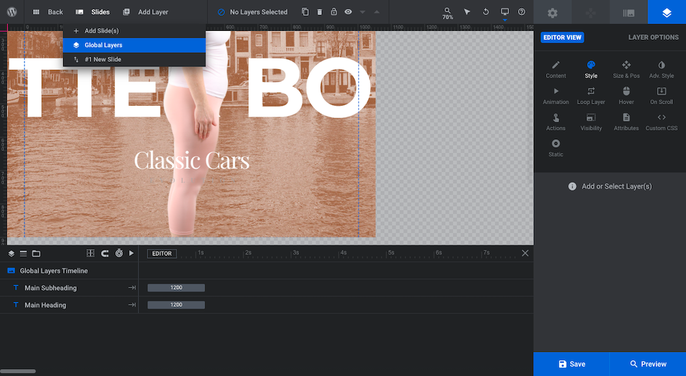
Pro tip: Global Layers is the best way to create static layers when you have a dynamic slider or effect behind them.
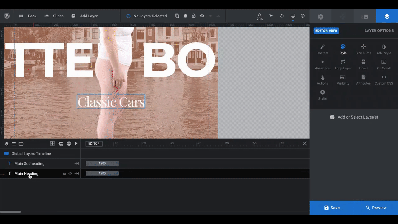
To update these layers, repeat Step 3. Select the individual layers in the timeline at the bottom. Then, go to “Layer Options” to edit the text and change the styling, size, position, and so on:
Pro tip: Use contrasting fonts here to make your slide more visually attractive. If your Before and After text is a sans serif font, then make these global layers be a serif. And vice versa. Also, don’t be afraid to play around with all-caps, small-caps, and regular title case text.
Again, hold on making any final changes to the font color until you finalize the background of your before-and-after image slider.
Learn more:
Step 5: Edit the slide background
The template uses a different background image based on the car model shown. You can create a similar effect with your before-and-after slider, using two different backdrops for your images. Or you can use the same background for a more uniform look across the two halves of the slider.
We don’t want to complicate the visual sales pitch we’re making here; namely, that when you go to Orlando Wellness, you’re going to see real results. So, we’ve chosen to use the same background for each.
Regardless of which route you go, you’ll have to set the background twice.
Go to “Slide Options” and “Background”. You’ll see a “Before” and “After” tab now:

Click on each one and designate your source “Type”. You can upload a different image or set a color:
To access the color gradient options in the color modal, click the second “Color Type” at the top to see your options or to create your own. Slider Revolution offers a number of premade gradients for your convenience as well. Feel free to start there or use them as is.
One last note: With your backgrounds in place, you should review your text layer colors one more time. We actually like the existing colors and they contrast nicely with the image and background color, so we’re going to keep them as is.
If you need to make changes to yours, do it now before moving onto the final step.
Learn more:
- Changing Template Background Colors and Images
- Configuring the Background Layer
- The Tools of the Color Selection Dialogue
Step 6: Configure the image slider
The last thing to do is tweak the Before/After AddOn settings. First, let’s start with under “Slider Options” > “Before After”:
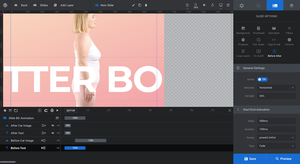
You can modify the sliding mechanism in a number of ways:
Direction: The most common way to create a before-and-after image slider is to set it up horizontally. However, if you have a product that would be more interesting to reveal vertically, you can update the slider direction here.
Keep in mind this may require additional changes to images and text layers, so be sure to preview your work on all devices to ensure that everything looks good after you switch directions.
Init Split: This is where the slide tool gets placed on the photo. The default is 50% and ends up in the center. However, we’ve placed ours at about 60%. While a 50/50 split works well for something like a car, we want to pique our visitors’ curiosity by only showing the Before results first.
Start/End Animation: Use these settings to control what type of animation moves the slider into place as well as how it eases in. We’ve left this as is.
Teaser Settings: By default, the dividing arrows are just that: arrowheads. If you’ve created a visual spectacle between the oversized font, before-and-after image, and a background setting, you may just want to leave them as is.
Since we’ve tamed down our design by stripping down the background to a gradient, we’ve decided to add a “teaser”. With this setting enabled, the arrows pull away from each other until someone engages with the image slider:
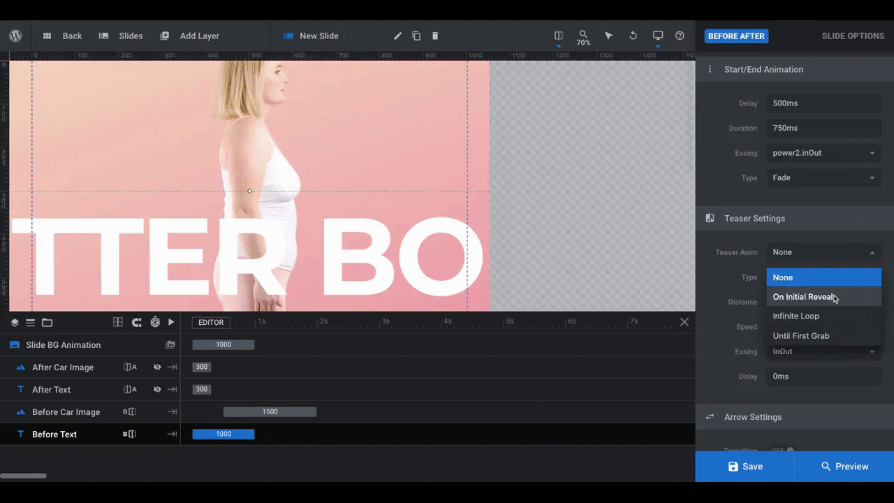
As you can see in the preview, the left arrowhead gets somewhat lost on top of the white text.
To remedy this, go to “Module Options” > “Before After”. If there are any changes you want to make in terms of how the slider icons, divider line, animation, and drag container look, make them here:
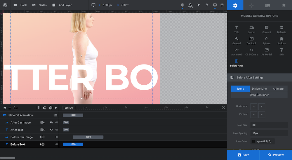
For instance, you can change the arrows to a different icon shape. You can also edit their size, the space between them, and the color. All we did was make the arrows a bit darker so they stand out better to our users.
When you’re done, save your changes and preview your new image slider to make sure it looks and works exactly as you want it to.
Learn more:
Make a rock solid sales pitch with a before-and-after slider
As consumers spend time researching various solutions to their problem online, it’s the websites that can most effectively answer “What’s in it for me?” that will capture their business. A before-and-after image slider isn’t just effective because it depicts the amazing results a customer will get. Its interactive design will also make it more memorable.
With the help of Slider Revolution, you’ll be able to easily create an image slider of your own to wow prospective customers with.


