
Even though our world is growing ever more digital, that doesn’t mean that we as humans are completely detached from the real world. To bring a little more realness into our digital spaces, we’re seeing designers add texturized and tangible qualities to their interfaces.
In this tutorial, we’ll show you how to repurpose one of the slides from the Particle Wave Showcase template and design a hero image that visitors will want to reach out and touch.
Table of Contents:
- Step 1: Choose your hero image slide
- Step 2: Edit the slide and module background color
- Step 3: Edit the headline
- Step 4: Add a description layer
- Step 5: Edit the call-to-action button layer
- Step 6: Customize the particle wave layers
- Step 7: Deactivate the navigation
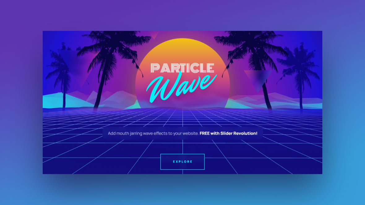
How to design a hero image that feels alive with particle animation
Take a look through this Slider Revolution template and you’ll see the many ways in which you can use particle animation to create a three-dimensional landscape for your hero image:
In this tutorial, we’re going to edit the third “TOUCH” slide to create a touchable flowing effect for our ecommerce site’s sales event:
If this is your first time using Slider Revolution, get acquainted with the basics before you begin:
Step 1: Choose your hero image slide
There are five distinctly designed hero image templates within the larger Particle Wave Showcase template. While each is attractive and eye-catching in its own right, you want your hero image or hero slider to offer up a consistent tone and look to visitors.
So, starting out, you’ll need to choose just one of the slides in the template to work with. To design our totally touchable hero image, we’re going to choose slide #3.
Note: If you choose to use a different slide, that’s fine. Just keep in mind that some of the following steps might not be relevant since there are different content and settings in each of the slides.
To delete the slides you don’t need, go to “Slides” in the toolbar. Hover over them one at a time and click the trash can to remove them:
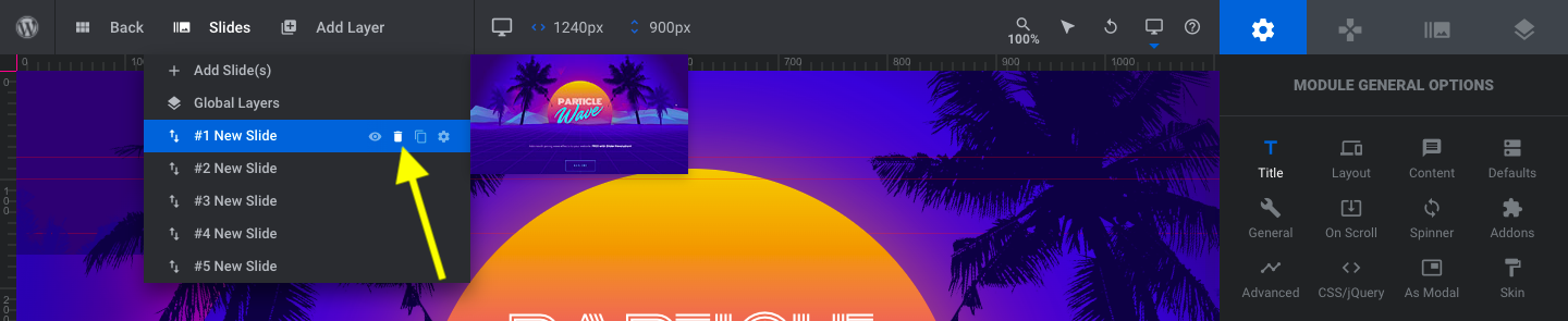
You should be left with Global Layers and your chosen slide when you’re done. There are no Global Layers to edit in this template, so we’re going to focus our attention on the remaining slide for the rest of this tutorial.
Learn more:
Step 2: Edit the slide and module background color
To change out the background of our design, we’re going to update two areas in the template. The first you’ll find under “Module Options” and “Layout” settings. Scroll down to the section for “Module Background”:
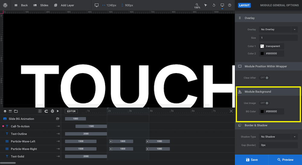
Click on the box next to BG Color to open the color selection dialogue. While you can add an image or color gradient to the background, we want the main wow factor to come from the particle wave animation, so stick to choosing a solid color:
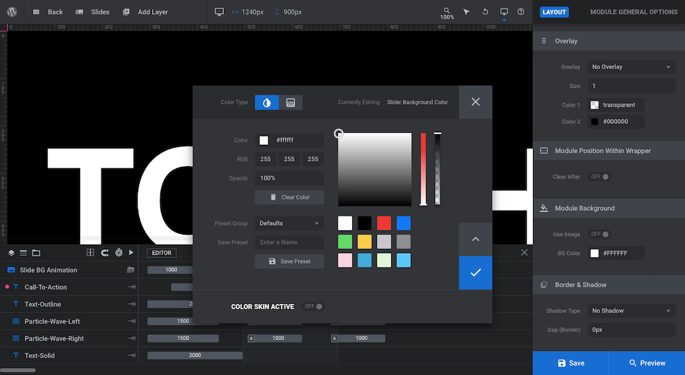
After you’ve applied the module background color, go to “Slide Options” and “Background”. Do the same thing to the BG Color there. Save your changes before moving on.
Learn more:
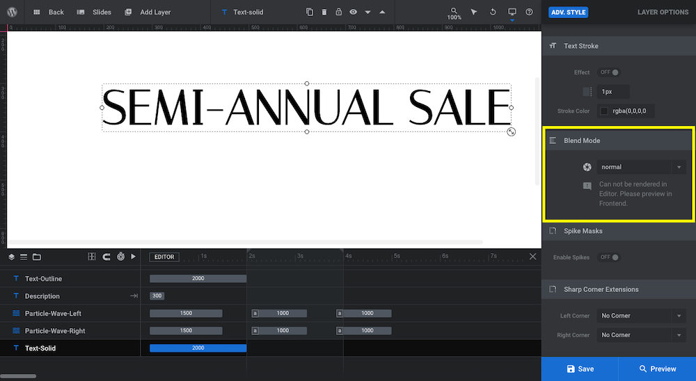
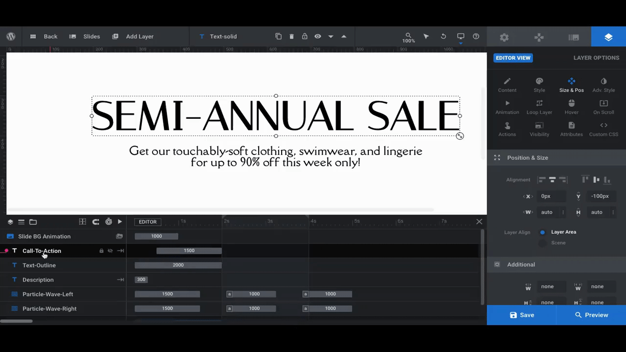
Step 3: Edit the headline
The headline is created using two text layers:
Text-Outline is an outlined version of the header that appears in the areas where the particle wave moves over the headline.
Text-Solid is a solid version of the header that partially disappears as the wave moves over it. This happens because the solid layer is placed below the particle waves in the timeline, which pushes the layer behind them in the slide.
We’re going to make similar edits to both of these layers. Let’s start with Text-Outline. To edit it, select in it the timeline or canvas, then go to “Layer Options”:
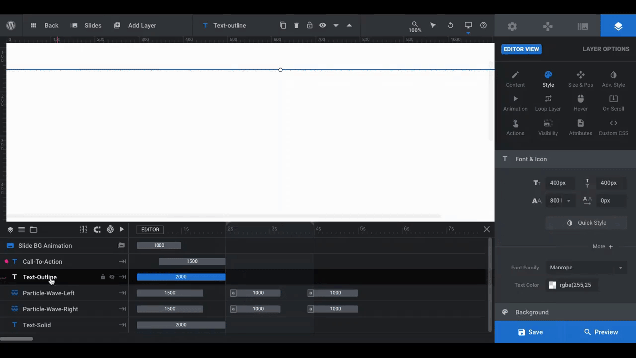
We made just a few changes to the layer:
- Changed the text and alignment under “Content”.
- Changed the text layer size along with the font under “Style”.
- Changed the text stroke color under “Adv Style”.
Whatever changes you make to the outline version of your header, do the same to Text-Solid. The only difference is that there is no Text Stroke effect applied. To edit the color of the solid text layer, do so under “Style” settings:
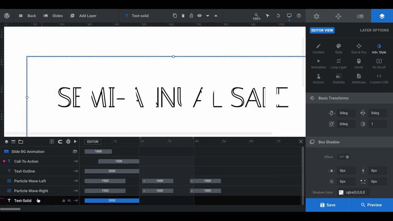
The two layers should now perfectly line up. If not, double-check that your text and size are identical for both.
Note: If Text-Solid does not appear over Text-Outline in “Preview” mode, select the Text-Solid layer. Go to “Adv Style” and change Blend Mode to normal:
Learn more:
Step 4: Add a description layer
We’re going to add a bit more context to this slide with a description layer placed beneath the headline.
To add a new text layer, go up to the toolbar, hover over “Add Layer”, and select “Text”:
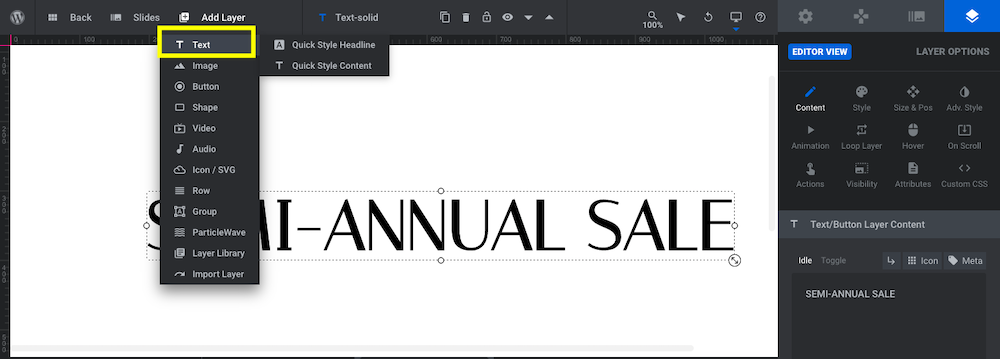
Note: If you select “Quick Style Headline” or “Quick Style Content”, a new sidebar will pull out from the right of the editor with predesigned text layers to choose from. If you’d prefer to style your own description, click on “Text” and then make the modifications in “Layer Options”.
Use the same settings under “Layer Options” as you did for Text-Solid to customize your new description.
In addition, you’ll need to move the new layer into position on the slide. While you can drag-and-drop the layer in the canvas to where you want it, you can make more precise positioning adjustments under “Size & Pos” settings:
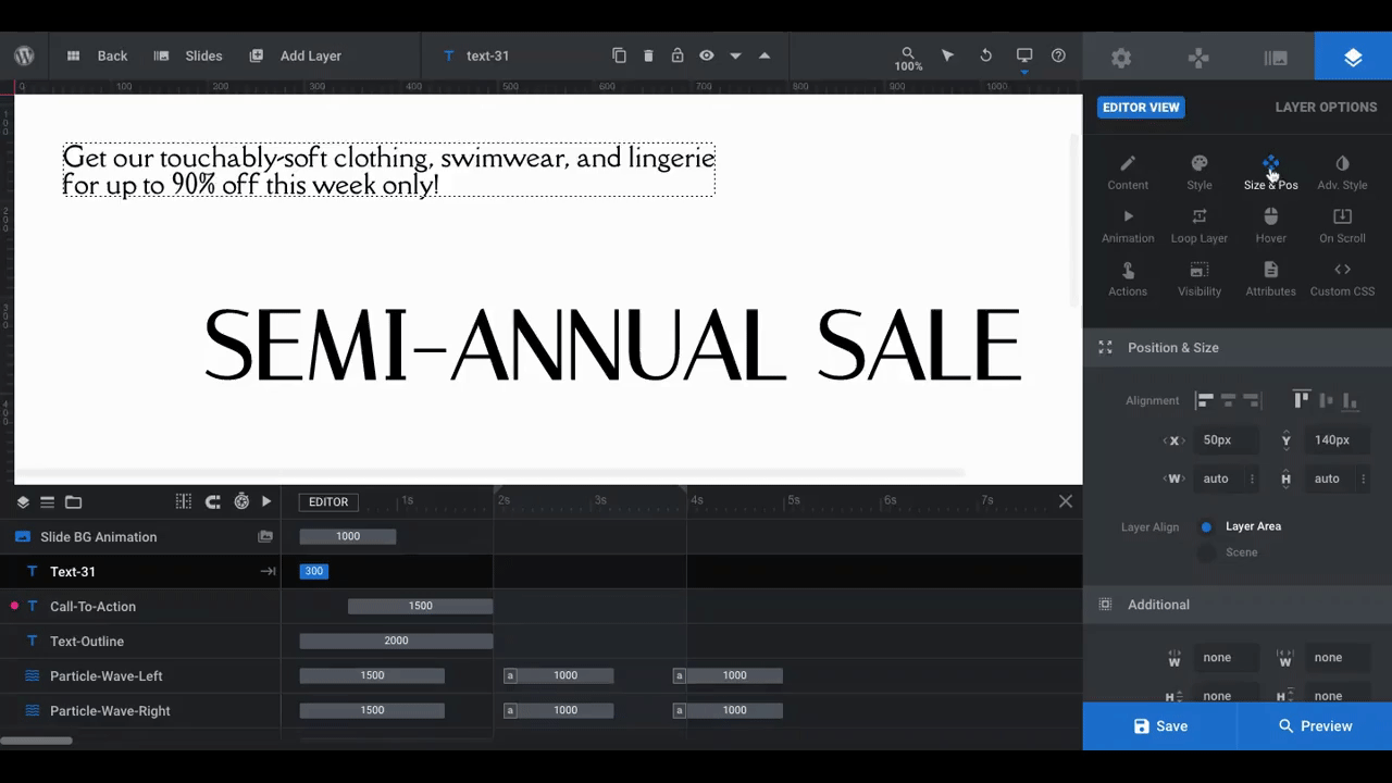
We’ve made two changed. Under “Size & Pos”, we used the horizontal and vertical alignment icons to quickly move the layer into place in the center of the page. Since it falls neatly under the header, no other changes are needed.
We then returned to “Content” to center our text.
The only other thing you’ll have to do in this step is a responsive check. Since this is a new layer, you want to make sure it doesn’t end up sitting on top of an existing text layer on a smaller device.
Go to “Preview” in the bottom-right corner of the page and then toggle between the responsive variants:
If you need to customize the positioning, use the responsive settings inside the editor to toggle between the devices and then customize the “Size & Pos” settings as needed.
Learn more:
- Quick Styled Headlines, Text Content, Buttons and Shadows
- Desktop, Laptop, Tablet and Phone Size Variants
- Adjusting for Responsiveness
Step 5: Edit the call-to-action button layer
Just as you want to keep the background of the slide simplified, you want to do the same with the button design. It should stick out enough so that visitors can easily find and click on it. However, you don’t want it to be so pronounced that it drowns out the particle wave animation.
So don’t worry about redesigning the button or adding a fill to it in this step. Instead, make simple changes to the Call-To-Action layer:
- Customize what the text says under “Content”
- Change the font, size, text color, and button outline color under “Style”
- Update the button hover state under “Hover”
When you’re satisfied with the new design, save your changes.
Learn more:
Step 6: Customize the particle wave layers
In order to design a hero image that feels alive and like you could reach out and touch it, you have to first find the particle wave animation that works well for the brand.
To explore your options, click on Particle Wave Left and go to “Particle Wave” settings. Click open the Particle Effects Library to display the Default Presets:
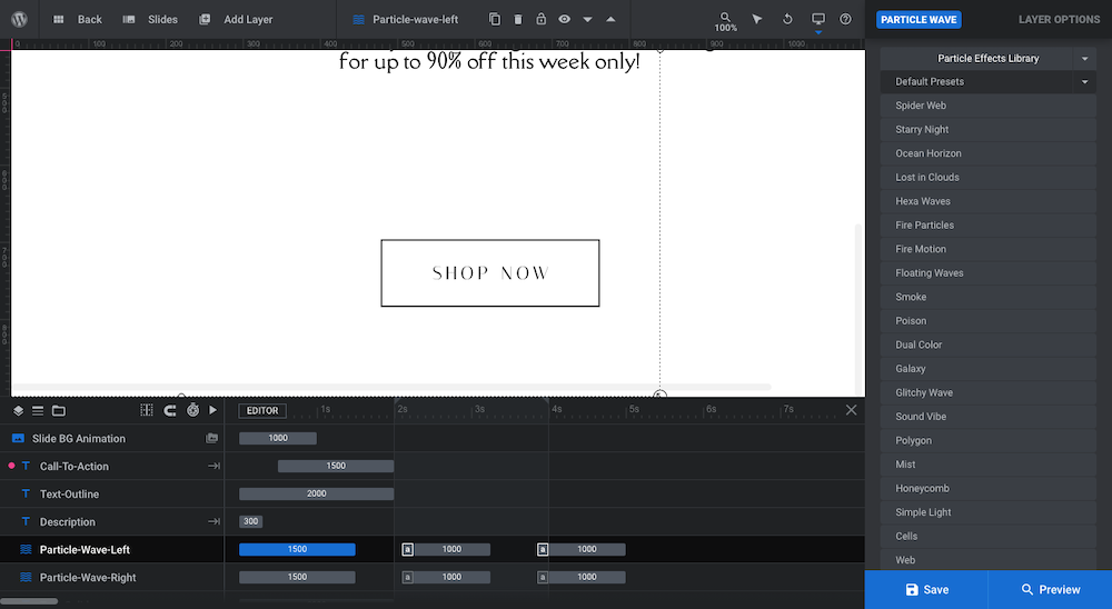
Many of these presets mimic naturally occurring objects in motion — like spider webs, ocean waves, and mist. Take your time testing each one out to find a general style of animation you prefer.
Note: You don’t have to use any of the wave settings out of the box. They’re just a starting point.
For our design, we’re going to swap out the existing particle wave for the Smoke effect.
After you select your particle effect, scroll beneath the library to customize your settings:
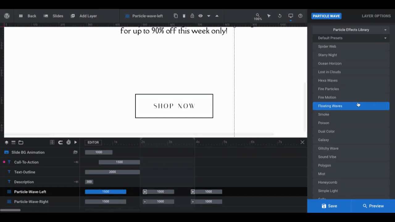
All we’ve done here is rotate the particle wave Angle to -45° under “Scene” settings. We also applied a custom tan gradient under “Particles”.
To edit Particle Wave Right, repeat the process. However, in order to create a mirror image effect, the rotation Angle will have to be set the other way — to 45°. You can then create a custom gradient for that particle wave.
Learn more:
Step 7: Deactivate the navigation
The last thing to do is deactivate the template’s navigation. Unless you’re creating a slider, there’s no need for it here.
To do this, go to “Navigation Options”. Select “Arrows” and turn the toggle to OFF:
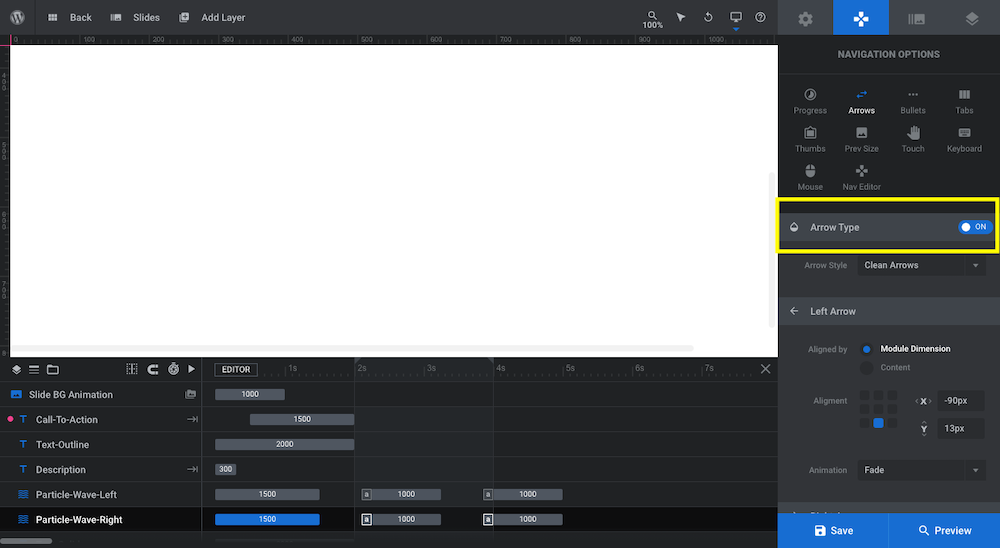
Do the same thing under “Bullets”. Save your changes. Then open up the preview and make sure there are no further changes needed to the design.
Move away from the flatness of digital and bring your hero image to life
Flat design is a good thing as it often leads to clean and minimal UIs. However, flat can sometimes be boring. It can also be difficult to interact with because it’s two-dimensional.
Using the Particle Wave Showcase template, some creative layering, and a three-dimensional particle animation, you can instantly liven up your home page. And the best part? Most of the hard work has already been done for you, so you can realistically have a beautiful hero image up and running in an hour or two.


