
Every year we see a slew of superhero blockbusters hit our movie screens. Marvel and DC seem to have a never-ending lineup of movies waiting for release, though they’re not alone. High-octane action series like Fast & Furious and John Wick provide us with heroes and antiheroes that audiences love to watch year in and year out.
One thing these movies all have in common is a showstopping title screen that sets the tone for what’s to come. For instance:
These title screens only last for a few seconds and, yet, they make the hero’s “brand” more memorable while giving the audience a visual preview of what’s to come. This is a succinct and powerful tool every brand can use.
While Hollywood studios have huge budgets to produce content like this, you won’t need one with Slider Revolution. In this tutorial, we’ll show you how to repurpose the Cinematic Hero Titles template to design a hero image and make a bold statement from your home page.
Table of Contents:
- Step 1: Update the slides based on the theme of your hero
- Step 2: Edit the background graphic
- Step 3: Edit content in the text layers
- Step 4: Style your text
- Step 5: Change text animation
- Step 6: Customize the Lottie
- Step 7: Finalize your slides and navigation
How to design a showstopping hero image for your home page
The home page is one of the most heavily trafficked pages on a website. If you’re not maximizing this opportunity and wowing visitors the second they enter it, you could be doing your brand a big disservice.
What you need to figure out is what kind of impact you want your hero image to make. Slider Revolution’s Cinematic Hero Titles template provides a good jumping off point:
This slider template comes with three wildly different hero image styles. You’re bound to find one that speaks to your brand.
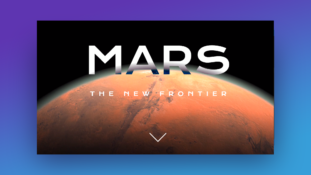
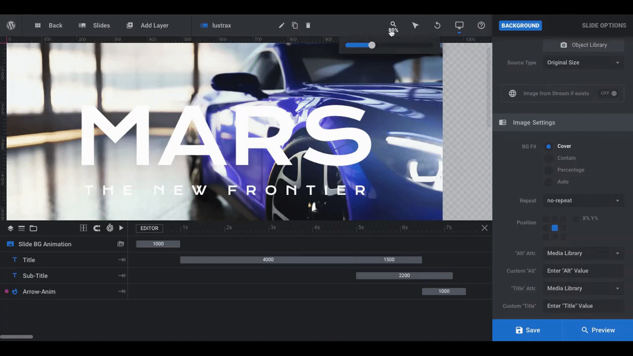
For instance, in this tutorial we’ve used the “MARS” cinematic styling to create a dramatic hero image for a luxury car company:
Before you get started, make sure you’re acquainted with the basic building blocks of a Slider Revolution template:
When you’re ready, start the tutorial to learn how to design your own impressive hero image here:
Step 1: Update the slides based on the theme of your hero
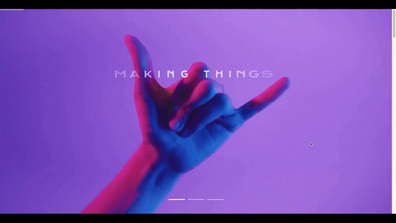
There are three styles showcased in the Cinematic Hero Titles template:
“SIMPLE” is fun and youthful and would work well for a creative agency, artisan, or even a local vendor like a coffee shop.
“MARS” conveys strength and power and would be valuable for companies selling high-end products or security features.
“CINEMATIC TITLES” feels more dramatic and emotional and would be useful for brands that have a unique story to tell or message to share with their audience.
Since we’re designing a hero image for a luxury car company, we’ve decided to use the “MARS” template. We’re also going to turn this slider into a single image.
To delete a slide, go to “Slides” in the toolbar and delete the ones you don’t need:
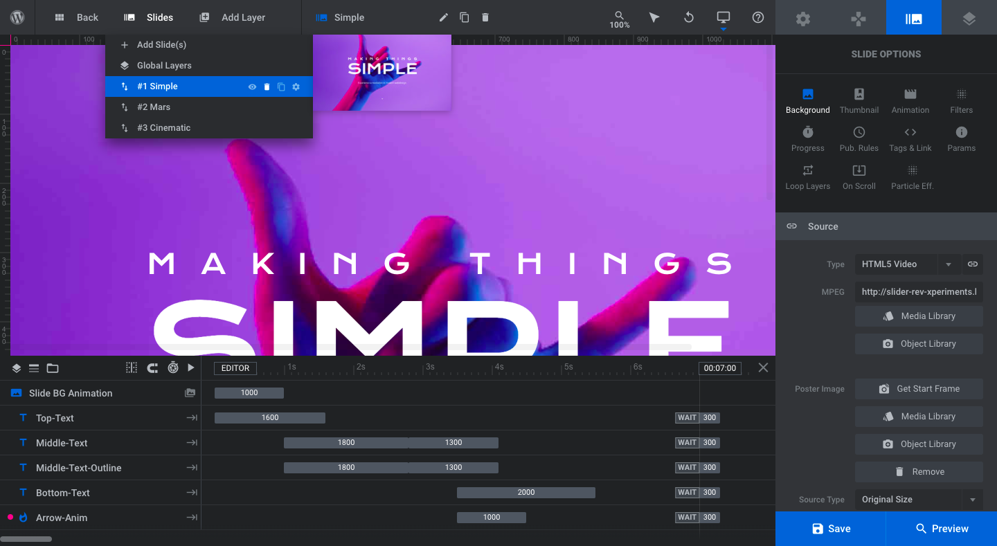
Hover over each slide and click on the trash can icon to delete it.
Pro tip: Even if you want to create a hero slider, you should delete all but one of the slides in this step. The cinematic styles vary quite a bit. Keeping all three of them could make your brand seem confused and all over the place.
Pick the one that fits best with your brand, delete the others, and then we’ll fill in the other slides at the end of the tutorial (if need be).
Learn more:
Step 2: Edit the background graphic
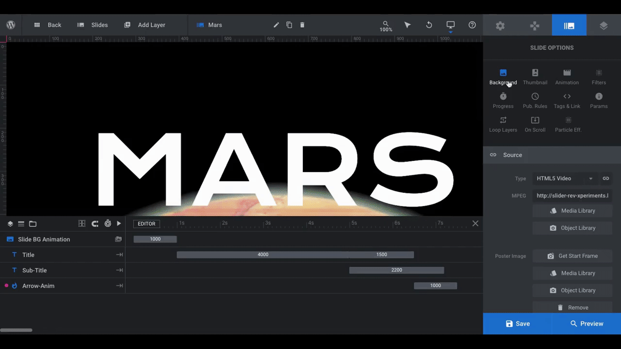
The “MARS” slide uses a video background of a planet. To replace it with something else, go to “Slide Options” and “Background”.
You can replace the video with a video or image file. You can also strip out the content and apply a color or gradient background instead.
We want to replace the video with an image. So we open the “Media Library” and upload the new file:
Feel free to play around with the “Image Settings” to see if there’s a better fit or position for the image. Our car image, for instance, needed to be repositioned so that the car wasn’t so close to the middle while ensuring that visitors could still see the headlights.
From “Slide Options”, you can also apply a filter on top of an image or an overlay on top of a video. For example:
Pro tip: Color and gradient filters are great if you want to change the mood of an image. Or if you want to apply a branded filter to all of your imagery. However, be mindful of what you apply filters or overlays to. With the planet, it doesn’t matter all that much. With a car that you’re trying to sell, on the other hand, a filter could mess with the integrity of the product.
Filters and overlays aren’t the only ways to enhance the contrast between the background and text in your slide. We’ll look at some ways to style the text in Step 4 so that it stands out more.
Learn more:
Step 3: Edit content in the text layers
If you’ve chosen to use the first or second slide in the template, you’ll want to keep your text short and punchy.
Marvel movies like the Avengers series do this well:
<iframe width=”560″ height=”315″ src=”https://www.youtube.com/embed/rg8JY4I73Lw” title=”YouTube video player” frameborder=”0″ allow=”accelerometer; autoplay; clipboard-write; encrypted-media; gyroscope; picture-in-picture” allowfullscreen></iframe>
You see the main name (i.e. “Avengers”) and then the tagline. This isn’t just some movie branding or marketing gimmick. Big name companies like Apple do this, too:
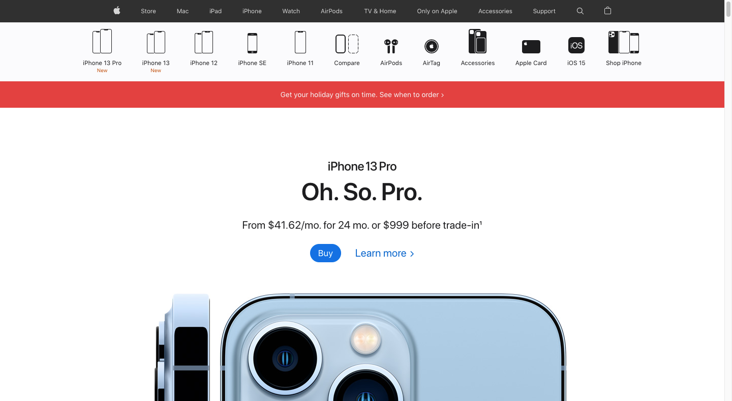
If your website is centered around selling an in-demand product or service, use a similar formula for your hero image: “Brand/Product Name” + “Tagline”.
If your website or top-level menu pages can’t be boiled down to a major product, service, or brand, then slide #3 in the template is probably a better choice for you.
To update your text layers, select them in the timeline at the bottom or click on them in the visual editor above. Then go to “Layer Options” and “Content”:
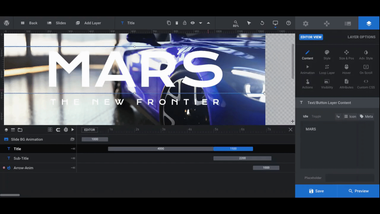
Replace the text for each layer in the corresponding text box.
Learn more:
Step 4: Style your text
In this step, you want to accomplish two things:
- Update the text styling so it aligns with your branding
- Enhance the text contrast with the background
To make style changes to your text layers, go to the settings under “Layer Options”:
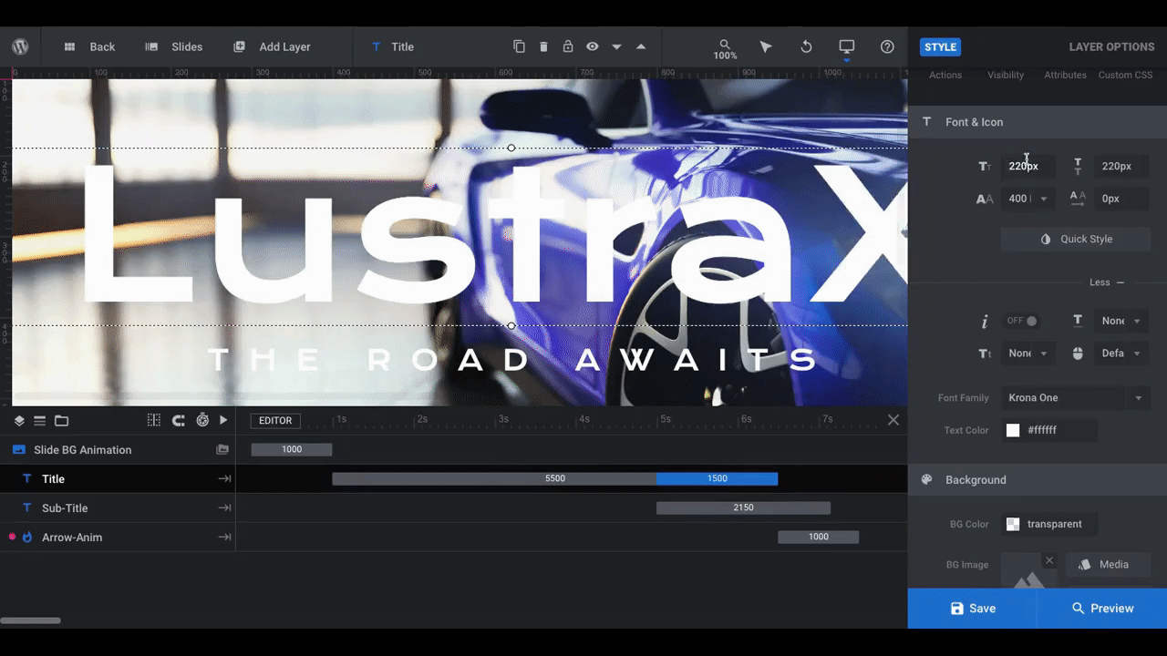
While we liked how strong the initial font and sizing was, it didn’t perfectly fit our company or product. To tweak it, we did the following:
Header:
- Decreased the size to 180px
- Changed the font to Racing Sans One
- Activated the “Text Shadow” setting
Subheader:
- Decreased the size to 35px
- Change the font to Racing Sans One
- Changed the color to #d2ccc4
- Activated the “Text Shadow” setting
- Added a 5px shadow to the horizontal (x) position to deepen it a bit more
There are other ways to modify your text layers. You can adjust the spacing and position. You can also add backgrounds, borders, text strokes, and so on. You’ll find these settings under “Style”, “Size & Pos”, or “Adv Style”.
Learn more:
Step 5: Change text animation
Each of the slides in the template makes an eye-popping entrance. Because of how well-timed and complex the animations are, they’re also going to force visitors to stop and wait for the slide to completely load.
As it stands now, you don’t need to do much to the animations since they were designed to capture attention the way a movie title screen does. That said, you might want to tweak the animation so it fits better with your brand’s style.
To experiment with different animations, go to “Layer Options” and “Animation” for both the header and subheader text layers:
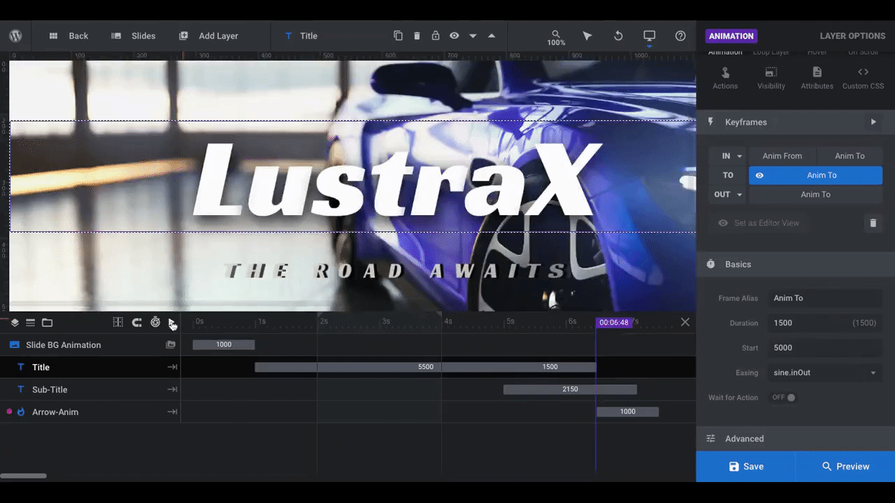
In this example, we’ve kept the main header text as is. The text slowly fades in and then the letters pull together. This is the kind of strong entrance a product like this needs.
The one thing we decided to change was the subheader. Rather than fade into place the way the header does, we changed the “IN” / “Anim TO” setting to “Long Slide from Left”. This gives it more of a Fast & Furious or Gone in 60 Seconds feel.
Take your time testing out the different transitions if this is your first time using them. There’s a lot of variation here, so you might find something else that packs the right kind of punch for your brand. If that doesn’t work, you can always create a custom animation using the “Advanced” settings at the bottom.
Learn more:
- The Two Default Animations: “IN” and “OUT”
- Slider Revolution’s Simple and Unique “From” and “To” Animation System
- Using Presets to Quickly Apply Animations
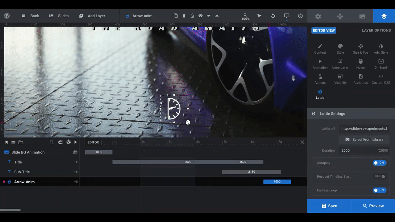
Step 6: Customize the Lottie
At the bottom of the hero image is an animated bouncing arrow. This is what’s called a “Lottie”. This is a special Addon for Slider Revolution that enables you to add small animated illustrations to your designs.
To modify the Lottie, select the layer, then go to “Layer Options” and “Lottie”:
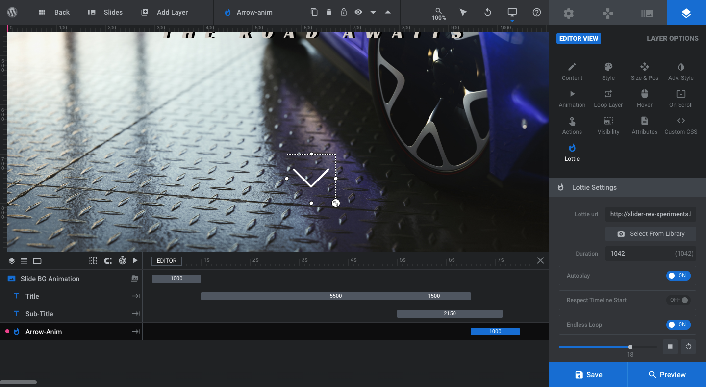
The bouncing arrow shape will work well for most hero image designs as it signals to visitors that they should scroll down. To modify the existing Lottie, use the settings to:
- Turn off autoplay
- Deactivate the endless loop
- Change interactivity
- Modify the size
- Update the color
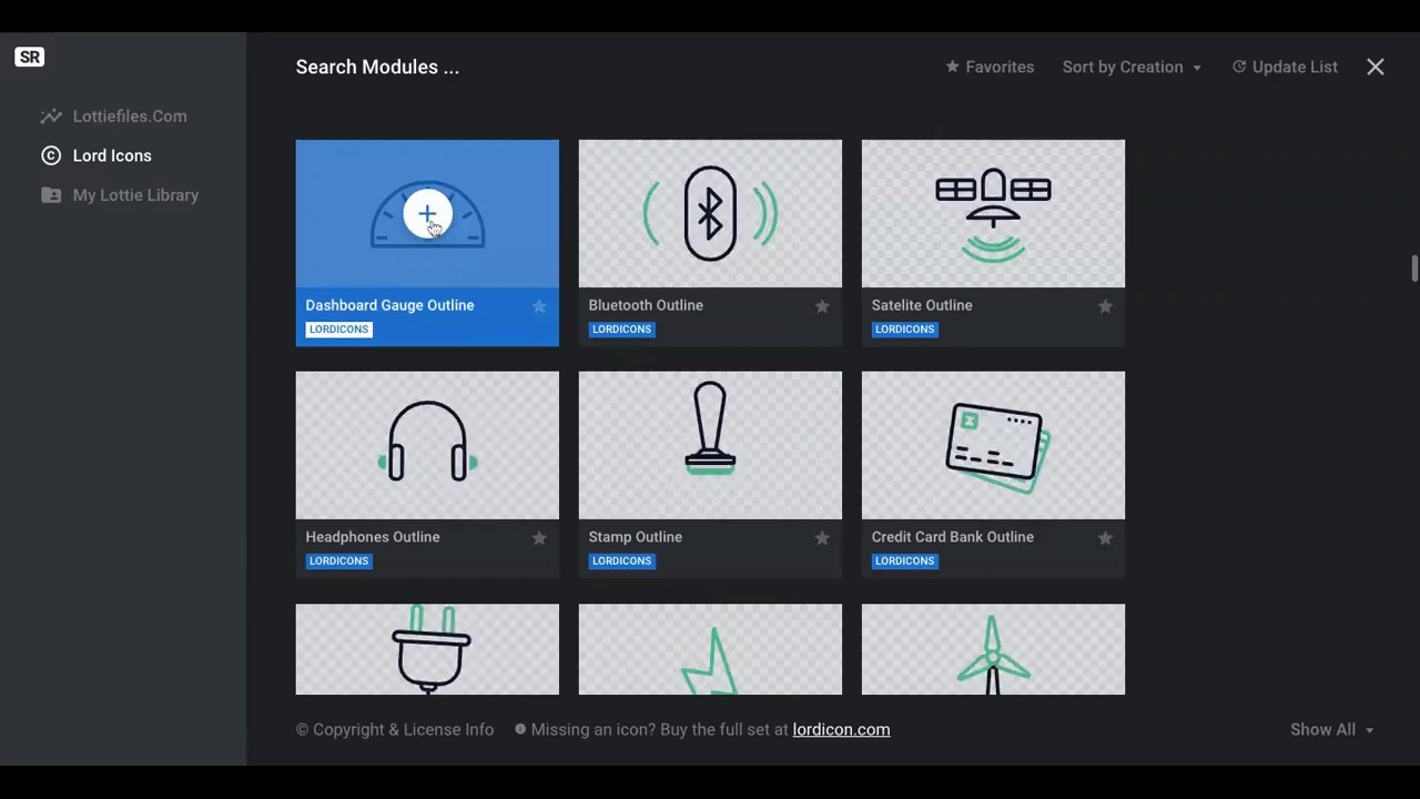
If you’d like to explore other Lottie options, click the “Select From Library” button to see the Lord Icons options. You can also upload your own here:
By replacing the Lottie file instead of adding a new Lottie layer to the slide, you’ll be able to preserve the settings of the original Lottie, which means less work for you.
One thing we changed on ours was the rotation of the Lottie. In the template, the arrow has been rotated 90 degrees. If you need to fix it, go to “Adv Style”:
Change “90deg” to “0deg”. You can then customize the rest of the settings if you’d like.
Pro tip: You don’t have to keep the Lottie in your slide. It’s a unique element that will draw visitors’ attention to the bottom of your hero image and urge them to move onto the rest of the page. However, if your goal is to get them to visit a different page, consider swapping the Lottie for a call-to-action button.
To delete the Lottie, click on it and hit “delete” on your keyboard. Then go to “Add Layer” and “Button” in the toolbar:
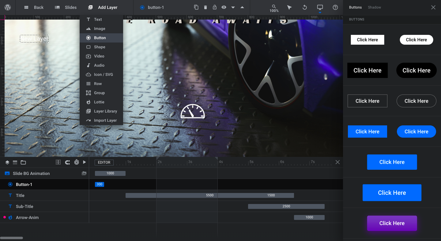
Premade button designs will appear on the right. Choose one that’s closest to what you’d like to use and then customize it using the “Layer Options” settings.
Learn more:
Step 7: Finalize your slides and navigation
If you’re going to create a slider, this is where you’ll duplicate the slide you just finished. Then go through Steps 2 through 6 to customize the content in each.
To duplicate the slide, open up “Slides” in the toolbar, hover over the one that’s there, and click the duplicate icon:
By doing it this way, you’ll keep the same settings and placement of elements from slide to slide which will create a smoother experience for your visitors. All you’ll need to do is swap the image, text, and Lottie.
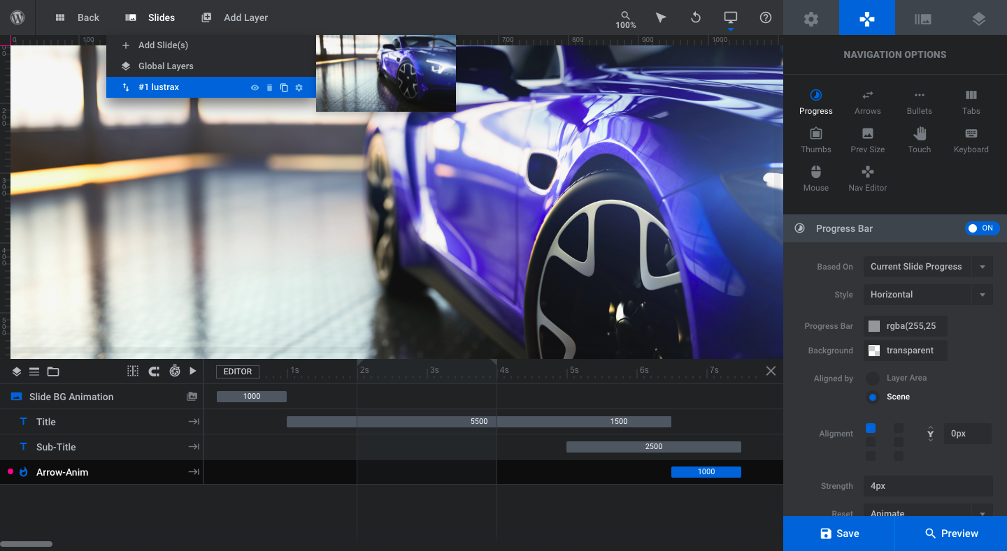
When you’re done, the last thing to deal with is the navigation.
If you’ve created a single slide hero image as we’ve done, go to “Navigation Options” and deactivate all of the navigational elements: Progress, Arrows, Bullets, Tabs, and Thumbs:
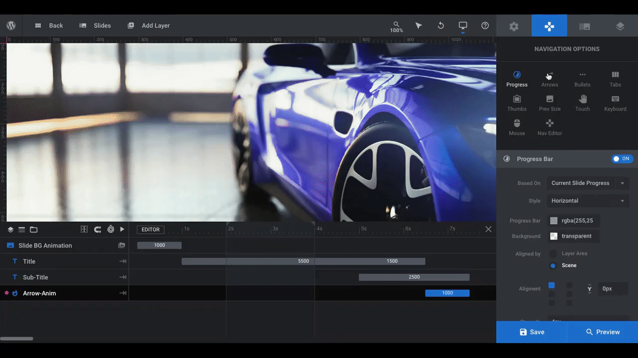
If you’ve created a slider, review the existing “Progress Bar” and “Bullets” navigation elements that are currently active. If you don’t like those elements, deactivate them and try something else.
Pro tip: “Arrows” work well for most sliders as they’re easy to spot and visitors instantly know that they give them control over the pace of the slider. However, another option to consider is “Thumbs”. This will show users the thumbnail images from each slide.
Similar to how you might see a thumbnail when rewinding or fast-forwarding through a movie you’re streaming, the Thumbs navigation will help you maintain the cinematic feel of this slider. What’s more, if you show visitors a preview of the awesome products featured in the other slides, you’ll encourage more of them to click through all of them rather than scroll past.
Learn more:
Make your brand the (super)hero with Slider Revolution
Movie title screens are designed to capture the audience’s attention right from the very start of the film. So why not leverage this technique to grab your website visitors’ attention on the home page?
When you use Slider Revolution to design your hero image and sliders, you don’t just save time (though that’s a big plus). The templates help you lay the groundwork for a design that’s truly impressive.


