
These days, you really only have a fraction of a second to capture someone’s attention online. That’s why less is often more when it comes to hero banner design.
In this tutorial, we’re going to explore the popular web design trend of typography-based hero banners. For this one in particular, we’re going to create a hero banner with high-impact typography and interactive shapes.
Rather than start from-scratch, we’ll put the Minimal Typography Website template to use.
Table of Contents:
- Step 1: Remove the global layers
- Step 2: Deactivate the navigation
- Step 3: Delete 3 of the slides
- Step 4: Customize the background gradient
- Step 5: Upload a new floating graphic
- Step 6: Edit the text layers
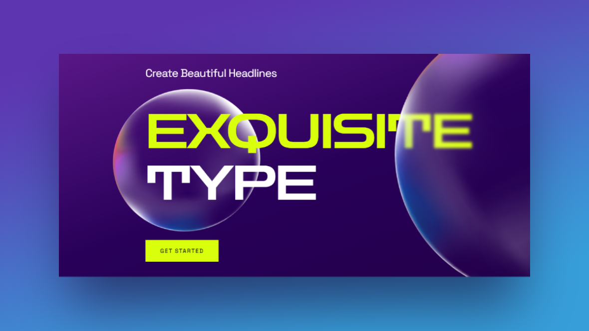
How to design a high-impact typography hero banner
When selling or marketing an abstract or complex concept, you may be hard-pressed to find traditional imagery that works well in your designs. And that’s okay. Text-only hero banners can be just as effective.
The trick is to create typography that is visually stunning. Adding an interactive component will also help, so long as it doesn’t steal the show. That’s the formula we used to create the Minimal Typography Website Slider template:
It’s the same formula we’re going to adhere to when customizing this template and turning it into a typography hero banner for a non-profit organization:
If you need a quick introduction to Slider Revolution before beginning the tutorial, start here:
Step 1: Remove the global layers
Global Layers are a handy tool in Slider Revolution. You can use them to create website header and navigational elements, like the ones included in this template. You can also use them to create layers that will stay put as users engage with a slider or carousel.
We’re going to turn this hero slider into a single hero banner for our home page. So we don’t need the Global Layers for this particular design.
To access Global Layers, go to “Slides” in the top toolbar and click on “Global Layers”:
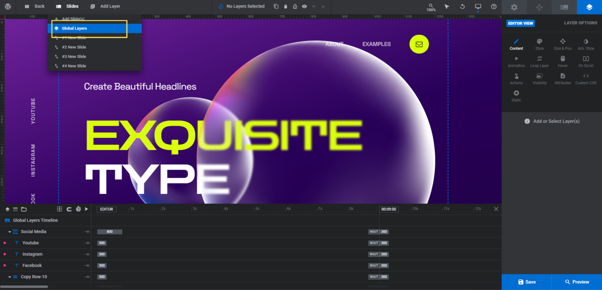
Down in the timeline editor, you’ll find various layers and groups that form the header bar at the top, the social media links on the left, and the navigation arrows at the bottom. We’re going to delete all of them.
In Slider Revolution, you can simultaneously delete layers by holding down the Ctrl or command button on your keyboard. Then, select the following layers:
- Social Media
- Copy Row-10 (that contains the header content)
- Copy Row-10 (that contains the slide number and arrows)
Note: Deleting the top-level group will delete all of the layers beneath it.
Hit the Backspace or delete key and it will remove all the Global Layers at once.
Learn more:
Step 2: Deactivate the navigation
Since we’re turning this slider template into a static banner, we don’t need a slider navigation.
To deactivate it, first open up any of your slides from the “Slides” controller. Then, go to “Navigation Options”.
“Bullets” are the only type of navigation activated. Click on the corresponding setting and then switch it off via the toggle:
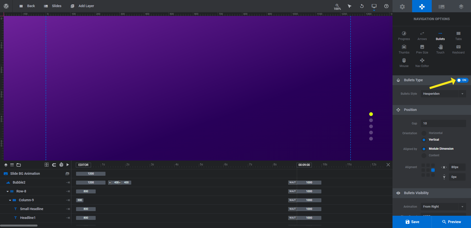
Save your changes.
Step 3: Delete 3 of the slides
Next, go back to “Slides” in the toolbar. To turn this hero slider into a hero banner, delete three of the four slides.
All of them contain the same elements. The main difference is in the text alignment. Slides #1 and #3 have left-aligned text. Slides #2 and #4 have right-aligned text. Make sure that the one slide that remains has the text on the side that you want it. This will save you from having to edit the alignment by hand.
To delete the slides, hover over the slide names one by one and then click on the trash can icon:
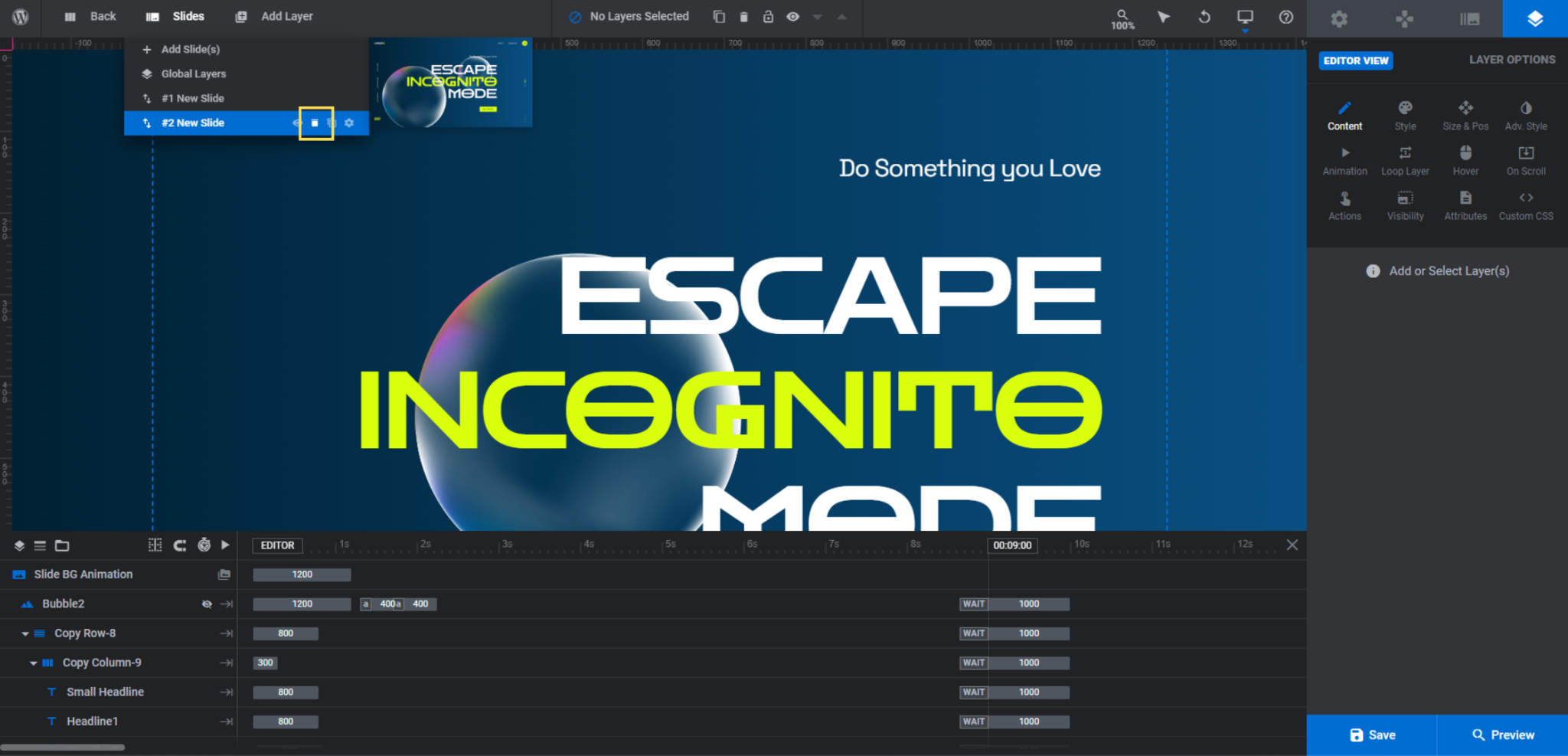
When you’re done, you’ll have just one slide remaining.
Learn more:
Step 4: Customize the background gradient
Each slide has a color gradient set as the background. To edit it, go to “Slide Options” and “Background”.
Pro tip: To keep the design of this typography hero banner as minimal as the original template, set the background as either a solid color or gradient. An image or video background will draw too much attention away from the text.
From within the color selection dialogue, you can edit the:
- Colors along the gradient
- The placement of each color
- The transparency of each color
- The direction of the gradient
If you’re having a hard time creating your own gradient, peruse the preset gradients in the bottom-right corner of the modal.
Note: There’s a loading animation set up for the slide called Water Surface Lite. The water theme makes sense for our theme, but it might not for yours. Take a look at the other transition effects available under “Slide Options” and “Animation” if you want to change it.
Learn more:
Step 5: Upload a new floating graphic
The same graphic is used to create the floating bubble layers — Bubble and Bubble2.You don’t have to use the same image for both if you don’t want to. Just know that that’s how this effect was created in the template.
Here are some tips to help you create your replacement graphic:
- Use a square image.
- Try to get the size as close to 765 px x 765 px as possible.
- Apply a transparent effect to the graphic so that the text can be seen behind it. (We used a 20% transparency on ours.)
- Export it with a transparent/invisible background so it looks like a free-floating object.
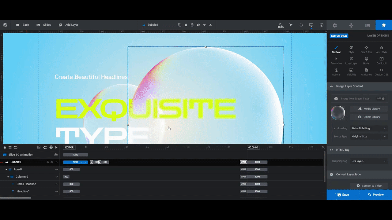
To preserve the interactive special effects, replace the bubble layers instead of deleting and adding new ones.
To do this, select the Bubble and Bubble2 layers one at a time. Then go to “Layer Options” and “Content” to replace the media file:
Keep in mind that the typography should be the most important content in this hero banner.
When choosing an image to replace the bubbles, make it something that won’t steal the show. You want it to be something that fits with the overall theme, but doesn’t visually tell much of a story of its own. It’s there to complement the text while also giving visitors something fun to interact with.
Learn more:
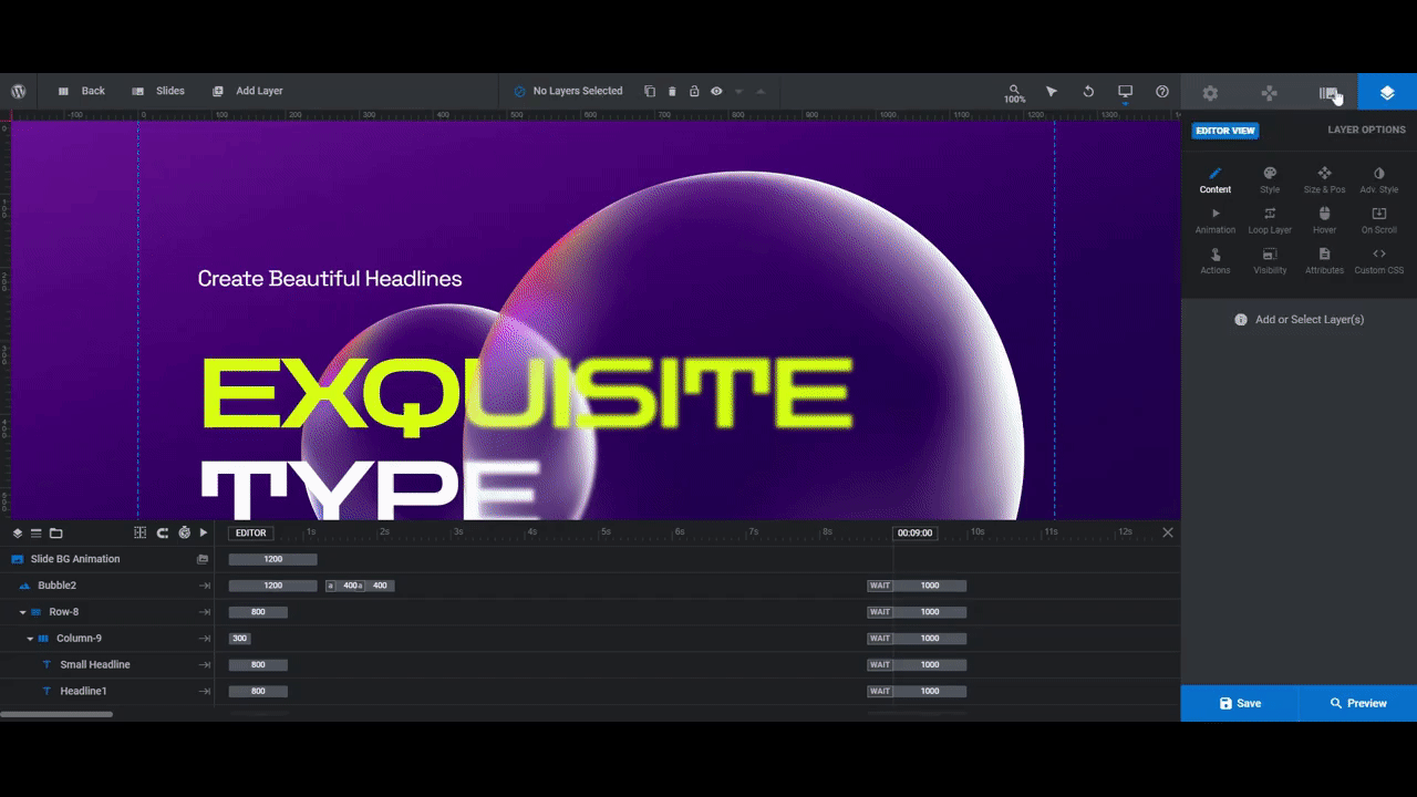
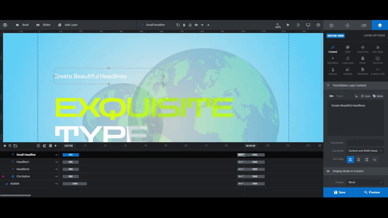
Step 6: Edit the text layers
In this last step we’re going to edit the text layers. There are four of them:
- Small Headline is the line of white text at the top.
- Headline1 is the yellow-green “Exquisite” part of the headline.
- Headline2 is the white “Type” part of the headline.
- Cta Button is the button at the bottom.
You want these lines of text to be high impact, which means choosing eye-catching fonts, using large font sizes, and adding bold colors.
To make these changes, select each text layer one at a time and go to “Layer Options”.
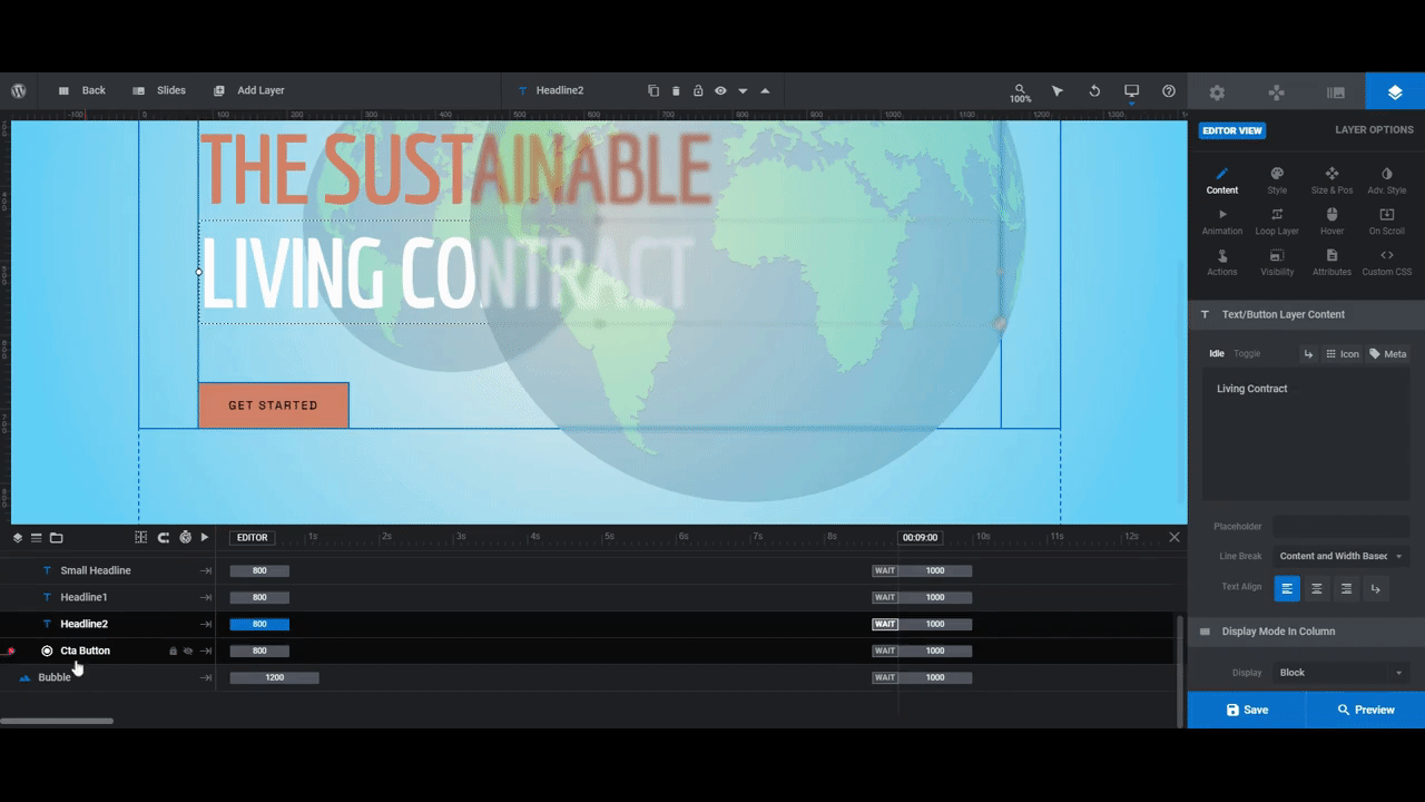
Modify what the layer says under “Content”.
Edit the font, color, styling, and spacing under “Style”.
Edit the size under “Size & Pos”.
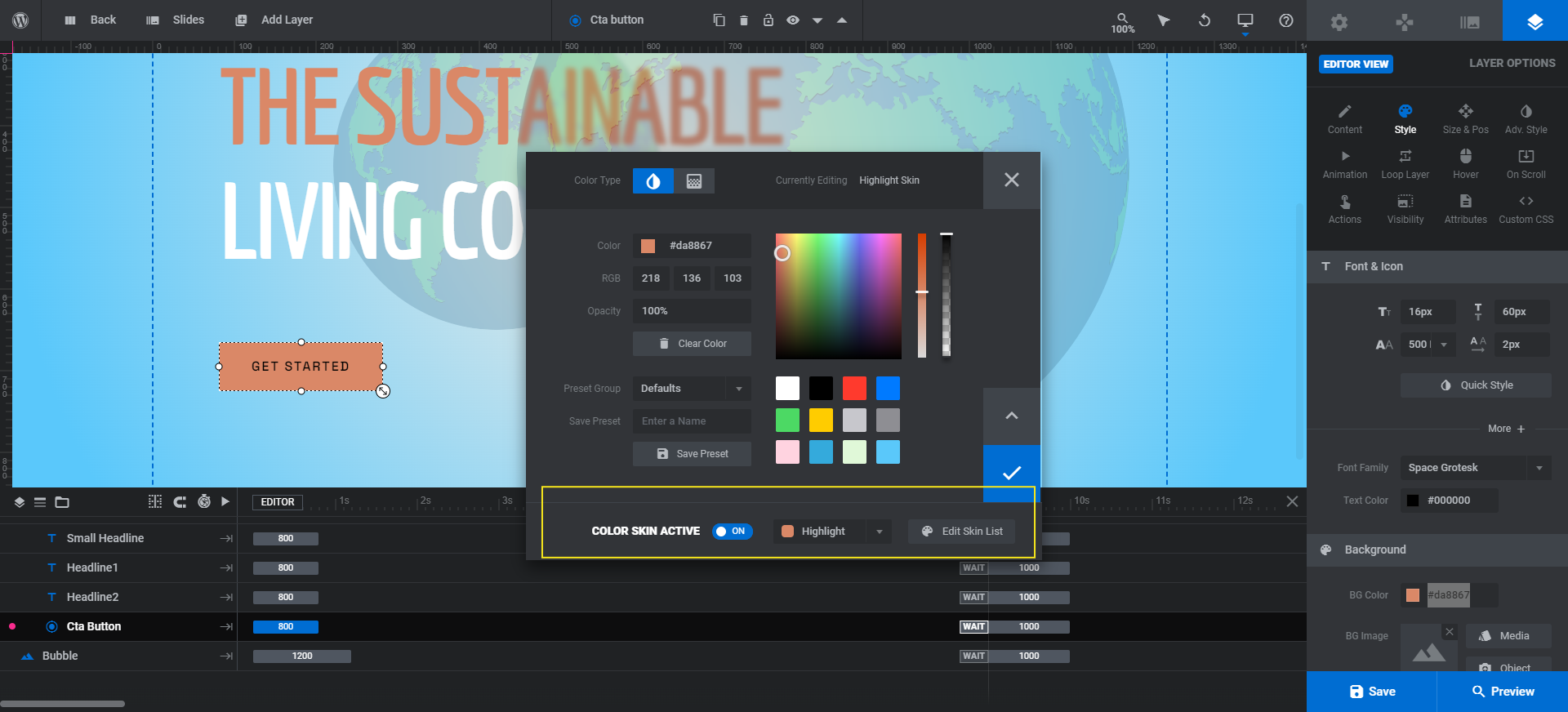
Note: When you edit the color of Headline1, the color of Cta Button will change. And when you edit the color of Small Headline, the color of Headline2 will change. That’s because the colors are configured under “Module Options” and “Skin” (you should have seen the pop-up when you first opened the template):
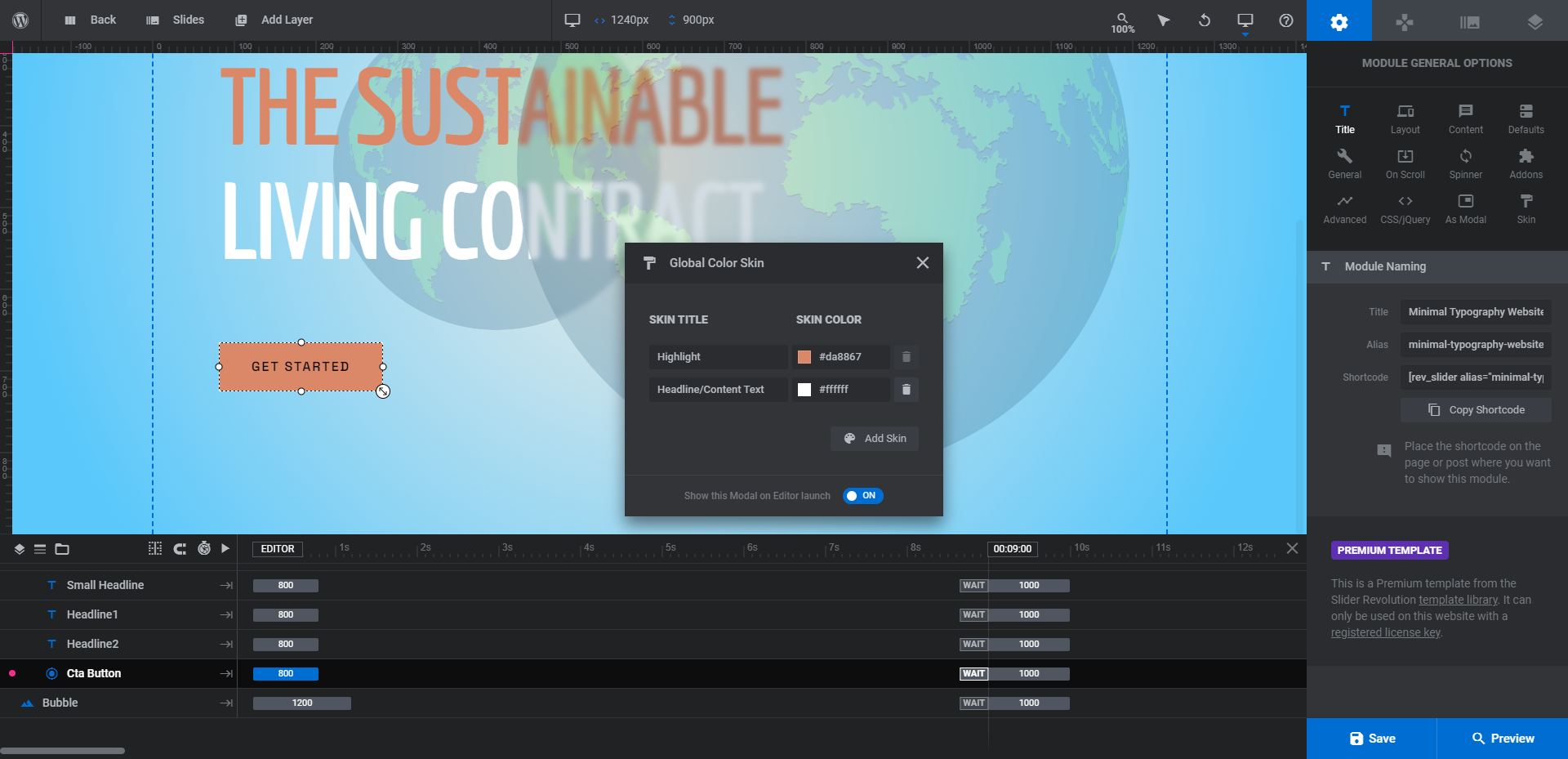
If you want to disconnect these layer colors so you can customize the color of each layer, you can do one of two things.
You can delete the Skin Color using the “Skin” tool under “Module Options”. You can also open the color selection dialogue for the layer that needs a different color and deactivate the Color Skin Active setting:
When you’re done configuring the three text layers, turn your attention to the Cta button. You can edit the button text, font, color, and size the same way you did the text layers.
In addition, you’ll want to configure the Hover settings of the button. While the main color of the button will match the color set for Headline1, the hover state won’t be updated. So that’s something to take care of now:
You can do additional styling to your button design if you prefer. For instance, you can add a border under “Style”, a shadow under “Adv Style”, and change the way it’s animated under “Animation”.
Learn more:
Minimize your hero banner design and maximize engagement
There’s a reason why typography hero banners are a popular trend in recent years. They provide an unexpected surprise.
While you can create some really cool designs and experiences with images and videos, sometimes all you need is a killer color gradient, bold typography, and a small dose of interaction. The Minimal Typography Website Slider template from Slider Revolution makes easy work of it, too.


Hey Dude! A classic article, everything is openly discussed. This step-to-step guide is very beneficial for designing high-impact typography hero banners. I really appreciate your work.
Thanks for writing this blog.